A compliance report dashboard is not just a reporting layer. In enterprise environments, it is the operational command center that shows whether controls are working, evidence is complete, remediation is progressing, and audit response risk is under control. For compliance leaders, internal audit teams, IT managers, and operations directors, the pain is familiar: evidence lives in too many systems, status updates are trapped in spreadsheets, ownership is unclear, and audit preparation becomes a last-minute fire drill. A well-built dashboard solves this by turning fragmented compliance activity into a defensible, real-time view of audit readiness.
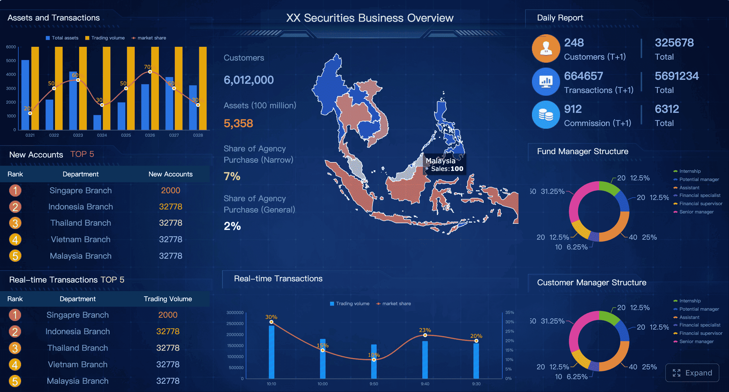
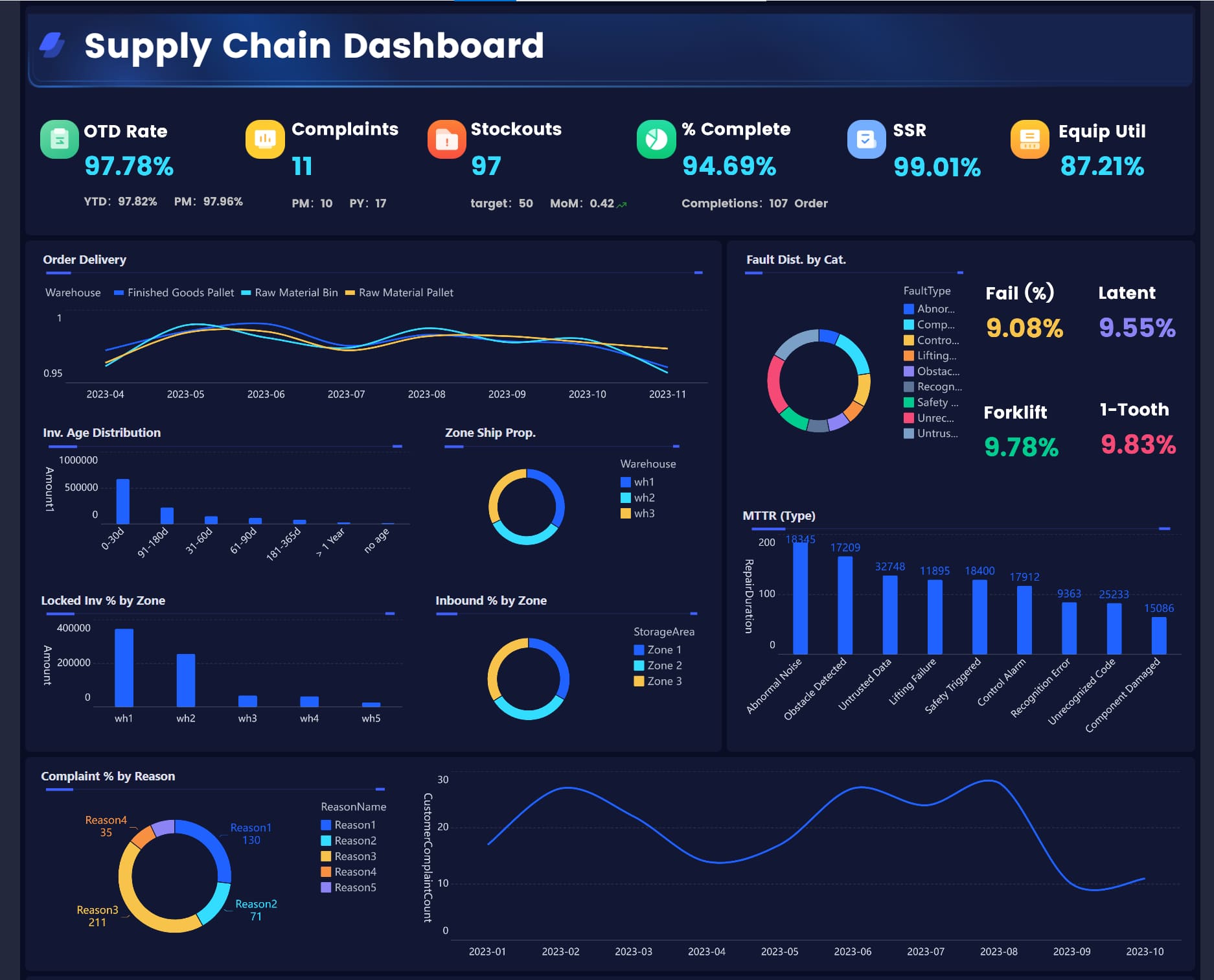
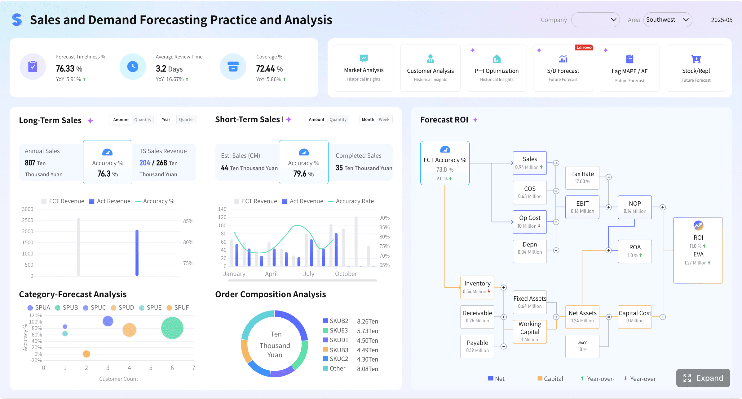
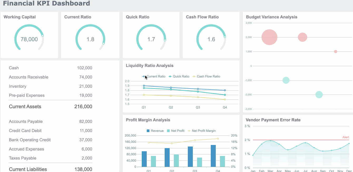
All reports in this article are built with FineReport
What a Compliance Report Dashboard Is and Why It Matters
A compliance report dashboard is a structured reporting interface that consolidates the data required to prove compliance readiness across regulations, internal policies, and audit programs. It brings together control status, testing records, issue logs, evidence links, ownership, due dates, and reporting progress in one place.
For enterprise teams, the business value is immediate:
Without a central dashboard, teams often confuse two different needs: ongoing operational monitoring and audit-facing reporting.
Operational Monitoring vs. Audit-Facing Reporting
Operational monitoring is about daily or weekly execution. It helps teams answer questions like:
Are controls being performed on time?
Is evidence being uploaded as expected?
Which actions are overdue this week?
Where are repeat issues increasing?
Audit-facing reporting is different. It focuses on defensibility and traceability. Auditors want to know:
Which requirement maps to which control?
Who owns the control?
What evidence supports operating effectiveness?
When was it reviewed?
What exceptions remain open?
Is the data complete, current, and attributable to a trusted source?
A mature compliance report dashboard supports both layers. It gives executives a concise readiness summary while allowing audit and compliance teams to drill into detailed records.
Core Metrics and Data Sources to Include in Compliance Report
The strength of a compliance report dashboard depends on the quality of its model. If the dashboard only summarizes outcomes, it will miss the drivers of audit readiness. If it only lists granular tasks, leaders will not see risk fast enough. The right design connects requirements, controls, evidence, exceptions, and remediation in one reporting structure.
Key Metrics (KPIs)
A strong compliance report dashboard should include these core KPIs:
Overall Compliance Readiness Score: A rolled-up measure of current audit preparedness based on control completion, evidence completeness, and unresolved issues.
In-Scope Requirements Count: Total number of regulations, standards, policies, or clauses being tracked.
Control Coverage Rate: Percentage of requirements mapped to active controls.
Control Effectiveness Status: Distribution of controls by effective, partially effective, ineffective, or not tested.
Evidence Completeness Rate: Percentage of required evidence artifacts collected and linked.
Testing Completion Rate: Share of scheduled control tests completed within the defined period.
Open Findings Count: Number of unresolved deficiencies, exceptions, or audit findings.
Overdue Remediation Actions: Corrective actions past due date.
Repeat Findings Rate: Percentage of issues recurring across periods or audits.
High-Risk Exception Count: Number of unresolved issues with high business or regulatory impact.
Average Remediation Cycle Time: Time taken to close findings or exceptions.
Upcoming Deadline Exposure: Number of actions, certifications, or submissions approaching due date.
Evidence Aging: How long critical evidence has gone without refresh or validation.
Owner Responsiveness Rate: Percentage of assigned owners updating status or closing actions on time.
Audit Request Fulfillment Time: Average time to respond to auditor information requests.
Map Requirements to Controls and Owners
The first design principle is simple: every requirement should map to a control, and every control should have an owner.
That means your dashboard should clearly show:
Applicable regulations and internal policies
Related business units and legal entities
Control IDs and descriptions
Primary and secondary control owners
Testing cadence
Current control status
Known gaps or unresolved deficiencies
This mapping eliminates one of the biggest enterprise reporting failures: control ambiguity. When nobody knows who owns a control, audit readiness deteriorates quickly.
Useful sub-views include:
Requirement-to-control coverage heat maps
Control owner workload by department
Controls with missing ownership
Controls not tested within required cadence
Gaps by framework, region, or process
Bring Together Evidence from Trusted Systems
A compliance report is only as credible as its data sources. Enterprise audit readiness usually requires pulling data from multiple systems, such as:
GRC platforms
ERP systems
HR tools
IT service management and ticketing systems
Identity and access tools
Policy management repositories
Shared document repositories
Workflow and approval systems
The dashboard should not merely display totals. It should preserve lineage: where the data came from, when it was refreshed, and who can access it.
Critical data design fields include:
Source system name
Refresh timestamp
Record owner
Data lineage or source reference
Access classification
Last validation date
Evidence document link
This is where many spreadsheet-based compliance report processes fail. Teams manually copy data from multiple applications, then lose timestamp integrity and source traceability. A dashboard connected to trusted systems reduces that risk significantly.
Track Exceptions, Remediation, and Deadlines
Open exceptions are what delay audits, trigger escalations, and expose program weakness. Your compliance report dashboard should make them impossible to ignore.
Track at minimum:
Overdue actions
Open findings by severity
Repeat findings
Remediation owners
Target closure dates
Closure trend over time
Bottlenecks by department or region
Exceptions with missing evidence
Items at risk of missing audit response deadlines
For decision-makers, the most valuable view is often not how many issues exist, but which issues are most likely to disrupt the next audit cycle.
The Step-by-Step Guide to Building the Compliance Report
Building an enterprise compliance report dashboard requires more than assembling charts. It requires a reporting model that reflects audit objectives, audience needs, governance standards, and defensible calculations.
Start with Audit Objectives and Reporting Audiences
Do not begin with visuals. Begin with decisions.
Ask four stakeholder groups what they need from the compliance report:
Executives need readiness summaries, top risks, trend signals, and major overdue items.
Compliance teams need detailed status by framework, entity, owner, and control.
Control owners need task status, due dates, evidence requests, and issue follow-up actions.
From there, define the primary reporting questions:
Are we audit-ready today?
Which business units are lagging?
Which controls are not tested on time?
Where is evidence incomplete?
Which findings are unlikely to close before the next audit?
A seasoned approach is to create one executive landing page and then separate drill-down views by role. This keeps the dashboard scannable while preserving detail where needed.
Design the Layout for Fast Decision-Making
A compliance report dashboard should support fast interpretation, not visual clutter. The best layouts follow a top-down pattern:
Summary KPI cards
Readiness and risk trends
Exceptions and overdue actions
Control and requirement drill-down
Evidence access and detail tables
Recommended design components include:
KPI summary cards
Trend lines for readiness and closure rates
Severity-based issue charts
Filters for region, business unit, framework, and owner
Drill-down tables with evidence links
Status color logic with consistent definitions
Searchable issue and control records
Keep terminology consistent. If one team uses "finding" and another uses "exception" for the same condition, the dashboard creates confusion instead of clarity. Create one approved data dictionary for all critical fields.
Set Rules for Data Quality and Governance
This is the difference between a dashboard that looks good and one that stands up in an audit.
For every metric in the compliance report, define:
Metric owner
Business definition
Calculation logic
Source system
Refresh frequency
Approval or review workflow
Exception handling rule
Then put governance around the reporting cycle:
Collect source data automatically where possible.
Validate completeness and freshness before publication.
Route unresolved discrepancies to designated owners.
Freeze or snapshot reporting versions used for audit periods.
Maintain change logs for logic, structure, and definitions.
A practical enterprise rule is to tag each metric as either operational, management, or audit-defensible. That classification helps teams know what level of review is required before sharing the data externally.
Best Practices for Enterprise Audit Readiness
The most effective compliance report dashboards are not the most complex. They are the most reliable, explainable, and repeatable.
Make Reporting Defensible and Easy to Verify
Auditors do not just inspect numbers. They inspect trust.
To make reporting defensible:
Maintain timestamps for every critical metric and evidence artifact.
Store version history for evidence, status changes, and report logic.
Preserve source references for all summarized values.
Reduce spreadsheet rework and email-based status collection.
Use drill-through paths from KPI to underlying record.
The practical goal is simple: if an auditor questions a number, your team should be able to explain it in minutes, not days.
Align the Dashboard with Recurring Compliance Reporting Cycles
Enterprise compliance work is cyclical. Your dashboard should reflect those cycles instead of forcing teams to rebuild reports every period.
Typical cycles include:
Monthly compliance reviews
Quarterly control certifications
Semiannual remediation reviews
Annual audit preparation
Ad hoc regulator or auditor response windows
Best-practice capabilities include:
Deadline calendars
Automated reminders
Missing evidence alerts
Upcoming certification notifications
Period-over-period trend comparisons
A dashboard that aligns with the operating calendar becomes part of the process, not just a reporting artifact.
Balance Visibility with Confidentiality
Not every stakeholder should see the same level of detail. Compliance reporting often includes sensitive tax, HR, legal, ethics, and investigation data.
Use role-based design to separate:
Executive summaries
Manager-level control views
Detailed issue logs
Sensitive evidence attachments
Restricted investigation or legal records
Apply security controls such as:
Role-based access
Department-level data permissions
Record-level or field-level restrictions
Watermarking for exported files
Segregated views for confidential domains
This protects confidentiality without weakening enterprise-wide visibility.
Common Compliance Report Scenarios and Specialized Use Cases
A good compliance report dashboard is modular. The core structure stays consistent, while specialized views support domain-specific reporting needs.
Tax Compliance Report Tracking
A tax compliance report dashboard should help tax and finance teams monitor filing readiness across jurisdictions and entities. Key views often include:
Filing status by jurisdiction
Calendar deadlines
Required document completeness
Open exceptions and missing submissions
Escalations requiring external review
Late payment or late filing risk indicators
For multinational enterprises, this view is especially valuable because local obligations, document requirements, and review cycles vary significantly across regions.
Compliance and Ethics Reporting Workflows
Compliance and ethics reporting requires a different lens. The dashboard should surface trend signals without exposing sensitive case details too broadly.
Important metrics include:
Hotline case volume trends
Investigation aging
Policy attestation completion
Substantiation outcomes
Remediation completion rates
Repeat issue categories
Escalation rates by region or function
The strongest design pattern is to connect ethics issue trends with broader audit readiness indicators. For example, a spike in unresolved investigations may signal policy control weakness or training gaps that auditors will want explained.
How to Maintain and Improve the Compliance Report Over Time
An enterprise compliance report dashboard should evolve with regulations, audit feedback, and business priorities. If it stays static, it gradually becomes less useful and less trusted.
Review the dashboard on a regular basis to confirm:
Metrics still reflect current regulations and internal policies
Review dashboard performance after each reporting cycle.
Collect feedback from auditors, compliance teams, and business users.
Identify low-value metrics or unused widgets.
Add new indicators where risk has shifted.
Update definitions and governance documentation.
Retest access permissions and evidence links.
This discipline keeps the compliance report aligned with real audit readiness needs instead of historical assumptions.
Build It Faster and More Reliably With FineReport
Building this manually is complex; use FineReport to utilize ready-made templates and automate this entire workflow.
Get Ready-to-Use Dashboard Templates in Fine Gallery
For enterprise teams, the challenge is not just designing a compliance report dashboard. It is connecting fragmented systems, standardizing metrics, enforcing permissions, automating refreshes, preserving audit trails, and delivering role-specific views at scale. That is exactly where FineReport fits.
Interactive drill-down and linked analysis for tracing KPI values to underlying records
Automated scheduling and report distribution for monthly, quarterly, and annual reporting cycles
Fine-grained permission controls by role, department, and data scope
Alerting and notification workflows for overdue actions, missing evidence, and KPI exceptions
Export and report output options for PDF, Excel, and formal audit reporting packages
Instead of relying on disconnected spreadsheets and manual status consolidation, teams can use FineReport to centralize the full compliance reporting process—from data collection and dashboarding to evidence traceability and management reporting.
If your goal is to improve audit readiness, reduce reporting friction, and create a more defensible compliance report process, this is the smarter path.
It should show control status, evidence completeness, open findings, remediation progress, ownership, due dates, and requirement-to-control mapping. The most useful dashboards combine executive summary metrics with drill-down access to detailed audit records.
A compliance report is usually a point-in-time document, while a dashboard provides a live view of readiness across controls, evidence, and issues. The dashboard helps teams monitor progress continuously instead of preparing only when an audit is near.
Common high-value KPIs include readiness score, control coverage, evidence completeness, testing completion, open findings, overdue remediation actions, and high-risk exceptions. These metrics help leaders spot risk early and prioritize follow-up actions.
Start with trusted source data and clear mappings between requirements, controls, owners, and evidence. The dashboard should also preserve traceability, show review history, and make it easy to explain how each status was calculated.
FineReport can help teams centralize compliance data, build role-based dashboard views, and support drill-down reporting across business units and controls. This makes it easier to track readiness in real time and respond faster during audits.
Product Trial
FineReport
Pixel-perfect reports · Interactive dashboards · Easy data entry · Digital twins