Data reporting is the business process of turning raw data into clear, repeatable updates that help teams monitor performance, communicate status, and make timely decisions. For IT managers, operations directors, finance leaders, and analysts, the real value is simple: reporting reduces guesswork. Instead of chasing spreadsheets, reconciling inconsistent numbers, or waiting days for updates, teams get a trusted view of what is happening now and what needs attention next.
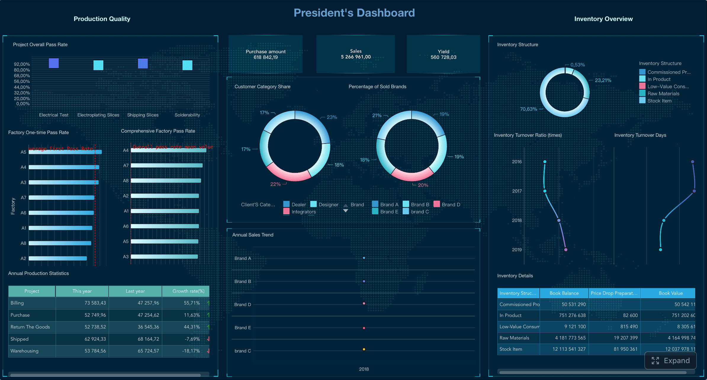
All reports in this article are built with FineReport.
What Is Data Reporting?
Data reporting is the structured practice of collecting, organizing, and presenting data in a format people can understand quickly. In plain language, it turns raw records, transactions, logs, and metrics into useful updates such as dashboards, weekly summaries, monthly performance reports, or executive scorecards.
At its core, data reporting helps teams answer “what happened?” It provides a consistent picture of business activity so stakeholders can track progress without digging through source systems themselves. A sales manager may review pipeline conversion, a plant director may watch downtime and output, and a CFO may monitor budget variance and cash flow. The report is the communication layer that makes this information usable.
Data reporting also plays a specific role in the wider data and analytics workflow. It usually sits between data preparation and deeper interpretation. First, data is collected and cleaned. Then reporting presents the important facts. After that, data analysis may explore why results changed, what caused an issue, or what may happen next.
Key Metrics (KPIs) Commonly Used in Data Reporting
The exact KPIs depend on the function, but most enterprise reporting frameworks rely on a core set of measurable indicators:
- Revenue: Total income generated over a reporting period.
- Cost: Total expenses associated with operations, projects, or departments.
- Profit Margin: Percentage of revenue remaining after costs.
- Growth Rate: Change in a metric over time, such as month-over-month or year-over-year.
- Conversion Rate: Percentage of leads, visitors, or prospects that complete a target action.
- Cycle Time: Time required to complete a process from start to finish.
- On-Time Delivery Rate: Share of orders, projects, or tasks delivered by the deadline.
- Utilization Rate: Extent to which available resources are being used.
- Error or Defect Rate: Frequency of quality issues in output or service delivery.
- Customer Satisfaction Score: Indicator of customer experience and service quality.
- Inventory Turnover: How efficiently inventory is sold and replenished.
- Budget Variance: Difference between planned and actual spending or results.
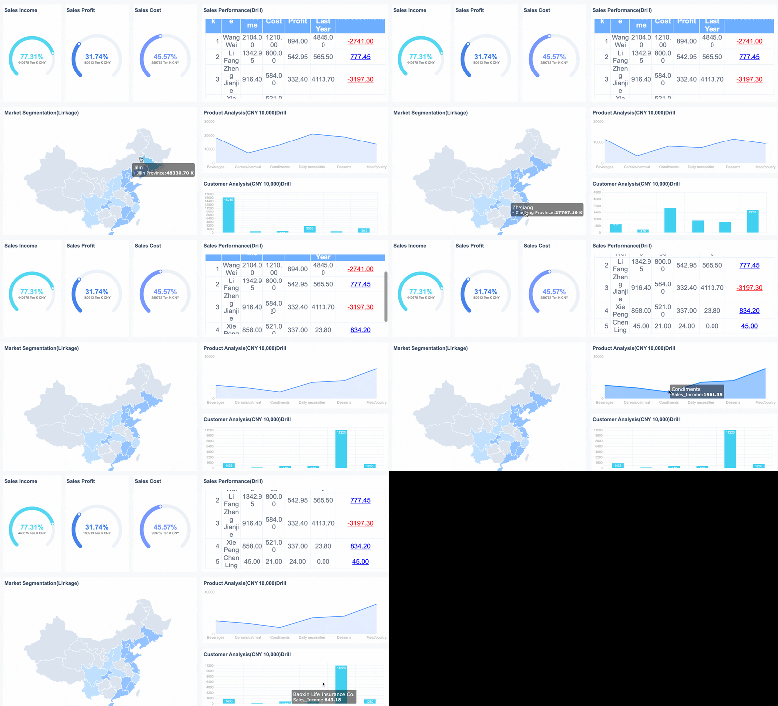 Overall-Sales Dashboard Created by FineReport
Why Data Reporting Matters
Data reporting matters because organizations move faster when everyone works from the same numbers. It creates visibility across teams, improves accountability, and shortens the distance between performance changes and management action.
Without good reporting, leaders rely on fragmented updates. One team may use spreadsheets, another may export data manually, and a third may present stale numbers in slides. This creates delays, conflicting interpretations, and low trust. Strong reporting solves that by standardizing how performance is measured and communicated.
The business benefits are immediate:
- Better visibility: Teams can see current performance without manual data gathering.
- Greater accountability: Owners can track targets, exceptions, and responsibilities clearly.
- Faster decisions: Leaders spend less time validating data and more time acting on it.
- Earlier issue detection: Trends, outliers, and operational bottlenecks surface sooner.
- More aligned communication: Departments discuss performance using shared definitions and formats.
Organizations use different report types depending on the decision they need to support:
| Report Type | Primary Purpose | Typical Audience | Example |
|---|---|---|---|
| Operational reports | Track day-to-day activity | Operations managers, supervisors | Production output, service backlog, fulfillment status |
| Financial reports | Monitor financial health | Finance teams, executives | P&L, cash flow, budget vs. actual |
| Performance reports | Measure KPI progress | Department heads, team leads | Sales targets, marketing ROI, employee productivity |
| Executive reports | Summarize strategic performance | C-suite, board, senior leadership | Enterprise KPI dashboard, business review pack |
In practice, data reporting is how organizations keep initiatives on track. A logistics team may monitor delivery delays daily. A retail team may review store sales and inventory weekly. A finance team may analyze monthly expense overruns before they become a budget problem. Reporting does not replace judgment, but it gives leaders a dependable operating picture.
The Data Reporting Process
A reliable data reporting process is not just about making charts. It is an operational system for moving from source data to stakeholder action.
From Data Collection to Distribution
Most reporting workflows follow a predictable sequence:
- Collect data from source systems such as ERP, CRM, HRIS, POS, spreadsheets, or databases.
- Clean and validate the data to remove duplicates, fix errors, and resolve missing values.
- Define metrics and business rules so calculations are consistent across teams.
- Build the report structure using tables, charts, filters, and summaries that fit the audience.
- Test for accuracy and usability before distribution.
- Distribute or publish the report through dashboards, email schedules, portals, or mobile access.
- Review usage and feedback to improve relevance over time.
This process sounds straightforward, but many reporting failures happen in the middle steps. Metrics may be defined differently by finance and operations. Source systems may refresh at different times. Reports may look polished but still confuse readers. That is why governance and business context matter as much as visualization.
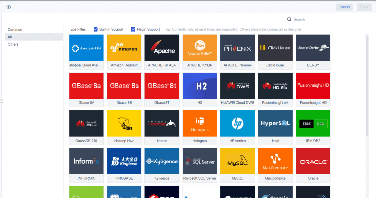 Data Connection of FineReport
Common Data Reporting Methods and Formats
Data reporting can take several formats, depending on urgency, audience, and level of detail.
Dashboards
Dashboards provide a live or near-real-time overview of KPIs in one interface. They work well for operational monitoring, executive visibility, and self-service exploration.
Scheduled Reports
These are recurring reports distributed on a fixed cadence, such as daily, weekly, or monthly. They are ideal for standardized business reviews and compliance routines.
Ad Hoc Reports
Ad hoc reports are created for a specific question or event. For example, a regional director may request a custom breakdown after an unexpected sales drop.
Visual Summaries
Visual summaries use charts, scorecards, heatmaps, and simple commentary to communicate trends quickly. They are useful for non-technical audiences who need fast interpretation.
Stakeholder-Specific Formats
Different stakeholders need different levels of detail. Executives want concise KPI summaries. Analysts may need drill-down views. Frontline managers often need actionable operational detail.
Best Practices for Clear and Useful Reports
Strong data reporting is not about adding more charts. It is about making the right information easy to trust and act on.
Focus on the audience
Start with who will use the report and what decision they need to make. A report for a COO should not look like a report for a data analyst.
Select metrics intentionally
Use metrics that connect directly to business goals. If a KPI does not support monitoring, accountability, or action, it may not belong in the report.
Keep definitions consistent
Standardized metric definitions prevent conflicts between teams. “Revenue,” “active customer,” or “on-time delivery” must mean the same thing everywhere.
Validate accuracy before publishing
A fast report with unreliable numbers damages trust. Include checks for missing data, unexpected spikes, refresh timing, and formula logic.
Design for visual clarity
Use clean layouts, meaningful labels, restrained color use, and chart types that match the data. The reader should understand the message within seconds.
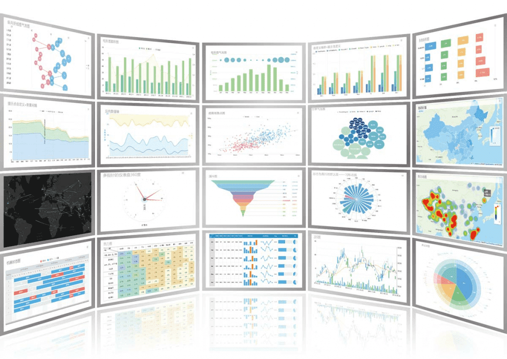 Interactive Charts of FineReport
Set the right reporting cadence
Not every metric needs real-time refresh. Match frequency to business need. Daily operational metrics and monthly strategic KPIs serve different purposes.
Data Reporting Tools and Techniques Explained
Reporting tools determine how quickly an organization can move from data collection to trusted insight. The right platform reduces manual work, supports governance, and scales across departments.
Common Features to Look For in Reporting Tools
When evaluating a data reporting platform, prioritize capabilities that support enterprise reliability and adoption.
- Data connectors: The tool should connect easily to databases, cloud apps, spreadsheets, APIs, and core business systems.
- Automation: Scheduling, refresh workflows, and burst distribution reduce repetitive manual effort.
- Visualization options: The platform should support dashboards, tabular reports, charts, drill-downs, and mobile-friendly layouts.
- Permissions and security: Role-based access is essential when different users need different data visibility.
- Export and sharing: Reports should be easy to distribute through PDF, Excel, web portals, embedded views, or scheduled email.
- Scalability: The solution should handle growing data volume, user count, and reporting complexity.
- Governance support: Standard templates, metric control, and centralized management improve consistency across teams.
Examples of Popular Reporting Tools
Different tools solve different reporting problems. The best choice depends on data complexity, user skill level, and how formal the reporting process needs to be.
| Tool Type | Best For | Strengths | Watchouts |
|---|---|---|---|
| Spreadsheets | Small teams, quick reporting | Familiar, flexible, low barrier to entry | Hard to govern, error-prone at scale |
| BI dashboards | Interactive monitoring and self-service | Strong visuals, drill-down, exploration | Can become fragmented without governance |
| Enterprise reporting platforms | Standardized operational and management reporting | Pixel-perfect reports, automation, permissions, large-scale distribution | Requires clearer planning and ownership |
| Embedded reporting tools | Software vendors and customer-facing analytics | Integrates reporting into applications | More technical implementation effort |
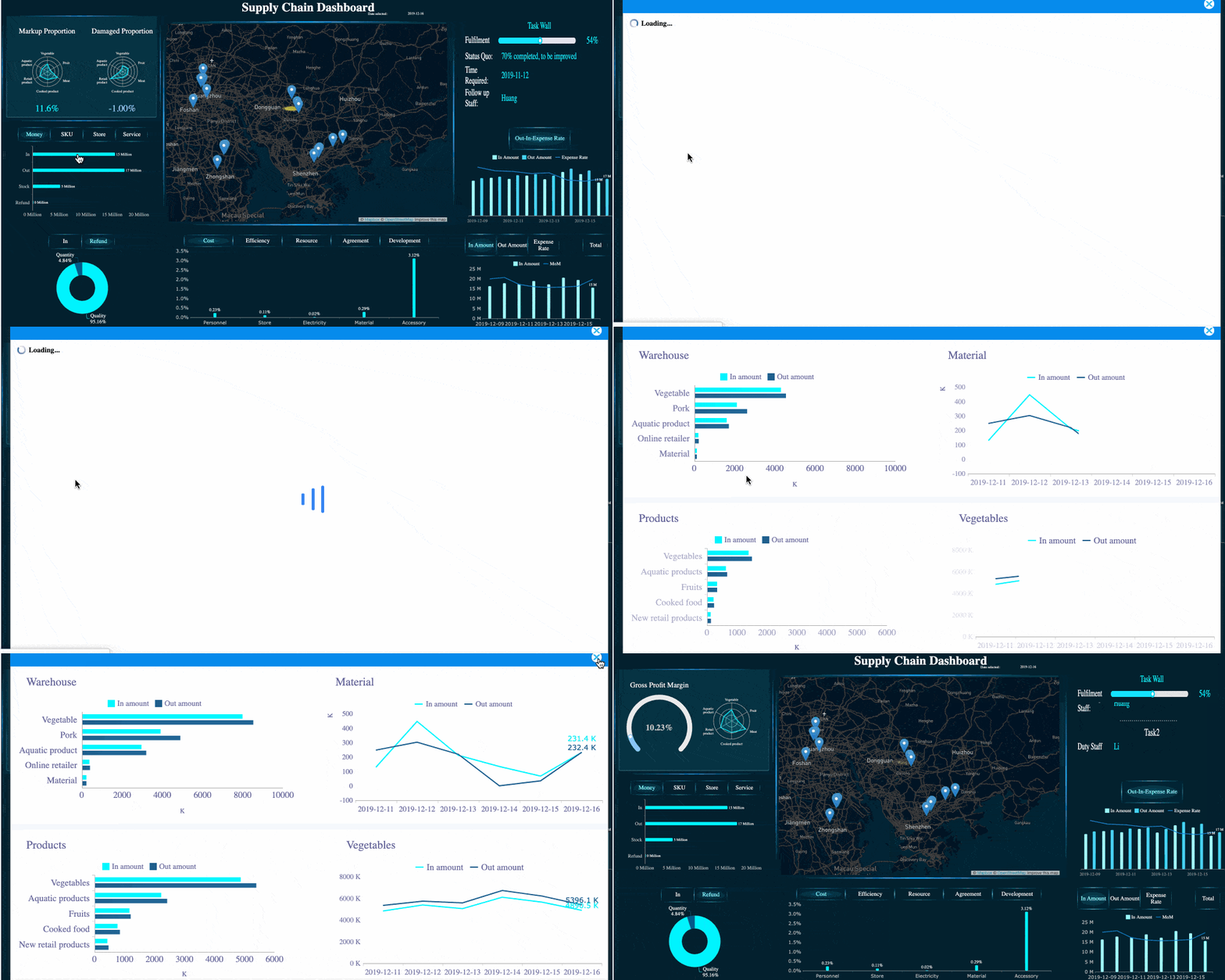
For organizations that need both dashboarding and structured enterprise reporting, FineReport is a practical option. It supports complex data integration, interactive dashboards, scheduled report delivery, permissions management, and formatted reporting for business users who need consistency without sacrificing flexibility.
Tips for Choosing the Right Tool
A reporting tool should fit your organization’s actual operating model, not just look impressive in a demo.
Match the tool to team size
A startup finance team may manage with lightweight reporting. A multi-entity enterprise typically needs stronger governance, distribution control, and template standardization.
Consider technical skill levels
If report creation depends only on developers, business agility slows down. Choose tools that balance IT control with business usability.
Align with reporting needs
If you need formal board packs, operational dashboards, and departmental templates, make sure one platform can support all three without awkward workarounds.
Evaluate total cost, not just license cost
Manual report maintenance, data reconciliation, and version conflicts are real costs. A more capable platform may reduce labor and risk significantly.
Plan for scale
Choose a tool that can handle more users, more data sources, and more reporting use cases over time. Re-platforming later is expensive.
Data Reporting vs. Data Analysis
Data reporting and data analysis are closely related, but they are not the same discipline. Confusing the two often leads to poor expectations and weak decision workflows.
Key Differences in Purpose and Output
Data reporting focuses on summarizing and communicating what happened. It organizes metrics into readable updates that support routine monitoring.
Data analysis goes further. It investigates why something happened, what factors influenced the result, and what may happen next.
A simple way to think about it:
- Reporting = status visibility
- Analysis = explanation and insight generation
Here is the difference more clearly:
| Aspect | Data Reporting | Data Analysis |
|---|---|---|
| Main goal | Show what happened | Explain why it happened |
| Output | Dashboards, summaries, recurring reports | Findings, models, root-cause insights, forecasts |
| Timing | Regular and repeatable | Often question-driven or investigative |
| Audience | Managers, executives, operational teams | Analysts, strategists, decision-makers |
| Typical questions | Are we on target? What changed? | Why did performance change? What should we do next? |
Simple Examples of Reporting vs. Analysis
A few business examples make the distinction easier:
-
Sales reporting: Monthly report shows regional revenue dropped 8%.
-
Sales analysis: Analyst finds the drop came from lower win rates in one segment after pricing changes.
-
Operations reporting: Dashboard shows machine downtime increased this week.
-
Operations analysis: Investigation reveals downtime is concentrated on one line due to maintenance scheduling gaps.
-
Marketing reporting: Campaign summary shows click-through rate improved but conversions fell.
-
Marketing analysis: Analyst identifies a landing page issue causing traffic quality and funnel leakage problems.
Reporting tells you where to look. Analysis tells you what it means.
When to Use Both Together
The strongest organizations combine data reporting and data analysis as part of one performance management system.
Reporting should run continuously to surface trends, exceptions, and target gaps. Analysis should then be triggered when those reports raise important questions or signal risk. This combination helps organizations move from passive observation to informed action.
A practical pattern looks like this:
- Use reporting to monitor core KPIs regularly.
- Flag anomalies such as missed targets, sharp trend changes, or unusual variance.
- Use analysis to diagnose causes and test hypotheses.
- Feed findings back into reporting through improved metrics, annotations, or alert thresholds.
That closed loop is what mature data-driven organizations do well.
How to Improve Data Reporting Over Time
Reporting quality is not fixed. It improves when teams treat reports as decision products rather than static deliverables.
1. Set clear goals and success metrics for each report
Every report should serve a specific purpose. Define what action it supports, who owns it, and which decisions it informs. If that is unclear, the report is likely too broad or too vague.
2. Gather stakeholder feedback and remove low-value metrics
Ask users which sections they review, which they ignore, and where confusion exists. Many reports become bloated over time. Removing weak metrics often improves adoption more than adding new ones.
3. Standardize definitions and templates across teams
Create a shared reporting language. Common KPI definitions, chart conventions, and templates reduce confusion and improve trust. This is especially important in enterprise environments with multiple departments or regions.
4. Review reports regularly for relevance and actionability
Business priorities change. Reports should evolve with them. Schedule periodic reviews to retire outdated reports, refresh KPI logic, and update layouts for clarity.
5. Automate wherever repeatability matters
If teams rebuild recurring reports manually, they waste time and introduce risk. Automation improves speed, consistency, and auditability. It also frees analysts to focus on interpretation rather than repetitive formatting.
Consultant Best Practices for Implementing Data Reporting
If you want to make data reporting actually work across the business, follow these proven steps:
-
Start with decisions, not dashboards
Identify the recurring business decisions that need support. Build reports backward from those needs. -
Create a KPI governance layer early
Standardize metric definitions, owners, refresh rules, and thresholds before scaling report distribution. -
Separate executive, managerial, and analyst views
One report rarely serves all audiences well. Tailor depth, granularity, and visualization style to the user. -
Automate high-frequency reporting first
Prioritize daily, weekly, and monthly reports that consume the most manual effort and touch the most stakeholders. -
Design for exceptions and action
The best reports do not just display numbers. They highlight variance, risk, and areas that require intervention.
Final Thoughts
Data reporting is the operational backbone of data-driven management. It transforms raw information into clear, consistent updates that teams can use to monitor performance, communicate results, and act faster. Done well, it increases visibility, strengthens accountability, and creates trust in the numbers behind business decisions.
The most effective reporting environments are not built on visuals alone. They rely on clean data, clear KPI definitions, audience-focused design, and scalable tools that support automation and governance. That is why many enterprises move beyond manual spreadsheets and adopt reporting platforms that can handle dashboards, formatted reports, permissions, and distribution in one system.
If your organization is trying to improve reporting quality, reduce manual effort, or standardize metrics across departments, FineReport is worth evaluating as a practical enterprise reporting solution.
FAQs
Data reporting is the process of turning raw data into clear, structured updates such as dashboards, scorecards, and scheduled reports. Its main purpose is to show what happened so teams can track performance and act quickly.