Digital production tracking dashboard solutions exist to solve a costly operational problem: manufacturing teams cannot improve what they cannot see in time. For plant managers, line supervisors, operations directors, and continuous improvement leaders, delayed visibility leads to slower response times, hidden downtime, scrap escalation, missed targets, and poor cross-functional coordination.
On a modern factory floor, the business value is straightforward. A real-time dashboard turns fragmented production data into immediate operational signals so teams can act while output is still recoverable. Instead of learning about losses at the end of a shift or after the daily meeting, decision-makers can detect issues as they happen, assign action quickly, and keep production moving.
This guide explains how digital production tracking dashboard solutions work, which metrics matter most, where they create value in daily operations, and how to choose an approach that delivers measurable manufacturing results.
Click To Try The Dashboard
What digital production tracking dashboard solutions do on the factory floor
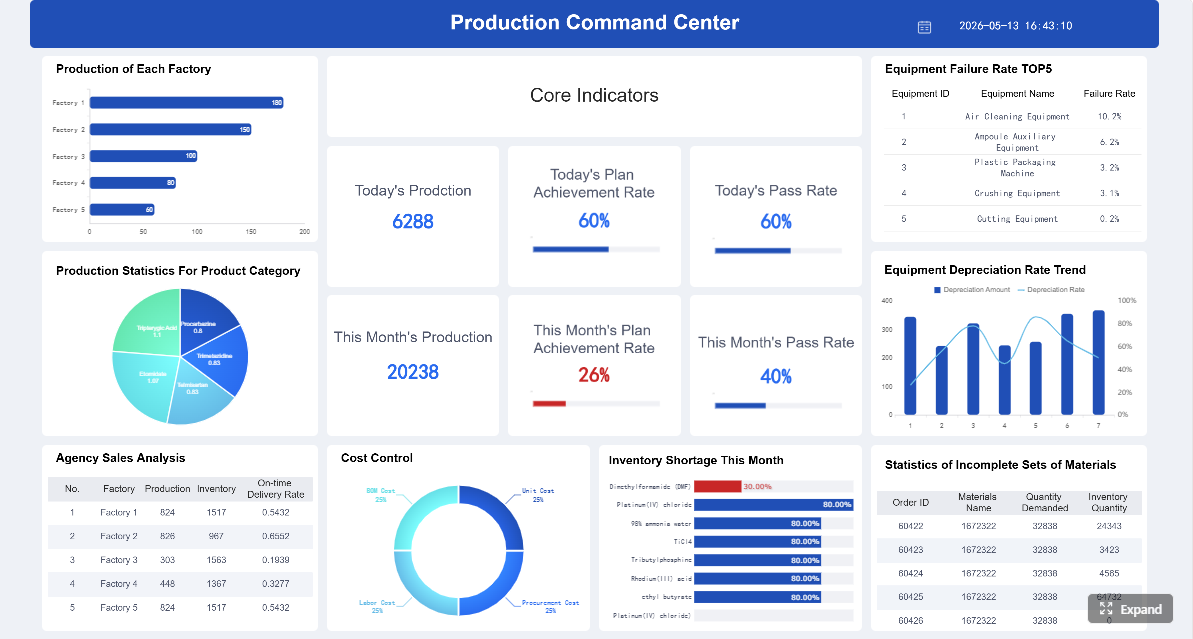
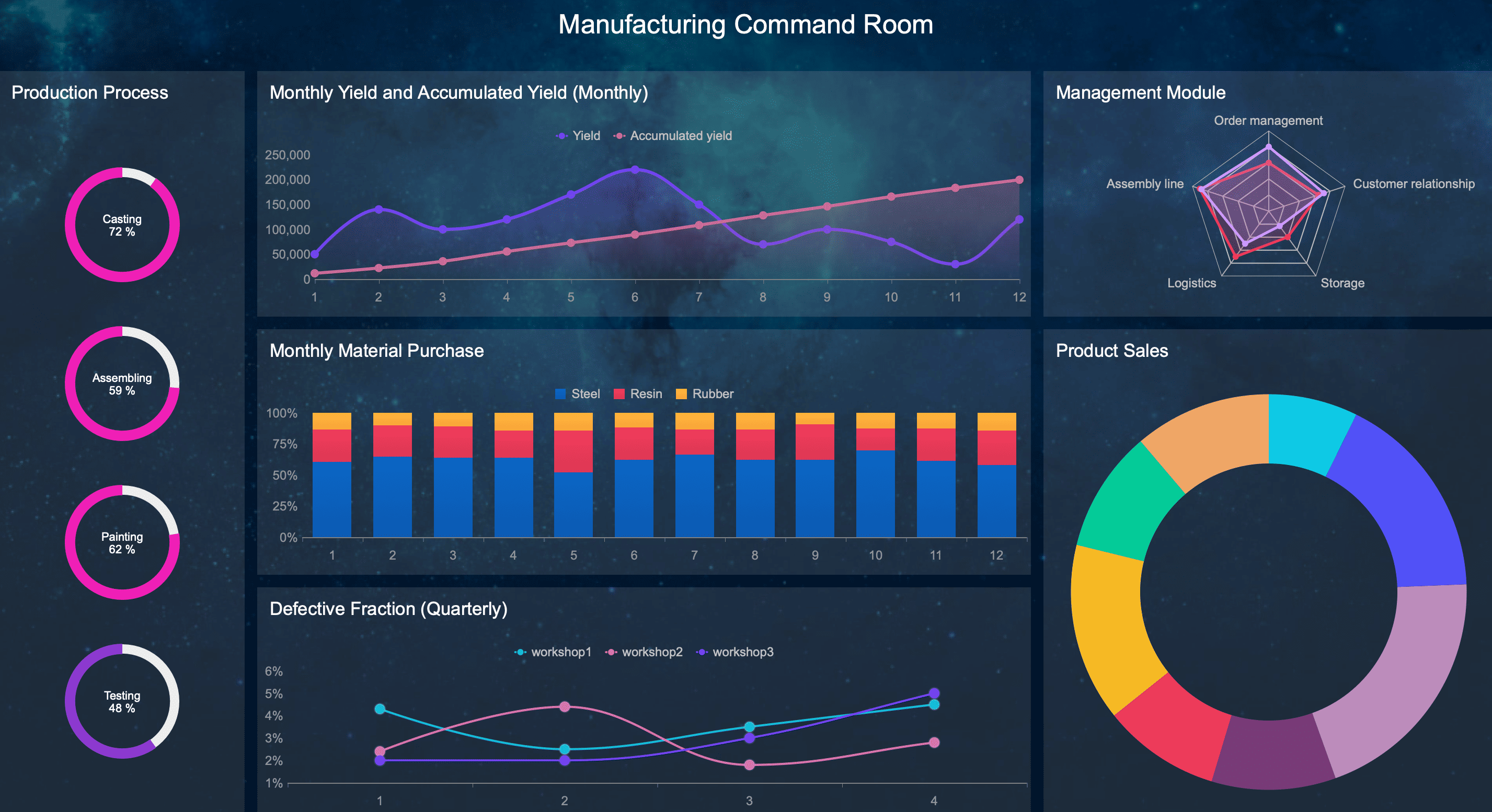
Digital production tracking dashboard solutions provide a live, visual operating layer for manufacturing. Their core purpose is to convert machine signals, operator inputs, quality events, and production status into a single, actionable view of what is happening right now.
On the factory floor, that means teams no longer rely solely on spreadsheets, shift-end summaries, whiteboards, or verbal updates. Instead, they can see line conditions, output performance, downtime status, quality issues, and work-in-progress in near real time.
A production dashboard is not just a display. It is a decision-support system for operations. It helps teams answer questions such as:
Is the line running to plan?
Where is downtime happening right now?
Which shift is underperforming?
Is scrap rising beyond acceptable limits?
Which bottleneck is constraining throughput?
What needs intervention first?
How live data turns machine, line, and labor activity into actionable signals
Live data becomes valuable when it moves beyond raw counts and status codes. Effective digital production tracking dashboard solutions aggregate signals from machines, PLCs, MES, ERP systems, IoT devices, and manual operator entries, then organize them into context-rich views.
For example:
A machine state change becomes a visible downtime alert.
A production count versus target becomes a throughput variance.
A rise in defects becomes an early warning for quality intervention.
A long changeover duration becomes a scheduling and staffing problem to address immediately.
A mismatch between labor deployment and line performance becomes a productivity signal.
This is what real-time manufacturing visibility actually means: not just seeing data, but seeing what requires action now.
Static reporting vs. daily logs vs. real-time tracking
Many manufacturers already collect data, but not all visibility methods are equal.
Static reporting is historical. It usually appears in spreadsheets, PDF summaries, or weekly KPI reviews. It is useful for post-event analysis, but too slow for rapid intervention.
Daily production logs are more operational, but often depend on manual updates and inconsistent timing. They can capture what happened, but not always when or why it happened.
Real-time tracking continuously reflects current conditions. It enables supervisors, planners, maintenance teams, and plant leadership to detect exceptions in the moment and respond before the impact grows.
That distinction matters. If teams discover a downtime issue after the shift ends, they can document it. If they discover it when it starts, they can reduce lost time.
Business outcomes teams expect
When deployed correctly, digital production tracking dashboard solutions drive practical, measurable outcomes:
Faster response to production losses
Higher throughput and schedule adherence
Reduced downtime duration
Improved visibility into scrap and quality drift
Better shift-to-shift consistency
Fewer operational blind spots across lines and plants
Stronger alignment between production, maintenance, and quality
Better decision-making based on trusted operational data
For enterprise manufacturers, these outcomes are not cosmetic reporting improvements. They directly affect cost per unit, labor efficiency, on-time delivery, and capacity utilization.
The data and metrics that make real-time visibility useful
The quality of a dashboard depends on the quality of the signals behind it. Real-time visibility only becomes useful when the dashboard reflects the production realities that frontline and management teams actually need to manage.
Core production signals to monitor
At a minimum, manufacturers should monitor the production signals that most directly influence output, cost, and responsiveness.
Key Metrics (KPIs)
Output: The number of units produced over a defined period. This indicates whether production is meeting plan.
Target vs. Actual: A comparison between planned production and actual output. This highlights performance gaps in real time.
Cycle Time: The time required to complete one production cycle. This helps identify speed losses and process instability.
Downtime: The amount of time equipment or lines are not producing when expected. This should include duration, frequency, and reason codes.
Downtime Reason Codes: Categorized causes of stoppages such as mechanical failure, material shortage, setup delay, or operator absence.
Scrap Rate: The percentage or volume of units lost due to defects or unusable output. This is essential for quality and cost control.
First Pass Yield: The percentage of units produced correctly without rework. This shows process capability and quality effectiveness.
Changeover Time: The time needed to switch from one product or batch to another. This affects scheduling flexibility and available capacity.
Work-in-Progress (WIP): The amount of material or product currently in process. Excessive WIP may signal bottlenecks or flow imbalance.
Labor Utilization: A view of staffing deployment relative to line activity and production output.
Schedule Attainment: How closely actual production aligns with the planned schedule or shift target.
Defect Trends: Defect type, frequency, and location patterns that help quality teams detect deterioration early.
Escalation Time: The time between issue occurrence and response. This measures operational responsiveness, not just machine performance.
These KPIs should be displayed in ways that match operational roles. A line supervisor needs immediate exceptions. A plant manager needs trends, comparisons, and systemic constraints. Executives need standardized roll-up views.
Connect operator inputs with machine data for a more complete operational view
Machine data alone rarely tells the full story. A machine may show stopped status, but not whether the cause is tooling, material shortage, sanitation, staffing, or quality hold. That context often comes from operators, team leads, or maintenance personnel.
The best digital production tracking dashboard solutions combine:
Automated equipment signals
Manual reason code entry
Shift notes and event annotations
Quality inspection data
Maintenance events
ERP or MES production order context
This blended approach gives operations teams a complete and usable picture. Without it, dashboards can become technically impressive but operationally incomplete.
How dashboards turn raw data into decisions
Raw data has limited value if it floods users with too many numbers. Effective dashboards simplify interpretation and direct attention to the conditions that matter.
They do this by using:
Thresholds to show when performance is outside acceptable range
Color-coded status indicators to surface risk quickly
Alerts and notifications for downtime, scrap spikes, or missed targets
Trend views to show whether performance is improving or deteriorating
Variance indicators to compare actual performance against goals
Drill-down paths so users can move from summary metrics to root-cause detail
The operational goal is simple: highlight exceptions instead of overwhelming users.
Show performance by shift, line, cell, or plant
A dashboard becomes far more useful when it allows comparison across operational dimensions. Production leaders need to understand not only what is happening, but where and under what conditions it is happening.
Useful views often include:
Shift-level comparisons
Line-by-line performance ranking
Cell or work-center productivity views
Department summaries
Plant-wide production status
Multi-site executive rollups
This supports better daily decision-making. A plant manager can compare shifts. A production supervisor can isolate one underperforming cell. A corporate operations leader can identify which site needs intervention first.
Scenario-based use cases across manufacturing operations
The real value of digital production tracking dashboard solutions appears in specific operating scenarios. Below are the situations where real-time visibility most often drives measurable gains.
Scenario: A line supervisor needs to respond to unplanned downtime
Unplanned downtime is one of the clearest use cases for a real-time dashboard. When a line stops unexpectedly, every minute matters.
A well-designed dashboard helps the line supervisor answer three questions quickly:
What stopped?
Why did it stop?
What action should happen next?
With live status indicators, reason codes, machine state changes, and escalation cues, the supervisor can identify whether the issue is mechanical, material-related, staffing-related, or process-related. That prevents wasted time chasing the wrong cause.
For example, if the dashboard shows repeated micro-stoppages on the same machine before a major stop, the supervisor can see the event pattern and involve maintenance sooner. If the issue is a missing material feed, they can redirect internal logistics immediately.
The dashboard should also support prioritization. Not every issue deserves the same response. A line that is the primary throughput constraint should be escalated faster than a low-priority cell with available schedule buffer.
Best practice for downtime response:
Surface current machine state clearly
Require structured downtime reason capture
Trigger alerts after predefined stop duration thresholds
Show recent stop history for pattern recognition
Define escalation workflows linked to downtime categories
Scenario: A plant manager wants to improve throughput across shifts
Throughput problems are rarely caused by one isolated event. More often, they are driven by recurring patterns across shifts, lines, staffing models, or scheduling practices.
A plant manager uses the dashboard to compare:
Output by shift
Actual vs. target production
Average cycle time by line
Changeover duration by team
Downtime distribution by shift
WIP accumulation points
This reveals systemic constraints. For instance, the night shift may consistently underperform because of reduced maintenance coverage, slower startup after breaks, or uneven operator skill mix. A specific line may show acceptable output on one shift and recurring shortfall on another.
Real-time visibility allows the plant manager to move from assumptions to evidence. Instead of asking teams why performance feels inconsistent, they can identify exactly where throughput loss is occurring and adjust labor allocation, scheduling, support coverage, or production sequencing.
How managers use this data effectively:
Compare shift-level performance over time
Review throughput by product family and line
Identify repeat bottlenecks instead of isolated incidents
Rebalance labor and resources where constraints are recurring
Pair dashboard trends with daily management routines
Scenario: A quality team needs earlier warning signs
Quality losses often become expensive because they are discovered too late. By the time a defect trend appears in an end-of-shift report, the process may already have produced significant scrap, rework, or customer risk.
Digital production tracking dashboard solutions help quality teams monitor leading indicators, not just final defect counts.
These include:
Scrap spikes by line or shift
Defect trends by product or process step
Process drift indicators
Yield deterioration over time
Correlations between downtime, startup conditions, and quality loss
A shared dashboard view between production and quality is especially valuable. It creates a common operating picture. Instead of quality identifying issues after the fact and production defending performance in parallel, both teams can align on the same signals and take corrective action faster.
This is critical in environments where quality variation spreads quickly, such as high-speed lines, continuous process manufacturing, or complex assembly operations.
Best practice for quality visibility:
Set threshold alerts for scrap and defect rates
Show trend charts rather than only cumulative totals
Break quality signals down by shift, line, product, and operator group
Link quality events to production conditions and machine states
Use shared dashboard ownership between operations and quality
Scenario: Leadership needs a clear view across multiple sites
Enterprise manufacturers often struggle with inconsistent reporting across plants. One site tracks downtime one way, another defines scrap differently, and executive reviews become debates over data instead of discussions about action.
This is where standardized digital production tracking dashboard solutions create strategic value.
Leadership needs a multi-site view that preserves local operational context while enforcing KPI consistency. That means:
Common KPI definitions across locations
Standard dashboard structures for core metrics
Local drill-down capability for site-specific operations
An executive dashboard should not flatten operational nuance, but it must make cross-site comparison possible. If one plant has significantly better changeover performance or lower scrap rates, leadership should be able to detect that and transfer best practices.
This level of visibility also supports stronger governance, better investment prioritization, and faster intervention at underperforming sites.
How to evaluate and choose the right dashboard approach
Selecting digital production tracking dashboard solutions is not just a software decision. It is an operational design decision. The right approach depends on who will use the dashboard, what decisions they need to make, and how easily the solution fits into daily manufacturing workflows.
Questions to ask before selecting a solution
Before evaluating platforms, manufacturers should define the practical use case clearly.
Ask these questions first:
Who are the primary users: operators, supervisors, plant managers, quality teams, executives, or all of them?
How often will each user group rely on the dashboard?
What decisions must they make in real time versus during daily review meetings?
Which KPIs truly influence response and performance?
What level of drill-down is necessary for root-cause analysis?
Where will dashboards be viewed: control rooms, line-side displays, desktops, tablets, or mobile devices?
What response workflow should occur when an alert appears?
These questions keep the project anchored in operations rather than aesthetics.
Integration requirements are especially important. In practice, many manufacturers need to connect dashboard solutions with:
MES platforms
ERP systems
PLCs and SCADA environments
IoT devices and gateways
Quality systems
Maintenance platforms
Manual operator input forms
Legacy databases and spreadsheets
If these integrations are difficult or fragile, trust in the dashboard will degrade quickly.
Features that matter in practice
Many dashboard tools look capable in demos. The difference appears during implementation and daily use on the factory floor.
The features that matter most include:
Configurable views for different roles and production contexts
Real-time data refresh suitable for operational decision-making
Mobile access for managers and supervisors away from fixed stations
Alerting and notifications tied to operational thresholds
Drill-down capability from KPI summary to event-level detail
Role-based visibility so each user sees relevant information only
Scalability across lines, plants, and regions
Data quality controls to validate input accuracy and consistency
Low-friction usability for frontline adoption
Reasonable implementation effort without excessive custom development
Governance support for KPI standardization and ownership
A practical dashboard solution must work for both frontline speed and enterprise structure. If it only serves analysts, operations will ignore it. If it only shows simple live counts, leadership will not gain strategic value.
Even strong dashboard technology can fail if rollout discipline is weak. Most failures come from operational design mistakes, not from the concept of real-time visibility itself.
Why dashboards fail to deliver value
The most common causes are predictable:
Too many metrics: Teams lose focus when dashboards try to show everything.
Poor data quality: Inaccurate counts, missing reason codes, or inconsistent definitions destroy trust.
Unclear ownership: No one is accountable for reviewing, acting on, or improving dashboard outputs.
Weak frontline adoption: If supervisors and operators do not use the dashboard in daily routines, it becomes passive reporting.
No action workflow: Dashboards report issues but do not define who responds and how.
Historical bias: The dashboard summarizes yesterday well but does not support intervention today.
Overcustomization: Complex builds become hard to maintain, scale, and govern.
A dashboard only creates value when it changes behavior at the moment of need.
A practical path to successful adoption
A disciplined rollout approach works better than an enterprise-wide launch with too many goals.
1. Start with one production area
Choose a line, cell, or department where losses are visible, stakeholders are engaged, and KPI improvement is meaningful. This creates a manageable proof point.
2. Limit the KPI set
Focus on a small group of operationally critical metrics such as output, downtime, scrap, cycle time, and target attainment. Avoid clutter.
3. Define response workflows
For every critical alert or exception, specify who acts, how fast they respond, and what escalation path applies. Visibility without action is wasted effort.
4. Validate data early
Test machine integrations, manual input processes, and KPI calculations before broad rollout. Trust is built in the first weeks.
5. Build user habits into daily management
Use the dashboard in shift handovers, tier meetings, production reviews, and issue escalation routines. Adoption rises when dashboard use becomes operationally mandatory.
Once one area shows measurable gains, expand gradually based on proven use cases, user feedback, and repeatable governance standards.
In practical terms, success means teams stop reacting late. Supervisors intervene sooner. Plant managers identify recurring constraints faster. Quality teams catch process drift earlier. Leadership gets a consistent, credible view across the enterprise.
Building this manually is complex—use FineReport to accelerate and automate the workflow
Many manufacturers begin by trying to build dashboards manually through spreadsheets, custom SQL queries, disconnected BI tools, or one-off integrations. That approach often becomes difficult to scale. Data pipelines break, views become inconsistent, KPI definitions drift across plants, and frontline usability suffers.
Building this manually is complex; use FineReport to utilize ready-made templates and automate this entire workflow.
FineReport helps manufacturers move faster by enabling:
Rapid dashboard creation with production-focused templates
Integration with MES, ERP, PLC, IoT, and manual data sources
Role-based dashboards for supervisors, plant managers, quality teams, and executives
Real-time visualization, alerting, and drill-down analysis
Standardized KPI governance across lines and sites
Scalable deployment without excessive custom development
For enterprise decision-makers, the value is not just faster reporting. It is the ability to create a reliable, standardized, real-time manufacturing visibility layer that improves response, throughput, and operational alignment.
If your goal is to turn factory-floor data into action, digital production tracking dashboard solutions are no longer optional. They are an operational necessity. FineReport gives you a practical way to implement that capability faster, with less complexity, and with a stronger path to enterprise-wide adoption.
FAQs
It is a real-time visual system that combines machine data, operator inputs, and production status into one view. It helps teams see output, downtime, and quality issues quickly enough to take action during the shift.
Real-time tracking shows current conditions as they happen, while spreadsheets and shift-end reports mostly show what already happened. That difference lets supervisors respond sooner and reduce losses before they grow.
The most useful KPIs usually include output, target versus actual, cycle time, downtime, downtime reasons, scrap rate, and first pass yield. These metrics help teams manage throughput, quality, and equipment performance in the moment.
A strong dashboard can improve response time, reduce downtime, increase throughput, and improve schedule adherence. It also supports better coordination between production, maintenance, and quality teams.
Common sources include machines, PLCs, MES, ERP systems, IoT devices, and manual operator entries. The goal is to turn fragmented shop floor data into a trusted operational view.
Product Trial
FineReport
Pixel-perfect reports · Interactive dashboards · Easy data entry · Digital twins