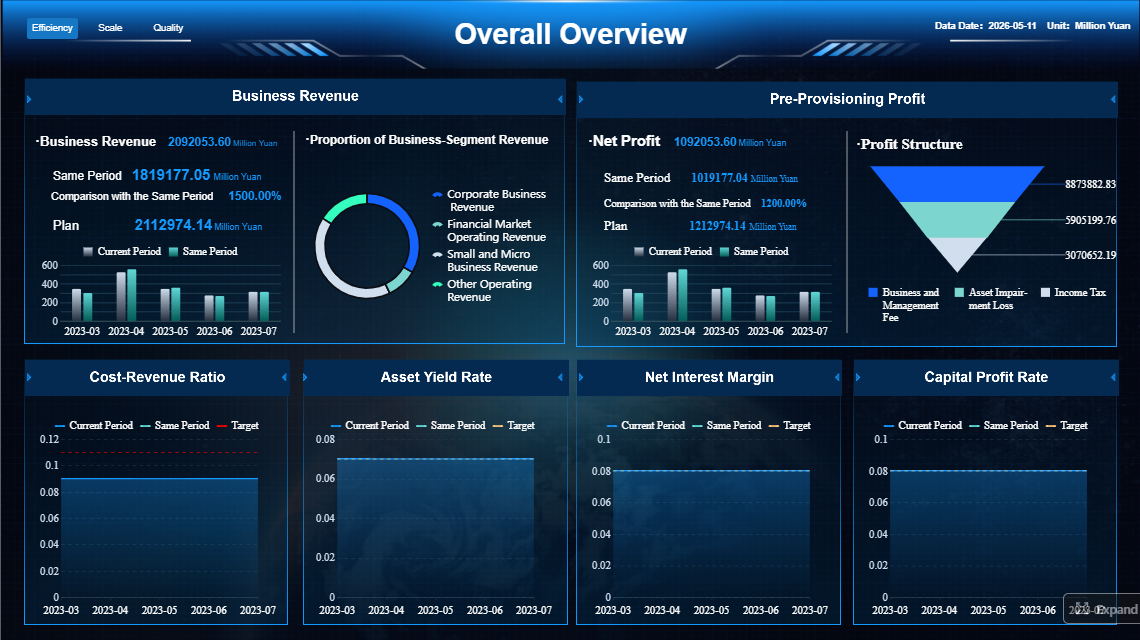
Month-end close slows down when finance teams lack a single operational view of what is done, what is blocked, and what still needs approval. A well-built accounting software dashboard fixes that by turning close management into a visible, measurable workflow instead of a chain of spreadsheet updates, email follow-ups, and last-minute reconciliations.
For controllers, accounting managers, and CFOs, the business value is direct: fewer reporting delays, faster issue escalation, clearer ownership, and a shorter close cycle. The right dashboard does not just show financial outcomes. It helps the team run the close process in real time.
Click To Try The Dashboard
Why an accounting software dashboard matters for month-end close
A month-end close is an operational process as much as a financial one. When task status, reconciliations, exceptions, and approvals live across disconnected tools, teams lose time chasing information rather than resolving issues.
A purpose-built accounting software dashboard reduces that friction in three ways:
It removes bottlenecks early by showing overdue tasks, blockers, and pending sign-offs before they cascade.
It cuts manual follow-up by making ownership and due dates visible by person, entity, and account.
It speeds reporting delivery by giving leaders instant insight into close readiness instead of waiting for status meetings.
The connection between visibility and accountability is especially important. When every owner can see open items and every manager can see where the process is stalled, close discipline improves. Teams stop reacting at the end of the cycle and start managing it daily.
For finance teams, the goal of this dashboard is not simply to create prettier reporting. It is to support three core outcomes:
Faster close cycles
Higher confidence in reported numbers
More consistent control over recurring close activities
In practice, that means your dashboard should answer operational questions immediately:
What is complete?
What is overdue?
What is blocked?
What is financially material?
What must be escalated today?
Core components of an accounting software dashboard
An effective accounting software dashboard for month-end close should combine workflow visibility, operational KPIs, financial indicators, and control monitoring in one structure. The mistake many teams make is focusing only on financial summaries. During close, finance needs execution visibility first.
Workflow status and close progress
This is the operational backbone of the dashboard. It should show close tasks by:
Entity
Account
Process step
Owner
Due date
Status
The goal is to let users identify progress and bottlenecks in seconds. For example, controllers often need to see close completion by legal entity, while accounting managers may need a task-level view by team member.
Your workflow section should highlight:
Task completion percentage by entity or business unit
Open reconciliations by aging bucket
Pending journal entry approvals
Overdue checklist items
Blocked tasks waiting on source data or intercompany confirmations
Items at risk of missing reporting deadlines
This section works best when status definitions are simple and standardized, such as:
Not started
In progress
Pending review
Blocked
Complete
Overdue
That consistency matters. If teams interpret statuses differently, the dashboard becomes decorative instead of operational.
Key KPIs and metrics to monitor
The most useful dashboards separate close process KPIs from executive financial KPIs. Finance operators need workflow speed and exception tracking. Executives need high-level signals about readiness, risk, and material impacts.
Key Metrics (KPIs)
Below are the essential metrics your month-end accounting software dashboard should include.
Operational close KPIs
Close Duration: Total number of days or hours required to complete the monthly close cycle.
Task Completion Rate: Percentage of close checklist items completed versus total assigned tasks.
Reconciliation Completion Rate: Share of required account reconciliations completed and approved.
Overdue Task Count: Number of close tasks past due date and still unresolved.
Pending Approval Volume: Total journal entries, reconciliations, or reports waiting for reviewer sign-off.
Journal Entry Volume: Number of manual and automated journal entries processed during close.
Exception Count: Total unresolved exceptions, breaks, or unmatched items requiring investigation.
Close Readiness Score: A summary indicator showing how close the organization is to final reporting readiness.
Financial and executive-level KPIs
Material Variance Count: Number of variances above defined materiality thresholds.
Budget vs. Actual Variance: Difference between actual month-end results and budgeted figures.
Entity-Level Reporting Status: Progress of close and review across subsidiaries or business units.
Cash Position Snapshot: High-level view of liquidity at close, especially important for treasury-sensitive businesses.
Accrual Completeness Indicator: A signal showing whether key accrual categories are posted and reviewed.
Intercompany Elimination Status: Tracking of unresolved intercompany balances and eliminations.
These metrics should not all receive equal visual weight. Operational teams need action-first visibility, while executives need summary confidence indicators with drill-down access.
Data quality and controls
A fast close is only valuable if the data is reliable. That is why a strong accounting software dashboard includes a dedicated section for data quality and financial controls.
This section should surface issues such as:
Missing or delayed transactions from source systems
Unusual balances compared with historical patterns
Duplicate journal entries or duplicate invoices
Suspense account growth
Unmatched intercompany balances
Audit trail gaps or unexplained overrides
Changes posted after cutoff
Reconciliation exceptions not resolved before sign-off
The practical benefit is simple: control issues become visible before they affect the final financial package. That reduces rework, lowers audit risk, and helps finance teams avoid late-cycle surprises.
For enterprise teams, this area should also show exception ownership and aging, so control failures are not just detected but actively managed.
A month-end dashboard is not a general BI homepage. It is a decision-support tool used under time pressure. Design choices should reduce cognitive load and direct attention to the next required action.
Prioritize the most important headline insights
The top of the dashboard should answer urgent questions first. Finance leaders should not scroll to discover whether close is off track.
Place these insights above the fold:
Total close progress
Number of overdue items
Open high-risk exceptions
Pending approvals
Reconciliations still incomplete
Overall close readiness indicator
This is where visual hierarchy matters. Use larger scorecards and clearer color logic for items that require action now. A common design mistake is making every widget equally prominent. That forces users to hunt for the signal.
A practical hierarchy often looks like this:
Urgent exceptions and blockers
Close readiness and completion status
Outstanding approvals and reconciliations
Trend views and detailed performance metrics
Keep labels plain. Instead of “process health index,” say “Overdue Close Tasks” or “Pending Journal Approvals.” Finance teams move faster when the dashboard uses operational language.
Build views for different users
Not every stakeholder needs the same dashboard layout. A controller, a staff accountant, and a CFO are managing different decisions.
Create role-specific views such as:
Controller view: entity-level progress, material exceptions, sign-off status, intercompany and consolidation risks
CFO view: close readiness, major variances, executive summary, reporting risk by entity
Business manager view: budget versus actuals, department-level variances, commentary status
The best approach is to keep a shared core structure but tailor the first screen and filters by role. That preserves a common source of truth while improving usability.
Drill-down capability is also essential. Summary cards should open into transaction-level or task-level detail so users can investigate without exporting to spreadsheets.
Use reporting templates that support consistent reviews
Templates are critical for speed. If every reconciliation, variance review, and month-end summary has a different structure, reviewers waste time reorienting themselves each cycle.
Standardize templates for:
Balance sheet reconciliations
Variance analysis reports
Entity close summaries
Journal review logs
Exception review reports
CFO month-end packs
Keep these elements consistent across templates:
Naming conventions
Period labels
Date filters
Status definitions
Materiality thresholds
Owner fields
Approval fields
Consistency improves review quality and makes adoption easier across teams. It also strengthens governance because everyone is working from the same reporting logic.
Finance teams often benefit from studying common dashboard patterns before designing their own. The objective is not to copy another platform blindly, but to understand which layouts and features improve visibility.
Common accounting dashboard examples and templates
Several dashboard structures are especially useful for month-end close.
1. Close tracking dashboard
Best for operational management. Shows checklist completion, overdue tasks, approval queues, and readiness by entity.
2. Cash flow visibility dashboard
Helpful for treasury-aware finance teams. Tracks cash position, inflows, outflows, and short-term liquidity during and after close.
3. Budget versus actuals dashboard
Useful for finance business partnering and executive review. Highlights variance drivers and flags areas that need commentary.
4. Entity-level reporting dashboard
Important for multi-entity organizations. Compares close progress, exceptions, and financial indicators across subsidiaries or business units.
For small teams, a simpler dashboard with one summary layer and a few drill-down reports may be enough. For multi-entity groups, the design should support roll-up and drill-through by company, region, department, or ledger.
Features to look for in financial dashboard software
The software matters because dashboard design is only as strong as the platform supporting it. When evaluating tools, finance leaders should focus on operational fit, not just visual appeal.
Look for these capabilities:
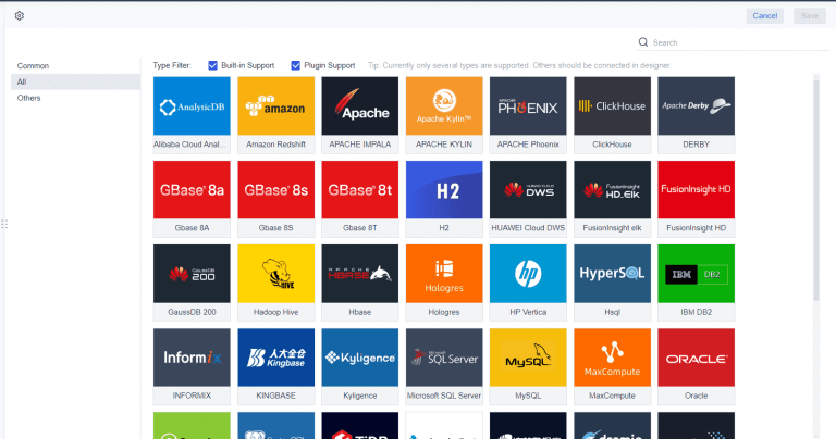
ERP and accounting system integrations
Multi-entity consolidation support
Automated data refresh and scheduling
Role-based permissions
Workflow tracking and status updates
Drill-down to transaction detail
Forecasting and variance analysis
Collaboration tools for comments and review
Audit trail visibility
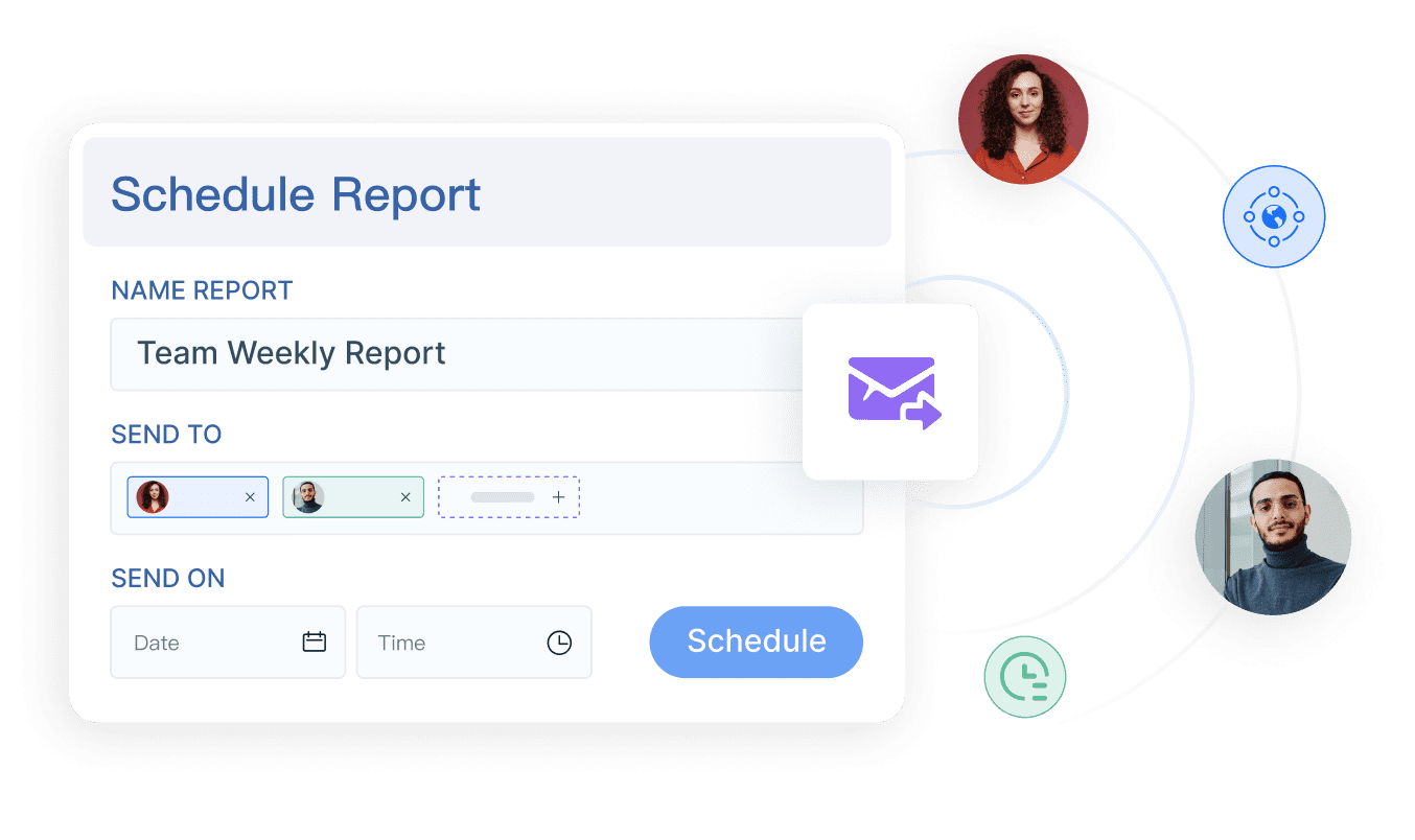
Template-based report distribution
The tool should match your reporting complexity. A small single-entity business may prioritize ease of use and rapid setup. An enterprise finance function may need robust governance, consolidation logic, and deeper permissions control.
What finance teams can learn from popular platforms
Popular accounting and financial reporting platforms often do a good job of presenting top-level business insights clearly. For example, tools commonly used in the market emphasize several reusable design ideas:
Headline summary cards for immediate business health signals
Trend charts that show whether the metric is improving or deteriorating
Alerts for overdue or unusual items
Clean separation between summary view and detailed analysis
Simple filters for period, entity, department, or owner
Finance teams can borrow these principles without importing unnecessary complexity. A month-end close dashboard should stay focused on execution. If a chart looks impressive but does not help someone act faster, it probably does not belong on the screen.
Best practices for implementation and ongoing improvement
The best dashboards are built around actual close pain points, tested during live cycles, and refined over time. This is where many projects fail: they launch as a reporting exercise instead of an operations improvement initiative.
Start with close pain points, not visuals
Before choosing charts, map the recurring delays in your close process.
Typical pain points include:
Late reconciliations
Journal approval bottlenecks
Missing source data
Intercompany mismatches
Variance review delays
Last-minute control exceptions
For each pain point, define the decision question the dashboard must answer. For example:
Which reconciliations are blocking close?
Which entity is at risk of missing deadline?
Which variances exceed materiality and lack explanation?
Which tasks have no accountable owner?
That method prevents bloated design. Every section should exist to support a specific action.
Test usability during live close cycles
A dashboard that looks good in a workshop can still fail during real close pressure. Test it while the team is actively working through month-end.
Ask users:
What do you check first?
What do you ignore?
Where do you still leave the dashboard and open spreadsheets?
Which filters save time?
Which alerts create action?
Which drill-down paths feel too slow?
Then refine based on usage, not opinion. Often the biggest gains come from removing clutter, simplifying status logic, or making exceptions more visible.
Keep the dashboard trustworthy over time
Trust is the currency of finance reporting. If users see stale data, inconsistent definitions, or unexplained variances, adoption drops quickly.
Review KPIs regularly as finance priorities evolve. A fast-growing company may care more about entity scaling and consolidation readiness. A mature organization may focus more on controls, audit support, and forecast accuracy.
4 practical implementation best practices from the field
As a consultant, I recommend these steps for a faster and more durable rollout:
Define the close operating model first
Document tasks, owners, deadlines, review stages, and escalation rules before building the dashboard.
Separate operational and executive layers
Give accountants action-oriented views and give leadership a concise readiness summary with drill-down access.
Automate alerts for true exceptions only
Do not overload users with notifications. Trigger alerts for overdue, blocked, or material items that require intervention.
Standardize templates before scaling
Lock down naming, status rules, and review formats across reconciliations and summaries before rolling the dashboard out enterprise-wide.
Common mistakes to avoid when building a month-end close dashboard
Even good tools and strong data can produce weak dashboards if the design is unfocused. The most common problems are avoidable.
Overloading the screen
Too many charts, tables, and duplicate widgets make the dashboard harder to use. Keep only what supports a decision or action.
Mixing strategic and operational metrics
Do not place high-level profitability trends beside detailed task checklists without structure. Separate executive indicators from working-level execution data.
Hiding exceptions behind too many clicks
The dashboard should surface urgent issues immediately. If users need multiple drill-downs to find blocked reconciliations or material variances, response time will suffer.
Treating the dashboard as a static report
A month-end close dashboard is not a one-time visual. It is a live operational tool. It should support updates, workflow movement, review actions, and recurring refinement.
Ignoring data governance
If status definitions, refresh timing, or ownership are unclear, confidence in the dashboard erodes. Governance is not optional for finance use cases.
Build faster with FineReport instead of designing everything manually
Designing a high-performing accounting software dashboard for month-end close is absolutely possible, but building it manually is often more complex than finance teams expect. You need data integration, workflow visibility, user-specific views, consistent templates, governance rules, and dependable refresh logic all working together.
That is why many organizations move faster with FineReport.
FineReport helps finance teams avoid reinventing the entire reporting stack. Instead of building every close view, reconciliation template, and executive summary from scratch, you can use ready-made templates, interactive dashboards, scheduled reporting, and automated data workflows to support the month-end close process end to end.
Build close tracking dashboards with drill-down analysis
Standardize reconciliation and variance reporting templates
Automate scheduled refreshes and report distribution
Create role-based views for accountants, controllers, and executives
Connect data from multiple financial systems into one reporting layer
Improve visibility without expanding spreadsheet dependency
The strategic advantage is clear: building this manually is complex; use FineReport to utilize ready-made templates and automate this entire workflow. That lets finance teams focus less on dashboard maintenance and more on shortening the close, improving controls, and delivering faster decision-ready reporting.
FAQs
It should show close progress, overdue tasks, blocked items, pending approvals, reconciliations, and key risk indicators in one place. The goal is to help finance teams see what is complete, what is delayed, and what needs escalation right away.
It reduces time spent chasing updates across spreadsheets, emails, and separate systems. By making ownership, due dates, and bottlenecks visible in real time, teams can resolve issues earlier and close faster.
The most useful KPIs include close duration, task completion rate, reconciliation completion rate, overdue task count, pending approval volume, and exception count. Leaders may also want readiness scores and material variance indicators for a higher-level view.
Keep status definitions simple, standardize ownership fields, and focus the layout on actions instead of summary charts alone. A useful dashboard helps users identify blockers and next steps in seconds, not just review historical data.
Controllers, accounting managers, CFOs, and close process owners benefit most from it. Different views can support both task-level execution for the team and high-level readiness monitoring for leadership.
Product Trial
FineReport
Pixel-perfect reports · Interactive dashboards · Easy data entry · Digital twins