Excel business intelligence gives you the power to turn your data into clear insights. You can use PivotTables to summarize information. Power Query helps you prepare and clean your data. Dynamic dashboards let you see trends and patterns quickly. You gain more control over your analysis. With solutions like FineBI, you can take your work further and collaborate with your team.
Getting Started with Excel Business Intelligence

Importing and Connecting to Data Sources
You begin your excel business intelligence journey by importing data from different sources. Excel lets you connect to databases, cloud services, and local files like CSV or TXT. You can use the "Get Data" feature to pull in information from SQL databases, web APIs, or even SharePoint. This flexibility helps you gather all the data you need in one place. When you connect to reliable sources, you reduce the risk of errors from manual entry. Many business professionals use learning paths and online courses to master these skills. For example, LinkedIn Learning offers courses on data collection and analysis using Excel and other business intelligence tools.
Cleaning and Structuring Data for Analysis
Clean data is the foundation of accurate analysis. In Excel, you can use several techniques to prepare your data. Start by removing duplicates and fixing errors. Handle missing values by filling them in or using averages. Standardize text and dates to keep everything consistent. Investigate outliers to make sure your results are valid. The table below shows some best practices:
| Technique | Description |
|---|---|
| Finding and removing duplicates | Eliminate exact and fuzzy duplicates to ensure data integrity. |
| Handling missing values | Use averages or fill methods to manage missing data. |
| Making everything consistent | Standardize text, dates, and categories for smooth analysis. |
| Dealing with outliers | Check outliers with statistics and business rules to confirm their accuracy. |
You can also use Excel functions to clean up extra spaces, fix spelling errors, and transform data for better analysis. These steps help you create a dataset that is ready for business intelligence work.
Organizing Data for Effective Insights
Organizing your data in Excel makes your analysis faster and more reliable. Well-structured data is easier to read and update. You can use tables, named ranges, and clear headers to keep everything in order. The benefits of organizing data include:
| Benefit | Explanation |
|---|---|
| Improved data clarity and accessibility | Well-structured data is easier to read and access, saving time in finding information. |
| Enhanced analysis and reporting | Clear data enhances trend analysis, making patterns and trends more visible in reports. |
| Faster decision-making | Organized data allows for quick access to information, facilitating data-driven decisions. |
| Reduced errors | Cleaner spreadsheets lead to fewer miscalculations and missed details. |
| Simplified management | Updates, sorting, and sharing data become easier with organized information. |
When you organize your data, you make it easier to spot trends and share insights with your team. This step sets the stage for advanced excel business intelligence features and helps you avoid common mistakes.
Essential Excel Business Intelligence Features
Excel business intelligence tools give you a strong foundation for analyzing and understanding your data. You can use several built-in features to uncover trends, clean up information, and perform advanced calculations. These features help you make better business decisions and prepare your data for deeper analysis.
Analyzing Data with PivotTables and PivotCharts
PivotTables and PivotCharts are two of the most powerful tools in excel business intelligence. You can use PivotTables to quickly summarize large amounts of data. This makes it easier to spot patterns and draw insights. For example, you can segment your data into categories and compare different data points. This is essential for trend analysis.
- PivotTables help you uncover hidden trends in financial data, such as seasonal sales spikes or cost-saving opportunities.
- You can compare time periods to forecast revenue growth or track operating expenses.
- PivotTables allow you to summarize expense categories, which helps with budgeting decisions.
PivotCharts work alongside PivotTables to give you a visual way to see your data. They make it easier to compare results, spot patterns, and identify trends. When you use both tools together, you can make informed decisions based on clear data insights.
Many businesses use these features every day:
- Marketing teams analyze advertising campaign performance and customer engagement.
- Financial analysts assess investment opportunities and manage risk.
- Retail businesses identify top-selling products and track seasonal trends.
Tip: PivotTables and PivotCharts are easy to use if you already know how to work with spreadsheets. You can drag and drop fields to create custom views and charts.
Transforming Data Using Power Query
Power Query is another key part of excel business intelligence. You can use Power Query to clean, reshape, and reorganize your data before you start your analysis. This tool makes it easy to import data from different sources and prepare it for reporting.
- Power Query automates repetitive tasks, so you can refresh your queries with one click.
- It handles large datasets without slowing down your workflow.
- You can clean and merge data from various sources, making your analysis more accurate.
- The user-friendly interface lets you import and transform data without writing code.
- Power Query improves data quality and helps you find actionable insights.
You can use Power Query to remove errors, combine tables, and standardize formats. The editor makes it simple to preview changes and adjust your steps as needed. This saves you time and reduces mistakes.
Note: Power Query is ideal for businesses that deal with large or complex datasets. You can automate your data preparation and focus on analysis instead of manual work.
Advanced Analysis with Power Pivot
Power Pivot takes excel business intelligence to the next level. You can manage large datasets, create relationships between tables, and use the DAX formula language for complex calculations. This feature helps you analyze millions of rows of data and build advanced models.
Power Pivot lets you:
- Create relationships between different tables, so you can analyze data from multiple sources at once.
- Use DAX formulas to calculate year-over-year growth, custom KPIs, and other advanced metrics.
- Eliminate the need for complex lookup formulas, making your analysis faster and more efficient.
With Power Pivot, you can move beyond standard Excel functions. You gain the ability to build sophisticated reports and dashboards that support better business decisions.
Tip: Power Pivot is especially useful if you need to analyze large volumes of data or create custom calculations for your business.
Comparing Excel Business Intelligence Tools to Other BI Platforms
You may wonder how excel business intelligence tools compare to other platforms. The table below highlights some key differences:
| Feature | Excel | Power BI / Other BI Tools |
|---|---|---|
| Data Capacity | Limited | High |
| Security | Basic | Advanced |
| Flexibility | High | Moderate |
| Visualization Options | Basic charts and graphs | Diverse and advanced visuals |
| Learning Curve | Low for spreadsheet users | Moderate for new users |
| Accessibility | Desktop and online | Primarily cloud-based |
| Interactivity | Limited | High |
| Cloud Features | Minimal | Extensive |
| Cost | Generally lower | Higher for enterprise features |
| Customization | High | Moderate |
Excel business intelligence tools offer a low learning curve and high flexibility. You can customize your analysis and keep costs low. However, other BI platforms provide more advanced features, scalability, and automation. For many users, Excel remains a practical choice for everyday business analysis.
Creating Actionable Visualizations and Dashboards in Excel Business Intelligence
Building Interactive Charts and Graphs
You can use interactive charts and graphs in excel business intelligence to make your data more engaging and easier to understand. When you create dynamic graphs, they adjust automatically as your data changes. This feature provides real-time insights and reduces manual updates. You can use column charts, pie charts, and map charts to visualize trends and patterns. Interactive controls, such as slicers, allow you to filter data and explore different views. Customization helps you focus on specific subsets, which enhances targeted analysis. The table below shows how interactive features improve decision-making:
| Feature | Benefit |
|---|---|
| Interactive Controls | Filter data and explore different views |
| Customization | Focus on specific subsets for deeper analysis |
| User Engagement | Improve experience and support informed decisions |
You can also use advanced chart types, such as waterfall charts and heat maps, to display complex business insights.
Designing Dynamic Dashboards in Excel
A dynamic dashboard brings together multiple visualizations and tables in one place. You can use excel business intelligence tools to build dashboards that summarize key metrics and KPIs. Dashboards often include charts, tables, and pivot tables for structured data presentation. Slicers provide interactive filtering options, letting you analyze data from different angles. Dynamic charts visualize information based on the type of data you present. The table below highlights essential dashboard components:
| Component | Description |
|---|---|
| Charts | Visualize data with column, pie, and map charts |
| Tables | Present data in a structured format |
| Pivot Tables | Summarize large datasets dynamically |
| Slicers | Enable interactive filtering |
| Dynamic Charts | Adjust visuals based on data changes |
You can use dashboards to track KPIs, monitor performance, and share insights with your team.
Highlighting Key Trends with Conditional Formatting
Conditional formatting helps you highlight important trends and anomalies in your data. You can set rules to change cell colors based on value thresholds, making it easy to spot critical areas. Color scales show data fluctuations, helping you track performance peaks and valleys. Icon sets and data bars turn spreadsheets into engaging visuals. You can identify errors or outliers by highlighting duplicates, blanks, or unusual values. Visually distinct data points make reports easier to read and share. This approach simplifies reporting and ensures stakeholders see the most relevant information.
Tip: Use conditional formatting to quickly identify trends and anomalies, improving the clarity of your reports.
After you master these excel business intelligence techniques, you can explore advanced solutions like FineBI. FineBI offers self-service analytics, drag-and-drop dashboards, and enhanced collaboration features. You can connect to multiple data sources, automate reporting, and share insights across your organization. FineBI helps you move beyond basic Excel tools, unlocking deeper analysis and smarter decision-making.
Automating Reporting and Sharing Insights For Excel Business Intelligence
Scheduling Data Refresh and Automating Reports
You can automate reporting tasks in excel business intelligence to save time and improve accuracy. Scheduling data refresh ensures your reports always reflect the latest information. When you automate data integration, you reduce manual errors and deliver up-to-date insights to stakeholders. Pivot Tables in Excel can refresh automatically when the underlying data changes, so you avoid manual updates and keep your reports current. Automation features like macros allow you to complete tasks in minutes that once took hours. Many businesses report a 50% reduction in weekly sales reporting time, which lets managers focus on strategic work instead of manual data entry.
| Benefit | Description |
|---|---|
| Increased Efficiency | Automating tasks leads to quicker completion of repetitive tasks, enhancing productivity. |
| Reduced Error Rates | Automation minimizes human errors in routine tasks, ensuring data accuracy and reducing time losses. |
| Improved Data Analysis | Centralization of data from various systems simplifies the review process, providing a comprehensive dataset. |
| Enhanced Collaboration | Customized reports can be created based on specific business requirements, facilitating better teamwork. |
Tip: Automating data refresh in Excel streamlines your workflow and ensures you always work with the most current data.
Exporting and Sharing Dashboards with Teams
You can share dashboards securely and efficiently with your business teams. Microsoft Groups provides a reliable way to distribute dashboards while maintaining data integrity. Data governance practices help you protect sensitive information and ensure only authorized users access your reports. Slicers and Timelines make it easy to filter data and visualize specific trends before sharing. These tools support efficient collaboration and help your team make informed decisions. When you export dashboards, you can choose formats that suit your audience, such as PDF or Excel files. This flexibility allows everyone to view and analyze data in a way that fits their needs.
- Use Microsoft Groups for secure dashboard sharing.
- Implement data governance to maintain data integrity.
- Apply Slicers and Timelines for efficient filtering and visualization.
Note: Sharing dashboards with your team improves transparency and supports better decision-making across departments.
Enhancing Collaboration with FineBI
FineBI takes collaboration to the next level when you integrate it with excel business intelligence workflows. You can work together on analysis subjects using optimized collaborative editing. Folder sharing simplifies teamwork by allowing users to share analysis folders. Publishing data tables to Public Data lets others view or use your findings. You can also set expiration dates for public links, which adds a layer of security when sharing dashboards externally.
| Feature | Description |
|---|---|
| Optimized Collaborative Editing | Users can work together on analysis subjects, facilitating easy collaboration and sharing. |
| Folder Sharing | Simplifies team collaboration by allowing users to share folders for analysis subjects. |
| Publishing Data | Users can publish analyzed data tables to Public Data for others to view or use. |
| Expiration Dates for Public Links | Securely share dashboards using public links that have expiration dates to control access. |
FineBI empowers you to collaborate more effectively, share insights securely, and streamline your reporting processes. You gain the ability to manage data access, improve teamwork, and ensure your organization benefits from timely, accurate business intelligence.
Integrating Excel Business Intelligence with FineBI
Integrating excel business intelligence with FineBI gives you a powerful way to unify your data analysis and reporting. You can combine the flexibility of Excel with the advanced analytics and collaboration features of FineBI. This integration helps you move from manual spreadsheet work to a more automated, scalable, and collaborative environment. You gain the ability to analyze data from multiple sources, visualize trends, and share insights across your organization.
Connecting Excel Data to FineBI for Unified Analysis
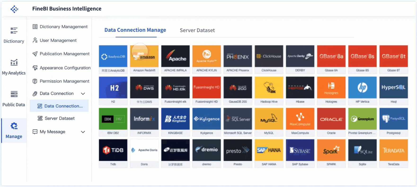
You can connect your Excel data directly to FineBI, creating a seamless workflow for unified analysis. FineBI supports easy import of Excel files, allowing you to bring in your existing datasets without complex setup. Once you upload your data, you can schedule automatic updates, ensuring your dashboards always reflect the latest information.
FineBI enables you to combine Excel data with other sources, such as databases, cloud warehouses, and APIs. This unified approach lets you analyze all your business information in one place. You can create relationships between different datasets, perform advanced calculations, and build comprehensive reports.
When you integrate Excel with FineBI, you unlock several advantages:
- Mobility: You can access your dashboards and reports from any device, whether you are in the office or traveling.
- Collaboration: FineBI makes it easy to share data and insights with your team, supporting better decision-making across departments.
- Scalability: FineBI supports multiple users and locations, making it suitable for organizations of any size.
- Monitoring: You can monitor your data in real time, ensuring accuracy and security for sensitive information.
This integration streamlines your workflow and helps you make faster, more informed decisions.
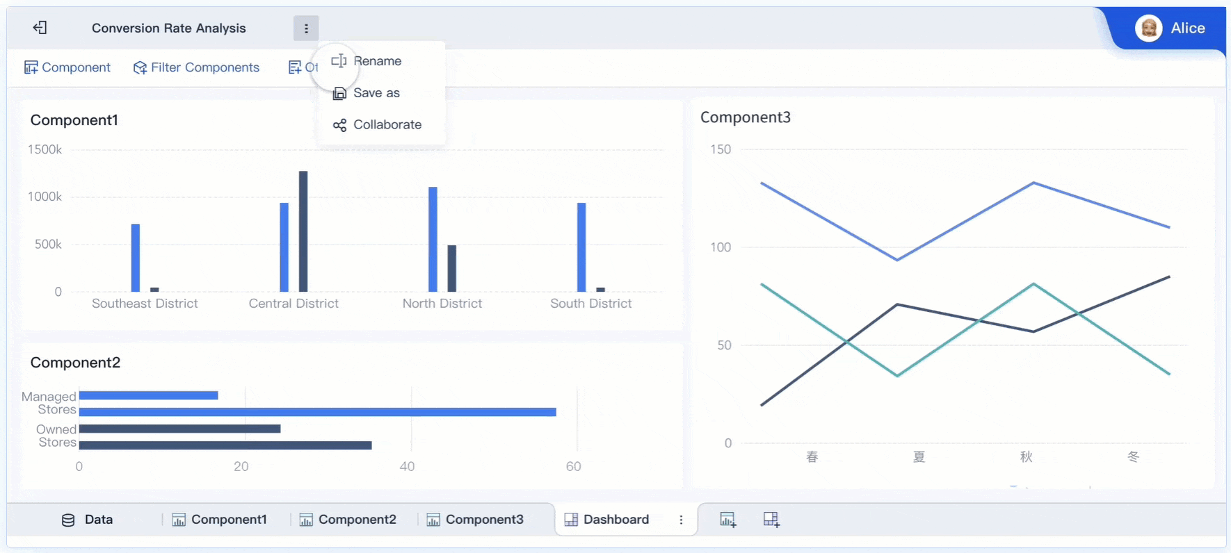
Leveraging FineBI’s Self-Service Analytics and Visualization
FineBI empowers you to perform self-service analytics without needing advanced technical skills. You can use drag-and-drop tools to build interactive dashboards and visualizations. FineBI offers a wide range of chart types, including bar charts, line graphs, and geographic maps. You can apply filters, drill down into details, and customize your views to match your business needs.
With FineBI, you can:
- Explore data visually and uncover hidden trends.
- Use real-time filters to analyze different time periods or business segments.
- Save reusable templates for common reports, saving you time on future analysis.
You do not need to rely on IT or external developers to modify dashboards or reports. You can make changes independently, which improves efficiency and reduces costs. FineBI's intuitive interface ensures that anyone in your organization can participate in data analysis, regardless of their technical background.
Tip: FineBI’s self-service features help you move beyond static spreadsheets, enabling dynamic and interactive business intelligence.
Streamlining Team Collaboration and Data Governance
FineBI enhances collaboration by allowing you and your team to work together on shared dashboards and reports. You can set up folder sharing, publish data tables for others to use, and manage access permissions based on roles or departments. This structure ensures that everyone sees the right information while protecting sensitive data.
You can communicate insights directly within FineBI, reducing the need for emails or external tools. Teams can discuss findings, annotate dashboards, and respond to changes in real time. This approach fosters a culture of data-driven decision-making.
FineBI also supports strong data governance. You can track user activity, audit changes, and enforce security policies. This helps you maintain compliance and ensures that your data remains accurate and secure.
When you transition from Excel to FineBI, you enable employees to modify dashboards independently and communicate insights without outside help. This shift improves efficiency and reduces the costs associated with outsourced report development.
Note: FineBI’s collaboration and governance features make it easier to manage data across departments, supporting both teamwork and security.
Excel business intelligence gives you the tools to analyze data quickly and make smarter decisions. When you master features like PivotTables, Power Query, and dashboards, you turn raw data into insights that drive your business forward.
- You gain the ability to analyze market trends and understand customer behavior.
- You support strategic planning and long-term growth.
- You encourage a culture of learning and innovation.
Integrating Excel with FineBI unlocks advanced analytics, seamless teamwork, and strong data governance for your organization.
Continue Reading About Excel Business Intelligence
MicroStrategy Business Intelligence Essentials for Today’s Enterprises
Top Emerging Business Intelligence Trends Shaping 2025
What Does a Business Intelligence Engineer Do in 2025
Top Business Intelligence Services Providers to Watch in 2025
What Are the Top Predictive Analytics Tools for 2025?
What Are the Top Digital Marketing Analytics Tools for 2025?


FAQ

The Author
Lewis
Senior Data Analyst at FanRuan
Related Articles
ERP Reporting Explained: What It Is, How It Works, and Why Enterprise Teams Rely on It
ERP reporting is the process of turning data inside your enterprise resource planning system into usable business insight. For finance leaders, operations directors, supply chain managers, and IT teams, that matters beca
Yida Yin
Jun 25, 2026
8 Best Restaurant Reporting Software Tools for 2026: Compare FineReport, Toast, SpotOn & More
$1 is a highly customizable business intelligence and reporting platform that helps restaurants turn POS, labor, inventory, finance, and multi location data into real time dashboards and decision ready reports. 8 Best Re
Yida Yin
Jun 24, 2026

Database Reporting Architecture: When to Use a Reporting Database vs Your Operational System
$1 is not just about pulling data into a dashboard. It is an architecture decision that affects application performance, reporting speed, data trust, and how confidently your teams can make decisions. If you are an IT ma
Yida Yin
Jun 24, 2026