A strong people analytics dashboard does more than display HR metrics. It gives leaders a reliable decision system for workforce planning, retention, representation, and talent movement. When designed well, it helps HR move from reactive reporting to proactive business guidance.
For most organizations, the highest-value starting point is a practical dashboard template covering four areas:
Headcount
Attrition
DEI
Internal mobility
This guide explains what to include, how to structure the layout, how to govern the data, and how to turn dashboard insights into action. The goal is not to create the most complex HR dashboard. The goal is to create one that leaders actually use.
What a people analytics dashboard template should include
A useful people analytics dashboard starts with business intent. Before selecting charts or KPIs, define the decisions the dashboard must support.
Define the purpose of the dashboard and the decisions it should support
The first question is not “What data do we have?” It is “What decisions need to be made faster and better?”
For example, your dashboard may need to support decisions such as:
Where to increase or slow hiring
Which teams need retention intervention
Whether promotion outcomes are equitable
Where mobility pipelines are healthy or blocked
Which business units face workforce risk
If the purpose is vague, the dashboard becomes a passive report. If the purpose is clear, the dashboard becomes an operating tool.
A practical template should map each metric to a management action. For instance:
Clarify the audience, such as HR leaders, people managers, and executives
One dashboard rarely serves everyone equally. A CHRO, a business leader, and a frontline manager need different levels of detail.
Common audiences include:
Executives: want headline KPIs, risk areas, and trends
HR leaders: need deeper workforce patterns and cross-functional comparisons
People managers: need team-level views with actionable context
HRBPs and people analytics teams: require drill-down capability and definitions
The best approach is to design a layered experience:
Executive summary page
Functional detail pages
Filtered team or cohort views
This keeps the dashboard focused while still supporting analysis.
Set a practical scope around headcount, attrition, DEI, and internal mobility
Many dashboards fail because they try to include everything: engagement, recruiting, compensation, learning, productivity, absenteeism, and more. That creates clutter and slows adoption.
A more effective first release focuses on the four workforce domains that matter most across industries:
Headcount and workforce composition
Attrition and retention
DEI representation and equity
Internal mobility and talent movement
This scope is broad enough to support strategic decisions, but narrow enough to keep definitions clean and implementation realistic.
Distinguish operational reporting from strategic people analytics
Strategic people analytics answers questions like:
Which parts of the business are growing faster than expected?
Where is regrettable attrition increasing among top performers?
Are promotion patterns creating representation gaps in leadership?
Which functions lack internal mobility pipelines?
A dashboard template should include both. But strategic insight should be the end goal. Reporting tells you what happened. Analytics helps you decide what to do next.
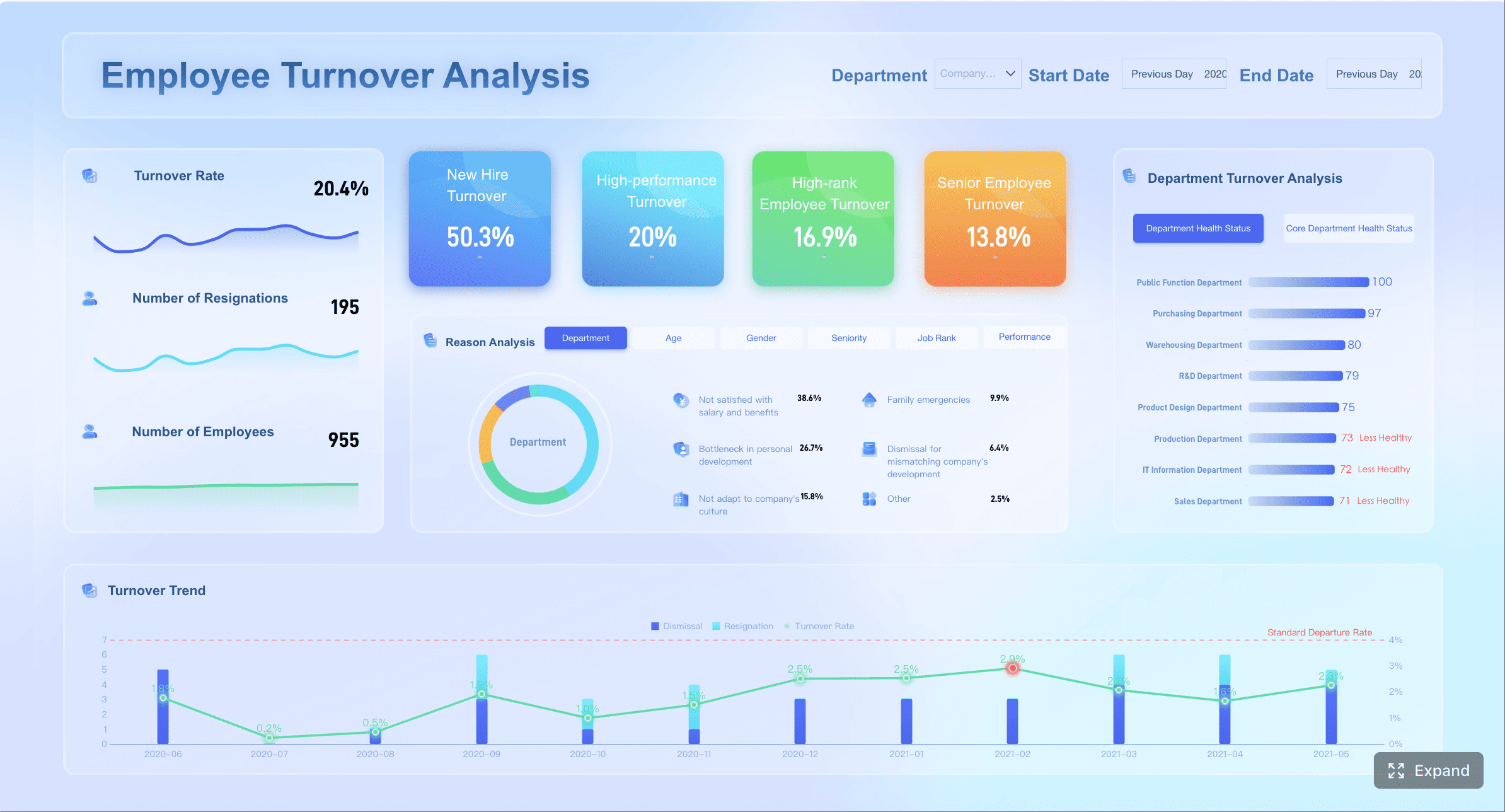
Core sections of a people analytics dashboard for headcount, attrition, DEI, and internal mobility
The four core sections below form the backbone of a high-value people analytics dashboard.
Headcount and workforce composition
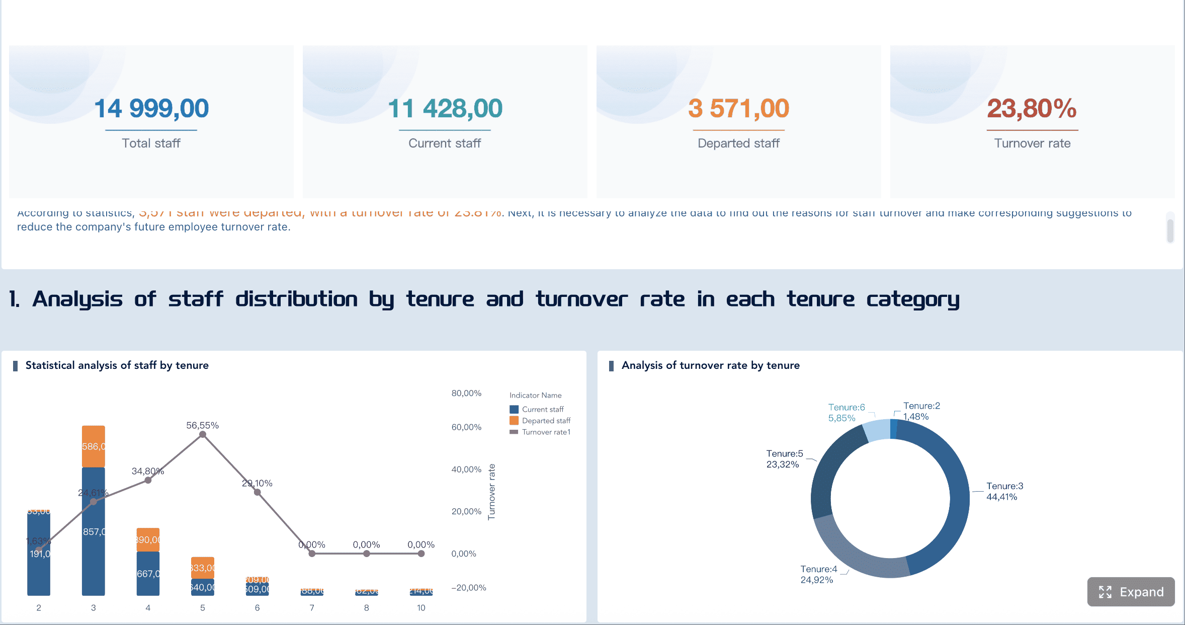
Headcount is the foundation. If leaders cannot trust the workforce baseline, they will not trust the rest of the dashboard.
At minimum, track:
Total headcount
Headcount growth rate
New hires and exits
Organizational structure
Employment type, such as full-time, part-time, contractor, temporary
Useful breakouts include:
Department
Business unit
Location
Job family
Management level
Tenure band
This section should help answer questions such as:
Where is growth concentrated?
Which teams rely heavily on contingent labor?
Are senior layers expanding faster than frontline capacity?
How is workforce mix changing over time?
A practical visual structure often includes:
KPI cards for current headcount and growth
Monthly trend lines
Stacked bar charts by employment type
Org or geographic breakdowns
A strong workforce composition page also highlights structural imbalances. For example, fast headcount growth in one region with rising turnover may indicate poor onboarding capacity, not healthy expansion.
Attrition and retention signals
Attrition is one of the clearest signals in workforce analytics. But not all attrition should be treated the same.
Your dashboard should separate:
Voluntary attrition
Involuntary attrition
Regrettable loss
Retention rate
Rolling 12-month attrition trend
Important comparison cuts include:
Team
Department
Location
Tenure cohort
Performance group
Critical role group
Time period
This matters because an overall attrition rate can hide very different realities. A stable enterprise rate may still mask serious risk in engineering, sales leadership, or early-career hires.
A useful attrition section should surface:
Where exits are highest
Whether the exits are concentrated among high performers or priority talent
Whether attrition is rising after a specific tenure point
Whether retention actions are working over time
You may also want threshold-based alerts, such as:
Voluntary attrition above target
Regrettable loss above benchmark
Exit spikes in key teams
Sudden changes after organizational restructuring
For leadership teams, the real value is not knowing the attrition rate. It is knowing where attrition requires intervention now.
DEI representation and equity views
DEI metrics require both rigor and care. A good dashboard helps leaders monitor progress while protecting privacy and preserving context.
Typical representation dimensions include, where legally and operationally appropriate:
Gender
Ethnicity or race
Age group
Disability status
Veteran status
Leadership level
Core views may include:
Representation by level
Representation by department or region
Hiring mix by demographic group
Promotion rate by group
Attrition rate by group
Pay distribution or pay gap indicators, where appropriate
The purpose is not only to show current representation. It is to identify whether workforce processes produce unequal outcomes.
Key diagnostic questions include:
Are underrepresented groups being hired but not promoted?
Is leadership representation improving or stagnating?
Are attrition rates disproportionately high for specific groups?
Are pay patterns consistent after controlling for job level and structure?
Because DEI dashboards are sensitive, trend context is essential. A single-period snapshot can mislead. Show movement over time, not isolated numbers.
Just as important, avoid showing disaggregated sensitive data for groups that are too small. Privacy protection is not a design detail. It is a governance requirement.
Internal mobility and talent movement
Internal mobility is often under-measured and strategically important. It shows whether the company is developing talent, creating career pathways, and filling needs from within.
A strong mobility section should cover:
Promotions
Lateral moves
Transfers across business units or geographies
Time-in-role
Mobility rate
Internal fill rate for key roles
This section should help answer:
Are employees progressing at healthy rates?
Which teams create strong internal talent pipelines?
Where are employees stuck in role too long?
Are promotions concentrated in narrow groups or functions?
Is the company building succession depth internally?
Useful views include:
Promotions trend over time
Internal movement matrix between functions
Average time-in-role by level
Talent pipeline readiness indicators
Mobility bottlenecks by role family
This is where a people analytics dashboard becomes especially strategic. Internal mobility metrics can expose whether talent management is real or merely aspirational.
How to design the people analytics dashboard layout for clarity and action
Even good metrics fail in a poor layout. Design determines whether leaders can quickly understand what matters.
Start with executive summary metrics
The top of the dashboard should answer the question: “What does leadership need to know in 30 seconds?”
Place a concise row of headline KPIs at the top, such as:
Total headcount
Headcount growth rate
Voluntary attrition rate
Regrettable loss rate
Representation at leadership level
Internal mobility rate
Each KPI should include:
Current value
Period-over-period change
A clear comparison period
A visual cue for direction
Do not overload the summary with ten or fifteen numbers. Highlight only the few metrics that matter most for fast decision-making.
A good rule: if a KPI does not trigger a conversation or action, it should not be in the summary row.
Use drill-down views for analysis
Summary metrics are only the entry point. Users need a path from enterprise view to root cause.
Build drill-down capability so users can move from:
Company
Business unit
Department
Team
Role
Demographic slice
Time period
This is where filters, tooltips, definitions, and context notes become critical. Without them, users may draw the wrong conclusion.
A well-designed drill-down experience should include:
Consistent filters across pages
Hover definitions for each metric
Clear date logic
Notes for exclusions or threshold rules
Comparison views for baseline versus selected segment
This structure helps maintain trust. Leaders are far more likely to act on insights they understand.
Use line charts for monthly or quarterly trend analysis
Use bars for team, location, or demographic comparisons
Use heatmaps for hotspots such as attrition risk or mobility bottlenecks
Use consistent scales across similar visuals
Limit color usage to preserve signal
Avoid decorative charts that add no analytical value
Clarity is a strategic advantage. A clean dashboard earns attention. A cluttered one gets ignored.
Data sources, metric definitions, and governance in the people analytics dashboard
The fastest way to lose trust in a people analytics dashboard is inconsistent data. Executive confidence depends on stable definitions and disciplined governance.
Connect the right systems and fields
Most organizations need to combine workforce data across several systems, such as:
HRIS / HCM for employee records and org structure
ATS for hiring pipeline and source data
Performance systems for performance groups and talent signals
Engagement tools for survey indicators
Learning systems for development activity and skills signals
For the dashboard in this guide, HRIS data is the minimum requirement. Additional systems improve context.
Critical integration priorities include:
Standard employee identifier
Effective dates
Organization hierarchy
Manager relationship
Job level and job family
Employment status
Location
Demographic attributes, where appropriate
Without standardized fields, you will struggle to create consistent trend logic.
Define metrics consistently
Metric definitions must be documented and stable. This is especially important for headcount, attrition, DEI, and mobility.
Examples of definitions to formalize:
Headcount: active employees at end of period or average during period
Attrition rate: exits divided by average headcount for the period
Representation rate: group population divided by total relevant population
Promotion rate: employees promoted during period divided by eligible population
Mobility rate: employees with internal move during period divided by active employee population
You also need explicit rules for:
Active employees
Contractors and contingent workers
Employees on leave
Interns and temporary labor
Backdated transactions
Organizational changes and reclassifications
A simple definitions table can prevent endless debate later.
Metric
Example Definition
Common Pitfall
Headcount
Active employees at period end
Mixing point-in-time with average headcount
Voluntary attrition
Voluntary exits / average headcount
Including internal transfers as exits
Promotion rate
Promotions / eligible active population
Counting title changes as promotions
Mobility rate
Internal moves / active employees
Using inconsistent move logic across business units
Protect privacy and build trust
People data is sensitive by definition. The dashboard must balance transparency with confidentiality.
Minimum governance practices should include:
Minimum group size thresholds before displaying data
Role-based access controls
Masked or suppressed sensitive fields
Restricted access to demographic attributes
Refresh schedules with visible timestamps
Named data owners for quality checks
For DEI and equity views, suppress small groups and avoid exposing personally identifiable combinations such as role plus location plus rare demographic category.
Leaders should also know:
When the dashboard refreshes
Which team owns metric quality
What each KPI includes and excludes
What to do if they find a discrepancy
Trust is built through transparency, consistency, and restraint.
Best practices for turning people analytics dashboard insights into decisions
A dashboard is valuable only when it changes decisions. This is where many HR teams underperform. They build the view, publish it, and stop there.
Focus on business questions, not just reporting
Every dashboard section should tie to a business decision.
Examples:
Headcount: Should we rebalance hiring across regions?
Attrition: Which business unit needs a retention action plan?
DEI: Where do promotion outcomes require process review?
Mobility: Which talent segments need stronger internal pathways?
This is also where benchmarks, targets, and thresholds add value. A number without context is hard to act on. A number against a target creates urgency.
Useful context layers include:
Prior-period comparison
Year-over-year comparison
Internal benchmark by peer group
Threshold-based color logic
Strategic target line
Review examples of effective HR dashboards
Looking at strong human resources dashboards is useful, but avoid copying every feature. The best templates are shaped by decision needs, not by vendor screenshots.
In practice, effective layouts usually fall into four patterns:
Executive dashboard
High-level KPIs, trend summaries, and major risk signals
DEI dashboard
Representation, hiring, promotion, and attrition comparisons over time
Retention dashboard
Attrition by team, tenure, performance group, and regrettable loss
Workforce planning dashboard
Headcount growth, workforce mix, organizational layers, and internal fill signals
Borrow what works:
Clear hierarchy
Limited KPI count
Strong period comparison
Drill-down filters
Definitions in context
Easy export or discussion views
Do not borrow what hurts usability:
Too many pages
Decorative charts
Excessive segmentation
Unclear metric logic
Uncontrolled access to sensitive data
Evolve the template over time
Your first version should not be your final version.
A strong dashboard template evolves through:
User interviews with executives and HR leaders
Review of which filters and pages are actually used
Removal of low-value metrics
Addition of new views for emerging workforce risks
Periodic review of metric definitions
Incorporation of new people analytics software capabilities
Risk detection for attrition, representation, or mobility gaps
But advanced capability should come after the dashboard basics are right. If your definitions are weak, AI will only scale confusion faster.
Common mistakes to avoid when building a people analytics dashboard
Most dashboard issues are not technical. They are design and governance errors.
Here are the most common ones to avoid:
Tracking too many KPIs without a clear audience or decision use case
More metrics do not create more insight. They usually create noise.
Mixing inconsistent definitions across headcount, attrition, and mobility metrics
If teams use different logic, leaders stop trusting the dashboard.
Presenting DEI data without enough context, privacy protection, or trend comparison
Sensitive data requires careful segmentation, suppression rules, and longitudinal interpretation.
Treating the dashboard as a static report instead of a tool for ongoing action
Dashboards should support monthly reviews, talent discussions, workforce planning, and intervention tracking.
A practical test is simple: if your dashboard is viewed only at quarter-end, it is probably a report. If it shapes weekly or monthly workforce decisions, it is working.
Build and scale your people analytics dashboard with FineBI
If you want your people analytics dashboard to drive real business action, the platform matters. You need more than visualization. You need governed data access, flexible slicing, reliable performance, and dashboards that business users can actually use.
FineBI helps organizations build workforce dashboards that combine HRIS, ATS, performance, and other people data into one decision-ready view. For HR and people analytics teams, that means you can:
Build executive and HR dashboards faster
Standardize metric definitions across teams
Enable self-service drill-down without losing governance
Deliver clear visuals for headcount, attrition, DEI, and internal mobility
Support secure access by role and audience
Expand from descriptive reporting toward more advanced analytics use cases
For enterprise decision-makers, the practical value is clear: faster answers, less spreadsheet dependency, and more confidence in workforce decisions.
A typical rollout approach with FineBI looks like this:
If your current HR reporting is fragmented, slow, or difficult to trust, this is the moment to modernize the operating model. Start with a focused template, govern the definitions, and deploy on a platform that can scale.
FineBI can help you turn a dashboard from a reporting artifact into a management system for workforce decisions.
A strong template should cover core workforce metrics for headcount, attrition, DEI, and internal mobility, along with trends, filters, and clear KPI definitions. It should also connect each metric to a business decision so leaders know what action to take.
Use a layered design with an executive summary for headline KPIs, detailed pages for HR leaders, and filtered team views for managers or HRBPs. This keeps the dashboard simple at the top while still allowing deeper analysis when needed.
For headcount, focus on total employees, growth rate, hires, exits, and workforce mix by department, location, and employment type. For attrition, track overall turnover, voluntary versus involuntary exits, and breakouts by tenure, business unit, and key talent groups.
It can show representation across levels, hiring and promotion outcomes, and movement patterns between teams or functions. These views help identify equity gaps, blocked career paths, and areas where internal talent pipelines need attention.
The dashboard needs trusted data, consistent definitions, and visuals that highlight changes, risks, and decision points rather than just raw numbers. Leaders use dashboards more when the insights are easy to understand and tied directly to workforce planning, retention, and talent actions.
Product Trial
FineReport
Pixel-perfect reports · Interactive dashboards · Easy data entry · Digital twins