A call center KPI dashboard should do one job exceptionally well: help leaders make faster, better operational decisions without digging through fragmented reports.
For operations directors, call center managers, workforce planners, and team leads, the pain is familiar. You have call data everywhere, but not enough clarity anywhere. One report shows volume. Another shows agent activity. A third shows CSAT. By the time someone connects the dots, the service-level miss has already happened, overtime has been approved, and customers have felt the impact.
A dashboard leaders actually use is not a wall of metrics. It is a decision system. It helps you answer questions like:
Are we staffed correctly right now?
Which queues are at risk today?
Is poor service being driven by volume, adherence, handling time, or transfers?
Which managers need to coach, escalate, or reforecast?
Are we improving customer outcomes while controlling cost?
That is the business value. A well-built dashboard reduces reaction time, improves accountability, and ties frontline execution to executive outcomes.
Click To Try The Dashboard
What a call center KPI dashboard should help leaders decide
Before choosing charts or metrics, define the decisions the dashboard must support. This is where most dashboard projects fail. Teams start with available data instead of operational use cases.
A high-value call center KPI dashboard should support daily, weekly, and monthly decisions across service delivery, staffing, coaching, and performance management.
Daily decisions
At the daily level, leaders need to manage immediate operational risk. The dashboard should help answer:
Are queues stable or deteriorating?
Do we need to move agents between teams or channels?
Is current staffing aligned with actual demand?
Are wait times, abandonment, or occupancy signaling service pressure?
Which supervisors need to intervene now?
This view is about control and speed. It should be built for intraday action, not postmortem analysis.
Weekly decisions
At the weekly level, the dashboard should support pattern recognition and performance management. Leaders should be able to see:
Which teams are consistently missing targets
Whether service failures are isolated or recurring
How schedule adherence and occupancy are affecting delivery
Where coaching is needed
Whether forecast assumptions were correct
This is where operational management moves from monitoring to diagnosis.
Monthly decisions
At the monthly level, senior leaders need the dashboard to summarize business performance, resource efficiency, and customer outcomes. It should support decisions such as:
Whether staffing models need to change
Which process bottlenecks increase cost per contact
Whether quality and customer satisfaction are improving
Which service lines or channels are underperforming
How contact center performance is affecting broader business goals
Separate executive visibility from frontline management needs
One of the most common mistakes is forcing all audiences onto the same screen.
Executives need:
Trend summaries
Goal attainment
Cost and customer impact
Cross-team comparisons
Exception-based highlights
Frontline managers need:
Queue-level detail
Agent execution data
Schedule adherence
Real-time service pressure indicators
Drill-downs into root causes
If your dashboard tries to satisfy both audiences equally on one page, it will satisfy neither. Build role-based views with a shared metric definition layer underneath.
Clarify the difference between monitoring activity, diagnosing issues, and improving performance
These are three distinct dashboard functions.
Monitoring activity tells you what is happening now.
Examples:
Calls in queue
Live service level
Agent status
Current abandonment rate
Diagnosing issues tells you why performance moved.
Examples:
Volume spike by interval
Adherence drop by team
Transfer rate increase by queue
AHT shifts after policy or product changes
Improving performance tells you what to do next.
Examples:
Reallocate staffing
Change break schedules
Trigger coaching for high-transfer agents
Review scripts causing long handle times
Escalate recurring process failures
The best call center dashboards are designed across all three layers, not just the first.
Choose the KPIs that matter most to service, efficiency, and outcomes
A dashboard becomes useful when it prioritizes a small number of metrics with clear operational meaning. Too many teams add every available KPI and end up with noise, not insight.
Focus on KPIs that connect directly to three areas:
Customer experience
Operational efficiency
Business outcomes
You also need a balance between leading indicators and lagging indicators.
Leading indicators help leaders act before performance slips. Examples include queue depth, occupancy, adherence, and staffing variance.
Lagging indicators confirm what already happened. Examples include CSAT, cost per contact, and monthly first contact resolution.
A mature call center KPI dashboard uses both. Leading indicators drive intervention. Lagging indicators validate whether those interventions worked.
Avoid vanity metrics that look busy but do not improve decisions. Total calls handled, for example, may matter in context, but on its own it says little about efficiency, quality, or customer outcome.
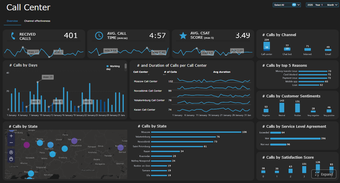
Key Metrics (KPIs)
Below are the core KPI categories most operations teams should evaluate and define consistently.
Service Level: The percentage of contacts answered within the target threshold, such as 80% within 20 seconds. This is the primary service delivery KPI for many voice operations.
Average Speed of Answer (ASA): The average time callers wait before reaching an agent. Useful for tracking responsiveness and queue health.
Abandonment Rate: The percentage of callers who disconnect before being answered. High abandonment usually signals wait-time friction or staffing imbalance.
Average Handle Time (AHT): The average total time spent per contact, typically including talk time, hold time, and after-call work. Important for efficiency, but should never be optimized without considering quality.
First Contact Resolution (FCR): The percentage of issues resolved on the first interaction. Strongly tied to customer effort and operating cost.
Occupancy Rate: The percentage of logged-in time agents spend handling or wrapping up contacts. Useful for understanding utilization and burnout risk.
Schedule Adherence: The degree to which agents follow assigned schedules. A core planning and workforce management KPI.
Transfer Rate: The percentage of contacts transferred to another agent or queue. Often indicates routing issues, training gaps, or poor knowledge access.
Escalation Rate: The percentage of cases requiring supervisor or specialist intervention. Helps identify complexity, policy friction, or frontline capability issues.
Customer Satisfaction (CSAT) and Quality Scores: Measures of perceived experience and interaction quality. These provide critical balance against purely speed-based KPIs.
Cost per Contact: The average operational cost of handling each interaction. Useful for executive decision-making and process improvement initiatives.
Forecast Accuracy: How closely projected volume matches actual demand. Essential for staffing quality and service-level stability.
Staffing Variance: The gap between planned staffing and actual staffed capacity. Helps explain missed service levels and overtime pressure.
The top 10 KPI categories most teams should evaluate
Service level and response speed
This is the headline area for service operations. If demand rises and staffing does not keep up, this metric will typically show the damage first.
Leaders should monitor:
Service level by queue
Service level by interval
Longest wait time
Trend versus target
Average speed of answer
ASA is one of the clearest signals of customer wait friction. It works best when viewed alongside call volume and staffing coverage, not in isolation.
Use it to:
Detect sudden queue pressure
Compare teams or time periods
Evaluate the effectiveness of staffing adjustments
Abandonment rate
Abandonment should trigger operational investigation, not just reporting. High abandonment can reflect poor service speed, but also channel mismatch or poor IVR design.
Look at:
Abandonment by time of day
Abandonment by queue
Correlation with ASA and volume spikes
Average handle time
AHT is useful, but easily misused. Shorter is not always better. If agents rush interactions and create repeat contacts, the operation gets less efficient, not more.
Use AHT in context with:
FCR
Transfers
Quality scores
CSAT
First contact resolution
FCR is one of the most valuable indicators because it captures both efficiency and customer experience.
A rising FCR typically means:
Better agent capability
Better knowledge access
Better routing
Lower repeat demand
Occupancy and schedule adherence
These metrics are essential for workforce control.
Occupancy tells you whether agent capacity is being overused or underused.
Adherence tells you whether the planned staffing model is actually being executed.
Together, they often explain why service level misses happen even when headcount looks sufficient on paper.
Transfer rate and escalation rate
High transfer or escalation rates usually point to a root-cause issue somewhere else in the system.
Common causes include:
Poor call routing
Incomplete agent training
Fragmented ownership between teams
Unclear escalation rules
These are diagnostic metrics with direct coaching and process implications.
Customer satisfaction and quality scores
A call center cannot be judged by speed alone. If service level improves while CSAT drops, the dashboard should make that contradiction visible immediately.
Leaders should compare:
CSAT by team
CSAT by issue type
Quality score versus AHT
Quality score versus transfer rate
Cost per contact
This is critical for executive reporting because it connects operating performance to financial efficiency.
Use cost per contact to assess:
Process changes
Automation impact
Channel shifts
Staffing model efficiency
Forecast accuracy and staffing variance
These two metrics help determine whether service problems were preventable.
If forecast accuracy is poor, planning assumptions are weak.
If staffing variance is high, execution is weak.
If both are strong and service still misses, the problem may be process design or demand complexity.
Design the dashboard layout so problems stand out fast
Even the right KPIs will fail if the dashboard layout forces leaders to hunt for meaning.
A strong call center KPI dashboard should be organized around operational workflow, not around whatever the source systems happen to output.
Group metrics by workflow: demand, service performance, agent execution, and customer outcomes
This structure works because it mirrors how leaders think through problems.
1. Demand
Start with incoming pressure:
Contact volume
Queue inflow
Channel mix
Forecast versus actual
Peak intervals
This tells leaders whether the operating environment changed.
2. Service performance
Next, show what customers experienced:
Service level
ASA
Abandonment
Queue depth
Longest wait
This tells leaders whether demand was absorbed effectively.
3. Agent execution
Then show how the workforce performed:
Occupancy
Schedule adherence
AHT
After-call work
Transfers
Escalations
This helps isolate whether the issue is staffing, execution, or process friction.
4. Customer outcomes
Finally, show outcome quality:
FCR
CSAT
Quality score
Repeat contact rate
Cost per contact
This prevents teams from optimizing speed while harming experience.
Use trends, comparisons, and thresholds to show when a metric is improving or drifting
A metric tile with one number is rarely enough. Leaders need context.
Use:
Trend lines to show movement over time
Target lines to show whether a KPI is on or off goal
Period comparisons such as versus yesterday, last week, or last month
Threshold coloring to make exceptions visible instantly
Good dashboard design reduces interpretation time. If a leader has to click four layers deep to realize service level is deteriorating, the design failed.
Highlight exceptions, not every available number
The dashboard should emphasize what requires attention now.
That means:
Flagging missed thresholds
Surfacing sharp variance
Ranking queues by risk
Showing top drivers of movement
Executives and managers do not need all numbers equally visible. They need the numbers that indicate action.
Dashboard examples by leadership use case
Real-time view for intraday staffing decisions
This should be the control tower for supervisors and real-time analysts.
Include:
Live queue volume
Service level by interval
Calls waiting
Longest wait time
Agent availability
Occupancy snapshot
Adherence exceptions
Primary actions:
Reassign staff
Pause non-phone work
Adjust breaks
Escalate queue risk
Daily operations view for team leads and supervisors
This view should summarize what happened today and where manager action is needed.
Include:
Daily service level
ASA
Abandonment
AHT by team
Adherence by team
Transfer rate
FCR or repeat contact trend
Primary actions:
Coaching
Follow-up on exceptions
Team-level issue escalation
Next-day staffing preparation
Weekly performance review view for operations managers
This should be diagnostic, comparative, and management-oriented.
Include:
Weekly KPI trends
Team comparisons
Forecast versus actual
Staffing variance
Quality and CSAT trend
Transfer and escalation patterns
Root-cause commentary area
Primary actions:
Performance reviews
Process improvement prioritization
WFM recalibration
Coaching plans
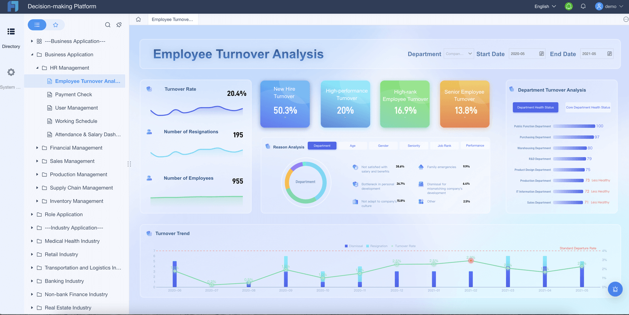
Monthly executive summary view for senior leadership
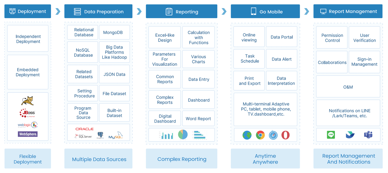
Use templates, software, and governance to keep the dashboard useful over time
The fastest way to lose dashboard adoption is to treat the first version as final. Call center operations change constantly. New channels appear. Staffing models shift. Business priorities evolve. The dashboard must be governed as a living asset.
Start with a focused KPI template, then customize for your operation size, channels, and goals
Do not begin with a blank page unless you have strong internal BI maturity. A focused template accelerates alignment because it gives teams a baseline structure and common language.
Start with a template that covers:
Demand
Service delivery
Agent execution
Customer outcomes
Financial efficiency
Then adapt it based on:
Operation size
Voice-only versus omnichannel scope
Inbound versus blended model
BPO versus in-house reporting needs
Executive versus frontline role requirements
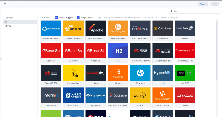
Evaluate dashboard software based on integrations, drill-downs, alerts, permissions, and usability
The right dashboard software should reduce manual effort and increase trust in the data.
Key evaluation criteria include:
Integrations: Can it connect cleanly to telephony, CRM, WFM, QA, and survey systems?
Drill-down capability: Can leaders move from summary KPI to queue, team, and agent detail quickly?
Alerts: Can it notify teams when thresholds are breached?
Permissions: Can executives, supervisors, and analysts each see the right level of detail?
Usability: Can non-technical managers use it without depending on analysts for every answer?
Performance: Does it load quickly enough for operational use?
Governance support: Can definitions, ownership, and refresh rules be standardized?
Audit the dashboard regularly to remove unused metrics and add new business priorities
A quarterly dashboard audit is a smart operating discipline.
Review:
Which widgets are actually used
Which KPIs no longer drive decisions
Whether metric definitions still align with operations
Whether new channels or workflows need inclusion
Whether leaders are getting the drill-downs and alerts they need
A dashboard with fewer, sharper metrics usually performs better than one that keeps expanding.
Common mistakes to avoid
Overloading one screen with too many widgets
When everything is visible, nothing is obvious. Keep each dashboard view focused on a specific decision-making context.
Reporting metrics without definitions or ownership
If nobody owns the metric, nobody trusts the number. Define every KPI and assign accountability.
Measuring agents in ways that conflict with customer experience goals
If you overemphasize AHT and underweight FCR, quality, or CSAT, agents will optimize for speed at the expense of resolution.
Failing to connect dashboard insights to coaching, staffing, and process improvement
A dashboard is only valuable if it changes behavior. If your review process does not convert insight into action, the dashboard becomes decorative.
Turn the methodology into a scalable operating system with FineBI
At this point, the pattern should be clear: building an effective call center KPI dashboard is not just about choosing charts. It requires KPI definition, role-based design, workflow alignment, governance, refresh logic, drill-down capability, and ongoing maintenance.
Building this manually is complex; use FineBI to utilize ready-made templates and automate this entire workflow.
FineBI helps operations leaders move faster by giving them a practical way to:
Start with dashboard templates built around real KPI use cases
Connect data from call systems, CRM platforms, WFM tools, and survey sources
Create role-based dashboards for supervisors, operations managers, and executives
Enable drill-down from high-level KPI summaries into queue, team, and agent-level detail
Standardize metric definitions and reporting rules
Automate refreshes, alerts, and scheduled reporting
Reduce spreadsheet dependency and manual report preparation
For enterprise teams, this is the difference between having reporting and having a true management system. Instead of spending cycles assembling numbers, leaders can focus on staffing decisions, coaching priorities, service recovery, and continuous improvement.
If your current reporting process depends on exported files, inconsistent definitions, and static presentations, you do not need more dashboard meetings. You need a better platform.
FineBI is the practical next step for teams that want to build a call center KPI dashboard operations leaders actually use, trust, and act on.
FAQs
A useful call center dashboard should focus on service level, average speed of answer, abandonment rate, queue volume, occupancy, adherence, average handle time, and customer outcomes such as CSAT or first contact resolution. The best mix combines leading indicators for fast action with lagging indicators that confirm long-term impact.
A dashboard is built for decisions, not just visibility. It brings real-time and historical metrics into one view so leaders can spot risk quickly, diagnose the cause, and respond before service levels slip further.
Operations leaders, call center managers, workforce planners, supervisors, and team leads all benefit from it, but they should not all use the same view. Executives usually need trend summaries and business impact, while frontline managers need queue-level detail and coaching signals.
Real-time or near-real-time updates are best for intraday management, especially for queue health, staffing, and agent availability. Weekly and monthly views should also be included to support trend analysis, coaching, and planning.
It should be designed around the decisions leaders need to make, not around every metric available in the system. A strong dashboard stays focused, separates monitoring from diagnosis, and makes it clear what action to take next.
Product Trial
FineReport
Pixel-perfect reports · Interactive dashboards · Easy data entry · Digital twins