If you want to know how to make a box and whisker plot, you just need to organize your data, find key values, and sketch the graph. A box and whisker plot shows the distribution of your data by highlighting the minimum, quartiles, median, and maximum. This type of chart helps you spot trends, compare groups, and catch outliers fast. With FineReport, you can create these plots easily and get a clear view of your data. Follow this step by step guide—you’ll have your plot ready in no time.
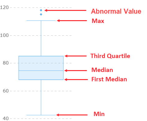
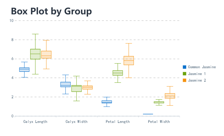
A box and whisker plot is a type of graph that helps you see how your data is spread out. The formal box and whisker plot definition, as found in leading statistics textbooks, says that this chart displays five key values: the minimum, first quartile, median, third quartile, and maximum. These values give you a quick snapshot of your dataset’s range and where most of your data points fall.
The box part of the plot shows the middle 50% of your data, which is called the interquartile range, or iqr. The lines, or “whiskers,” stretch out to the smallest and largest values that are not considered outliers. If you want to spot outliers, the iqr helps you set the boundaries. Anything outside 1.5 times the iqr from the quartiles is usually marked as an outlier.
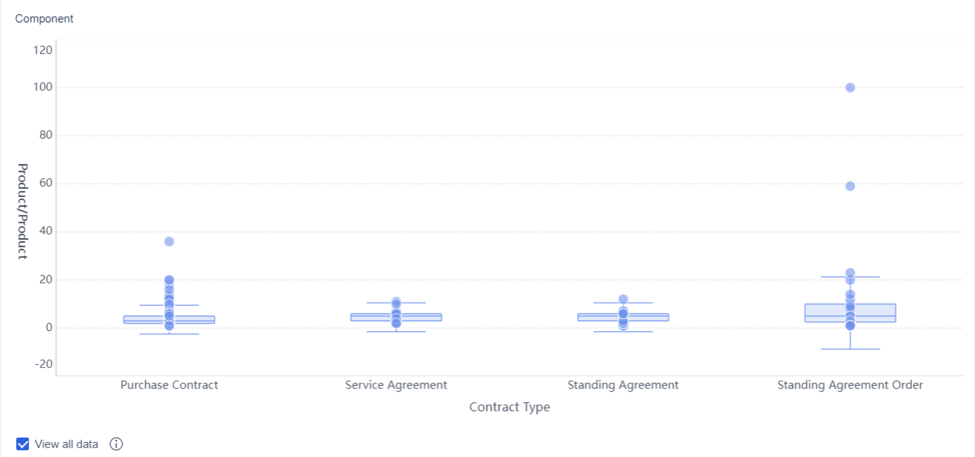
You use a box and whisker plot when you want to compare data sets or see how your data is distributed. This plot makes it easy to spot outliers, see if your data is skewed, and compare different groups side by side. Unlike a histogram or scatter plot, a box and whisker plot highlights outliers clearly with points outside the whiskers.
| Plot Type | Outlier Detection Method | Effectiveness in Revealing Outliers |
|---|---|---|
| Box Plot | Highlights outliers through whiskers and individual points outside | Very effective, provides a clear visual |
| Histogram | Reveals outliers by showing gaps in the distribution | Moderately effective, depends on bin size |
| Scatter Plot | Indicates outliers as points far from the general trend | Effective for identifying outliers in trends |
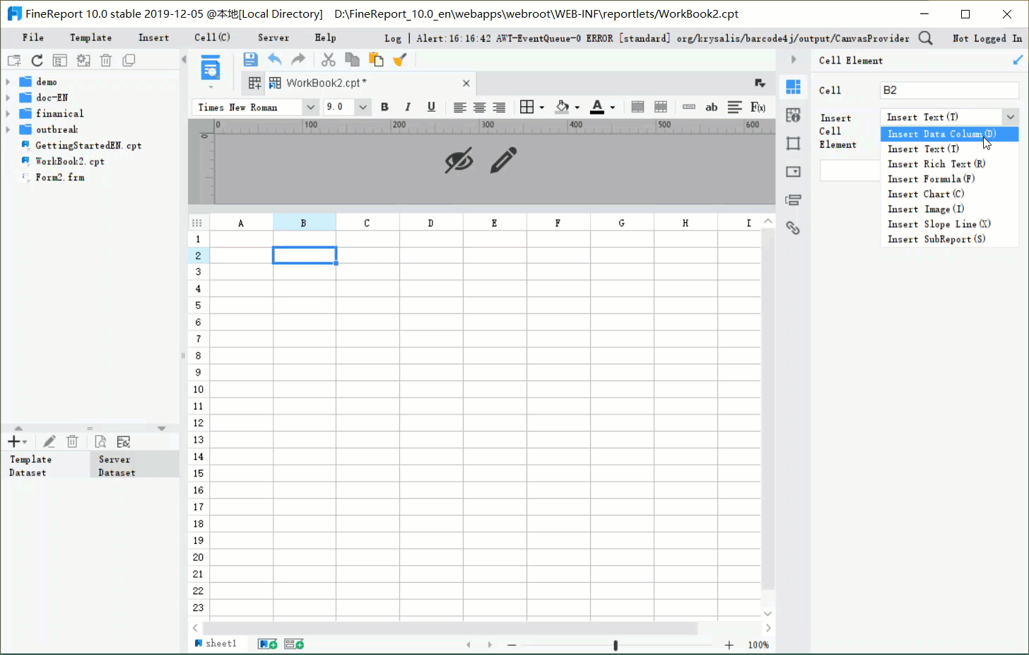
If you want to create a box and whisker plot quickly, FineReport offers a drag-and-drop interface that makes visualization simple. You can connect your data, select the box and whisker plot option, and instantly see the iqr, quartiles, and outliers. This saves you time and helps you focus on analyzing your results.
Ready to learn how to make a box and whisker plot step by step? You’re in the right place. This section breaks down each part of the process so you can create a box and whisker plot with confidence. Whether you’re working on a box and whisker plot worksheet for class or analyzing real-world data, these steps will help you avoid common mistakes and get accurate results.
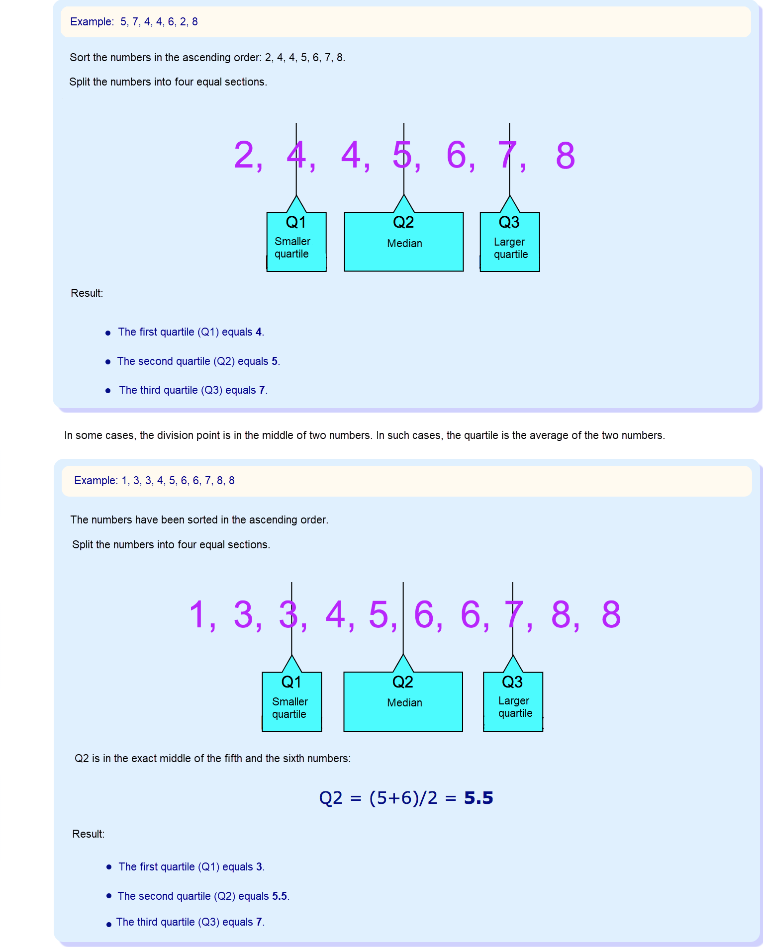
First, you need to organize your data. Start by listing all your values in order from smallest to largest. This makes it easier to spot patterns and ensures you don’t miss anything important. If you’re using a box and whisker plot worksheet, double-check that you’ve included every data point. Sorting your data helps you see the distribution and makes the next steps much simpler.
Now, let’s find the minimum and maximum values. These are the smallest and largest numbers in your dataset. You’ll use them to set the ends of your whiskers. If you’re working through a box and whisker plot worksheet, circle the lowest and highest values after sorting.
Outliers can change how you see the minimum and maximum. In a box and whisker plot, outliers appear as individual points beyond the whiskers. These points can shift your view of the distribution and central tendency. Sometimes, outliers are just data entry mistakes. Other times, they’re valid but unusual results. They might even reveal something new or interesting in your data.
Next, you need to find the median. The median is the middle value when your data is sorted. If you have an odd number of values, it’s the one right in the center. If you have an even number, average the two middle numbers. On a box and whisker plot worksheet, draw a line inside the box to show the median.
The position of the median tells you about the distribution. If it’s closer to Q1, your data has more lower values. If it’s centered, the distribution is likely symmetrical. If it’s closer to Q3, you have more higher values.
Quartiles split your data into four equal parts. You’ll need Q1 (the first quartile), Q2 (the median), and Q3 (the third quartile). Here’s how to find them:
Quartiles help you see the spread and skewness in your box and whisker plot. The interquartile range, or iqr, covers the middle 50% of your data. If the box is wider on one side, your data is skewed in that direction. The iqr is key for spotting outliers and understanding the distribution. Quartiles provide a clear representation of data spread and skewness in box plots.
You’re ready to draw your box and whisker plot. Start by sketching a box from Q1 to Q3. Draw a line inside the box for the median. Extend whiskers from the box to the minimum and maximum values that fall within the range of Q1–1.5 × iqr and Q3 + 1.5 × iqr. Mark any outliers as individual points outside the whiskers. If you’re using a box and whisker plot worksheet, label each part clearly.
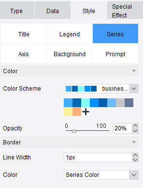
When you use FineReport’s drag-and-drop report designer, you can create a box and whisker plot in just a few clicks. The software automatically calculates the iqr, quartiles, and outliers, so you don’t have to do the math by hand. You can focus on analyzing the distribution and spotting trends. FineReport also helps you avoid common visualization errors, like using box plots for small datasets or categorical data, or overloading your plot with too many categories.
If you follow this step by step process, you’ll know how to make a box and whisker plot that’s accurate and easy to read. Try using a box and whisker plot worksheet for practice, and explore FineReport for a faster, more reliable way to visualize your data.
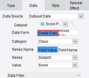
You want to create a box and whisker plot without spending hours on manual calculations. FineReport makes this process simple. The interface feels familiar if you have used Excel before. You can connect to almost any data source, drag your data into the workspace, and FineReport will help you visualize the iqr, quartiles, and outliers automatically. You do not need to write code or worry about complex formulas.
Let’s compare FineReport with other popular tools:
| Feature | FineReport | Tableau / Power BI |
|---|---|---|
| User Interface | User-friendly, resembles Excel | User-friendly, advanced features |
| Drag-and-Drop Functionality | Yes | Yes |
| No-Code Development | Yes | Yes |
| Chart Recommendation Feature | No | Yes |
| Real-Time Collaboration | No | Yes |
| Integration Capabilities | Limited | Extensive |
| Complexity of Reports | Easy to create complex reports | More complex but powerful |
| Data Analysis Convenience | Inconvenient for multiple analyses | Convenient for multiple analyses |
FineReport stands out when you want to create a box and whisker plot for a single dataset or a few groups. The drag-and-drop designer lets you focus on the iqr and the overall distribution, not the technical details. You can customize your dashboard, add filters, and update your plots with new data in seconds.
Box and whisker plots play a big role in manufacturing quality control. You can use them to track defect rates, spot outliers, and compare production lines. For example, if you want to see how defect rates change over time, a box and whisker plot shows the iqr and highlights any unusual spikes. This helps you find problems before they get bigger.
Here’s how these plots help in real-world manufacturing:
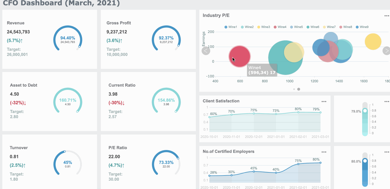
For example, you might see one production line with a much wider iqr than others. This tells you there is more variation and possibly more risk. You can use FineReport’s dashboard features to display multiple box and whisker plots side by side. This makes it easy to compare, share, and act on your findings.
FineReport's dashboards let you monitor key metrics in real time. You can set up alerts for outliers or sudden changes in the iqr. With these tools, you stay ahead of quality issues and keep your processes running smoothly.
When you create a box and whisker plot, you want your results to be clear and accurate. Many people run into the same box and whisker plot problems, but you can avoid them with a few simple tips:
Tip: Before you share your plot, double-check for these common mistakes. A well-made box and whisker plot helps everyone see the story in your data.
You can improve your skills by practicing with real examples. Try these ideas to get started:
Practicing with a variety of examples will help you master how to make a box and whisker plot. The more you work with real data, the easier it becomes to spot patterns and avoid mistakes.
You now know how to make a box and whisker plot step by step. Here’s a quick checklist to keep your plots accurate:
Follow these steps:
Use FineReport to visualize your data quickly. Try box and whisker plots for quality control or any scenario where spotting outliers and trends matters.

Bar Chart Race: A Complete Guide
16 Types of Chart for Effective Data Visualization
22 Different Types of Graphs in Data Visualization: A Practical Guide

The Author
Lewis
Senior Data Analyst at FanRuan
Related Articles

12 Best Data Visualization Tools for 2026: Features, Pricing, Pros and Cons
$1 are software platforms that turn raw data into charts, dashboards, maps, and interactive visual stories for analysis and decision making. 12 best data visualization tools for 2026 at a glance
Lewis Chou
Apr 23, 2026

Top 8 Data Visualization softwares You Should Try in 2025
Compare the top 8 data visualization software for 2025, including FineReport, Tableau, Power BI, and more to find the best fit for your business needs.
Lewis
Dec 19, 2025
10 Must-Have Data Visualization Tools for Modern Businesses
Compare the top 10 data visualization tools for 2025 to boost business insights, streamline analytics, and empower smarter decision-making.
Lewis
Dec 17, 2025


