The main difference between a chart vs graph comes down to how you display and understand your data. You use a chart to organize information visually, often to compare parts or show categories. In contrast, you use a graph to illustrate relationships or trends, especially how things change over time. Understanding this distinction helps you select the right tool for clear communication and avoids common mistakes, such as assuming all charts are interchangeable or that more detail always leads to better understanding. FineBImakes it easy for you to choose and create the best visual for your needs, helping you share insights quickly and accurately.
Chart vs Graph: What is a Chart?
Definition
You use charts to turn numbers and facts into pictures that make sense at a glance. A chart is a visual tool that helps you organize and present information clearly. When you look up the difference between charts and graphs, you will see that charts often show categories, parts of a whole, or comparisons. Charts make it easier for you to spot patterns, trends, and outliers in your data. You do not need to be a data expert to understand charts. They help you see the story behind the numbers.
Types of Charts
Many types of charts exist, each with its own best use. Here is a table that shows some of the most common chart types and when you might use them:
Chart Type
Best Use Cases
Line chart
Trend analysis, time series data, comparing multiple data series
Bar chart
Comparing categories, ranking items, frequency distribution
You can use charts to track your expenses, compare monthly bills, or see how your spending changes over time.
In school, teachers use charts to show test scores or class attendance.
At work, you might use charts to compare sales numbers, measure team performance, or present survey results.
Charts make complex data simple. They let you see trends, patterns, and outliers quickly.
Visual elements like colors and shapes in charts help you understand information faster and make better decisions.
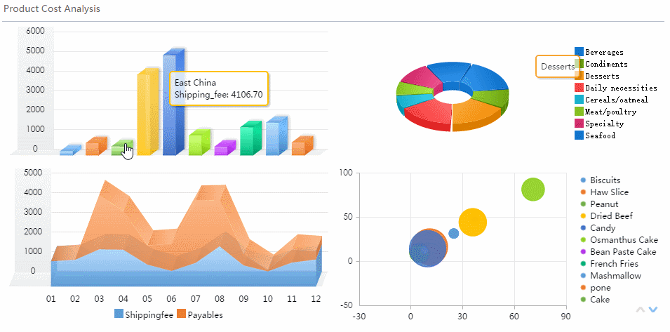
FineBI and Charts
FineBI gives you powerful tools to create and use charts with ease. You do not need coding skills to build clear and attractive charts. Here is how FineBI supports you:
Feature Type
Description
Chart Variety
You can choose from many chart types, such as column, line, and pie charts, for different needs.
Customization
FineBI lets you adjust colors, sizes, and labels to make your charts stand out.
Dashboard Creation
You can combine charts and other components into a dashboard for a complete view.
Intuitive Charts
FineBI offers easy-to-use chart options for all skill levels.
Custom Chart Options
You can create combination charts for flexible data exploration.
Dashboard Functionality
FineBI helps you organize charts so you can spot key issues at a glance.
With FineBI, you can turn raw data into clear, useful charts in minutes. This makes it simple for you to share insights and make informed choices. When you understand the difference between charts and graphs, you can pick the right visual for your message and audience.
You use graphs to show how things relate to each other or how they change over time. When you search online, you will find that graphs help you turn numbers into pictures that reveal patterns, trends, and relationships. Unlike charts, graphs often focus on showing connections between data points. You can use graphs to make sense of complex information quickly. Your brain processes visual data faster than reading tables or lists, so graphs help you spot important details at a glance.
Types of Graphs
Many types of graphs exist, each with a special purpose. Here are some of the most common types you will see in science and business:
Line graphs help you track changes or trends over time.
Bar graphs let you compare quantities across different groups.
Pie graphs show how parts make up a whole.
Scatter plots help you find relationships or patterns between two variables.
Histograms display how often values appear in a dataset.
You can use these graphs to answer questions like, “How did sales change this year?” or “Is there a link between study time and test scores?” Each type of graph gives you a different way to look at your data.
Everyday Uses
You use graphs in many parts of your daily life. In school, teachers use graphs to show class performance or attendance. At work, you might use graphs to track sales, monitor project progress, or compare results from different teams. When you look at the news, you often see graphs that explain trends in the economy or health statistics. Graphs make it easier for you to turn raw data into insights you can act on. They help you see patterns, spot outliers, and understand relationships that might not be obvious from numbers alone.
Analyzing Relationship Patterns: Look for patterns in your graph to gain insights and identify trends. Patterns like clusters, bridges, and outliers can reveal important information about the structure and behavior of your data.
FineBI and Graphs
FineBI gives you powerful tools to create and explore graphs, even if you have no technical background. You can use the drag-and-drop interface to build graphs without writing any code. FineBI processes your data in real time, so your graphs always show the latest information. You can prepare your data easily with built-in tools, making it simple to get your graphs ready for analysis. FineBI works on your computer and mobile devices, so you can view and share graphs anywhere. The in-memory computing engine keeps your graphs fast and responsive, even with large datasets. With FineBI, you can turn complex data into clear, interactive graphs that help you make better decisions.
You often wonder about the difference between charts and graphs when choosing how to present your data. The table below helps you see the main distinctions at a glance. You can use this as a quick reference when deciding which visual tool fits your needs.
Feature
Charts
Graphs
Data Type
You can represent both numbers and categories.
You usually visualize numbers and relationships.
Types
You use pie charts, bar charts, column charts, and more.
You often use line graphs, scatter plots, and histograms.
Axes
You may see categories on one axis and numbers on the other.
You see data points plotted on x and y axes.
Purpose
You organize and compare information visually.
You show how things change or relate over time.
Visual Focus
You highlight categories, proportions, or comparisons.
You focus on trends, patterns, and relationships.
Context
You use charts for quick insights in business or daily life.
You use graphs for deeper analysis in academic or technical settings.
Main Distinctions
You need to understand the difference between charts and graphs to choose the right visual for your message. Here are the main distinctions explained in simple terms:
Visual Structure: Charts often use shapes, colors, and sections to organize information. You see bars, slices, or columns that make it easy to compare categories or parts of a whole. Graphs use points, lines, or curves to show how values change or relate. You track movement or patterns across axes.
Functional Use: You use charts when you want to summarize data, compare groups, or show proportions. Charts help you spot differences quickly. You use graphs when you want to analyze trends, relationships, or changes over time. Graphs help you see connections and patterns that numbers alone cannot show.
Contextual Application: In business, you use charts to present sales figures, expenses, or survey results. Charts give you quick insights for decision-making. In academic settings, you use graphs to support research, show experimental results, or validate findings. Graphs provide detailed analysis for deeper understanding.
Tip: When you choose between a chart vs graph, think about your audience and your goal. If you want to compare categories or show proportions, use a chart. If you want to reveal trends or relationships, use a graph.
You can see that the difference between charts and graphs is not just about how they look. It is about how you use them to communicate information clearly and effectively.
How to Choose: Chart vs Graph
Quick Tips
Choosing between a chart or a graph can feel confusing. You want your data to be clear and easy to understand. Here are some practical tips to help you decide:
Think about your goal. Ask yourself, “What do I want to show to my users?”
Consider the type of data you have. Are you working with categories, numbers, or relationships?
Focus on clarity. Simple visuals help your audience understand your message quickly.
Match your visual to your audience’s needs. Some people prefer quick comparisons, while others want to see trends or patterns.
Use colors wisely. Consistent colors make your charts easier to read and more accessible.
Experts recommend that you keep your visualizations simple. Avoid clutter and information overload. Choose the most effective chart type for your data.
When you understand the difference between graphs and charts, you can select the best tool for your message. Charts work well for comparing categories or showing proportions. Graphs help you reveal trends, patterns, or relationships.
Matching Data to Visuals
You need to match your data type to the right visual. This step makes your information clear and meaningful. Here is a table to guide your choice:
Data Type
Recommended Visualization
Continuous Data
Line charts
Categorical Data
Bar charts
Large Datasets
Scatter plots
Small Datasets
Pie charts
The size of your dataset matters. Large datasets often need scatter plots or line charts to show patterns.
Complex data may require special chart types to make your message clear.
Not every chart fits every dataset. For example, pie charts work best with small datasets.
Ask yourself what you want to show:
Do you need to display one big number?
Do you want to compare values within or between groups?
Are you showing the relative composition of data?
Do you need to display change over time?
Are you explaining the relationship between metrics?
Do you want to plot geographical data?
Are you showing details of many items?
When you know the difference between graphs and charts, you can answer these questions and pick the right visual.
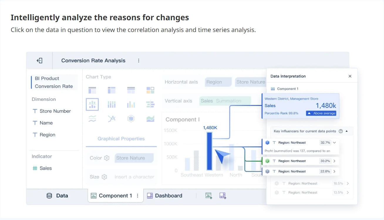
FineBI Recommendations
FineBI helps you choose and create the best visual for your data. You do not need technical skills to use FineBI. The platform guides you through each step:
Data Integration: Connect to your data sources easily. FineBI supports databases, files, and APIs.
Data Processing: Prepare your data with simple tools. You can join tables, add formulas, and filter records.
Visual Exploration: Drag and drop your data to build charts and graphs. FineBI offers many chart types, including line charts, bar charts, and pie charts.
Publishing & Governance: Share your dashboards securely. FineBI keeps your data safe and lets you control who sees your reports.
FineBI recommends the best chart or graph based on your data type. For continuous data, you can use line charts to show trends. For categories, bar charts help you compare groups. If you have a large dataset, scatter plots reveal patterns. FineBI’s workflow makes it easy to match your data to the right visual.
You can preview your charts before sharing them. FineBI’s dashboard lets you organize multiple charts and graphs for a complete view. You can apply filters and customize styles to highlight key insights.
When you use FineBI, you avoid common mistakes. You do not need to worry about the difference between graphs and charts. FineBI’s smart recommendations and intuitive design help you communicate your message clearly.
Expenses Tracking and the difference between charts and graphs
You want to understand your spending habits. You collect data from your bank statements and receipts. You organize this information into categories like groceries, rent, and entertainment. You use charts to see where your money goes each month. Bar charts help you compare spending across categories. Pie charts show the proportion of each expense. These visual representations of data make it easy to spot patterns and identify unnecessary costs. You can reduce expenses by seeing which categories take up the most money. When you use graphs, you track changes in your spending over time. Line graphs reveal trends, such as rising utility bills or decreasing grocery costs. FineBI lets you create these visuals quickly. You drag and drop your data, choose the best chart or graph, and see your financial health at a glance.
Charts and graphs help you organize expenses, compare financial items, and support better decision-making for long-term planning.
Benefit of Charts for Tracking Expenses
Description
Shows Spending Patterns
Helps you identify where money is spent.
Aids in Cost Reduction
Visualisation highlights unnecessary costs.
Comparison of Financial Items
Enhances understanding of overall financial health.
Sales Trends and the difference between charts and graphs
You manage a small business and want to track sales performance. You use time series charts to see how sales change month by month. Line graphs show trends and help you spot seasonal patterns. Bar charts let you compare sales across products or regions. You break down sales data to find what drives growth. FineBImakes this process simple. You connect your sales data, select the right visualisation, and analyze results in real time. You see clear directional indicators, which help you make quick decisions. You can share dashboards with your team and improve meeting efficiency.
Time series charts show sales trends over time.
Breakdown analysis helps you identify sales drivers.
Survey Results and the difference between charts and graphs
You conduct a survey to understand customer preferences. You collect responses and want to present the results clearly. You use bar graphs to compare answers across different groups. Pie charts show how many people chose each option. Line graphs highlight changes in opinions over time. These visual representations of data help you reveal insights that raw numbers cannot show. FineBIguides you to select the best chart type for your survey data. You visualize trends, compare results, and share findings with your team.
Chart Type
Effectiveness in Presenting Survey Results
Bar Graph
Best for comparisons and showing relationships between data sets.
Pie Chart
Best for showing parts of a whole in specific cases.
Line Graph
Ideal for highlighting trends over time.
Venn Diagram
Useful for showing relationships and overlaps.
Charts and graphs are great at presenting insights, comparing data, or highlighting trends. They use visuals to help you see patterns, relationships, and key insights at a glance.
FineBI in Action and the difference between charts and graphs
FineBI streamlines your workflow for every scenario. You connect to your data sources, prepare your data, and create visualisation dashboards with ease. You use interactive visualizations to enhance meeting efficiency. Advanced data preparation tools let you focus on insights, not data management. Integrated collaboration features help your team share knowledge and improve decision-making. FineBI supports both charts and graphs, so you always choose the best data representation for your needs. You see the difference between charts and graphs in action, making your business analysis faster and more effective.
The main difference between charts and graphs is that charts help you organize and compare categories, while graphs show relationships and trends over time. To choose the right visual for your data, follow these steps:
Define your goal for presenting the data.
Decide what you want to communicate.
Select the chart or graph type that matches your goal.
FineBI makes it easy for you to create clear visuals and share insights. Try FineBItoday and discover how simple data analysis can be.
Access a wealth of case studies, industry insights, and solution guides to accelerate digital transformation.
FAQ
What is the main difference between charts and graphs?
You use charts to organize and compare categories visually. You use graphs to show relationships and trends over time. The difference between charts and graphs helps you choose the right tool for your data.
When should you use a chart instead of a graph for your data?
You should use a chart when you want to compare categories or show proportions. The difference between charts and graphs is that charts work best for quick comparisons and summaries.
Can you use both charts and graphs in one FineBI dashboard?
You can combine charts and graphs in a FineBI dashboard. This approach lets you highlight the difference between charts and graphs and present multiple perspectives for deeper analysis.
How does FineBI help you understand the difference between charts and graphs?
FineBI guides you through choosing the best visual for your data. You see recommendations based on your dataset, making the difference between charts and graphs clear and easy to apply.
Why does knowing the difference between charts and graphs matter in business?
You make better decisions when you understand the difference between charts and graphs. You select visuals that match your goals, improve communication, and avoid confusion in reports and presentations.