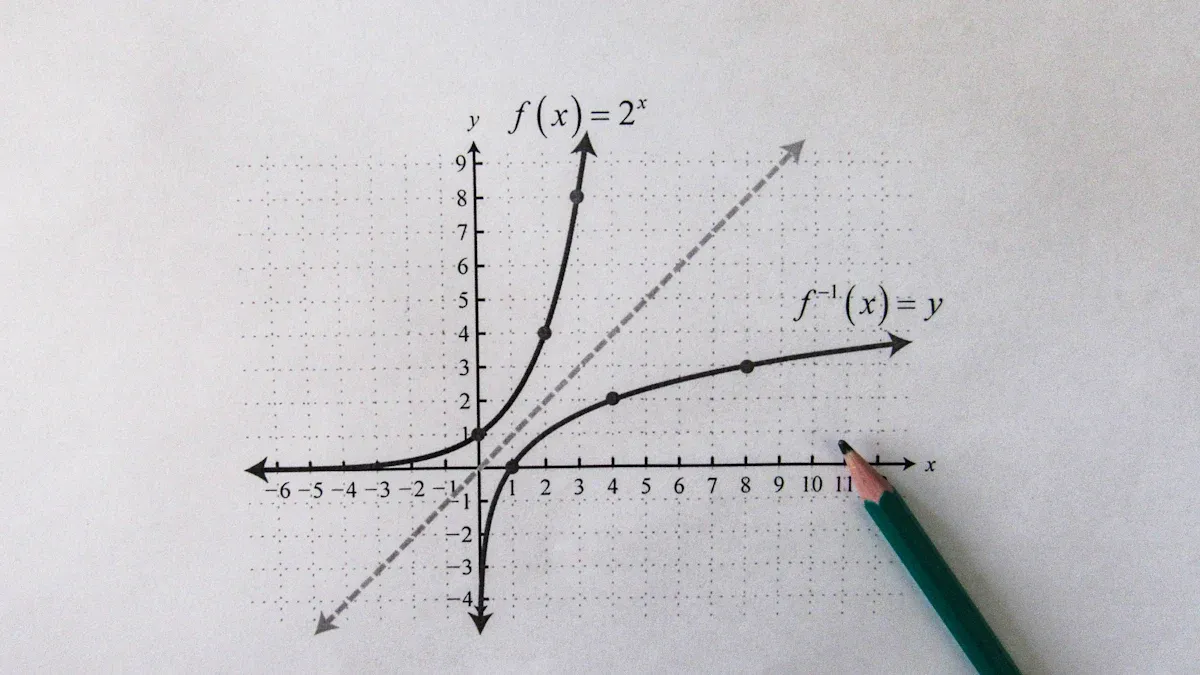
You might wonder what is a line plot. A line plot shows information using points connected by straight lines. You can use it to track changes or trends in data. If you want to make or analyze your own line plot, FineReporthelps you create clear charts with simple tools. You will find practical tips and examples easy to follow, even if you are just starting out.
What is a Line Plot
Simple Definition
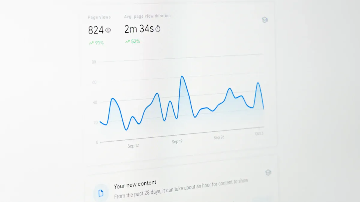
You may ask, what is a line plot? A line plot is a simple graph that displays data points on a number line and connects them with straight lines. You use a line plot to show how something changes over time or across categories. This type of graph helps you see patterns and trends quickly. Many people also call a line plot a line chart. You often see line charts in business, science, and everyday life because they make it easy to track changes.
A line plot stands out from other chart types. Here is a quick comparison:
Feature
Line Plots
Other Chart Types
Purpose
Show trends over time
Focus on comparisons or distributions
Data Representation
Points connected by lines
Various forms (bars, dots, etc.)
Best Use Case
Sequential data
Relationships between variables
Clarity
Effective for small changes
May obscure trends in complex data
Complexity
Can become cluttered with variables
Generally simpler in presentation
You use a line plot when you want to see how values move from one point to another. For example, you can track your grades each semester or monitor daily temperatures. Line charts are preferred forvisualizing trends over time, especially in fields like business and finance.
How It Works
A line plot uses a few key parts to display information. You start with a number line, which acts as the x-axis. This axis usually shows time or categories. The y-axis shows the values you want to measure, such as sales or temperature.
Here are the main components of a line plot:
X-Axis: Shows the independent variable, often time or categories.
Y-Axis: Displays the dependent variable, which is the value you want to track.
Data Points: Mark specific values at each position on the graph.
Lines: Connect the data points to reveal patterns and trends.
Title and Labels: Give context and explain what each axis measures.
Legend: Helps you understand what each line represents, especially if you have more than one line.
You plot each data point at the correct spot on the graph. Then, you connect the points with straight lines. This connection helps you see how the values change. For example, if you plot your monthly savings, the line will show if your savings go up, down, or stay the same.
Line charts are highly favored in professional data analysis. You see them used to track stock prices, sales figures, and scientific measurements. They are effective for showing trends and patterns, making them a staple in data visualization.
Research shows that line charts help readers visualize changes in data over time. They make it easy to spot increases, decreases, or steady values. You can use a line plot to compare different sets of data, but it works best when you want to focus on how something changes.
Tip: Use a line plot when you want to highlight trends or changes in your data. It works best for sequential data, such as time series.
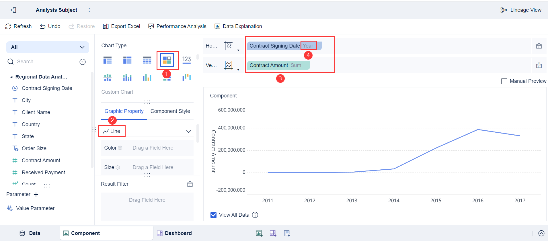
If you want to create or analyze a line plot, you will find that the structure is simple and clear. You can use tools like FineReportto make line charts quickly and customize them for your needs.
When you look at a line plot, you notice two main axes. The x-axis usually shows time, such as months or quarters. The y-axis displays a quantitative value, like sales or temperature. This setup makes it easy for you to see how values change over time. Labels on both axes help you understand what each axis represents. You often see labels for the first and last data points, which provide context and make the chart easier to read.
Tip: Always check the axis labels before interpreting a line chart. They guide you to the meaning behind the numbers.
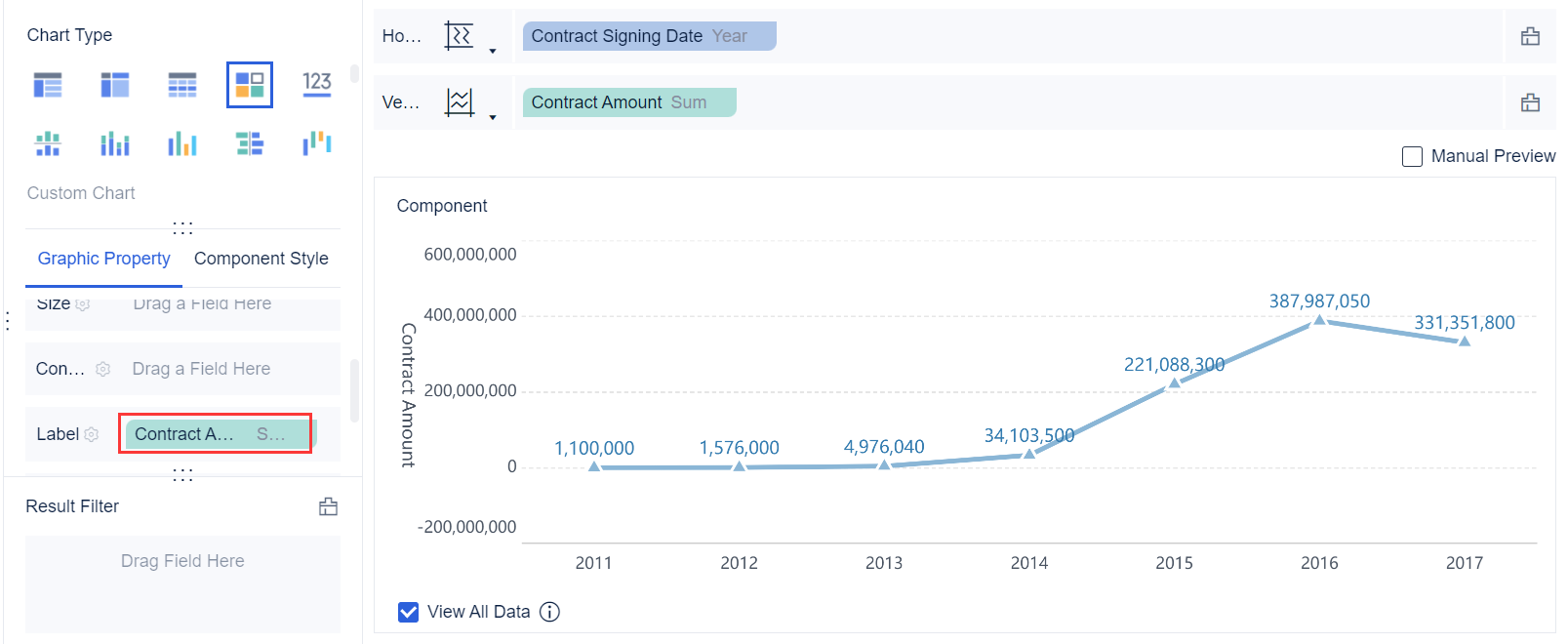
In business, the x-axis often represents dates, while the y-axis shows figures such as revenue or units sold. This arrangement lets you spot trends quickly. FineReportallows you to customize axis label positions and colors, making your charts clearer and more professional.
Feature
Description
Axis Label Position
You can set where axis labels appear, improving clarity.
Customization Options
Choose colors and formats for each axis and label to distinguish data series.
Custom Multiple Axes
Add extra axes for more complex data, making it easier to compare multiple trends.
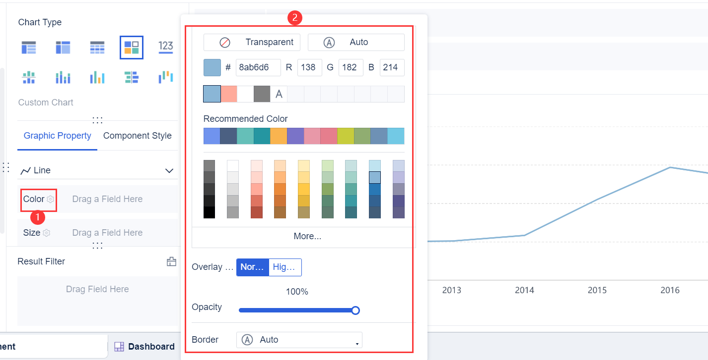
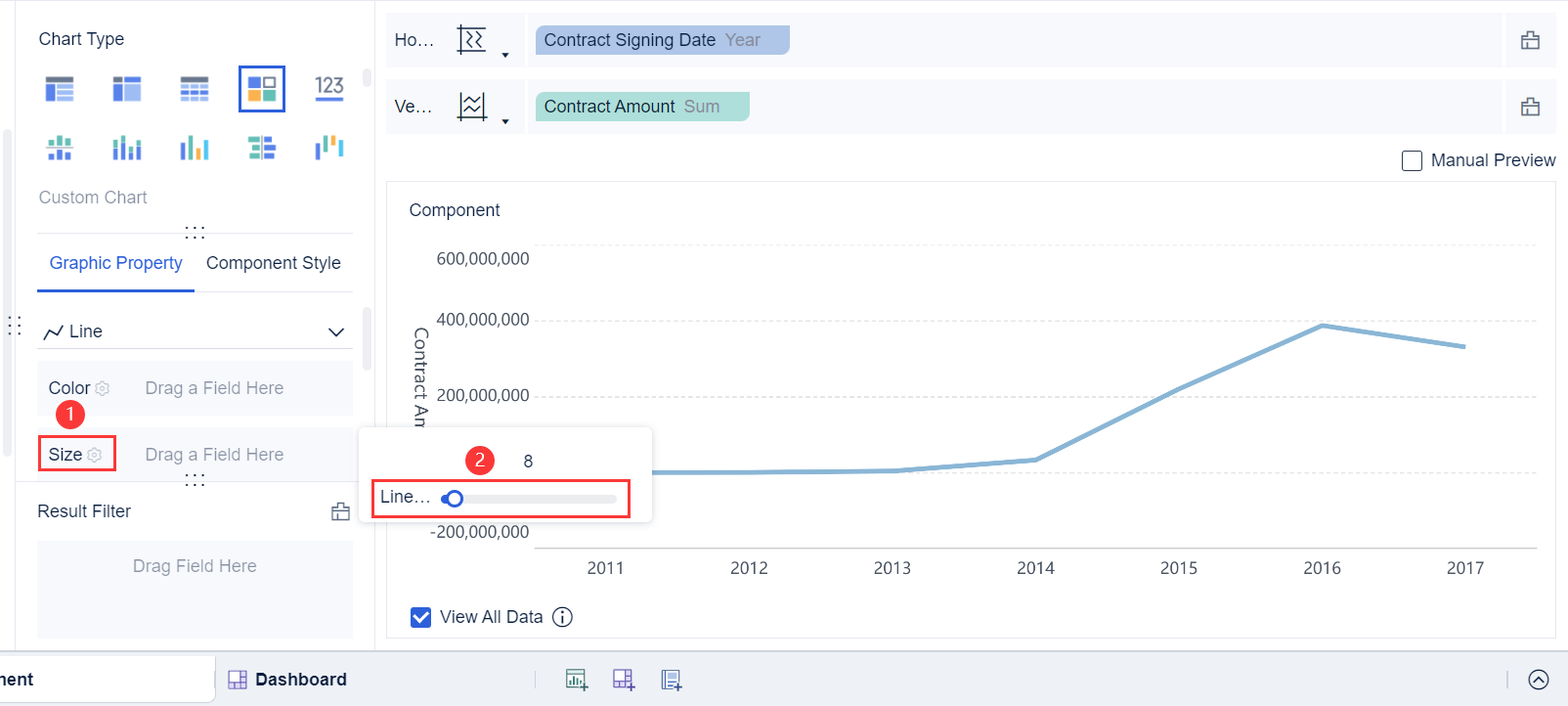
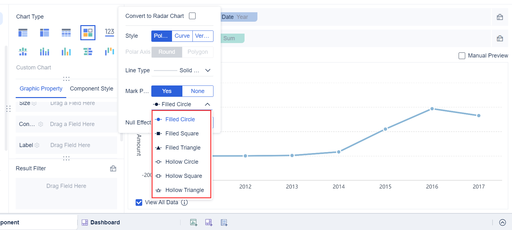
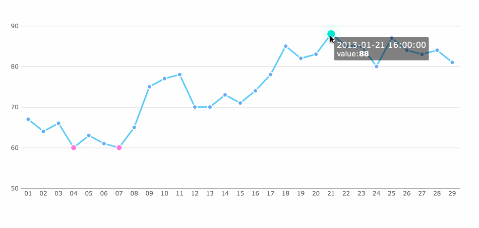
A line plot uses data points to mark specific values. Each point stands for a measurement at a certain time or category. You connect these points with straight lines. This connection shows how values move from one point to the next. You can see the rate of change, or slope, between points. Markers for data points can vary in color and size, which helps highlight important information.
Aspect
Description
Data Points
Each mark shows an individual value.
Connection of Points
Lines link the points, revealing local changes and overall trends.
Markers
You can adjust marker color and size for emphasis.
Strive for simplicity in your line chart. Use contrasting colors that are easy to distinguish. Limit the number of colors to six or fewer. Assign colors based on the importance of the data. This approach keeps your chart readable and helps you communicate the most important trends.
Title and Legend
The title of a line plot gives context. It tells you what the chart represents, such as "Quarterly Sales by Region." A clear title helps you understand the purpose of the chart right away. The legend explains what each line or color stands for, which is essential when you have more than one data series.
Element
Role in Clarity
Title
Provides context and relevance, helping you understand what the chart shows. Descriptive titles enhance interpretation.
Legend
Explains each color or line, making it easier to read charts with multiple data series. Customization improves visibility.
FineReportlets you customize titles and legends. You can enter a specific title, such as "Monthly Air Conditioner Sales," and choose whether to show or hide the legend. These options help you create line charts that match your needs and make your data easy to interpret.
You can create a line plot by following a few simple steps. This process helps you visualize changes and trends in your data. Here is a step-by-step guide:
Draw a number line. This will serve as your x-axis.
Identify the data range. Decide the minimum and maximum values for your axes.
Choose the data you want to analyze. For example, you might track daily temperatures for a week.
Assign axes. Place time or categories on the x-axis and values on the y-axis.
Add scale intervals to both axes. Make sure the intervals are consistent.
Plot data points. Mark each value as a dot or short line on the graph.
Connect the points with straight lines. This forms the line chart and reveals patterns.
Write a clear title. Describe what the line plot shows.
Add a legend if you have more than one data series.
Tip: Each line plot should focus on one main message. Avoid exaggerating scales, as this can mislead viewers about trends.
Common Mistakes in Line Plots
Description
One claim for one graph
Each graph should convey a single message to avoid confusion.
Exaggerating scales
Changing the scale can misrepresent data trends.
FineReportmakes it easy to generate and customize line charts. You can select your data, adjust axes, and add titles or legends with just a few clicks. This tool helps you create professional charts for business or educational projects.
When you read a line plot, you look for trends and patterns in the data. Here are some ways to interpret what you see:
Spot peaks and valleys. High points show maximum values, while low points reveal minimums.
Detect cycles. Repeating patterns suggest regular changes over time.
Recognize anomalies. Outliers may indicate errors or special events.
Examine the trendline. The direction and slope show if the data moves upward, downward, or stays steady.
A line chart helps you understand how values change. You can see if sales increase, decrease, or remain stable over months. Trendlines smooth out short-term fluctuations and highlight the overall direction. Different types of trendlines, such as linear or exponential, provide unique insights into data behavior.
FineReportallows you to customize your line plot for deeper analysis. You can adjust colors, add multiple lines, and set up interactive features. This flexibility supports clear communication and better decision-making.
What is a Line Plot: Line Chart Uses
Trend Analysis
You often use a line chart to analyze trends in many fields. This type of chart helps you see how values change over time. For example, you can track stock prices, monitor patient health, or observe population growth. The clear design of a line chart makes it easy to compare data points and spot patterns. You can quickly identify if numbers rise, fall, or stay steady.
Here are some common scenarios where you use line charts:
Finance: Track stock performance and investment trends.
Economics: Show changes in GDP or inflation rates.
Healthcare: Monitor patient vital signs and disease spread.
Demography: Visualize population growth.
Environmental Science: Assess air quality and environmental changes.
Energy Sector: Analyze energy consumption patterns.
The table below shows how different industries use line charts for trend analysis:
Industry/Application
Description
Social and Demographic Research
Visualize population trends, such as birth rates and migration patterns over time.
Business Performance
Monitor sales trends and assess marketing campaign effectiveness.
Scientific Research
Plot experimental results to observe trends and validate hypotheses.
Quality Control in Manufacturing
Monitor product quality and process parameters, identifying variations over time.
Quality Control in Manufacturing
You rely on line charts to maintain quality in manufacturing. Control charts, a special type of line chart, help you monitor process stability and spot deviations. You plot data points over time to see if the process stays within expected limits. The chart includes an Upper Control Limit, Center Line, and Lower Control Limit. If data points fall outside these limits, you know something unusual happened and can take corrective action.
Line charts reveal patterns in production data. Consistent trends or sudden changes signal the need for investigation. This approach improves quality control and reduces defects or scrap rates. You can use line charts to track qualification rates, defect rates, and scrap rates, making it easier to manage and optimize production.
FineReport for Line Charts
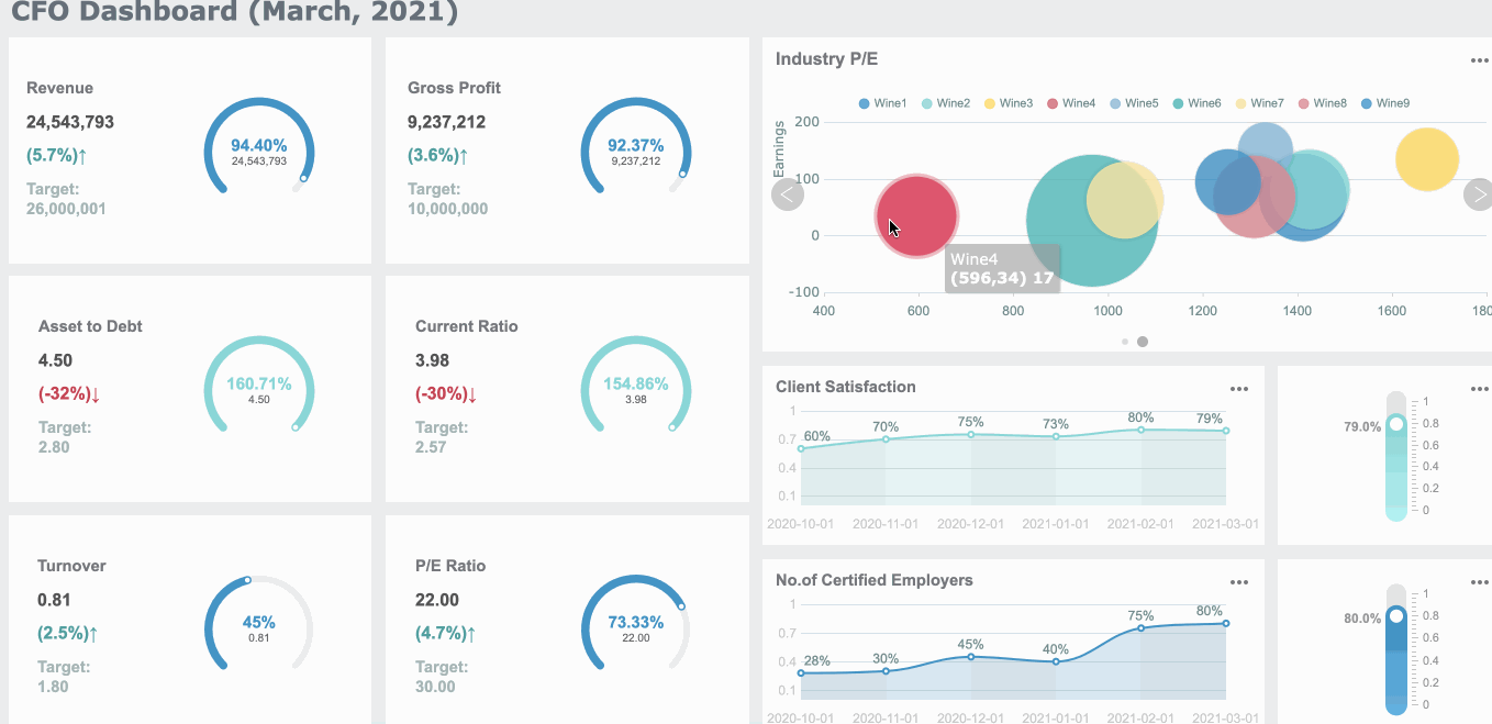
FineReportgives you powerful tools for creating interactive, real-time line charts and dashboards. You can integrate data from multiple business systems, which helps you break down information silos. FineReport continuously monitors background data, so you always see the latest information. You can interact with your charts, exploring connections and analyzing trends from different angles.
The table below highlights the benefits of using FineReport for line charts:
Benefit
Description
Data Integration
Connects data from various sources for better decision-making.
Real-time Data Monitoring
Displays up-to-date information for timely insights.
Dynamic Interaction
Lets you explore data relationships and solve problems efficiently.
Adaptive Display
Shows your charts on any device, so you can access data anywhere.
FineReport'sdashboards allow you to combine multiple templates and datasets in one view. You can perform interactive operations, analyze key content, and make informed decisions quickly. This solution is especially valuable for manufacturing, where you need to monitor defect and scrap rates and respond to quality issues in real time.
A line plot gives you a clear way to visualize trends and changes in your data. You see patterns over time, compare variables, and communicate information with labeled axes and legends.
Line plots show trends in time series data.
You can compare multiple variables on one graph.
Clear labels and legends make complex data easy to understand.
You may face challenges, such as reading fractional values or interpreting patterns.
Challenge Description
Accurately identifying fractional values on the number line
Understanding the concept of frequency and its representation
Interpreting data patterns to draw conclusions
Try creating your own line plot or interpreting one using FineReport. Explore these resources to build your skills:
Access a wealth of case studies, industry insights, and solution guides to accelerate digital transformation.
FAQ
What is the difference between a line plot and a line graph?
You use a line plot to show individual data points connected by lines. A line graph often displays continuous data and trends. Both help you visualize changes, but a line plot works best for discrete values.
When should you use a line plot for time series analysis?
You should use a line plot when you want to track changes in data over time. Time series analysis becomes easier because you can see patterns, trends, and cycles clearly.
How do you read multiple lines on a line plot?
You look at each line and compare their shapes and directions. Each line represents a different data series. The legend helps you identify what each line stands for.
Can you customize a line plot in FineReport?
You can customize colors, labels, and legends in FineReport. You select your data, adjust axes, and add interactive features. This makes your line plot clear and easy to understand.
What are common mistakes to avoid when creating a line plot?
You should avoid cluttering the chart with too many lines. Always label axes and use a clear title. Do not exaggerate scales, as this can mislead viewers about trends.