You can learn how to make a histogram by following simple steps that anyone can master. You start with your data and move through a clear process to create a visual summary. FineBI helps you work faster and more accurately. With the right approach, you will see patterns in your numbers and gain insights that guide your decisions.
Learning how to make a histogram starts with collecting accurate and relevant data. You need a dataset that truly represents the subject you want to analyze. Reliable data collection ensures your histogram reflects real patterns, not random noise. Use a sample size of at least 50 observations for each group. This helps your histogram resemble the true distribution of your population. Avoid using inconsistent measurement tools, as they can lead to unreliable results.
Here are some effective methods for collecting data suitable for histogram analysis:
FineBI makes this process easier. You can connect to various data sources, such as databases, Excel files, and APIs. FineBI’s data integration feature allows you to bring all your information together for a unified analysis.
| Feature | Description |
|---|---|
| Data Integration | Seamless integration from various sources, enabling holistic data analysis. |
| Data Cleansing Tools | Remove duplicates, correct errors, and organize data into a structured format for accuracy. |
Once you have collected your data, you need to organize and review it before moving forward. Sorting your data in ascending order helps you see trends and makes visualization easier. Define your bins in advance and ensure they do not overlap. Remove any duplicates or irrelevant entries to keep your dataset clean.
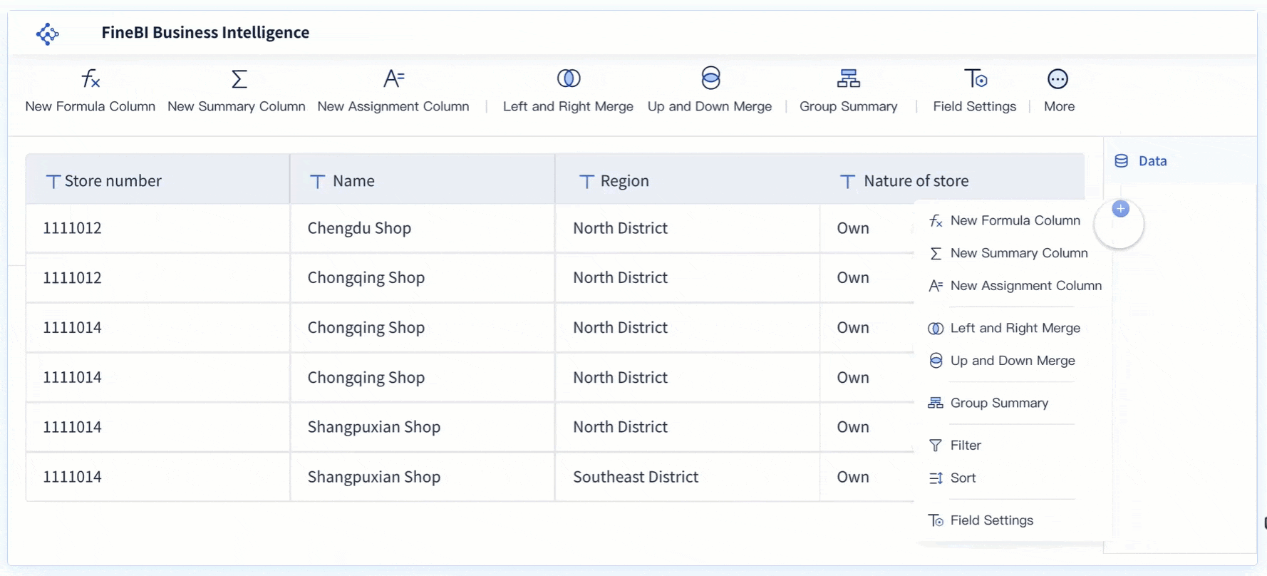
FineBI supports you in this step as well. You can prepare your required data in tables before creating charts. This minimizes errors and allows for a more intuitive presentation of your data through visual analysis.
Tip: Clean and organized data leads to more accurate and meaningful histograms.
By following these steps, you set a strong foundation for how to make a histogram that delivers clear and reliable insights.
When you learn how to make a histogram step by step, choosing the right bin ranges is essential. Bins divide your data into intervals, showing how values are distributed. The number of bins and their width can change how your histogram looks and what patterns you see.
You can use several methods to decide on bin ranges:
| Binning Method | Description |
|---|---|
| Equal Width Binning | Divides the range of values into equally spaced intervals. |
| Quantile Binning | Creates bins so each bin has the same number of data points. |
| Median-Centered Binning | Centers bins around the median, useful for skewed distributions. |
| Custom Binning | Defines bin edges based on domain knowledge or specific requirements. |
The choice of bin width affects what you see in your histogram. Wider bins reduce noise but may hide details. Narrower bins show more detail but can introduce noise. You should balance clarity and precision. Start with automated methods like Sturges’ or Scott’s Rule. Test different bin widths and compare histograms to find the best fit for your audience.
FineBI helps you set bin ranges easily. You can group data points and define bin sizes using drag-and-drop tools. This makes the process faster and more accurate.
Tip: Custom binning is useful when you need to analyze specific ranges or thresholds in your data.
The next step in how to make a histogram step by step is building a frequency table. This table summarizes your data by showing how many values fall into each bin. A clear frequency table helps you create an accurate histogram.
| Evidence Point | Explanation |
|---|---|
| Frequency tables condense large datasets into clear, structured summaries. | This clarity aids in understanding the overall composition of data, which is essential for accurate histogram representation. |
| They show how data is spread across categories or intervals. | Understanding data distribution is key to accurately populating histogram bins. |
| Frequency tables highlight recurring patterns and trends by grouping data. | Identifying these patterns is crucial for interpreting the data visualization in histograms. |
FineBI's data processing tools let you filter, group, and summarize your data. You can create frequency tables by selecting fields, applying filters, and grouping data into bins. This step ensures your histogram reflects the true distribution of your data.
Note: Accurate frequency tables lead to meaningful histograms and better insights.
By following these steps, you master how to make a histogram step by step and prepare your data for clear visualization and analysis.

Learning how to make a histogram step by step involves drawing the axes and plotting the bars accurately. You start by setting up the horizontal (X) axis to represent your bin ranges. The vertical (Y) axis shows the frequency or count of data points in each bin. Proper axis scaling is crucial for readability and accuracy.
| Evidence Point | Description |
|---|---|
| Proportional Scaling | The axis scale should be proportional to the data range to avoid exaggeration or omission of visual data. |
| Visual Balance | The length of the axes should be visually balanced, ideally maintaining a ratio of X to Y axis between 1.0 to 1.3. |
| Clarity in Labels | Clear and concise axis labels are essential for effective communication of measurement variables and units. |
You should use equal-width bins unless your data requires custom intervals. Draw each bar so that its height matches the frequency from your table. The bars must touch each other to show the continuous nature of the data. Avoid gaps between bars, as these can confuse viewers about the distribution.
When you make a histogram, always check that the axes are labeled clearly. Use simple terms and include measurement units if needed. This step ensures that anyone viewing your chart can understand what the data represents.
The next step in how to make a histogram step by step is to add a clear title and labels. These elements help viewers quickly grasp the purpose and content of your chart. Follow these guidelines for effective labeling and titling:
A well-labeled histogram allows you to visualize the distribution of data and spot trends or outliers. You should always review your chart to ensure the labels and title match the data and analysis goals.
After you understand how to make a histogram step by step, you can use FineBI to streamline the process. FineBI provides a drag-and-drop dashboard that lets you create a histogram quickly and efficiently. You do not need coding skills. You simply select your prepared dataset, choose the histogram chart type, and drag your data fields into the appropriate axes.
FineBI supports over 60 chart types. This variety gives you flexibility in data presentation, so you can select the most suitable visualization for your analysis. You can adjust bin sizes, axis scales, and colors directly in the dashboard editor.
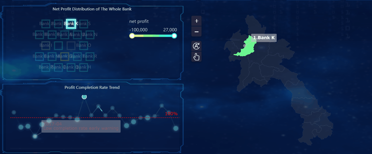
FineBI also offers interactive features such as real-time filtering. These features simplify complex data interpretation and help you uncover insights faster. You can analyze customer behavior patterns in real time and customize your workflow for greater satisfaction and productivity.
Tip: Interactive dashboards in FineBI let you explore your data from different angles, making it easier to find patterns and make informed decisions.
When you use FineBI to create a histogram, you gain access to a powerful set of tools that help you visualize, analyze, and share your findings. You can save your histogram as part of a dashboard, apply filters, and collaborate with your team for deeper analysis.
After you finish creating your chart, you need to review your work to ensure accuracy and completeness. When you follow how to make a histogram step by step, checking for common errors helps you avoid misinterpretation. Here are some frequent mistakes you should watch for:
To verify your histogram, use this checklist:
Tip: A careful review ensures your histogram accurately reflects your data and supports reliable conclusions.
Interpreting your chart is a crucial part of how to make a histogram step by step. Start by studying the shape of your histogram. Calculate basic statistics, such as the mean and median, to understand your data better. Compare your histogram to a normal distribution to see if your data follows expected patterns.
You can draw several insights from your histogram:
FineBI enhances your analysis with collaborative features. You can use the Analysis Subject container for group editing and share or publish your dashboards for team collaboration.
| Feature | Description |
|---|---|
| Analysis Subject | Supports collaborative editing among users. |
| Sharing and Publishing | Allows you to publish datasets, dashboards, and share analysis for team collaboration. |
By following how to make a histogram step by step, you gain clear insights and support data-driven decisions. FineBI’s interpretation and sharing tools help you work with others and maximize the value of your analysis.
You now know how to make a histogram step by step, from gathering data to interpreting results. When you create a histogram, you can:
Histograms help you analyze large datasets and make informed decisions. Try building your own using FineBI or similar tools. Practice will improve your skills. Explore FineBI’s advanced features for deeper analysis and easy sharing with your team.

Bar Chart Race: A Complete Guide
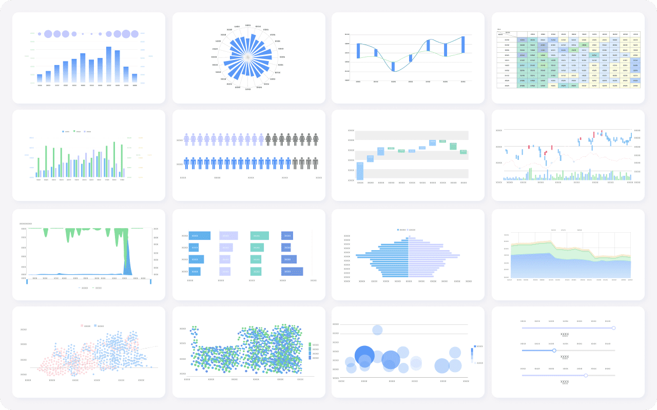
16 Types of Chart for Effective Data Visualization
22 Different Types of Graphs in Data Visualization: A Practical Guide

The Author
Lewis
Senior Data Analyst at FanRuan
Related Articles

12 Best Data Visualization Tools for 2026: Features, Pricing, Pros and Cons
$1 are software platforms that turn raw data into charts, dashboards, maps, and interactive visual stories for analysis and decision making. 12 best data visualization tools for 2026 at a glance
Lewis Chou
Apr 23, 2026

Top 8 Data Visualization softwares You Should Try in 2025
Compare the top 8 data visualization software for 2025, including FineReport, Tableau, Power BI, and more to find the best fit for your business needs.
Lewis
Dec 19, 2025
10 Must-Have Data Visualization Tools for Modern Businesses
Compare the top 10 data visualization tools for 2025 to boost business insights, streamline analytics, and empower smarter decision-making.
Lewis
Dec 17, 2025


