Tracking the right marketing KPIs helps you make smarter decisions and boost your results. Many organizations struggle with issues like picking KPIs that don’t match their goals, dealing with inconsistent data, or facing resistance to new data practices. You might see challenges such as:
- Choosing KPIs that don’t align with business objectives
- Data quality problems
- Misalignment with strategic goals
- Inconsistent data sources
A marketing kpi dashboard makes it easier to spot these problems and take action. FineReport gives you the tools to visualize and manage your KPIs so you can focus on what matters most.
Essential Marketing KPI Dashboard Metrics
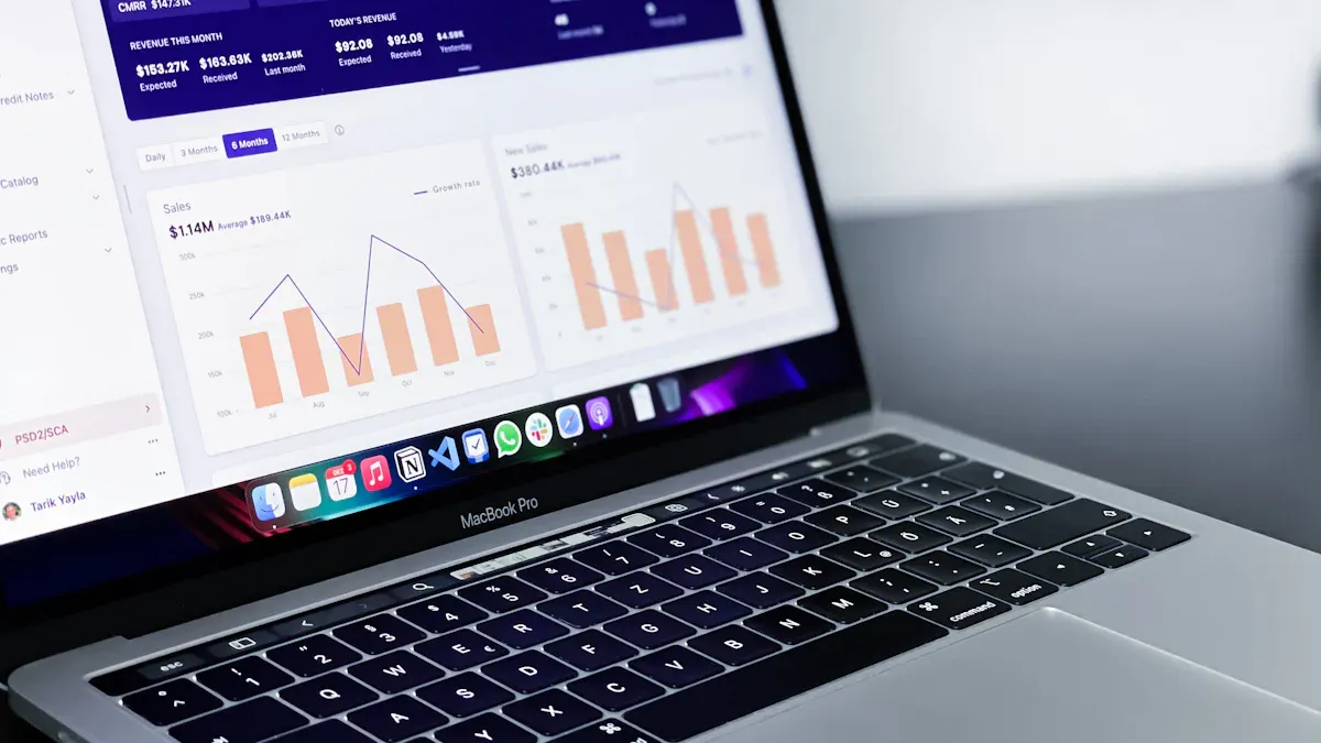
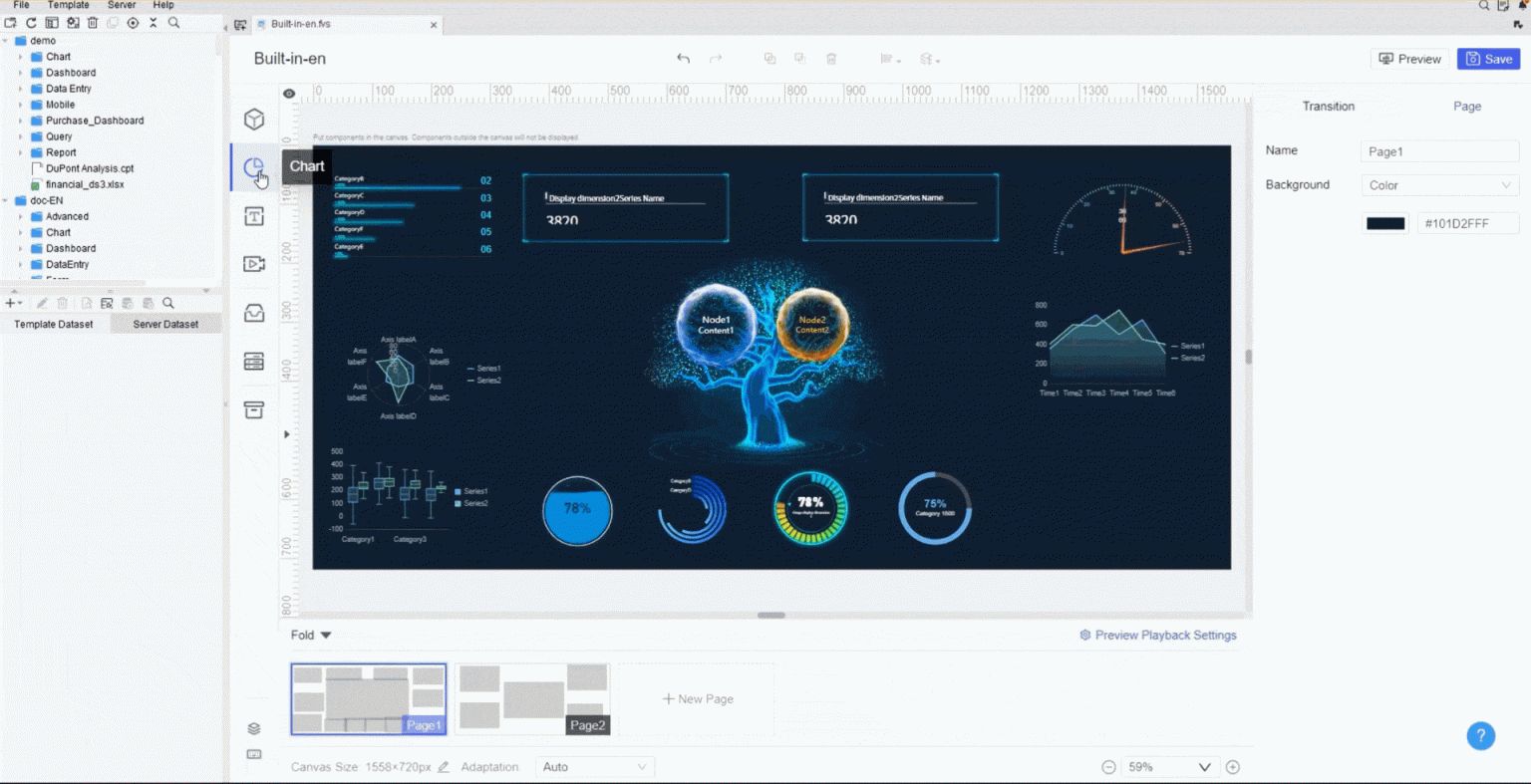
A marketing kpi dashboard is your command center for understanding how your marketing efforts perform. You get a clear, real-time view of what’s working and what needs attention. Modern marketing teams rely on these dashboards to make quick decisions, spot trends, and stay ahead of the competition. You can bring together data from your website, social channels, email campaigns, and more—all in one place. FineReport makes this process seamless. You can connect multiple data sources, visualize your marketing kpis, and customize your dashboard to match your goals. These foundational marketing metrics set the stage for smarter strategies and better results.
Website Traffic & Engagement
Website traffic sits at the heart of every marketing kpi dashboard. You want to know how many people visit your site, where they come from, and what they do once they arrive. Most retail and B2B sites in the U.S. see between 1,000 and 15,000 visitors each month. Segments like eCommerce and Apparel often drive these numbers higher. Tracking website traffic helps you measure the reach of your content marketing and see if your campaigns attract the right audience.
But traffic alone doesn’t tell the whole story. Engagement metrics show how visitors interact with your site. Are they clicking, sharing, or commenting? Recent studies show that higher engagement on professional networks can boost audience interaction by up to 40%. Organic content can drive three times more B2B conversions. Fast feedback loops help you adjust your content marketing strategy quickly.
Here’s a quick look at engagement metrics that predict marketing success:
| Engagement Metric | Impact on Marketing Success |
|---|---|
| Up to 40% higher engagement in professional networks | Indicates increased audience interaction and reach |
| 3× more B2B conversions from organic content | Shows effectiveness in driving sales and leads |
| Faster feedback loops for narrative optimization | Enhances ability to adapt and refine strategies |
FineReport lets you pull these numbers from Google Analytics, social platforms, and other sources. You can see all your website marketing kpis in one dashboard and spot trends at a glance.
Conversion Rate
Conversion rate is the heartbeat of your marketing reporting dashboard. It tells you how many visitors take the action you want—like signing up, downloading, or buying. You can track conversion rates at every stage of your funnel, from visitor to lead, lead to customer, and beyond. In B2B marketing, the average visitor-to-lead conversion rate ranges from 0.8% to 2.5%. Top performers hit 3-5%. As leads move through the funnel, you might see 20-40% convert to marketing qualified leads (MQLs), and 20-35% move from MQL to sales qualified leads (SQLs).
Here’s a table with industry benchmarks for B2B conversion rates:
| Conversion Stage | Benchmark Range |
|---|---|
| Visitor to Lead | 0.8% to 2.5% (Top: 3-5%) |
| Lead to MQL | 20% to 40% |
| MQL to SQL | 20% to 35% |
| SQL to Opportunity | 30% to 50% |
| Opportunity to Won | 20% to 35% |
| Trial to Activation (7-14 days) | 25% to 45% |
| Trial to Paid | 8% to 20% (Top: 25-40%) |
Conversion rates also change by channel. Direct traffic and paid search often perform best, while social media tends to lag behind. Check out this chart to see how different channels stack up:

With FineReport, you can break down your conversion rate by channel, campaign, or landing page. This helps you double down on what works and fix what doesn’t. Your marketing dashboard becomes a powerful tool for optimizing every step of your content marketing.

Bounce Rate & Dwell Time
Bounce rate and dwell time are two marketing kpis that reveal how engaging your website really is. A high bounce rate means visitors leave after viewing just one page. For e-commerce sites, the average bounce rate sits around 45.68%, though some sources put it closer to 38.7%. If your bounce rate is high, you might need to improve your content marketing or site experience.
Dwell time measures how long visitors stay on your site. Longer dwell times usually mean your content marketing is hitting the mark. There’s a strong link between dwell rate and conversion rate. For example, a 5% to 15% increase in dwell rate can lead to a 45% jump in conversions. High dwell rates also boost brand-related searches and web traffic.
Here’s how dwell time impacts marketing results:
| Dwell Rate Increase | Conversion Rate Increase |
|---|---|
| 5% to 15% | 45% |
| Low Dwell Rate | 12% increase in brand-related searches |
| High Dwell Rate | 39% increase in brand-related searches |
| High Dwell Campaign | 17% increase in Web traffic |
| Video Ads | 29% increase in Dwell Rate |
FineReport makes it easy to track bounce rate and dwell time alongside other marketing metrics. You can set up alerts, compare pages, and see how changes to your content marketing strategy affect user behavior.
Brand Awareness
Brand awareness is the foundation of every content marketing dashboard. You want people to recognize your brand, talk about it, and search for it online. The most common marketing kpis for brand awareness include follower growth, brand mentions, branded search, and referral traffic. Follower growth shows how well your content marketing resonates. Brand mentions track how often people talk about you across platforms. Branded search measures how many people look for your brand directly. Referral traffic shows which sources trust and reference your brand.
Other key performance indicators for brand awareness include share of voice and earned media value. Share of voice compares your presence to competitors. Earned media value shows how much visibility you get from organic mentions, not paid ads.
You can use FineReport to bring all these marketing kpis into one content marketing dashboard. You’ll see how your campaigns impact brand awareness in real time. This helps you adjust your content marketing strategy and stay ahead in a crowded market.

Tip: Start with these foundational marketing kpis in your marketing kpi dashboard. They give you a clear picture of your marketing health and set you up for smarter decisions.
A marketing kpi dashboard powered by FineReport helps you track, visualize, and act on the marketing metrics that matter most. You can connect data from multiple sources, customize your dashboard, and share insights with your team. These essential marketing dashboards are the backbone of every successful content marketing strategy.
Lead Generation & Social Marketing KPIs

Tracking lead generation and social media kpis helps you see where your marketing dollars go and what actually brings in results. You want to know which campaigns attract quality leads, how much you pay for each one, and how your brand performs on social platforms. When you pull all this data into one dashboard, you can spot trends, fix weak spots, and double down on what works. FineReport makes it easy to combine lead and social data, so you get a clear view of your marketing funnel from start to finish.
Cost per Lead (CPL)
Cost per lead tells you how much you spend to get a single lead. If you work in tech, you might see an average CPL of $84 across channels. This number helps you set budgets and measure campaign efficiency. With FineReport, you can track CPL in real time and compare it across different channels or campaigns. Here’s how a dashboard helps you optimize CPL:
- You see the average cost to acquire a lead.
- You track conversion rates at each stage.
- You spot bottlenecks and find ways to improve.
| Metric | Description |
|---|---|
| Cost per Lead (CPL) | Tracks the average cost to acquire a single lead across all channels. |
| Conversion Rates | Shows performance at each stage of the customer journey. |
| Bottlenecks | Helps you find areas for improvement and optimization. |
Lead-to-Customer Rate
Lead-to-customer rate shows how many leads actually become paying customers. In SaaS, this rate usually falls between 0.5% and 1.5%. You can use FineReport to break down this metric by source, campaign, or sales rep. This helps you see which efforts bring in the best leads and where you might need to tweak your approach. If you work in retail or manufacturing, tracking this rate helps you focus on the channels that drive real revenue, not just empty clicks.

Social Engagement Rate
Social engagement rate is one of the most important social media kpis. It measures how people interact with your posts—likes, comments, shares, and saves. The average engagement rate for brands on Instagram is about 0.36%, but top brands hit 1.02% or higher. If you work in retail, you might use FineReport to compare engagement rates across different campaigns or products. In manufacturing, you can track how new product launches perform on social media. High engagement means your content connects with your audience and can boost your overall marketing ROI.
| Source | Insight |
|---|---|
| Swydo | Track how social interactions drive real business results, not just surface-level metrics. |
| Sprout Social | Social media works best when it educates, supports, and builds community. |
| Admetrics | Engagement-driven content can influence customer decisions more than you think. |
Click-Through Rate (CTR)
Click-through rate shows how often people click your links or ads. For email, the average CTR is about 2.5%. You can use FineReport to track CTR across emails, ads, and social posts. This helps you see which messages grab attention and drive action. When you combine CTR with other social media kpis, you get a full picture of what motivates your audience.
Tip: Use dashboards to compare CPL, lead-to-customer rate, and social engagement side by side. This helps you spot what’s working and where you can improve.
FineReport brings all your lead generation and social media kpis together. You can build dashboards for retail campaigns, track manufacturing leads, or monitor social engagement—all in one place. This makes it easier to optimize your marketing and grow your business.
Email & Customer Journey KPIs in FineReport
FineReport helps you see the full story of your customer journey and email marketing kpis. You can track every step, from the first email open to the final purchase. When you connect FineReport with your CRM or membership management system, you get deeper insights into how your audience interacts with your brand.
Email Open Rate
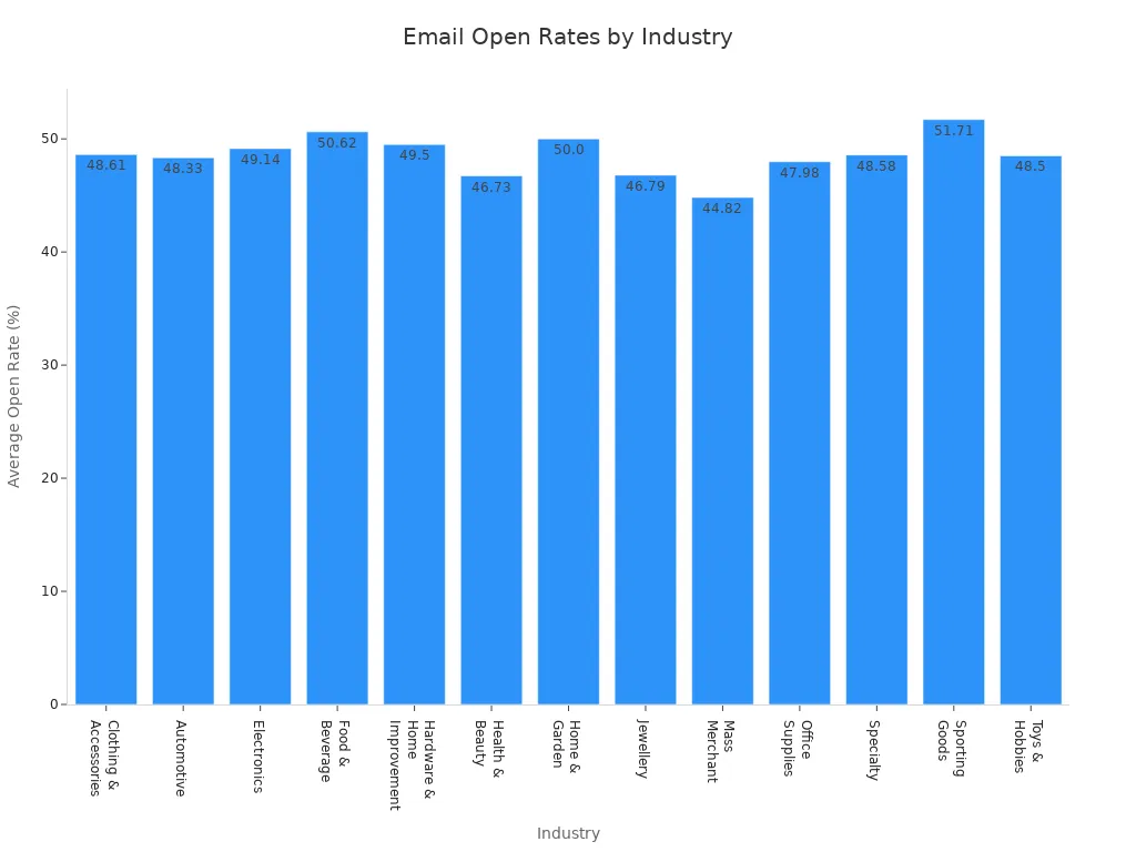
Email open rate tells you how many people actually open your emails. You want to know if your subject lines grab attention or if your messages get lost in crowded inboxes. The average email open rate for B2C companies is 19.7%. Some industries see much higher numbers. For example, food & beverage brands reach 50.62%, while sporting goods hit 51.71%. Automated email flows usually get better open rates because they target users based on their actions.
| Industry | Average Open Rate |
|---|---|
| Food & Beverage | 50.62% |
| Sporting Goods | 51.71% |
| Electronics | 49.14% |
| Health & Beauty | 46.73% |
| Office Supplies | 47.98% |
FineReport lets you compare open rates across campaigns and industries. You can spot trends and adjust your email marketing kpis for better results.
Email CTR
Email click-through rate (CTR) shows how many people click links in your emails. This metric helps you see if your content inspires action. You might notice that automated emails get more clicks than regular campaigns. With FineReport, you can track CTR for every email and see which messages drive the most engagement. You can also break down CTR by audience segment or campaign type, making it easier to improve your email marketing kpis.
Unsubscribe Rate
Unsubscribe rate tells you how many people leave your email list after receiving a message. High unsubscribe rates can signal problems with your content or frequency. You want to keep this number low to maintain a healthy audience. FineReport helps you monitor unsubscribe rates in real time. You can set alerts if the rate spikes and quickly adjust your strategy.
Tip: Use dashboards to compare open rates, CTR, and unsubscribe rates side by side. This helps you find what works and what needs fixing.
Customer Lifetime Value (CLV)
Customer lifetime value shows how much revenue you can expect from each customer over time. Subscription businesses usually have higher customer lifetime value because they focus on loyalty and reducing churn. Transactional businesses see lower values since customers buy less often.
| Business Model | Customer Lifetime Value (CLV) | Focus on Loyalty | Churn Minimization |
|---|---|---|---|
| Subscription-based | Higher | Yes | Yes |
| Transactional | Lower | No | No |
You can use FineReport to calculate customer lifetime value with models like BG/NBD and Gamma-Gamma. These tools help you predict future purchases and segment customers by value. When you connect FineReport with your CRM or membership management solution, you get a complete view of your customer journey. This makes it easier to tailor your marketing and boost long-term revenue.
ROI & Financial Marketing KPIs
When you want to make smart decisions about your marketing budget, you need to track roi and financial KPIs. FineReport gives you the power to see your numbers clearly and act fast. You can connect data from sales, campaigns, and finance, then build dashboards that show what’s working and what needs a change.
ROI Analysis
ROI analysis helps you measure how much value your marketing brings compared to what you spend. You want to know if your campaigns deliver real results or just eat up your budget. FineReport lets you set up dashboards that show roi for each channel, campaign, or product. You can compare performance over time and spot trends. If you work in finance, you know how important it is to prove the return on marketing investment. With FineReport, you get instant access to charts and tables that make your roi easy to understand.

Tip: Use FineReport’s scheduled reporting to get regular updates on your roi. You can share these insights with your team and make quick decisions.
Customer Acquisition Cost (CAC)
Customer acquisition cost tells you how much you pay to win a new customer. You want to keep this number low while growing your business. FineReport helps you track CAC across different channels and campaigns. You can break down costs by product, region, or customer segment. In retail, CAC varies a lot:
- Arts and Entertainment: $21
- Health and Beauty: $127
- Fashion and Accessories: $129
- Home, Furniture, and Garden: $129
- Electronics: $377
You also see numbers like:
- Food & Beverage: about $53
- Beauty and Body Treatment: about $61
- Fashion & Apparel: about $66
- Electronics: about $76
When you see these numbers in your dashboard, you can adjust your strategy and focus on channels that give you the best roi.
Revenue Attribution
Revenue attribution shows you which marketing activities drive sales. You want to know what brings in money and what doesn’t. FineReport lets you connect data from ads, emails, and sales to see the full picture. You can use tables to compare revenue by campaign or channel. This helps you invest in the right places and boost your roi.
| Channel | Revenue Contribution | ROI Trend |
|---|---|---|
| Paid Search | High | Rising |
| Social Media | Medium | Steady |
| Medium | Improving | |
| Organic Search | High | Consistent |

FineReport’s financial dashboards make it easy to track these KPIs. You get real-time updates, clear visuals, and the confidence to make data-driven decisions.
Building Smarter Marketing Dashboards with FineReport
Selecting the Right KPIs
Choosing the right KPIs for your dashboard starts with knowing your goals. You want to measure what matters, not just what’s easy to track. Here’s a simple way to pick KPIs that fit your business:
- Define clear and measurable KPIs that connect to your goals.
- Don’t try to link every metric to revenue. Many factors can affect results.
- Limit the number of KPIs. Too many can make your dashboard confusing.
- Make sure each KPI fits your business context.
- Set targets for each KPI that match your goals.
- Track your KPIs regularly and adjust your strategy as needed.
If you’re not sure where to start, look at dashboards from other companies or industry solutions. You can find inspiration in customer stories, like how UnionPay Data Services improved their marketing by focusing on the right KPIs.
Dashboard Customization Tips
FineReport makes dashboard building easy. You get a drag-and-drop designer that feels familiar, like working in Excel. You can add charts, tables, and filters with just a few clicks. Want to highlight your top-performing campaigns? Use color coding or custom layouts. Need to compare different channels? Try a multi-report layout to show everything side by side.
Tip: Keep your dashboard simple. Show only the KPIs that help you reach your goals. You can always add more details later.
You can customize dashboards for different teams. Sales might want to see conversion rates, while marketing cares about engagement. FineReport lets you build dashboards that match each team’s needs.
Real-Time Data & Mobile Access
You need to see your numbers fast. Real-time dashboards give you instant updates, so you can act quickly. FineReport’s mobile BI tools let you check your dashboard anywhere—on your phone, tablet, or laptop. You don’t have to wait for a report to land in your inbox.
- Mobile access means you can track metrics anytime, anywhere.
- Real-time data helps you spot trends and make decisions on the fly.
- You stay ahead in a fast-moving market.

If you want to see how others use mobile dashboards, check out industry examples in retail or manufacturing. Many teams use FineReport to monitor KPIs on the go and keep their goals in sight.
Tracking the right KPIs helps you make smarter choices and reach your marketing goals faster. When you use FineReport, you get dashboards that show what matters most. You can spot trends, fix problems, and share insights with your team. Keep reviewing your KPIs and update your dashboard often. That way, you stay ahead and keep improving.
Continue Reading About dashboard
What is a KPI Dashboard and Why Your Business Needs One
What is a Digital Dashboard and How Does It Work
How to Craft an Effective Analytics Dashboard


FAQ

The Author
Lewis
Senior Data Analyst at FanRuan
Related Articles

Portfolio Reporting for PMOs: 9 Executive Metrics Every Weekly Portfolio Dashboard Should Include
Weekly portfolio reporting should help executives answer three questions fast: Are we delivering the right initiatives, are we putting outcomes at risk, and what decisions need leadership this week? For PMOs, that means
Yida Yin
Jul 01, 2026

How to Build an Investment Portfolio Reporting Dashboard for Executives: KPIs, Benchmarks, and Drill-Down Views
Investment portfolio reporting for executives is not about showing every holding, transaction, and chart your investment team can produce. It is about giving CEOs, CFOs, CIOs, boards, and investment committees a fast, re
Yida YIn
Jun 25, 2026

12 KPI Reporting Examples for Executive Dashboards: What to Show in Weekly, Monthly, and Quarterly Reviews
Executive leaders do not need more data. They need decision ready $1 examples that match how often they review the business and what actions they are expected to take. A weekly $1 should surface fast moving risks and per
Yida YIn
Jun 25, 2026