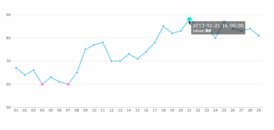
A line plot example in data analysis helps you see how values change over time or across categories. A line plot connects data points with straight lines, making it easy to spot trends and patterns. You can draw a line plot to compare frequencies or monitor changes at regular intervals. Many data analysts prefer line plots for business and manufacturing because they highlight highs, lows, and variability.
Line plots display trends over time.
They show differences in variables and help you forecast future changes.
Application Type
Context Examples
Time Series Analysis
Financial data, stock prices
Comparing Trends
Social media traffic, wildlife populations
Visualizing Changes
Population studies, crime rates
FineBIlets you create and analyze line plots quickly, even if you have little technical experience. You will see a practical line plot example later in this article.
Line Plot Example: Line Plot Basics
What Is a Line Plot
A line plot is a simpleyet powerful tool for visualizing data. You use a basic line plot to display information as a series of points connected by straight lines. This method helps you see how values change over time or across categories. The main purpose of a line plot is to highlight patterns and relationships in your data.
You can distinguish a line plot from other visualizations by its unique characteristics. The table below summarizes these features:
Characteristic
Description
Trends over time
A line plot shows how data changes over time, making it ideal for time series analysis.
Connection of data points
Points are linked by lines, helping you visualize relationships between variables.
Relationship representation
It clearly displays the link between independent and dependent variables.
A basic line plot works best when you want to track changes or compare values at regular intervals. You can use it to monitor sales, production rates, or any metric that varies over time. The uses and significance of a line plot become clear when you need to spot upward or downward movements in your data.
When to Use a Line Plot
You should choose a line plot when your goal is to analyze trends or changes over time. This type of chart excels at showing how a variable shifts from one period to another. The uses and significance of a line plot stand out in scenarios where you want to visualize continuous data.
The table below helps you decide when to use a line plot compared to other charts:
Chart Type
Recommended Use Case
Line Plot
Tracking changes over periods of time, showcasing trends
Bar Chart
Comparing quantities across different categories
Scatter Plot
Highlighting relationships between two different variables
A line plot is not always the best choice. If you add too many lines, the chart can become cluttered and hard to read. You may find it difficult to determine exact values at specific points. When you plot many series, the chart may look confusing, making it tough to see clear patterns.
Too many lines can make the chart look messy, like spaghetti on a plate.
Line plots may mislead you if you use them with independent or categorical variables.
You should use a basic line plot for time series analysis, monitoring production quality, or tracking business performance. This approach helps you make informed decisions by revealing important trends.
When you create a line plot, you start by setting up the axes and labels. The horizontal axis (x-axis) usually shows time or categories. The vertical axis (y-axis) displays the values you want to analyze. You need to label each axis clearly. Short and precise labels help you understand what each axis represents. For example, you might use "Month" for the x-axis and "Defect Rate (%)" for the y-axis in a manufacturing quality control scenario.
Proper labeling improves clarity and comprehension. You see the measurement variables, units, and the number of subjects at a glance. This context helps you interpret the line graph accurately.
The table below highlights how axes and labels contribute to the accuracy of a line plot:
Component
Purpose
Axis Labels
Clarify variables and units
Title
Provides overall context
Scale
Shows intervals and range
You should always check that your axes and labels match your data. This step ensures your line plot communicates the right information.
Data Points and Lines
The next step involves plotting data points and connecting them with lines. You mark each value as a dot or short line at its x-y coordinate. After placing all points, you draw a continuous line through them in sequential order. This process forms the main structure of a line graph.
Here are the essential components of a line plot:
Choose the data you want to analyze.
Assign axes and label them.
Add scale intervals.
Plot data points.
Connect points with a line.
Add details like a title or legend.
You should avoid using smoothing techniques unless your data follows a clear trend. Smoothing can sometimes hide real relationships or suggest patterns that do not exist. A standard line graph gives you a direct view of changes over time. If you use smoothed lines, you might miss important details or misinterpret the data.
"Smoothed lines are abused. If you are plotting measured data, the only valid connecting curve between points is a straight line (or a line which is fitted to a function that comes from a physical model of the data). A smoothed curve implies that the data goes places where it has not been measured."
By focusing on the main components of a line plot, you ensure your analysis remains accurate and easy to interpret.
Line Plot Example
Create Line Plot in FineBI
A line plot example in data analysis often starts with a real-world scenario. Imagine you work in a manufacturing company and want to monitor product quality over several months. You decide to track the defect rate each month to identify patterns and improve your process. This line plot example will help you represent data clearly and spot trends over time.
Let’s use the following sample data for your line plot example:
Month
Defect Rate (%)
January
2.5
February
2.1
March
1.8
April
2.0
May
1.6
June
1.4
This data visualization helps you see how the defect rate changes month by month. You can use a line plot to represent data from your quality control process, making it easier to communicate results with your team.
FineBI makes it simple to create a line plot example using its intuitive workflow. You do not need advanced technical skills. Follow these steps to build your line plot example in FineBI:
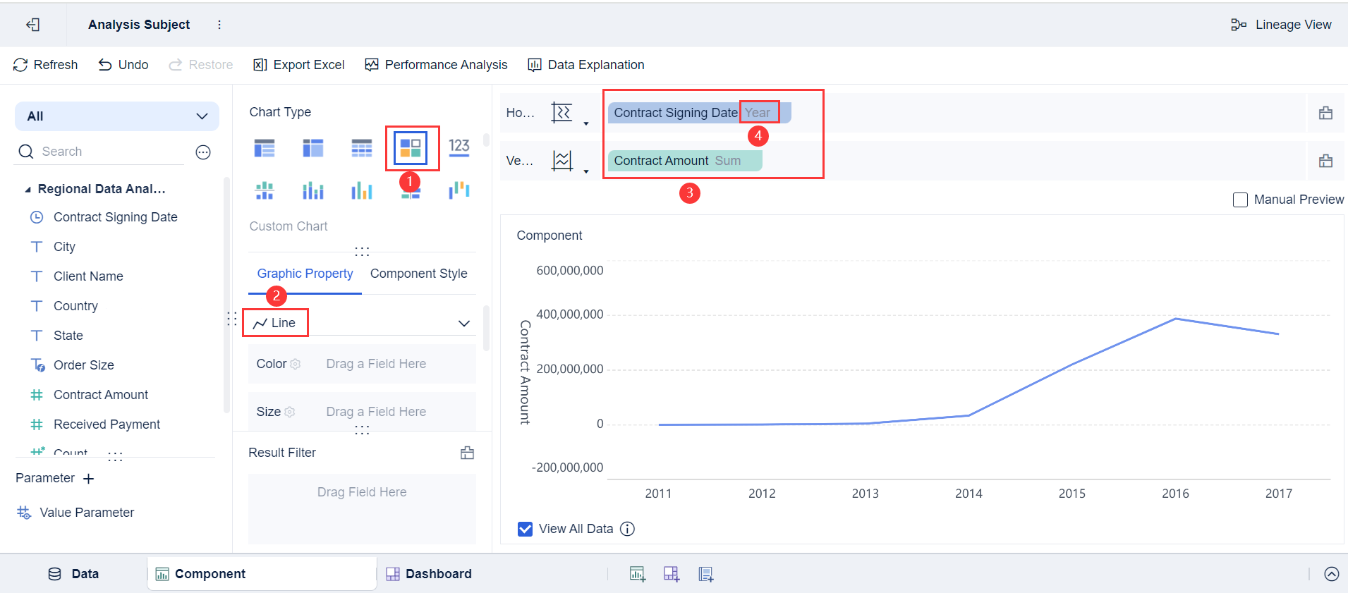
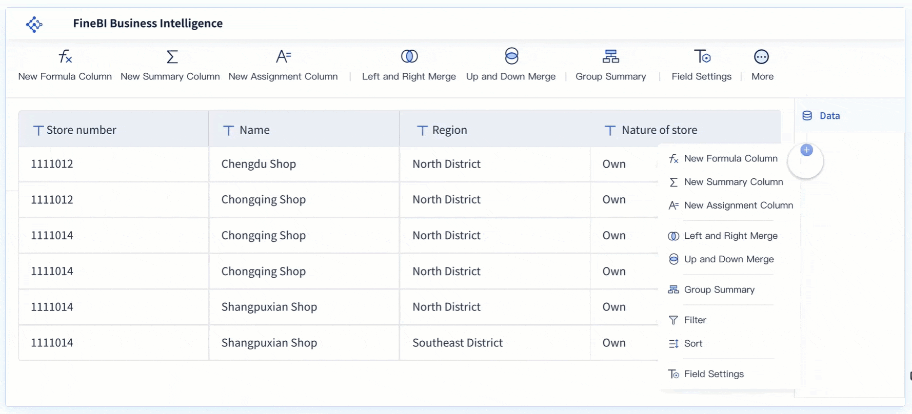
Open FineBI and go to My Analysis. Select a folder and click New Subject
Choose Local Excel and upload your quality control data.
Click Add Component in the lower left corner.
Select the Custom Chart icon and pick Line from the drop-down list.
Drag Month to the Horizontal Axis and Defect Rate (%) to the Vertical Axis.
Adjust the Month field to display by month or year, depending on your data.
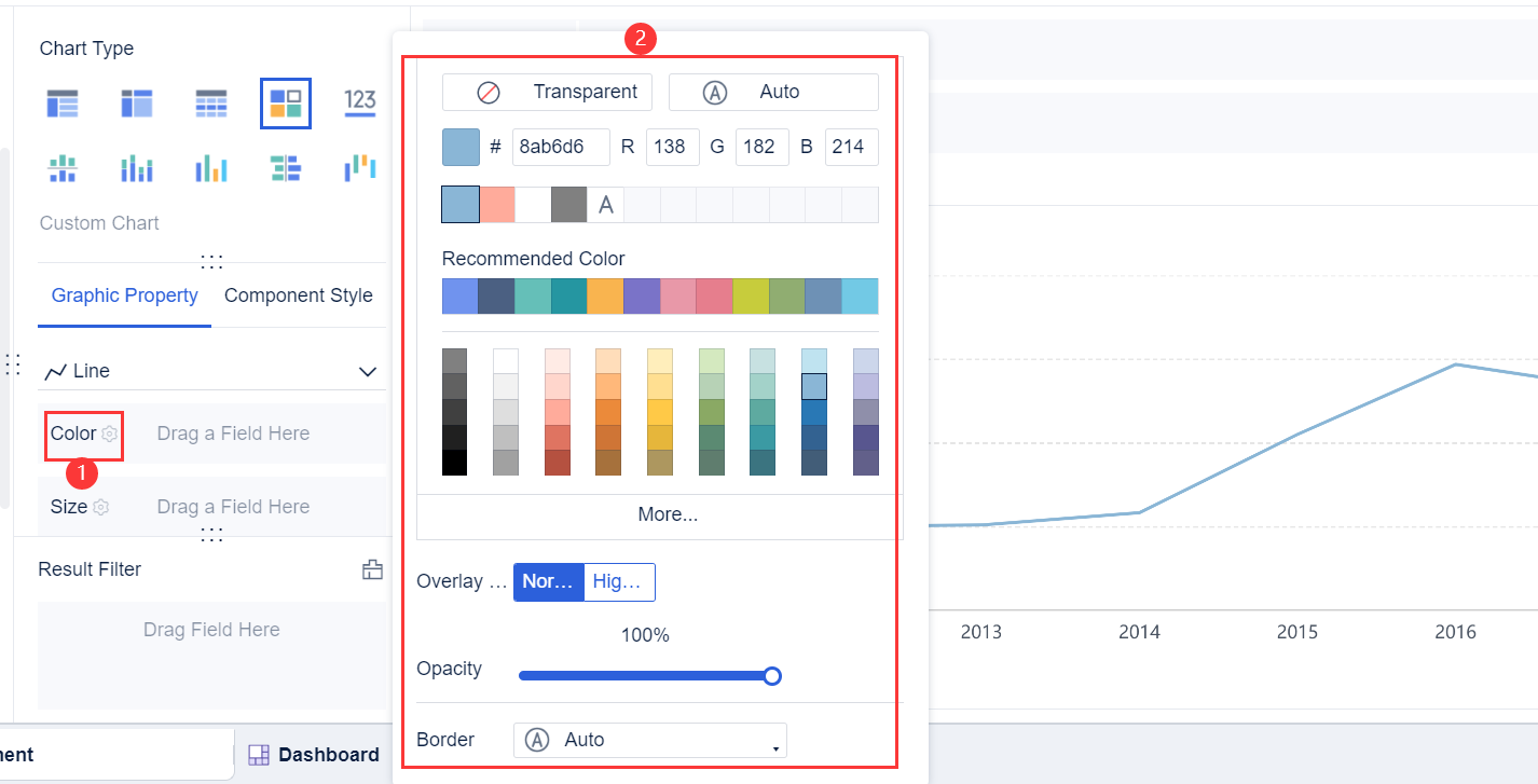
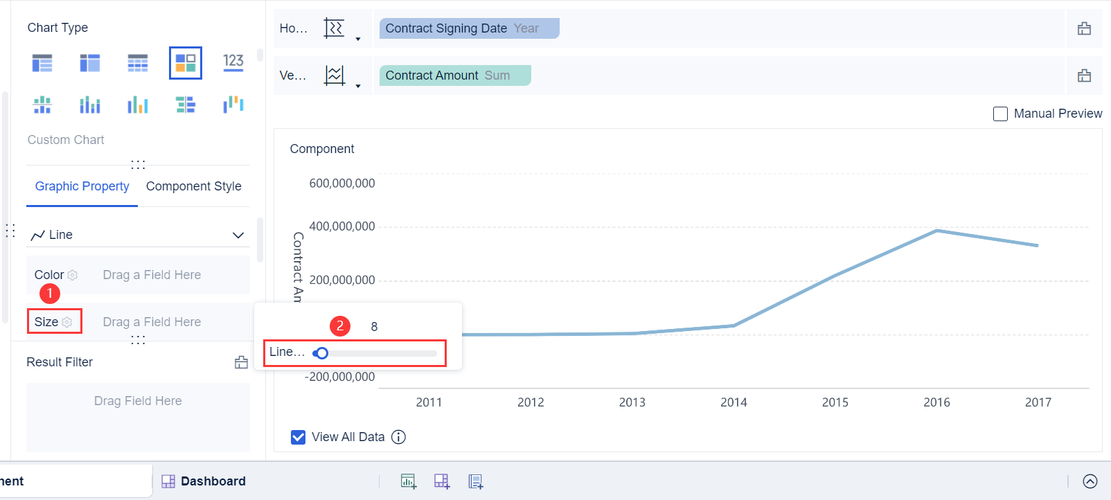
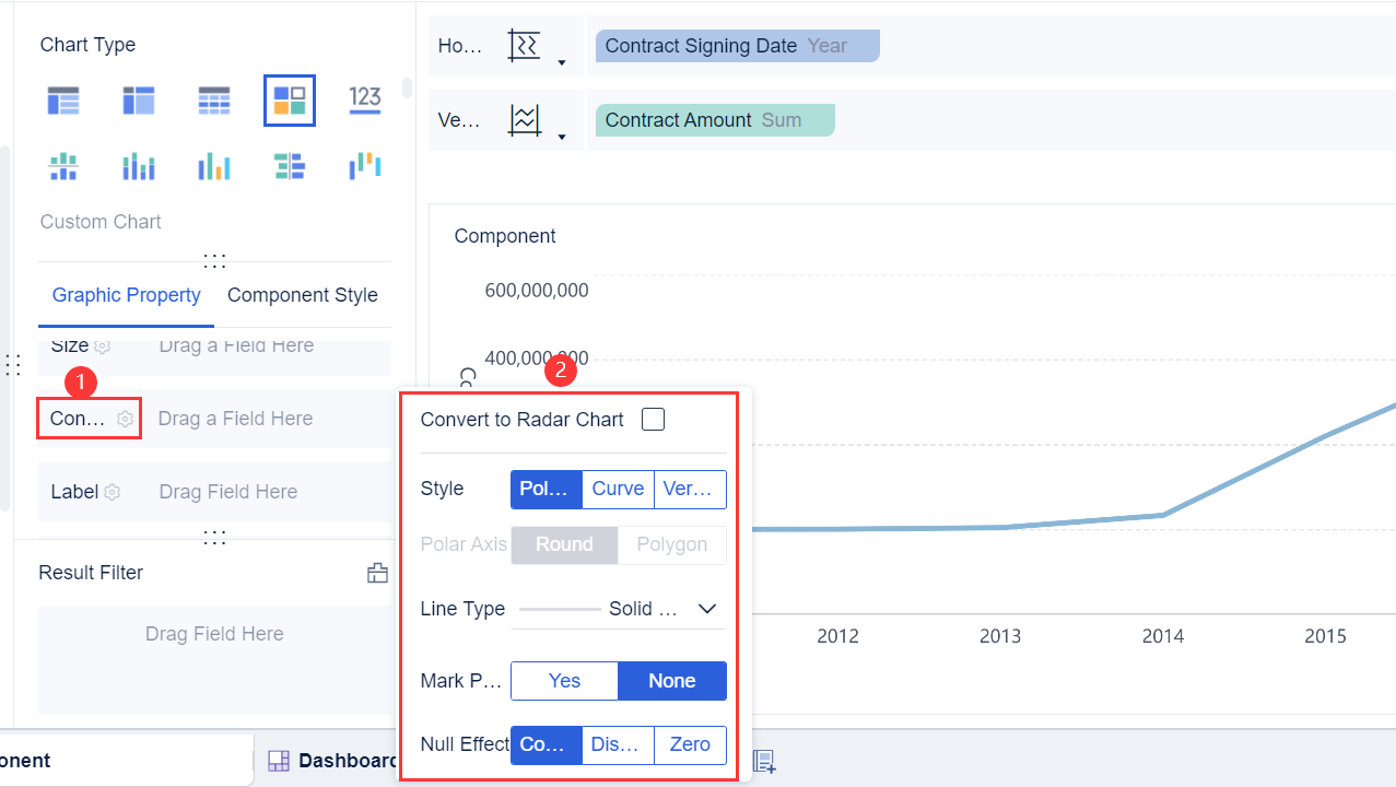
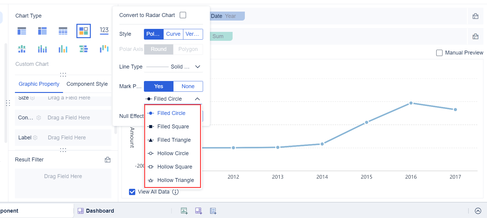
Customize the line color, border, and opacity in the Color Setting.
Set the line width and style to make your chart easy to read.
FineBI'sdrag-and-drop interface streamlines the process. You can create a line plot example quickly, without writing code or dealing with complex settings. This approach saves time and reduces errors, especially when you need to update your data or adjust your chart.
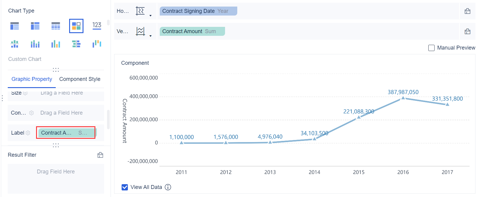
Once you have created your line plot example, you can start visualizing trends in your data. The line plot shows how the defect rate changes over time. You can see if your quality control efforts are working or if you need to investigate certain months with higher defect rates.
When you look at your line plot example, pay attention to the direction and shape of the line. An upward slope means the defect rate is increasing, which may signal a problem. A downward slope shows improvement. The connection between data points helps you observe local changes and overall patterns.
FineBIoffers several statistical methods to help you analyze trends in your line plot example. You can apply different fitting methods to better understand your data:
Fitting Method
Description
Linear Fitting
Best for data that shows a straight-line trend.
Exponential Fitting
Useful for data that rises or falls rapidly.
Logarithmic Fitting
Good for data that increases quickly, then levels off.
Polynomial Fitting
Helps when data follows a curved pattern.
You can use these tools in FineBI to make your analysis more accurate. The software lets you switch between fitting methods and see which one best matches your data.
A line plot example in data analysis helps you identify trends and make predictions. You can use the line plot to forecast future defect rates or set quality targets. The visualizing trends feature in FineBI makes it easy to spot changes and take action.
When you interpret your line plot example, remember these key points:
The line plot shows how a continuous variable changes over time.
The slope and direction of the line reveal important trends.
You can use the line plot to represent data from any time series, not just manufacturing.
FineBI supports real-time analysis. When you update your data, your line plot example refreshes instantly. This feature helps you respond quickly to changes and make better decisions.
A line plot example in data analysis is a powerful tool for quality control, business monitoring, and time series analysis. FineBIgives you everything you need to create, customize, and analyze your line plot example with ease.
When you interpret a line plot, you focus on highlighting patterns and trends that reveal important information about your data. In manufacturing quality control, you often use a graphical representation to monitor defect rates over time. You look for patterns such as upward or downward movements, sudden spikes, or periods of stability. These patterns help you understand if your process is improving or if issues are emerging.
A typical line plot for quality control includes control limits and a central line. The table below shows the main components you should watch:
Component
Description
Upper Control Limit (UCL)
Indicates the upper threshold for process stability.
Lower Control Limit (LCL)
Indicates the lower threshold for process stability.
Central Line (CL)
Serves as the baseline for quality characteristics.
Patterns
Data points outside control limits or consistent trends signal potential problems.
You can spot patterns by observing how data points relate to these control limits. If you see points outside the UCL or LCL, you may need to investigate further. Consistent trends, such as a steady increase in defect rates, often point to underlying issues in your process. Visualizing trends in a time series helps you react quickly and maintain product quality.
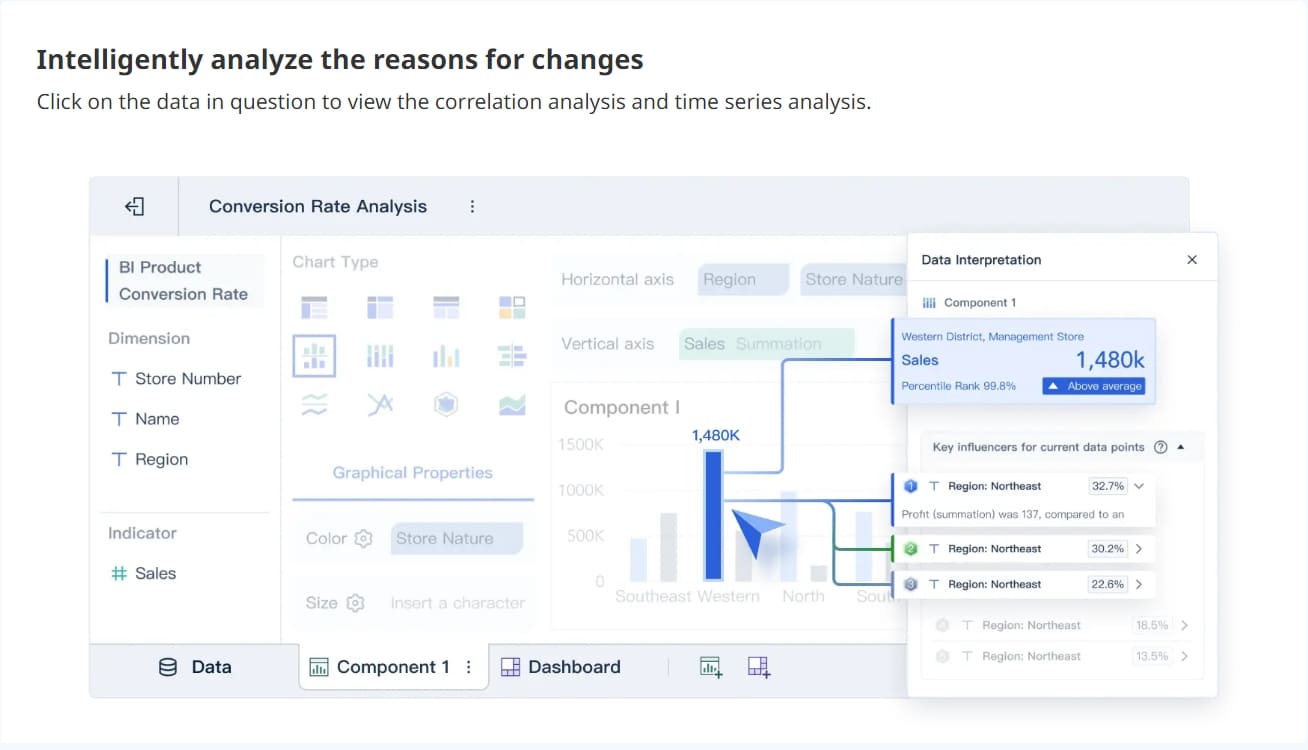
FineBI'sdashboard enhances your ability to identify patterns. You use interactive data visualization tools to drill down into specific periods and receive alerts when anomalies appear. This approach makes it easier to detect outliers and monitor changes in real time.
Interpreting line plot results gives you valuable business insights. In manufacturing, you use trend analysis to track productivity and spot inefficiencies. You rely on graphical representation tools like line and bar charts to compare performance over time. Heat maps help you find hotspots in your operations, while pie charts and scatter plots reveal relationships between variables.
Visual Tool
Application in Manufacturing Analysis
Line and bar charts
Used for trend analysis to identify productivity changes over time.
Heat maps
Identify performance hotspots within operations.
Pie charts
Analyze the composition of operational metrics.
Scatter plots
Examine relationships and correlations between variables.
You gain insights by visualizing trends and patterns. Line plots allow you to monitor key performance indicators and make immediate adjustments to production schedules. You can detect bottlenecks and inefficiencies, leading to targeted improvements. Accurate analysis supports early issue detection and cost reduction by minimizing defects and rework.
When you interpret line plot results, you may face challenges such as overplotting, handling outliers, and missing data. You should focus on the main patterns and avoid clutter to ensure clear analysis. FineBI’s dashboard helps you overcome these challenges by providing real-time monitoring and automated alerts.
You use line plots to support decision-making in business and manufacturing. By highlighting patterns and trends, you improve your process and drive better outcomes.
Line plots give you a clear way to visualize trends and patterns in your data. You can quickly spot changes in a time series, making it easier to make informed decisions.
A well-designed line plot guides you through trends and highlights key insights.
Adding context and using visual cues helps you present results to any audience.
Try creating your own line plots in FineBI. Explore more features and learn best practices with the resources below:
Feature Description
Link
Edit line plot settings, compare metrics, and visualize averages
Smarter product, pricing, and inventory management across retail sectors.
FAQ
What is a Line Plot Example in Data Analysis and when should you use it?
You should use a line plot example in data analysis when you want to visualize changes over time or compare trends across categories. This method helps you spot patterns and make informed decisions quickly.
How do you create a line plot example in data analysis using basic tools?
You start by organizing your data in a table. Label your axes, plot each data point, and connect them with straight lines. This process gives you a clear visual of trends and changes.
What is a Line Plot Example in Data Analysis for manufacturing quality control?
You can track defect rates each month using a line plot example in data analysis. This approach helps you monitor quality, identify problems, and improve production efficiency.
What features make a line plot example in data analysis easy to interpret?
Clear axis labels, a descriptive title, and consistent scales make your line plot example in data analysis easy to read. You should avoid clutter and focus on the main trend.
Can you update a line plot example in data analysis with new data?
Yes, you can update your line plot example in data analysis by adding new data points. This keeps your analysis current and helps you respond to changes in real time.