A line plot gives you a simple way to display information using points connected by straight lines. You can use a line plot to show how something changes over time or across categories. This method makes visualizing trends straightforward and helps you see if numbers go up, down, or stay the same. Many people rely on line plots for highlighting patterns in finance, science, or health because you can quickly compare data points and spot important shifts.

A line plot gives you a way to display data using points placed along a number line. You use this type of chart to show how often each value appears in your data set. Each point or mark stands for a single data value, and you can quickly see which values occur most often. For example, if you want to show how many hours students spend watching TV each week, you can use a line plot to mark each student's answer above the correct number on the line.
You often use a line plot when you want to see the frequency of data points. This makes it easy to spot patterns, such as which value appears the most or if there are any gaps in your data. The main purpose of a line plot is to help you organize and visualize simple data sets in a clear way.
Line plots stand out because they connect data points with straight lines, which helps you see how values change over time or across categories. You can use them to track trends, compare different groups, or forecast future results. When you look at a line plot, you can quickly identify patterns, spot unusual values, and understand the overall shape of your data.
Tip: Line plots work best when you have a small set of data and want to show how often each value appears. They help you see the distribution and frequency at a glance.
Here is a table that shows how line plots differ from other types of data visualizations in terms of structure and use:
| Characteristic | Description |
|---|---|
| Data Points | Connected through straight line segments, emphasizing continuity. |
| X-axis | Represents a timescale or continuous variable. |
| Y-axis | Represents quantitative values. |
| Multiple Series | Can accommodate multiple data series for comparison. |
You can use a line plot to track trends over time, such as stock performance. It also allows you to compare multiple data variables on a single chart, making it easier to see relationships. You can use a line plot to forecast future trends based on past data and to visualize recurring patterns or seasonality.
Many people use the terms line plot and line graph interchangeably, but they have important differences. You use a line plot to show the frequency of individual data points. Each mark or "X" above a value on the number line represents one occurrence. You do not connect the points with lines in a basic line plot.
A line graph, on the other hand, shows how data changes over time or across categories. You plot points on a graph and connect them with straight lines. This connection helps you see trends, increases, decreases, and patterns in the data. For example, you might use a line graph to show the growth of a tree over several years.
Here is a table that highlights the key differences between a line plot and a line graph:
| Characteristic | Line Plot | Line Graph |
|---|---|---|
| Purpose | Shows frequency of data | Shows change over time |
| Connection of Points | Not connected | Connected to show trends |
| Example | Number of hours watching TV | Growth of a tree over time |
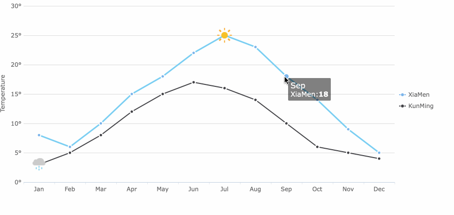
You use a line graph when you want to see how something changes, such as temperature throughout the year or sales over several months. The connected points make it easy to spot trends, seasonality, and fluctuations. You can also compare multiple data series on the same line graph, which helps you analyze relationships between different variables.
A line chart is another term often used for a line graph. It emphasizes the visual connection between data points and helps you identify patterns or anomalies. When you use a line graph, you can easily see if values rise, fall, or stay the same over time.
Some important features of a line graph include:
You can use a line graph to identify trends, spot unusual changes, and make predictions based on historical data. For example, if you track monthly sales, a line graph helps you see which months perform best and whether sales are increasing or decreasing.
Note: While line plots and line graphs both use points to represent data, the main difference lies in how you connect and interpret those points. Line plots focus on frequency, while line graphs highlight change and trends.
Line graphs help you identify patterns in time-series data. By connecting data points, you get a visual representation of changes, making it easier to spot trends, seasonality, and fluctuations. You can also use color or other markers to differentiate between categories, which enhances your ability to see seasonal variations or group differences.
When you use a line graph, you gain a powerful tool for analyzing data over time. You can compare different data series, forecast future trends, and visualize recurring patterns. This makes line graphs essential in fields like finance, science, and business analytics.

When you look at the components of a line plot, you see the building blocks that make this type of chart clear and effective. Each part plays a role in helping you understand the data and spot trends. The main components of a line plot include the axes and number line, data points and markers, and the connecting lines that show how values change.
The axes and number line form the foundation of any line graph. The horizontal axis, or x-axis, usually shows the independent variable, such as time or categories. The vertical axis, or y-axis, displays the dependent variable, like temperature or sales. Clear labeling of both axes is important. When you add a number line with evenly spaced intervals, you make it easier for readers to compare values and see changes. Axes and number lines provide a structured framework that helps you quickly identify trends and compare values over time. If you choose the wrong scale or forget to label the axes, you risk confusing your audience or misrepresenting the data.
| Evidence Description | Impact on Interpretation |
|---|---|
| Choice of unit of measure and scaling of y-axis can mislead readers | Can create bias in perception and interpretation of data. |
| Different scaling can lead readers to focus on specific time periods | May mislead conclusions drawn from the data. |
Data points and markers show the actual values on a line graph. You plot each value as a dot, cross, or other symbol at the correct spot on the graph. These markers help you see where each value falls and make it easy to compare different points. You often use line graphs for time series data, trends, values with uneven intervals, or to compare how different groups change over time. Marker styles can vary, such as circles, triangles, or stars, depending on what you want to highlight.
| Marker | Description |
|---|---|
| o | Circle |
| + | Plus sign |
| * | Asterisk |
| x | Cross |
| ^ | Upward-pointing triangle |
| v | Downward-pointing triangle |
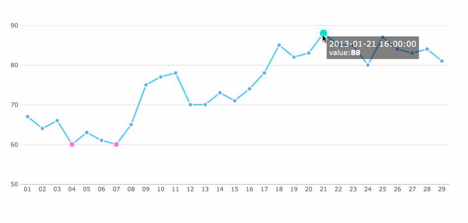
Connecting lines link the data points in a line graph. These lines help you follow the order of the data and see how values rise or fall. When you connect the points, you can easily spot trends, patterns, and changes over time. Connecting lines guide your eyes from one point to the next, making it simple to track the progression of data. They also help you notice important changes, such as sudden increases or decreases, and highlight relationships between different data series. You can add reference lines or annotations to draw attention to key moments or thresholds, which makes the graph even more informative.
Tip: Always check that your line graph includes all the main features—clear axes, accurate markers, and connecting lines—to ensure your data story is easy to understand.
Labels and titles play a crucial role in making your line plot easy to read and understand. When you create a line plot, you need to help your audience know exactly what the chart shows. Labels tell you what each axis represents, while the title gives a quick summary of the main idea behind the data. Without clear labels and a strong title, your line plot can confuse viewers or hide important information.
You should always label both the x-axis and y-axis on your line plot. These labels must include the name of the variable and the unit of measurement. For example, you might write "Revenue (in millions)" or "Temperature (°C)". This approach helps everyone understand what the numbers mean. You can also use legends to explain different colors or symbols if your line plot compares multiple groups. Annotations highlight important points or trends, making your chart even more informative.
Here are some best practices for labeling and titling your line plot:
Choosing the right title for your line plot is just as important as labeling. A good title helps your audience quickly grasp the main message. You want your title to be clear, simple, and relevant. It should include context, such as time periods or units, and avoid unnecessary words. Descriptive titles help viewers interpret the data, not just state the facts.
| Guideline | Description |
|---|---|
| Clarity | Ensure the title clearly conveys the main idea of the plot. |
| Simplicity | Keep titles short and straightforward for quick understanding. |
| Relevance | Include context, such as time periods and units of measurement. |
| Avoid Excessive Articles | Minimize the use of articles to enhance readability. |
| Descriptive Titles | Use titles that help interpret the data, not just state facts. |
When you follow these guidelines, your line plot becomes a powerful tool for sharing insights. Clear labels and strong titles make your data easy to understand and help your audience focus on the story your line plot tells.
A basic line plot gives you a clear way to display data points along a number line, making it easy to see how often each value appears. You use a basic line plot to organize and visualize simple data sets, which helps you quickly spot patterns or outliers. This type of chart is especially helpful when you want to show the frequency of values in a data set.
You can build a basic line plot by following these simple steps:
Tip: Always check your data before plotting. Make sure you include every value and use a consistent scale on your number line.
Suppose you want to visualize Tesla's vehicle delivery history. You can use a line graph to show how deliveries of different models change over time. For example, the line graph might reveal exponential growth for the Model 3 and Y, while showing a steady decline for the Model S and X. This approach helps you see trends and compare performance across different time periods.
You can also use a line graph in the classroom. Try measuring pencil lengths with your classmates and plotting the results together. This hands-on activity makes the concept of a basic line plot easy to understand and connects real-life data to the chart.
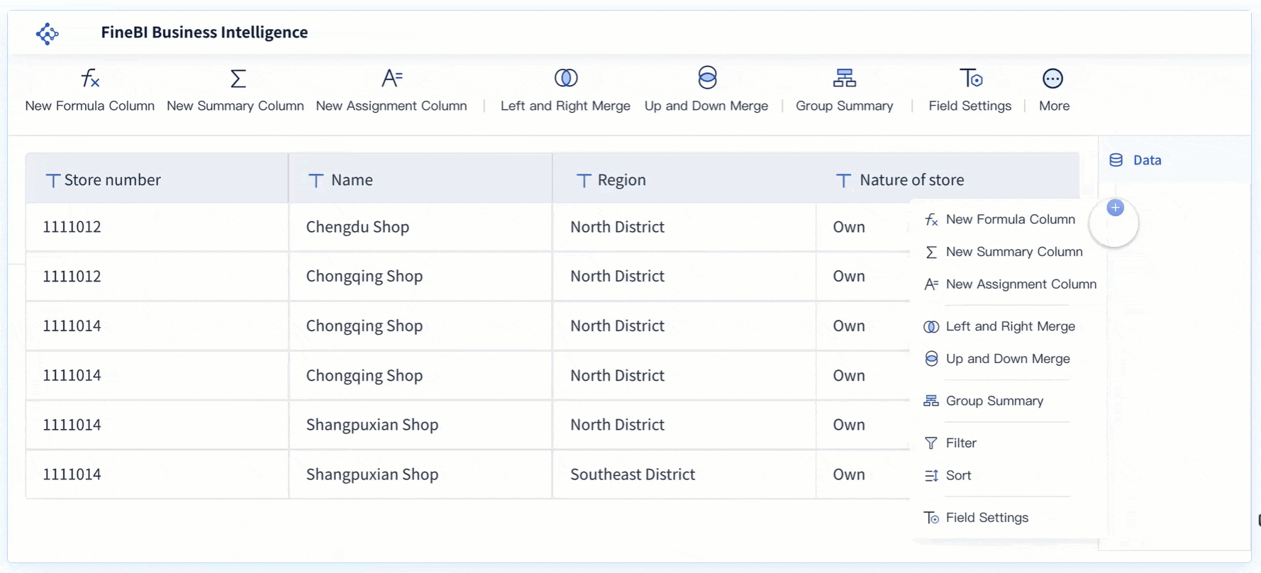
FineBI makes creating a line graph simple and efficient. You get a user-friendly drag-and-drop interface, which means you do not need technical skills to build your chart. FineBI empowers you to analyze data independently and create various analytical charts, including the line chart, with just a few clicks.
| Feature | FineBI | Other BI Tools |
|---|---|---|
| Interface | User-friendly drag-and-drop | Often complex setups |
| Self-service Capability | Empowers users | May require technical skills |
| Chart Variety | Wide range, easy to create | Limited flexibility |
With FineBI, you can connect to your data, select the fields you want to visualize, and instantly generate a line graph. This process saves you time and helps you focus on analyzing trends and making informed decisions.
A line plot is a powerful tool for visualizing trends in your data. You use a line plot when you want to see how values change over time or across categories. This type of chart helps you quickly spot patterns, making it easier to understand the uses and significance of your data. When you choose a line plot, you gain a clear view of how numbers rise, fall, or stay the same, which supports better decision-making.
You often turn to a line graph when you need to track changes, compare groups, or forecast future results. The uses and significance of a line graph become clear when you want to highlight even small fluctuations or compare multiple data series. A line graph provides an easy comparison between different sets of data, helping you see relationships and trends at a glance.
You find line plots most useful in situations where you need to monitor changes or analyze interactions. For example, in manufacturing, you might use a line graph to understand how different factors affect material strength. In business, a line graph helps you track revenue growth or customer behavior over time. The table below shows common scenarios where a line graph is the best choice:
| Scenario Description | Application of Line Plots |
|---|---|
| Analyzing interactions in processes | Understanding how different factors affect outcomes, such as material strength in manufacturing. |
| Tracking changes over time | Monitoring trends like revenue growth or customer behavior in business contexts. |
You also use a line graph to compare trends across different groups by using distinct colors or styles. This approach makes it easier to see how each group performs over time.
When you use a line graph, you benefit from several key advantages of using line plots:
Line graphs also compress large amounts of data into a simple visual, reducing your cognitive workload. Compared to other chart types, a line graph excels at illustrating trends and fluctuations over time, as shown below:
| Chart Type | Strengths in Interpretation | Use Cases |
|---|---|---|
| Line Plots | Effective for illustrating trends and fluctuations | Monthly revenue, stock prices |
| Bar Charts | Better for categorical comparisons | Comparing sales across products |
| Pie Charts | Good for part-to-whole relationships | Market share distribution |
If you want to create a line graph quickly and efficiently, FineBI offers a user-friendly platform. You can connect your data, drag and drop fields, and instantly generate a line graph for your analysis. FineBI makes it simple to explore trends, compare groups, and share insights with your team.

A line plot gives you a clear way to show how often each value appears in your data. You see its main features in the table below:
| Feature | Description |
|---|---|
| Definition | A line plot is a graph that shows the frequency a value occurs in a dataset. |
| Construction | Title, x-axis, caption, and Xs indicating occurrences. |
| Outliers | Data points much higher or lower than the rest. |
You benefit from using line plots because:
Try building your own line plot with FineBI. The drag-and-drop tools help you create clear charts and explore your data independently.

16 Types of Chart for Effective Data Visualization
22 Different Types of Graphs in Data Visualization: A Practical Guide

The Author
Lewis
Senior Data Analyst at FanRuan
Related Articles

12 Best Data Visualization Tools for 2026: Features, Pricing, Pros and Cons
$1 are software platforms that turn raw data into charts, dashboards, maps, and interactive visual stories for analysis and decision making. 12 best data visualization tools for 2026 at a glance
Lewis Chou
Apr 23, 2026

Top 8 Data Visualization softwares You Should Try in 2025
Compare the top 8 data visualization software for 2025, including FineReport, Tableau, Power BI, and more to find the best fit for your business needs.
Lewis
Dec 19, 2025

10 Must-Have Data Visualization Tools for Modern Businesses
Compare the top 10 data visualization tools for 2025 to boost business insights, streamline analytics, and empower smarter decision-making.
Lewis
Dec 17, 2025


