Operations leaders do not need more reports. They need earlier signals, faster decisions, and clearer accountability. A predictive analytics dashboard turns raw forecasts into practical operational guidance so teams can act before service levels fall, costs spike, or bottlenecks spread across the business.
For directors of operations, supply chain managers, service leaders, and workforce planners, the value is simple: instead of reviewing what already went wrong, you can see what is likely to happen next and decide what to do now. That is the difference between reactive management and proactive control.
Click To Try The Dashboard
What a predictive analytics dashboard does for operations leaders
A predictive analytics dashboard converts forecast outputs into visible, trackable signals that operations teams can use in daily planning. Rather than hiding predictive models in data science notebooks or weekly analyst presentations, the dashboard places forecast information where decisions actually happen: in standups, dispatch reviews, staffing meetings, and exception management workflows.
Historical reporting tells you what happened. Real-time monitoring tells you what is happening. Forward-looking decision support tells you what is likely to happen next and how much time you have to respond.
That distinction matters in operations:
Historical reporting explains lagging outcomes such as missed SLAs, excess overtime, stockouts, or downtime.
Real-time monitoring shows current conditions such as queue length, order backlog, line speed, or open tickets.
Forward-looking decision support estimates future demand, delay risk, staffing pressure, equipment failure probability, or throughput constraints.
Operations teams need forecast visibility at the point of action, not only in weekly business reviews. If frontline managers see a likely labor shortfall for the next shift, they can reassign staff before service quality drops. If a warehouse lead sees a rising delay probability by lane, they can reroute shipments before customer commitments are missed. The dashboard shortens the distance between forecast and action.
What predictive analytics means in an operations context
Core concepts behind predictive models
In operations, predictive analytics uses patterns in historical and live data to estimate likely future outcomes. These models look for recurring relationships between variables such as demand, staffing, weather, machine conditions, order mix, route congestion, ticket volume, and fulfillment speed.
The practical objective is not theoretical accuracy alone. It is operational usefulness. A forecast is valuable only if it helps a team make a better decision in time.
Common operational use cases include:
Demand shifts: forecasting order volume, service requests, inbound calls, or patient visits
Delay probability: estimating shipment delays, production hold-ups, or resolution time overruns
Equipment issues: identifying maintenance risk, failure probability, or performance degradation
Capacity bottlenecks: forecasting utilization pressure across lines, teams, vehicles, or sites
Quality risk: predicting defects, returns, rework, or compliance exceptions
A strong predictive model in operations typically combines:
Historical transaction or event data
Live operational feeds
Context variables such as seasonality, location, promotions, weather, supplier performance, or staffing patterns
Business rules that translate model outputs into action thresholds
Benefits, types, and practical examples
The main benefit of predictive analytics in operations is earlier intervention. When leaders can see likely outcomes before they occur, they can allocate labor, inventory, and capacity more efficiently.
Other major business benefits include:
Improved service levels
Faster response to emerging issues
Lower operating cost
Reduced overtime and expediting
Better asset utilization
Fewer disruptions and escalations
Higher confidence in planning decisions
The major model types used in operations often include:
Time series forecasting: predicts future volume or demand based on past patterns
Classification models: estimates the likelihood of a binary event, such as delay or failure
Regression models: predicts a continuous outcome like resolution time or output volume
The metrics and views that make forecasts useful every day
A dashboard becomes valuable when forecast outputs are tied to operational metrics that teams already use to run the business. If the dashboard shows abstract model scores without decision context, adoption will fail.
Leading indicators and outcome metrics
Leading indicators help teams act early. Outcome metrics confirm whether actions worked. The best predictive analytics dashboard includes both.
Key Metrics (KPIs)
Forecast Demand Volume: Predicted orders, calls, tickets, visits, or units expected in a future period.
Forecast Accuracy: The gap between predicted and actual outcomes; used to assess model reliability.
Service Level Risk: Probability that service targets or SLAs will be missed if no action is taken.
Throughput Forecast: Expected processing volume for a team, line, warehouse, or service channel.
Capacity Utilization Forecast: Predicted use of labor, equipment, vehicles, or system capacity.
Staffing Coverage Risk: Estimated likelihood that available staffing will not meet projected demand.
Delay Probability: Likelihood of late shipment, delayed completion, or breach of expected turnaround time.
Inventory Risk: Forecasted stockout, overstocks, or replenishment gaps based on demand and supply patterns.
Equipment Failure Risk: Predicted probability of asset malfunction or maintenance need.
Cost Impact Forecast: Estimated financial effect of expected demand shifts, disruptions, or interventions.
Response Time to Alert: Time between risk detection and operational action.
Intervention Success Rate: Percentage of forecast-driven actions that prevented or reduced the expected issue.
These metrics should connect directly to operational outcomes such as:
Service levels
Throughput
Utilization
Cost per unit or transaction
Delay rate
Risk exposure
Margin protection
The operational rule is straightforward: if a forecast metric cannot trigger a decision or change a workflow, it should not dominate dashboard space.
Turning forecasts into dashboard views
Forecast information must be presented in a way that supports quick decisions. Good dashboard design is less about visual complexity and more about reducing hesitation.
The most effective daily views include:
Alert view
This is the action layer. It highlights urgent exceptions such as:
Staffing shortfall forecast for the next shift
Delivery delay probability above threshold
Site capacity expected to exceed safe utilization
Inventory depletion likely within a defined time window
This view should answer three questions immediately:
What is at risk?
How severe is it?
Who needs to act?
Trend and range view
A simple line chart with forecast bands helps leaders see expected direction, not just a single point estimate. Showing upper and lower ranges is essential because operations rarely run on certainty.
This view is useful for:
Demand forecasts by hour, day, or week
Throughput expectations by team or facility
Utilization trends under current staffing assumptions
Scenario comparison view
Operations leaders often need to compare options before acting. Scenario views help evaluate trade-offs such as:
Add temporary labor vs. accept longer cycle time
Shift inventory between sites vs. expedite replenishment
Reassign routes vs. absorb delay risk
A good scenario panel compares outcomes side by side:
Service level
Cost impact
Labor requirement
Delay reduction
Capacity relief
Decision-threshold view
This view translates model output into operating thresholds. For example:
If delay probability exceeds 35%, trigger rerouting review
If forecast occupancy exceeds 90%, activate overflow staffing
If projected backlog exceeds target by 15%, escalate to planning lead
That is where predictive analytics becomes operationally actionable.
Confidence range view
Leaders need to understand uncertainty without slowing down. Confidence ranges should be displayed clearly, but not in a way that overwhelms the user.
Best practice:
Use forecast intervals or risk bands
Label them in business language, not statistical jargon
Pair uncertainty with recommended action windows
For example, instead of showing only model variance, display:
How to turn forecasts into daily operational decisions
Forecasts do not improve operations on their own. What matters is the decision system around them. That means defining rules, assigning ownership, and embedding the dashboard into routine execution.
Building decision rules for frontline teams
A forecast must lead to a playbook. If the dashboard predicts a problem but no one knows what to do next, trust erodes quickly.
Translate forecast outputs into concrete action rules for:
Staffing changes: call in float staff, reassign shifts, cross-train available personnel, or limit nonessential tasks
Inventory moves: rebalance stock across locations, accelerate replenishment, or adjust picking priorities
Routing adjustments: reroute deliveries, re-sequence field schedules, or consolidate loads
Escalation triggers: notify managers when forecast risk exceeds agreed thresholds
Each decision rule should define:
Who acts: supervisor, planner, dispatcher, shift lead, or operations director
When they act: immediate, same shift, next planning cycle, or within a specific risk window
What threshold triggers action: utilization level, delay probability, volume surge, or stockout forecast
What action is required: exact response step, not a vague recommendation
What outcome is expected: reduced backlog, restored SLA, lower overtime, or mitigated risk
A seasoned operations consultant would advise starting with a small set of high-value rules rather than trying to automate every response at once.
Embedding the dashboard into operating rhythms
A dashboard only becomes part of the business when it is tied to recurring management routines.
Use forecast reviews in:
Daily standups
Focus on the next 24 to 72 hours:
Demand spikes
Staffing shortages
Site-level bottlenecks
Escalations that may affect service commitments
This keeps teams focused on near-term action, not abstract analysis.
Shift handoffs
Shift leaders should review:
Forecasted risk by work area
Open alerts requiring follow-up
Intervention actions already taken
Expected changes in volume or capacity during the next shift
This reduces information loss between teams.
Weekly planning meetings
Use broader forecast views for:
Capacity planning
Labor scheduling
Supplier coordination
Inventory positioning
Maintenance planning
The weekly review is where you connect tactical forecast signals to medium-term resourcing decisions.
Feedback from frontline teams is critical. If supervisors repeatedly ignore a forecast, investigate why:
Is the threshold wrong?
Is the alert too noisy?
Is the action unrealistic?
Is the model missing a key local variable?
This feedback loop improves both model relevance and dashboard adoption over time.
4 best practices for implementation
1. Start with one operational decision chain
Choose one high-impact workflow such as staffing coverage, delivery delays, or stockout prevention. Build the dashboard around that decision chain first. Narrow scope improves adoption and makes ROI easier to prove.
2. Align metrics to action owners
Every critical metric should have an owner. If no team owns a forecast signal, it will become another passive chart. Assign accountability at the same time you define thresholds.
3. Use thresholds that reflect business tolerance
Not every risk requires intervention. Set thresholds based on operational cost, customer impact, and available response capacity. Over-alerting destroys trust.
4. Review forecast performance continuously
Track forecast accuracy, action response time, and intervention success by site, team, or use case. This turns the dashboard into a managed operating system rather than a static reporting artifact.
Choosing tools and data solutions that support action
The right toolset matters because operations teams need more than model outputs. They need integration, explainability, and workflow support.
What to look for in leading predictive analytics tools in 2025
When evaluating leading predictive analytics tools in 2025, enterprise buyers should prioritize business usability as much as technical sophistication.
Key evaluation criteria include:
Usability: Can operations managers understand and use the dashboard without depending on analysts every day?
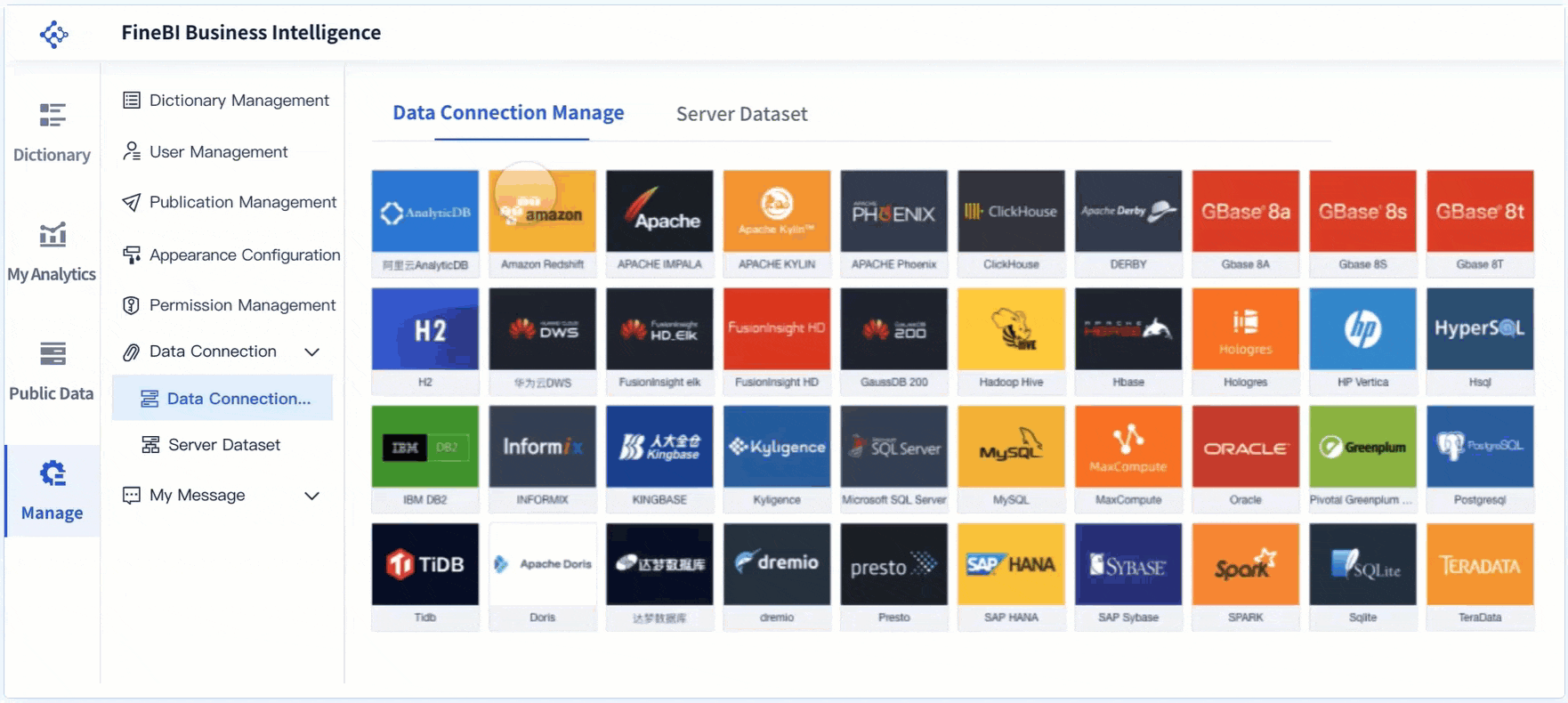
Integration: Does the platform connect to ERP, WMS, MES, CRM, HR, IoT, and other core systems?
Scenario modeling: Can users test what-if decisions quickly?
Alerting: Does the tool push relevant exceptions to teams at the right time?
Governance: Are data access, definitions, and version control managed consistently?
Explainability: Can users understand what is driving the forecast and why the model is recommending action?
Scalability: Can the same framework work across multiple sites, teams, and business units?
Self-service capability: Can business users adapt views without rebuilding the entire solution?
Decision speed fit: Does the platform support the cadence of the operation, whether hourly, daily, or weekly?
The best tool is not always the one with the most advanced modeling library. It is the one that matches your operational maturity, data readiness, and decision velocity.
Data analytics solutions that strengthen forecast quality
Forecast quality depends heavily on the underlying data environment. Even a well-designed predictive analytics dashboard will fail if data is stale, fragmented, or poorly governed.
Strong data analytics solutions should support:
Reliable data quality controls: handling duplicates, gaps, timing mismatches, and inconsistent definitions
Workflow integration: connecting forecast outputs to planning, dispatch, staffing, or replenishment actions
System connectivity: pulling data from transactional systems, sensors, external feeds, and operational tools
Near-real-time refresh where needed: especially for fast-moving operations
Master data consistency: ensuring sites, SKUs, assets, teams, and regions are standardized
Role-based access: so each user sees relevant metrics and actions
Auditability: allowing teams to trace how forecasts and decisions were generated
In practice, the dashboard is only as trustworthy as the data pipeline behind it.
Intervention effectiveness: whether actions based on the forecast changed outcomes
A useful executive scorecard might include:
Forecast accuracy trend
Alert-to-action time
Service level improvement
Cost avoided
Adoption by manager or site
These measures prove whether the dashboard is influencing real operational decisions, not just generating attention.
Build a predictive analytics dashboard that teams actually use
The winning formula is clear: start with a specific operational decision, define the right KPIs, translate forecasts into thresholds and playbooks, and embed the dashboard into daily execution. That is how forecasts move from analyst output to frontline action.
But building this manually is complex. You need data integration, model visibility, role-based dashboards, scenario views, alert logic, and governance that can scale across the business.
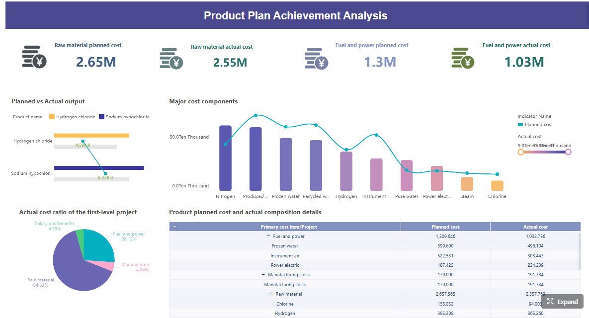
This is where FineBI becomes the practical enabler. Instead of stitching together custom dashboards, workflows, and reporting layers from scratch, use FineBI to utilize ready-made templates and automate this entire workflow. Operations leaders can unify data, visualize predictive signals, build action-oriented dashboards, and deliver self-service access to business users without creating unnecessary technical overhead.
For enterprise teams that want a predictive analytics dashboard that improves daily decisions, the goal is not just forecasting better. It is operating better, faster, and with more confidence. FineBI helps make that transition achievable.
FAQs
It is a dashboard that turns forecast data into practical signals for daily decisions about staffing, capacity, service levels, and risk. Instead of only showing past performance, it helps teams see likely future issues early enough to act.
A regular dashboard mainly reports historical or current performance, while a predictive dashboard estimates what is likely to happen next. That forward-looking view helps leaders prevent disruptions rather than just respond to them.
It should include forecast demand, delay or failure risk, staffing pressure, capacity utilization, and forecast accuracy tied to business KPIs. The most useful dashboards also show thresholds and alerts that make next steps clear.
Supply chain, service delivery, workforce planning, manufacturing, and field operations teams often gain the most value. Any team that must balance demand, labor, assets, and service commitments can use forecasts to make faster decisions.
Forecasts need to be embedded in the workflows where managers already make decisions, such as shift planning, dispatch reviews, and exception handling. Adoption improves when predictions are connected to clear actions, owners, and timing.
Product Trial
FineReport
Pixel-perfect reports · Interactive dashboards · Easy data entry · Digital twins