A react dashboard is most valuable when it becomes a working command center, not just a pretty admin screen. In this tutorial, the scenario is straightforward: you need to deliver a real-time KPI workspace for operators, managers, or analysts who must track changing business metrics without waiting on engineering to build every UI block from scratch. The business value is speed and control. A solid UI template reduces front-end lift, while a well-structured React architecture keeps your dashboard flexible enough for live data, evolving widgets, and enterprise-grade workflows.
What you'll build in this React dashboard tutorial
The goal is to build a KPI workspace that gives end users one place to monitor performance, spot anomalies, and take action. Think of a customer support lead tracking ticket backlog, a supply chain manager watching fulfillment rates, or a SaaS operations team monitoring signups, churn risk, and system health. Your react dashboard should answer three questions fast: What is happening now? What changed? What needs attention?
A finished layout usually includes a top summary row of KPI cards, one or two trend charts, a table for detailed records, filters for slicing the data, and a lightweight activity or alert panel. Starting from a UI template accelerates this because you inherit layout scaffolding, styling primitives, navigation, cards, tables, and often chart wrappers. That saves days or weeks of repetitive setup, without forcing you to keep demo content or rigid component logic.
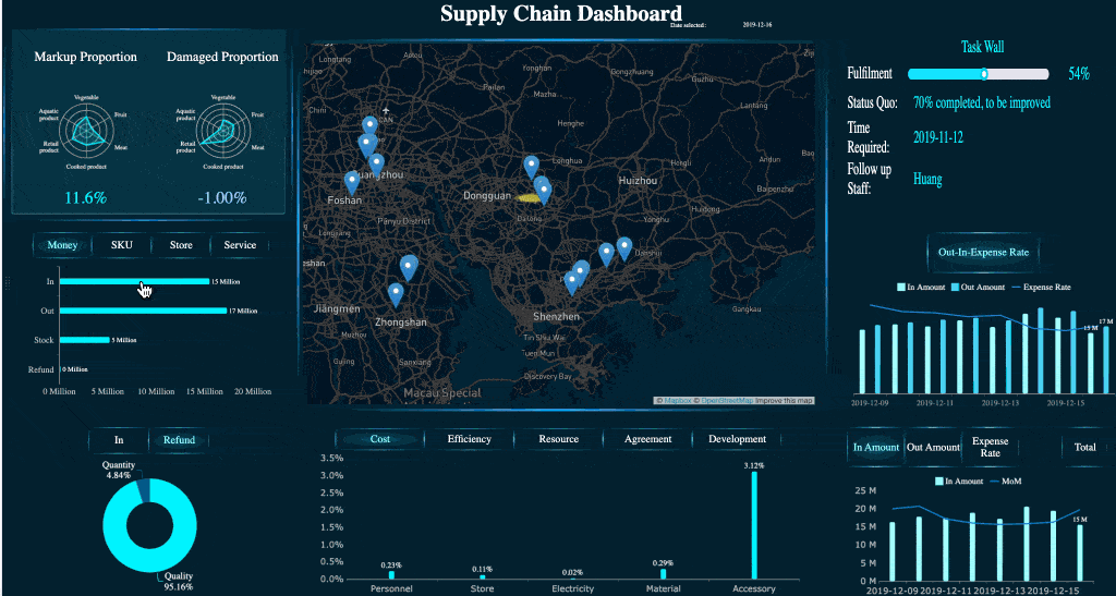
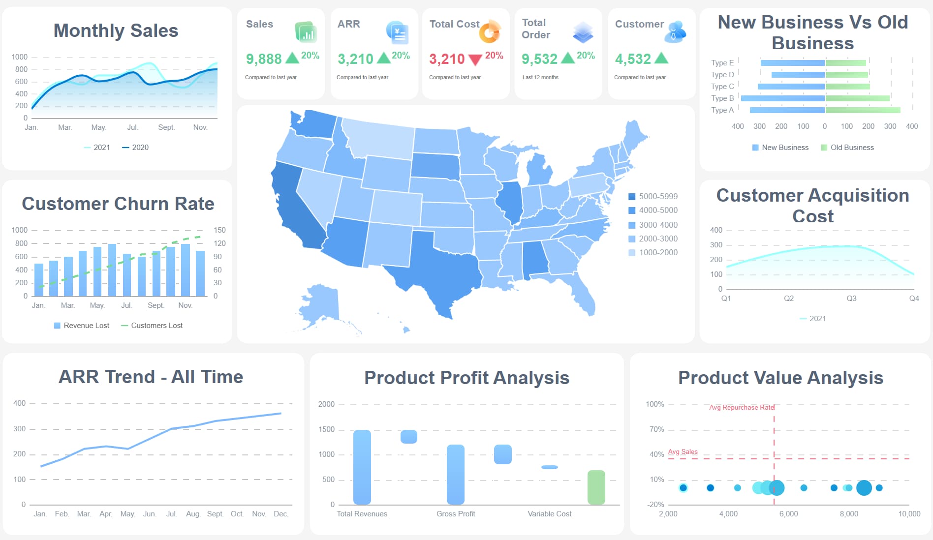
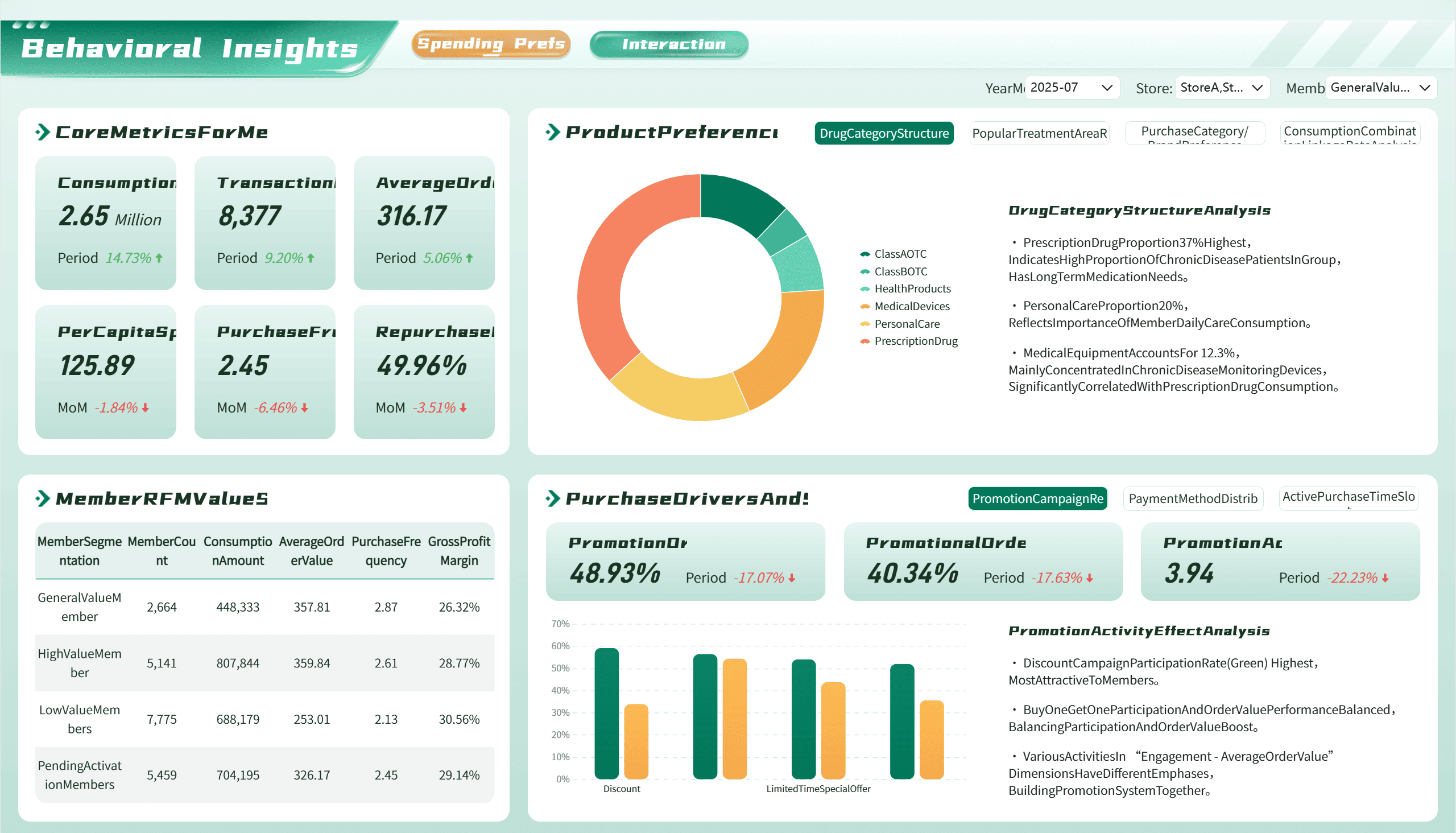
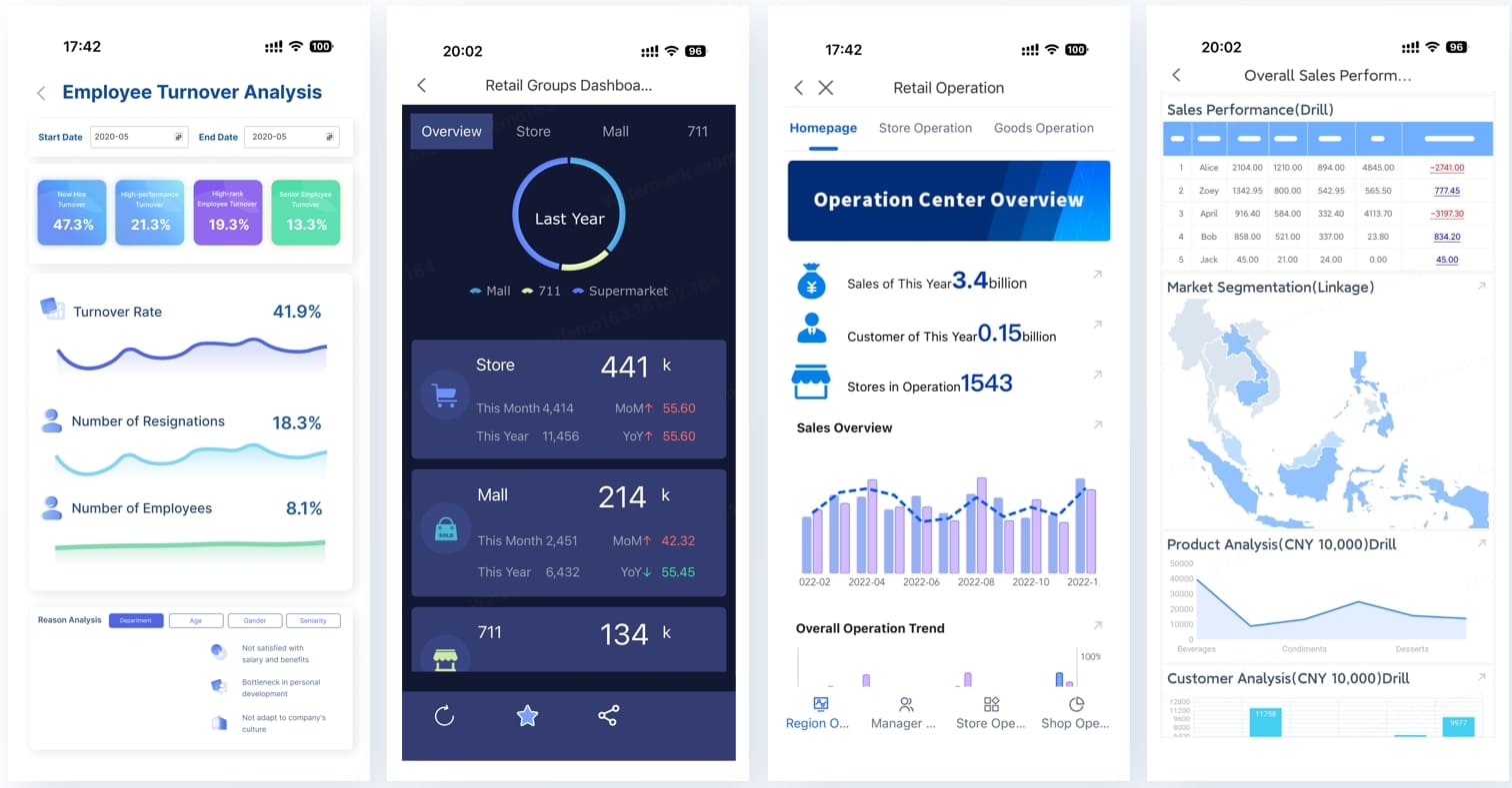
All dashboards in this article are built with FineBI.
In practical terms, “real-time” does not always mean millisecond streaming. For most KPI workspaces, real-time means the data refreshes at a pace that matches operational decisions. For a warehouse monitor, that may be every 15 seconds. For executive sales tracking, every 5 minutes may be enough. Your stack can remain simple: React for UI, a template built on MUI, Ant Design, Chakra UI, or Tailwind, a charting library such as Recharts or ECharts, and a data layer powered by fetch, Axios, React Query, or SWR.
Key Metrics (KPIs)
To make a react dashboard useful, define KPIs before building widgets. Common KPI categories include:
Current Value: The latest metric snapshot, such as revenue today or active incidents.
Trend Over Time: A line or area chart showing direction, momentum, and volatility.
Delta vs Previous Period: Change compared with the last hour, day, week, or month.
Target Attainment: Progress toward a goal, quota, SLA, or forecast.
Alert Threshold Breaches: Indicators when a metric moves outside an acceptable range.
Data Freshness: Timestamp showing when the dashboard last received valid data.
Segment Breakdown: Performance split by team, region, product, or channel.
Operational Backlog: Open tasks, unresolved cases, pending approvals, or queued jobs.
Conversion or Completion Rate: Ratio-based KPI that shows throughput quality.
Exception Volume: Count of failures, escalations, errors, or anomalies needing review.
Core elements of the KPI workspace
A strong implementation usually includes these core elements:
Navigation shell: Header, sidebar, breadcrumbs, and page actions.
Reusable KPI cards: Standardized components for value, trend, status, and comparison.
Chart region: Time-series views, category comparisons, and anomaly markers.
Detail table: Drill-down records for investigation and follow-up.
Filter bar: Date range, business unit, product line, owner, or status filters.
Refresh and sync state: Loading, updating, stale, and error conditions.
Role-aware content: Different widgets or data access by user type.
Choose a UI template that fits your react dashboard goals
A template should shorten delivery time, not introduce long-term constraints. The wrong template looks fast on day one and expensive by sprint three. The right one provides consistent visual language, production-ready layout patterns, and enough composability to let your team swap static placeholders for live KPI widgets.
What to evaluate before picking a template
Start with layout flexibility. A KPI workspace changes over time, so you need a grid and card system that supports expansion, hiding widgets, and responsive reordering. Avoid templates that are visually polished but hard-coded around one demo layout.
Next, assess component quality. Inspect cards, tables, modals, tabs, filters, and form controls. Many templates look impressive in screenshots but contain brittle code, duplicated logic, or poor state handling. Enterprise teams should also review accessibility, keyboard support, color contrast, and semantic markup.
Chart support matters too. Some templates include pre-wired chart examples, but the deeper question is whether chart containers are easy to replace and resize. Also verify theming, especially if your organization needs dark mode, branding control, or white-label support.
Finally, check whether the template is actively maintained. If it depends on outdated React versions or unmaintained UI libraries, your react dashboard will inherit upgrade risk.
Compare free, open-source, and premium options
Free and open-source templates are strong for fast proof-of-concept work. They lower entry cost and often have visible GitHub activity, which helps during evaluation. The trade-off is inconsistent documentation, limited design polish, or extra cleanup work before production.
Premium templates can be worth it when your team values speed, documentation, design consistency, and support. They often include stronger page scaffolding and cleaner design systems. But they may also add code you do not need, which affects bundle size and maintainability.
A practical way to decide is to compare them across four dimensions:
Template Type
Best For
Main Strength
Main Risk
Free template
MVPs, internal pilots
Fast start, low cost
Inconsistent support
Open-source template
Teams that want code control
Transparent codebase, community
Variable quality
Premium template
Faster production delivery
Better UX polish, docs, support
Licensing and vendor reliance
For teams that want rapid front-end delivery but also care about downstream BI adoption, it can be useful to pair a custom react dashboard with a governed analytics layer. That is where tools like FineBI can complement the stack. React handles app experience and workflow integration, while FineBI helps standardize dashboarding, governed metrics, and self-service analysis across business teams.
Once you choose a template, strip it down aggressively. Most templates ship with demo pages, sample charts, fake notifications, placeholder users, and routes you do not need. Remove them early.
Your setup sequence should be simple:
Install dependencies and verify the template runs cleanly.
Remove demo routes, assets, and unused style tokens.
Create a dedicated dashboard page and route.
Separate shared components from page-specific widgets.
Add a service layer for KPI APIs before binding real endpoints.
This cleanup phase is where many teams save themselves future refactoring pain.
Build the react dashboard structure and KPI components
At this stage, your focus shifts from template adoption to dashboard architecture. A scalable react dashboard is built from small, reusable UI units with predictable props and minimal coupling.
Create the page shell and navigation
Start with the shell: header, sidebar, content container, and page-level controls. Keep the shell generic. It should support not just this KPI workspace, but future operational or admin pages too.
Within the main content area, use a grid layout that supports cards of different widths. For example:
Top row for headline KPIs
Middle row for trends and segmented views
Lower row for detail tables and activity panels
A reusable metric card should accept values such as:
Title
Current value
Previous comparison
Trend direction
Status color
Loading state
Click action for drill-down
Turn template components into KPI widgets
This is where the template becomes your product. Convert stat cards into business KPIs. Replace sample user tables with operational records. Adapt chart blocks to reflect your real reporting logic.
Typical widget types include:
Stat cards for revenue, incidents, backlog, or conversion
Line charts for trend monitoring
Bar charts for channel or region comparisons
Tables for latest transactions, tickets, or exceptions
Activity panels for audits, alerts, or recent changes
Keep widgets small and composable. A good pattern is one container component per widget and one presentational component for rendering. That way, testing and data mocking stay simple.
This structure makes it easier to standardize multiple widgets across the dashboard.
Design for clarity and responsiveness
Dashboard usability is often lost in visual clutter. Prioritize hierarchy over decoration. The most important KPI should be visually dominant, but not oversized enough to crowd the rest of the workspace.
Design rules that work well:
Use consistent card heights for scanning speed.
Reserve color for status and emphasis, not decoration.
Make empty states informative, not blank.
Show skeleton loaders for charts and tables during fetches.
Collapse noncritical panels on smaller screens.
Avoid forcing users to horizontally scroll key business data.
For mobile, you do not need full parity with desktop. You need continuity. A mobile react dashboard should preserve the top KPIs, filter access, and at least one actionable drill-down path.
Dashboard Mobile
Connect live data and make the react dashboard feel real-time
This is where a dashboard stops being a mockup. Real-time behavior is not just about fresh data. It is about trust. Users need to know the numbers are current, the refresh logic is reliable, and the system will communicate clearly when something breaks.
Choose a data flow for updates
There are three common update models:
Polling
Polling is the easiest to implement. The client requests fresh KPI data every fixed interval, such as 15 or 30 seconds. This works well when the cost of stale data is low and the backend can handle repeated requests.
Best for:
Standard KPI dashboards
Moderate update frequency
Simpler infrastructure
WebSockets
WebSockets support full-duplex communication and are ideal when values change frequently and must update instantly. They are more complex but powerful for operations, trading, monitoring, or collaborative tools.
Best for:
High-frequency events
Push-based updates
Interactive operational screens
Server-Sent Events
SSE sits between polling and WebSockets. It is useful when the server mainly pushes updates one way to the client.
Best for:
Notification streams
Lightweight event feeds
Simpler live update scenarios
A practical rule: start with polling unless the business case truly requires event streaming.
Fetch, normalize, and cache KPI data
Use a service layer to isolate API logic from UI components. That means your widgets do not fetch directly from scattered endpoints. Instead, they rely on shared hooks or service functions.
A clean pattern looks like this:
Fetch raw KPI payloads from one or more APIs.
Normalize responses into stable front-end shapes.
Cache data using a client strategy such as React Query.
Expose predictable loading, error, and stale states to widgets.
This prevents visual flicker and avoids repeated transformation logic across components.
When governance and consistency become bigger concerns, especially across departments, a BI layer can add value. FineBI is useful in scenarios where teams need trusted metric definitions, reusable dashboards, and broader self-service access beyond the React app itself. The react dashboard can serve operational workflows, while FineBI supports governed analytics at scale.
Users should never wonder whether the dashboard is current. Always display:
Last updated time
Loading or syncing state
Stale data warning
Retry action after errors
Alert badge for threshold breaches
This is not cosmetic. It is operational UX. If your refresh pipeline fails silently, trust in the dashboard collapses fast.
A solid alerting pattern includes:
Inline warning for stale KPIs
Color-coded health indicators
Tooltip or expandable detail explaining why a metric is delayed
Human-readable error messages instead of raw API failures
Improve usability, performance of the react dashboard, and admin workflows
Once your core widgets are working, shift focus to the experience around them. This is where good dashboards become decision tools rather than passive reports.
Add filters, drill-downs, and role-based views
Filters should reduce ambiguity, not introduce complexity. Focus first on dimensions users actually need: date range, business unit, region, product, channel, and owner. Keep global filters visible and local widget filters lightweight.
Drill-downs are critical because KPI cards alone rarely answer root-cause questions. A healthy pattern is:
KPI card shows top-line status
Clicking opens a table, drawer, or detail page
User investigates records behind the metric
Action can be taken from the deeper screen
Role-based views also matter in enterprise environments. An operations manager may need system-wide KPIs, while a team lead should only see their assigned region or queue. Build this into your widget rendering and service layer early.
Role-based views
Optimize rendering and bundle size
Real-time screens can become expensive fast. Heavy charts, repeated polling, and too many state updates can drag performance down.
Key optimization practices:
Memoize expensive components with React.memo
Use useMemo for derived chart data
Use useCallback only where it actually prevents rerenders
Lazy-load chart libraries and lower-priority modules
Virtualize long tables
Avoid global state for every widget if local state is enough
Also audit your template imports. Many templates pull in large icon sets, full chart libraries, and unused utility modules. Trim them early to keep your react dashboard responsive.
Make the dashboard easier to maintain
Maintenance is where many internal dashboards fail. They work for one use case, then become painful when new KPIs, filters, or modules are added.
A seasoned approach is to standardize widget contracts. Every widget should define:
Inputs
Data shape
Loading behavior
Empty state behavior
Error behavior
Drill-down action
Access rules
Document widget configuration and naming conventions. If possible, create a dashboard registry so teams can add modules without rewriting the shell.
This is also the point where some organizations benefit from combining bespoke React UI with a broader BI capability. If your internal app needs custom workflows but business teams also want no-code or low-code dashboarding, FineBI can reduce reporting bottlenecks and prevent engineering from becoming the only route to analytics delivery.
Actionable best practices for implementing a real-time KPI workspace
Here is the consultant-style version of what works in production.
1. Start with business thresholds before you build charts
Do not begin by choosing chart types. Start by identifying what decisions users must make and what thresholds trigger action. A KPI without operational meaning is decoration.
Step by step:
List the top five decisions the dashboard should support.
Define the KPI, acceptable range, and escalation threshold for each.
Match each KPI to the simplest visual that supports action.
Add alerts only where users can respond meaningfully.
2. Build one widget pattern and reuse it ruthlessly
Many teams waste time designing each panel independently. Instead, create one strong widget standard for cards, charts, and tables.
Step by step:
Define shared props and state patterns.
Standardize titles, timestamps, loading skeletons, and error blocks.
Reuse the same grid spacing and card behavior across the page.
Expand through composition, not one-off widget logic.
3. Treat data freshness as a first-class UX requirement
If a metric can be stale, say so clearly. If refresh fails, surface that fast.
Step by step:
Add lastUpdated to every KPI response.
Establish stale thresholds by metric type.
Display warning states when refresh falls behind.
Include a manual refresh action for high-priority widgets.
4. Keep drill-downs close to the KPI
Do not force users to leave the dashboard too early. Use drawers, modals, tabs, or linked detail pages with context preserved.
Decide whether the answer belongs in a drawer, table, or separate page.
Pass the current filters into the detail view.
Let users return to the dashboard without losing context.
5. Plan now for the second dashboard, not just the first
The first page is never the last. If your architecture only supports one hard-coded KPI workspace, you will rebuild it sooner than expected.
Step by step:
Separate shell, widget, and data logic from business-specific content.
Create configuration-driven widgets where possible.
Version your API contracts.
Document how to add a new KPI module without touching the whole page.
Final polish of your react dashboard and next steps
Before launch, test the dashboard like an operator would use it. Click every filter combination. Validate each KPI against the source system. Check what happens when APIs fail, data is delayed, or a widget returns no records. Accessibility review matters too: keyboard navigation, focus order, contrast, and screen-reader labels should not be afterthoughts.
Deployment should match the maturity of your data sources. If production APIs are not ready, use mock services that simulate delayed updates, refresh intervals, and failure states. That gives you a more realistic test environment than static JSON alone.
From here, your next steps are clear:
Add admin configuration for widget visibility and filter defaults
Expand role-based access rules
Introduce reusable dashboard modules for new teams
Upgrade the template only after isolating your custom layer
Consider a governed analytics platform alongside your React app for broader business reporting
A react dashboard built from a UI template can absolutely move from prototype to production, as long as you treat the template as a starting point rather than the architecture itself. Build for clarity, trust, and extensibility. That is what turns a dashboard into an operational asset.
If you also need governed, enterprise-friendly analytics beyond the app layer, FineBI is a strong option to evaluate alongside your React implementation.
The fastest approach is to start with a well-structured UI template and replace demo content with your own KPI cards, charts, tables, and filters. This cuts boilerplate work while keeping the dashboard flexible for live data.
Pick a template based on layout flexibility, component quality, chart compatibility, theming, accessibility, and maintenance history. A good template should speed up delivery without locking you into outdated code or rigid page structures.
In most business dashboards, real-time means data refreshes often enough to support decisions, not necessarily instant streaming. Depending on the use case, that could mean every few seconds or every few minutes.
Teams often combine React with UI systems like MUI, Ant Design, Chakra UI, or Tailwind, plus chart libraries such as Recharts or ECharts. For data fetching and refresh logic, tools like fetch, Axios, React Query, or SWR are common choices.
Yes, FineBI can support dashboard creation when you need business users to work with KPI views more quickly. It is useful when the goal is to reduce front-end effort while still delivering interactive monitoring and analysis.
Product Trial
FineReport
Pixel-perfect reports · Interactive dashboards · Easy data entry · Digital twins
 Dashboard Mobile
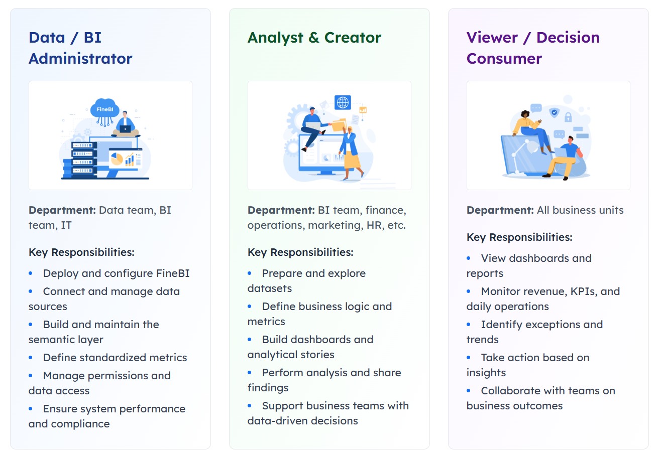 Role-based views