A performance report template is the operating system for a monthly business review. It gives leadership teams one place to assess results, spot risks early, and decide what actions to take next. For IT managers, operations directors, finance leaders, and department heads, the challenge is rarely lack of data. The real problem is turning scattered metrics into a report that is fast to read, easy to trust, and useful for decision-making every single month.
Click To Try The Dashboard
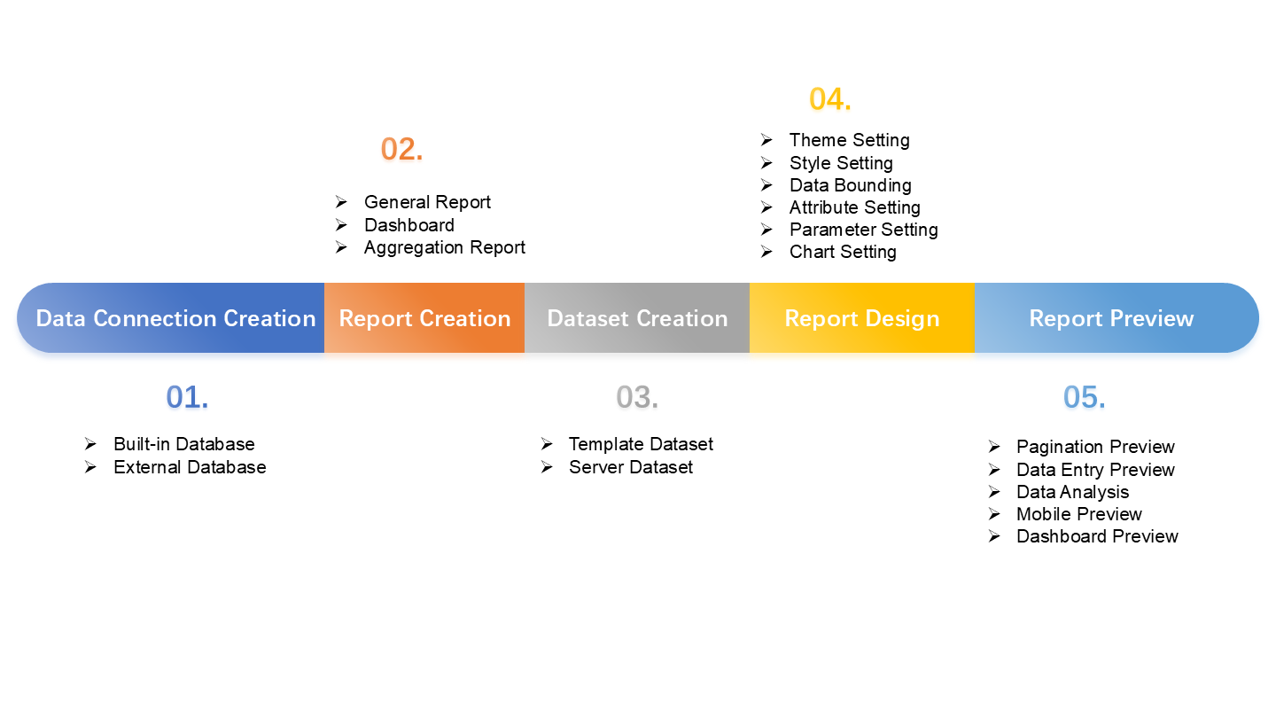
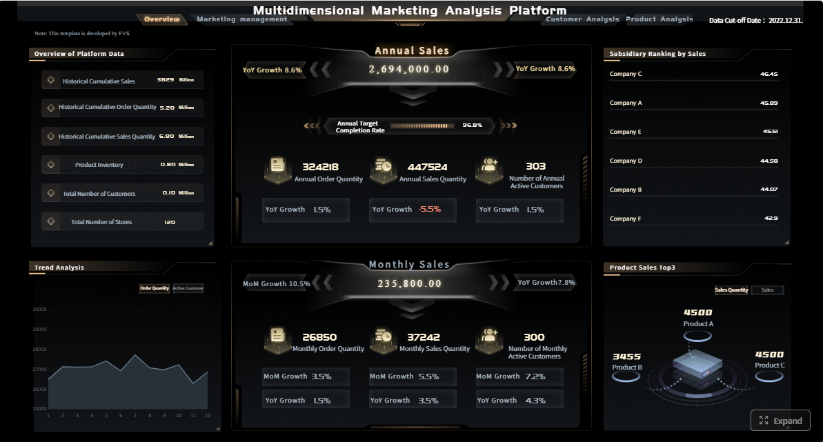
All reports in this article are built with FineReport
A strong monthly review template should help leaders answer five questions quickly:
What happened this month?
Are we on target?
What changed from last month?
What risks need intervention?
What actions have owners and deadlines?
Without this structure, monthly reviews become long status meetings instead of decision sessions.
The purpose of a monthly business review and the decisions it should support
A monthly business review exists to connect operational performance to business action. It is not just a recap. It should support decisions such as:
reallocating budget or headcount
adjusting sales or delivery targets
escalating quality or service issues
changing priorities for the next 30 to 60 days
confirming whether strategic initiatives are on track
For enterprise teams, the monthly cycle is especially important because it sits between daily operational dashboards and quarterly strategy reviews. It gives enough time to identify meaningful trends without waiting too long to correct problems.
The most effective performance report template includes these core sections:
Executive summary: A one-page view of the month, including major wins, shortfalls, and decisions needed.
KPI dashboard: The central scorecard showing targets, actuals, variance, and trend direction.
Trend analysis: A short explanation of what changed and why.
Risks and issues: Key blockers, emerging threats, and likely business impact.
Action items: Named owners, due dates, and next steps.
This structure keeps the report balanced. Leaders get headline visibility first, then supporting detail only where it matters.
How to balance clarity, detail, and speed for recurring reporting
Monthly reporting fails when teams try to include everything. A better approach is to make the core dashboard concise and move supporting detail into drill-down pages or appendices.
Use three practical rules:
Show only decision-relevant KPIs in the main view.
Write short analysis summaries tied to changes, not generic commentary.
Keep visual standards consistent so readers do not need to relearn the report each month.
Key Metrics (KPIs)
The exact KPI set will vary by function, but most monthly business reviews should define and track a small, disciplined set of measures:
Revenue: Total recognized income during the reporting period.
Pipeline value: Open opportunity value that indicates future sales potential.
Customer retention rate: Percentage of customers retained over the period.
Gross margin: Revenue minus cost of goods or service delivery, shown as value or percentage.
Operational efficiency: Output achieved relative to labor, time, or cost input.
Quality rate: Measure of defects, rework, compliance issues, or service errors.
On-time delivery: Percentage of deliverables completed by agreed deadlines.
Customer satisfaction: Survey-based indicator such as CSAT or NPS.
Team utilization: Share of available capacity spent on productive work.
Absenteeism or turnover: Workforce stability indicators that affect execution risk.
Budget variance: Difference between planned and actual spending.
Forecast accuracy: How closely prior forecasts matched actual outcomes.
A high-value dashboard usually mixes lagging KPIs such as revenue and margin with leading KPIs such as pipeline growth, backlog health, service backlog, or employee capacity.
How to build a monthly KPI dashboard for business reviews
A dashboard should help leaders make decisions in minutes, not search for meaning in dozens of charts. The best designs follow business priorities first and visuals second.
Choose the metrics that reflect business goals
Start with business goals, then map KPIs to them. If the company priority is profitable growth, the dashboard should not focus only on top-line revenue. It should also include margin, win rate, retention, and delivery efficiency.
Typical KPI categories include:
revenue and margin
pipeline and conversion
customer retention and churn
efficiency and productivity
quality and compliance
team performance and capacity
Revenue, pipeline, customer retention, efficiency, quality, and team performance indicators
A practical dashboard often covers six performance dimensions:
Revenue: Monthly sales, recurring revenue, average deal value
Highlight exceptions, root causes, and recommended next steps
Dashboards become far more useful when they identify exceptions instead of leaving readers to detect them manually. Use threshold rules or color logic to surface:
missed targets
sharp month-over-month drops
persistent underperformance across multiple periods
conflicting patterns, such as strong bookings but weak collections
Then add a short note for each critical exception:
what changed
likely root cause
business impact
recommended next step
This is where reporting moves from descriptive to actionable.
Add practical analysis without overwhelming readers
The purpose of analysis is not to repeat the chart in paragraph form. It is to explain the signal.
A strong summary under each section should answer:
What changed?
Why did it change?
What should we do next?
Summarize key changes, explain drivers, and link insights to actions
Use concise analysis statements such as:
Revenue exceeded target by 6%, driven by higher enterprise renewals and improved win rate in the manufacturing segment.
On-time delivery fell 4 points due to supplier delays and backlog growth in one regional hub.
Customer churn increased in the mid-market segment, signaling a service responsiveness issue that requires escalation.
Each insight should lead naturally to an action item. If the report identifies a problem but no owner, it is incomplete.
Performance report template formats and customization options
Format affects adoption more than many teams expect. A report that is easy to edit but hard to standardize creates governance problems. A report that looks polished but takes too long to update creates process fatigue.
When to use free, printable, and customizable report templates
Different formats serve different reporting needs:
Free templates: Best for small teams, pilot reporting, or simple recurring reviews
Printable templates: Useful for board packs, stakeholder handouts, or offline review meetings
Customizable templates: Ideal when teams need branded layouts, KPI logic, and role-based views
For enterprise use, customizable templates usually create the best long-term value because they can evolve with changing goals and reporting requirements.
Comparing Word, spreadsheet, and AI-assisted report tools
Here is the practical trade-off:
Word templates
Good for narrative summaries and formal review documents
Weak for automation and data refresh
Better for static presentation than live KPI management
Spreadsheet templates
Good for calculations, flexible edits, and quick setup
Weak for version control, governance, and executive presentation quality
Often become fragile as metrics and teams scale
AI-assisted report tools
Good for draft summaries, anomaly explanations, and faster formatting
Need strong data governance and validation
Most valuable when paired with structured dashboards rather than used alone
For recurring monthly reviews, spreadsheet-only processes often break first. The issues usually appear as manual copy-paste work, inconsistent definitions, and too many local versions.
Employee performance report and review template examples
Employee reporting needs a different balance. It should combine quantitative output with qualitative development feedback.
What to include for manager check-ins, formal reviews, and development conversations
For employee performance reviews, include:
role and review period
goals and achievement status
productivity or output metrics
quality of work indicators
collaboration and communication feedback
strengths and development areas
manager comments
agreed next steps and support needed
Use shorter monthly check-in templates for coaching and workload alignment. Use more detailed quarterly or annual versions for formal review and development planning.
Performance analysis report template example
A performance analysis report goes deeper than a standard monthly dashboard. It is useful when leaders need diagnosis, not just status.
A deeper format for diagnosing trends, gaps, and corrective actions
This version should include:
problem statement
KPI history over several months
variance breakdown
segmentation by team, region, product, or customer type
root cause analysis
corrective action options
expected impact and timeline
This format is especially useful when a KPI has been below target for several periods and simple commentary is no longer enough.
Common reporting mistakes and how to avoid them
Most reporting problems are not technical. They come from weak reporting design and unclear ownership.
Tracking too many KPIs without clear business relevance
If every team adds metrics freely, the dashboard becomes a data museum. Limit the main monthly review to KPIs tied directly to strategic or operational decisions.
Fix: Define a KPI governance rule. Every metric in the dashboard must answer one business question and support one likely decision.
Presenting data without benchmarks, trends, or context
A number alone rarely means anything. If revenue is 12 million or utilization is 78%, leaders still need to know whether that is good, bad, improving, or risky.
Fix: Always show target, variance, and trend.
Using inconsistent definitions across teams and reporting periods
Few things damage trust faster than different teams using different definitions for the same KPI.
Ending the review without owners, deadlines, or follow-up actions
A review without action discipline turns reporting into theater.
Fix: End every report with a live action tracker including:
issue
action
owner
due date
status
expected outcome
How to make your monthly review process more useful
Improving the report format is only half the job. The review process itself must be reliable.
Create a reporting cadence with clear owners and deadlines
Set a standard timeline such as:
Day 1 to 2: Data refresh and validation
Day 3: Department commentary due
Day 4: Executive summary finalized
Day 5: Monthly review meeting
Day 6 onward: Action follow-up
This creates rhythm and reduces last-minute reporting chaos.
Standardize definitions and visual rules across reports
Standard visual rules make dashboards easier to scan:
one color logic for status
one date format
one variance convention
one KPI naming standard
one chart style per metric type
That consistency matters in enterprise environments where many teams contribute to reporting.
Review the template regularly as goals, teams, and systems change
A performance report template should not stay frozen. Review it every quarter or after major business changes such as new systems, reorganizations, or updated strategic priorities.
Retire KPIs that no longer influence decisions. Add leading indicators where teams need earlier warning signals. Simplify sections that create effort but little value.
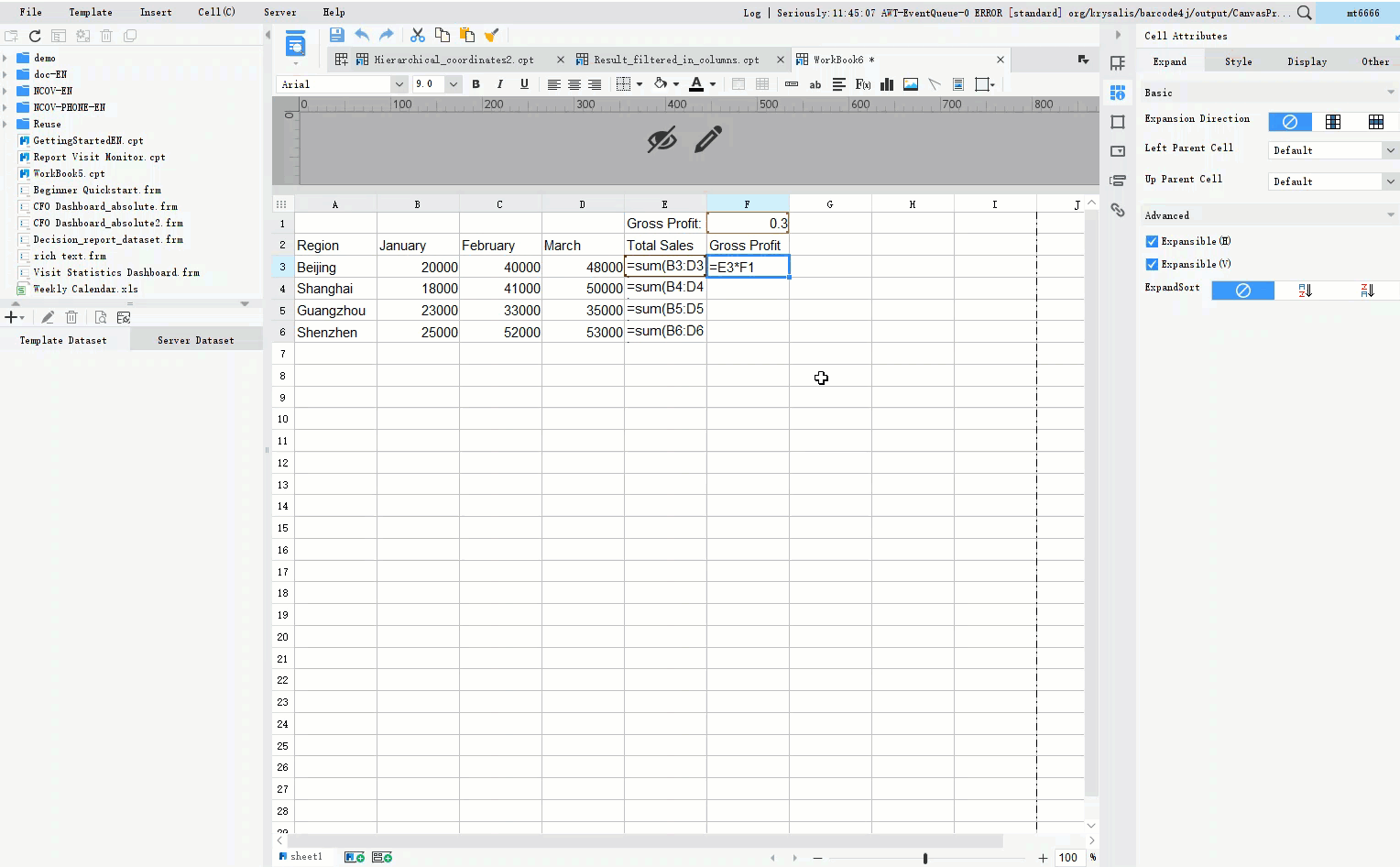
Building this manually is complex; use FineReport to automate the workflow
At scale, building and maintaining a monthly review process manually becomes difficult. Teams end up stitching together spreadsheets, slide decks, and comments from multiple departments. That creates delays, version issues, inconsistent KPI logic, and avoidable reporting errors.
Building this manually is complex; use FineReport to utilize ready-made templates and automate this entire workflow.
The best performance report template is not the one with the most charts. It is the one that helps your leadership team decide faster, align actions more clearly, and improve performance month after month. If you want to move from manual reporting to a scalable KPI dashboard process, FineReport gives you the structure, automation, and flexibility to make that happen.
A strong monthly performance report template usually includes an executive summary, KPI dashboard, trend analysis, risks or issues, and action items with owners and deadlines. This structure helps leaders move from results to decisions quickly.
The most important KPIs depend on business goals, but common choices include revenue, margin, pipeline, customer retention, efficiency, quality, and budget variance. The best reports combine leading and lagging indicators so teams can track both outcomes and early warning signs.
Keep the main dashboard focused on decision-relevant metrics, show target versus actual versus variance, and highlight trends clearly. Supporting detail should sit in drill-down pages or appendices instead of crowding the main view.
A template creates consistency, reduces reporting time, and makes it easier to compare results from month to month. It also helps leadership teams spot risks sooner and assign follow-up actions more effectively.
A KPI dashboard is the visual scorecard that shows metrics, targets, and trends at a glance. A performance report is broader and usually adds narrative analysis, risk context, and action plans around that dashboard.
Product Trial
FineReport
Pixel-perfect reports · Interactive dashboards · Easy data entry · Digital twins