Picture this: You walk into a meeting with your latest data analysis, and everyone’s eyes go straight to your report cover page. That first impression matters. Choosing the right report cover sets the stage for how your work gets received. A clean, professional look shows you care about details and your brand. Think about both style and function to make your report stand out and meet FanRuan’s high standards.
When you start a new report design, think about who will read it and what you want to achieve. Your audience shapes every choice you make. If you’re creating a financial report for executives, you want a cover that feels trustworthy and matches your company’s vision. For an HR summary, you might focus on clarity and alignment with organizational goals. In data analytics, your report design should highlight key metrics and support smart decisions.
Knowing your audience helps you tailor your report design for maximum impact. You can focus your efforts on the people who matter most, instead of trying to please everyone. This approach often leads to better results and even higher profits.
Here’s a quick look at how different goals influence your report design:
| Goal Type | Description | Influence on Cover Design |
|---|---|---|
| Organizational Goals | Align HR metrics with company needs | Covers reflect the company’s vision and strategic direction |
| Informed Decision-Making | Metrics lead to actionable insights | Design highlights clarity and key data |
| Strategic Vision | Support the overall strategy | Covers visually represent priorities and direction |
FanRuan and FineReport users know that a strong report design is more than just looks. It’s about making sure your message gets across to the right people, whether you’re sharing a financial report with the board or a project update with your team.
Now, let’s talk about style. The right report design depends on your purpose. For internal analysis, you might choose a simple cover with just a title. If you’re presenting to clients, bold colors or a landscape format can grab attention. A classic layout with creative elements works well for mixed audiences. For marketing, a colorful or illustrated cover can make your report stand out.
| Style Description | Purpose |
|---|---|
| Minimal approach with only a title | Internal analysis |
| Bold colors and landscape format | Client presentations |
| Simple yet elegant design | Both internal and client-facing reports |
| Colorful cover page | Marketing presentations |
| Fun, illustrative style | Informal settings |
| Classic layout with creative elements | Diverse audiences |
| Customizable illustrated cover | Industry-specific, internal or external use |
| Modern, minimal border with illustrations | Study results, analytical reports |
In industries like healthcare, technology, or finance, trends in report design can shift. For example, healthcare reports now focus more on cybersecurity, while tech companies may highlight innovation. Always match your report cover to your audience and goals for the best results.

When you choose materials for your report cover, you want something that looks sharp and lasts. Think about how often people will handle your report. If you expect your report to pass through many hands, durability matters even more. You do not want a flimsy cover that bends or tears after one meeting.
Some materials stand out for both strength and appearance. Linen weave cover sheets give your report design a textured, fabric-like look. They feel sturdy and come in many professional colors. Embossed sturdy grain cover sheets add a touch of class with their upscale texture and smooth back. These covers work well for a financial report or any document you want to impress with.
Poly leather cover sheets offer a premium leatherette look. They are flexible and tough, perfect for reports that need to travel. Poly sand cover sheets have a modern, orange peel texture. They resist scratches and keep your report design looking fresh. If you want something unique, GBC designer cover sheets use thick poly plastic with clear patterns. These covers make your report stand out while protecting it.
Here’s a quick guide to help you compare:
| Material Type | Description | Colors Available |
|---|---|---|
| Linen Weave Cover Sheets | Textured, durable, professional look | Various professional colors |
| Embossed Sturdy Grain Cover Sheets | Upscale texture, smooth back, elegant finish | Black, white, ivory, navy, red, etc. |
| Poly Leather Cover Sheets | Flexible, durable, premium leatherette appearance | Black, navy blue |
| Poly Sand Cover Sheets | Modern, orange peel texture, scratch-resistant | Several professional colors |
| GBC Designer Cover Sheets | Thick poly, unique clear patterns, eye-catching | Various designs available |
You want your report design to match your brand’s standards. FineReport users often pick materials that show quality and attention to detail. For a financial report, a linen weave or embossed sturdy grain cover sends a message of trust and professionalism. Poly leather covers work well when you need both style and durability, especially for reports that travel between offices.
If you want your report design to look modern, poly sand or GBC designer covers are great picks. They keep your report safe and give it a fresh, creative edge. No matter which material you choose, make sure it fits your report’s purpose and audience. The right cover material helps your report design leave a lasting impression.

Color and branding play a huge role in how people see your report design. When you choose the right colors, you guide the reader’s eye and set the tone for your message. A cohesive color palette makes your report cover design look polished and easy to read. If you use contrasting colors for important numbers or highlights, you help readers spot key information fast.
You want your report cover to match your company’s brand. This means using the same colors, logos, and style you use everywhere else. For example, if you use FanRuan or FineReport, you can add their branding elements to keep everything consistent. This helps people recognize your work right away and builds trust.
Here’s a quick table to show which design elements work best for brand alignment:
| Design Element | Description |
|---|---|
| Cohesive Brand Identity | Every part of your report cover design should reflect your brand’s identity. |
| Color | Pick a balanced color scheme that matches your brand and looks appealing. |
| Texture | Use texture, like embossing, for visual interest and depth. |
| Imagery | Choose images that fit your brand’s message and energy. |
| Message | Add a short, catchy mission statement to engage your audience. |
When you create an annual report cover design, stick to your brand’s main colors and logo. This makes your report design look professional and helps your audience connect with your company.
Simplicity is your best friend in report cover design. You want your report design to look clean, not crowded. Too many graphics or too much text can make your cover confusing. Instead, focus on what matters most—your title, logo, and maybe the date.
A clean report cover design shows you care about details. It also makes your report design easier to read and more inviting. When you keep things simple, your audience can focus on your message instead of getting lost in the details.
You want your report cover to speak for your brand before anyone even opens the document. Adding your company logo is a simple way to boost recognition. Place it at the top or bottom corner, where it stands out but doesn’t distract from your report design. You can also include important details like the report title, date, and the department that created it. These elements help readers know what they’re looking at right away.
Here’s how you can make your report cover more effective:
Tip: When you use consistent colors and fonts across all your reports, you build a strong brand image. People start to recognize your work at a glance.
A custom report cover lets you show off your creativity and attention to detail. You can tailor each report design to fit the type of report you’re sharing. For example, FineReport users often add project-specific icons or a short mission statement to highlight the report’s purpose. You might use a special border or background pattern for annual reports, or add a watermark for confidential documents.
Here are some ways to personalize your report design:
| Customization Option | How It Enhances Your Report Cover |
|---|---|
| Project-specific icons | Makes each report unique and easy to spot |
| Mission statement | Connects the report to your company’s goals |
| Special borders | Adds a polished look for formal reports |
| Watermarks | Protects sensitive information |
| Background patterns | Creates visual interest without clutter |
When you take time to customize your report cover, you show your audience that you care about every detail. Your report design becomes a reflection of your brand’s values and professionalism.
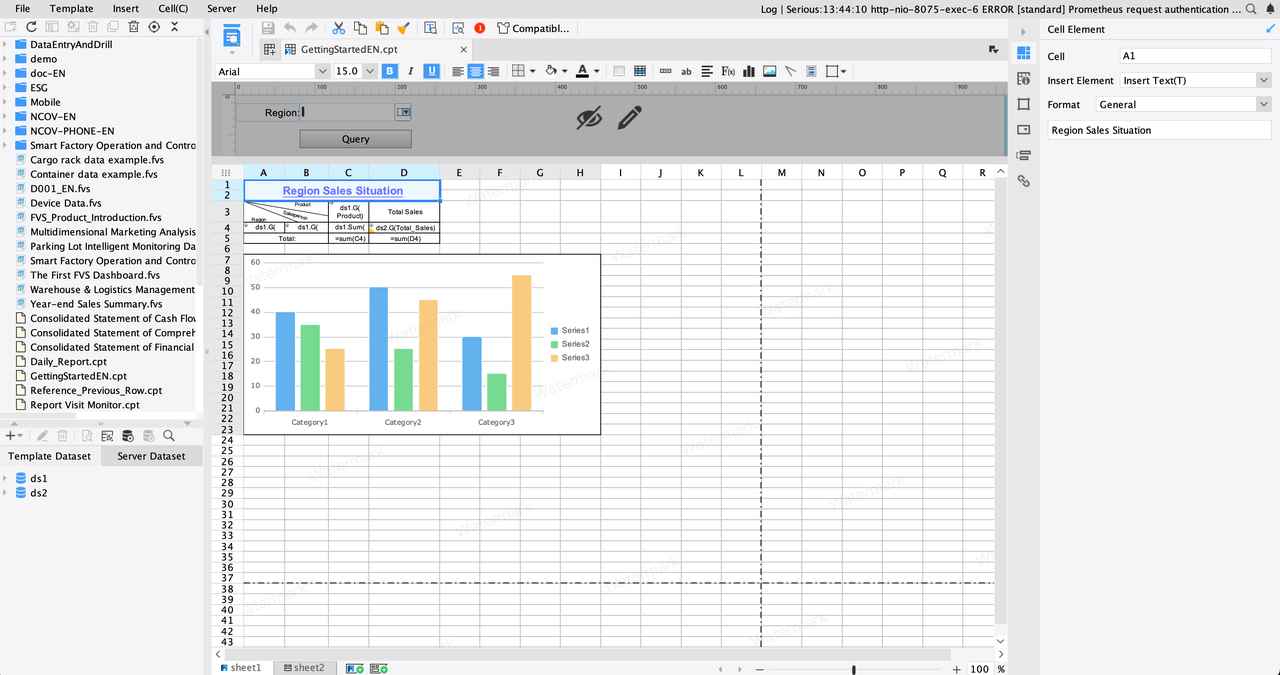
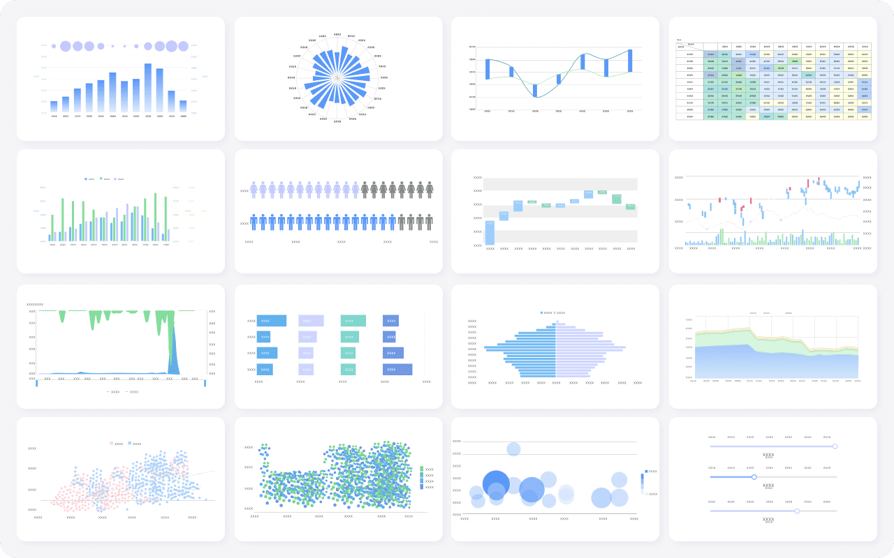
You want your report design to grab attention right away. Charts and images can do that for you. When you add a chart to your report cover, you show readers that your data matters. A simple bar graph or pie chart can highlight key results. Images, like icons or photos, help set the mood and make your report design feel more inviting.
FineReport makes it easy to add dynamic charts and images to your report design. You can use visuals to show trends, highlight achievements, or explain complicated ideas. When you choose the right visuals, you make your report cover stand out in any meeting.
You need to find the right mix between text and graphics in your report design. Too many visuals can overwhelm your reader. Too much text can make your report cover look boring. The best report design uses both in harmony.
| Guideline | Description |
|---|---|
| Define the purpose and audience | Know your message and who will read it. Pick colors, fonts, and images that fit. |
| Focus on robust visuals | Add strong visuals that match your theme but don’t crowd the page. |
| Choose clean typography | Use clear fonts and keep the number of fonts low. |
| Create a harmonious color palette | Select colors that match your brand and set the right mood. |
| Keep things balanced | Arrange text and graphics for a professional, appealing look. |
Tip: Always step back and look at your report design as a whole. If something feels crowded or confusing, simplify it. A balanced report cover helps your audience focus on your message and makes your work look polished.

When you pick a finish for your report cover, you set the tone for your entire report design. Matte and glossy finishes each bring something unique to the table. Matte covers give you a soft, elegant look that feels sophisticated and professional. They don’t reflect light, so your report design stays easy to read, even under bright lights. Glossy covers, on the other hand, shine with vibrant colors and a polished surface. They make images pop and grab attention right away.
Here’s a quick comparison to help you decide:
| Feature | Matte Finish | Glossy Finish |
|---|---|---|
| Appearance | Subdued, non-reflective, elegant | Bright, shiny, colors stand out |
| Durability | Resists fingerprints, but can wear over time | Moisture-resistant, shows fingerprints |
| Readability | Excellent for text-heavy report design | Can create glare, harder to read small text |
| Ideal Use | Formal reports, business cards, menus | Visual-heavy reports, promotional materials |
If your report design focuses on data, charts, or lots of text, matte might be your best choice. You get clear readability and a refined feel. If you want your report design to stand out with bold visuals, glossy covers can make your graphics look stunning.
How your report cover feels can change the way people see your work. When you hand someone a FanRuan report with a premium finish, you give them more than just information—you give them an experience. Soft touch lamination or special inks can make your report design feel luxurious and memorable. People often keep and remember reports that feel good in their hands.
A great tactile impression can boost the perceived value of your report design. Recipients are more likely to engage with and remember your work. This small detail can lead to higher response rates and better results in meetings or presentations. When you choose the right texture and finish, you show your audience that you care about every aspect of your report design, from the data inside to the way it feels on the outside.
When you finish your report design, you want it to stay secure and look sharp. The way you bind your report can make a big difference. You have several options to choose from, each with its own benefits.
You can also pick from different cover sheets. Clear matte gloss, thick vinyl, and clear poly covers all offer durability and style. Linen weave and embossed sturdy grain covers add texture and a professional feel. Poly leather and poly sand covers give your report design a premium look. If you want something unique, GBC designer covers stand out with bold patterns.
Tip: Choose a binding and closure that matches your report design and the way your audience will use it.
You can take your report design to the next level by adding extra features. These small touches help your report stand out and make it easier to use.
Here’s a quick table to show how these features enhance your report design:
| Feature | Description |
|---|---|
| Material Quality | High-quality materials keep your report design durable and professional. |
| Professional Appearance | Sleek designs make a strong first impression. |
| Customization Options | Logos and colors personalize your report design. |
| Practical Applications | Easy organization and protection for business documents. |
When you deliver a FineReport document, these features help you look organized and professional. Your report design becomes more than just a cover—it becomes a tool for success.
You now have seven expert tips to help you create a standout report cover page. When you choose a color scheme, add texture, align your report design with content, and include a clear message, your annual report or any business document will shine. Remember to know your audience, follow brand standards, and use subtle add-ons for extra flair. Apply these report design strategies to every project. Want more inspiration? Discover how FanRuan and FineReport can elevate your next report design.
Click the banner below to try FineReport for free and empower your enterprise to transform data into productivity!
How to Find Investment Analyst Reports Online

The Author
Lewis
Senior Data Analyst at FanRuan
Related Articles

10 Custom Reporting Dashboard Tools Compared: Features, Limits, and Best-Fit Use Cases
Compare 10 custom reporting dashboard tools on features, limits, and best-fit use cases.
Lewis Chou
May 03, 2026

10 Best Dashboard Reporting Tools for 2026 Compared: Power BI, Tableau, Looker Studio, and More
Dashboard reporting tools are software platforms that turn business data into interactive dashboards, scheduled reports, and decision ready insights.
Lewis Chou
Apr 27, 2026
How to create an HTML report from scratch in 2026
Build an html report from scratch in 2026 with easy steps, tools, and tips for customization, sharing, and making your data clear and interactive.
Lewis Chou
Mar 23, 2026


