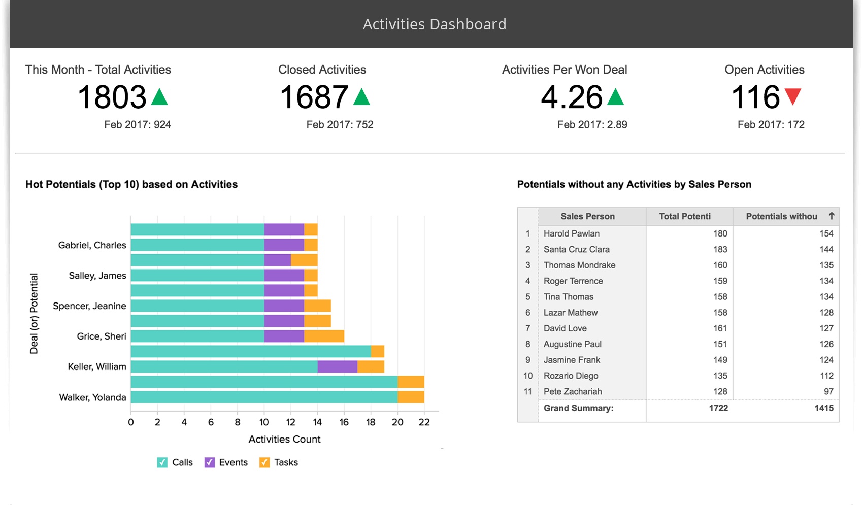
If you want to boost business growth with data-driven decisions, you need the best dashboard software. Here are the top 10 picks for 2025:
Each dashboard software on this list offers something unique—some focus on interactive dashboards and self-service analytics, while others deliver real-time data visualization or cloud-based analytics. You’ll find tools for kpi tracking, real-time dashboards, and cloud-based solutions. Most of these business intelligence tools give you real-time visibility into performance, making data analytics and reporting simple and actionable.
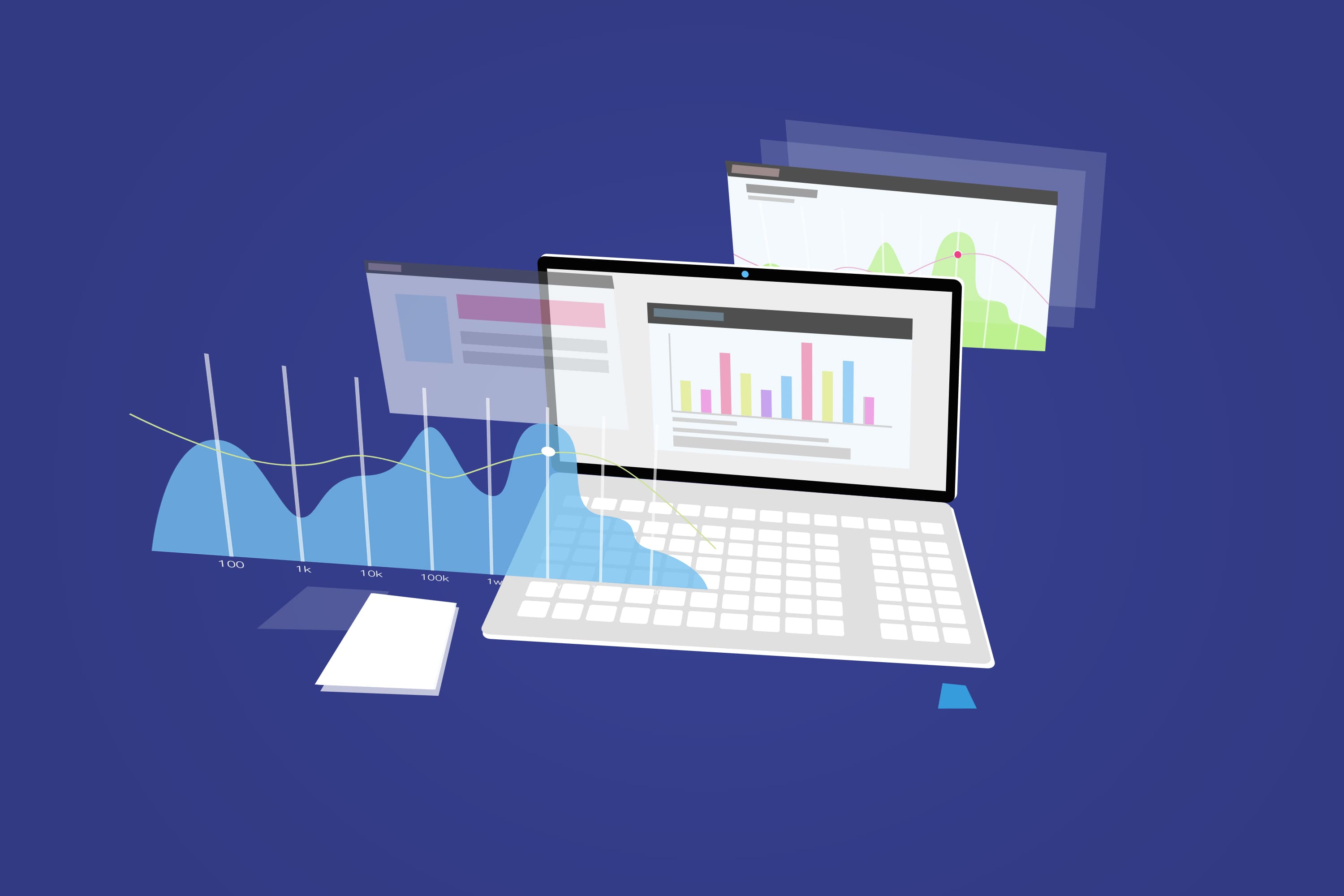
Dashboard software helps you turn raw data into interactive insights. You can use real-time analytics, data visualization tools, and data dashboard software to spot trends and make smarter choices. Teams get clarity, confidence, and better resource allocation. With interactive features and real-time dashboards, you can stay ahead of the curve and keep your business data-driven.
When you start looking for dashboard software, you want something that fits your business needs. You should check how well the software handles large datasets and if it gives you real-time analytics. Fast performance means you get real-time visibility into performance, which helps you make quick decisions. Good customer support matters, too. If you run into problems, you want help right away. User reviews can show you what other people like or dislike about the software. Cost is another big factor. You need to think about both the price and the long-term value. Here’s a quick table to help you compare:
| Criteria | Description |
|---|---|
| Performance | Handles big data and supports real-time analytics for fast decision-making. |
| Customer Support | Solves issues quickly and keeps your business running smoothly. |
| User Reviews | Shares real-world experiences and highlights strengths and weaknesses. |
| Cost | Looks at upfront price and long-term savings from better efficiency and scalability. |
Tip: Always match the dashboard software features to your business goals. You want tools that grow with you.
You have lots of choices for dashboard software. Each tool brings something special to the table. Some focus on interactive dashboards, while others offer cloud-based solutions or advanced data visualization tools. Here’s a quick look at what makes each one stand out:
| Dashboard Software | Unique Selling Points |
|---|---|
| FineReport by FanRuan | Flexible platform, pixel-perfect reporting, interactive visualization, 3D dashboards, mobile access. |
| Tableau | Drag-and-drop interface, powerful analytics, deep data exploration, custom visualization. |
| Microsoft Power BI | Easy integration with Microsoft products, cost-effective, real-time analytics, strong reporting. |
| Google Looker | Advanced analytics, flexible dashboards, custom data modeling. |
| Qlik Sense | Strong ETL capabilities, interactive dashboards, custom reports, automated workflows. |
| Domo | Real-time dashboards, easy data sharing across the organization. |
| Sisense | Embeds analytics into apps and dashboards, customizable data experience. |
| Zoho Analytics | AI assistant, pre-built connectors, collaboration, data blending, embedded analytics. |
| FineBI | Self-service analytics, interactive dashboards, real-time analytics, enterprise-grade governance. |
You’ll find that the best dashboard software gives you interactive features, self-service options, and cloud-based access. These business intelligence tools help you turn data into action. With data dashboard software, you get real-time analytics and data visualization tools that make your work easier.
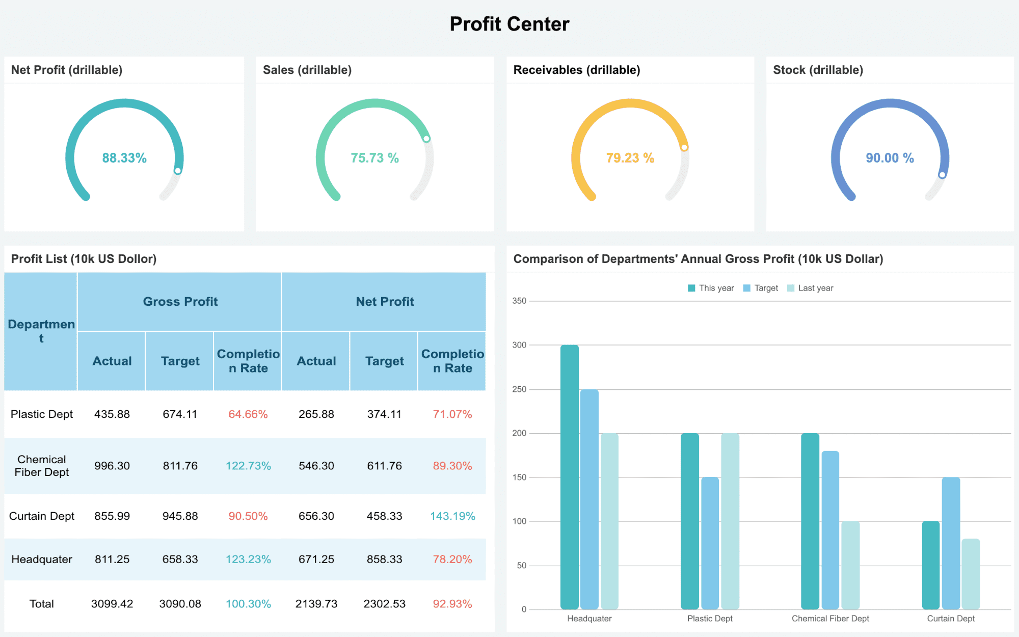
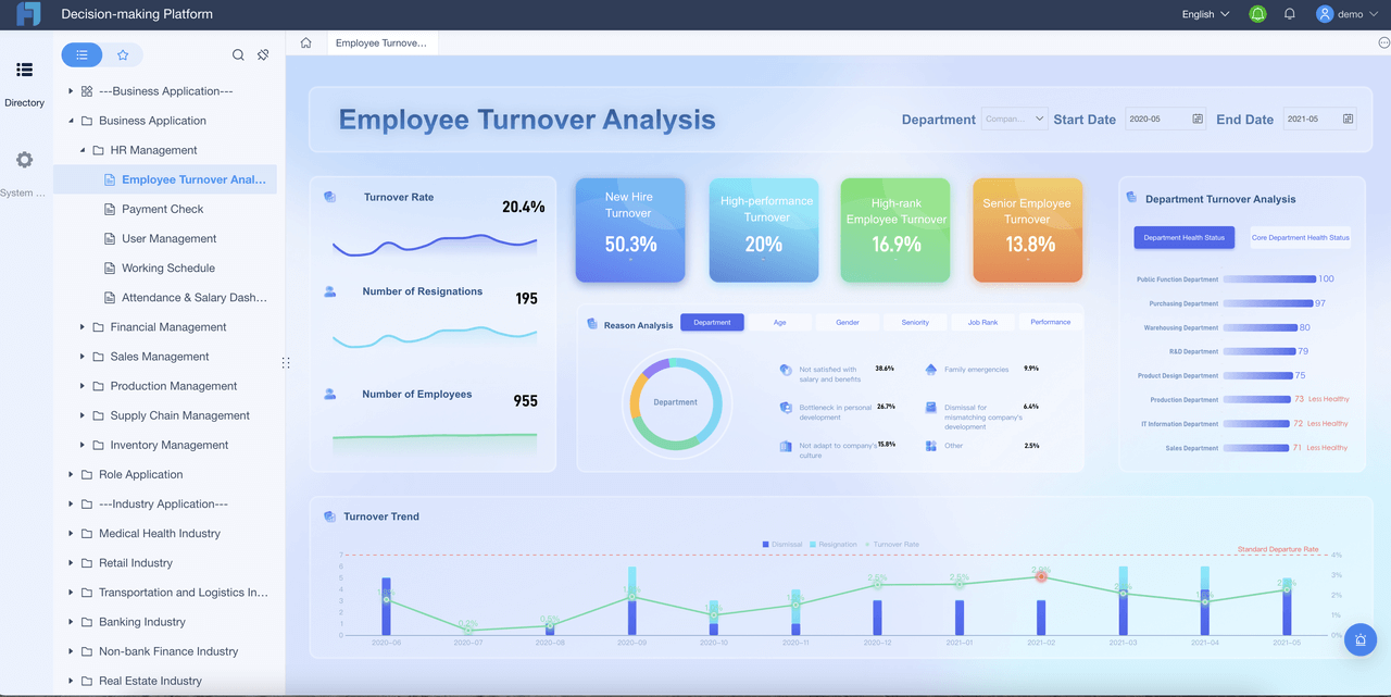
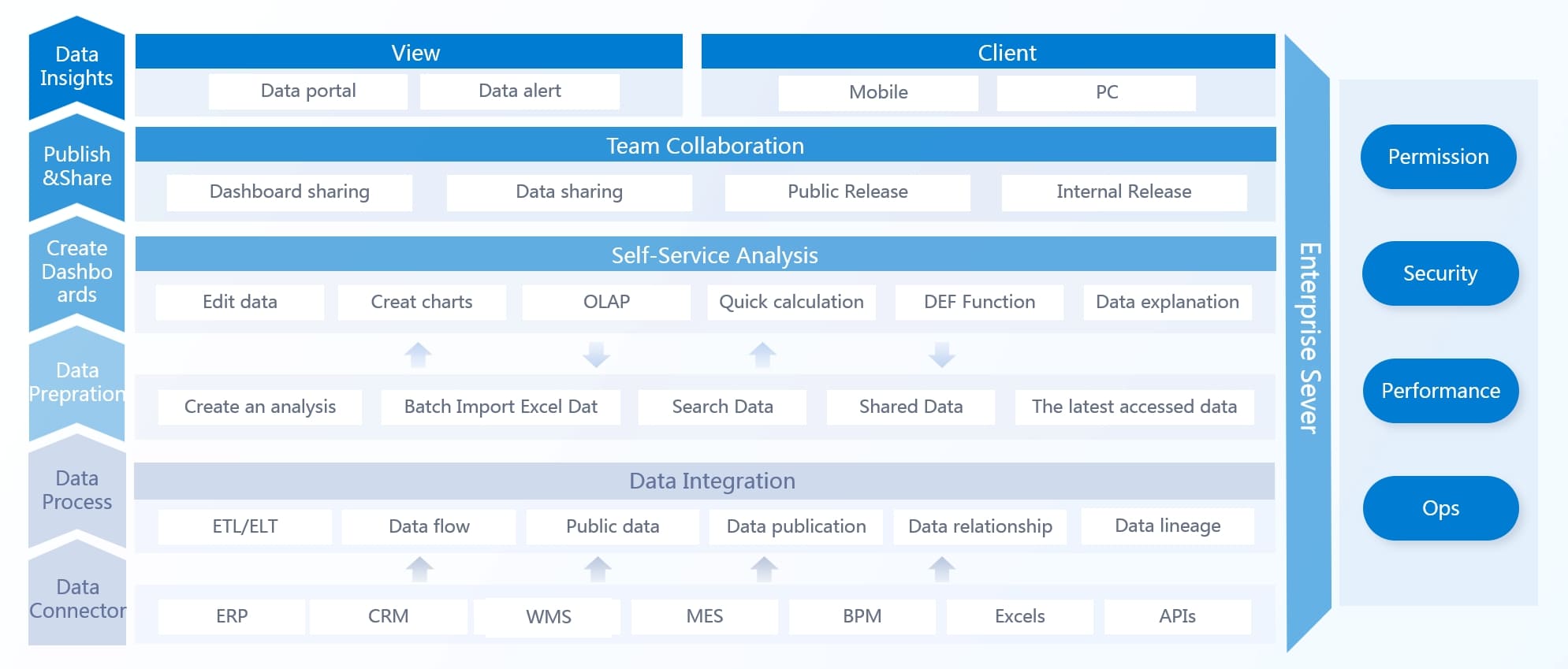
If you want dashboard software that makes data analysis easy, FineBI stands out. You get a folder-based system to organize your data by business topics. Admins can model data using relationships in your data warehouse, which helps you link different tables with composite keys. You can spot data issues quickly with user-focused visualization tools. FineBI lets you work with your team using three collaboration modes: Collaboration, Data Sharing, and Dashboard Sharing. You can clean up messy data with low-code tools, so you spend less time fixing problems. The dashboard function lets you merge analytics and create unified reports to track key business indicators. FineBI uses advanced columnar storage and compression to save space and speed up your work. Its cluster design keeps your data available, even if something goes wrong.
Website: https://www.fanruan.com/en/finebi
Tip: FineBI’s interactive dashboards help you see trends and make decisions faster.
| Feature | Description |
|---|---|
| Data Management | Organize data by business package subjects. |
| Data Modeling | Model data with composite primary key linkage. |
| Data Visualization | Spot issues with user-centric analysis. |
| Collaboration | Three modes for teamwork and sharing. |
| Data Development | Cleanse data with low-code tools. |
| Dashboard Function | Merge analytics and generate unified reports. |
| Advanced Storage | Save space and speed up work with columnar storage and compression. |
| Robustness | Cluster design keeps data available. |
You don’t need to be a tech expert to use FineBI. The dashboard software gives you a drag-and-drop interface, so you can build interactive dashboards without coding. You get real-time analytics, which means you see updates instantly. FineBI supports over 60 data sources, including cloud-based platforms. You can set up alerts for important metrics and share dashboards with your team. FineBI’s role-based access control keeps your data secure. Teams at UnionPay Data Services improved efficiency by 5% and boosted customer value identification to 90% after switching to FineBI. You can expect faster insights and better teamwork.

FineBI offers flexible pricing based on your business size and needs. You can start with a free trial to test the dashboard software. Paid plans scale up for larger teams and enterprise requirements. You get options for cloud-based deployment or on-premises installation. For details, visit the official FineBI website.

FineBI works well for companies that want interactive dashboards and self-service analytics. You can use it in finance, manufacturing, retail, or logistics. If you need to track KPIs, analyze sales, or manage operations, FineBI fits your needs. UnionPay Data Services used FineBI to unify data and improve marketing. You can use FineBI to empower business users, reduce IT bottlenecks, and make smarter decisions with dashboard software.
You want dashboard software that makes data easy to see and understand. Tableau gives you a classic drag-and-drop interface, so you can build interactive dashboards without much effort. You get a huge chart library with more than 20 types, from simple bar charts to advanced maps. Tableau’s visualization engine helps you turn raw data into stories that everyone can follow. You can connect to over 75 data sources, including spreadsheets and cloud services. The in-memory engine lets you work with millions of rows quickly. Tableau also brings AI features, like smart recommendations and automated insights, to help you explore data faster.
Website: https://www.tableau.com/
| Feature | Description |
|---|---|
| Data Visualization | Visual analytics with polished charts and new AI features. |
| User Interface | Drag-and-drop dashboard building. |
| AI Integration | Smarter recommendations and automated insights. |
| Flexibility | Adaptable for many workflows. |
| Extensive Chart Library | 20+ visualization types. |
| Customization Options | Control every visual detail. |
| Interactive Dashboards | Click-through and filtering features. |
| Data Source Connectivity | Connects to 75+ sources. |
| In-memory Engine | Handles millions of rows. |
| Community Support | Active forums and free learning resources. |
Tableau stands out for its interactive dashboards and strong data visualization. You get a flexible dashboard software that adapts to your needs. The active user community helps you learn quickly and solve problems. You can customize almost every part of your dashboard. On the downside, some users say Tableau has a steep learning curve for beginners. Advanced features may take time to master. You might need extra training if you want to use all the tools.
Tip: If you want dashboard software with powerful interactive features and a big support community, Tableau is a top choice.
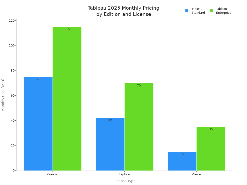
Tableau offers different pricing plans based on your role and business needs. You can choose between Standard and Enterprise editions. The Creator license costs $75 per user per month for Standard and $115 for Enterprise. Explorer and Viewer licenses are cheaper, starting at $42 and $15 per user per month. Enterprise plans offer more features and support. You can also find bundles for larger teams.
| Edition | License Type | Monthly Cost (per user) | Additional License Cost (per user) |
|---|---|---|---|
| Tableau Standard | Creator | $75 | $15 |
| Explorer | $42 | N/A | |
| Viewer | $15 | N/A | |
| Tableau Enterprise | Creator | $115 | $35 |
| Explorer | $70 | N/A | |
| Viewer | $35 | N/A | |
| Tableau+ Bundle | Creator | Contact Sales | N/A |
You can use Tableau dashboard software in many business scenarios. If you want to unlock deeper customer insights, Tableau helps you combine data from different departments. You can boost product quality by tracking machine data and spotting problems early. Supply chain teams use Tableau for end-to-end visibility and predictive tracking. Cybersecurity teams rely on Tableau to connect security data, detect threats, and respond faster. Tableau fits companies that need interactive dashboards, real-time analytics, and flexible reporting.
| Use Case | Description |
|---|---|
| Unlock Deeper Customer Insights | Unified view of customer behavior and preferences. |
| Boost Product Quality | Monitor performance and spot anomalies. |
| Accelerate Supply Chain Operations | Track KPIs and predict outcomes. |
| Enhance Cybersecurity | Holistic visibility and faster incident response. |
You want dashboard software that feels familiar and easy to use. Power BI gives you that comfort, especially if you already use Microsoft products like Excel or Teams. You can connect data from hundreds of sources with Power Query. This dashboard software lets you build interactive dashboards quickly, so you see your data come alive. You get strong security features, including data loss prevention and Microsoft information protection. Power BI also works great on mobile devices, so you can check your dashboards anywhere.
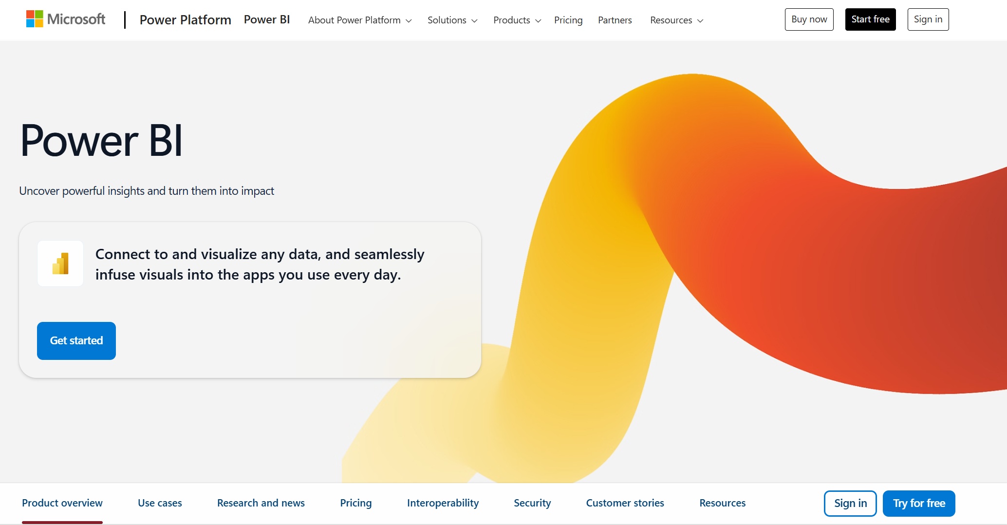
Website: https://www.microsoft.com/en-us/power-platform/products/power-bi
Here are some features that make Power BI stand out:
Tip: If you want interactive dashboards that work well with your existing Microsoft tools, Power BI is a smart pick.
You get a lot of value from Power BI. The dashboard software is easy to learn if you know Excel. You can create interactive dashboards with drag-and-drop tools. The cost is lower than many competitors, so you save money. You also get strong security and mobile access. Some users say the interface can feel crowded, and advanced features may take time to master. You might need extra training for complex analytics.
Power BI keeps things simple. You pay $14 per user each month for the Pro plan. The Premium Per User plan costs $24 per user each month. These plans give you bigger data models and advanced AI features. The free plan is still available for basic needs.
| Plan Type | Old Price (2025) | New Price (2025) | Percentage Increase |
|---|---|---|---|
| Power BI Pro | $10 | $14 | 40% |
| Power BI Premium Per User | $20 | $24 | 20% |
You can use Power BI dashboard software in many business scenarios. If you work alone, Personal BI gives you a private workspace. Team BI helps you share dashboards with coworkers using Teams. Departmental BI lets you distribute dashboards to a whole department. Enterprise BI is perfect for large companies that need to share dashboards with many users.
| Scenario | Description |
|---|---|
| Personal BI | Focuses on individual usage with a personal workspace for content creation. |
| Team BI | Emphasizes informal collaboration among team members using shared workspaces and Microsoft Teams. |
| Departmental BI | Aims at distributing content to a larger audience within a department using Power BI apps. |
| Enterprise BI | Concentrates on large-scale content distribution using Premium capacity for read-only consumers. |
You get dashboard software that grows with your business. Power BI makes it easy to build interactive dashboards for any team or department. You can track sales, monitor operations, or share insights across your company.
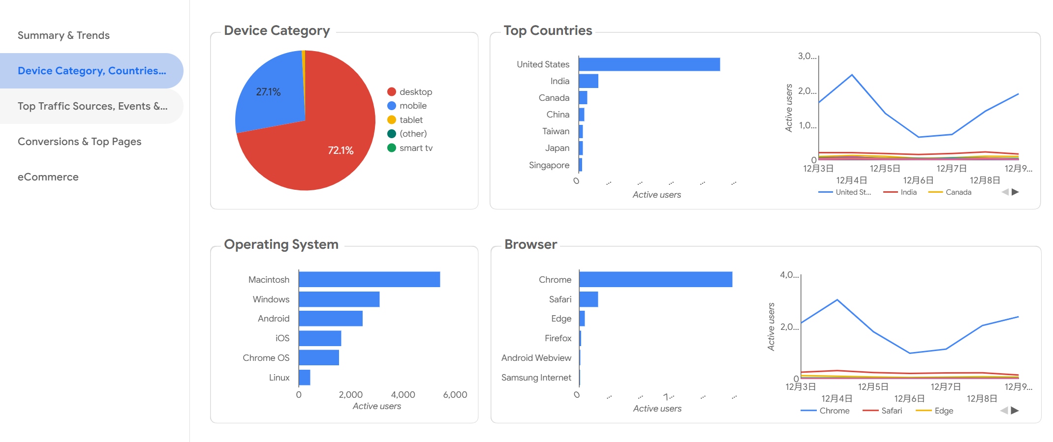
You want dashboard software that feels modern and easy to use. Google Looker gives you a unified experience by combining Looker and Looker Studio in one platform. You can manage data governance, so your data stays secure and accurate. Looker sends queries straight to your data warehouse, which means you get fast performance and scalability. You can use APIs and embedded features to connect Looker with other tools. If you like digging deep into your data, Looker’s data drilling lets you investigate trends and find root causes. The visualization interface is user-friendly, so you can build interactive dashboards without much effort.

Website: https://lookerstudio.google.com/navigation/reporting
| Feature | Description |
|---|---|
| Unified Experience | Access Looker and Looker Studio in one place for seamless workflow. |
| Data Governance | Keep your data safe and accurate with strong governance tools. |
| Performance & Scalability | Queries go straight to your data warehouse for speed and growth. |
| Advanced Extensibility | Use APIs and embedded features to connect with other apps. |
| Data Drilling | Dive deep into your data for detailed analysis. |
| User-Friendly Visualization | Build interactive dashboards easily with a flexible interface. |
Tip: If you want dashboard software that grows with your business, Looker’s scalability and extensibility make it a smart choice.
You get a lot of flexibility with Looker dashboard software. The platform supports interactive dashboards and lets you customize almost everything. You can connect to many data sources and use advanced analytics. The user interface is simple, so you don’t need much training. Some users say the pricing can be high for small teams. You might need technical help for complex integrations.
Google Looker uses a custom pricing model. The cost depends on how many users you have, how much data you process, and the size of your deployment. Pricing starts at about $35,000 per year for the Standard Edition. If you need more features or want to embed dashboards, the price can go over $150,000 per year. You should talk to Google for a quote that fits your business.
You can use Looker dashboard software for many business needs. If you work in marketing, you can track audience trends and traffic sources. SEO specialists use Looker to compare branded and non-branded KPIs. Content marketers check top query lists. Email marketing teams monitor key performance indicators and campaign conversion funnels. Looker connects with Google My Business, Google Search Console, and Mailchimp, so you get data from all your favorite platforms.
| Use Case | Ideal For | Data Sources |
|---|---|---|
| Audience trends | Local SEO Specialists | Google My Business |
| Traffic source breakdown | Small Business Owners | Google My Business |
| Geographic analysis | Marketing Managers | Google My Business |
| Branded vs. non-branded KPIs | SEO Specialists | Google Search Console |
| Top query lists | Content Marketers | Google Search Console |
| Key performance indicators | Email Marketing Specialists | Mailchimp |
| Campaign conversion funnel | Digital Marketing Managers | Mailchimp |
You can build interactive dashboards for any department. Looker dashboard software helps you turn data into action, so your team makes smarter choices every day.
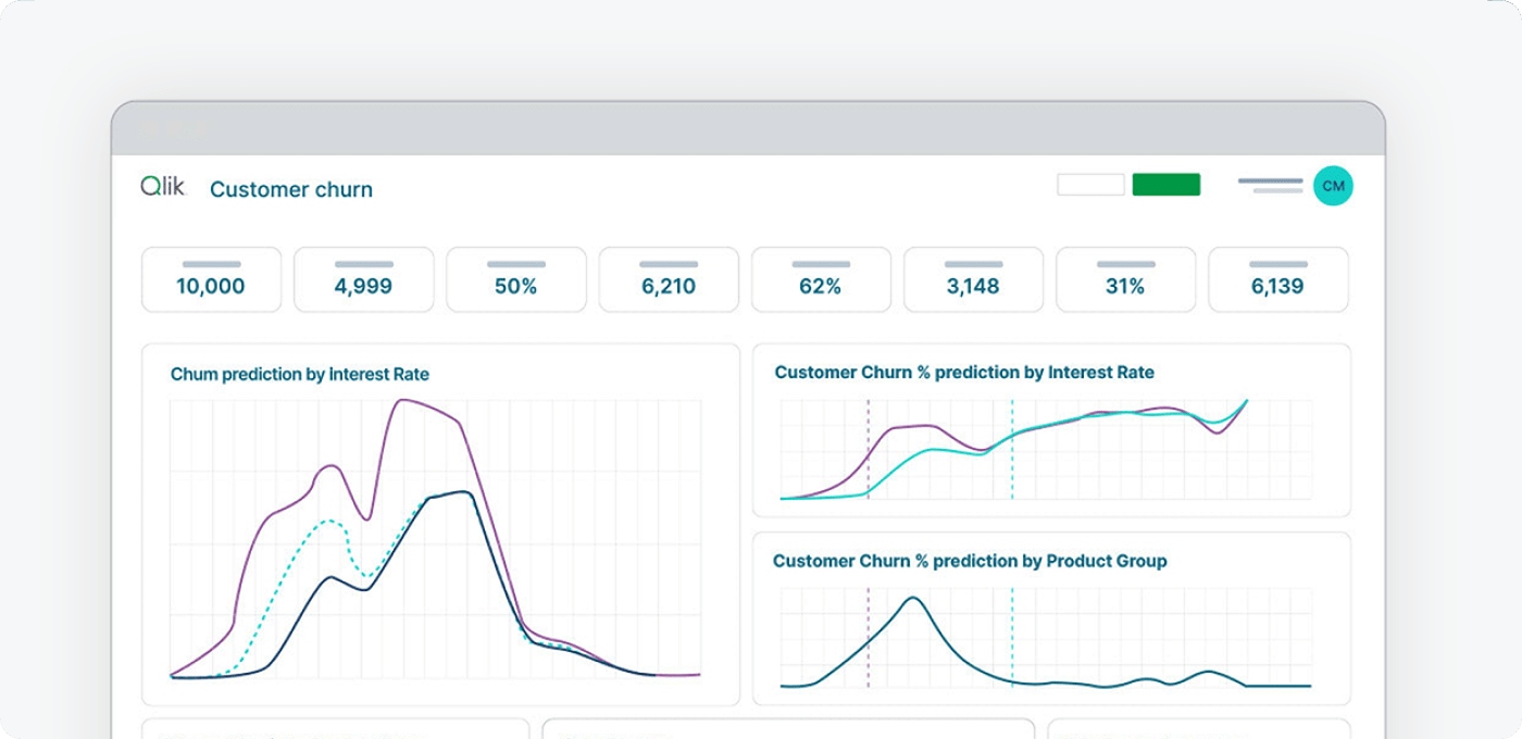
If you want dashboard software that gives you freedom to explore your data, Qlik Sense is a strong choice. You can dig into your numbers without getting stuck in rigid queries. Qlik Sense uses an associative data model, so you can jump from one idea to another and spot hidden connections. You get self-service analytics, which means you can build your own reports and dashboards without waiting for IT. This dashboard software also brings teams together with collaboration tools. You can share insights and work on projects as a group. Qlik Sense uses AI to help you find trends and patterns faster. The responsive design means your dashboards look great on any device, even your phone.
Website: https://www.qlik.com/us/products/qlik-sense
Here’s a quick look at what you get:
| Feature | Description |
|---|---|
| Associative Data Model | Explore data freely and make new discoveries without limits. |
| Self-Service Analytics | Create your own dashboards and reports for true independence. |
| Collaboration Tools | Share findings and work together with your team. |
| AI Integration | Use artificial intelligence to uncover insights quickly. |
| Responsive Design | Access dashboards on your laptop, tablet, or phone with ease. |
Tip: Qlik Sense helps you build interactive dashboards that make your data come alive.
You’ll like how Qlik Sense lets you create interactive dashboards with just a few clicks. The dashboard software feels flexible and modern. You can connect to many data sources and use AI to speed up your analysis. Teams can work together and share results easily. Some users say the learning curve can be steep at first. You might need some time to get used to all the features, but once you do, you’ll move fast.
Qlik Sense offers a few options, so you can pick what fits your needs. You can start with the free Basic plan if you just want to try things out. The Business plan costs $30 per user each month and works well for small teams. If you run a big company, you can ask Qlik for an Enterprise plan with more storage and features.
| Plan Type | Price | Best For |
|---|---|---|
| Qlik Sense Basic | Free | Getting started and basic exploration |
| Qlik Sense Business | $30/user per month | Small teams with limited data requirements |
| Qlik Sense Enterprise | Contact Qlik | Large organizations with big data needs |
You can use Qlik Sense dashboard software in many industries. Hospitals use it to analyze patient data and improve care. Banks rely on it for risk management and forecasting. Retailers track sales and manage inventory. Manufacturers boost production efficiency and optimize supply chains.
| Industry | Business Scenario |
|---|---|
| Healthcare | Analyzing patient data and improving care delivery |
| Finance | Risk management and financial forecasting |
| Retail | Sales performance tracking and inventory management |
| Manufacturing | Production efficiency and supply chain optimization |
If you want dashboard software that grows with your business and helps you build interactive dashboards, Qlik Sense is worth a look.
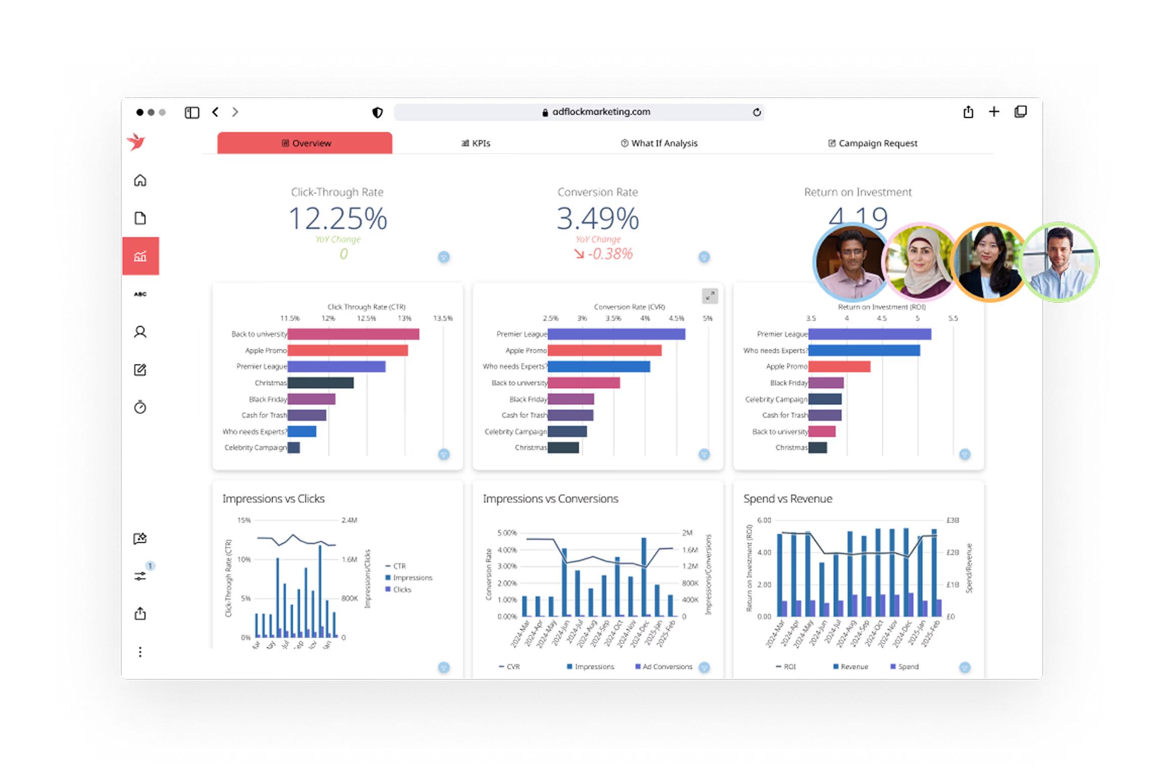
If you want dashboard software that feels modern and powerful, Domo gives you a lot to work with. You get built-in analytics, a huge library of customizable data visualizations, and over 1,000 pre-built data connectors. You can pull data from almost any system, making it easy to centralize information for your team. Domo’s user-friendly design means you don’t need to be a tech expert to build interactive dashboards. You can tailor security settings and manage data access, so your business stays safe. The platform makes data visualization simple, helping you spot trends and make decisions quickly.
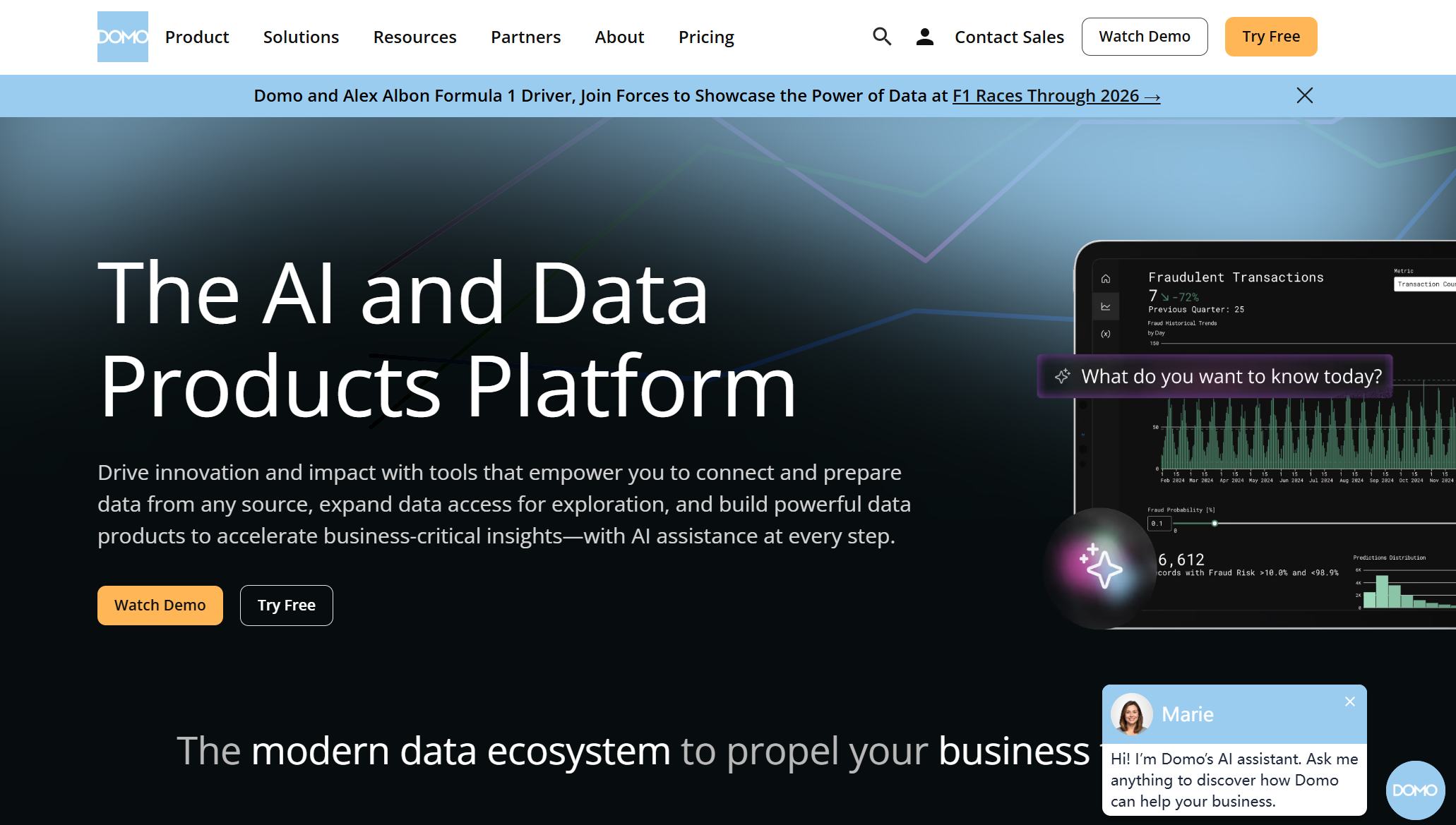
Website: https://www.domo.com/
| Key Features | Description |
|---|---|
| Built-in analytics | Integrated tools for data insights. |
| Customizable visualizations | Many formats to represent your data. |
| Data sources and plugins | Connects to multiple systems for better visibility. |
| Data security and management | Lets you adjust security and data controls. |
| Intuitive design | Easy for everyone to use. |
| Robust visualization tools | Helps you make sense of complex data. |
| 1,000+ data connectors | Connects to almost any data source. |
Tip: Domo’s dashboard software helps you create interactive dashboards that everyone in your company can use.
You’ll find Domo easy to use, even if you’re new to dashboard software. The platform supports a wide range of data sources and offers interactive features for exploring your data. You can customize dashboards to fit your business needs. Domo works well for teams that want to collaborate and share insights. On the flip side, the cost can be high for small businesses, especially if you process a lot of data or need frequent updates.
Domo uses a consumption-based pricing model. You buy credits, and these get used up depending on how much data you process and how often you update dashboards. The average annual cost is about $134,000, but your price depends on usage. Base user fees start at $750 per year. Domo doesn’t publish detailed rates, so you’ll need to contact sales for an estimate. There’s a free 30-day trial, so you can test the dashboard software before you commit.
Domo dashboard software fits companies that want to centralize data and make it accessible for everyone. You can use it for real-time analytics, so you always know how your business is performing. Teams use Domo for collaboration, sharing insights between executives, analysts, and operations. The platform is designed for non-technical users, so anyone can build interactive dashboards and understand the data.
| Use Case | Description |
|---|---|
| Data Integration | Centralizes data from multiple systems for easy access. |
| Real-time Analytics | Gives you instant visibility into performance metrics. |
| Collaboration | Helps teams share insights and work together. |
| Accessibility for Non-technical Users | Makes data easy to understand for everyone. |
If you want dashboard software that brings your team together and helps you make smarter decisions, Domo is a strong choice.
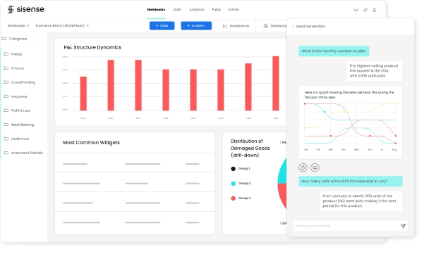
You want dashboard software that goes beyond basic reporting. Sisense gives you a toolkit for building interactive dashboards and embedding analytics right into your apps. You can use AI and machine learning to predict trends and make smarter choices. Sisense lets you see real-time metrics, so you always know what’s happening in your business. You get strong data integration and preparation tools, which help you clean and organize your data before you start analyzing. Security and scalability come built-in, so you can trust your data and grow your system as your business expands.

Website: https://www.sisense.com/
Here’s a quick look at what sets Sisense apart:
| Feature | Description |
|---|---|
| Embedded Analytics | Add analytics to your SaaS products or customer-facing apps. |
| AI and Machine Learning | Use predictive analytics and forecasting to stay ahead. |
| Real-time Dashboards | Monitor KPIs and metrics as they happen. |
| Data Integration | Connect and prepare data from many sources. |
| Security & Governance | Protect your data and control access. |
| Scalability | Handle growth without slowing down. |
Tip: Sisense helps you create interactive dashboards that fit your business needs.
Sisense dashboard software gives you flexibility. You can embed analytics in your own products or use it for internal reporting. The platform supports interactive features, so you can explore data and spot trends quickly. You get strong AI tools for forecasting and analysis. Some users say the price can be high, especially for larger teams. You may need technical help to set up advanced integrations.
Sisense offers different pricing options based on how you deploy the dashboard software. If you want a self-hosted setup, you start around $10,000 per year for five users. Cloud-hosted plans begin near $21,000 annually for five users. Enterprise customers often pay between $25,000 and $70,000 per year, depending on their needs. You pay more if you want unlimited viewer access or OEM rights. Creators pay about $1,200 per user each year, while viewers pay $240 per user each year.
| Deployment Type | Entry Price | Enterprise Reality |
|---|---|---|
| Self-Hosted | $10,000/year (5 users) | $70,000+ (40 users) |
| Cloud | $21,000/year (5 users) | $167,000+ |
| OEM Rights | $60,000+/year | Unlimited viewer access |
Sisense dashboard software works well for many business scenarios. You can use it to embed analytics in SaaS products, giving your customers interactive dashboards inside your apps. Supply chain and logistics teams use Sisense for real-time monitoring and route efficiency. Healthcare and pharma companies rely on Sisense for patient care and resource management. Retailers and e-commerce businesses use it for personalized recommendations and inventory control. Technology companies use Sisense to innovate and understand user behavior.
Sisense dashboard software helps you turn data into action, no matter your industry.
You want dashboard software that makes your life easier. Zoho Analytics gives you a drag-and-drop builder, so you can create reports without much effort. You get more than 50 visualization options, including charts, widgets, and AI-powered recommendations. The platform lets you blend data from over 100 business apps, making it simple to unify information from different sources. You can build data pipelines for integration, cleansing, and transformation. Geo-visualization helps you analyze data on interactive maps. You can combine multiple reports into beautiful dashboards with images and widgets. Zoho Analytics also offers dynamic features like tooltips and contextual filters for exploratory analysis. Sharing and collaboration are easy, and you can set fine-grained access controls for your team.
Website: https://www.zoho.com/analytics/
| Feature | Description |
|---|---|
| Usability | Easy drag and drop filters and drill down options for quick report creation. |
| Visualization Options | 50+ options including charts, widgets, and AI recommendations for visualizations. |
| Drag-and-drop Builder | Intuitive interface for creating and customizing reports. |
| Beautiful Dashboards | Combine multiple reports into tabbed dashboards with images and widgets. |
| Geo-visualization | Analyze geographical data with interactive map charts. |
| Dynamic & Interactive | Features like tooltips and contextual filters for exploratory analysis. |
| Data Engineering Agent | Build data pipelines with integration, cleansing, and transformation. |
| Data Analysis Agent | Create reports through conversations, gaining insights from trends and predictions. |
| Easy Connectors | Connect to 100+ business apps for data unification. |
| Prebuilt Analytics | Access hundreds of domain-specific pre-built metrics and dashboards. |
| Smart Data Blending | Blend data from multiple sources for comprehensive insights. |
| Sharing and Collaboration | Share reports and collaborate with colleagues easily. |
| Fine-grained Access Control | Set user roles, groups, and permissions for data access. |
| Accessible Across Devices | Access dashboards from PCs, tablets, and mobile devices. |
| Export and Email Dashboards | Schedule automatic emails of dashboards and export for offline access. |
Zoho Analytics dashboard software stands out for its usability. You can build interactive dashboards quickly, even if you’re new to analytics. The platform supports a wide range of visualization options and makes data blending simple. You get easy access from any device, so you can check your dashboards on the go. Some users say advanced features may take time to master. You might need a little practice to use all the data engineering tools.
Tip: Zoho Analytics helps you create interactive dashboards that make your data easy to understand.
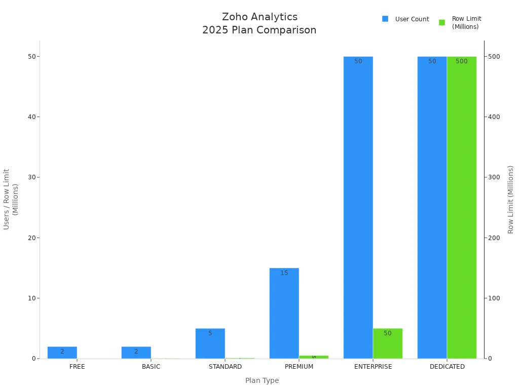
Zoho Analytics dashboard software offers flexible plans for every business size. You can start with the free plan for up to 2 users and 10,000 rows. Paid plans scale up with more users and data rows. You save 20% if you choose yearly billing. The Dedicated plan gives you custom options for large organizations.
| Plan Type | Users | Rows | Monthly/Yearly Options | Discounts |
|---|---|---|---|---|
| BASIC | Starts at 2 | 0.5 Million Rows | Monthly/Yearly | Save 20% on Yearly |
| STANDARD | Starts at 5 | 1 Million Rows | Monthly/Yearly | Save 20% on Yearly |
| PREMIUM | Starts at 15 | 5 Million Rows | Monthly/Yearly | Save 20% on Yearly |
| ENTERPRISE | Starts at 50 | 50 Million Rows | Monthly/Yearly | Save 20% on Yearly |
| DEDICATED | Starts at 50 | 500 Million Rows | Customized Plans | Get Quote |
| FREE | 2 Users | 10K Rows | Free | N/A |
You can use Zoho Analytics dashboard software for many business needs. Here are some popular scenarios:
Zoho Analytics helps you track KPIs, blend data, and share interactive dashboards with your team. You get a flexible dashboard software that grows with your business.
IBM Cognos Analytics gives you a powerful dashboard software that helps you see your business data in new ways. You can connect to many data sources and pull everything together in one place. The platform lets you build interactive dashboards with drag-and-drop tools. You can use AI-powered features to get smart suggestions and automate your reports. Cognos Analytics supports advanced visualizations, so you can create charts, graphs, and maps that make your data easy to understand. You also get strong data governance and security controls, which keep your information safe.
Website: https://www.ibm.com/us-en
Tip: You can use Cognos Analytics to create interactive dashboards that show real-time updates and trends.
You will find that Cognos Analytics dashboard software works well for both small teams and large organizations. The platform gives you interactive features that help you explore data quickly. You can customize dashboards to fit your needs. The AI assistant helps you find insights without much effort. On the downside, some users say the interface feels complex at first. You might need some training to use all the advanced features. The setup process can take time if you have a lot of data sources.
IBM Cognos Analytics offers flexible pricing for different business sizes. You can start with a free trial to test the dashboard software. The Standard plan starts at $10 per user each month. The Premium plan gives you more features and costs about $40 per user each month. Enterprise pricing is available for larger deployments. You can choose cloud or on-premises options. For exact pricing, you should contact IBM sales.
| Plan | Monthly Cost (per user) | Features |
|---|---|---|
| Standard | $10 | Basic dashboard software |
| Premium | $40 | Advanced analytics |
| Enterprise | Custom | Full enterprise support |
You can use Cognos Analytics dashboard software in many industries. Retailers use it to track sales and inventory. Finance teams analyze budgets and forecasts. Healthcare organizations monitor patient data and outcomes. Manufacturing companies watch production metrics and quality. If you want interactive dashboards that help you make better decisions, Cognos Analytics fits your needs. The platform works for reporting, KPI tracking, and real-time analytics.
If you want dashboard software that gives you total control over your reports, FineReport is a great choice. You can create pixel-perfect reports and design custom templates with an Excel-like interface. FineReport connects to almost any data source, so you can pull in information from databases, files, or cloud systems. You get strong data integration, which means you can read and use all your data through server datasets. FineReport supports mobile access, so you can view and operate your dashboards on the go. You can also use FineReport to build fixed analysis reports with multiple graphics, making it easy to track key business indicators.
Website: https://www.fanruan.com/en/finereport
Here’s a quick look at how FineReport and FineBI work together:
| Feature | FineReport | FineBI |
|---|---|---|
| Data Source Integration | Can read and use all data sources via server | Supports direct connection to real-time |
| Report Usage | All reports can be mounted for viewing | N/A |
| Deployment | Integrated deployment recommended | Integrated deployment supported |
| Data Processing | Directly connects to databases, uses SQL | Self-service query platform |
| Big Data Capability | Quick SQL queries for display access | High efficiency for large datasets |
| Table/Chart Creation | C/S designer for custom templates | B/S drag-and-drop analysis |
| Dashboard Management | Fixed analysis reports with graphics | Management cockpit for key indicators |
| Mobile Support | View and operate on mobile | View and analyze data on mobile |
You get a dashboard software that is flexible and powerful. FineReport lets you design reports that fit your business exactly. You can use interactive features to drill down into your data and spot trends. FineReport works well with FineBI, so you can combine fixed reports with interactive dashboards for a complete view. Many companies, like Bifido Foods, use FineReport to connect data from different departments and improve decision-making. You can also share reports easily with your team, making collaboration simple.
Tip: FineReport’s integration with FineBI means you can switch between detailed reports and interactive dashboards without missing a beat.
FineReport offers flexible pricing based on your business needs. You can choose between perpetual licenses or subscription plans. There’s a free trial if you want to test the dashboard software first. Pricing depends on the number of users and deployment options. For exact details, you can visit the official FineReport website.

FineReport fits businesses that need detailed, custom reports and strong data integration. You can use it in manufacturing, retail, finance, or logistics. If you want to track sales, monitor production, or manage operations, FineReport gives you the tools. Companies like Bifido Foods have used FineReport to connect sales, logistics, and product data, making their operations smarter and more visual. You can use FineReport alone or together with FineBI to get both fixed reports and interactive dashboards.


Choosing dashboard software can feel overwhelming. You want to see how each tool stacks up. Here’s a quick table to help you compare the main features side by side:
| Software | Data Sources | Visualization | Collaboration | Real-Time Analytics | Mobile Access | AI Features | Governance |
|---|---|---|---|---|---|---|---|
| FineBI | 60+ | 60+ charts | Yes | Yes | Yes | Yes | Yes |
| Tableau | 75+ | 20+ charts | Yes | Yes | Yes | Yes | Yes |
| Power BI | 100+ | 30+ charts | Yes | Yes | Yes | Yes | Yes |
| Looker | Many | 20+ charts | Yes | Yes | Yes | Yes | Yes |
| Qlik Sense | Many | 20+ charts | Yes | Yes | Yes | Yes | Yes |
| Domo | 1,000+ | Many | Yes | Yes | Yes | Yes | Yes |
| Sisense | Many | Many | Yes | Yes | Yes | Yes | Yes |
| Zoho Analytics | 100+ | 50+ charts | Yes | Yes | Yes | Yes | Yes |
| Cognos | Many | Many | Yes | Yes | Yes | Yes | Yes |
| FineReport | Many | Custom | Yes | Yes | Yes | Yes | Yes |
Tip: You can use this table to spot which dashboard software matches your business needs.
You want dashboard software that fits your budget. Pricing varies a lot. Some tools offer free trials. Others use subscription plans or custom quotes. Here’s a quick look:
Integration matters when you pick dashboard software. You want to connect data from many sources. Scalability helps your business grow. Most dashboard software supports cloud and on-premises options. FineBI and FineReport work well together for unified data management. Domo and Sisense offer strong integration for big data. Zoho Analytics and Power BI make it easy to blend data from apps. You can scale up as your team grows.
You want dashboard software that matches your goals. If you need interactive dashboards for self-service analytics, FineBI is a top choice. Tableau and Power BI work well for deep data exploration. Domo and Sisense fit companies with complex data needs. Zoho Analytics is great for small businesses. FineReport helps you create custom reports. Looker and Qlik Sense offer advanced analytics for tech-driven teams.
Note: Think about your business size, industry, and how much you want to customize your interactive dashboards before you decide.
Picking dashboard software can feel tricky. You want something that fits your business size, industry, and goals. Start by asking yourself a few questions. Do you need interactive dashboards for quick insights? Will your team use self-service tools to explore data? Think about how many people will use the dashboard software. Some tools work better for small teams, while others scale up for big companies. Check if the software supports real-time updates. Fast data means you make data-driven decisions without waiting.
Tip: Always look for dashboard software that grows with your business. You want a solution that handles more data as your company expands.
Every business is different. You might need interactive dashboards for sales, finance, or operations. Make a list of must-have features. Do you need mobile access? Is data security important? Some dashboard software offers strong data governance and role-based controls. Others focus on easy data integration from many sources. Use a table to compare your top choices:
| Feature | Must-Have | Nice-to-Have |
|---|---|---|
| Real-time analytics | ✅ | |
| Mobile access | ✅ | |
| Data integration | ✅ | |
| AI features | ✅ | |
| Collaboration | ✅ |
Ready to get started? Try a free trial before you buy. Test how easy it is to build interactive dashboards. Ask your team to use the dashboard software and share feedback. Check if the software connects to your current data sources. Make sure it fits your budget and offers good support. If you want self-service analytics, pick a tool that lets users explore data without help from IT. Remember, the best dashboard software helps you make data-driven choices and keeps your business moving forward.
You’ve seen how dashboard software can transform your business. Each tool offers something unique, so think about your goals and business size. The best dashboard software fits your budget, integrates with your systems, and scales as you grow. Try a free demo or reach out to vendors for advice. When you choose dashboard software that matches your needs, you make data-driven decisions with confidence. Ready to take the next step?

The Author
Lewis
Senior Data Analyst at FanRuan
Related Articles
Payment Analytics Dashboard: 12 KPIs Every Operations Leader Should Track to Cut Revenue Leakage
Losing revenue to declines? Discover 12 essential KPIs to track in your payment analytics dashboard to stop leakage and manage disputes.
Lewis Chou
May 05, 2026

SOC Dashboard Explained: 12 Essential KPIs, Views, and Workflows Security Teams Use
Learn about SOC dashboards, the 12 essential KPIs for security teams, and how they centralize alerts and workflows for faster threat detection and response.
Lewis Chou
May 05, 2026

EMR Dashboard Guide: 12 Metrics to Track for Faster Clinical and Operational Decisions
Learn the 12 essential EMR dashboard metrics to track for faster clinical and operational decisions, improving patient flow and revenue cycle management.
Lewis Chou
May 05, 2026


