You want your dashboard to be special and useful for people. New dashboard widgets can change how you look at data. They can help you make choices every day. FineReport by FanRuan gives you tools to show ideas in clear, modern ways. Good design always begins with the right inspiration.
Why Dashboard Widgets Matter
Enhancing User Experience
You want your dashboard to be simple and helpful. Good dashboard widgets make your work easier and more fun. Clear charts and easy layouts help you find what you need fast. You do not waste time looking for numbers or get confused by messy screens. Smart dashboard design gives you tools that match your job. You can change your dashboard, pick what you see, and focus on what is important. Clean pictures and the same colors help you notice trends and make choices quickly. Interactive things, like drill-down charts and tooltips, let you look at data without leaving the dashboard. You feel sure and interested because everything is easy to find. This kind of idea makes dashboards great helpers at work.
- Dashboards made for you are more useful.
- Clear visuals show the most important numbers.
- Using the same design stops confusion.
- Custom layouts fit what each person needs.
- Easy navigation makes it less hard to use.
Boosting Business Intelligence
Dashboard widgets do more than just look nice. They help you make better choices. You can see what is happening in your business right away. This helps you act fast when things change. Dashboards show trends and patterns, so you can spot problems or chances. You can change views and look closer at certain numbers for more details. Companies check how well they are doing by tracking KPIs, customer actions, and campaign results. For example, a marketing team used a dashboard to see which channels worked best. This helped them spend money better and get more back. More businesses want dashboards because they need quick, clear data to plan well.
| Aspect | Description |
|---|---|
| Real-time visibility | See important numbers right away to decide fast. |
| Trend identification | Notice patterns and act quickly when things change. |
| Customization | Change views and look closer for more details. |
Dashboard Widget Design Trends
You want your dashboard to be new and simple. In 2026, dashboard design keeps changing. It helps you see data faster. You can make better choices. Let’s check out the top trends. These trends give you ideas and useful tips for your next dashboard.
Minimalist Dashboard Widgets
You do not need a busy screen to find answers. Minimalist dashboard widgets show only what matters most. You see just the numbers and charts you need. This clean style makes your dashboard look nice and modern. Here’s why it works:
- You stay focused by taking away extra design parts.
- You can know your business status in five seconds.
- A clean layout lets you scan the dashboard quickly. You follow a natural ‘F-pattern’.
- Too much information can confuse you. Less is better.
A clean interface helps you decide faster. Pick the best chart for your data. Always give context for numbers.
AI and Automation in Dashboards
AI is changing how you use dashboards. Now, you can ask questions in simple words. You get answers right away. AI blocks can summarize, sort, and find trends for you. You do not need to be a tech expert to build a smart dashboard. Here’s what you get:
- Faster choices because AI turns data into insights fast.
- Predictive analytics help you plan ahead.
- Real-time updates come from different web sources.
- Easy sharing and teamwork with built-in comments.
Modern dashboards use AI to spot problems early. They suggest solutions. You get more value from your data with less work.
Responsive and Mobile-First Design
You want your dashboard to work everywhere. It should work on your computer, tablet, or phone. Responsive design makes sure your dashboard looks good on any device. Many people check dashboards on mobile now. A flexible web interface is needed. Here’s what experts say:
| Source | Key Insight |
|---|---|
| Brand.dev | Different views for mobile and desktop users stop frustration. |
| Setproduct.com | More people use mobile, so mobile-first design improves experience. |
| Medium.com | Responsive and adaptive design is now best practice for dashboards. |
A responsive dashboard means you never miss updates. You get a clean look and a smooth experience every time.
Inspirational Dashboard Widget Designs with FineReport
You want your dashboard to be special. You want it to help you work better every day. Let’s check out some cool dashboard designs you can make with FineReport. These examples show how you can turn ideas into dashboards that look great and work for any job.
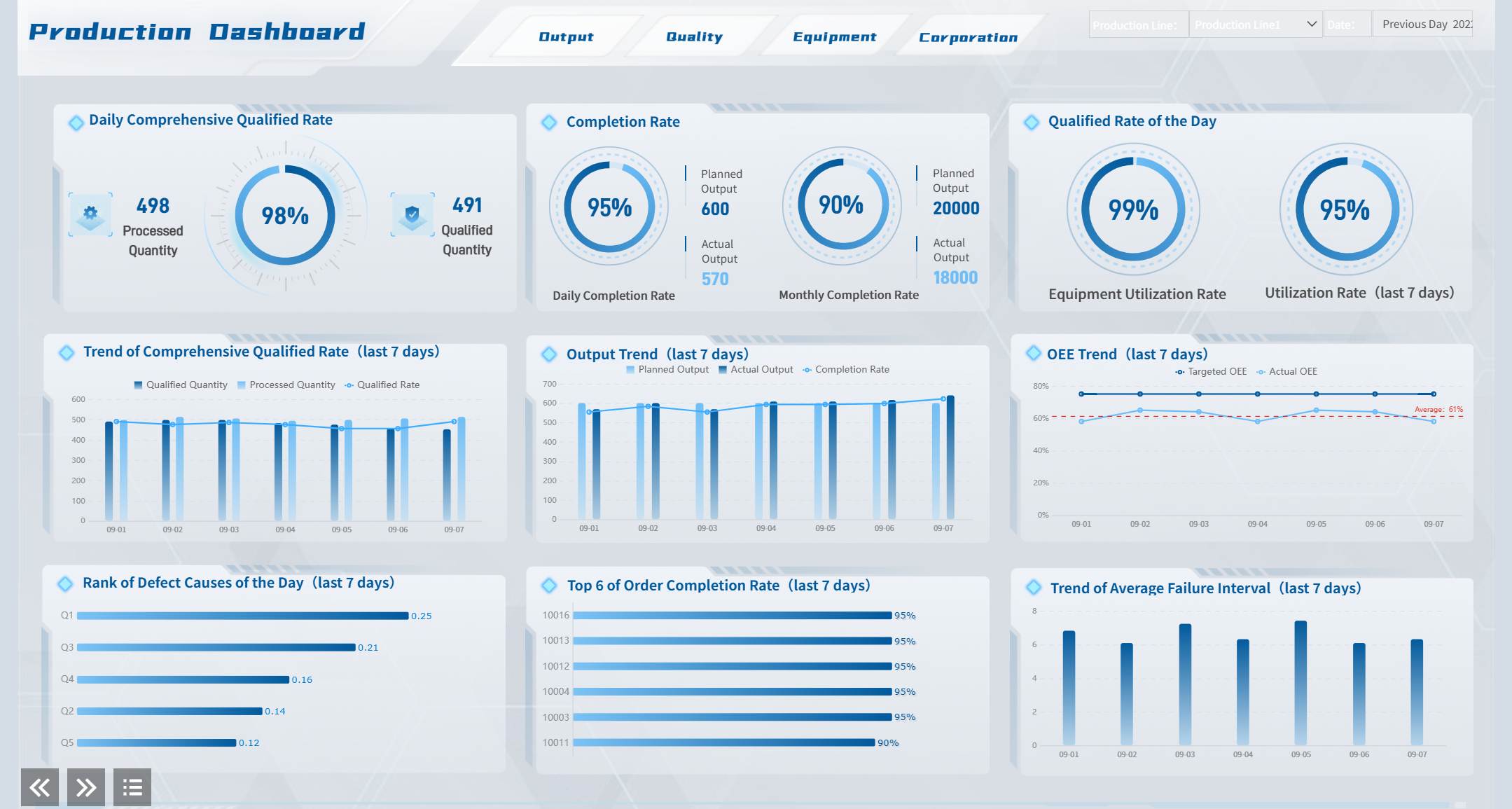
Manufacturing Quality Control Dashboards
Think about working in a busy factory. You need to check product quality all the time. A modern dashboard lets you see everything at once. With FineReport, you can track defect rates and scrap rates in real time. You can see product qualification numbers right away. Bar charts compare different production lines. Line charts show trends over time. Pie charts help you find the main reasons for defects.
You can set alerts when numbers get too high. You can drill down to find the cause of a problem. This dashboard design gives you control. You do not need to look through lots of reports. Everything you need is right there. You can change the layout, colors, and chart types to fit your factory. FineReport connects to over 30 data sources, so you always get the newest numbers. You can use templates that match your company’s style.
Public Sector Project Dashboards
You might work for a city or government office. You have big projects to manage. You want to keep everything on track. A well-designed dashboard helps you see project status, budgets, and risks in one place. FineReport makes this easy. You can build dashboards that show key numbers for every project. You can add maps, tables, and charts to track progress.
You can set permissions so only the right people see sensitive data. You can use web-based dashboards, so your team can check them from anywhere. This makes teamwork simple. You can change templates for each department. You can add filters to sort projects by type or location. This means you get dashboards that fit your needs.
| Feature | Description |
|---|---|
| Data Source Integration | Connect to over 30 data sources for easy reporting. |
| Customizable Templates | Change templates to match your reporting needs. |
| Complex Parameters Support | Use advanced filters for detailed reports. |
| Web-based Deployment | Access dashboards from any device, no installation needed. |
Real-Time Data Visualization Widgets
You want to see what’s happening right now. Real-time data helps you react fast. FineReport gives you dashboard widgets that update instantly. You can watch sales, inventory, or website visits as they happen. You can use gauges, speedometers, and animated charts. These widgets make your dashboard feel alive.
You can set up data connections to pull numbers from many sources. You do not need to refresh the page. Everything updates on its own. You can use these widgets in any dashboard you need. You can even put dashboards in your own app. This lets you share insights with your whole team.
If you want ideas for your next dashboard, try mixing 3D charts, motion effects, and interactive filters. You can make dashboards that look cool and work fast. FineReport helps you build dashboards that are smart and beautiful.
You can see how FineReport’s flexibility and integration make it easy to build dashboards for any job. You get tools that help you design, customize, and share dashboards without extra work. If you want to make dashboards that look amazing, FineReport gives you everything you need.
Dashboard Widget Use Cases and Styles
Analytics and KPI Widgets
You want your analytics dashboard to show the most important things. Analytics and KPI widgets change raw data into useful ideas you can use right away. You see single numbers, trend lines, and charts that help you check progress fast. These widgets let you see what is happening and help you act quickly. Modern dashboards use AI to find sudden changes and warn you, so you do not miss anything. You get more than numbers—you get a dashboard that helps you make choices.
When you make these widgets, keep them clean and simple. Put related metrics together. Use clear labels and give context for every number. Make important things stand out with size and where you put them. Always test your layout and change it to fit what works best for you. A clean look helps you focus and makes your dashboard easy to use.
Collaboration and Data Entry Widgets
Teamwork is easier with collaboration and data entry widgets. You can comment, tag teammates, and update records in real time. Everyone sees the newest changes right away. FineReport lets you make views for each department, so teams see only what they need. Automated reporting sends updates to the right people. This keeps your data correct and your team working together.
| Feature | Benefit |
|---|---|
| Department-specific views | Each team sees only what matters, helping focus and teamwork. |
| Commenting and tagging | Teams talk about data on the dashboard, making communication better. |
| Automated reporting | Everyone gets the right dashboard at the right time. |
| Real-time data synchronization | Updates show up right away, so your data stays correct. |
3D and Interactive Dashboard Widgets
You want your dashboard to be different. 3D and interactive widgets make your data come alive. You can spin, zoom, and explore charts with a tap or click. These widgets make your dashboard look modern and fun. FineReport gives you tools to add animation and motion, making your dashboard look amazing.
Try using responsive design so your dashboard works on any device—computer, tablet, or phone. Responsive web design and admin dashboard layouts give you a smooth experience everywhere. Keep your dashboard clean and easy to use. Use nice visuals and interactive parts to help users. Get ideas from new web trends and always make things clear.
Actionable Tips for Dashboard Widget Design
Balancing Function and Aesthetics
You want your dashboard to look elegant and work well. Start with a clean layout that puts the most important information at the top. Use color and size to show what matters most. Keep your interface simple, so you do not overload your mind with too much data. Stick to the same style for buttons, charts, and text. This makes your dashboard user-friendly and easy to understand.
- Add enough white space between widgets. This keeps everything clean and helps you focus.
- Mix different widget types and sizes. Show what is important and make your dashboard interesting.
- Let users change what they see. Customization makes the experience better for everyone.
- Try out your design with real people. Ask for feedback and make changes before you finish.
Ensuring Accessibility and Responsiveness
You want everyone to use your dashboard, no matter where they are or what device they use. Make sure your dashboard works on both web and mobile screens. Responsive design means your dashboard looks good everywhere. Use high color contrast for text and buttons, so everyone can read them. Make sure people can use the keyboard to move around your dashboard.
- Add ARIA labels to all interactive parts. This helps people who use screen readers.
- Check that your dashboard stays clean and readable, even if someone zooms in.
- Space out touch targets, so it is easy to tap on mobile devices.
- Test your dashboard with different users. Fix anything that makes it hard to use.
You learned that new dashboard widget designs help you do better work. Using trends like real-time updates and simple layouts gives you better results. Look at this table to see how fast changes can help your business:
| Scenario | Evidence of Improvement |
|---|---|
| Campaign optimization | Seeing updates right away stops wasting money. |
| Crisis response | Finding problems early helps you act fast. |
| Budget reallocation | Spotting changes quickly lets you move resources. |
Try FineReport by FanRuan. Stay creative and be a leader in dashboard design for 2026.


FAQ

The Author
Lewis Chou
Senior Data Analyst at FanRuan
Related Articles

How to Build an Investment Portfolio Reporting Dashboard for Executives: KPIs, Benchmarks, and Drill-Down Views
Investment portfolio reporting for executives is not about showing every holding, transaction, and chart your investment team can produce. It is about giving CEOs, CFOs, CIOs, boards, and investment committees a fast, re
Yida YIn
Jun 25, 2026

12 KPI Reporting Examples for Executive Dashboards: What to Show in Weekly, Monthly, and Quarterly Reviews
Executive leaders do not need more data. They need decision ready $1 examples that match how often they review the business and what actions they are expected to take. A weekly $1 should surface fast moving risks and per
Yida YIn
Jun 25, 2026

How to Build a Digital Marketing Reports Dashboard: Executive Examples, KPIs, and Templates
A $1 is the control layer that helps executives and marketing leaders turn scattered channel data into fast, confident decisions. If you are a CEO, CMO, operations director, or marketing analytics lead, the real problem
Yida Yin
May 07, 2026