You want the best modern dashboard design for your business, right? This post lists 15 top-notch templates for 2026 that deliver clean ui, clean features, and clean results. Usability, clean design, and future-proof options matter most. FineReport stands out with real dashboard templates, clean enterprise solutions, and clean ui examples. Find clean templates—free or premium—fast. Clean dashboards make your workflow simple. You get clean template choices, clean design ideas, and clean ui for every need. Clean dashboard templates mean clean data, clean decisions, and clean results.
Modern Dashboard Design Overview
Modern dashboard design in 2026 means smarter, more interactive dashboards that help you make decisions faster. You get real-time insights, intuitive UI, and tools that adapt to your needs. FineReport leads the way with flexible templates and advanced features for every business.
Why Modern Dashboard Design Matters in 2026
You want dashboards that do more than just look good. In 2026, dashboards must deliver real value. They need to help you spot trends, act quickly, and stay ahead. The modern concept dashboard design puts you in control, making complex data simple and actionable.
Let’s look at the biggest trends shaping dashboard design for 2026:
| Trend | Description |
|---|---|
| AI as the Core Engine | AI powers automated insights and personalizes your dashboard experience. |
| Ubiquitous Analytics | You see analytics everywhere, right inside your business apps. |
| Human-Centric Design | Dashboards focus on trust, privacy, and user needs. |
| Hyper-Personalization | Your dashboard adapts to your habits and preferences. |
| Real-Time and Proactive Intelligence | Dashboards alert you to issues and predict outcomes instantly. |
| Immersive Experiences | 3D and AR/VR dashboards let you interact with data in new ways. |
| Mobile-First Design | Dashboards look great and work smoothly on any device. |
| Interactive Dashboards | You can explore and drill into data with ease. |
FineReport stands out by embracing these trends. You get dashboards with AI-powered insights, real-time updates, and a UI that feels natural. FineReport’s templates support immersive 3D dashboards, mobile dashboards, and interactive features that keep you engaged.
Key Features of Modern Dashboard Design
You need dashboards that are easy to use, fast, and flexible. Here’s what defines a top dashboard template in 2026:
| Feature | Description |
|---|---|
| Design & User-friendliness | Clean UI and simple navigation make dashboards easy for everyone. |
| Customization & Responsiveness | Dashboards adjust to any screen and let you tweak layouts and colors. |
| Built-in Components | You get a wide range of charts, tables, and widgets for rich data visualization. |
| Performance Optimization | Dashboards load quickly and run smoothly, even with big data. |
FineReport brings all these features together. You can create dashboards with drag-and-drop design, responsive layouts, and a UI that works on any device. The platform supports advanced visualizations, including 3D and mobile dashboards, so you always have the right tools for your data.
Tip: Choose a dashboard template that matches your workflow and lets you customize the UI. This way, you get a dashboard that grows with your business.
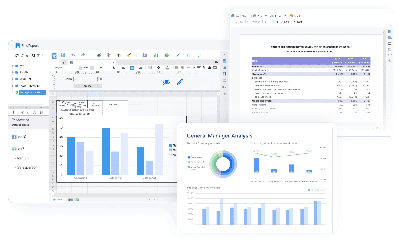
FineReport Modern Dashboard Design Template
Template Description
You want a dashboard template that feels modern, powerful, and easy to use. FineReport gives you just that. You can build dashboards with a clean UI, flexible layouts, and interactive features. The template supports everything from classic admin dashboard template setups to advanced 3D dashboards. You can create dashboards for any business scenario—sales, operations, HR, or manufacturing. FineReport’s templates let you drag and drop charts, tables, and widgets, so you get a dashboard that matches your workflow. You can even use react dashboard components and data entry forms to collect and manage information right inside your dashboard.
Key Features & Tech Stack
FineReport’s dashboard templates stand out because they combine design flexibility with robust technology. Here’s what you get:
- Drag-and-drop interface for fast dashboard creation
- Real-time reporting for up-to-date insights
- Mobile accessibility for dashboards on any device
- Customizable templates for unique UI and branding
- Integration with react dashboard and data visualization libraries
Check out how FineReport compares to other solutions:
| Feature | FineReport's Dashboard Templates |
|---|---|
| Drag-and-Drop Functionality | Intuitive and easy to use for creating reports quickly |
| Database Integration | One-click integrations with mainstream databases |
| Stream-to-TV Feature | Allows tracking of KPIs on large screens |
| Pre-built HTML5 Charts | Over 50 styles with dynamic effects for visualization |
| Mobile App Technology | Utilizes ReactNative for a seamless mobile experience |
You can use these templates for any admin dashboard template or react dashboard project. The tech stack supports HTML5, ReactNative, and connects with all major databases.
Unique Advantages for Enterprises
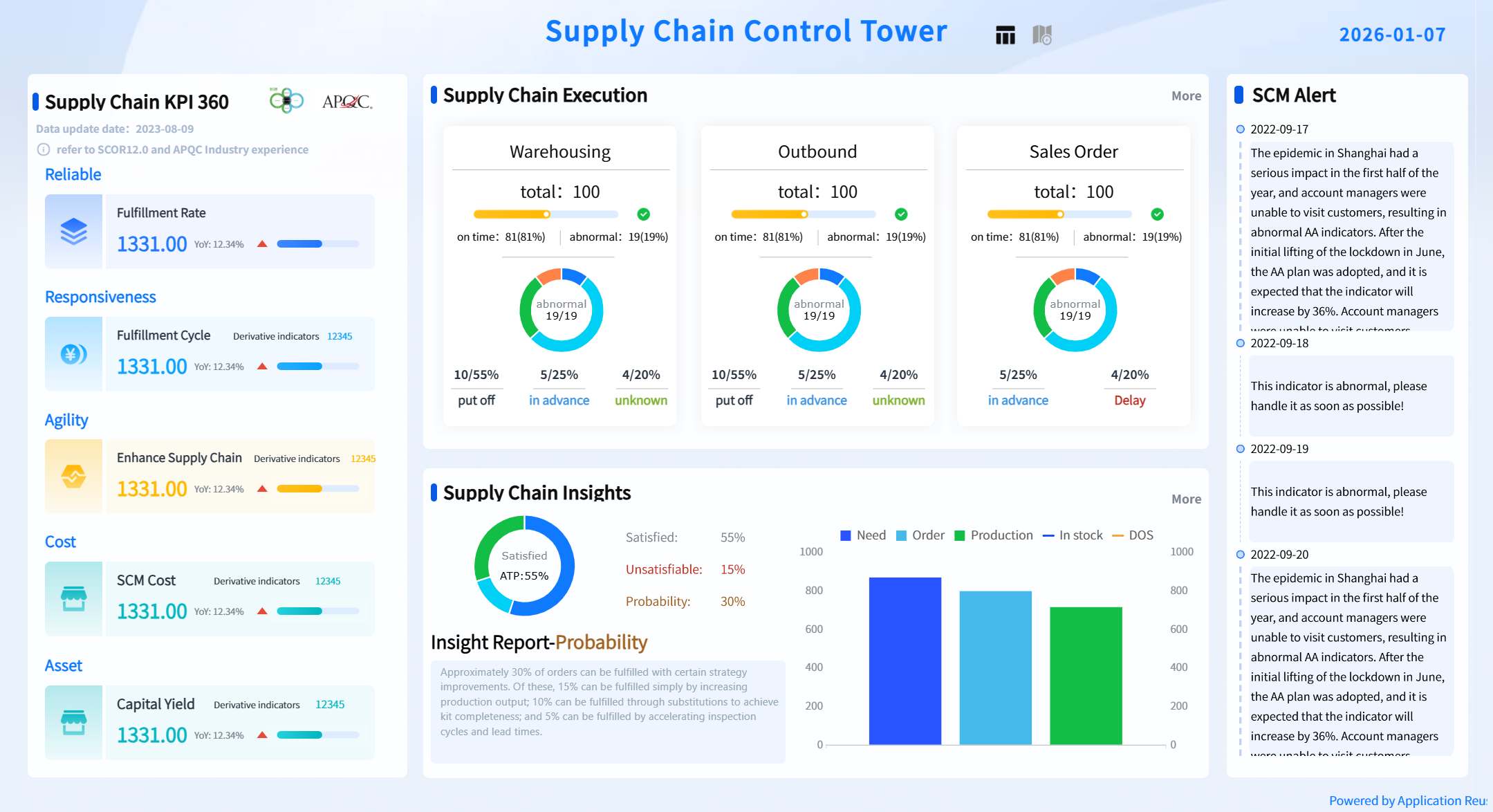
FineReport’s modern dashboard design template brings real value to your business. You get dashboards that scale with your needs. Enterprises like BOE use FineReport to unify data, standardize metrics, and boost operational efficiency. In manufacturing, you can monitor production, track KPIs, and visualize data in real time. The 3D dashboard lets you see factory operations or smart city data in a whole new way. Mobile dashboards keep your team connected anywhere. Data entry forms make it easy to collect and update information. You can customize every part of the UI, so your dashboard fits your brand and workflow. FineReport’s templates help you make smarter decisions, faster.

Free Dashboard Templates for 2026
You want the best free dashboard templates for 2026. Here are the top picks that give you modern design, flexible UI, and easy integration—so you can start building dashboards right away.
Top Free Dashboard Template Picks
You have a lot of choices when it comes to free dashboard templates. Some stand out for their clean UI, responsive design, and focus on analytics. Here are the most popular options for 2026:
- FanRuan’s FineReport: Offers a modern dashboard template with drag-and-drop design, customizable layouts, and advanced integration. You get a lightweight free analytics dashboard with real-time data and flexible UI.
- Colorlib: Delivers free dashboard templates with customizable colors, fonts, and layouts. You can pick templates for profiles, tables, maps, and more. These templates work well for website analytics and e-commerce dashboards.
- WrapPixel: Provides free HTML admin templates with seven-page layouts. You get templates for analytics, reporting, and e-commerce dashboards. The UI is user-friendly and easy to navigate.
- Tailwind CSS: Features 10+ best free analytics dashboard templates. These templates are responsive and easy to customize for any project.
- Free HTML dashboard templates: Great for website analytics, e-commerce, and admin dashboards. You can use these templates for different business needs.
Tip: Try different templates to find the one that matches your workflow and UI preferences.
Features and Usability
You want templates that make dashboard design simple. FanRuan’s FineReport stands out with its drag-and-drop interface and easy integration with many data sources. Colorlib lets you customize colors and fonts, so you can match your brand. WrapPixel focuses on user-friendly UI and offers multiple page options for different dashboard needs.
Here’s a quick comparison:
| Template | Usability Features | Integration Capabilities |
|---|---|---|
| FanRuan | Drag-and-drop design, customizable layouts | Easy integration with many data sources |
| Colorlib | Customizable colors and fonts | Flexible, but not specified |
| WrapPixel | Seven-page templates, user-friendly UI | Not specified, focus on usability |
You can use these free dashboard templates for analytics, reporting, and project management. They support free project dashboard templates, so you can track tasks and visualize progress. If you want a lightweight free analytics dashboard, these options give you the flexibility and modern design you need. The UI stays clean and easy to use, making your dashboard experience smooth.
Best Analytics Dashboard Templates
You want the best analytics dashboard templates for 2026. These templates give you powerful analytics, clean design, and a UI that makes data easy to understand. You can track KPIs, spot trends, and make smarter decisions with the right dashboard template.
Analytics-Focused Dashboard Designs
When you look for the best analytics dashboard templates, you want options that focus on data clarity and flexibility. Modern templates like TailAdmin - Analytics, NextAdmin - Next.js Analytics Template, and Tabler lead the way. Each template offers a unique approach to dashboard design and UI.
- TailAdmin - Analytics gives you over 500 customizable components. You can build a modern dashboard for any project. The design supports multiple tech stacks and works well for finance saas dashboard needs.
- NextAdmin - Next.js Analytics Template uses powerful tools like Prisma and Algolia. You get fast data handling and a dashboard that feels modern and responsive.
- Tabler keeps things simple. The minimalist design makes your dashboard load fast and scale easily. This template works great for projects where performance matters most.
You can use these templates for finance saas dashboard projects, sales analytics, or any business that needs a modern dashboard design. The UI stays clean and easy to use, so you can focus on your data.
Integration with FineReport
You want your analytics dashboard to connect with all your data sources. FineReport makes this easy. The template supports integration with databases, cloud services, and even Excel files. You can combine data from Google Analytics, ad platforms, and CRM systems in one dashboard.
FineReport’s templates automate data extraction and transformation. You spend less time on manual work. The dashboard design ensures your data is ready for analysis and reporting. You can use drag-and-drop tools to build a modern dashboard UI that matches your workflow.
Here’s a quick look at what you get with FineReport:
| Feature | Benefit for Analytics Dashboards |
|---|---|
| Data Integration | Connects to all major enterprise sources |
| Automation | Reduces manual data handling |
| Visualization | Prepares data for clear reporting |
| Customizable Design | Lets you match the dashboard to your brand |
| Responsive UI | Works on any device |

With FineReport, you get the best analytics dashboard templates for any business need. The templates help you create dashboards that are modern, flexible, and ready for the future.
Project Dashboard Templates for Teams
You want project dashboard templates that help your team track progress, visualize tasks, and stay organized. The best templates for 2026 make collaboration easy and keep everyone on the same page.
Project Tracking and Visualization
Project dashboard templates give you a clear view of your team’s work. You can see tasks, deadlines, and updates in one place. The design focuses on simple navigation and a clean ui, so you never feel lost. Modern templates let you drag and drop tasks, customize layouts, and use widgets for real-time updates. You get dashboards that show project status, team workload, and key milestones. The ui helps you spot issues early and adjust plans fast.
Here’s a quick look at popular project dashboard templates for team collaboration:
| Template Name | Key Features | Benefits |
|---|---|---|
| Notion | Customization options | Flexible workspace for notes, tasks, dashboards |
| Trello | Kanban-style workflow | Visual organization with drag-and-drop tasks |
| ClickUp | Customizable widgets | Real-time updates and workload monitoring |
| Airtable | Real-time updates | Centralized project details for smooth teamwork |
| Asana | Visual boards | Easy tracking of tasks and deadlines |
| Monday.com | Colorful visuals | User-friendly dashboard with automation |
| Wrike | Cloud-based updates | Instant access to the latest project information |
You can use these templates to design dashboards for any project. The ui stays clean, and the dashboard adapts to your workflow.
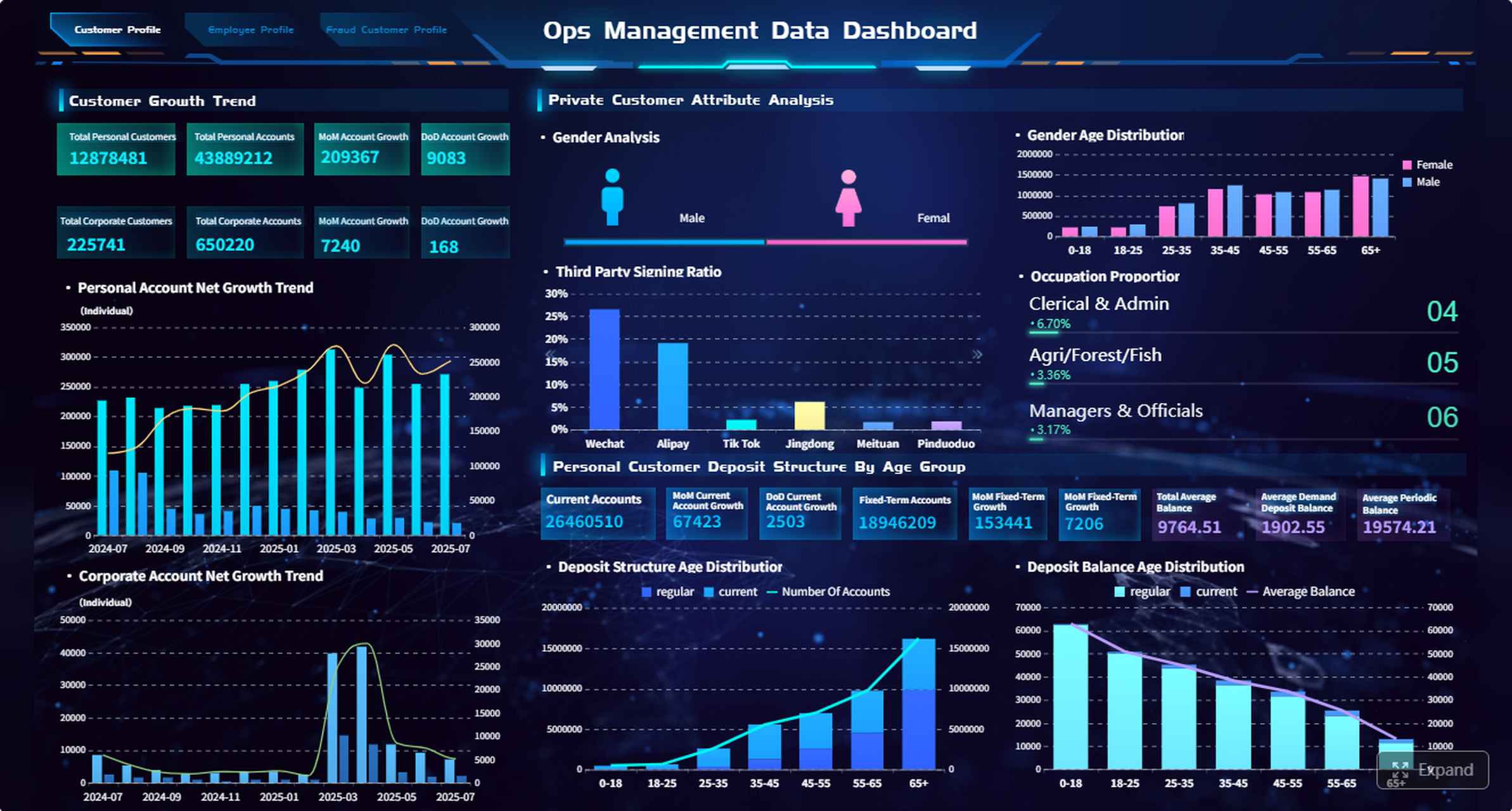
FineReport for Project Management
FineReport takes project dashboard templates to the next level. You get a dashboard that tracks every detail, from tasks to resources. The template design lets you build dashboards with drag-and-drop tools and real-time data. You can create dashboards for manufacturing, digital transformation, or any business project. FineReport’s ui makes it easy to monitor KPIs, visualize timelines, and manage team performance. You can set up automated reports, schedule updates, and share dashboards across devices. In manufacturing, you can track production, equipment status, and quality metrics. Digital teams use FineReport to manage sprints, monitor progress, and keep stakeholders informed. The dashboard templates help you make quick decisions and keep your projects moving forward.
Tip: Choose project dashboard templates that match your team’s workflow and let you customize the design. A clean ui keeps everyone focused and productive.
Mobile Dashboard Design Templates
You need a modern dashboard design template that works everywhere. Mobile dashboards let you check data, track KPIs, and make decisions on the go. You get a responsive ui, fast access, and a design that fits any device.
Responsive and Mobile-First Dashboards
You want your dashboard to look great on every screen. A responsive dashboard design adapts to phones, tablets, and desktops. You never have to zoom or scroll awkwardly. The ui stays clean and easy to use. You can swipe, tap, and interact with charts or tables. Responsive dashboards help you stay productive, even when you leave your desk.
Here’s what makes a mobile-first dashboard stand out:
- The ui adjusts automatically to any device size.
- The design uses touch-friendly controls.
- You get real-time updates, so your data is always fresh.
- Navigation stays simple, so you find what you need fast.
Tip: Always test your dashboard on different devices to make sure the ui and design stay consistent.
FineReport Mobile Dashboard Features
FineReport gives you a powerful mobile dashboard experience. You can access dashboards on your phone, tablet, or PC. The responsive design means the ui looks sharp everywhere. You get real-time data, so you never miss important updates. FineReport lets you customize the dashboard layout for your workflow. You can use the FanRuan Data Analysis App or embed dashboards in your own app. The ui supports touch gestures, making it easy to drill down into details. You can even set up alerts and notifications, so you act fast when something changes.
FineReport’s mobile dashboard design helps you stay connected and make smart decisions, no matter where you are.

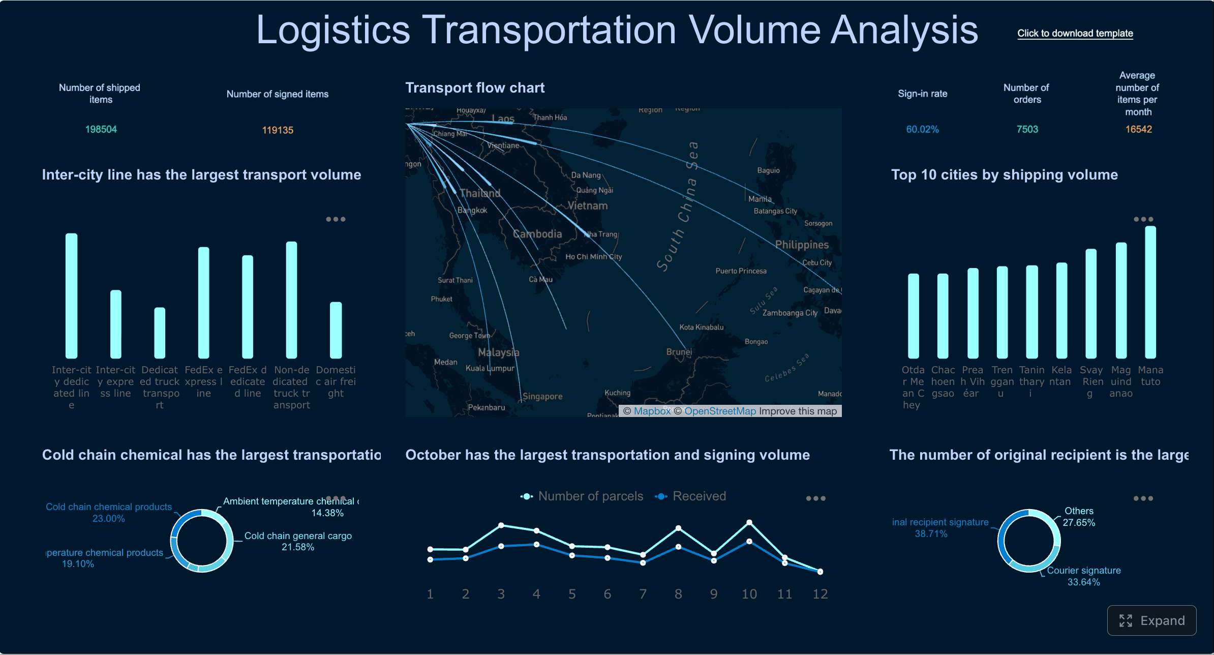
3D Dashboard Design Templates
You want to see your data come alive. 3D dashboard templates let you explore information in new ways. These designs help you spot trends, track operations, and make decisions faster.
Interactive 3D Visualizations
Imagine looking at your dashboard and seeing a factory floor or a city map in three dimensions. You can zoom in, rotate, and click on different parts. This interactive experience makes complex data easy to understand. You don’t just see numbers—you see how everything connects. 3D dashboard design gives you a clear view of your operations. You can check equipment status, monitor traffic, or track shipments. The ui feels smooth and modern. You can move through the dashboard with simple gestures or clicks. This design helps you find problems and act quickly.
Tip: Use interactive 3D dashboards when you need to monitor large spaces or lots of moving parts. It makes your job easier and your insights sharper.
FineReport 3D Dashboard Capabilities
FineReport takes 3D dashboard design to the next level. With FineVis, you get powerful tools for building interactive dashboards. You can create a smart factory dashboard that shows machines, lines, and sensors in real time. In a smart city project, you can track traffic, water use, or safety alerts—all in one dashboard. The ui is flexible, so you can customize every part. FineReport supports animation and real-time updates. You can use these dashboards on big screens, tablets, or phones. Many companies use FineReport for smart manufacturing and city management. They get better control, faster decisions, and a modern dashboard design that grows with their needs.
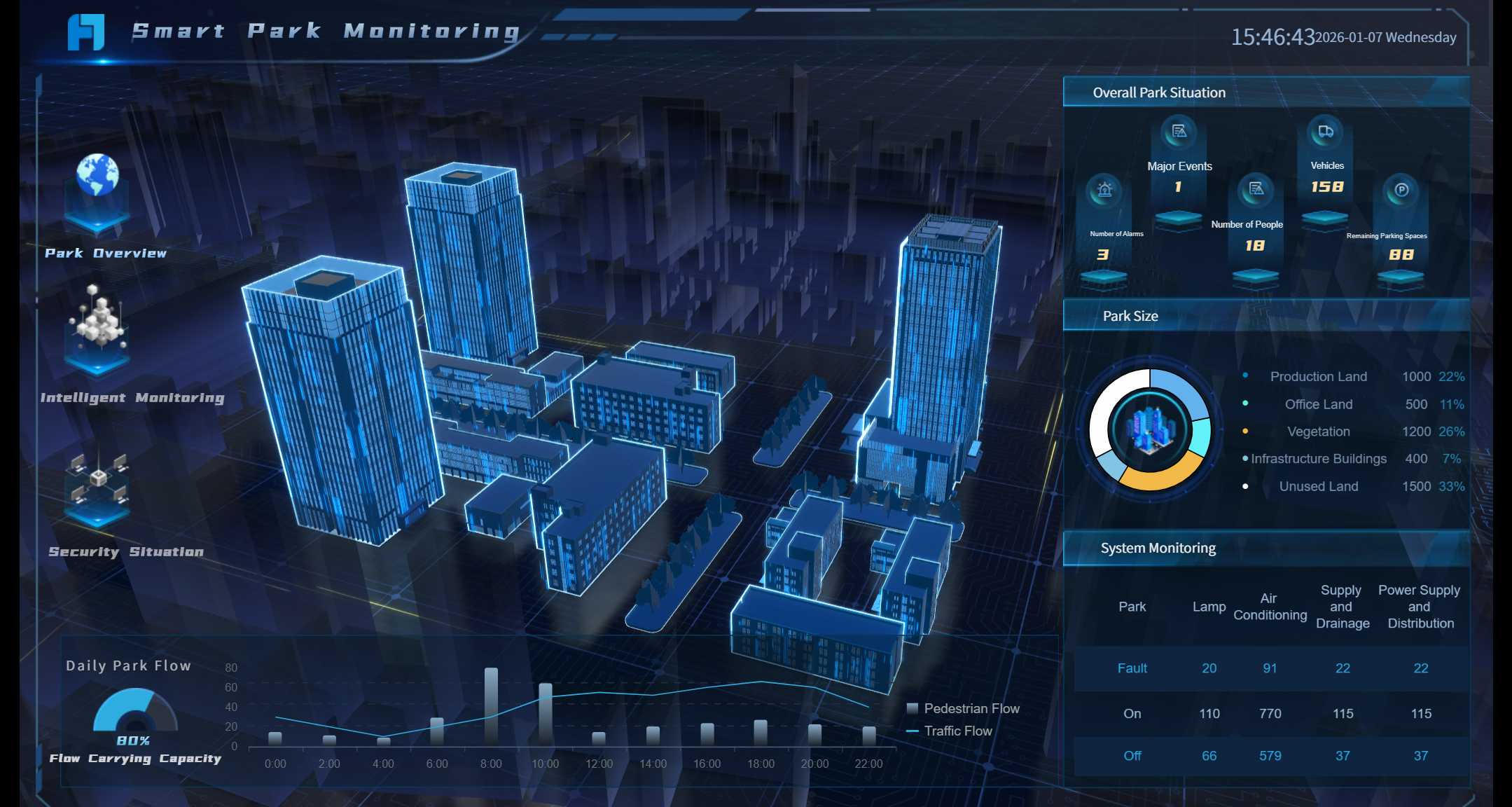
Note: FineReport’s 3D dashboard templates help you turn data into action. You get a design that fits your workflow and a ui that everyone can use.
Dashboard Template Comparison Table
You want to pick the right dashboard template for your needs. This table makes it easy to compare features, tech stacks, and which templates fit different users. You can see at a glance which design or ui works best for your workflow.
Feature Summary
Let’s break down what sets each dashboard template apart. You’ll find options for marketing, analytics, business intelligence, and more. Each template brings something unique to the table.
| Tool | Best For | Key Differentiators |
|---|---|---|
| FineReport | Enterprises, manufacturing, analytics | Drag-and-drop design, 3D dashboards, mobile ui, advanced data integration |
| Funnel | Marketing teams | No-code dashboards, automatic data normalization, many data connectors |
| Looker BI | Technical enterprise users | Strong data modeling, LookML, advanced analytics |
| Looker Studio | Beginners, Google users | Easy drag-and-drop builder, native Google integrations |
| Databox | Fast setup for busy teams | Large template library, KPI scorecards, quick deployment |
| Klipfolio | Custom dashboards for teams | Role-based access, wide integration, flexible design |
| Tableau | Data-heavy BI projects | Powerful visualization, AI analysis, deep reporting |
| Whatagraph | Agencies and client reporting | White label reports, live sharing, agency-focused features |
Tip: Choose a template that matches your team’s skills and the type of data you want to visualize.
Tech Stack Overview
Modern dashboard templates use popular frameworks and libraries. You’ll see a lot of React, Angular, Vue, and Bootstrap in today’s dashboard design. These tools help you build a fast, responsive ui that works on any device.
- React powers many dashboard templates for its flexibility and component-based design.
- Angular and Vue offer strong options for building interactive dashboards.
- Bootstrap helps you create a clean, mobile-friendly ui with ready-made components.
FineReport stands out with its pure Java backend, HTML5 front end, and seamless integration with these modern stacks. You can connect your dashboard to almost any data source and customize the ui for your brand.
Suitability for Different Users
Not every dashboard template fits every user. Here’s a quick guide to help you match the right template to your needs:
| User Type | Template Name | Description |
|---|---|---|
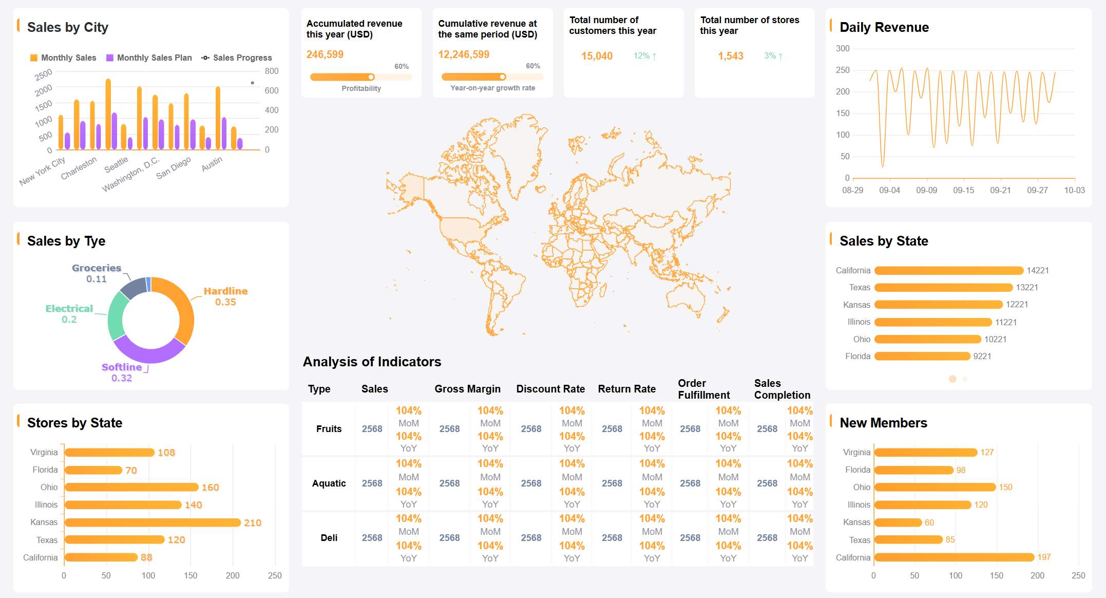
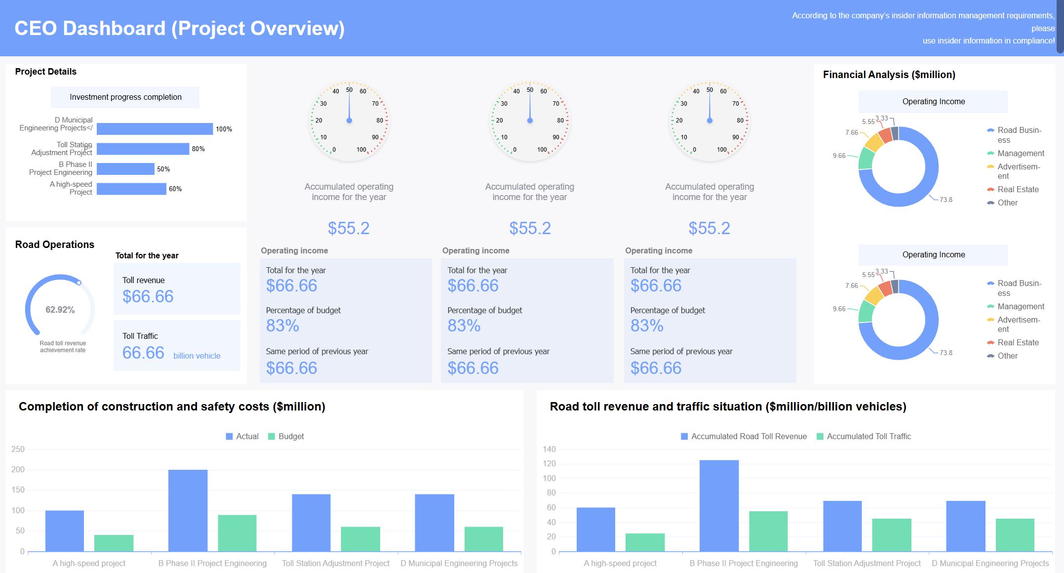
| Enterprises | Business Dashboard | Brings all your business data together for executive insights |
| Small Businesses | Restaurant Dashboard | Manages orders and customer feedback for small teams |
| Individual Professionals | Digital Marketing Dashboard | Tracks campaigns and social media for marketing pros |
| Educational Institutions | Education Management Dashboard | Handles student performance and attendance |
| Healthcare Providers | Healthcare Dashboard | Shows patient data and hospital operations |
| Financial Institutions | Banking Dashboard | Aggregates transactions and risk metrics |
| Manufacturing Sector | Manufacturing Dashboard | Monitors production and inventory in real time |
| Logistics Operations | Logistics Dashboard | Tracks shipments and inventory for supply chain management |
You can see how each template and dashboard design fits a specific user group. Pick the one that matches your industry and workflow for the best results.
How to Choose a Modern Dashboard Design Template
To pick the right modern dashboard design template, focus on your project’s goals, your team’s needs, and how well the template fits your workflow. Look for options that offer flexibility, strong integration, and a UI that makes your data easy to understand.
Selection Criteria
You want a dashboard that works for your team, not against it. Start by checking if the template offers customization, so you can tweak layouts, colors, and components. Make sure it’s responsive and looks great on any device. Performance matters, especially if you handle lots of data or use complex UI elements. Good documentation saves you time and headaches. Security is key for user management dashboard projects, so look for features like role-based access. Integration is another big one—your template should connect easily with APIs and libraries. Don’t forget to check the license and costs, especially for next.js admin dashboard template options.
Here’s a quick table to help you compare:
| Criteria | What to Look For |
|---|---|
| Customization Flexibility | Can you adjust colors, layouts, and styles? |
| Responsiveness & Compatibility | Does it work on all devices and browsers? |
| Performance | Is it optimized for speed and large datasets? |
| Documentation Quality | Are the guides clear and helpful? |
| Security Features | Does it support encryption and role-based access? |
| Integration Capabilities | Can you connect it with APIs and libraries? |
| Licensing Considerations | Are there any costs or restrictions? |
Matching Templates to Needs
You need a template that matches your business goals. Ask yourself what decisions your team will make with the dashboard. Figure out your KPIs and what data matters most. Do you need high-level overviews or detailed reports? Decide if you want real-time updates or if periodic data is enough. Think about how your team will use the dashboard—do they need to filter, drill down, or interact with the data? For a next.js dashboard or user management dashboard, make sure the template supports customizable components and fits your workflow.
Here’s a simple way to match templates to your needs:
- Identify the main decisions your dashboard will support.
- List your KPIs and business goals.
- Decide if you need summaries or detailed data.
- Choose between real-time or scheduled updates.
- Pick the best visualizations for your audience.
- Check if users need to interact with the dashboard.
Final Tips
Choosing the best modern dashboard design template doesn’t have to be hard. Define your objectives first. Know your audience and select metrics that matter. Use visualizations that make sense for your data. Organize information clearly and keep the UI simple. Add interactivity if your team needs it. Test your dashboard with real users and refine it based on feedback. Keep your dashboard updated as your business grows. FineReport gives you customizable dashboards, strong integration, and a UI that adapts to any device. You can build a next.js dashboard, next.js admin dashboard template, or user management dashboard with ease. If you need saas management tools or customizable components, FineReport has you covered.
Tip: Always choose templates that let you grow and adapt as your needs change. A flexible next.js dashboard or user management dashboard will save you time and effort down the road.
Choosing the right modern dashboard design template helps you turn data into clear decisions. You need a dashboard that matches your goals, uses the right visualizations, and stays easy to use. Test a demo dashboard with your team and talk with stakeholders. FineReport makes your dashboard journey simple.


FAQ

The Author
Lewis
Senior Data Analyst at FanRuan
Related Articles

How to Build an Investment Portfolio Reporting Dashboard for Executives: KPIs, Benchmarks, and Drill-Down Views
Investment portfolio reporting for executives is not about showing every holding, transaction, and chart your investment team can produce. It is about giving CEOs, CFOs, CIOs, boards, and investment committees a fast, re
Yida YIn
Jun 25, 2026

12 KPI Reporting Examples for Executive Dashboards: What to Show in Weekly, Monthly, and Quarterly Reviews
Executive leaders do not need more data. They need decision ready $1 examples that match how often they review the business and what actions they are expected to take. A weekly $1 should surface fast moving risks and per
Yida YIn
Jun 25, 2026

How to Build a Digital Marketing Reports Dashboard: Executive Examples, KPIs, and Templates
A $1 is the control layer that helps executives and marketing leaders turn scattered channel data into fast, confident decisions. If you are a CEO, CMO, operations director, or marketing analytics lead, the real problem
Yida Yin
May 07, 2026