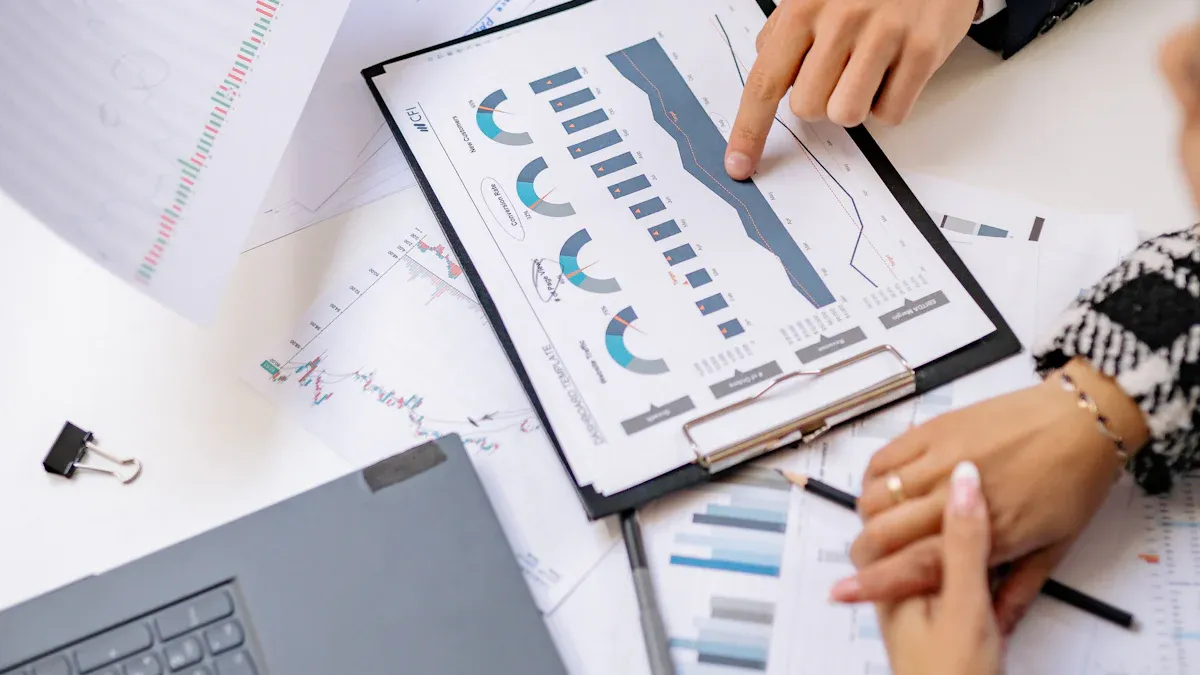
A visual dashboard is an interactive tool that displays key data and metrics using charts, graphs, and tables, helping you monitor performance at a glance. You can make smarter decisions faster because dashboards present information in real time, unlike static reports or traditional tools. The table below shows how dashboards improve decision-making speed:
| Type | Benefit |
|---|---|
| Decision-Making Speed | Decisions up to 5x faster with AI-driven dashboards |
| Time to Insight | 80% reduction in time to insight |
| Proactive Decision-Making | Issues detected and alerts sent within minutes |
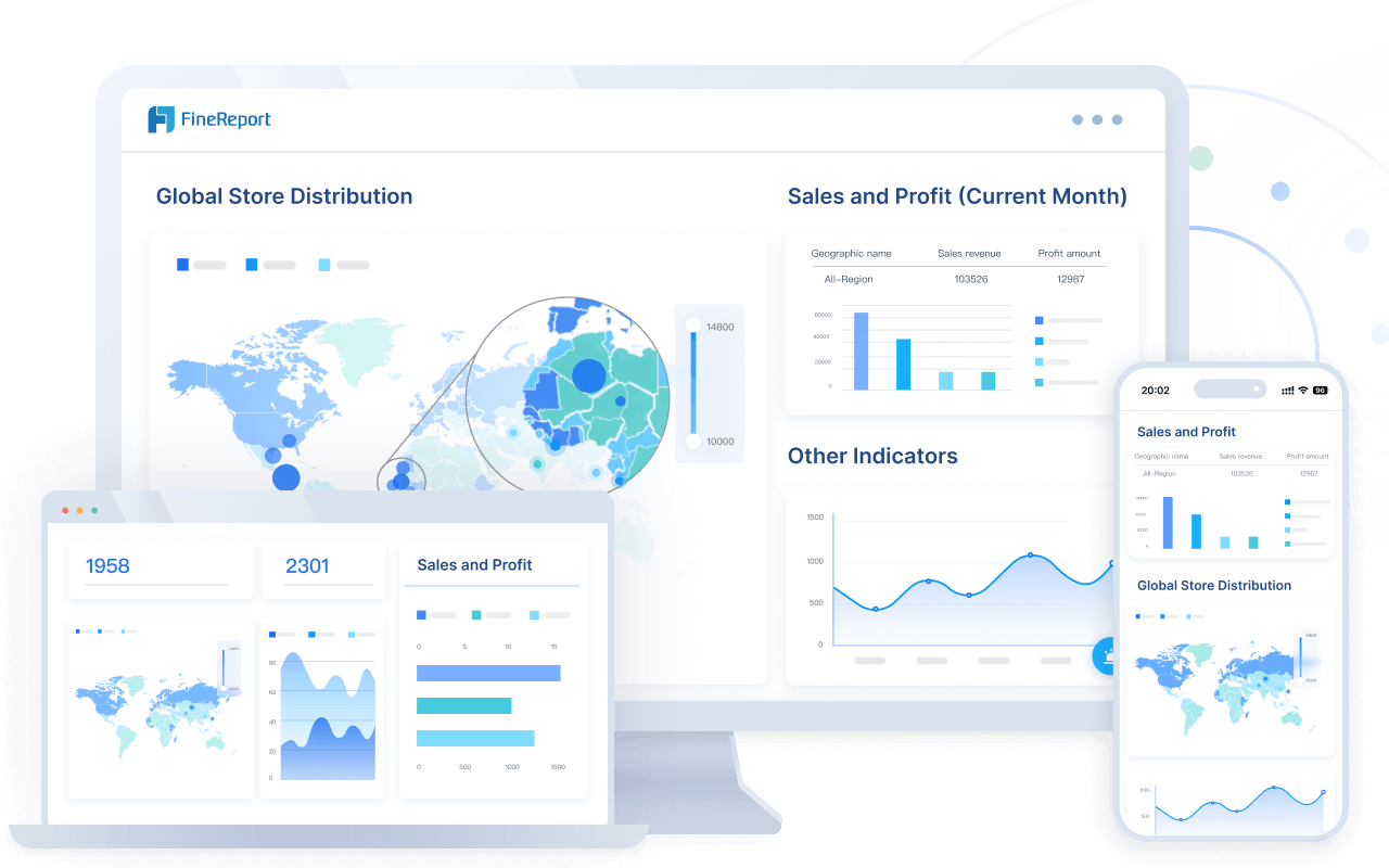
FineReport gives you a simple way to create interactive dashboards and visualize data for better business outcomes.
Visual Dashboard Meaning and Purpose
What Is a Visual Dashboard?
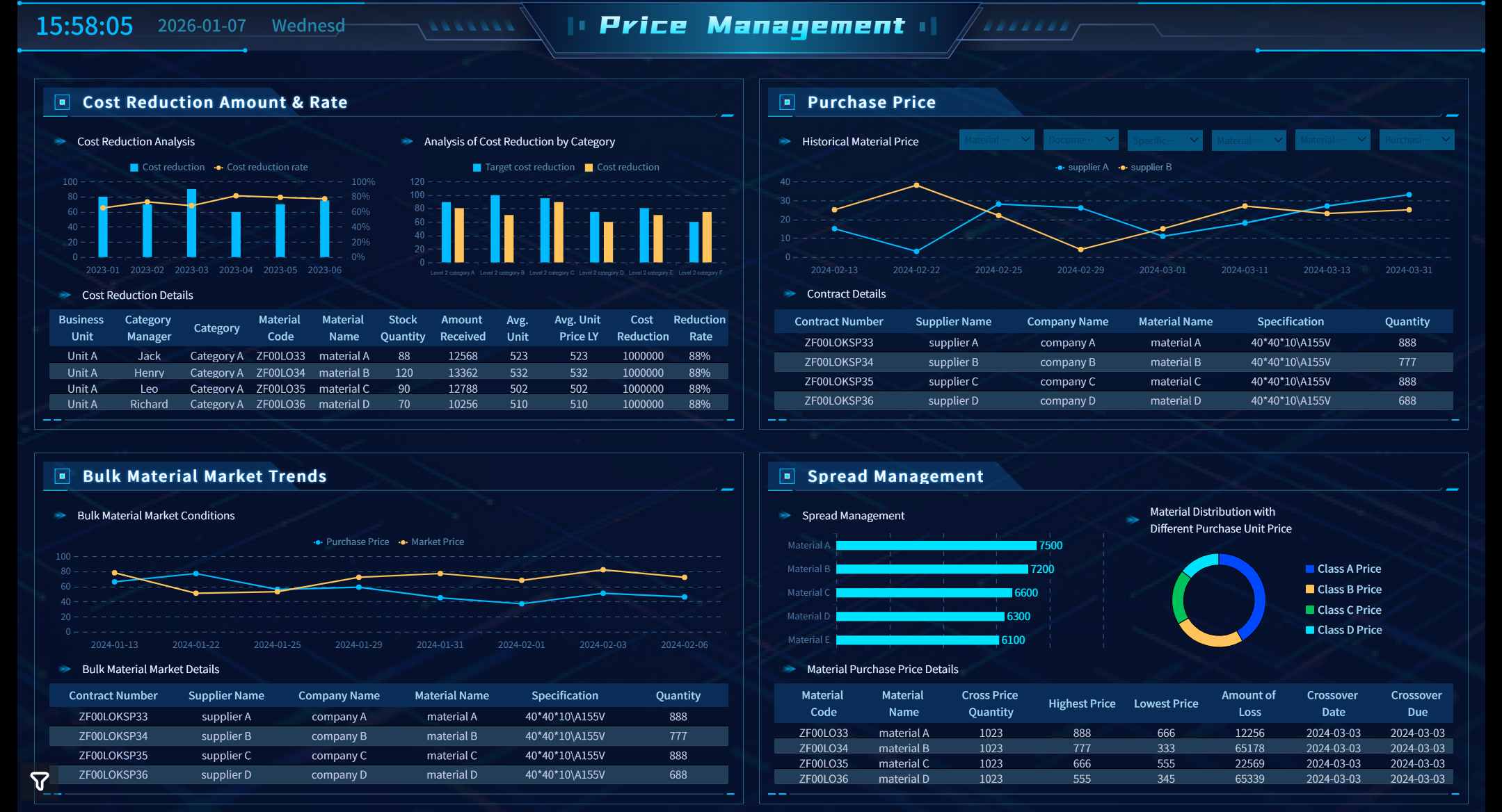
A visual dashboard in business analytics is a workspace that brings together your most important metrics into a single, clear view. You see real-time updates from different sources, all displayed through easy-to-understand charts and graphs. This approach helps you track key performance indicators (KPIs) and spot trends quickly. When you use a visual dashboard, you get a snapshot of your business at any moment, making it easier to respond to changes and opportunities.
You can think of a visual dashboard as your command center for data. It combines information from sales, operations, finance, or any other area you need to monitor. Instead of searching through spreadsheets or static reports, you get a dynamic, interactive display that highlights what matters most. This makes your daily work more efficient and supports better decision-making.
FineReport gives you the tools to build these dashboards with ease. You can create a data visualization dashboard by dragging and dropping components, adding 3D models, and connecting to multiple data sources. FineReport lets you customize every detail, from the layout to the way you view your data. You can even set up scenes, import models, and adjust how your dashboard looks and feels. This flexibility means you can design business dashboards that fit your exact needs.

Why Use a Visual Dashboard?
You use a visual dashboard because it turns complex data into clear, actionable insights. In modern organizations, dashboards serve several important purposes:
| Purpose | Description |
|---|---|
| Monitoring Performance | Dashboards provide real-time tracking of performance metrics, enabling quick adjustments and insights. |
| Facilitating Decision-Making | They present data in a structured way, allowing for informed, data-driven decisions. |
| Enhancing Transparency | Dashboards serve as a single source of truth, improving communication and stakeholder reporting. |
| Promoting Accountability | They align individual goals with organizational objectives, fostering a culture of responsibility. |
| Improving Efficiency | Dashboards streamline processes by automating data collection and reporting, saving time and reducing errors. |
With a data visualization dashboard, you can monitor sales, track equipment efficiency, or oversee quality control—all in one place. This helps you stay on top of your goals and react quickly to any issues. You also improve communication across teams, since everyone sees the same up-to-date information.
Visual dashboards stand out from static reports in several ways:
- Dashboards give you a quick overview of key metrics and update in real time.
- Reports focus on detailed analysis and are often static.
- Dashboards are designed for fast insights, while reports are used for in-depth analysis.
You can see the main differences in the table below:
| Aspect | Reports | Dashboards |
|---|---|---|
| Purpose | Provide in-depth data analysis and detailed information | Offer a visual summary of key metrics for quick insights |
| Format | Often formatted in tables or written summaries | Primarily visual with charts, graphs, and gauges |
| Interactivity | Typically static, though can be interactive with filters | Usually interactive with drill-down and filtering capabilities |
| Level of Detail | High level of detail and comprehensive data | High-level overview focused on key performance indicators |
| Use Case | Ideal for audits, historical reviews, and complex analysis | Best for real-time monitoring and performance tracking |
| Frequency | Often scheduled or generated as needed | Frequently updated in real time or near real time |
| Audience | Used by analysts, department leads, or auditors | Designed for executives, managers, or front-line decision-makers |
| Customization | Customizable for specific queries or reports | Customizable layout and widgets for fast visualization |
When you use FineReport, you can move beyond traditional reporting. You create interactive data dashboards that help you see the big picture and drill down into details when needed. This approach supports business intelligence, data analytics, and reporting in a way that is both powerful and easy to use. You gain the ability to visualize your data, share insights, and make better decisions every day.
Visual Dashboard Features and Capabilities

Real-Time Data and Interactivity
You need a dashboard that keeps up with your business. FineReport gives you a real-time dashboard that updates instantly as new data comes in. You see the latest metrics without waiting for manual refreshes. This helps you spot trends and respond quickly to changes.
| Feature | Description |
|---|---|
| AI-powered search | Ask questions about your data and get instant answers with visualizations. |
| Real-time data visualizations | View current business activities and identify patterns or anomalies as they happen. |
| Personalized visualizations | Pin and rearrange dashboard elements to focus on what matters most. |
| Seamless connectivity | Connect to cloud data sources and databases for comprehensive KPI tracking. |
| Augmented analytics | Use machine learning to uncover deeper insights into business challenges. |
| Analyst Studio | Perform ad-hoc analysis and data modeling for enhanced insights. |
| Mobile accessibility | Track KPIs and share insights from anywhere, on any device. |
FineReport’s interactive dashboard lets you explore data in new ways. You can use cross-filtering to connect multiple visualizations. When you click on a chart, related data updates instantly. Drill-down features allow you to see details without cluttering your main dashboard. These interactive data visualizations make your analysis more engaging and effective.
Tip: Real-time dashboards help you make decisions based on the most current information. You avoid delays and stay ahead of issues.
Customization and Flexibility
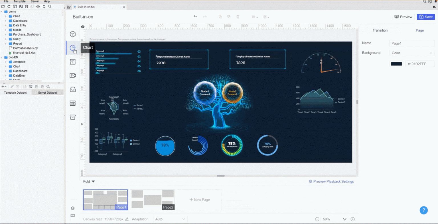
You want a dashboard that fits your needs. FineReport offers a drag-and-drop interface, so you can build your data visualization dashboard without coding. You edit widget properties, modify chart styles, and adjust canvas layouts. This flexibility lets you create dashboards that match your business goals.
- You can customize dashboards to monitor the metrics that matter most.
- Flexible views help you identify inefficiencies, such as bottlenecks or duplicate efforts.
- Teams adapt quickly with dashboards that support ongoing improvements and cost reductions.
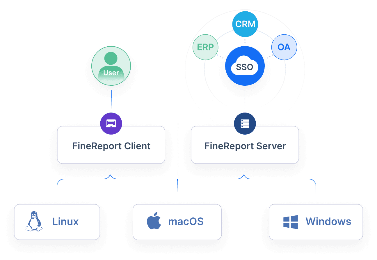
FineReport supports integration with multiple data sources. You connect to SQL databases, Excel files, cloud platforms, and more. This seamless connectivity ensures your dashboard pulls in the right data for analysis and reporting. You can create dynamic reports that update automatically, saving you time and reducing errors.
Note: Customizable dashboards help you allocate resources more effectively and forecast future needs. You make informed decisions with real-time insights.
Visual Clarity and Data Storytelling
You need clear data visualizations to tell your story. FineReport provides over 70 chart styles, including bar charts, heat maps, scatter plots, treemaps, and line charts. Each visualization type serves a specific purpose:
| Visualization Type | Best Use Case |
|---|---|
| Bar Charts | Comparing categories, ranking items, frequency distribution |
| Heat Maps | Recognizing patterns, correlation analysis, risk assessment |
| Scatter Plots | Correlation analysis, detecting outliers, identifying relationships |
| Treemaps | Hierarchical data visualization, nested data categories |
| Line Charts | Tracking evolution of quantitative values over time |
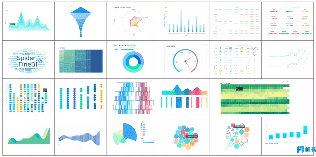
Bar charts work best for comparing categories. Heat maps help you spot patterns and correlations. Scatter plots show relationships between variables. Treemaps visualize hierarchical data. Line charts track changes over time. Choosing the right data visualization makes your dashboard easy to understand and act on.
FineReport’s 3D dashboards add another layer of visual presentation. You can model complex data in three dimensions, making it easier to analyze operations in smart factories, logistics, or city management. Mobile dashboard support ensures you access your data dashboards on any device, so you stay informed wherever you go.
Tip: The right data visualization helps you communicate insights clearly and drive better decisions.
You benefit from dashboards that combine real-time insights, customization, and visual clarity. FineReport empowers you to create interactive dashboards that support analysis, reporting, and business intelligence. You see the big picture and drill down into details, making your data work for you.
Data Visualization Dashboard Uses and Benefits
Business Applications of Data Dashboards
You can use data dashboards in many areas of business. These dashboards help you track important metrics and make sense of large amounts of data. Here are some common applications:
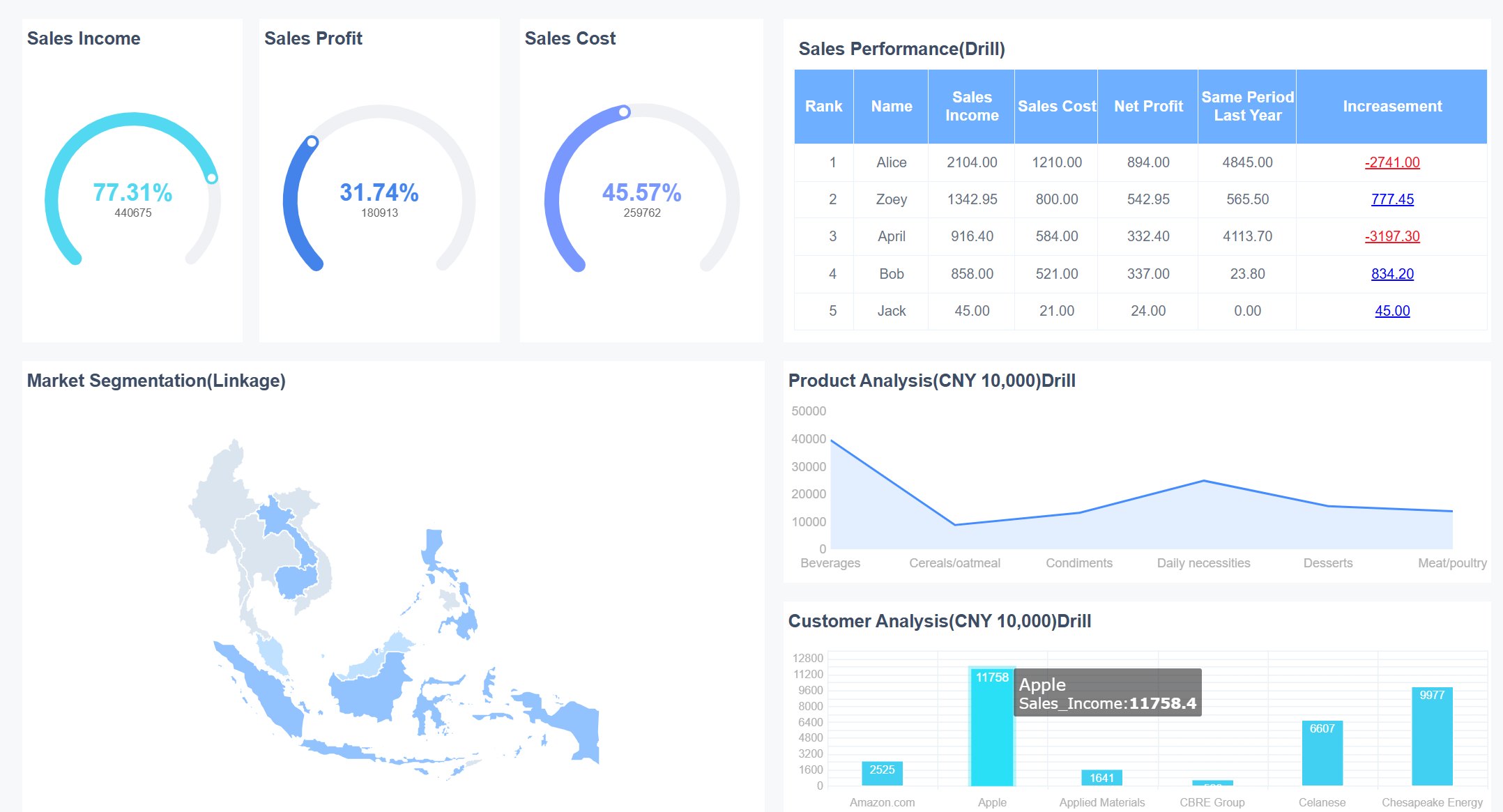
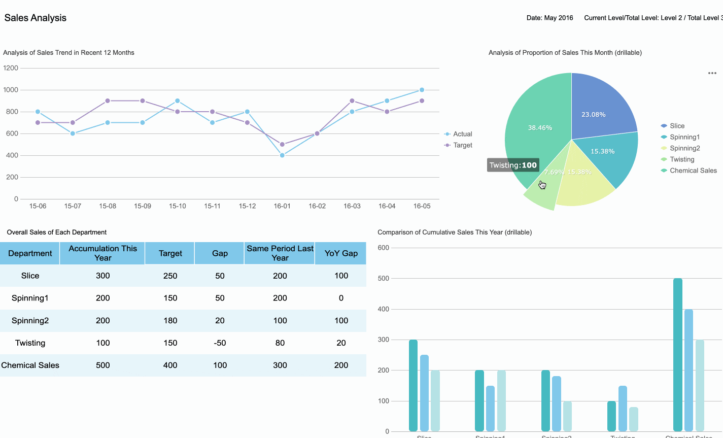
- Monitor sales performance and spot trends quickly.
- Track equipment efficiency and production quality in manufacturing.
- Manage customer relationships by viewing real-time updates on interactions and orders.
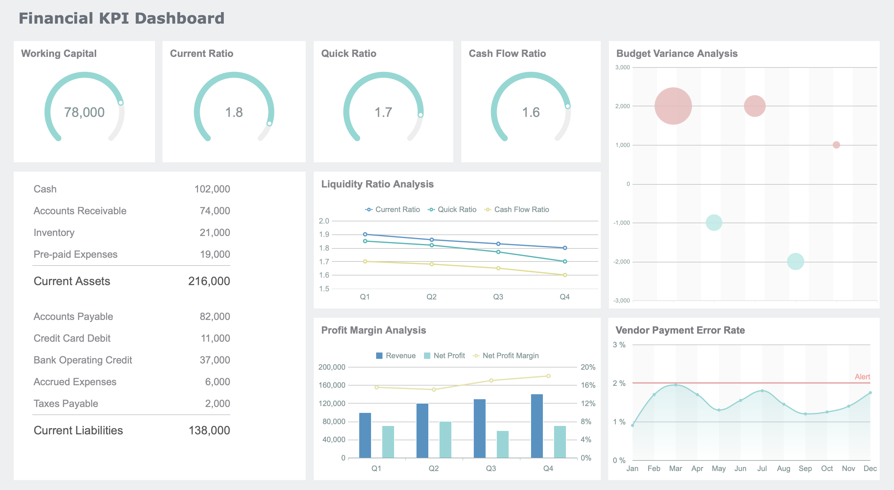
- Oversee financial health by visualizing expenses, revenue, and budgets.
- Support marketing teams with campaign analysis and lead tracking.
Top business dashboards offer strong data sources, real-time accuracy, custom visuals, interactivity, easy sharing, and reliable performance. You can also set up alerts for key changes and use dashboard templates to get started faster.
Industry Solutions with FineReport
FineReport gives you powerful tools for industry-specific needs. In manufacturing, you can use dashboards for quality control and OEE (Overall Equipment Effectiveness) monitoring. These dashboards provide real-time insights into operations. You can reduce costs, increase throughput, and improve production quality. FineReport helps you identify problems quickly and analyze root causes. Operators and managers get role-specific data, which boosts productivity and reduces downtime.
For example, Kintetsu improved operational efficiency by using FineReport to create a centralized reporting system. This system made it easier to manage data, design reports, and support data-driven decisions. You can see how FineReport adapts to different industries and helps you streamline reporting and analysis.
Practical Benefits for Decision-Making
Dashboards support better decision-making by giving you access to current and precise data. You can monitor KPIs, sales, and equipment efficiency in real time. The table below shows how different dashboards help you manage your business:
| Dashboard Type | Purpose |
|---|---|
| KPI Dashboard | Provides real-time data visualization for informed decision-making and early problem detection. |
| Sales Dashboard | Offers at-a-glance sales information to manage sales teams effectively. |
| Manufacturing Dashboard | Monitors equipment performance and identifies opportunities for process improvement. |
| Early Warning System | Detects potential issues like sales declines or production bottlenecks before they escalate. |
You gain a comprehensive summary of your organization’s performance. Dashboards help you communicate business-critical information at a glance, track and execute on KPIs, and identify trends or outliers quickly. With an interactive dashboard, you empower your team to make data-driven decisions and improve business intelligence. You can focus on analysis instead of manual reporting, making your workflow more efficient.
Tip: Use dashboards to keep everyone aligned on important metrics and support continuous improvement in your business.
Interactive Dashboard vs Other Data Tools
Interactive Dashboard vs Static Reports
You often need to choose between an interactive dashboard and a static report. Static reports give you a snapshot of your data at a specific time. You cannot change the view or explore details. Interactive dashboards, on the other hand, let you filter, drill down, and explore your data in real time. This means you can answer new questions as they come up, without waiting for a new report.
A recent survey shows that 38% of organizations still use static reports for analytics, while 22% prefer live dashboards. Static reports work well for audits or historical reviews. However, interactive dashboards help you make decisions faster because you see updates instantly. You gain more control over your analysis and can adapt quickly to changes.
| Feature | Interactive Dashboards | Traditional Tools |
|---|---|---|
| Real-time access to insights | Yes | No (scheduled reports) |
| Speed of decision-making | Faster (instant visibility) | Slower (waiting for reports) |
| User autonomy | High (self-service) | Low (dependent on analysts) |
| Adaptability to changing trends | High (quick adjustments) | Low (limited by report schedules) |
Dashboard vs Data Visualization Tools
You may also wonder how an interactive dashboard compares to basic data visualization tools like spreadsheets. Spreadsheets show raw data in rows and columns. They offer basic analysis with formulas, but they can feel overwhelming. Interactive dashboards present your data through graphs, maps, and charts. You get a user-friendly experience and can customize layouts and visuals to fit your needs.
| Aspect | Spreadsheet | Interactive Dashboards |
|---|---|---|
| Presentation | Raw and unformatted data | Visual representations (graphs, charts, maps) |
| Interactivity | Static | Filtering, drilling down, exploring |
| User Experience | Can be overwhelming | User friendly and intuitive |
| Customization | Limited to data cells and formatting | Customizable layouts and visuals |
| Data Analysis | Basic functions and formulas | Advanced analysis and real-time exploration |
When to Use an Interactive Dashboard
You should use an interactive dashboard when you need to make quick decisions, explore data from different angles, or empower your team to analyze information on their own. Real-time dashboards are perfect for tracking sales, monitoring inventory, or managing employee engagement. You can drill down for more detail or filter to focus on what matters most.
Common use cases include:
- Sales performance dashboards for tracking conversion rates
- Campaign ROI dashboards to optimize marketing spend
- Employee engagement dashboards to improve retention
- Budget performance tracking dashboards for cost control
- Inventory management dashboards to avoid stockouts
Interactive dashboards offer unique value in these scenarios:
- Drill-down: You can view granular details without leaving the dashboard.
- Drill-through: You can focus on specific metrics for deeper analysis.
You gain agile decision-making, immediate updates, and increased productivity. Interactive dashboards give you the power to respond to business changes as they happen, making your reporting and analytics more effective.
Visual dashboards give you a clear view of key metrics and trends, helping you make quick, informed decisions. You use dashboards to monitor progress, track KPIs, and spot issues early. FineReport lets you build interactive dashboards that turn complex data into actionable insights. The dashboard software market is growing fast, with more organizations choosing visual tools for better engagement and speed. If you want to start, identify your business needs, check your data quality, and design a dashboard that fits your goals. Are you ready to transform your decision-making with FineReport?
Continue Reading About Visual Dashboard
What is a Call Center Metrics Dashboard and How Does It Work
How to Build an Effective Manufacturing KPI Dashboard
Executive Project Dashboards for Smarter Leadership
Strategy Dashboard Explained and Why Your Business Needs One


FAQ

The Author
Lewis
Senior Data Analyst at FanRuan
Related Articles

How to Build an Investment Portfolio Reporting Dashboard for Executives: KPIs, Benchmarks, and Drill-Down Views
Investment portfolio reporting for executives is not about showing every holding, transaction, and chart your investment team can produce. It is about giving CEOs, CFOs, CIOs, boards, and investment committees a fast, re
Yida YIn
Jun 25, 2026

12 KPI Reporting Examples for Executive Dashboards: What to Show in Weekly, Monthly, and Quarterly Reviews
Executive leaders do not need more data. They need decision ready $1 examples that match how often they review the business and what actions they are expected to take. A weekly $1 should surface fast moving risks and per
Yida YIn
Jun 25, 2026

How to Build a Digital Marketing Reports Dashboard: Executive Examples, KPIs, and Templates
A $1 is the control layer that helps executives and marketing leaders turn scattered channel data into fast, confident decisions. If you are a CEO, CMO, operations director, or marketing analytics lead, the real problem
Yida Yin
May 07, 2026