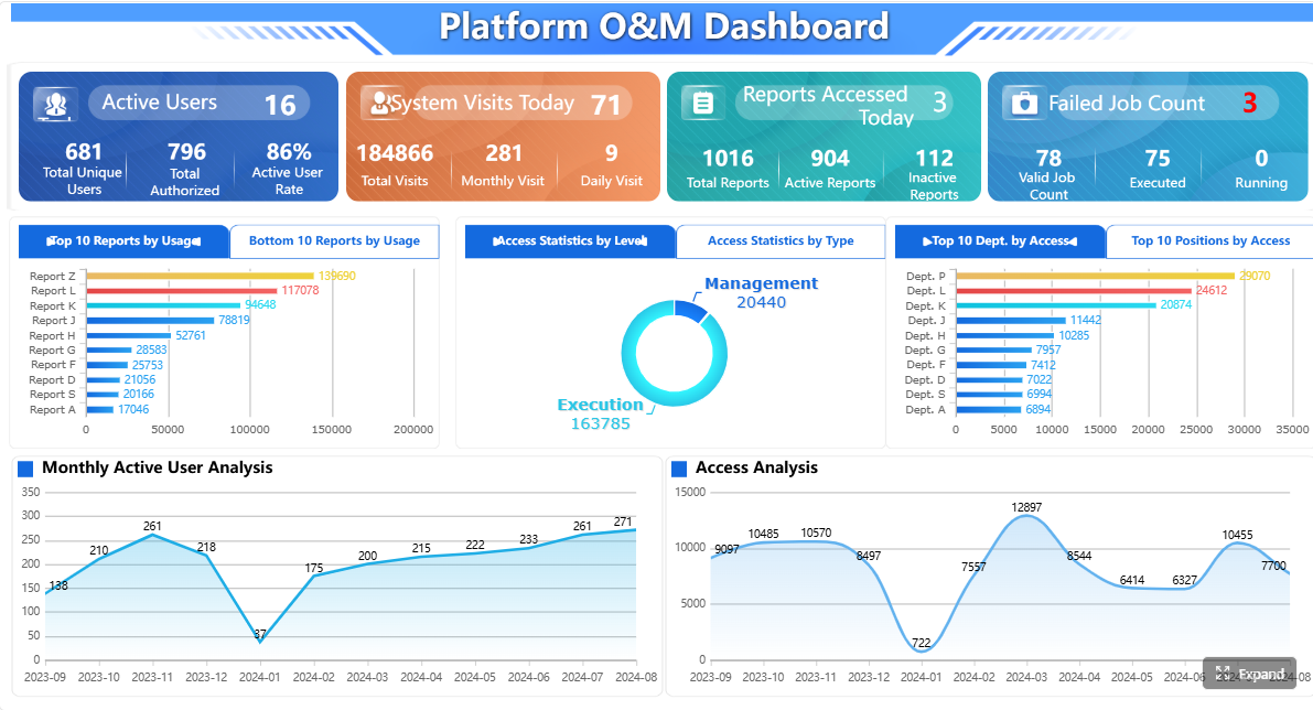
A BMS dashboard gives building operations teams one place to monitor, understand, and act on building performance. If you manage HVAC, alarms, energy use, occupant comfort, or maintenance workflows across one facility or a portfolio, the problem is familiar: data exists everywhere, but decisions still feel slow, reactive, and fragmented.
That is exactly where a BMS dashboard creates business value. It turns building management system signals into a practical operational layer for engineers, facility managers, energy teams, and service providers. Instead of bouncing between graphics pages, spreadsheets, meter portals, and alarm logs, teams get a single view of what matters now, what is drifting, and what needs action next.
Click To Try The Dashboard
What a BMS dashboard is and why it matters
A BMS dashboard is a visual interface that consolidates data from a building management system and related building technologies into an easy-to-read operational view. In plain language, it helps building operations teams see how the building is performing without digging through raw points, control logic, or multiple software screens.
For most facilities, the dashboard is where operations become manageable. It pulls together equipment status, environmental conditions, alarms, energy trends, and maintenance signals so teams can respond faster and prioritize the right work.
A BMS dashboard in plain language
For building operations teams, think of a BMS dashboard as the decision layer on top of your building systems. The underlying BMS may already collect thousands of data points, but that does not automatically help staff make better decisions. A dashboard organizes those points into meaningful summaries:
What systems are running now
Which zones are out of range
Where alarms are escalating
How energy use compares to normal
Which assets show early signs of failure
This is why a good dashboard is not just a display. It is an operational tool.
How it turns building management system data into a single operational view
Modern buildings generate data from many sources. HVAC controllers, lighting systems, submeters, occupancy sensors, and indoor air quality devices all produce valuable signals. A BMS dashboard collects and presents that information in one place so teams can understand building conditions quickly.
Instead of checking each subsystem separately, users can:
View building-wide status at a glance
Drill into floors, zones, or equipment
Compare live values against thresholds and schedules
Track trends over time
Connect alarms to likely operational causes
This consolidation reduces manual effort and shortens the gap between issue detection and corrective action.
Raw controls data vs. graphics vs. decision-ready dashboards
This distinction matters.
Raw controls data is point-level information such as temperatures, setpoints, valve positions, fan status, and sensor values. It is essential, but difficult to interpret at scale.
Graphics are traditional BMS screens that show equipment layouts, floor plans, or system diagrams. They help technicians inspect status and navigate equipment relationships, but they are often designed for device-level interaction rather than management-level insight.
Decision-ready dashboards go further. They summarize performance, highlight exceptions, and frame data around business outcomes such as uptime, comfort, response time, and energy reduction. That is the difference between seeing data and knowing what to do with it.
An effective bms dashboard is not just a collection of widgets. It is a structured system that combines reliable data, usable design, and clear workflows. If any of those elements are weak, user adoption drops and operational value declines.
Data sources and system integrations
The first requirement of a strong dashboard is broad, clean data integration. Most buildings do not run on a single source of truth. Relevant data typically lives across multiple systems, which means the dashboard must unify them in a way users can trust.
The real value comes from normalization. Different vendors, point names, units, and update intervals can make data inconsistent. A robust BMS dashboard standardizes these inputs so users can compare assets, floors, and buildings without confusion.
Core elements every integration layer should support
Point normalization: Standardizes names, units, and labels across vendors and systems.
Time-series history: Preserves trend data for analysis, diagnostics, and reporting.
Context mapping: Connects points to equipment, zones, floors, and buildings.
Cross-system correlation: Aligns alarms, meter data, occupancy, and environmental readings.
Data validation: Flags missing, stale, or implausible values before they distort decisions.
Without these capabilities, teams often end up with a dashboard that looks polished but lacks operational credibility.
User interfaces and visual design
The best dashboards make complex building data instantly understandable. Good visual design is not cosmetic; it directly affects how fast teams can identify issues and act on them.
Role-based design is especially important. A facilities director, controls technician, energy manager, and external contractor do not need the same screen or the same level of detail.
Effective interfaces often include:
Executive summary views for building health and KPIs
Floor plans with color-coded conditions
Trend charts for temperature, runtime, and consumption
Status widgets for critical equipment
Alarm panels with severity filters
Mobile-friendly layouts for field access
Clear graphics and intuitive navigation reduce response time because users can move from overview to diagnosis without unnecessary clicks. In real operations, that speed matters. When a comfort issue escalates or a plant alarm repeats, teams need context immediately.
Alerts, workflows, and access control
A BMS dashboard becomes far more valuable when it is tied to action, not just observation. That means alerts and workflows must be designed with operational reality in mind.
Key features include:
Alarm prioritization by severity and impact
Acknowledgement workflows
Escalation paths for unresolved issues
Work order linkage to maintenance systems
User-based permissions for different teams
Secure remote access for internal and external users
This structure prevents teams from drowning in noise. Too many buildings generate excessive alarms, many of which are low value or repetitive. A useful dashboard helps separate actionable events from background clutter.
Access control is equally important. A technician may need detailed equipment visibility, while a tenant-facing team should only see comfort conditions or service status. A strong permissions model protects security while keeping information relevant.
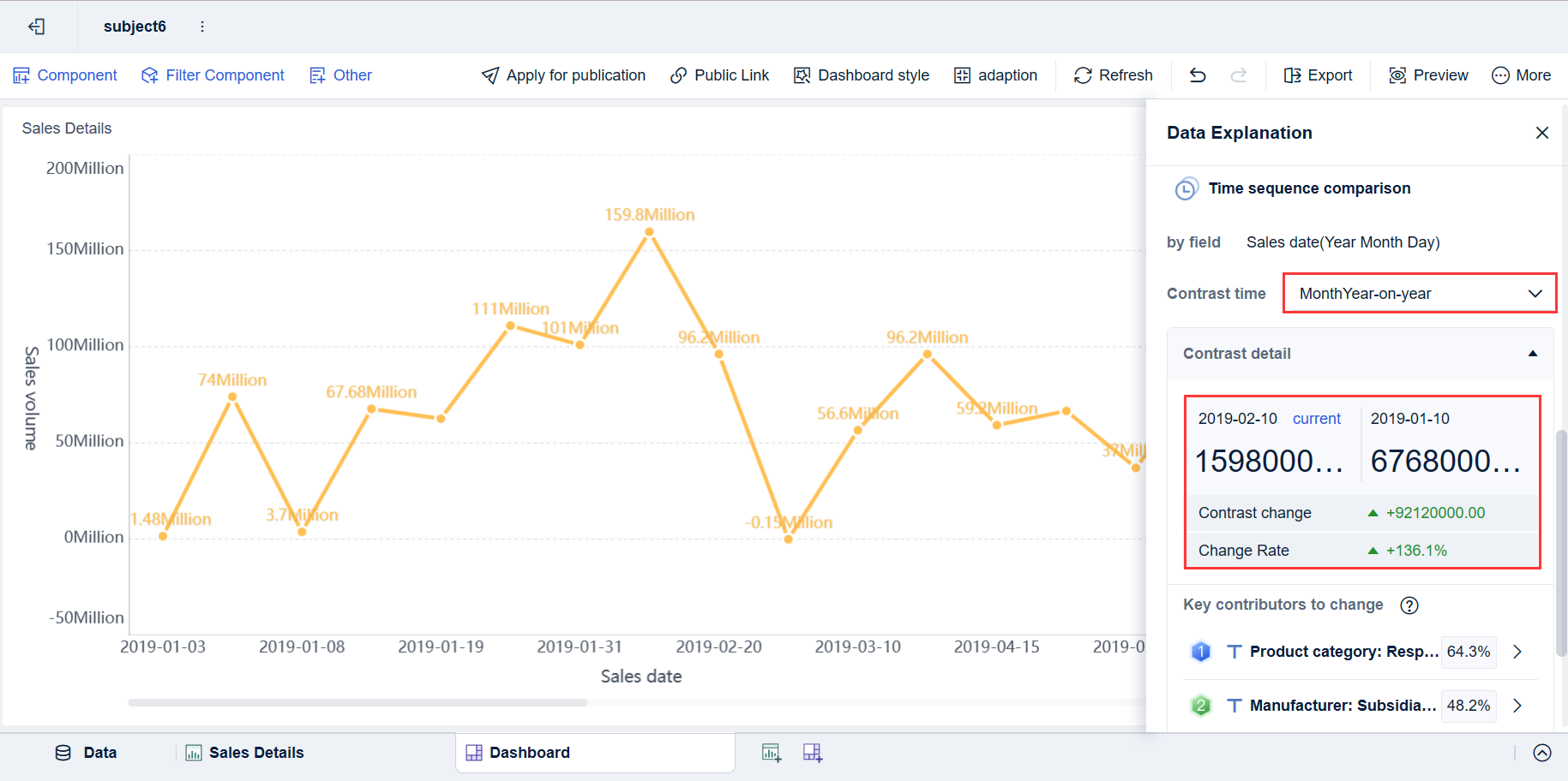
A dashboard only becomes decision-ready when it focuses on the right KPIs. Too many screens fail because they try to show everything. The goal is not more data. The goal is faster, better building decisions.
Below are the Key Metrics (KPIs) building operations teams should track in a bms dashboard.
Energy and equipment performance metrics
These metrics help teams understand whether systems are operating efficiently and whether equipment behavior is drifting away from expected performance.
Key Metrics (KPIs)
Energy use: Total electricity, gas, steam, or water consumption over a defined period.
Peak demand: Highest power draw during a billing interval; critical for managing utility costs.
Equipment runtime: Total operating hours for fans, pumps, boilers, chillers, and other assets.
Cycling frequency: How often equipment starts and stops; excessive cycling may signal control problems or wear.
Setpoint deviation: Difference between actual conditions and intended control targets.
Efficiency trend: Change in energy consumed relative to output or operating conditions over time.
Load profile: Hourly or daily demand pattern used to identify waste, schedule mismatch, or abnormal spikes.
After-hours operation: Runtime or consumption outside occupied schedules.
Simultaneous heating and cooling: A common inefficiency that indicates sequencing or control issues.
These metrics are especially useful for identifying hidden waste that is not obvious from a single piece of equipment or a single day of operation.
Comfort, indoor environment, and occupant experience
Comfort is one of the clearest tests of building performance. If occupants are uncomfortable, operational efficiency alone is not enough.
Key Metrics (KPIs)
Zone temperature compliance: Percentage of time spaces remain within the defined comfort band.
Humidity range compliance: Frequency and duration of humidity conditions outside acceptable limits.
Indoor air quality readings: CO2, particulate matter, VOCs, or other IAQ measures where available.
Complaint rate: Number of occupant comfort complaints by area, time, or system.
Hot/cold spot recurrence: Repeat comfort issues in the same space, often tied to balancing or controls faults.
Ventilation performance: Indication that outside air delivery and space conditions align with requirements.
Space condition stability: How much temperatures or humidity fluctuate over time.
These KPIs matter because they connect system performance to occupant experience, tenant satisfaction, and workplace productivity.
Maintenance and alarm management metrics
A good BMS dashboard should also help teams manage maintenance workload and reduce recurring failures.
Key Metrics (KPIs)
Alarm frequency: Total number of alarms generated by asset, system, or building.
Alarm response time: Time between alarm generation and first acknowledgement.
Alarm resolution time: Time from alarm creation to closure or corrective action.
Work order linkage rate: Percentage of significant alarms connected to maintenance tasks.
Fault recurrence: How often the same issue returns after intervention.
Downtime: Duration an asset or system is unavailable or degraded.
Nuisance alarm ratio: Share of alarms that are low value, repetitive, or non-actionable.
Open critical alarms: Count of unresolved high-priority events.
Maintenance backlog by risk: Outstanding tasks prioritized by building impact or asset criticality.
These indicators help operations leaders understand whether the team is truly getting ahead of problems or simply reacting faster.
The most effective bms dashboard deployments are built around operational scenarios, not abstract reporting goals. Below are the use cases that typically drive the strongest return.
Daily monitoring and faster issue detection
Daily monitoring is the most immediate value case. Teams need to know what changed overnight, what is drifting now, and what requires intervention before it affects occupants or costs.
A dashboard supports this by helping operators:
Spot temperature or humidity anomalies early
Identify assets running outside schedules
Surface critical alarms without combing through logs
Reduce routine manual checks
Focus limited attention on systems with the highest risk
For example, an operations supervisor can start the day with a portfolio summary, drill into one building showing unusual after-hours demand, and quickly see that a handling unit remained active due to a schedule override. That is a much faster workflow than navigating point lists or waiting for monthly reports.
Preventive maintenance and troubleshooting
A BMS dashboard is also a practical maintenance tool. It helps technicians move from symptoms to root causes by combining alarms, trends, and equipment context in one place.
Common troubleshooting scenarios include:
A zone repeatedly misses temperature setpoint
A pump short cycles during part-load conditions
A VAV cluster shows recurring comfort complaints
A chiller’s efficiency trend worsens over time
The same fault alarm keeps returning after reset
Trend views can reveal whether the issue is mechanical, control-related, or schedule-driven. Alarm histories can show recurrence patterns. Runtime metrics can support maintenance prioritization based on actual asset use rather than fixed calendars.
This shifts maintenance from reactive dispatch to informed intervention.
Portfolio reporting and performance improvement
For organizations managing multiple buildings, dashboards help standardize visibility across sites. This is where the strategic value increases.
Portfolio-level use cases include:
Comparing buildings by energy intensity
Tracking progress against sustainability targets
Identifying sites with the highest alarm burden
Benchmarking comfort stability across facilities
Prioritizing capital or controls optimization work
When buildings use different controls vendors or operating models, portfolio reporting becomes difficult without a normalized dashboard layer. A strong system lets leaders compare like-for-like performance and target the biggest improvement opportunities first.
Choosing and deploying a dashboard should be treated like an operational transformation project, not a simple software add-on. The right design depends on users, workflows, data quality, and governance.
Questions to ask before adoption
Before selecting a solution, building owners and operations leaders should answer a few core questions:
Which users need visibility: operators, engineers, managers, executives, vendors, or all of the above?
Which KPIs matter most for your business: energy, comfort, uptime, alarm management, compliance, or portfolio benchmarking?
What systems must connect from day one?
Do you need mobile access for field teams?
What reporting cadence is required: live monitoring, daily review, weekly operations meetings, monthly executive summaries?
What cybersecurity and remote access controls are mandatory?
How will naming conventions and asset hierarchies be standardized?
If these questions are skipped, teams often end up with attractive screens that do not support real decisions.
Best practices for rollout and adoption
From a consultant’s perspective, the fastest path to value is to start narrow, prove usefulness, and then scale. Here are the most effective implementation practices.
1. Start with high-value views first
Do not launch with dozens of screens. Begin with the operational views that solve immediate problems:
Critical alarms
Energy summary
Top equipment exceptions
Comfort compliance by floor or zone
After-hours runtime
This creates adoption quickly and helps users trust the platform.
2. Standardize naming and asset structure
Dashboards fail when users cannot tell whether two points refer to the same thing. Normalize equipment names, zone labels, and building hierarchies early. A clean taxonomy makes every future dashboard, report, and alert more useful.
3. Build around real workflows
Design screens around what users actually do each day. For example:
Morning operations review
Alarm triage
Comfort complaint investigation
Weekly maintenance planning
Monthly energy performance reporting
This is more effective than adding screens simply because data is available.
4. Train users by role
An energy manager should not receive the same training as a field technician. Provide role-specific onboarding so each team understands:
Which dashboards matter to them
Which KPIs they own
What action is expected when thresholds are exceeded
Training is often the difference between a dashboard that gets opened occasionally and one that changes operations.
5. Review KPIs regularly and refine
Buildings change. Schedules change. Occupancy patterns change. The dashboard should evolve too. Review KPI relevance, alarm noise, and user behavior on a regular basis. Remove clutter. Add context where needed. Treat the dashboard as a living operational asset.
The term bms dashboard can be confusing because search results often include unrelated tools, branded apps, school portals, or pharmaceutical login pages that use the same initials. In the context of facilities and smart buildings, however, a BMS dashboard refers specifically to a dashboard tied to a Building Management System.
It is also important to understand what a dashboard is not.
A dashboard is not the same as:
The full BMS platform itself
Every equipment graphic in the controls front end
A generic mobile app with status screens
A standalone analytics system with no live operational workflow
A useful dashboard sits between raw controls data and business action. It provides clarity, context, and prioritization.
What makes a BMS dashboard truly useful
The best dashboards share a few traits:
Clarity: Users can understand the state of the building immediately.
Context: Data is tied to equipment, zones, time, and operational impact.
Actionable KPIs: Metrics support decisions, not just observation.
Workflow alignment: Alerts, trends, and reports match how teams actually work.
Adoption across roles: Operators, managers, and energy teams all find value.
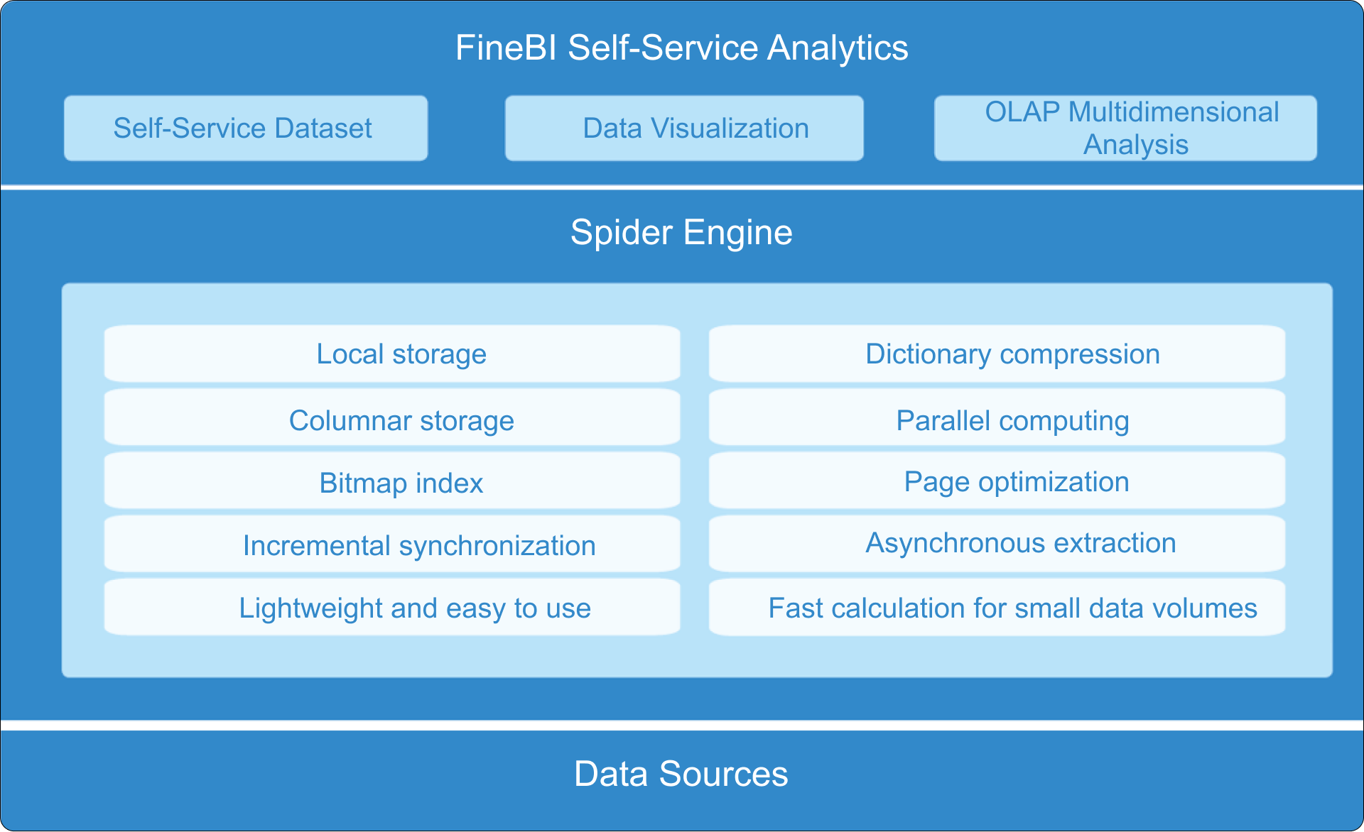
Build smarter with FineBI
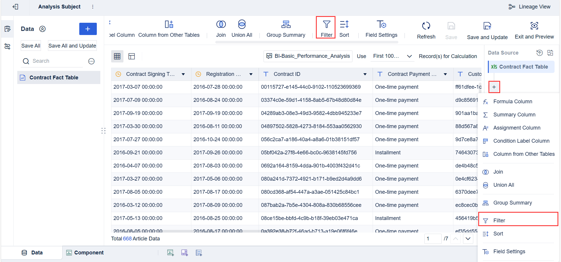
Building this manually is complex; use FineBI to utilize ready-made templates and automate this entire workflow.
For enterprise teams, the challenge is rarely just dashboard design. It is integrating multiple systems, modeling the right KPIs, maintaining consistency across sites, and delivering role-based views that people actually use. That takes time, data expertise, and ongoing governance.
FineBI helps simplify that process by enabling teams to:
Connect and unify data from multiple building and business systems
Build role-based dashboards faster with reusable templates
Automate recurring reports and performance tracking
Standardize KPI logic across buildings or portfolios
If your goal is to turn fragmented building data into an operational decision engine, FineBI is the practical path forward. It helps facility leaders move beyond static screens and create a scalable bms dashboard strategy that supports monitoring, maintenance, energy management, and executive reporting in one modern analytics environment.
FAQs
A BMS dashboard brings data from building systems into one operational view so teams can monitor performance, spot issues, and act faster. It helps turn raw points and alarms into information that is easier to understand and prioritize.
Most BMS dashboards display HVAC status, temperatures, alarms, energy use, indoor air quality, runtimes, and zone conditions. More advanced dashboards may also include occupancy, metering, and maintenance or work order data.
Traditional graphics are mainly designed to show equipment layouts and point-level status for technicians. A BMS dashboard summarizes trends, exceptions, and KPIs so users can make quicker operational decisions.
Common KPIs include alarm counts, equipment uptime, energy consumption, comfort compliance, response times, and fault trends. The right mix depends on whether the user focuses on facilities, energy management, maintenance, or executive reporting.
BMS dashboards are useful for facility managers, building engineers, controls technicians, energy teams, and service providers. Role-based views help each user see the information they need without unnecessary detail.
Product Trial
FineReport
Pixel-perfect reports · Interactive dashboards · Easy data entry · Digital twins