A real time monitoring dashboard is not just a screen full of charts. In enterprise operations, it is the decision layer that helps teams detect issues early, prioritize response, and keep services running without delay.
If you manage network operations, IT services, security events, customer support queues, or digital business systems, the pain points are familiar: fragmented tools, delayed reporting, alert fatigue, unclear ownership, and too much time spent figuring out what is actually wrong. A well-designed dashboard solves these problems by turning live operational data into a clear, actionable control center.
For enterprise teams, the business value is straightforward:
Reduce mean time to detect (MTTD)
Cut mean time to resolve (MTTR)
Prevent customer-facing disruptions
Improve escalation accuracy
Support faster, better operational decisions
This guide explains what makes a high-performing real time monitoring dashboard, the nine design elements that matter most, and how to build one that works in real operating conditions.
Click To Try The Dashboard
Why a Real Time Monitoring Dashboard Matters for Enterprise Operations
A real-time dashboard is a live operational interface that continuously updates metrics, statuses, alerts, and trends from systems that matter to the business. For operations teams, it acts as a shared situational awareness layer across infrastructure, applications, support workflows, security events, and service performance.
In practical terms, this means teams can see:
which services are healthy
where performance is degrading
which incidents are active
who owns the issue
what requires immediate action
That is fundamentally different from traditional reporting.
When teams rely on static reports or delayed analytics, they are reacting to yesterday’s problems. A real time monitoring dashboard helps teams act while events are still unfolding.
Live visibility improves operations in several ways:
Faster response times: Teams spot anomalies as they happen rather than after batch reports arrive.
Lower service disruption risk: Small issues can be addressed before they cascade into outages.
Better decision-making: Operators and managers work from the same current picture.
Improved cross-team coordination: Shared dashboards reduce confusion during incident handling.
Greater accountability: Ownership, severity, and timing are visible in one place.
Static reporting vs analytics dashboards vs monitoring dashboards
These dashboard categories are often confused, but they serve different purposes.
Static reporting
Static reports summarize historical performance on a fixed schedule. They are useful for audits, monthly reviews, and executive reporting, but not for active response.
Analytics dashboards
Analytics dashboards help users explore patterns, trends, and root causes over time. They are valuable for strategic insight and performance analysis.
Monitoring-focused dashboards
A real time monitoring dashboard is built for immediate operational awareness. Its purpose is not deep historical exploration first. Its first job is to answer:
What is happening right now?
What needs attention first?
What action should we take next?
That distinction is critical. Enterprise monitoring dashboards should prioritize clarity, speed, and actionability over visual complexity.
The 9 Must-Have Elements of an Effective Dashboard
A dashboard may look impressive and still fail under operational pressure. The best designs are built around fast interpretation, trustworthy live data, and clear next actions.
Key Metrics (KPIs) for a Real Time Monitoring Dashboard
Before diving into design elements, align on the KPIs that matter most. These are the metrics enterprise teams commonly use to measure whether a dashboard is truly operationally effective:
MTTD (Mean Time to Detect): How quickly teams identify an issue after it begins.
MTTR (Mean Time to Resolve): How long it takes to restore normal operations.
Alert Precision: The percentage of alerts that represent real, actionable issues.
Data Freshness: The delay between source event creation and dashboard visibility.
System Availability: The percentage of time critical services remain accessible.
Incident Volume: The number of active or new incidents in a defined period.
Threshold Breach Rate: How often monitored KPIs cross warning or critical thresholds.
Escalation Accuracy: Whether incidents are routed to the right team on the first pass.
Dashboard Load Time: How quickly the interface renders during normal and peak conditions.
User Adoption Rate: How consistently operations teams use the dashboard during daily workflows.
These KPIs help separate a visually attractive dashboard from one that actually improves enterprise operations.
1. Clear operational goals and audience alignment
The first design decision is not visual. It is organizational.
A dashboard built for everyone usually helps no one. NOC analysts, IT operations managers, SecOps teams, support leads, and business operations stakeholders all need different levels of detail and different decision support.
NOC teams need service health, infrastructure status, traffic patterns, and outage indicators.
IT operations needs application performance, dependency mapping, and incident status.
Security teams need threat anomalies, suspicious activity, and high-risk alerts.
Support teams need queue volume, SLA risk, unresolved cases, and backlog visibility.
Business operations leaders need service impact, regional disruption views, and executive-level summaries.
If these needs are mixed into one undifferentiated layout, the dashboard becomes noisy and slow to interpret.
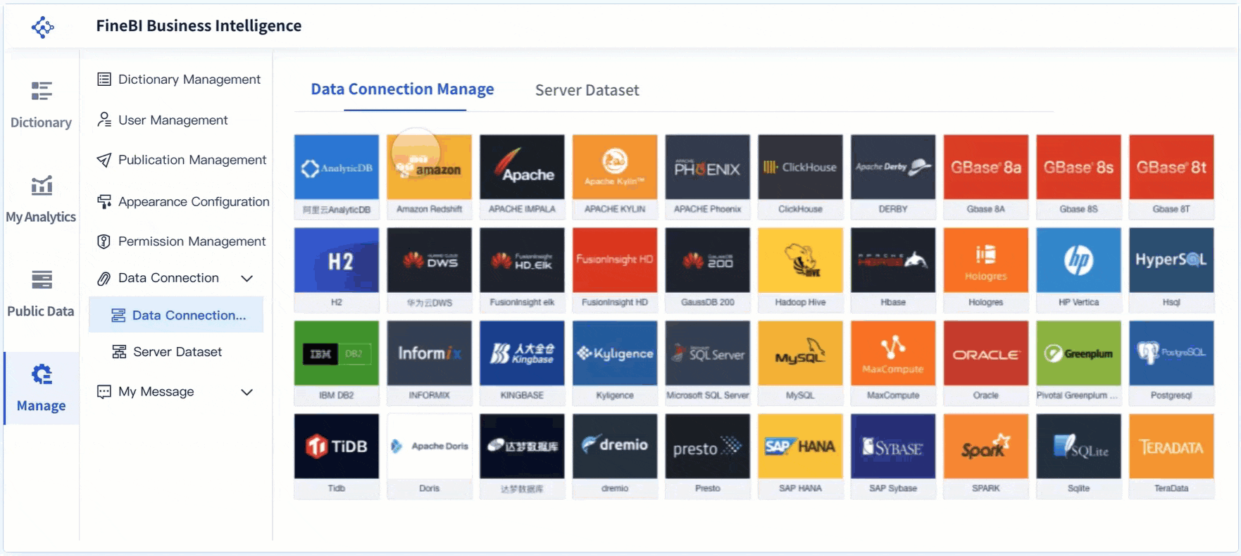
2. Live data pipelines and trustworthy integrations
A monitoring dashboard is only as good as the data behind it. If refreshes lag, integrations break, or metrics disagree across systems, users stop trusting the dashboard.
A reliable dashboard should pull live or near-live data from:
applications
infrastructure monitoring tools
event streams
device telemetry
logs
ticketing systems
cloud services
databases
security platforms
The goal is minimal latency with stable refresh behavior.
Core elements of trustworthy live data
Low-latency ingestion: Data should arrive quickly enough to support active response.
Consistent refresh intervals: Users should know how current the data is.
Data quality controls: Null values, duplicates, and mapping errors must be handled.
Semantic consistency: Definitions of uptime, incidents, severity, and ownership must match across systems.
Integration resilience: Pipeline failures need monitoring too.
Without this foundation, the dashboard becomes a false source of confidence.
3. KPI hierarchy and alert thresholds
Not every metric deserves equal space. Effective monitoring dashboards separate strategic indicators from operational signals.
Executive stakeholders may care about overall availability, SLA compliance, or service impact. Frontline responders need CPU saturation, queue depth, failed transactions, or endpoint error rates.
That means your real time monitoring dashboard should present KPIs in a hierarchy.
A metric without threshold logic is only information. A monitoring dashboard needs clearly defined:
warning and critical thresholds
anomaly conditions
event correlation rules
auto-escalation triggers
ownership assignments
This keeps teams from treating every fluctuation as an emergency while ensuring real risk gets surfaced quickly.
4. Visual hierarchy for fast scanning
In high-pressure operations, users do not read dashboards. They scan them.
Visual hierarchy helps teams identify what matters first. The dashboard should direct attention immediately to exceptions, degraded services, and critical actions.
Design principles for fast scanning
Place the most important status indicators at the top left or top center.
Use color intentionally, not decoratively.
Group related metrics by system, function, or severity.
Limit chart variety if it slows interpretation.
Keep background noise low and labels readable.
Use whitespace to separate functional zones.
Red should mean urgent. Amber should mean risk. Green should mean healthy. If every widget competes for attention, nothing stands out.
A monitoring dashboard should feel calm in normal conditions and unmistakably urgent during incidents.
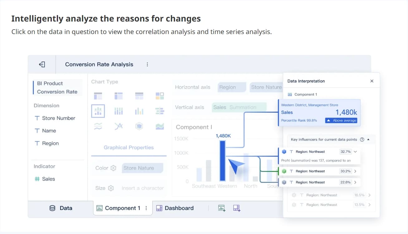
5. Drill-down paths from overview to root cause
A dashboard fails when it shows that something is wrong but forces the user into other tools to investigate. High-performing enterprise dashboards support a smooth path from summary to diagnosis.
Users should be able to move from:
enterprise overview
to region
to service
to application
to host, asset, transaction, or event detail
This drill-down capability shortens the time between detection and root cause analysis.
Good drill-down design includes
clickable summaries
filtered transitions by service or geography
linked views of logs, events, and trends
preserved context when moving deeper
breadcrumb navigation back to summary level
The point is not to expose every data point at once. The point is to let users investigate without losing operational flow.
6. Contextual alerts and incident cues
An alert is only useful if the responder knows what it means and what to do next.
Too many dashboards still show simple red warnings without context. That creates confusion, duplicate effort, and delayed action.
distinguish between warning, critical, and informational events
show if an issue is new, ongoing, or acknowledged
indicate whether customers or internal users are affected
connect alerts to recent changes or correlated events
support escalation directly from the dashboard
This is what makes a real time monitoring dashboard operationally useful during active incidents rather than merely informative.
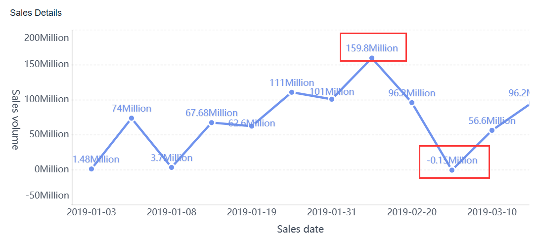
7. Real-time analytics and trend comparison
Live status alone is not enough. Teams also need immediate context around whether current behavior is normal, worsening, or stabilizing.
That is why strong dashboards combine current status with short-term trends and baseline comparisons.
For example, a current queue length of 120 tickets means little without knowing:
the normal range at this time of day
the trend over the last hour
whether incoming volume is accelerating
whether handling capacity is keeping up
Trend comparison helps teams
spot emerging issues before thresholds are breached
identify slow degradation patterns
compare current behavior to historical baselines
distinguish short spikes from sustained incidents
prioritize action based on likely trajectory
This blend of monitoring and immediate analytics is what helps enterprises move from reactive operations to proactive management.
8. Role-based customization and access control
Enterprise operations involve multiple teams, but not every user should see the same metrics or have access to the same level of detail.
A real-time dashboard should support role-based customization so each team sees what is relevant to its responsibilities.
Common role-based dashboard views
Executives: high-level service health and business risk
Operations managers: active incidents, SLA exposure, team workload
NOC analysts: infrastructure health and live events
Security analysts: threat indicators and suspicious activity
Support leaders: queues, backlogs, and customer case pressure
At the same time, access controls are essential for governance.
Access control should protect
sensitive infrastructure data
security incident details
customer or personally identifiable information
privileged admin views
system-level configuration controls
Usability and security must work together. The dashboard should feel tailored without creating governance gaps.
9. Performance, usability, and mobile readiness
A dashboard used during service degradation cannot become slow when the system is under stress. Performance is a design requirement, not a nice-to-have.
The best dashboards are optimized for:
fast rendering
stable refresh behavior
readable typography
intuitive navigation
responsive layout across screens
Why this matters in practice
During high-pressure situations, teams may access dashboards from a war room screen, a laptop, or a mobile device. If interaction breaks down, load times spike, or visuals become unreadable, response suffers.
Designing a monitoring dashboard is as much an operational exercise as a visual one. The process should start with business workflows, not chart types.
Start with the operating model
Begin by understanding how the enterprise actually runs.
Document:
operational workflows
service levels and SLAs
escalation paths
ownership models
incident response procedures
decision points by role
This step prevents a common mistake: building a dashboard around available data instead of around the actions teams need to take.
Best practice 1: Design from decisions backward
Ask each stakeholder group:
What decisions do you make in real time?
What signals tell you action is needed?
What context do you need before acting?
What escalation path follows?
Use those answers to shape dashboard sections and drill-down paths.
Choose the right data and update cadence
Not every metric needs second-by-second refresh. Some data should stream continuously; other metrics can update every minute, five minutes, or longer without hurting operations.
This is where many enterprise teams overbuild and create unnecessary noise or performance issues.
Best practice 2: Match refresh speed to operational value
Use a simple cadence model:
Critical live metrics: update in seconds for incidents and service health.
Operational trends: refresh every 1 to 5 minutes.
Contextual summaries: refresh on a slightly slower interval if needed.
Historical comparisons: pre-aggregate where possible for performance.
This balances freshness with usability and system efficiency.
Prototype, test, and refine with users
Dashboard design should be validated in real operating scenarios, not only in workshops.
Test whether users can:
detect issues quickly
understand urgency correctly
identify ownership
navigate to root cause
act without confusion
Best practice 3: Use scenario-based testing
Run practical simulations such as:
A regional service outage
A sudden spike in failed transactions
An abnormal backlog increase
A suspicious access pattern
A degradation that remains below absolute threshold but exceeds baseline
Observe where users hesitate. That is where the dashboard needs refinement.
Best practice 4: Reduce cognitive load ruthlessly
After testing, remove anything that does not support detection, prioritization, investigation, or action.
That usually means:
cutting low-value widgets
simplifying labels
tightening color rules
improving grouping
reducing duplicate metrics
Best practice 5: Build governance into the design process
Before launch, define:
KPI ownership
threshold approval process
metric definitions
access rules
dashboard change control
This keeps the dashboard useful as systems and teams evolve.
A real time monitoring dashboard must operate on standardized definitions and disciplined governance if it is going to support enterprise decision-making.
Alerts include context, severity, ownership, and next steps
Role-based access is configured
Dashboard performance is tested under load
Users have validated the design in real scenarios
Governance and change ownership are established
Build Faster and Smarter With FineBI
Building an enterprise-grade real time monitoring dashboard manually is possible, but it is rarely simple. You need live integrations, KPI modeling, visual hierarchy, alert design, role-based permissions, performance optimization, and a repeatable governance process. For most teams, that becomes a long and fragile build effort.
This is where FineBI becomes the practical solution.
With FineBI, enterprises can utilize ready-made templates and automate this entire workflow instead of piecing everything together from scratch. Teams can connect operational data sources, standardize KPI definitions, design role-based dashboards, and accelerate deployment without sacrificing control.
integrate data from multiple systems into one monitoring layer
build dashboards faster with reusable templates
create intuitive visual layouts for operations teams
support drill-down analysis and real-time visibility
manage permissions and role-based access securely
reduce manual reporting effort and improve consistency
If your team is trying to scale monitoring across operations, support, IT, and business functions, the challenge is not only dashboard design. It is sustainable execution. Building this manually is complex; use FineBI to utilize ready-made templates and automate this entire workflow.
The best enterprise dashboards do two things well: they help teams act faster today, and they create a stronger operational system for tomorrow. FineBI is built to enable both.
FAQs
A real time monitoring dashboard is built for immediate operational awareness and fast response, while an analytics dashboard is usually used to explore trends and historical performance. The key difference is that monitoring focuses on what is happening now and what needs action next.
The most useful metrics depend on the team, but common choices include service availability, incident volume, alert severity, data freshness, MTTD, and MTTR. The best dashboards show only the KPIs that support rapid decisions during live operations.
It should update often enough to reflect meaningful operational changes without creating noise or performance issues. For most enterprise use cases, low-latency refresh intervals and clear visibility into data freshness are essential.
Teams can reduce alert fatigue by prioritizing alerts by severity, filtering out low-value signals, and assigning clear ownership for action. A dashboard should highlight what is urgent instead of treating every event as equally important.
Real time monitoring dashboards are useful for NOC teams, IT operations, security teams, support leaders, and other stakeholders responsible for service health. Each audience should see a version tailored to its decisions, responsibilities, and level of detail.
Product Trial
FineReport
Pixel-perfect reports · Interactive dashboards · Easy data entry · Digital twins