An analysis report is a structured document that turns raw data into findings, explains what those findings mean, and recommends what should happen next. For operations leaders, analysts, and managers, the business value is simple: better decisions with less guesswork. Without a clear analysis report, teams often face the same problems—fragmented data, inconsistent interpretations, long reporting cycles, and decisions made without enough context.
What Is an Analysis Report?
An analysis report is a document that evaluates information, identifies patterns, and presents conclusions that help people make decisions. In plain language, it does more than show numbers. It explains what the numbers mean.
Raw data is just input. A summary gives a short recap. A dashboard displays metrics visually. But an analysis report connects the dots. It answers questions like:
What happened?
Why did it happen?
What risks or opportunities does it reveal?
What should we do next?
That is the key difference. A strong analysis report transforms findings into insights.
Organizations use analysis reports in many settings, including:
An analysis report matters because decision-makers rarely need more data. They need clarity. A well-built report helps stakeholders quickly identify:
emerging trends
operational bottlenecks
financial risks
underperforming segments
growth opportunities
practical next steps
When teams rely on informal updates alone, important nuance gets lost. A quick message or slide deck may be enough for status sharing, but not for decisions involving budget, staffing, compliance, strategy, or root-cause analysis. In those cases, a formal analysis report is the better tool because it creates a documented, evidence-based view of the situation.
The biggest advantage is context. A number on its own is weak. A number compared against target, history, region, product, or benchmark becomes useful. That is why good analysis reports combine:
Clarity: the reader understands the issue fast
Evidence: claims are backed by reliable data
Context: findings are interpreted in business terms
Direction: recommendations are practical and specific
Key Metrics (KPIs) to Include in an Analysis Report
The right KPIs depend on the scenario, but most effective analysis reports include a structured set of core metrics:
Objective KPI: The primary measure tied to the business question, such as revenue growth, defect rate, or conversion rate.
Baseline Metric: The starting point used for comparison, such as last quarter, prior year, or pre-project performance.
Variance: The difference between actual and expected results, usually shown as absolute value and percentage.
Trend Indicator: The direction of change over time, helping readers spot improvement, decline, or volatility.
Segment Performance: Results broken down by product, region, team, customer type, or campaign.
Root-Cause Driver: Metrics that help explain performance, such as traffic source, production downtime, or staffing levels.
Risk Metric: An indicator of exposure, such as churn probability, overdue tasks, quality incidents, or budget overrun.
Forecast Metric: A projection of expected future performance based on historical and current data.
Action Metric: A measure tied to follow-up decisions, such as recommended inventory level, campaign budget shift, or process adjustment.
Core Structure and Format of an Effective Analysis Report
A strong analysis report follows a logical structure. The format should help busy readers move from high-level understanding to detailed evidence without confusion.
Typical sections to include
Most analysis reports should include these sections:
Executive summary: A concise overview of the question, major findings, and recommended actions.
Background or problem statement: The business issue, scope, and why the analysis was conducted.
Data sources and methodology: Where the data came from, how it was cleaned, and what methods were used.
Key findings: The most important patterns, trends, comparisons, and anomalies.
Interpretation and recommendations: What the findings mean and what stakeholders should do.
Conclusion and appendices: Final takeaway, supporting tables, assumptions, or technical details.
How to organize information for readability
Readability is what separates a useful report from a report nobody finishes. Good organization usually means:
clear section headings
short paragraphs
charts placed next to commentary
consistent labels and definitions
a logical order from evidence to insight to action
Put the most important conclusion early, but support it with evidence before making broad claims. This is especially important when the audience includes executives, clients, or cross-functional leaders.
A practical layout often follows this flow:
State the business question.
Show the most relevant evidence.
Explain what the evidence means.
Recommend next steps.
Add supporting detail in appendices if needed.
Reporting vs. analysis: what’s the difference?
This distinction is critical.
Reporting describes what happened. Analysis explains why it happened, what it means, and what should happen next.
For example:
Reporting: Revenue declined 8% in Q2.
Analysis: Revenue declined 8% in Q2, mainly due to lower repeat purchases in two regions after pricing changes. Recommendation: adjust pricing test scope and launch a retention campaign for affected customer segments.
If your document only lists figures, it is a report. If it interprets the figures and guides action, it is an analysis report.
How to Create an Analysis Report Step by Step
Creating a useful analysis report requires a disciplined process. The goal is not to collect the most data. It is to answer the right question with enough evidence to support action.
Start with the objective and audience
First, define the core question the report must answer. If the objective is vague, the report will be vague too.
Ask:
What decision should this report support?
Who will read it?
What level of detail do they need?
What action should happen after they review it?
A CFO may want margin, forecast variance, and financial risk. An operations manager may need bottleneck analysis, throughput, and downtime trends. A technical team may expect methodology detail that executives do not.
Gather and evaluate the right data
Once the objective is clear, collect only the data that helps answer it. Evaluate data quality before you begin interpreting anything.
Check for:
source credibility
relevance to the objective
completeness
consistency across systems
time period alignment
known limitations or assumptions
If data is incomplete or biased, say so directly. Transparent limitations increase trust.
Analyze findings and build the narrative
This is where many reports fail. They show charts but do not build a story.
A good narrative connects:
patterns
comparisons
exceptions
causes
business impact
For example, do not stop at “customer acquisition cost increased.” Go further: which channels drove the increase, whether conversion quality changed, whether seasonality played a role, and what the increase means for budget allocation.
Your narrative should always point back to the original objective.
Write, review, and refine the final report
Before publication, review the report for:
factual accuracy
consistent metric definitions
chart readability
strong section flow
recommendation quality
audience fit
Recommendations should be specific and realistic. “Improve efficiency” is weak. “Reduce approval steps from five to three in the procurement workflow to cut average cycle time by 15%” is much better.
Analysis Report Examples and Real-World Use Cases
Analysis reports appear in almost every function because every function needs to turn data into decisions.
Business performance analysis
In business, an analysis report often reviews:
sales by product or region
gross margin trends
customer retention behavior
campaign effectiveness
cost drivers and profitability
A sales director might use an analysis report to identify why one region missed target while another exceeded forecast. The report would not just show revenue. It would isolate product mix, discounting patterns, account concentration, and sales cycle changes.
Research and scientific analysis
In research, the analysis report documents the problem, methods, findings, and interpretation in a formal structure. The audience expects rigor, clear methodology, and careful language around limitations.
Common elements include:
hypothesis or research question
data collection method
analytical approach
results
interpretation
implication for future study or application
The same core principle applies: findings must be explained, not just presented.
Operational and project analysis
Operations and project teams use analysis reports to improve execution. Typical focus areas include:
cycle time
resource utilization
schedule variance
quality issues
failure rates
process bottlenecks
An operations director might review a monthly analysis report to determine why order fulfillment slowed down. A strong report would trace the issue to labor allocation, supplier delays, warehouse congestion, or system downtime instead of merely stating that SLA compliance fell.
What strong examples have in common
No matter the industry, the best analysis report examples tend to share the same qualities:
a clear objective
credible and relevant data
an easy-to-follow structure
meaningful visuals
honest discussion of limitations
conclusions tied directly to evidence
actionable recommendations
Common Mistakes to Avoid and Best Practices to Follow When Building an Analysis Report
Weak analysis reports usually fail in predictable ways. The good news is that these problems are avoidable.
Common mistakes
Avoid these frequent issues:
presenting data without interpretation
adding too many charts with no clear purpose
using jargon that obscures the message
mixing metrics with inconsistent definitions
making recommendations unsupported by evidence
ignoring data gaps or methodological limits
ending without practical takeaways
Best practices from an industry consultant
If you want your analysis report to support real decisions, follow these implementation practices:
Start with one decision question.
Build the report around a specific business decision, not a broad theme. Narrow scope improves relevance and speed.
Prioritize KPIs before building visuals.
Identify the handful of metrics that truly determine success. Then choose visuals that clarify those metrics, not decorate them.
Lead with insight, support with evidence.
Put the key takeaway in the executive summary, then validate it through charts, comparisons, and commentary.
Expose assumptions and data limitations early.
Enterprise readers trust reports more when limitations are acknowledged openly instead of hidden.
Translate findings into operational actions.
Every major finding should lead to a clear recommendation, owner, or next step.
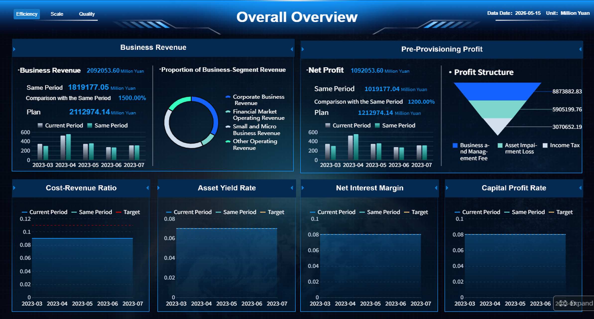
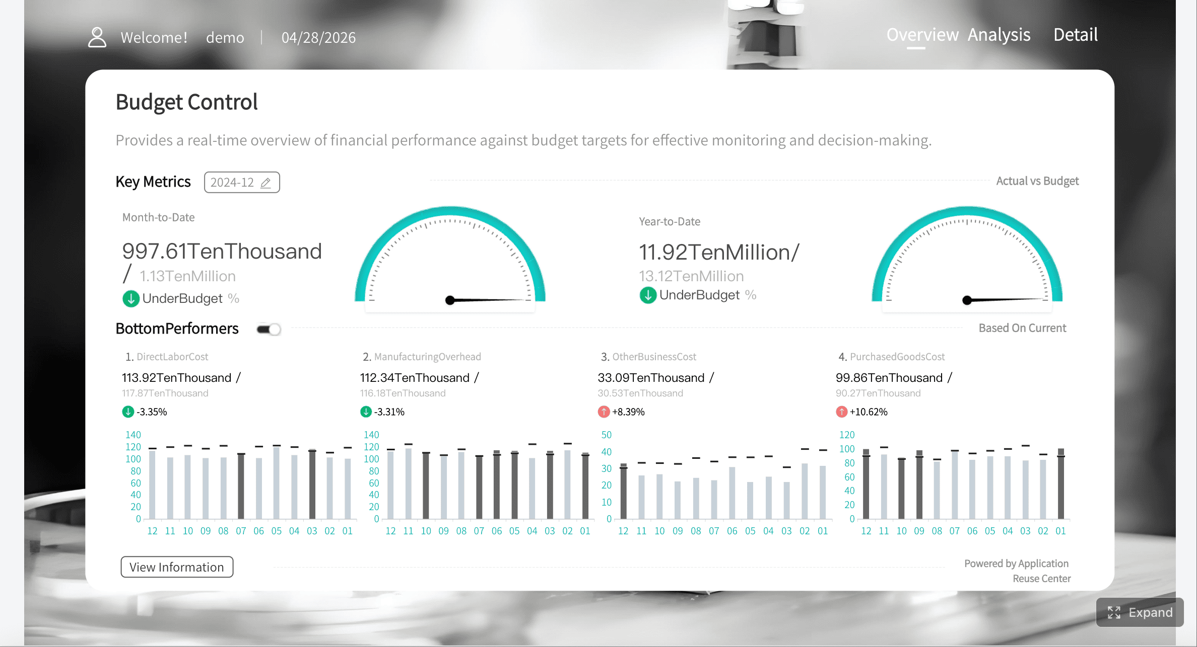
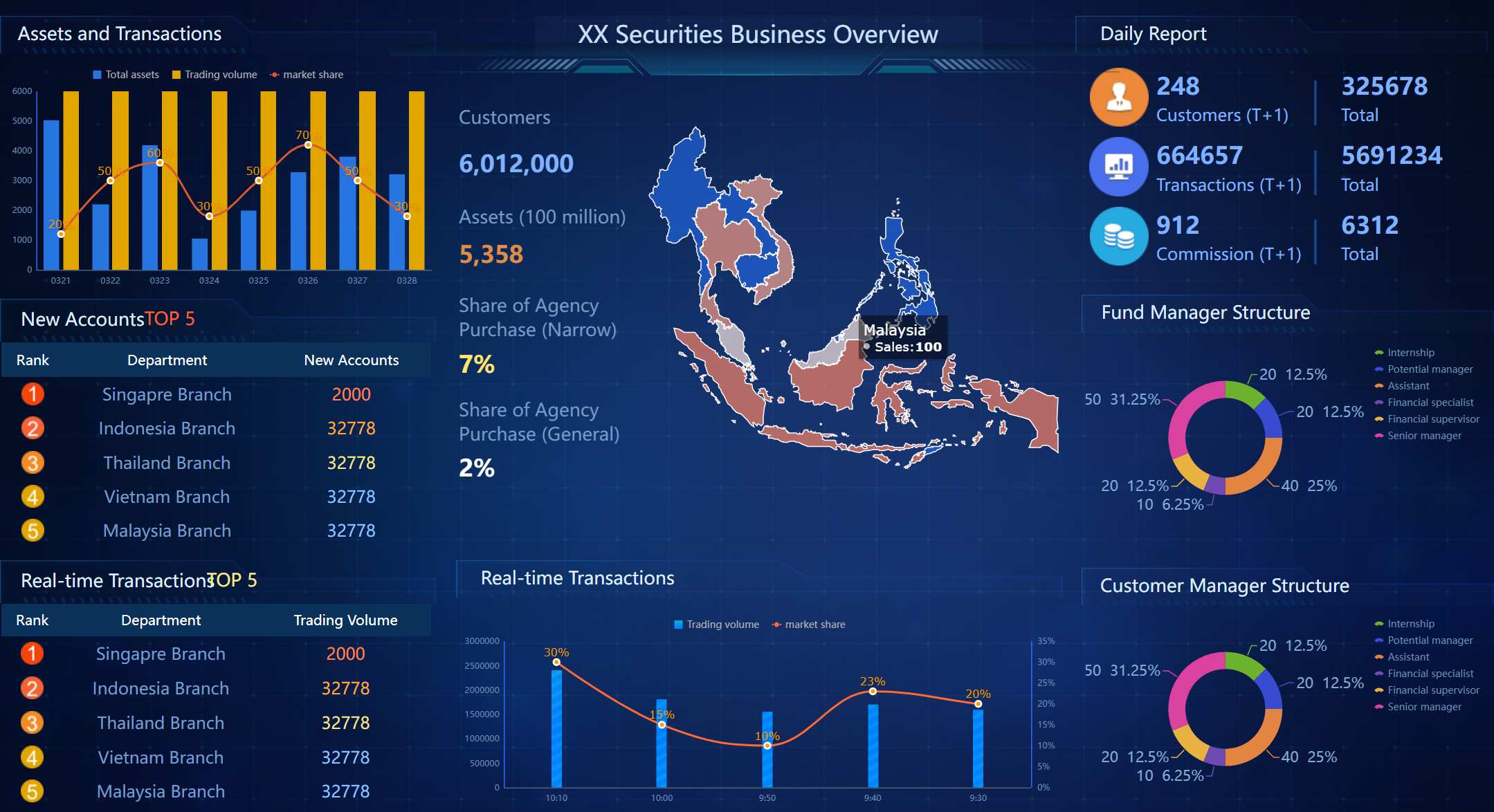
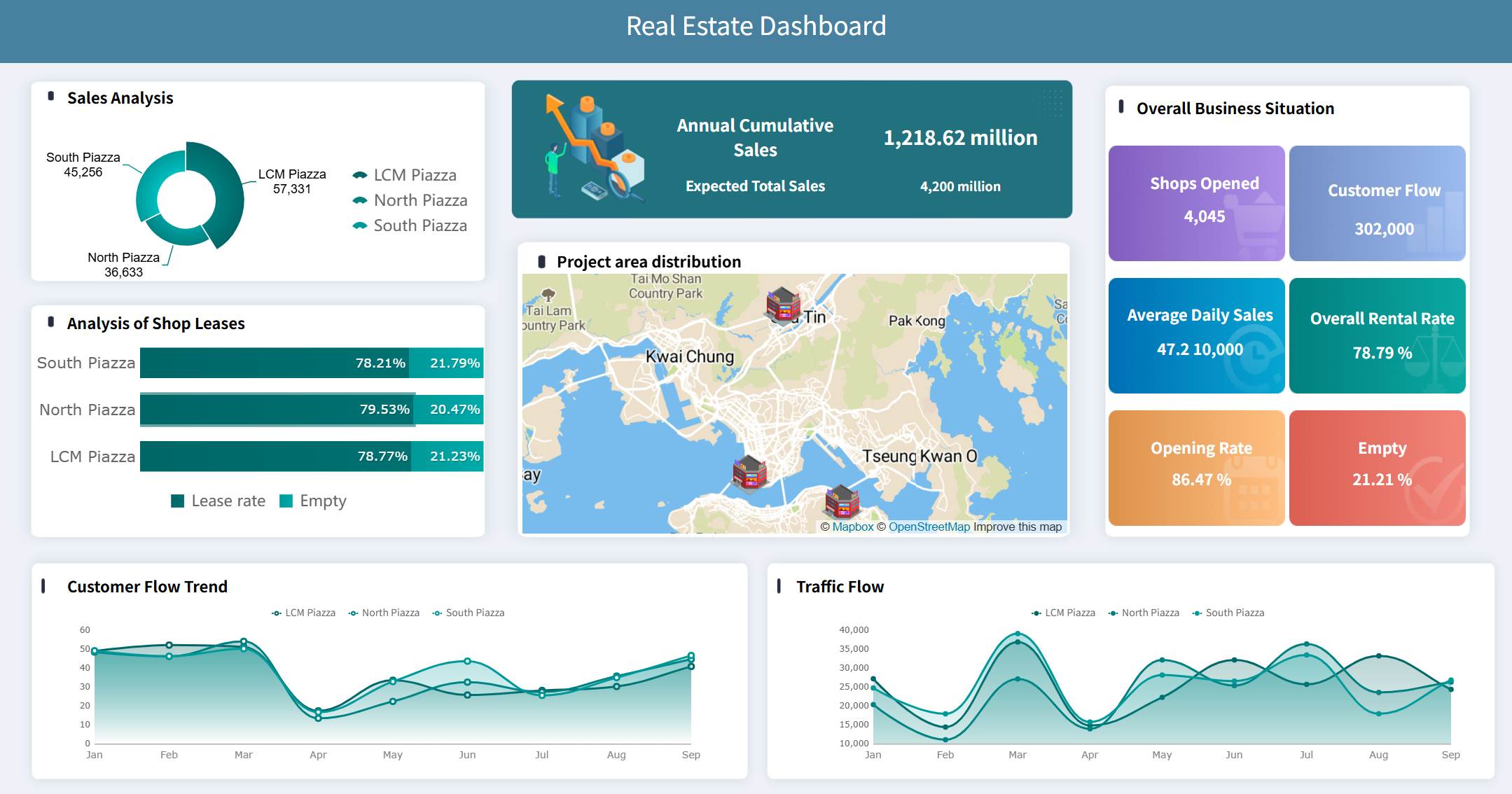
Build Analysis Reports Faster and Smarter with FineReport
Building this manually is complex; use FineReport to utilize ready-made templates and automate this entire workflow.
Instant Access to More Free Dashboard Templates in Fine Gallery
For many teams, the challenge is not understanding what an analysis report should look like. The challenge is producing one consistently, across multiple departments, data sources, and reporting cycles. Manual workflows in spreadsheets and slide decks slow everything down. They also increase the risk of version conflicts, calculation errors, and poor visualization choices.
mobile-friendly access for decision-makers on the go
Instead of rebuilding the same analysis report each week or month, teams can standardize the format, automate updates, and focus on interpretation. That is where the real value is created.
If your organization needs analysis reports that are faster to produce, easier to read, and stronger in decision support, FineReport is a practical enterprise solution.
A regular report mainly presents data or status updates, while an analysis report explains what the data means. It connects findings to causes, risks, opportunities, and recommended actions.
Most analysis reports include an executive summary, problem statement, data sources and methodology, key findings, and recommendations. Supporting tables or appendices can be added when readers need more detail.
Start by defining the business question and audience, then choose the right KPIs and collect reliable data. Organize the report clearly, use visuals to support the findings, and end with practical next steps.
The best KPIs depend on the goal, but common choices include the main objective metric, baseline, variance, trend, segment performance, and forecast. Good KPIs should help readers understand performance and decide what to do next.
Yes, tools like FineReport can speed up data collection, visualization, and report updates. They also make it easier to show trends, compare segments, and turn complex data into decision-ready insights.
Product Trial
FineReport
Pixel-perfect reports · Interactive dashboards · Easy data entry · Digital twins