You need the best ai data visualization tools to turn complex data into clear insights. Here are the top 10 best AI data visualization tools you should try in 2026:
- FineChatBI
- Tableau
- Microsoft Power BI
- Google Looker Studio
- Qlik Sense
- Sisense
- Zoho Analytics
- ThoughtSpot
- Domo
- Julius AI
| Tool | Best For | Standout Feature | Gartner Rating |
|---|---|---|---|
| FineChatBI | Organizations needing self-service analytics with enterprise-grade governance | Conversational analytics with Text2DSL technology, 60+ data source connections, rule-based and LLM integration | N/A |
| Tableau | Enterprises requiring powerful visualization capabilities and interactive dashboards | AI-powered Explain Data, Einstein Discovery, real-time data connections, extensive data source integrations | 4.4 |
| Microsoft Power BI | Enterprises embedded in Microsoft ecosystem | Copilot AI integration, seamless Microsoft product integration, DAX language, predictive analytics | 4.4 |
| Google Looker Studio | Organizations using Google Cloud ecosystem | BigQuery and Vertex AI integration, cloud-based collaboration, 1000+ connectors, real-time data updates | N/A |
| Qlik Sense | Enterprises needing advanced analytics and non-linear data exploration | Associative data model, AI-driven insights, natural language queries, self-service BI capabilities | 4.5 |
| Sisense | Organizations requiring embedded analytics and handling large, complex datasets | Powerful embedded analytics, scalable architecture, AI-driven insights, customizable dashboards | 4.1 |
| Zoho Analytics | Small to medium-sized enterprises seeking scalable analytics | AI-generated insights, interactive visuals, drag-and-drop interface, augmented analytics | 4.4 |
| ThoughtSpot | Organizations that want everyone to explore and act on live data | Spotter AI analyst, AI-augmented dashboards, natural language queries, automated insights | 4.6 |
| Domo | Small and medium-sized organizations seeking low-code analytics | AI-generated dashboards, auto-chart generation, real-time data pipelines, integrated data management | 4.5-4.6 |
| Julius AI | Teams needing quick, code-free insights and collaboration | Intuitive interface with automated visualizations, data transformations, chat-based analysis | N/A |
When you choose a tool, consider ai capabilities, ease of use, strong data integration, high visualization quality, and fair pricing. Top solutions help you connect to multiple data sources, handle data securely, and scale as your business grows. The right ai platform makes data-driven decisions faster and easier.
- Data integration lets you work with all your sources.
- Ai features boost analysis and automate insights.
- Easy interfaces save time for every user.
- Reliable security keeps your data safe.
What Is AI Data Visualization?
Definition & Concepts
You use ai data visualization to turn complex data into clear, actionable insights. This approach relies on ai to process large datasets and present them in easy-to-understand visuals. You see line charts, heat maps, and scatter plots that help you spot trends and relationships quickly. Traditional visualization tools often struggle with the volume and speed of data today. Ai data visualization solves this by using machine learning algorithms, natural language processing, and computer vision. These technologies identify patterns, predict outcomes, and convert raw data into human-readable formats.
- Ai simplifies the complex by distilling raw data into clear visuals.
- Dashboards update automatically, turning real-time insights into real-time action.
- Ai bridges the gap between teams, making insights accessible to everyone.
- You get personalized dashboards and natural language interfaces that adapt to your needs.
- Ai highlights what matters most, focusing your attention on trends and opportunities.
You can use tools like Data Formulator to express your visualization ideas as data concepts. This helps the ai agent understand your intent and deliver the right analysis.
Importance in Modern Analytics
Ai data visualization plays a key role in modern analytics. You need to make fast decisions based on data-driven insights. Ai integrates information from many sources and creates interactive dashboards. In marketing, you optimize campaigns by analyzing customer behavior. In supply chain management, you track shipments and respond to issues using real-time metrics. In finance, you process huge amounts of data to find correlations and trends that help you manage risk and spot investment opportunities.
- Natural language processing lets you query data in plain language.
- Automated machine learning makes analysis and visualization easier for everyone.
- Generative ai creates custom visualizations for different audiences and use cases.

Ai data visualization gives you the intelligence to act quickly and confidently. You see patterns, predict outcomes, and share insights across your organization. This approach transforms analysis, making it faster, more accurate, and more accessible.
Why Use AI Data Visualization Tools in 2026
Industry Trends & Benefits
You see rapid changes in how organizations use ai data visualization. In 2026, ai will automate the creation of visualizations from raw data. You will notice more sophisticated outputs that help you understand complex information quickly. Personalized visualizations will become common, letting you tailor dashboards to your preferences. This makes your analysis more relevant and easier to act on.
Immersive technologies like VR and AR will allow you to interact with data in new ways. You can explore analytics in three dimensions, improving your understanding and retention. Ethical considerations will also play a bigger role. You need to address biases in data representation to ensure fair and accurate analysis.
Tip: Embracing these trends helps you stay ahead in your industry and make smarter decisions.
- Ai automates visualization, saving you time.
- Personalized dashboards improve your experience.
- VR and AR make analytics more engaging.
- Ethical ai data visualization builds trust in your insights.
Business Impact
Ai data visualization tools change how you work with data. You can access insights independently, speeding up decisions and reducing bottlenecks. Executives see key takeaways at a glance, without sorting through complex tables. You make data-driven decisions in real time, optimizing performance instead of just monitoring it.
Ai automates data collection and transformation, cutting down manual preparation. You identify trends and anomalies faster, getting actionable recommendations. Cognitive computing lets you understand not just what happened, but why it happened and what steps to take next.
You interact with data conversationally, asking questions and receiving instant visual insights. This interactivity shortens the time between inquiry and analysis, helping you respond quickly to business challenges.
- Ai data visualization tools empower cross-functional teams.
- Real-time analytics drive better outcomes.
- Automated analysis improves accuracy and speed.
- Conversational interfaces make data exploration simple.
Best AI Data Visualization Tools 2026
You want to choose the best ai data visualization tools for your business. These platforms help you turn raw data into clear charts and dashboards. Each tool offers unique ai features, integration options, and visualization strengths. Below, you will find the top 10 best data visualization tools for 2026, including FineChatBI by FanRuan, Tableau, Microsoft Power BI, Google Looker Studio, Qlik Sense, Sisense, Zoho Analytics, ThoughtSpot, Domo, and Julius AI.
Tip: Review the user satisfaction ratings before you select a platform.
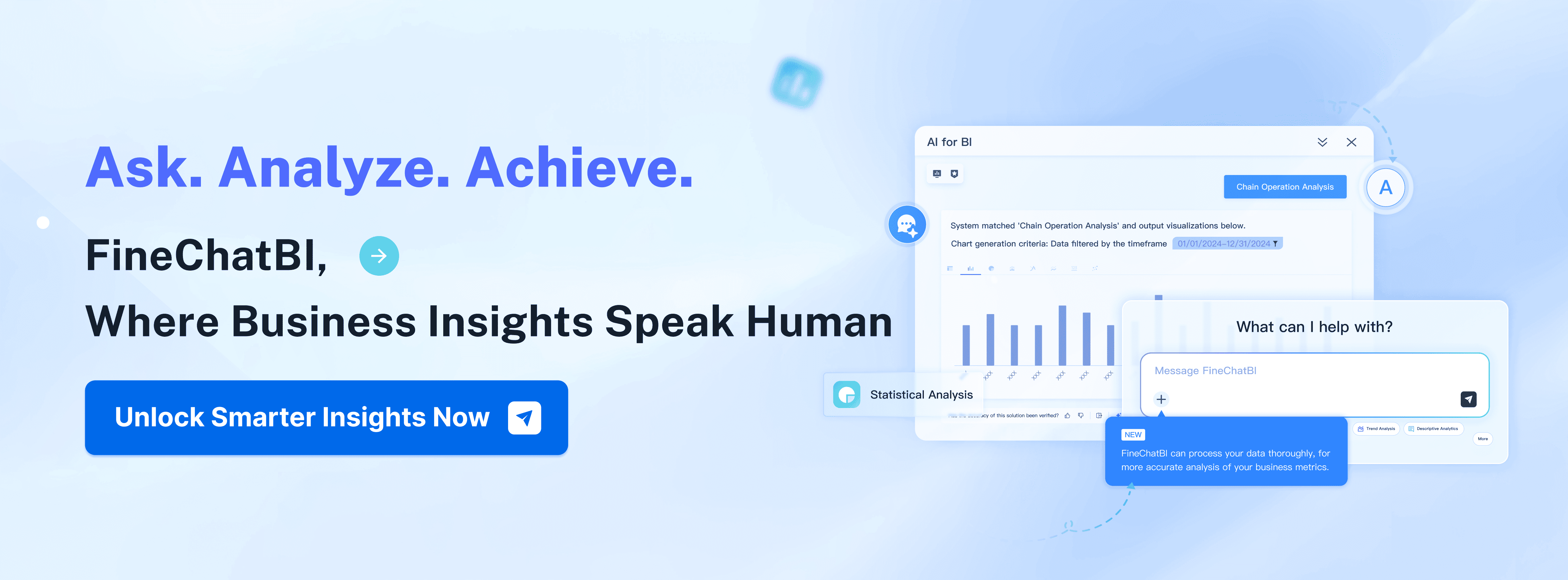
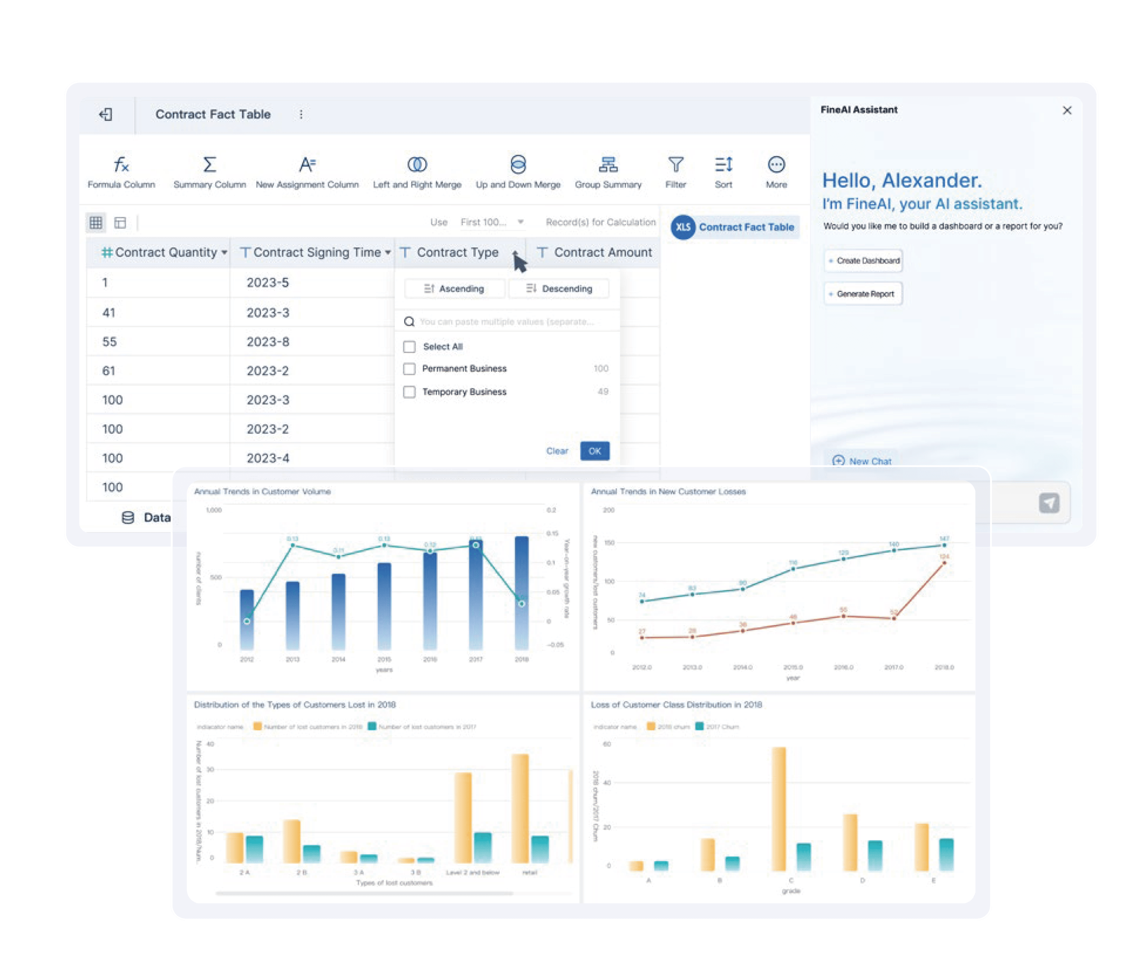
1. FineChatBI
FineChatBI stands out among the best ai data visualization tools for its self-service analytics and enterprise-grade governance. You can connect to over 60 data sources, including big data platforms and cloud databases. FineChatBI uses ai chart generators and conversational analytics to help you explore data with natural language queries. You build dashboards by dragging and dropping charts, then share insights securely across your organization.
- Key Features:
- Zero-code dashboard creation
- Real-time data integration
- Augmented analytics with ai tools
- Role-based access control
- Mobile-friendly visualization
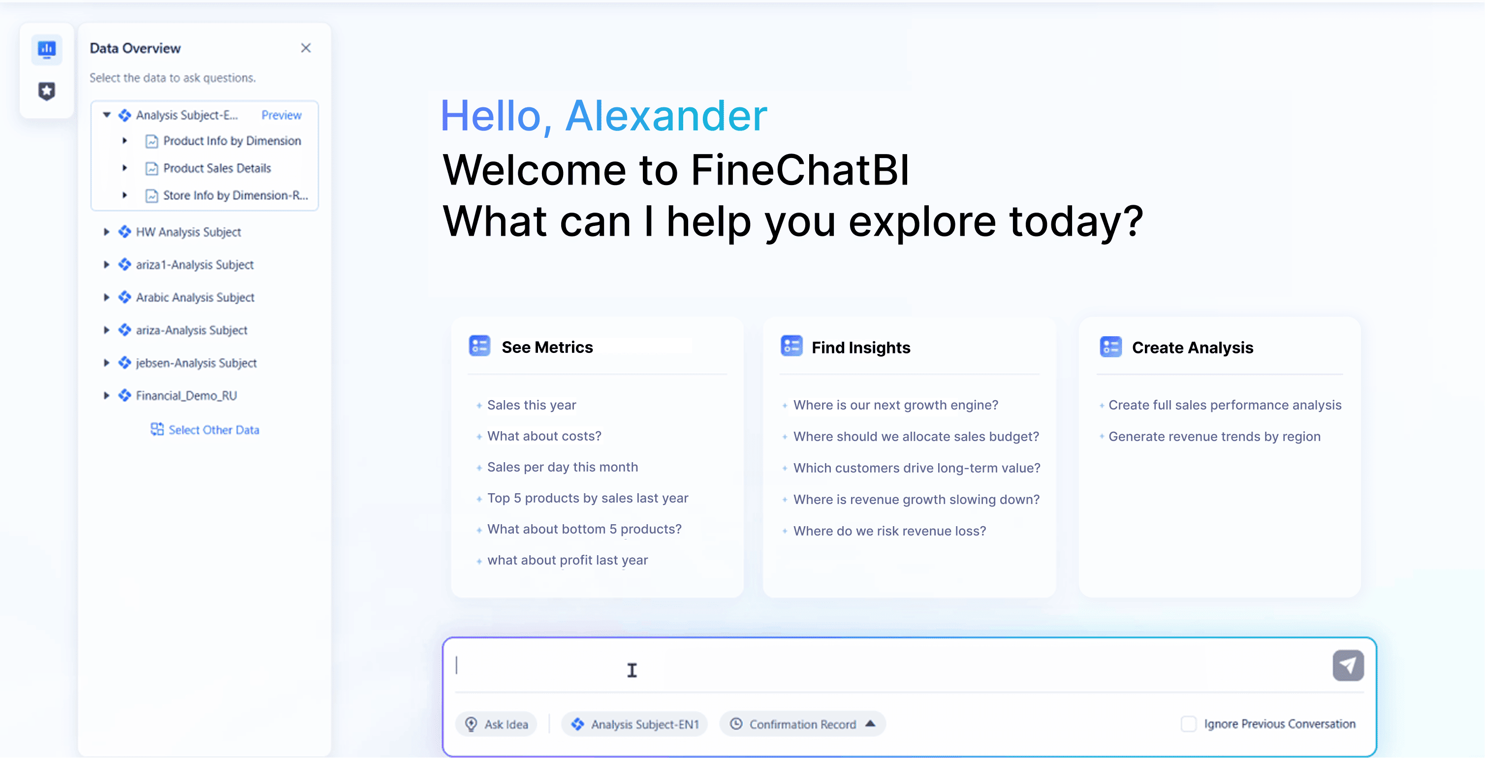
Website: https://www.fanruan.com/en/finechatbi
FineChatBI supports large-scale deployments and handles massive datasets. You get interactive charts, predictive analytics, and automated insights. The platform ranks high in user satisfaction, scoring 4.9 out of 5, just behind Power BI.
| Tool Name | User Rating | Tool Name | User Rating |
|---|---|---|---|
| Microsoft Power BI | 5.0 | Lightdash | 4.6 |
| FineChatBI | 4.9 | Redash | 4.6 |
| Metabase | 4.8 | Jaspersoft Community Ed. | 4.5 |
| Apache Superset | 4.7 | BIRT | 4.5 |
| KNIME | 4.7 | Looker Studio | 4.5 |
2. Tableau
Tableau remains a leader among the best ai data visualization tools. You create interactive dashboards and use ai graph generators to analyze trends. Tableau offers several plans, each with different features and pricing.
| Plan Type | Price (per user/month) | Key Features | Best For |
|---|---|---|---|
| Tableau Explorer | $42 | Build and edit dashboards, explore published data sources, ad-hoc analysis | Teams needing more than viewing access but no advanced data prep or AI features |
| Tableau Creator | $75 | Full access to Tableau Desktop, Tableau Prep, create dashboards, publish data | Data analysts and power users needing complete control over data visualization |
| Tableau+ Premium | Custom pricing | Tableau Agent, Tableau Prep, Tableau Pulse, advanced analytics capabilities | Enterprises aiming to scale AI-powered analytics across their organization |
| Tableau Server | Custom pricing | Centralized data management, user access control, secure on-premise deployment | Organizations wanting to host Tableau on their own infrastructure |
| Tableau Cloud | Custom pricing | No infrastructure maintenance, automatic updates, scalable cloud deployment | Businesses preferring a fully managed, cloud-hosted analytics solution |
| Free Trial | N/A | 14-day trial to explore capabilities without financial commitment | Potential users wanting to evaluate Tableau before purchasing |
| Educational License | N/A | Free platform for students and educators | Students and educators looking to build and share interactive visualizations |
 Website: https://www.tableau.com/
3. Microsoft Power BI
Microsoft Power BI ranks as one of the best ai data visualization tools. You use ai to create interactive dashboards and automate insights. Power BI supports predictive analytics, natural language queries, and automated recommendations.
| AI Capability | Contribution to Data Visualization |
|---|---|
| Enhanced Data Visualization | Users can create interactive dashboards and improve visualization skills. |
| Predictive Analytics | Extracts insights from historical data to predict future trends. |
| Natural Language Processing | Enables non-technical users to derive insights through simple queries. |
| Automated Insights | Generates insights and recommendations to aid decision-making. |
| Improved Data Quality | Enhances data accuracy and reliability for professional use. |
Website: https://www.microsoft.com/en-us/power-platform/products/power-bi
4. Google Looker Studio
Google Looker Studio offers ai-powered analytics and flexible integration options. You connect to Vertex AI and BigQuery for advanced modeling. You build custom models using AutoML, TensorFlow, or PyTorch. Real-time data updates keep your dashboards current.
- Integration Options:
- Connect to Vertex AI and BigQuery
- Build models with AutoML, TensorFlow, PyTorch
- Real-time data updates
- Seamless flow between ML models and dashboards

Website: https://lookerstudio.google.com/navigation/reporting
5. Qlik Sense
Qlik Sense stands out for its natural language insights and dynamic visualization. You use ai tools to generate narratives and data stories directly on dashboards. The platform supports customization and responds to user selections in real time.
| Strengths/Use Cases | Description |
|---|---|
| Natural Language Insights | Qlik Sense offers a natural language generation (NLG) feature that provides AI-generated insights directly on dashboards, enhancing data storytelling and literacy. |
| Customization Options | Users can customize the NLG object to generate narratives in various formats (paragraph, bulleted) and for different contexts, making it versatile for different analytical needs. |
| Dynamic and Responsive | The NLG feature is fully dynamic, responding to user selections and leveraging Qlik's associative engine to refresh insights, ensuring that users receive the most relevant information after each interaction. |
| Broad Audience Accessibility | This capability allows a wider range of users, including those less familiar with data analysis, to gain insights from visualizations, thus promoting data literacy across different user levels. |
| Integration with Data Storytelling | The NLG feature supports the creation of analytic data stories and reporting, making it easier to communicate insights effectively in formats like PDF and PowerPoint. |
| Augmented Analytics | Qlik Sense aims to integrate AI and ML into core analytics workflows, simplifying tasks and expanding access to insights, which is beneficial for BI developers, business analysts, and end-users alike. |

Website: https://www.qlik.com/us/products/qlik-sense
6. Sisense
Sisense delivers deep ai integration and high-quality visualization. You connect data effortlessly and use generative ai for faster processes. Sisense offers drag-and-drop tools and natural language queries for building charts.
| Feature | Description |
|---|---|
| AI Integration | Deep integration of generative AI, predictive analytics, and natural language processing. |
| Visualization Quality | Powerful visualization tools with customization and dynamic visuals for enhanced user experience. |
| User Accessibility | Conversational interfaces and automated insights that eliminate technical barriers to data exploration. |
- Effortless data connection
- GenAI-powered integration
- Drag-and-drop chart creation
- Natural language queries

Website: https://www.sisense.com/
7. Zoho Analytics
Zoho Analytics offers affordable pricing and user-friendly ai tools. You connect to over 500 business applications and use the Ask Zia ai assistant for natural language queries.
| Feature | Description |
|---|---|
| Affordable Pricing | Plans starting at $24/month with generous free tiers |
| User-Friendly Interface | Designed for business users, not technical specialists |
| 500+ Integrations | Connect to popular business applications easily |
| Ask Zia | AI assistant for natural language queries |
| Small Business Success | A startup achieved 3x ROI using Zoho Analytics for tracking marketing performance |
| Optimal For | Small to medium businesses, budget-conscious organizations |
- 30-day free trial available
- Standard plan for small businesses
- Professional plan for advanced features

Website: https://www.zoho.com/analytics/
8. ThoughtSpot
ThoughtSpot uses Spotter, an ai-powered agent, to deliver analytics with natural language. You break down complex concepts into simple questions and get text summaries and visualizations instantly. The Agentic Analytics Platform ensures human oversight and accurate results.
- Spotter enables natural language analytics
- Agentic Analytics Platform supports conversational queries
- Human-in-the-loop architecture for accuracy
- Optimized data preparation for ai consumption
The platform gives you your own ai analyst and a semantic layer for reliable outputs. You interact with data using ai tools and verify results in plain language.

Website: https://www.thoughtspot.com/
9. Domo
Domo combines integration, data management, and dynamic reporting in one platform. You use real-time data pipelines to synchronize information across environments. Automated reporting tools help you make decisions faster.
- Integration, data management, and reporting in one platform
- Real-time data pipelines
- Automated reporting for descriptive analytics
- Business-friendly dashboards
- Strong data governance

Website: https://www.domo.com/
10. Julius AI
Julius AI is a new contender among the best ai data visualization tools. You use ai to generate charts and dashboards from plain language queries. Julius AI focuses on simplicity and speed, making it easy for anyone to visualize data.
- Natural language chart generation
- Fast dashboard creation
- User-friendly interface
- Integration with popular data sources

Website: https://julius.ai/
Features & Strengths of AI Data Visualization Tools

AI Capabilities
You rely on ai data visualization tools to turn raw data into actionable insights. These tools use ai to automate chart creation, suggest the best visuals, and highlight trends you might miss. FineChatBI stands out with its ai-powered analytics, offering automated chart suggestions and conversational interfaces. You can ask questions in plain language and receive instant answers. This makes analysis faster and more accessible for everyone. Many platforms now include predictive analytics, so you can forecast trends and make smarter decisions.
Visualization Quality
High-quality visualization helps you understand complex data quickly. FineChatBI delivers interactive visualizations with a wide range of chart types, including advanced analytics options like Gantt charts and Sankey diagrams. You can customize dashboards to fit your needs. Tools like Tableau and Power BI also offer strong visualization features, but FineChatBI’s automated data visualization and ai-powered analysis platforms make it easy for you to create clear, engaging visuals without coding.
Integration & Compatibility
You need tools that connect to all your data sources. FineChatBI supports over 60 connectors, including big data platforms and cloud databases. Enterprise users value seamless integration and broad compatibility. For example, Microsoft Power BI integrates with the Microsoft ecosystem, while Tableau connects to almost any business data source. Secure, governed analytics are essential, especially when you work with sensitive information.
| Tool | Integration Features | Compatibility Features |
|---|---|---|
| Microsoft Power BI | Seamless integration with Microsoft ecosystem | Broad data source connectivity |
| Tableau | Connects to virtually any marketing, sales, or business data source | N/A |
| FineChatBI | 60+ connectors, real-time sync, API support | Big data, cloud, and legacy system support |
Pricing & Value
You want value from your ai data visualization tools. FineChatBI offers enterprise-grade features at a competitive price, making it accessible for both large organizations and growing teams. Zoho Analytics provides affordable plans for small businesses. Power BI and Tableau have flexible pricing, but you should compare features to ensure you get the best return on investment.
Use Cases & Industries
You find ai data visualization tools in many industries. In enterprise analytics, you transform raw data into visual insights for better decisions. Self-service analytics lets non-technical users explore data independently. Predictive analytics uses ai to suggest future actions. FineChatBI supports manufacturing, finance, and retail, helping you track KPIs, optimize operations, and share insights across teams.
| Use Case/Industry | Description |
|---|---|
| Enterprise Analytics | AI tools transform raw data into visual insights quickly, enhancing decision-making processes. |
| Self-Service Analytics | Non-technical users can explore data independently, democratizing access to information. |
| Predictive Analytics | AI algorithms suggest future trends and actions based on historical data patterns. |
Tip: Choose ai-powered analytics tools that match your industry needs and support your data strategy.
Data Visualization Tools Comparison Table

Feature Comparison
You want to see how the top data visualization tools compare. The table below highlights key strengths and possible limitations for each platform. This helps you choose the right solution for your real-time dashboards and analysis needs.
| Tool | Starting Price | Key Strengths | Limitations |
|---|---|---|---|
| FineChatBI | Contact Sales | Self-service, real-time integration, AI, mobile, enterprise governance | Custom pricing |
| Tableau | $15/user/month | Handles large data, deep customization, strong visualization | Higher cost, learning curve |
| Power BI | $10/user/month | Affordable, Microsoft integration, real-time analysis | Limited free version, scaling cost |
| Qlik Sense | Custom pricing | Associative data model, dynamic visualization, real-time insights | Complex setup, higher costs |
| Domo | ~$20,000/year (estimate) | Cloud-native, collaboration, real-time data pipelines | Pricing less transparent |
| Sisense | Custom pricing | GenAI, drag-and-drop, real-time dashboards | Advanced features may require training |
| Zoho Analytics | $24/month | 500+ integrations, AI assistant, user-friendly | Limited advanced analytics |
| ThoughtSpot | Custom pricing | Natural language, conversational AI, semantic layer | Enterprise focus |
| Julius AI | N/A | Fast, simple, natural language chart generation | Newer tool, limited integrations |
| Google Looker Studio | Free | Google Cloud integration, real-time updates, ML models | Advanced features need setup |
Pricing Overview
You need to understand the pricing before you invest in data visualization tools. Here is a quick look at the main options:
| Tool | Pricing Structure |
|---|---|
| FineChatBI | Contact Sales for a custom quote |
| Tableau | Creator: $75/user/month; Explorer: $42/user/month; Viewer: $15/user/month |
| Power BI | Pro: $10/user/month; Premium: $20/user/month |
| Qlik Sense | Custom pricing |
| Domo | Estimated ~$20,000/year |
| Sisense | Custom pricing |
| Zoho Analytics | Starts at $24/month |
| ThoughtSpot | Custom pricing |
| Julius AI | N/A |
| Google Looker Studio | Free |
Note: Pricing can change based on features, deployment, and user count. Always check with the vendor for the latest details.
Best For (User Types)
You want to match the right data visualization tools to your needs. Here is a guide to help you decide:
- FineChatBI: Best for business users, analysts, and enterprises needing real-time analysis and secure dashboards.
- Tableau: Ideal for data professionals who want deep customization and advanced visualization.
- Power BI: Great for organizations using Microsoft products and needing affordable real-time dashboards.
- Qlik Sense: Fits teams that need dynamic analysis and associative data exploration.
- Domo: Works well for large companies needing cloud-based, real-time data management.
- Sisense: Good for teams wanting AI-driven analysis and easy dashboard creation.
- Zoho Analytics: Perfect for small businesses and users who want simple integration and AI help.
- ThoughtSpot: Best for executives and teams who prefer conversational AI and natural language queries.
- Julius AI: Useful for anyone needing fast, plain-language chart generation.
- Google Looker Studio: Great for users in the Google ecosystem who want free, real-time visualization.
Tip: Choose tools that fit your data sources, analysis needs, and user skills. The right platform makes your data work for you.
How to Choose the Best Data Visualization Tool
Assessing Needs
You start by understanding your data landscape. Clean your data, standardize formats, and organize sources. Document where your data comes from and how you plan to use it. This step helps you avoid confusion later. Choose a tool that matches your team’s skill level. If you want a simple start, try user-friendly platforms like Tableau Public or Power BI Desktop. Explore ai features such as natural language queries and automated chart recommendations. These options make data visualization easier for everyone.
Tip: Preparing your data before selecting a tool saves time and improves results.
Key Selection Criteria
You need to compare features before making a decision. Use the table below to guide your choice. Look for interactive dashboards, natural language processing, advanced analytics, and easy integration with real-time updates.
| Feature | Description |
|---|---|
| Interactive and customizable visualizations | Explore data with dashboards you can adjust and personalize. |
| Natural language processing (NLP) | Use plain language to interact with data and get insights without coding. |
| Advanced analytics and predictive capabilities | Automate analysis and get predictive insights using ai models. |
| Easy data integration and real-time updates | Connect to your existing data sources and keep visualizations current with live updates. |
Tips for Decision-Making
You make better choices when you focus on your project goals. Understand what you want to achieve with your data. Evaluate each tool’s customization options and user-friendliness. Validate your data sources and clean your data to ensure accuracy. Consider the cost and licensing to stay within your budget while getting the features you need.
- Define your project needs and objectives.
- Review tool features for customization and ease of use.
- Check data accuracy by cleaning and validating sources.
- Compare costs and licensing to match your budget.
Note: The right ai data visualization tool helps you turn data into clear insights and supports your analysis goals.
FanRuan Solutions & Customer Success
Manufacturing & Smart Factory
You see how FineChatBI transforms manufacturing operations. You connect business and equipment systems to one platform. Real-time data integration helps you monitor production and equipment status. You use dashboards to track key metrics and spot trends. Mobile reporting lets you capture data on the factory floor. Automated workflows reduce manual work and improve efficiency. You make decisions faster with ai-powered analytics. Companies like Danfoss have increased productivity and reduced complaints by using smart factory solutions.

Tip: Unified data systems help you optimize production and reduce downtime.
Financial Services & Analytics
You manage financial data with FineChatBI. You analyze credit card revenue, customer segments, and risk factors. Real-time dashboards show you important trends. Ai tools help you predict outcomes and identify opportunities. You improve accuracy and speed in reporting. UnionPay Data Services used FineChatBI to unify data platforms and boost customer value identification. You gain deeper insights and make better decisions with advanced analytics.
| Benefit | How FineChatBI Helps You |
|---|---|
| Faster reporting | Automated data workflows |
| Improved accuracy | Ai-driven analysis |
| Better segmentation | Real-time data dashboards |
Customer Stories
You learn from real-world examples. Bifido Foods integrated data from multiple sales channels and product lines. The company built interactive reports and improved decision-making. TXC Corporation used FineChatBI to democratize data access and empower employees. Staff now analyze data independently and drive process improvements. UnionPay Data Services unified fragmented data systems and increased efficiency. These stories show you how FineChatBI helps organizations unlock the value of their data.
- Bifido Foods: Enhanced data connectivity and visualization
- TXC Corporation: Empowered employees with ai-driven insights
- UnionPay Data Services: Improved data accuracy and customer targeting
Note: You can use FineChatBI to solve data challenges in any industry. Real results come from better data integration and ai-powered analytics.
You need to choose the best ai data visualization tool for your business. You should look at your data needs and match them with the right platform. FineChatBI and other top tools help you turn raw data into clear visualization. You can compare features and pricing using the tables above. Try a free trial or talk to experts before you decide. You will see how ai makes data analysis and visualization easier. You can share insights and improve your decisions with better data visualization.


FAQ

The Author
Lewis
Senior Data Analyst at FanRuan
Related Articles

Data Analysis Using AI for Non-Technical Teams: 7 Tools, Real Use Cases, and Key Limits
For non technical teams, $1 means turning business questions into usable answers without waiting in line for SQL queries, dashboard builds, or analyst bandwidth. Marketing managers want campaign answers today, sales lead
Saber Chen
May 29, 2026
AI With Access to Real Time Data: 10 Free Apps Compared for Business Teams in 2026
AI with access to real time data is software that uses live web signals, current business metrics, or connected internal systems to generate answers, insights, and actions based on what is happening now rather than yeste
Saber Chen
Jun 12, 2026

Google AI Sustainability Reporting: How to Build a Workflow Using Google’s Playbook
Google AI sustainability reporting is not just about drafting a better report faster. It is about building a controlled, traceable workflow that helps sustainability leaders, finance teams, legal reviewers, and data owne
Yida Yin
Jun 16, 2026