Payroll is one of the largest and most sensitive operating expenses in most organizations. Yet many companies still manage it through disconnected exports, static reports, and last-minute reconciliations. The result is predictable: weak cost visibility, slow issue detection, and audit pressure.
A well-designed payroll dashboard changes that. It gives finance, HR, payroll, and business leaders a shared operational view of labor cost, exceptions, approvals, and compliance signals. Instead of reacting after payroll closes, teams can identify anomalies early, investigate root causes faster, and document corrective action with confidence.
This guide explains what decision-makers should monitor, which metrics matter most, and how to build a payroll dashboard architecture that leaders can trust.
Why a payroll dashboard matters for cost control and auditability
When payroll data sits across HRIS, attendance systems, scheduling tools, spreadsheets, and finance platforms, leaders lose the ability to manage labor cost proactively. Overtime may rise in one site while absenteeism increases in another. Manual adjustments may accumulate without clear ownership. Off-cycle payments may become common, but no one sees the pattern soon enough to intervene.
That fragmentation creates three business problems:
Labor cost blind spots that hide overspending until month-end
Delayed decisions because teams spend time reconciling instead of analyzing
Audit risk caused by inconsistent records, weak traceability, and undocumented exceptions
A strong payroll dashboard brings the critical signals into one place. Executives need a top-line view of payroll spending, trends, and budget variance. HR leaders need visibility into headcount shifts, attendance impacts, and policy exceptions. Finance controllers need confidence that payroll outputs reconcile with source systems and ledger expectations. Payroll managers need operational detail to resolve issues by pay run, department, or employee.
The goal is not just visibility. It is better control.
A well-designed dashboard should help organizations achieve:
Outcome
Business impact
Faster issue detection
Spot anomalies before payroll closes
Clearer accountability
Assign owners for approvals, exceptions, and follow-up
More reliable reporting
Reduce disputes between HR, payroll, and finance
Stronger audit readiness
Preserve evidence, history, and control traceability
Better labor planning
Connect payroll trends to staffing and budget decisions
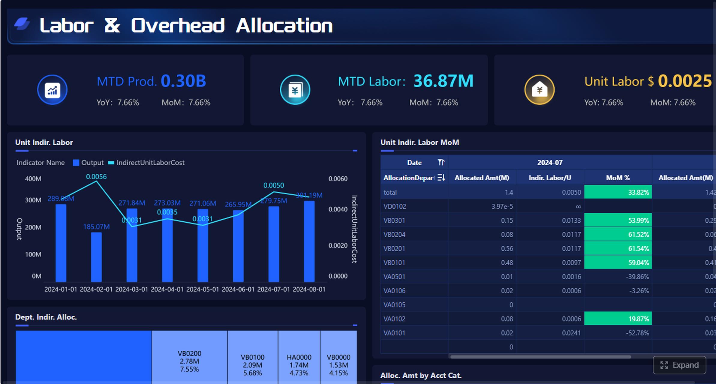
After explaining dashboard goals, it is useful to show an executive summary mockup with total payroll cost, variance to budget, exception rate, and reconciliation status.
All dashboard examples in this article were created by FineBI.
Core metrics to include in a payroll dashboard
The quality of a payroll dashboard depends on the quality of its metrics. Too few metrics leave blind spots. Too many create noise. The right design combines executive-level KPIs with drill-down analysis.
Labor cost visibility
At the core, a payroll dashboard must make labor cost transparent. This means more than showing gross payroll. Leaders need to understand what is driving spend and where it is changing.
Key metrics typically include:
Total payroll expense
Gross pay and net pay
Overtime cost
Bonus and incentive payouts
Employer taxes
Benefits expense
Employer contributions
Off-cycle payment totals
Labor cost per employee
Labor cost as a percentage of budget or revenue
These measures should be comparable across:
Department
Business unit
Cost center
Location
Legal entity
Team
Employment type
Pay period
A practical dashboard also highlights planned versus actual labor costs. That view helps leaders distinguish expected growth from avoidable leakage. For example, a manufacturing site may show payroll cost above plan because of overtime concentration on one shift. A retail region may show rising premiums tied to seasonal staffing gaps.
Trend and variance views are especially important. They allow teams to surface:
Sudden spikes in overtime
Rising tax or benefit burden
Unusual bonus concentration
Location-specific cost drift
Persistent over-budget departments
After this section, a variance visualization is highly effective for decision-makers.
Audit and compliance indicators
Payroll cost visibility alone is not enough. A reliable payroll dashboard must also surface control quality and audit signals.
The most useful indicators include:
Missing approvals
Late timesheet or attendance submissions
Manual payroll adjustments
Exception rate by pay run
Off-cycle payments
Retroactive corrections
Unapproved overtime
Incomplete employee records
Missing documentation
Policy exceptions
Open reconciliation items
These indicators matter because payroll errors often begin upstream. A missing manager approval, inconsistent pay code, or unmatched employee identifier can eventually become a financial discrepancy or audit finding.
A strong dashboard should also show reconciliation status between:
HRIS and payroll records
Attendance or timekeeping and payroll
Scheduling and worked hours
Payroll summaries and finance postings
Payroll outputs and bank or payment files
This allows finance and payroll teams to distinguish between isolated corrections and systemic control failures.
A useful design pattern is to combine KPI cards with an exception table. KPI cards give a quick count of unresolved issues. The table provides operational detail such as employee ID, exception type, pay period, owner, and status.
Operational reporting views for HR and finance teams
Different teams use payroll data differently. The dashboard should reflect that reality with role-based views.
Payroll managers usually need a pay-run control view, including approvals, exceptions, adjustments, and processing readiness.
HR business partners need insight into attendance trends, staffing patterns, overtime concentration, leave impacts, and policy exceptions across their business areas.
Finance controllers need labor cost summaries, accrual alignment, department variance, and reconciliation to the general ledger.
Executives need concise KPI summaries with alerts and trend context, not operational clutter.
The best payroll dashboards balance summary and depth. A CFO may start with total payroll cost by region, then drill to a specific cost center, then review the employees or records driving the variance. That drill-down capability is what turns reporting into investigation.
Effective reporting views often include:
Executive payroll overview
Department variance analysis
Exception management view
Reconciliation status dashboard
Employee-level detail explorer
Pay-period comparison report
A FineBI architecture approach to building the payroll dashboard
A payroll dashboard only becomes trusted when the architecture behind it is consistent, governed, and easy to maintain. This is where many dashboard projects fail. They focus on the front end before fixing the underlying model.
A better approach is to build the payroll dashboard as a controlled analytics layer on top of integrated payroll-related data. This is especially effective in FineBI, where teams can combine governed data modeling with flexible business-facing exploration.
Unify payroll-related data sources
Payroll reporting rarely comes from one source. In most enterprises, the required data is spread across:
Payroll systems
HRIS platforms
Attendance and timekeeping tools
Shift scheduling systems
Expense or reimbursement platforms
ERP or finance systems
Budget planning files
To build a reliable dashboard, these sources must be brought into one consistent model. That means standardizing:
Employee identifiers
Position and department mappings
Pay codes
Cost center structures
Organizational hierarchies
Reporting periods
Entity and location definitions
Without this standardization, the same employee may appear differently across systems, or the same labor cost may be classified inconsistently by function or site.
Validation rules should be established before analysis begins. For example:
Attendance hours reconcile to payable hours within threshold
Detects upstream timing or coding issues
Department and cost center assignments are current
Improves budget variance accuracy
Reporting periods align across systems
Prevents false trend distortions
In FineBI, teams can consolidate these feeds into a reusable business dataset, reducing repeated manual joins and improving consistency across reports.
Design the data model for trusted reporting
Once the data sources are unified, the next step is to build subject areas that match business decisions.
A practical payroll dashboard model usually includes these subject areas:
Labor cost
Headcount
Attendance
Payroll exceptions
Approvals
Reconciliation status
Budget and plan
Each area should contain governed calculations that business users can trust. Typical reusable calculations include:
Gross pay
Net pay
Overtime pay and overtime rate
Employer tax burden
Benefit load
Labor cost per FTE
Planned vs actual variance
Exception rate
Off-cycle payment ratio
Manual adjustment ratio
Historical snapshots are essential. Payroll dashboards should not only show current results but also preserve prior states for audit review. That allows teams to answer difficult questions such as:
What did the record look like at payroll close?
When was the adjustment introduced?
Which manager approved the change?
How did the exception trend change over three quarters?
FineBI supports this type of governed, multi-subject reporting well when teams model facts and dimensions clearly, define shared business metrics centrally, and control metric definitions across reports.
Build interactive views for faster investigation
The dashboard interface should support fast investigation, not just static monitoring.
Useful filters include:
Entity
Country or region
Location
Department
Cost center
Employment type
Payroll cycle
Time period
Manager
Exception type
Drill-down paths should be designed intentionally. A good path might look like this:
Company-wide payroll trend
Region or entity variance
Department overspend
Exception category
Employee-level record detail
This allows users to move from signal to cause without requesting a new report.
Threshold-based alerts are also valuable. Organizations can define triggers for:
Overtime exceeding a target percentage
Manual adjustments above normal range
Reconciliation gaps beyond tolerance
Repeated missing approvals
Off-cycle payments above threshold
Department payroll cost exceeding budget
In FineBI, these interactive views can be tailored for both leadership and operational teams, enabling self-service exploration while preserving metric governance.
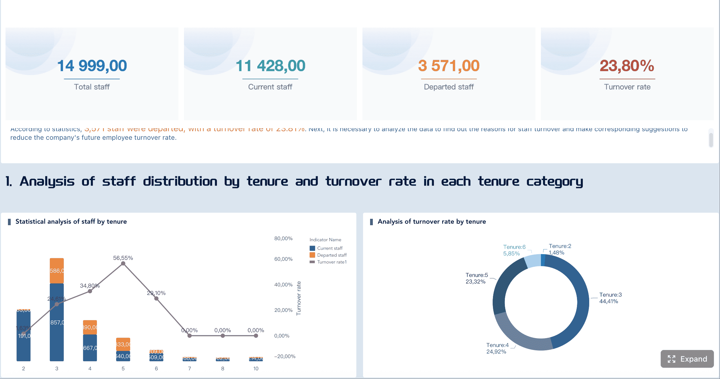
How to use a payroll dashboard to reduce blind spots
A payroll dashboard creates value only when teams use it as part of management routines. The best organizations do not treat payroll reporting as a static monthly artifact. They use it to detect, investigate, and act.
Spot cost drivers early
Blind spots usually emerge from recurring patterns, not one-time errors. A good dashboard helps leaders identify the underlying drivers before they become structural cost problems.
Typical early warning signals include:
Overtime concentrated in a few departments
Rising absenteeism affecting premium pay
Shift differentials increasing in one facility
Seasonal staffing costs exceeding plan
Contractor or temporary labor cost drift
Frequent retroactive corrections
These indicators become more powerful when compared against adjacent business metrics such as:
Productivity
Output volume
Staffing plan
Budget consumption
Utilization
Headcount movement
For example, if payroll cost rises while output remains flat, leaders can investigate scheduling inefficiency or role mix imbalance. If absenteeism rises before overtime spikes, managers can intervene earlier with staffing changes.
Strengthen payroll controls and audit readiness
Auditability improves when evidence is easy to find, trace, and explain. A strong payroll dashboard centralizes the review process.
Teams should regularly review:
Adjustment logs
Approval trails
Exception workflows
Reconciliation status
Historical comparisons
Documentation completeness
This helps internal audit, finance, HR, and payroll align around the same facts. It also reduces dependence on last-minute spreadsheet compilation.
For external audits, the dashboard should help answer questions such as:
Were all payroll adjustments approved?
Which payments were off-cycle, and why?
Do time records match payable records?
Were policy exceptions documented?
Can prior-period values be reproduced?
A dashboard cannot replace controls. But it can make controls visible and measurable.
Turn reporting into action
The highest-performing teams operationalize payroll analytics. They do not stop at observation.
A simple action framework works well:
Detect anomalies through dashboard alerts and review cadences
Assign an owner for each exception or variance
Investigate the root cause with drill-down reporting
Document decisions and corrective actions
Review recurrence in the next payroll cycle
This process creates accountability. It also strengthens collaboration between HR, payroll, operations, and finance.
A monthly dashboard review is useful, but many organizations benefit from a tighter rhythm:
Weekly for operational payroll controls
Per pay cycle for exception review
Monthly for labor cost and budget analysis
Quarterly for policy and control trend review
Common payroll dashboard patterns, examples, and implementation tips
Many payroll dashboard projects fail not because the concept is wrong, but because the rollout is poorly scoped. The solution is to start with the reporting patterns that support real decisions.
Useful dashboard layouts and reporting templates
Most organizations benefit from four foundational views:
Dashboard view
Primary purpose
Main audience
Summary view
Track payroll KPIs, trends, and budget status
Executives, finance leaders
Variance view
Compare planned vs actual labor cost
Finance controllers, department leaders
Exception view
Monitor errors, adjustments, and control failures
Payroll managers, HR operations
Reconciliation view
Match payroll with HR, attendance, and finance records
Payroll, finance, audit
A prebuilt template can be useful when the organization needs a quick starting point or has relatively standard payroll processes. It helps teams align on layout, common KPIs, and navigation.
A custom design is usually better when the business has:
Multiple legal entities
Complex pay codes
Union or shift rules
Shared-service payroll operations
Cross-border payroll models
Detailed audit requirements
The right choice depends on process complexity, not just software preference.
Evaluate software options with the right criteria
When selecting a payroll dashboard solution, teams should look beyond visual appeal. The real differentiators are data depth, governance, and usability.
Evaluate vendors and internal tools against criteria such as:
Integration with payroll, HRIS, attendance, and finance systems
Ability to standardize and model payroll data
Drill-down from summary to transaction detail
Audit trail visibility
Historical snapshot support
Governance and permission controls
Self-service reporting for business users
Alerting and exception monitoring
Scalability across entities and regions
It is also important not to copy a vendor demo blindly. A payroll dashboard should reflect your organization’s control framework, pay logic, and decision rhythms. A polished example can inspire layout ideas, but it cannot replace metric design and data governance.
First, metric overload. Teams try to show everything. Users then ignore the dashboard because it is too dense.
Second, unclear ownership. If no one owns exception review, reconciliation quality, or metric definitions, the dashboard loses trust quickly.
Third, inconsistent definitions. When HR, payroll, and finance calculate overtime, headcount, or labor cost differently, every meeting turns into a debate about numbers instead of action.
To avoid these issues:
Start with decision-critical KPIs
Define metrics centrally
Assign process owners
Validate data before publishing
Design role-based views
Expand gradually based on feedback
Review control requirements regularly
This is also where FineBI becomes especially relevant. For enterprises that need both governed reporting and flexible business analysis, FineBI provides a practical foundation for building a trusted payroll dashboard. Teams can integrate payroll-related data, standardize definitions, build interactive drill-down views, and deliver role-specific dashboards without losing governance. For decision-makers, that means less manual reconciliation, faster issue resolution, and stronger auditability. For implementation teams, it means a scalable architecture rather than another reporting patchwork.
Get Ready-to-Use Dashboard Templates in Fine Gallery
If your organization is trying to reduce labor cost blind spots while improving payroll transparency, FineBI is worth evaluating as the reporting and analysis layer that connects payroll, HR, attendance, and finance into one decision-ready environment.
A payroll dashboard should combine labor cost KPIs with control and exception metrics, such as total payroll expense, overtime cost, budget variance, missing approvals, manual adjustments, and reconciliation status. It should also support drill-downs by department, location, pay period, and employee group.
It brings payroll, time, HR, and finance data into one view so leaders can spot overspending patterns earlier. This makes it easier to catch issues like overtime spikes, off-cycle payments, or department-level budget overruns before payroll closes.
Payroll affects compliance, financial accuracy, and employee trust, so teams need clear records of approvals, adjustments, and reconciliations. A dashboard improves auditability by making exceptions visible and preserving traceable evidence for review.
Finance, HR, payroll, and operational leaders all benefit because they need different views of the same payroll process. Executives focus on trends and variance, while payroll managers and controllers use detailed data to investigate and resolve issues.
The best cadence depends on payroll complexity, but near real-time or scheduled daily updates are often ideal for monitoring exceptions and approvals. More frequent refreshes help teams act before errors become closed-period problems.
Product Trial
FineReport
Pixel-perfect reports · Interactive dashboards · Easy data entry · Digital twins

 Platform


