Creative dashboard design matters when enterprise teams need to absorb complexity fast and act without hesitation. For operations leaders, sales directors, support managers, and BI owners, the challenge is not making a dashboard look modern. The real challenge is designing a dashboard that helps people detect issues, prioritize action, and trust the data in seconds.
That is the core business value of creative dashboard design: using visual originality to improve comprehension, not distract from it. In enterprise settings, a dashboard that is visually impressive but operationally vague creates risk. Teams miss alerts, misread trends, and waste time debating what the numbers mean. A strong design does the opposite. It turns dense data into a clear decision environment.
 Click To Try The Dashboard
What creative dashboard design means in enterprise operations
In enterprise operations, creative dashboard design is not about decoration for its own sake. It is about making critical information easier to notice, compare, and act on.
A decorative dashboard often relies on visual tricks: excessive gradients, crowded widgets, flashy animation, and unconventional layouts that look exciting in a gallery but slow users down in real workflows. These dashboards may win attention in a design review, yet fail under pressure when executives need quick answers or frontline teams need immediate operational guidance.
A decision-focused dashboard is different. It uses creativity with discipline. Every color, chart, label, and layout choice supports one question: what does the user need to know right now, and what should they do next?
Enterprise teams need this balance because their operating conditions are demanding:
- They work with large and fast-changing data volumes
- They monitor multiple functions at once
- They rely on shared definitions and governed metrics
- They need role-specific views without losing cross-functional consistency
- They must trust that the dashboard is both accurate and easy to scan
The tension between bold visuals and operational clarity is real. Too much restraint, and the dashboard becomes flat, forgettable, and hard to prioritize. Too much visual ambition, and users lose the signal in the styling. The best creative dashboard design resolves that tension by making important insights more visible, not more theatrical.
The principles behind creative dashboard design that still drives clear decisions
Start with the decision, not the decoration
The most effective dashboards begin with user decisions, not visual concepts. Before selecting a layout or color system, identify the decisions each audience must make.
For example:
- An executive wants to know whether performance is on track and where intervention is needed
- An operations manager wants to spot bottlenecks and service disruptions early
- A sales leader wants to compare pipeline quality, target attainment, and regional variance
- A support manager wants to detect SLA risks before customer satisfaction drops
When you map metrics, alerts, and workflows to these questions, the structure becomes clearer. Summary cards belong where fast scanning happens. Trends belong where context is needed. Alerts belong where urgency is unmistakable.
This is also where teams should prioritize signal over novelty. A creative layout is useful only if it helps users move from observation to action faster. If a striking visual element delays interpretation, it is not creative in a business sense. It is friction.
Build visual hierarchy that guides attention
Enterprise users do not read dashboards casually. They scan them under time pressure. That is why visual hierarchy is one of the most important parts of creative dashboard design.
Hierarchy tells users:
- What matters most
- What changed
- What needs action
- Where to look next
Use these design levers intentionally:
- Contrast: Separate critical metrics, alerts, and exceptions from background context
- Scale: Give strategic KPIs more visual weight than secondary details
- Spacing: Create breathing room so users can group information quickly
- Alignment: Make scanning predictable across rows, cards, and panels
- Grouping: Cluster related metrics so users understand relationships immediately
Good hierarchy also reduces clutter. If every widget looks equally important, nothing is important. Bold visuals work best when they amplify the key signal: a missed target, a rising backlog, a margin drop, or a service risk.
Design for enterprise realities
Enterprise dashboards do not live in ideal conditions. They must support varied users, diverse data sources, and strict governance requirements.
That means your design has to account for:
- Role-based access and tailored views
- Large data volumes and query performance
- Cross-functional use across finance, sales, operations, and service teams
- Accessibility requirements, including color contrast and readable typography
- Standardized metric definitions and governed calculations
- Consistency across departments and dashboard versions
Creative dashboard design must therefore scale. A bold concept that works in a static mockup may fail when real enterprise filters, drill-downs, or data refresh cycles are applied. Design with performance, consistency, and maintainability in mind from the beginning.
Key Metrics (KPIs) for evaluating dashboard design quality
A dashboard should be measured like any other business asset. These KPIs help teams assess whether creative dashboard design is actually improving outcomes.
- Time to Insight: How quickly a user can identify the main takeaway or issue after opening the dashboard
- Decision Speed: The time it takes for a stakeholder to move from dashboard review to a documented action
- Alert Response Time: How fast teams react to critical thresholds or exceptions surfaced in the dashboard
- Error Rate in Interpretation: How often users misunderstand a metric, trend, or visual cue
- Task Completion Rate: The percentage of users who can complete a monitoring or analysis task without assistance
- Adoption Rate: How consistently target users return to the dashboard in their normal workflow
- Filter and Drill-Down Efficiency: How easily users can segment data and reach needed detail without confusion
- Cross-Functional Alignment: Whether different teams are making decisions from the same governed view of performance
- Accessibility Compliance: How well the dashboard supports readable, inclusive use across users and devices
- Performance Load Time: How quickly the dashboard renders with realistic enterprise data volumes
9 enterprise dashboard examples that balance bold visuals and usability
Below are nine practical examples of creative dashboard design in enterprise environments. Each one uses visual sophistication with clear operational intent.
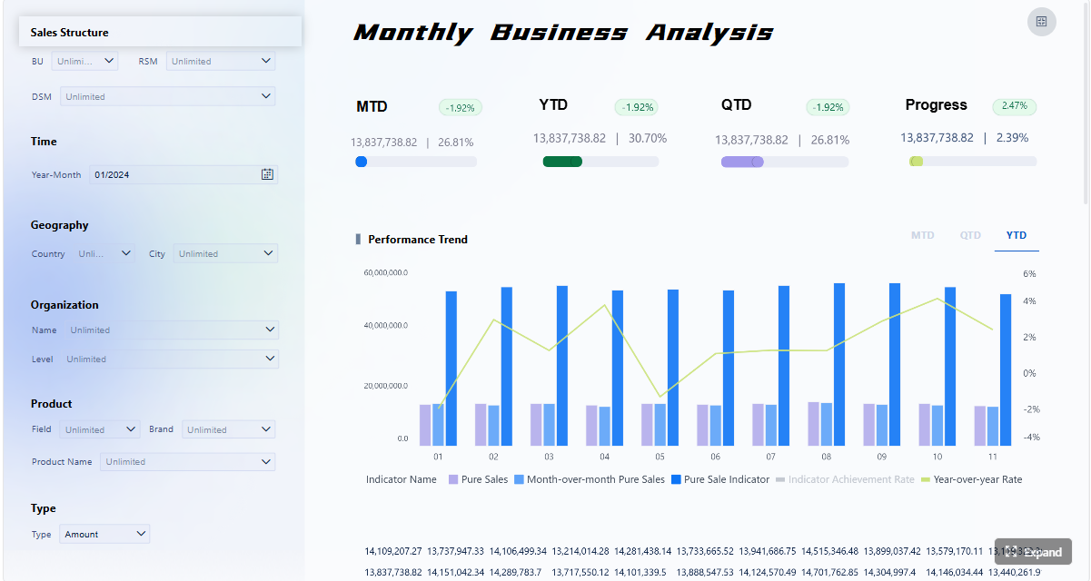
Executive KPI dashboard
An executive KPI dashboard should help leadership assess business health in seconds. The strongest version uses large typography, restrained color, and compact summary cards to present revenue, margin, forecast variance, churn, and strategic initiative status.
The creative element is not excess. It is precision. A subtle use of brand color can separate financial, customer, and operational categories. A clean top row of summary cards supports instant scanning. Trend indicators and variance arrows add motion to the story without adding clutter.
Why it works:
- Leaders can scan high-level performance fast
- Exceptions stand out without overwhelming the page
- Supporting charts provide context below the summary layer
Operations control dashboard
Operations teams need a dashboard that behaves like a live control center. Throughput, queue length, incident volume, cycle time, and bottlenecks must be visible at a glance.
Creative dashboard design here often means using strong alert states, disciplined color coding, and spatial grouping by workflow stage. The page should make it obvious where congestion is forming and which process area needs intervention.
Why it works:
- Critical alerts are visually prioritized
- Bottlenecks are easy to compare across stages
- Minimal noise preserves attention for action-heavy metrics
Sales performance dashboard
A sales dashboard needs to combine targets, actuals, pipeline movement, conversion rates, and regional comparisons in one coherent view. Creativity shows up through layout strategy rather than decoration.
For example, top-line revenue performance can sit above a middle band of pipeline trends and rep activity, followed by a regional comparison panel. Strong use of whitespace and a single accent color helps sellers and managers orient quickly.
Why it works:
- Users can compare progress against target immediately
- Pipeline health is contextualized, not isolated
- Regional underperformance is easy to spot
Customer support dashboard
Support leaders need early warning visibility. Ticket volume, SLA risk, backlog, channel mix, CSAT trends, and agent workload should all work together as one service health picture.
A creative but practical support dashboard uses status indicators, heat-style workload views, and compact trend snapshots. The goal is to reveal service risk before customers feel the impact.
Why it works:
- Rising backlog and SLA exposure become visible early
- Team workload can be balanced more intelligently
- Trend snapshots support proactive staffing and prioritization
Financial performance dashboard
Finance teams need sharp visibility into revenue, operating costs, profit margin, cash flow, budget variance, and forecast confidence. A creative financial dashboard should feel disciplined and trustworthy.
The best designs use conservative color, tight formatting, and clear variance logic. Creative touches may include visual callouts for abnormal expense categories or waterfall-style views that simplify contribution analysis.
Why it works:
- Variances are easy to detect and explain
- Confidence in the data presentation remains high
- Executives can bridge summary and detail without losing context
Supply chain dashboard
Supply chain teams juggle inventory, lead time, fulfillment rate, supplier performance, and logistics exceptions. A strong dashboard organizes these around flow: inbound, inventory position, fulfillment, and exception management.
Creativity can appear through directional movement cues, segmented status bands, and compact maps or distribution panels when geography matters. The key is to keep movement and friction visible.
Why it works:
- Delays and stock risks surface quickly
- Supplier and distribution issues are easier to isolate
- Teams can coordinate action across procurement and logistics
Marketing performance dashboard
Marketing dashboards often fail by trying to show everything. A better approach uses a layered structure: campaign performance on top, channel efficiency in the middle, and funnel outcomes below.
Creative dashboard design here may use bold campaign cards, disciplined color categories by channel, and comparative trend blocks for spend versus pipeline contribution. The visual system should help marketers see both efficiency and business impact.
Why it works:
- Channel performance is easier to compare
- Spend efficiency is connected to downstream outcomes
- Teams can shift budget faster based on evidence
HR workforce dashboard
HR and people operations teams need dashboards for headcount, attrition, hiring pipeline, time-to-fill, diversity metrics, and workforce capacity. These dashboards work best when they combine summary views with sensitive, role-based drill-down options.
Creative design can help by segmenting the page into workforce health, hiring flow, and risk indicators. The strongest examples use visual calm, not flashy patterns, because trust and clarity are critical.
Why it works:
- Workforce changes are visible at a strategic level
- Hiring bottlenecks can be spotted before they hurt capacity
- Sensitive metrics remain readable and controlled
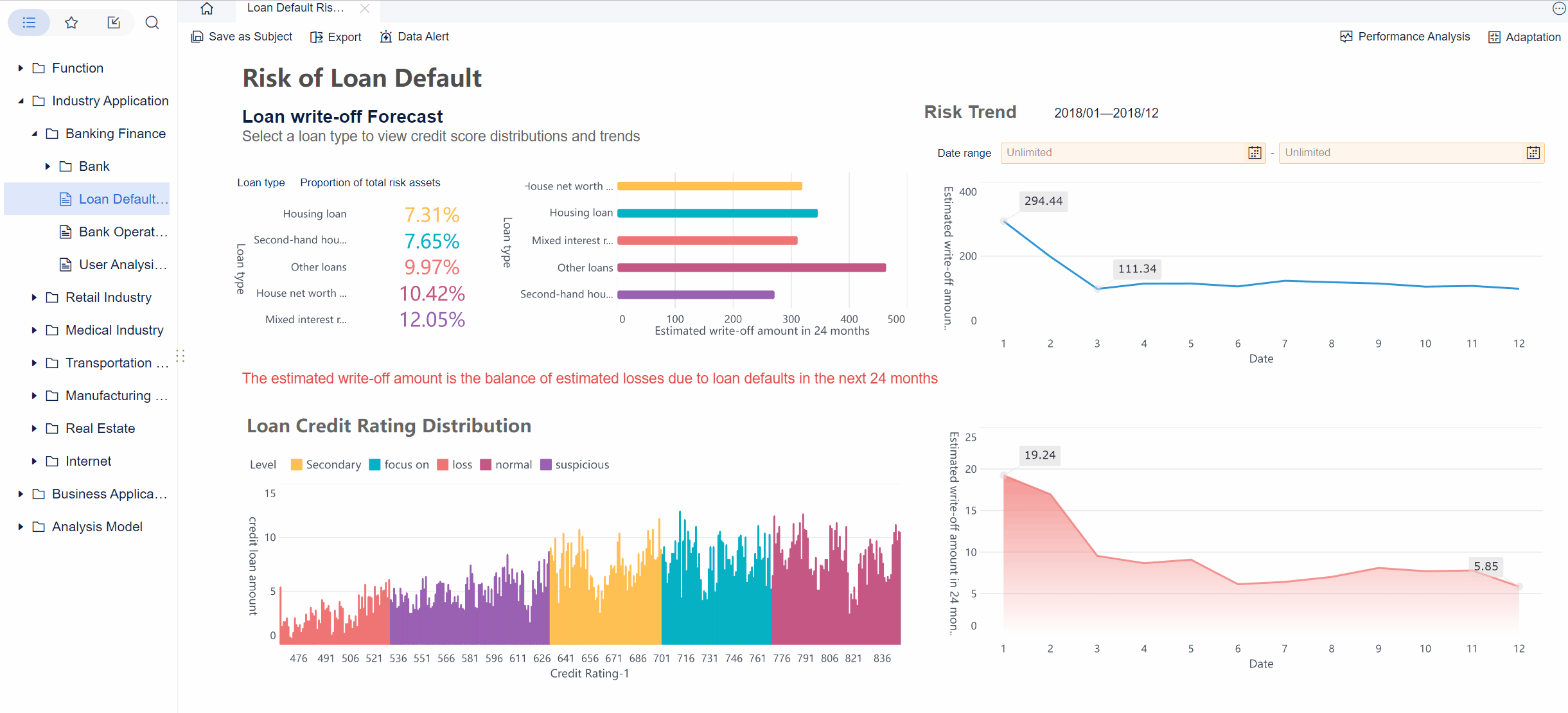
IT service and infrastructure dashboard
IT leaders need dashboards that support uptime monitoring, incident tracking, ticket aging, system utilization, and change impact. In this environment, visual hierarchy must be immediate and unforgiving.
Creative dashboard design helps when it makes severity levels, service dependencies, and active incidents easier to recognize. Clear status banners, incident queues, and infrastructure trend panels can create a control-room effect without becoming visually chaotic.
Why it works:
- Teams can identify urgent issues fast
- Service reliability is easier to monitor continuously
- Technical and leadership users can share one source of truth
Why these dashboard design examples actually work
These examples succeed because they share a few repeatable design patterns.
First, they use hierarchy aggressively. Important information gets prime position, stronger contrast, and more space. Secondary detail is available, but it does not compete with the main message.
Second, they maintain consistency. Cards, chart types, alert states, and labels behave predictably across the dashboard. That reduces cognitive load and builds trust. Users should not have to relearn visual rules from one section to another.
Third, they provide contextual detail. A good dashboard does not just say that a metric changed. It shows whether the change is good or bad, against what benchmark, and where the user should investigate next.
Bold visuals improve comprehension when they:
- Separate priority from background information
- Clarify state changes such as normal, warning, and critical
- Highlight comparisons, outliers, and trend shifts
- Help users remember structure and navigate faster
Bold visuals distract when they:
- Use too many competing colors
- Introduce decorative charts with weak analytical value
- Overuse animation or micro-interactions
- Break scanning patterns with unconventional layout logic
- Emphasize brand aesthetics over task completion
The result of getting this balance right is measurable. Teams often see:
- Faster monitoring and issue detection
- Fewer interpretation errors
- Better alignment across departments
- Shorter meeting cycles because the story is already visible
- Higher dashboard adoption because the experience feels useful, not exhausting
Where teams find dashboard design inspiration without copying trends blindly
Evaluate galleries, template libraries, and idea collections critically
Many teams start with visual inspiration sources such as galleries, template libraries, and curated design collections. That is useful, but only if you evaluate them through an enterprise lens.
When reviewing inspiration, look for:
- Layout patterns that support fast scanning
- Component combinations that simplify common workflows
- Effective use of summary cards, filters, tables, and trend blocks
- Practical data storytelling patterns for real business questions
Ignore concepts that look impressive but fail basic operational needs. If a design buries alerts, overuses novelty charts, or cannot scale to enterprise data complexity, it is not a model to copy.
A good rule is simple: if the design would confuse a busy executive in a five-minute review or slow down an analyst during incident response, it is inspiration only, not implementation guidance.
Turn inspiration into a practical design system
The best teams convert inspiration into a repeatable design system. Instead of reinventing every dashboard, they define reusable patterns that preserve both creativity and clarity.
That includes:
- Standard KPI card designs
- Approved chart types by use case
- Alert color rules and severity states
- Layout templates for executive, operational, and analytical dashboards
- Typography and spacing standards
- Filter placement and drill-down behavior
- Accessibility and performance guidelines
This approach allows creativity to scale. Designers can introduce fresh visual ideas within a controlled structure, while BI teams maintain consistency and governance.
Create review criteria before publishing any dashboard, such as:
- Does the dashboard answer a defined business question?
- Is the primary action or insight visible in under ten seconds?
- Are alert states unmistakable?
- Are labels, units, and metric definitions clear?
- Does the design work with realistic data volumes and edge cases?
- Is the visual style helping comprehension or competing with it?
A practical checklist for creating enterprise dashboards that stay creative and clear
Here is a practical consultant-style process for implementing creative dashboard design without sacrificing usability.
1. Clarify audience, decisions, and success metrics first
Start with the user role and the decisions they must make. Identify the top metrics, required comparisons, threshold logic, and expected actions. Define what success looks like, such as faster issue resolution, improved forecast reviews, or reduced reporting time.
2. Choose one or two visual ideas that reinforce meaning
Do not stack every visual trend into one screen. Select a limited set of creative elements that genuinely improve understanding. That could be a stronger hierarchy system, a more effective alert treatment, or a clearer summary-card model. Restraint creates impact.
3. Prototype with realistic workflows and governed metrics
Design screens around actual enterprise behavior. Test filters, drill paths, role-based views, and heavy data states early. Confirm that calculations, labels, and metric definitions are governed before investing in polish.
4. Test with real users, realistic data, and edge cases
Put the dashboard in front of executives, managers, and analysts who will actually use it. Ask them to complete real tasks. Watch where they hesitate, misread, or ignore important signals. Test exception states, sparse data, late-refresh scenarios, and unusual spikes.
5. Review and evolve continuously
Enterprise dashboards should not be static assets. Business goals change. Data quality changes. Users change. Schedule regular reviews to refine layout, retire unused components, and add context where confusion remains.
Building creative dashboard design at scale with FineBI
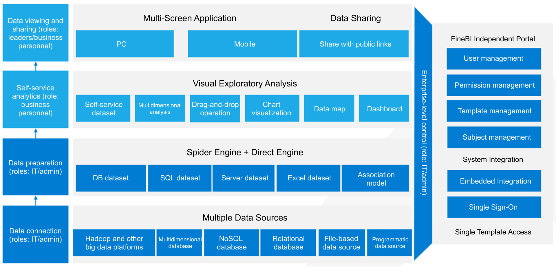
The methodology is clear, but building this manually is complex. Enterprise teams have to manage data integration, governed metrics, role-based permissions, visual consistency, performance optimization, and continuous iteration across many departments. That is a heavy lift if every dashboard starts from scratch.
This is where FineBI becomes the practical enabler.
With FineBI, teams can use ready-made templates and automate this entire workflow. Instead of manually stitching together data models, dashboard layouts, access controls, and visual rules for every use case, organizations can accelerate delivery with a self-service BI platform built for enterprise scale.
FineBI helps teams:
- Build dashboards faster with reusable templates and components
- Standardize KPI definitions and governed data access
- Support self-service exploration without sacrificing control
- Create role-based views for executives, operations, sales, and support teams
- Handle large data volumes with enterprise-ready performance
- Maintain consistency across dashboards while still allowing creative flexibility
For organizations pursuing creative dashboard design that actually improves decision-making, FineBI offers the balance most teams need: visual freedom where it adds value, and operational structure where it matters most.
If your team is trying to design dashboards that are bold, usable, and trusted across the enterprise, do not rely on manual processes alone. Use FineBI to turn strong dashboard ideas into scalable, governed, decision-ready systems.
FAQs
An effective enterprise dashboard uses visual creativity to make important signals easier to notice and act on quickly. It should improve clarity, trust, and decision speed rather than add decoration that slows users down.
Start with the decisions users need to make, then apply color, layout, and emphasis to support those actions. Bold design works best when it strengthens hierarchy and highlights what changed, what matters, and what needs attention.
Common problems include overcrowded widgets, excessive visual effects, weak hierarchy, and charts that look impressive but are hard to interpret. These choices can hide risks, delay insight, and reduce confidence in the data.
Useful KPIs include time to insight, decision speed, and alert response time. These metrics show whether the dashboard helps users understand issues faster and move to action with less friction.
Enterprise users often scan dashboards under time pressure, so hierarchy helps them find the most critical information first. Clear contrast, spacing, grouping, and scale make the interface easier to read and reduce missed signals.


The Author
Yida YIn
FanRuan Industry Solutions Expert
Related Articles

Portfolio Reporting for PMOs: 9 Executive Metrics Every Weekly Portfolio Dashboard Should Include
Weekly portfolio reporting should help executives answer three questions fast: Are we delivering the right initiatives, are we putting outcomes at risk, and what decisions need leadership this week? For PMOs, that means
Yida Yin
Jul 01, 2026

How to Build an Investment Portfolio Reporting Dashboard for Executives: KPIs, Benchmarks, and Drill-Down Views
Investment portfolio reporting for executives is not about showing every holding, transaction, and chart your investment team can produce. It is about giving CEOs, CFOs, CIOs, boards, and investment committees a fast, re
Yida YIn
Jun 25, 2026

12 KPI Reporting Examples for Executive Dashboards: What to Show in Weekly, Monthly, and Quarterly Reviews
Executive leaders do not need more data. They need decision ready $1 examples that match how often they review the business and what actions they are expected to take. A weekly $1 should surface fast moving risks and per
Yida YIn
Jun 25, 2026