Executive dashboards fail when they look impressive but do not help leaders decide what to do next. The real purpose of reviewing interactive dashboard examples is not to copy layouts. It is to understand how strong dashboards reduce executive friction, surface risk earlier, and connect top-line performance to fast action.
For CIOs, operations directors, finance leaders, and business unit heads, the pain points are familiar: too many disconnected reports, endless status meetings, conflicting KPI definitions, and no easy way to move from a red metric to the reason behind it. An executive dashboard should solve those problems in one place.
Speeds decision-making by showing only the metrics tied to strategic choices
Reduces reporting overhead by replacing manual updates and scattered spreadsheets
Improves accountability by linking each KPI to an owner and expected action
Enables earlier intervention through thresholds, alerts, and drill-down analysis
If you are evaluating interactive dashboard examples, use this guide as a practical framework for building one that executives will actually trust and use.
Click To Try The Dashboard
What executive teams can learn from interactive dashboard examples
Most executives do not need more data. They need a better decision environment. The best dashboard examples succeed because they are built around decisions first, visuals second.
Before selecting charts, filters, or sources, define what the dashboard is supposed to support. Is the CEO reviewing growth and forecast confidence? Is the COO monitoring delivery risk and capacity strain? Is the CFO watching margin erosion and cash flow pressure? The dashboard should reflect those recurring decisions clearly.
The next lesson is hierarchy. Executive teams need a fast, strategic scan before they need detail. That means separating top-level outcomes from operational diagnostics. The first view should answer, “Are we on track?” Only then should users drill into “What changed?” and “Where do we need to act?”
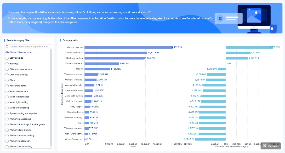
Interactivity is what turns a dashboard from a static status board into a decision tool. A leader should be able to investigate a trend, compare periods, filter segments, and isolate drivers without opening three more reports or waiting for an analyst.
Clear success criteria matter too. A dashboard initiative should not be judged by visual polish alone. It should be measured by outcomes such as:
Faster decisions during executive reviews
Fewer recurring status meetings built around manual report preparation
Earlier risk detection before performance issues become business failures
Better follow-through because owners and actions are visible
Key Metrics (KPIs) for executive dashboard success
When assessing interactive dashboard examples, these are the operational and business KPIs that matter most:
Decision cycle time: How long it takes leadership to move from review to action
Time to root cause: How quickly users can identify why a KPI changed
Dashboard adoption rate: Percentage of intended executive users actively using the dashboard
Meeting reduction: Number of reporting or status meetings eliminated or shortened
Alert response time: Speed at which owners respond to threshold breaches
Data freshness: How current the underlying data is when decisions are made
Metric consistency: Degree to which KPI definitions are standardized across teams
Action completion rate: Percentage of dashboard-identified actions closed on time
These KPIs help determine whether the dashboard is creating business value, not just generating screen views.
Click To Try The Dashboard
Choose KPIs that connect directly to executive decisions
The best executive dashboards do not start with available data. They start with repeated business questions.
Start with the business questions leaders ask most often
Ask what leaders regularly need to know in board meetings, weekly reviews, and monthly planning sessions. Common examples include:
Are we on pace to hit revenue and margin targets?
Which regions or business units are off plan?
Where are the biggest delivery or customer risks?
What needs intervention this week versus this quarter?
Once those questions are clear, map each KPI to four things:
Decision: What choice the metric informs
Owner: Who is accountable for movement
Review cadence: Daily, weekly, monthly, or quarterly
Expected action: What should happen if the metric moves outside threshold
This mapping prevents a common dashboard mistake: showing numbers that generate discussion but not action.
Keep the first view limited. Executives should see a small set of metrics that reveal performance, risk, and momentum. In most cases, that means a focused summary rather than an overloaded command center.
Balance outcome metrics with leading indicators
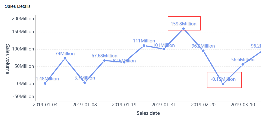
A dashboard that only shows lagging results tells leaders what already happened. A decision-ready dashboard also includes signals that predict what is likely to happen next.
This combination gives leaders both confirmation and warning. A growth dashboard may show current revenue above target while pipeline conversion quality drops. An operations dashboard may show acceptable service levels today while backlog and cycle time signal future disruption.
Always present targets, thresholds, and trends alongside actual performance. A KPI without context is easy to misread.
Define metric logic before dashboard design begins
Many executive dashboard failures are really governance failures. If teams argue over formulas during review meetings, the dashboard has already lost credibility.
Add plain-language metric definitions for anything that could be interpreted in multiple ways. Terms like “active customer,” “qualified pipeline,” “gross retention,” or “on-time delivery” often vary across departments. If the logic is unclear, adoption will be low no matter how polished the interface looks.
Design drill-down paths that turn summary views into action
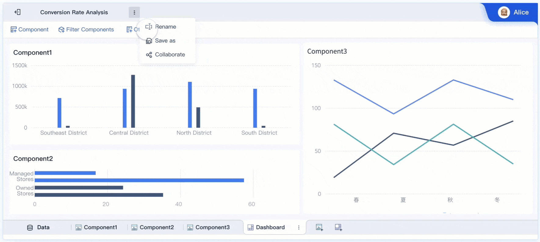
The value of interactive dashboard examples becomes most obvious in drill-down design. Executives need a quick path from summary performance to the specific cause of deviation.
Build each top-line metric into a guided investigation path
Every top-line KPI should have a logical investigation path. A red revenue number should not force the user to guess where to click next.
A good drill-down flow typically moves through levels such as:
Enterprise summary
Region or business unit
Team or product line
Customer segment or account tier
Transaction, issue, or exception detail
This progression helps leaders go from “performance is off” to “here is the source of the issue” in minutes.
Keep filters persistent throughout the journey. If a leader selects a quarter, region, or channel, that context should remain in place while drilling deeper. Losing filter state creates confusion and slows interpretation.
Use interactive visualization patterns that reveal causes, not just values
Strong executive dashboards do more than display numbers. They explain movement.
Useful interactive patterns include:
Trend plus breakdown: Show overall movement, then split by segment
Actual vs target: Highlight performance against plan
Variance views: Reveal where overperformance or underperformance originates
Period comparison: Contrast current performance with prior periods
Top driver analysis: Surface the dimensions most associated with change
The best dimensions depend on the business model, but common ones include:
Geography
Sales channel
Product category
Account tier
Time period
Business unit
Service line
This is what separates decorative dashboards from operationally useful ones. Leaders should not have to ask analysts for a second report to understand why a KPI moved.
Reduce friction in the executive workflow
Executives use dashboards under time pressure. The interface must support the most common actions immediately.
Make these actions obvious:
Filter
Compare
Drill down
Annotate
Share
Avoid cluttered layouts, buried controls, and dense menu systems. If users need training just to find a regional filter or comparison toggle, the design is too complex for executive use.
A pragmatic rule: if the dashboard cannot be used effectively during a live leadership meeting, it is not ready.
Build alerts and thresholds that prompt decisions at the right time
A dashboard becomes much more valuable when it does not wait for scheduled review meetings to surface problems.
Turn KPI movement into clear, actionable notifications
Alerts should fire when something requires attention, not when data simply changes. High-value alert triggers include:
Threshold breaches
Unusual spikes or drops
Missed targets
Trend reversals
Data quality failures
Forecast confidence deterioration
Each alert should include enough context to support a decision. A useful executive alert answers:
What changed?
By how much?
Against what threshold or baseline?
Where is the issue concentrated?
Who owns the next action?
Without context, alerts create noise instead of action.
Not every KPI shift deserves the same urgency. Executive dashboards should separate strategic risk from operational exceptions and informational updates.
A simple model works well:
Critical: Immediate strategic or financial impact; requires escalation
Informational: Context update; no immediate action required
Routing matters as much as severity. Alerts should go to the people who can act, not just the people who requested visibility. An at-risk retention trend may go to customer success leadership, while a forecast miss may route to sales and finance owners.
Prevent alert fatigue
Poorly designed alerting destroys trust quickly. If executives receive too many low-value notifications, they will ignore the important ones too.
Use these controls to keep alerts effective:
Suppress duplicate alerts within a defined period
Group related issues into one signal
Set meaningful thresholds instead of minor fluctuations
Review false positives regularly
Retire unused or low-value alert rules
Alert quality should be reviewed like any other KPI. If alerts do not drive faster action, they need redesign.
Dashboard examples and templates to adapt for executive use
Reviewing interactive dashboard examples is useful when you know what to borrow and what to ignore. The goal is not imitation. It is pattern recognition.
Common executive dashboard examples worth borrowing from
Several dashboard types consistently work well for leadership teams because they align with recurring executive decisions.
Revenue and growth dashboards
These typically track:
Revenue vs target
Pipeline coverage
Conversion rates
Forecast accuracy
Regional growth contribution
Sales cycle movement
These are useful for CEOs, CROs, and finance leaders because they combine current performance with forward-looking confidence.
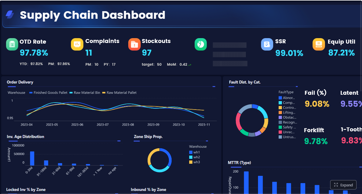
Operations dashboards
These often include:
Service levels
Backlog
Cycle time
Quality trends
Capacity utilization
Delivery risk signals
These are valuable for COOs and operations heads who need to detect execution bottlenecks before customer or financial impact compounds.
Customer dashboards
These usually focus on:
Retention
Churn risk
NPS or satisfaction trends
Support ticket patterns
Expansion opportunity
Adoption or usage signals
These help leaders understand both current customer health and future revenue stability.
How to evaluate live examples and vendor templates critically
Not all polished dashboards are useful. Evaluate examples with an executive lens, not a design lens.
Ask these questions:
Does the first view support a real decision?
Can a leader identify root causes without leaving the dashboard?
Are metrics clearly defined and trusted?
Are targets and thresholds visible?
Is data freshness obvious?
Do permissions align with executive and functional access needs?
Can users follow up with annotation, sharing, or escalation?
Many templates look good in demos but fail in practice because they ignore governance, refresh timing, and actionability.
Adapt examples to your own organization without copying blindly
Borrow interaction patterns, not generic content. A good template can give you structure for hierarchy, drill-down, and layout. But your metrics, thresholds, and decision rules must reflect your business model.
Use this adaptation process:
Keep the proven navigation and interaction design
Replace generic KPIs with company-specific measures
Align thresholds with your risk tolerance and targets
Validate metric definitions with owners
Test the dashboard against real executive review scenarios
A dashboard should be proven in live decision moments before broad rollout. If executives cannot use it naturally in a real review, refine it before scaling.
Click To Try The Dashboard
Avoid the mistakes that make dashboards impressive but ineffective
Many executive dashboards fail for predictable reasons. They prioritize visual density over decision clarity.
Common mistakes include:
Overloading the first view with too many KPIs, charts, colors, and widgets
Mixing strategic and operational metrics without clear hierarchy or narrative
Hiding essential context like targets, benchmarks, data freshness, and confidence levels
Treating the dashboard as a static report rather than an evolving decision system
Skipping governance and creating mistrust through inconsistent numbers
These failures usually show up in behavior before they show up in feedback. Executives stop opening the dashboard. Analysts keep rebuilding ad hoc reports. Meetings still revolve around arguing over the numbers.
Best practices to build an executive dashboard that gets used
If you want a practical implementation model, follow these consultant-grade steps:
Define the top 5 to 8 executive decisions first
Do not begin with charts or source systems. Begin with the decisions leadership must make repeatedly.
Build a KPI dictionary before the first mockup
Standardize formulas, owners, thresholds, and refresh timing so trust is built into the design.
Design the first page for scanning in under 30 seconds
The opening view should show performance, risk, and momentum immediately, with drill-down available only where needed.
Create guided drill paths for every major KPI
Ensure users can move from summary to cause logically, without resetting filters or opening external reports.
Launch with alerts, annotations, and feedback loops
Dashboards improve when leaders use them in real review cycles and provide direct input on friction points and missing context.
These steps sound simple, but execution is not. The complexity usually comes from data alignment, governance, usability design, and workflow automation.
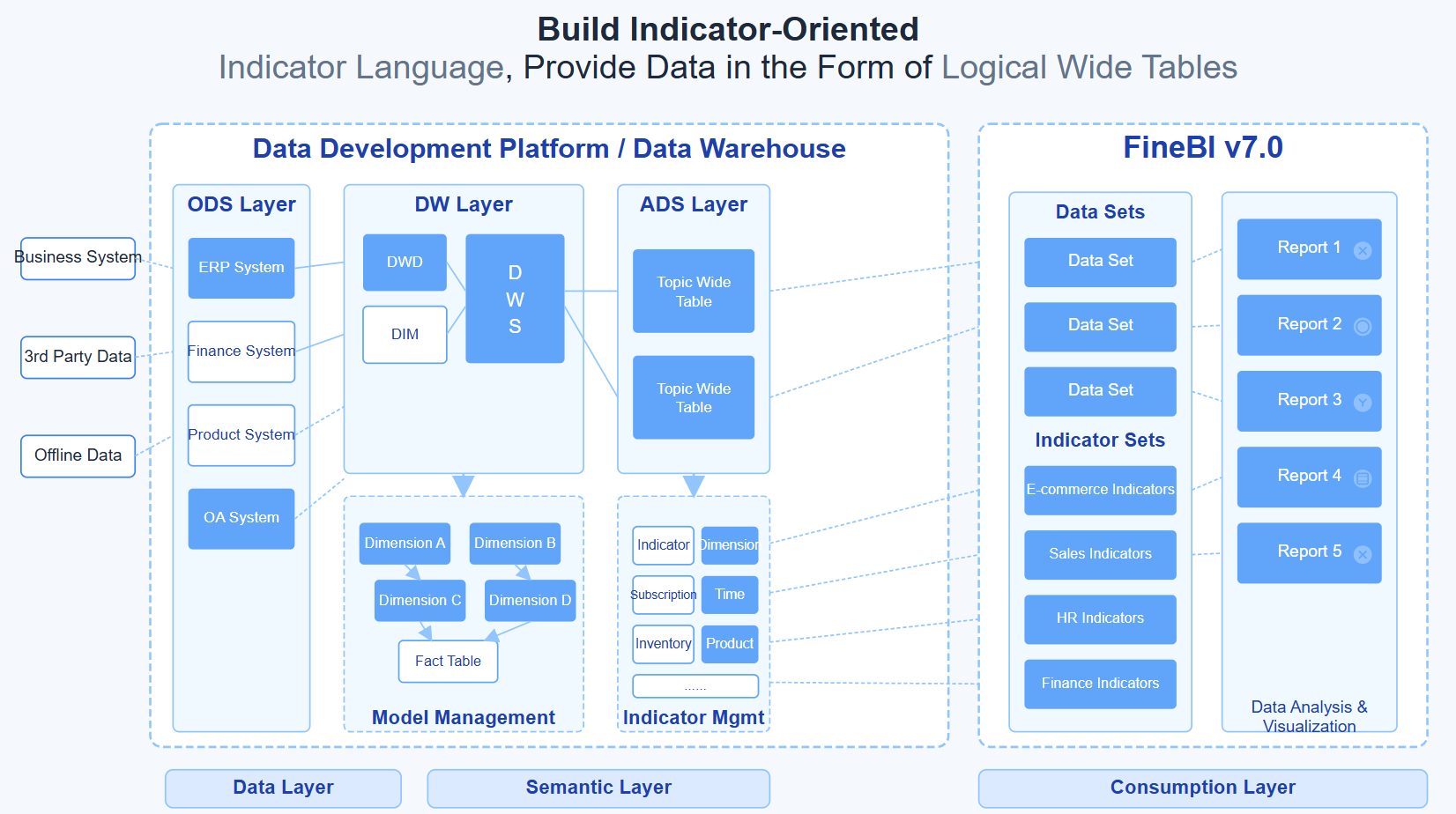
Building this manually is complex—use FineBI to automate the workflow
Studying interactive dashboard examples is a smart starting point, but building an executive dashboard manually across multiple systems is difficult. You need trusted KPI logic, interactive drill-down, alerting, permissions, data refresh orchestration, and a layout executives can use without training.
This is where FineBI becomes the practical solution.
Building this manually is complex; use FineBI to utilize ready-made templates and automate this entire workflow.
Use ready-made dashboard templates as a faster starting point for executive use cases
Connect data from multiple business systems into a governed analytics layer
Standardize KPI definitions so leadership reviews are based on the same numbers
Enable interactive drill-down, filtering, and comparison without custom-heavy development
Set up thresholds and alerts that route the right issues to the right owners
Support self-service analysis while maintaining enterprise-grade control and consistency
Scale dashboards across departments without rebuilding the same logic repeatedly
For enterprise decision-makers, the advantage is straightforward: less manual reporting, faster insight-to-action cycles, and stronger trust in the numbers. Instead of spending months stitching together a dashboard framework from scratch, teams can use FineBI to operationalize best practices from proven interactive dashboard examples and turn them into a working executive system faster.
If your current dashboard still behaves like a prettier spreadsheet, it is time to upgrade the model. The right executive dashboard should not just show performance. It should help leadership decide, act, and follow through with confidence.
FAQs
An interactive executive dashboard lets leaders filter data, compare time periods, drill into problem areas, and trace KPI changes to likely causes without needing separate reports. The goal is faster investigation and action, not just better-looking charts.
Most executive dashboards work best with a focused set of high-priority KPIs rather than a crowded screen. Start with the few metrics tied directly to strategic decisions, then allow drill-down for supporting detail.
The right KPIs depend on the decisions leaders make most often, such as revenue pace, margin pressure, delivery risk, cash flow, or churn exposure. Each metric should have a clear owner, review cadence, threshold, and expected action.
They usually fail when they prioritize visual complexity over decision support, or when KPI definitions are inconsistent across teams. Dashboards also lose trust when data is stale or users cannot move quickly from a red metric to root cause.
Success should be measured by business outcomes such as faster decision cycles, shorter time to root cause, higher adoption, fewer manual reporting meetings, and quicker response to alerts. A dashboard is effective when it improves decisions and follow-through, not just when it gets viewed.
Product Trial
FineReport
Pixel-perfect reports · Interactive dashboards · Easy data entry · Digital twins