A strong hiring dashboard does not just display recruiting data. It helps teams make faster, better hiring decisions with less back-and-forth, fewer spreadsheet exports, and clearer accountability.
For recruiters, it should highlight what needs action today. For hiring managers, it should show where interviews, feedback, or approvals are slowing progress. For leadership, it should reveal whether hiring plans are on track, where risks are emerging, and which teams need support.
The challenge is that many dashboards look polished but fail in practice. They contain too many metrics, inconsistent definitions, weak filters, or visuals that look impressive but do not guide action. This guide explains how to build a hiring dashboard that is practical, trusted, and decision-ready.
What a hiring dashboard should do before you design it
Before selecting fields, charts, or colors, define the purpose of the dashboard. This is the step that prevents clutter and improves adoption.
A hiring dashboard should support real decisions across three common stakeholder groups:
Recruiters need operational visibility into pipeline movement, overdue actions, and aging requisitions.
Hiring managers need role-level clarity on interview progress, candidate status, and bottlenecks.
Leadership needs summary metrics such as hiring goal progress, time-to-hire trends, forecast risk, and recruiter capacity.
If you skip this alignment step, one dashboard often tries to serve everyone equally and ends up serving no one well.
Define the decisions the dashboard needs to support
Start by listing the questions each audience asks most often.
Audience
Key decisions
Dashboard focus
Recruiters
Which roles are stuck? Which candidates need action? Which sources are working?
Daily pipeline management
Hiring Managers
Why is my role not moving? Where is interview feedback delayed?
Role-specific progress and bottlenecks
Leadership
Are we on plan? Which teams are at risk? How fast are we hiring?
Executive summary and forecasting
A useful hiring dashboard should answer questions such as:
Are candidates moving through stages at the expected pace?
Which open roles are aging beyond target?
Where are conversion rates dropping?
Which sources generate quality candidates, not just volume?
Are hiring goals likely to be met this quarter?
When the dashboard is built around decisions, it becomes a management tool, not a reporting artifact.
After clarifying the decision framework, place a visual planning mockup nearby for layout alignment.
All dashboard examples in this article were created by FineBI.
Clarify which hiring stages, roles, and time periods the dashboard will cover
Scope matters. If your organization hires for frontline, technical, and executive roles, a single view may hide important differences. A software engineering funnel behaves very differently from a retail hiring funnel.
Define:
Hiring stages included in the funnel
Role groups included or excluded
Geographies or business units covered
Reporting periods such as weekly, monthly, quarterly, or rolling 90-day
Be especially careful with date logic. For example:
Application date is useful for candidate inflow analysis
Req open date is useful for time-to-fill and open role aging
Offer accepted date is useful for hires and hiring plan progress
Using mixed date logic in one dashboard is one of the most common causes of mistrust.
Distinguish between operational tracking, pipeline health, and executive reporting
A high-performing hiring dashboard usually has three layers:
Operational tracking
Focused on tasks, pending actions, and stage-level movement.
Pipeline health
Focused on funnel shape, conversion rates, source quality, and bottlenecks.
Executive reporting
Focused on plan attainment, hiring velocity, forecast risk, and resource allocation.
These layers can live in one dashboard if the layout is disciplined, but in many organizations it is more effective to create role-specific views from a shared data model.
Set success criteria so the dashboard is useful, not just visually impressive
A dashboard is successful when users actually rely on it. Practical success criteria may include:
Recruiters check it daily
Hiring managers use it in weekly hiring syncs
Leadership uses it in headcount reviews
Metric definitions are documented and accepted
Users can drill from KPI to role-level detail without needing analyst support
A good rule: every metric on the dashboard should support a decision, action, or escalation.
Essential fields to include in a hiring dashboard
The best hiring dashboards balance foundational detail with decision-driving metrics. You need enough context to diagnose problems, but not so much that the dashboard becomes noisy.
Candidate and requisition details
At minimum, your data model should include core requisition and candidate attributes. These fields enable filtering, segmentation, and drill-down.
Recommended requisition fields:
Requisition ID
Role title
Department
Location
Recruiter
Hiring manager
Opening date
Requisition status
Priority level
Employment type
Role level or seniority
Job family
Recommended candidate fields:
Candidate ID
Candidate source
Application date
Current stage
Stage entry date
Interview dates
Feedback completion status
Offer status
Expected start date
Final outcome
These are not merely reporting fields. They are the foundation for answering practical questions like:
Which recruiter owns the role?
Which department has the most open positions?
Which location is causing the longest cycle time?
Which candidates are stalled in interview or offer stage?
After introducing field structure, insert a layout cue for a requisition detail panel or ATS-style summary table.
Funnel and speed metrics
A hiring dashboard should make the funnel visible from top to bottom. This includes both volume and velocity.
This is where many dashboards become more valuable. Volume alone can be misleading. A role with many applicants may still be unhealthy if review time is slow or pass-through rates are weak.
Consider using both average and median carefully. In hiring workflows, median often gives a more realistic view because outliers can distort averages.
A useful structure is:
Metric type
Example metric
Why it matters
Volume
Applicants
Measures top-of-funnel demand
Conversion
Screen-to-interview rate
Shows stage efficiency
Speed
Time to first interview
Reflects process responsiveness
Outcome
Hire count
Tracks actual delivery
After explaining funnel and speed metrics, add a visual placeholder for conversion analysis.
Quality, diversity, and forecasting signals
A mature hiring dashboard should go beyond activity counts. It should help leaders judge whether hiring is efficient, effective, and aligned with broader workforce goals.
Quality and planning signals to include:
Offer acceptance rate
Source quality
Pass-through rates by source
Hiring goal progress
Open roles by priority
Aging requisitions
Expected start dates
Forecasted hires vs target
Diversity representation by stage can also be included where legally appropriate, responsibly governed, and aligned with internal policy. This data must be handled carefully, with proper aggregation, permissions, and review standards.
What matters here is governance. Not every metric should be visible to every user. Candidate-level sensitive attributes should never be exposed casually in a broad dashboard.
Forecasting signals are particularly valuable for executives. For example, if critical roles are aging beyond target and pass-through rates are lower than historical norms, the business can intervene early by reallocating sourcing effort, adjusting compensation, or revisiting hiring criteria.
Filters that make the hiring dashboard practical to use
Even a well-designed hiring dashboard becomes frustrating if users cannot isolate the segment they care about. Filters are what turn a static report into a decision tool.
Core filters for day-to-day analysis
The most useful day-to-day filters are the ones that mirror how hiring teams work.
Core filters to include:
Date range
Department
Location
Recruiter
Hiring manager
Job family
Role level
Candidate source
Requisition status
Hiring stage
Employment type
These filters enable fast analysis without rebuilding reports each time a user asks a new question.
For example:
A recruiter may filter to active roles + assigned recruiter + last 30 days
A hiring manager may filter to their department + interview stage
A TA leader may filter to priority roles + aging over 45 days
The best dashboards also standardize filter logic across pages so users do not have to relearn controls on every tab.
After the filter strategy section, place a UI cue for interactive controls.
Comparison and drill-down options
Basic filters are not enough. A practical hiring dashboard should also support comparison and drill-down.
Useful comparison options include:
Team vs team
Office vs office
Job family vs job family
Recruiter vs recruiter
Source vs source
Role type vs role type
These views help expose structural differences. For instance, a long time-to-hire in one office may relate to interviewer availability, while low conversion in a specific job family may point to sourcing quality or role calibration.
Essential drill-down paths:
From KPI to department
From department to requisition
From requisition to candidate list
From candidate list to stage history or action status
This drill path matters because summary metrics often trigger the question, “Which roles or candidates are causing this?” If the dashboard cannot answer that in one or two clicks, users return to manual exports.
Visuals that turn data into useful insights in a hiring dashboard
A hiring dashboard is only as effective as its visual communication. Good visuals reduce interpretation time. Poor visuals create debate over what users are seeing.
Best chart types for recruiting metrics
Each recruiting metric tends to have a natural visual format. Choosing the right chart type improves speed to insight.
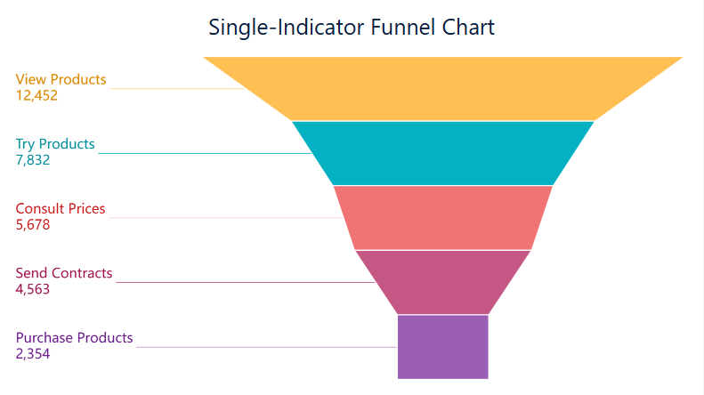
Funnel charts for stage conversion and candidate drop-off
A funnel chart is ideal for showing:
Applicants
Screens
Interviews
Offers
Hires
It makes stage drop-off visible immediately. If interview-to-offer conversion is healthy but screen-to-interview conversion is weak, recruiters know where to focus.
Funnel visuals are especially useful for pipeline health reviews and stakeholder meetings.
A common best practice is to reserve strong alert colors for exceptions only. If everything is red, nothing is actionable.
Common hiring dashboard examples and use cases
Different users need different views of the same hiring process. The smartest approach is to build one trusted model and then expose tailored views based on role.
Views for recruiters, hiring managers, and executives
Recruiter view
A recruiter view should prioritize daily execution. Typical components include:
Active requisitions
Stage movement in the last 7 or 14 days
Candidates awaiting review
Overdue follow-ups
Upcoming interviews
Aging candidates by stage
Source performance
This view is highly operational. It should answer, “What do I need to move today?”
Hiring manager view
A hiring manager view should stay focused on role progress and decision delays.
Verify row-level permissions and sensitive data access
Check drill-down paths from summary to detail
Remove visuals that do not support a clear decision
Review dashboard with recruiters, hiring managers, and leadership before rollout
A useful hiring dashboard is not the one with the most charts. It is the one people trust enough to run hiring meetings from.
For many teams, the hardest part is not defining metrics. It is combining ATS, HRIS, and business planning data into a governed, flexible, and easy-to-use analytics layer. This is where a modern BI platform becomes critical.
FineBI is a strong fit for organizations that want to build an interactive hiring dashboard with enterprise-grade governance and self-service exploration. It can help teams unify recruiting data from multiple systems, create role-based views for recruiters and executives, enable drill-down analysis, and maintain consistent metric definitions at scale. That means less time spent reconciling spreadsheets and more time acting on hiring insights.
If your goal is to move from fragmented recruitment reporting to a trusted, decision-ready hiring dashboard, FineBI can provide the structure, flexibility, and visual analytics foundation to do it well.
Get Ready-to-Use Dashboard Templates in Fine Gallery
After the final recommendation, reserve space for a polished end-state product visual.
Start with a small set of decision-making metrics such as open requisitions, total hires, time to hire, time to fill, offer acceptance rate, and stage conversion rates. These give teams a clear view of progress, speed, and bottlenecks without overcrowding the dashboard.
Time to hire measures how long it takes a candidate to move from entering the pipeline to accepting an offer. Time to fill measures the full process from opening or approving the requisition to offer acceptance.
Build the dashboard around the decisions each audience needs to make rather than forcing one identical view for everyone. Recruiters need action-oriented pipeline detail, hiring managers need role-level visibility, and leadership needs summary metrics and forecast risk.
The most useful filters usually include department, role, location, recruiter, hiring manager, job family, requisition status, and reporting period. These let users isolate bottlenecks and compare hiring performance across teams or timeframes.
Trust usually breaks when metric definitions are inconsistent, date logic is mixed, or visuals look polished but do not explain what action to take. A reliable hiring dashboard uses clear definitions, consistent source data, and easy drill-downs from KPIs to role-level detail.
Product Trial
FineReport
Pixel-perfect reports · Interactive dashboards · Easy data entry · Digital twins
 A funnel chart example made by