A sales analytics dashboard should do one job exceptionally well: help sales leaders predict revenue, inspect pipeline health, and take action before targets are missed. If your VP of Sales, revenue operations team, or regional sales managers are still stitching together CRM exports and spreadsheet forecasts every week, the problem is not effort. It is dashboard design, data discipline, and reporting structure.
This guide explains how to build a sales analytics dashboard that supports real forecasting decisions, not just activity monitoring. You will learn which questions the dashboard must answer, which metrics matter most, how to structure the reports, and how to improve reporting over time.
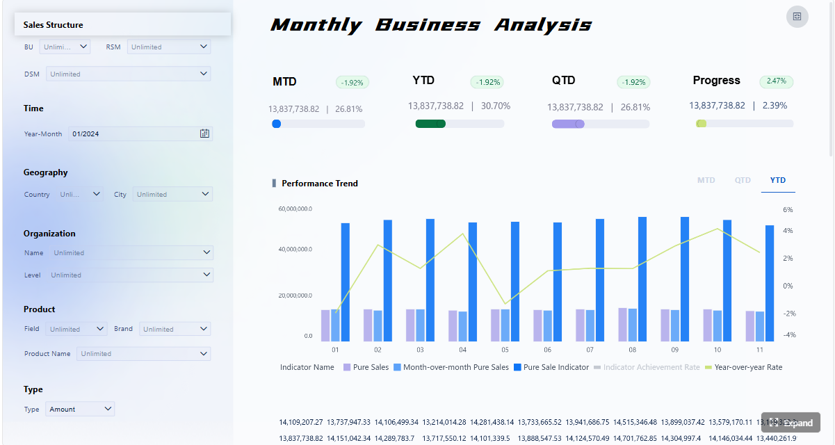
Click To Try The Dashboard
What a sales analytics dashboard should help you answer
A useful sales analytics dashboard starts with decision support, not chart selection. Before building visuals, define the exact business questions your dashboard must answer for forecasting, pipeline visibility, and team performance.
At a minimum, your dashboard should answer:
Are we on track to hit this month, quarter, and year revenue targets?
How much of the forecast is supported by healthy pipeline versus optimistic assumptions?
Which pipeline stages are weakening conversion or slowing velocity?
Which teams, regions, segments, or reps are outperforming or underperforming?
Where are deals stalling, aging, or slipping beyond expected close dates?
What actions should managers take this week to protect forecast accuracy?
For enterprise teams, the dashboard also needs to clarify who uses it, how often it is reviewed, and which decisions it supports. Executives usually need a concise revenue and forecast summary. Sales managers need pipeline inspection, conversion analysis, and rep-level coaching views. Front-line reps need focused visibility into their own book of business, priorities, and at-risk opportunities.
If you combine all of that into one crowded interface, the dashboard becomes noisy and hard to trust. A better approach is to separate views by role:
Executive summary view: revenue target, forecast, coverage, trend, and major risks
Manager view: stage movement, pipeline health, aging, velocity, and team performance
Rep view: owned opportunities, next actions, slipped deals, and personal attainment
That separation keeps reporting focused and improves adoption. A dashboard that everyone can use often ends up serving no one particularly well.
How to build a sales analytics dashboard step by step
Start with revenue forecasting goals
Forecasting logic should be defined before a single chart is built. Start by deciding the forecast horizon that matters most to the business:
Monthly forecast
Quarterly forecast
Rolling 90-day or 180-day forecast
Annual planning forecast
Next, define the sales motions and segments you want to track. For example:
New business vs renewals
SMB vs mid-market vs enterprise
Direct sales vs partner-led sales
Product line or business unit splits
Then choose what the forecast will measure. This is where many teams create confusion. Your sales analytics dashboard may need one or more of the following:
Bookings: total value of signed deals in a period
Recognized revenue: revenue earned according to finance rules
Weighted pipeline: pipeline value adjusted by stage probability
Expected close value: estimated deal value expected to close in a period
These are not interchangeable. If sales reports bookings while finance reports recognized revenue, forecast debates become inevitable. Align definitions early.
You also need standard definitions for:
Sales stages
Stage probability
Deal value
Forecast category
Close date
Opportunity owner
Without this alignment, the dashboard may look polished while producing unreliable insights.
Define pipeline health metrics
Pipeline health is the operational backbone of forecasting. A forecast is only as strong as the pipeline feeding it. Your sales analytics dashboard should include metrics that show whether the pipeline is large enough, balanced enough, and moving fast enough to support future targets.
Key Metrics (KPIs)
Pipeline Coverage: ratio of open pipeline value to future quota or revenue target. This indicates whether enough opportunity value exists to support goals.
Stage Conversion Rate: percentage of deals that move from one stage to the next. This reveals where prospects drop off.
Sales Velocity: the speed at which opportunities move through the funnel. Faster movement typically improves forecast confidence.
Win Rate: percentage of qualified opportunities that close as won. This measures sales effectiveness and forecast realism.
Average Deal Size: average value of closed-won or active opportunities. This helps explain revenue changes and segment differences.
Pipeline Aging: length of time deals remain open or remain within a specific stage. This surfaces stalled or low-quality opportunities.
Stage Distribution: share of opportunities or pipeline value in each stage. This shows whether the pipeline is balanced or bunched up.
Slipped Deals: opportunities with close dates pushed out beyond the original or expected period. This is a major forecast risk indicator.
Top-of-Funnel Volume: number and value of new opportunities entering the pipeline. This helps assess future pipeline sufficiency.
Forecast Accuracy: variance between forecasted and actual results. This measures whether your revenue planning process is trustworthy.
Warning signs of pipeline risk often include:
Too little top-of-funnel creation
Excessive concentration in one middle stage
Long aging in proposal or negotiation stages
Weak stage-to-stage conversion
High volume of slipped deals late in the quarter
Large forecast gaps masked by low-probability upside deals
To make the dashboard actionable, set thresholds for each KPI. For example:
Pipeline coverage below 3x target for enterprise sales
Stage aging above historical average by 20%
Win rate drop of more than 10% quarter over quarter
Close-date slippage above a set limit in commit deals
Thresholds help managers move from observation to intervention.
Connect and clean the source data
A sales analytics dashboard is only as good as its source systems. Most organizations pull sales reporting data from more than one platform, including:
CRM systems such as Salesforce, HubSpot, or Dynamics
Marketing automation platforms
ERP or finance systems
Customer success or account management systems
Product usage or subscription platforms where relevant
For forecasting and pipeline health, the CRM is usually the primary source, but finance data often becomes essential for validating bookings, revenue recognition, and target alignment.
The key data inputs typically include:
Opportunity ID
Account and contact details
Stage and stage history
Opportunity amount
Forecast category
Created date and expected close date
Owner, manager, and territory
Lead source or channel
Product or service category
Closed-won and closed-lost status
Actual revenue or bookings where available
Before dashboard development, standardize:
Field names and labels
Stage definitions
Team and territory hierarchies
Ownership rules
Currency treatment
Time periods and fiscal calendars
You also need quality controls for:
Missing close dates
Blank owner fields
Duplicate opportunities
Inactive or outdated deals
Unrealistic stage probabilities
Opportunities left open after effective inactivity
This is where many reporting projects fail. Teams invest heavily in visuals while underinvesting in data hygiene. The result is a dashboard that looks real-time but cannot be trusted in forecast calls.
Design the dashboard layout and update cadence
A high-performing sales analytics dashboard should feel obvious to use. Executives and managers should find answers in seconds, not minutes.
A practical layout usually follows this structure:
Top section: summary KPIs such as target, forecast, actuals, coverage, win rate, and velocity
Middle section: trend charts for revenue, forecast variance, stage movement, and pipeline progression
Bottom section: drill-down tables for opportunity-level inspection, rep performance, and at-risk deals
This layout supports both executive scanning and manager investigation.
Filters should be useful, not overwhelming. The most practical filter dimensions are:
Region
Team
Segment
Product
Lead source
Time period
Manager or rep
Limit the number of visible controls so the dashboard remains readable. Too many filters often produce user confusion and inconsistent interpretations.
Refresh cadence should match the business rhythm:
Daily: for active pipeline reviews and manager coaching
Weekly: for forecast inspection and revenue leadership reviews
Monthly: for board-level and executive trend reporting
Assign ownership clearly. Someone should be responsible for:
Data refresh monitoring
CRM hygiene review
KPI definition updates
Dashboard access and governance
Report enhancement requests
Without operating ownership, even a well-built dashboard degrades quickly.
Core reports for revenue forecasting and pipeline health
Forecast accuracy and revenue trend report
This report answers the question: how reliable is our forecast, and how does actual performance compare to expectations over time?
A strong forecast accuracy report should compare:
Forecasted revenue vs actual revenue
Target vs forecast vs closed revenue
Current forecast vs prior forecast versions
Commit, best case, and upside where relevant
This helps leadership understand not only whether targets are at risk, but whether the forecasting process itself is improving.
Useful visuals include:
Line charts for forecast vs actual trend over time
Variance bars for target gap analysis
Stacked views for commit, best case, and upside
Period-over-period comparison tables
The most important insight is not just whether the number is high or low. It is where the gap comes from. Is the issue weak pipeline generation, low conversion, delayed deal movement, or overly optimistic forecasting behavior?
Pipeline coverage and stage conversion report
This report evaluates whether the current pipeline is large and healthy enough to support upcoming revenue goals.
It should show:
Total open pipeline by target period
Pipeline coverage ratio by segment or team
Stage distribution by value and volume
Stage-to-stage conversion rates
Opportunity inflow and outflow over time
The strongest versions also break conversion down by:
Segment
Region
Sales rep
Manager
Lead source
Product line
That level of segmentation helps teams identify patterns such as:
A region with strong volume but poor late-stage conversion
A lead source that creates opportunities but few wins
A manager team with unusually weak qualification quality
If pipeline coverage is below required levels, the dashboard should make that visible immediately. If stage conversion is deteriorating, leaders should see exactly where the drop-off is happening.
Deal velocity and aging report
Velocity and aging are often overlooked until a quarter starts slipping. This report gives sales managers an operational view into pipeline movement and bottlenecks.
Track:
Average days in pipeline
Average days by stage
Time-to-close by segment or product
Number and value of stalled deals
Close-date slippage trends
This report is especially valuable for coaching because it shows whether issues are concentrated in:
Specific reps
Complex enterprise deals
Certain products
Particular geographies
Individual stages like proposal, legal review, or procurement
Aging metrics also help distinguish healthy late-stage deals from pipeline clutter. Not every old deal is dead, but every old deal deserves scrutiny.
Rep and manager performance report
This report should support coaching, accountability, and territory planning without turning into a vanity leaderboard.
Focus on metrics that connect activity to outcomes, including:
Quota attainment
Win rate
Average deal size
Pipeline created
Pipeline coverage
Stage conversion
Deal cycle length
Forecast accuracy by manager or team
The goal is to give managers enough detail to diagnose performance issues. For example:
A rep with high activity but low win rate may need qualification coaching
A rep with good pipeline generation but slow velocity may need deal progression support
A team with decent volume but low average deal size may need better account targeting
Leaderboards can be useful, but they should reinforce action. If a ranking widget does not lead to coaching, resource shifts, or process improvement, it adds noise rather than value.
The best sales analytics dashboard examples usually share a few common design principles.
First, they have a clear KPI hierarchy. The most important numbers appear at the top, and supporting trends or drill-down detail appear below. Users do not have to hunt for the story.
Second, they use simple visuals matched to the question. Trend lines for revenue, funnels for conversion, bars for comparison, and tables for inspection. Complex charting rarely improves sales decision-making.
Third, they include plain metric definitions. If users cannot tell whether forecast means bookings, expected value, or recognized revenue, trust erodes quickly.
Fourth, they are role-specific. Executive dashboards are concise. Manager dashboards are diagnostic. Rep dashboards are tactical.
When reviewing examples, borrow the layout logic and visual discipline, but adapt the KPI set to your own sales process. A dashboard that works for a high-volume transactional sales motion may fail in an enterprise environment with long cycles and deal-stage complexity.
How to evaluate examples from real companies
Not every attractive dashboard is useful for your organization. Evaluate examples with business context in mind.
Ask these questions:
Does the example support revenue forecasting, or only activity tracking?
Does it help inspect pipeline quality, not just pipeline size?
Is the sales cycle similar to ours in length and complexity?
Are the segmentation dimensions relevant to our go-to-market structure?
Does the reporting cadence align with our operating rhythm?
Can the template be customized for our stage definitions and forecast categories?
A dashboard built for simple lead-to-close reporting may be too shallow for enterprise forecasting. Likewise, a board-style executive dashboard may not offer enough detail for frontline pipeline reviews.
Strong templates are starting points, not finished systems.
Common mistakes and how to improve your reporting over time
Most sales dashboard problems come from governance and design choices, not from BI software limitations.
Common mistakes include:
Overcrowding the dashboard with too many KPIs
Mixing strategic summary metrics with granular rep activity in the same view
Using inconsistent stage definitions across teams
Ignoring CRM hygiene issues
Tracking vanity metrics that do not support decisions
Failing to update metrics as the sales process evolves
A mature reporting practice reviews the dashboard regularly. If a chart is rarely used or no longer influences decisions, remove it. If managers repeatedly ask follow-up questions the dashboard cannot answer, improve the design or data model.
Here are practical best practices for improving reporting over time:
1. Run a metric definition workshop before development
Bring together sales leadership, RevOps, finance, and BI stakeholders. Lock down definitions for forecast categories, stages, pipeline value, close date logic, and attainment. This prevents downstream conflicts and rebuilds.
2. Create a minimum viable dashboard first
Start with core forecasting and pipeline health reports rather than building every possible view at once. A tighter first version gets adopted faster and reveals what decision-makers truly need.
3. Add exception-based monitoring
Do not make managers manually search for issues. Highlight exceptions such as low coverage, aging spikes, slippage increases, or conversion declines. This makes the dashboard operationally useful.
4. Review usage and feedback monthly
Track which pages, filters, and reports people actually use. Interview managers about what drove action and what created confusion. Then simplify aggressively.
5. Recalibrate KPI thresholds as the business changes
New territories, pricing changes, product launches, and shifts in go-to-market motion all affect benchmark values. Coverage ratios and velocity targets should evolve with the business.
Build a scalable sales analytics dashboard with FineBI
Building an enterprise-ready sales analytics dashboard manually is possible, but it is rarely efficient. You need to connect multiple systems, standardize definitions, design role-based views, maintain data quality, and keep reports aligned with evolving sales operations. That is a complex workflow to manage from scratch.
This is where FineBI becomes the practical choice.
With FineBI, teams can use ready-made templates and automated workflows to build revenue forecasting and pipeline health reporting faster and with less risk. Instead of spending weeks stitching data sources together and rebuilding dashboard logic every quarter, you can centralize your metrics, standardize reporting, and give executives, managers, and reps the views they actually need.
Automate refresh schedules and reduce manual reporting effort
Use ready-made templates to accelerate forecasting and pipeline reporting
Enable drill-down analysis without overwhelming end users
For sales leaders and RevOps teams, the real value is speed to trust. You do not just want a dashboard that looks good. You want one that becomes the system of record for forecast reviews, pipeline inspections, and performance coaching.
If your current reporting process still depends on exported spreadsheets, manually maintained forecast files, or fragmented CRM reports, this is the right moment to modernize. Building this manually is complex; use FineBI to utilize ready-made templates and automate this entire workflow.
FAQs
The core metrics usually include pipeline coverage, win rate, sales velocity, stage conversion, average deal size, slipped deals, and forecast accuracy. Together, these show whether the pipeline can realistically support revenue targets.
Pipeline health is measured by looking at coverage, stage distribution, deal aging, conversion rates, and how many opportunities are slipping past expected close dates. A healthy pipeline is balanced, moving steadily, and large enough to support future quota.
Weighted pipeline estimates potential deal value by applying stage-based probabilities to open opportunities. A revenue forecast is a broader prediction of expected results for a period and may also include forecast categories, historical trends, and manager judgment.
Executives, sales managers, revenue operations teams, and frontline reps all use sales dashboards, but they need different views. Executives focus on targets and forecast risk, while managers and reps need pipeline detail and next-step visibility.
Forecasts usually fail when CRM data is incomplete, sales stages are not consistently defined, or close dates and probabilities are overly optimistic. A dashboard improves visibility, but forecast quality still depends on clean data and disciplined reporting rules.
Product Trial
FineReport
Pixel-perfect reports · Interactive dashboards · Easy data entry · Digital twins