Operations leaders do not need more task updates. They need a kanban dashboard that shows where work is slowing down, why commitments are slipping, and what action will improve flow without creating more noise for teams.
If you manage service delivery, internal operations, support, fulfillment, or cross-functional project work, the core challenge is usually the same: too much work enters the system, too little exits predictably, and bottlenecks stay hidden until service levels drop. A well-designed kanban dashboard solves that by making workflow visible and measurable in real time.
The business value is straightforward:
Reduce bottlenecks before they become delivery failures
Improve predictability across teams and handoffs
Balance demand against real operating capacity
Support better staffing, prioritization, and escalation decisions
Create a fact-based continuous improvement loop
Click To Try The Dashboard
Why a kanban dashboard matters for operations leaders
A kanban dashboard is more than a visual board with cards in columns. For operations leaders, it is a management system for understanding flow. It helps teams see current work, monitor queue buildup, identify blocked items, and intervene before small delays turn into major operational issues.
The biggest mistake many organizations make is tracking activity instead of performance. Activity tells you how busy people are. Flow performance tells you whether work is actually moving through the system at the speed the business needs.
A useful kanban dashboard answers questions like:
Where is work accumulating right now?
Which stages are creating the longest delays?
Are teams finishing work at a sustainable rate?
Are we meeting service expectations consistently?
Is the issue capacity, quality, prioritization, or dependency management?
What a kanban board is and how it supports continuous improvement
At a basic level, a kanban board visualizes work as it moves through stages such as Backlog, Ready, In Progress, Review, and Done. Each work item appears as a card, and each column represents a step in the workflow.
That sounds simple, but the operational value is powerful. Once work is visible, leaders can start improving the system rather than reacting to symptoms. This is what makes kanban so effective for continuous improvement:
It exposes overloaded stages
It highlights waiting time and blocked work
It encourages limiting work in progress
It helps teams pull work based on capacity
It creates measurable signals for process change
In other words, a kanban dashboard turns a board from a coordination tool into a decision-making tool.
The 12 KPIs that reveal bottlenecks and flow problems
If your goal is to reduce bottlenecks, your kanban dashboard should focus on a tight set of metrics that describe flow, delays, quality, and operational balance.
Key Metrics (KPIs)
Cycle time: The time it takes for a work item to move from active start to completion.
Lead time: The total elapsed time from request creation to final delivery.
Throughput: The number of work items completed in a defined period.
Work in progress (WIP): The number of items currently being worked on.
Flow efficiency: The percentage of total elapsed time spent in active work versus waiting.
Blocked items: The count of work items that cannot move forward due to a constraint.
Aging work items: Active items that have remained open longer than expected.
Queue length by stage: The amount of work waiting between process steps.
On-time delivery rate: The percentage of items delivered by the committed date or SLA.
Rework rate: The share of items that must be reopened, corrected, or repeated.
Escaped defects or incident volume: Quality issues discovered downstream after completion.
Capacity versus demand: A comparison of incoming workload against actual delivery output.
1. Cycle time
Cycle time measures how long work takes from the point a team starts actively working on it to the point it is completed. This is one of the most important kanban dashboard KPIs because it shows how efficiently work flows once it enters execution.
Longer cycle times usually point to:
Too much WIP
Overloaded specialists
Excessive handoffs
Slow reviews or approvals
Hidden waiting inside active stages
For operations leaders, cycle time is especially useful when compared by work type, team, priority level, or workflow stage. If one process path consistently takes longer, that is where bottleneck analysis should begin.
2. Lead time
Lead time measures the total time from request intake to delivery. While cycle time focuses on active execution, lead time reflects the full customer-facing experience.
This KPI matters because customers and internal stakeholders do not care only when work started. They care how long it took from request to outcome.
A rising lead time can indicate:
Intake backlog growth
Poor prioritization rules
Delayed triage
Queue buildup before work starts
Structural mismatch between demand and capacity
If cycle time is stable but lead time is increasing, the likely issue is upstream queueing rather than execution speed.
3. Throughput
Throughput tracks how many work items are completed in a period such as a day, week, or month. This metric helps leaders understand actual delivery capacity.
Throughput is useful for:
Capacity planning
Staffing discussions
Forecasting short-term delivery volume
Comparing output trends over time
But throughput should never be used alone. A team can increase throughput by completing only small items while large, risky items sit untouched. That is why throughput works best alongside cycle time, aging, and queue metrics.
4. Work in progress (WIP)
WIP shows how many items are currently active. It is one of the clearest operational signals in any kanban dashboard.
When WIP rises beyond healthy limits, teams often experience:
Context switching
Longer cycle times
More blocked work
Lower focus
Increased defect risk
Leaders should treat WIP as a system control, not just a status number. Excess WIP is often the earliest sign that work intake is outpacing the team’s ability to finish.
5. Flow efficiency
Flow efficiency compares active working time against total elapsed time, including waiting. This KPI reveals how much of the process is actually productive versus delayed.
For example, if an item takes 10 days end to end but only 2 days involve active work, flow efficiency is 20%. That means 80% of the time was spent waiting in queues, approvals, or handoffs.
Low flow efficiency often points to:
Cross-team dependencies
Approval bottlenecks
Batch processing behavior
Unclear ownership between stages
This metric is extremely valuable because many organizations assume they have a speed problem when they really have a waiting problem.
6. Blocked items
Blocked items are tasks that cannot move forward because of a known constraint. Examples include missing information, unavailable approvers, system outages, vendor delays, or unresolved dependencies.
A kanban dashboard should track both:
Blocked item count
Blocked reason categories
The count shows immediate operational impact. The categories reveal recurring systemic issues. If blocked work repeatedly traces back to the same dependency, the organization has identified a high-value improvement target.
7. Aging work items
Aging work items are tasks that remain in progress longer than expected. Unlike average cycle time, aging gives leaders a live risk view of specific items before they become severe delays.
This KPI is powerful because averages can hide outliers. An aging chart or threshold-based view helps teams detect which work items are drifting beyond normal ranges right now.
Use aging metrics to:
Escalate stalled work early
Review priority conflicts
Detect hidden blockers
Protect delivery commitments
8. Queue length by stage
Queue length by stage measures how much work is waiting between process steps. This is one of the clearest ways to locate bottlenecks.
If a queue grows in front of testing, approvals, or deployment, the issue is not upstream productivity. It is downstream capacity or policy.
This KPI helps leaders answer:
Where does work accumulate?
Which function is the current constraint?
Are handoffs too slow for incoming volume?
Is a single specialist role limiting overall flow?
Queue analysis is often more actionable than broad status summaries because it points directly to the stage that needs intervention.
9. On-time delivery rate
On-time delivery rate measures how often the team fulfills commitments by the promised date, SLA, or service window.
This KPI matters because senior stakeholders and customers judge operations on reliability, not effort. A team can appear busy and still underperform if commitments are missed frequently.
When on-time delivery declines, common causes include:
Uncontrolled intake
Weak prioritization
Overcommitment
Excess rework
Dependency delays
This metric should be reviewed alongside lead time and aging work items to distinguish isolated misses from broader predictability issues.
Rework rate tracks items that must be reopened, corrected, or redone after they were thought to be complete. This metric exposes quality issues that directly affect flow.
High rework usually means the system is losing capacity to avoidable repetition. Common drivers include:
Poor requirement clarity
Weak handoffs
Inadequate review controls
Rushed completion under delivery pressure
Misalignment between teams
For operations leaders, rework is a hidden bottleneck multiplier. It inflates WIP, extends cycle time, and reduces throughput without adding new value.
11. Escaped defects or incident volume
Escaped defects and downstream incidents measure quality failures discovered after delivery or after work leaves a workflow stage. This KPI connects kanban performance to real operational outcomes.
For example:
A support process with rising incident volume may have poor triage or incomplete resolutions
A fulfillment process with downstream exceptions may have rushed approvals
A change process with more post-release incidents may be bypassing quality controls
This metric prevents leaders from optimizing for speed alone. Fast flow that creates downstream failure is not operational excellence.
12. Capacity versus demand
Capacity versus demand compares incoming requests with completed output. This is the most strategic KPI on the list because it reveals whether bottlenecks are temporary or structural.
If demand consistently exceeds output, no amount of local process improvement will fully solve the problem. The organization may need to:
Reprioritize intake
Add capacity
Redesign the workflow
Segment work types
Tighten service policies
A kanban dashboard should show this comparison as a trend, not just a point-in-time snapshot.
How to build a useful KPI view without overwhelming the team
A dashboard fails when it becomes a data wall. Operations leaders need a kanban dashboard that is selective, decision-oriented, and easy to scan in minutes.
Start with the few metrics tied to business outcomes
Do not begin with every available chart. Start with the KPIs that connect directly to business performance.
For most operations teams, the strongest starting set includes:
Cycle time
Throughput
WIP
Blocked items
On-time delivery rate
These metrics usually provide enough visibility to improve service levels, reduce delays, and support smarter planning. Once the team is using those consistently, add deeper metrics like flow efficiency, queue length, or rework rate.
Match each KPI to a workflow stage or management question
Every metric on the dashboard should answer a specific management question. If it does not support a decision, remove it.
Use a simple mapping approach:
Cycle time: Are execution stages slowing down?
Lead time: Are customers waiting too long overall?
WIP: Are teams overloaded right now?
Blocked items: What is preventing movement today?
Queue length by stage: Where is work piling up?
On-time delivery: Are commitments still credible?
Capacity versus demand: Is the system structurally underpowered?
Also assign each KPI:
A clear owner
A review cadence
A threshold for action
A standard follow-up response
This prevents dashboards from becoming passive reporting tools.
Use trend lines, thresholds, and drill-downs
Single-point numbers are rarely enough. Leaders need context.
The best kanban dashboard designs include:
Trend lines to show whether conditions are improving or worsening
Thresholds to highlight when a KPI needs intervention
Drill-downs to inspect teams, stages, work types, or blocked reasons
This design helps leaders avoid overreacting to one-off spikes while still spotting meaningful changes early.
Keep the dashboard actionable
A dashboard should trigger decisions, not just conversations. That means every visual should point toward a likely intervention.
Good examples:
Rising WIP triggers intake control or reprioritization
High aging triggers item review and escalation
Queue buildup triggers capacity balancing at the constrained stage
High rework triggers quality review and handoff redesign
How to interpret KPI patterns and act on bottlenecks
A single KPI can be informative, but bottlenecks usually show up as patterns across several metrics. This is where experienced operations leaders separate signal from noise.
What combinations of metrics usually signal a bottleneck
The most common bottleneck pattern in a kanban dashboard looks like this:
WIP is rising
Cycle time is increasing
Blocked items are increasing
Queue length is growing at the same stage
On-time delivery is starting to slip
That combination usually points to a real flow constraint, not random variation.
Other common patterns include:
Pattern: Stable throughput, rising lead time
Likely issue: intake backlog or slow triage before active work begins
Pattern: High throughput, rising rework
Likely issue: speed pressure is degrading quality
Pattern: Low flow efficiency, normal staffing
Likely issue: handoffs, approvals, or external dependencies are driving delays
Pattern: Aging items increasing, average cycle time stable
Likely issue: a small number of critical items are being neglected while easier work gets completed
How to separate temporary spikes from systemic issues
Not every KPI increase deserves process redesign. Operations environments are affected by seasonality, urgent demand spikes, staffing gaps, and one-time events.
To distinguish temporary disruption from systemic problems, review:
Historical trends over multiple periods
Changes by work type or priority class
Seasonal demand patterns
SLA or customer expectation context
Whether the same stage repeatedly becomes constrained
A one-week increase in blocked items may reflect a vendor issue. A three-month pattern of rising queues at the same handoff likely indicates a structural bottleneck.
How leaders should respond when the data turns negative
When the data deteriorates, leaders should not jump straight to blaming individuals. Most bottlenecks are system problems.
A pragmatic response sequence looks like this:
Confirm where the constraint is
Use queue length, blocked reasons, and aging items to identify the specific stage or dependency.
Reduce overload
Tighten WIP limits, pause lower-priority intake, and stop starting more work than the team can finish.
Rebalance capacity
Move support to the constrained stage, cross-train where possible, or reduce non-essential work competing for the same specialists.
Clarify prioritization
Ensure teams know what should move first and what can wait. Poor priority clarity often masquerades as a capacity problem.
Redesign the handoff if needed
If delays happen between teams, simplify approval rules, standardize entry criteria, or eliminate unnecessary transitions.
These are the kinds of actions that change flow performance at the system level.
Tools and examples operations leaders can learn from
The right platform makes a major difference. Many teams can sketch a board, but far fewer can create a kanban dashboard that combines visibility, analytics, and operational discipline at scale.
What to look for in modern kanban software
When evaluating software, operations leaders should focus on whether the tool supports both execution and management insight.
Key capabilities to prioritize:
Real-time board visibility across teams and workflow stages
Custom KPI reporting for cycle time, lead time, throughput, WIP, and aging
Blocked item tracking with reason categorization
Trend analysis and alerts for threshold breaches
Workflow automation to reduce manual updates
Drill-down filtering by team, service line, priority, or item type
Integrations with ticketing, ERP, CRM, or service systems
Ease of adoption for both frontline teams and managers
A modern kanban dashboard should not require operations leaders to stitch together spreadsheets every week just to understand flow.
Common tools teams may consider
Teams often explore purpose-built kanban platforms such as:
KanbanFlow
Kanboard
Kanban Zone
These tools can be useful for visual task management and basic flow tracking. Depending on the organization, teams may also compare broader work management or analytics platforms that offer kanban views alongside reporting and automation.
The key evaluation question is not just whether the software displays cards. It is whether it helps leadership answer operational questions fast enough to intervene effectively.
Simple ways to explain the dashboard to stakeholders
Many executives and business stakeholders are not kanban experts. That is fine. The dashboard should still be easy to explain.
Use a short walkthrough built around three ideas:
What work is in the system right now
Where work is getting stuck
Whether delivery is getting faster or slower
A practical stakeholder explanation might sound like this:
The board shows where requests sit in the process
The KPI layer shows whether flow is healthy
The trend views show whether bottlenecks are growing or shrinking
The drill-downs show what action we need to take next
This framing helps non-experts understand that the kanban dashboard is not just a team board. It is a control tower for operational flow.
Even experienced leaders can get kanban metrics wrong. The issue is rarely lack of data. It is poor metric design and weak management discipline.
The most common mistakes include:
Measuring too many KPIs at once instead of focusing on the few that drive flow improvement
Treating every delay as a people problem instead of examining policy, capacity, and dependency constraints
Reviewing metrics without agreed actions owners, or follow-up timelines
Ignoring context such as work type, urgency, or variability when comparing teams or time periods
There are also a few less obvious traps:
Optimizing throughput while ignoring quality
Looking only at averages and missing aging outliers
Using dashboard data for blame rather than system improvement
Failing to define normal ranges before escalating issues
Mixing strategic and operational KPIs in one cluttered view
A strong kanban dashboard creates clarity. A weak one creates surveillance, confusion, and dashboard fatigue.
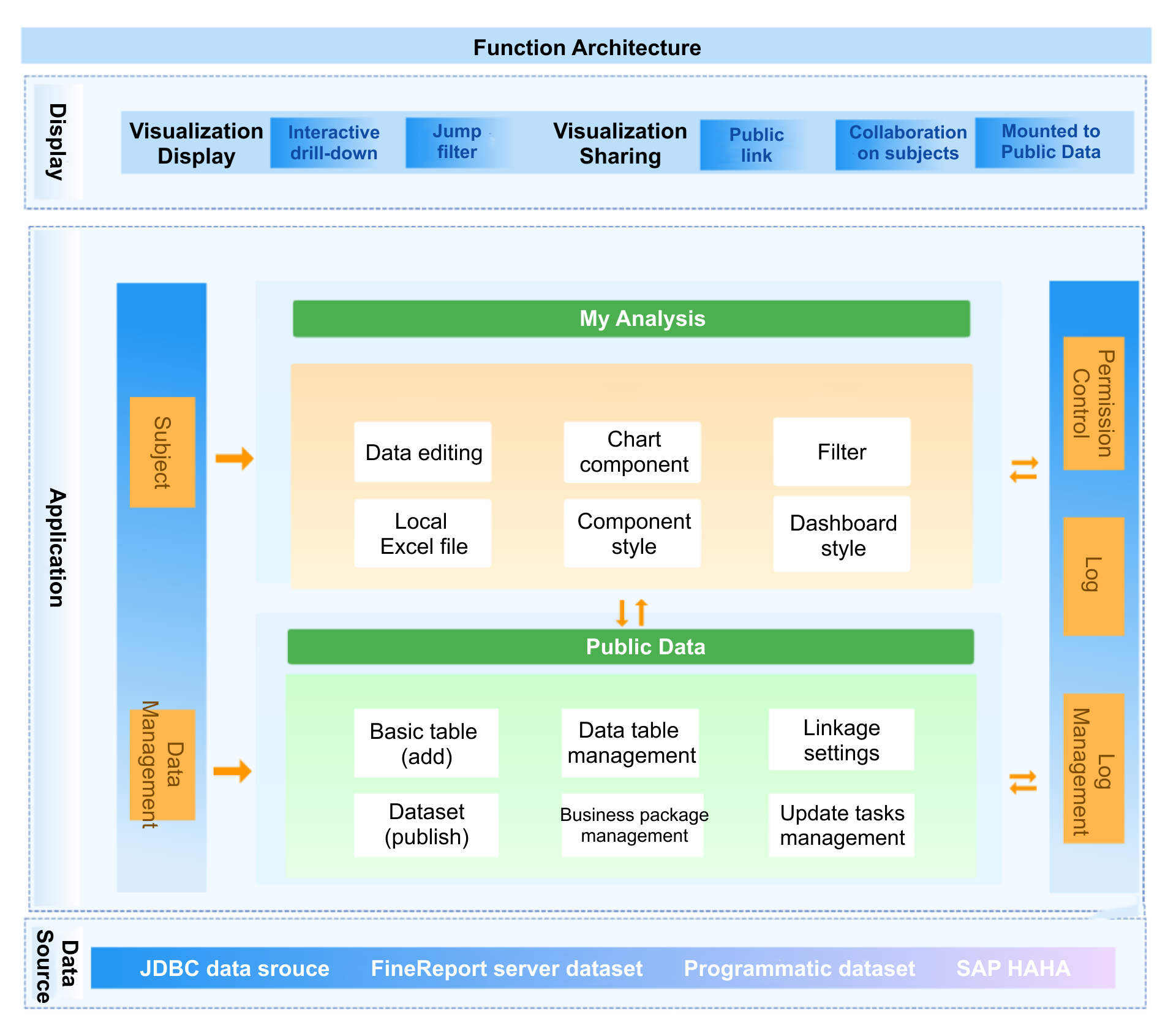
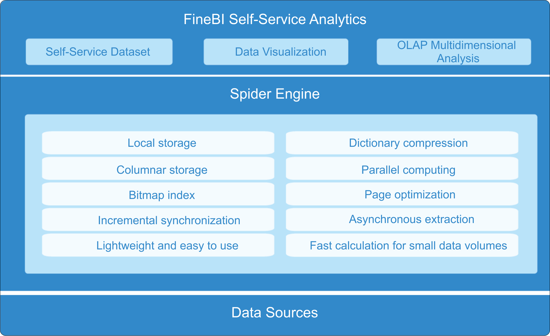
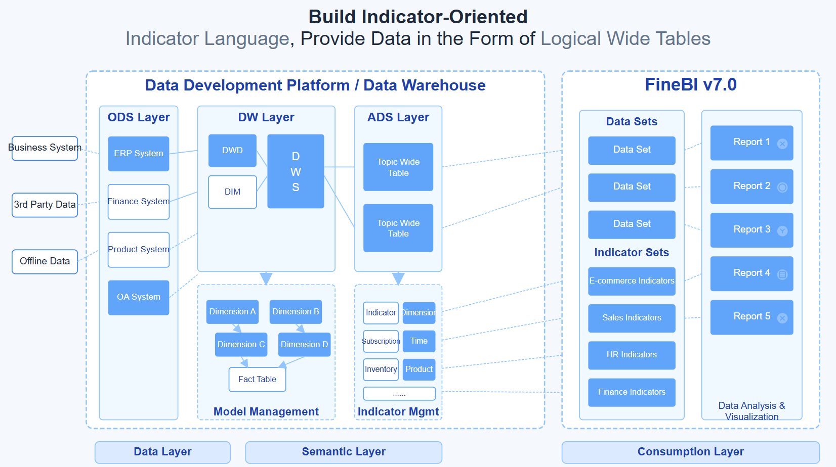
Turn methodology into execution with FineBI
The principles are clear: make work visible, track flow, interpret KPI patterns, and act on bottlenecks quickly. The challenge is implementation. Building this manually across teams, workflows, and data sources is complex, time-consuming, and hard to sustain.
That is where FineBI becomes the practical solution.
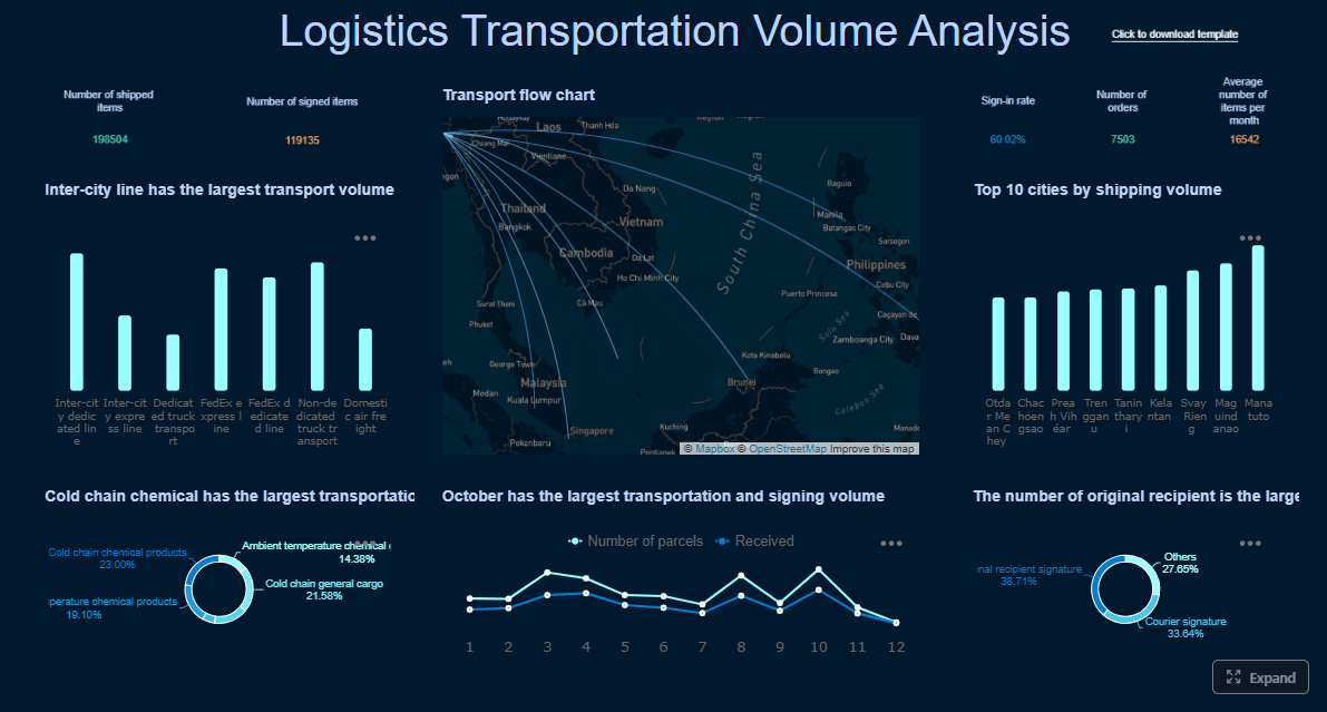
With FineBI, operations leaders can build a kanban dashboard that does more than visualize tasks. It can combine workflow data, service metrics, and business outcomes into one decision-ready view. Instead of manually assembling reports, teams can use ready-made templates, configure KPI logic faster, and automate the entire reporting workflow.
Unify kanban and operational data from multiple systems
Create dashboards for cycle time, lead time, throughput, WIP, and blocked items
Add trend lines, thresholds, and drill-down analysis without heavy manual work
Standardize KPI definitions across teams and departments
Support faster executive reporting and frontline action
For operations leaders, the value is simple: building this manually is complex; use FineBI to utilize ready-made templates and automate this entire workflow.
If your goal is to reduce bottlenecks, improve predictability, and turn workflow data into operational action, FineBI gives you a faster path from board visibility to enterprise-grade decision support.
FAQs
A kanban board shows work moving through workflow stages, while a kanban dashboard adds metrics and trends for managing performance. Operations leaders use the dashboard to spot bottlenecks, delays, and capacity issues in real time.
Cycle time is often the fastest way to see where work slows down once execution begins. It becomes even more useful when paired with WIP, blocked items, and queue length by stage.
WIP limits prevent teams from starting more work than they can realistically finish. This reduces multitasking, exposes overloaded stages sooner, and improves overall flow.
This usually means the problem is happening before active work starts, not during execution. Common causes include intake backlogs, weak prioritization, or too much demand entering the system.
High-level flow metrics should be checked frequently enough to catch issues before service levels slip, often daily or weekly depending on work volume. Trend reviews can happen on a regular cadence to support staffing, prioritization, and continuous improvement decisions.
Product Trial
FineReport
Pixel-perfect reports · Interactive dashboards · Easy data entry · Digital twins