A line graph gives you a clear way to track changes and trends over time. This type of visualization connects data points to show how values evolve, making it easier to spot patterns in areas like sales, website traffic, or production output. Compared to bar or pie charts, a line graph stands out for showing continuous changes. Many business intelligence platforms, such as FanRuanandFineBI, rely on line graph examples to reveal insights and support data-driven decisions. The uses of a line graph include monitoring performance and forecasting future results. You can quickly grasp the definition and practical power of a line graph when you see real-world applications.
Line Graph Examples: Definition
What Is a Line Graph?
Aline graphis a visual tool that helps you track changes in data over time. According to leading statistical sources, the most widely accepted definition describes a line graph as a chart that depicts trends or relationships between two or more variables across a period. You see this type of graph use a Cartesian coordinate system, where each axis has equal-interval scales. This setup allows you to see absolute changes, not just proportional ones, making it easier to understand the direction and size of trends. When you want to analyze behavior, spot patterns, or compare results, a line graph gives you a clear picture of how values shift.
You often hear the termline chartused interchangeably with line graph. Both terms refer to the same type of visualization. In a basic line graph, you plot individual data points and connect them with straight lines. This approach makes it simple to see how a value rises, falls, or stays steady. For example, if you want to monitor sales, website visits, or temperature changes, a line graph shows you the story behind the numbers.
Many business intelligence platforms, such as FanRuanandFineBI, make it easy for you to create and analyze line graphs. FineBI, for instance, lets you customize axis styles, grid lines, legends, and titles. You can build interactive dashboards and explore data over time without needing advanced technical skills. The drag-and-drop interface means you can focus on insights, not on complex setup. FineBI supports real-time data processing, so your line chart always reflects the latest information.
Tip: Use a line graph when you want to visualize changes in data over time or compare trends between different groups.
Key Elements
To understand how a line graph works, you need to know its essential parts. Each component plays a specific role in helping you interpret the data accurately. The table below breaks down the main elements of a line graph and explains how each one contributes to clear data representation:
Component
Contribution to Data Representation
Title
Gives you the subject or main idea of the graph, setting the context for the data displayed.
Axes (X-axis and Y-axis)
Show you the variables being measured and their scales, forming the framework for plotting data.
Labels
Tell you what each axis represents, including units, so you can interpret the graph correctly.
Mark the individual values on the graph, showing specific measurements at each point in time.
Connecting Line
Links the data points, making it easy to see trends, patterns, or relationships as they develop.
When you look at a basic line graph, you first notice the axes. The horizontal axis (X-axis) usually represents time, while the vertical axis (Y-axis) shows the variable you are measuring, such as sales or temperature. Labels on each axis help you understand what the numbers mean. Data points appear as small dots or markers, each one showing a value at a specific moment. The connecting line ties these points together, revealing the overall trend.
A line chart can display one or more lines, depending on how many variables or groups you want to compare. For example, you might use a multi-series line chart to compare sales across different regions. This flexibility makes the line graph a powerful tool for analyzing data over time.
You can find best practices for designing effective line graphs from experts like Edward Tufte, Stephen Few, and Alberto Cairo. Industry guidelines from Google Material Design, IBM Carbon, and Tableau also offer valuable advice on making your line chart clear and easy to read.
Note:FineBI supports a wide range of visualization options, including line graphs, time series plots, and multi-series charts. You can create customized dashboards that help you track changes, spot trends, and make informed decisions.
Line Graph Examples: How to Make It
Steps to Create
Learning how to make a line graph helps youturn raw data into a clear visual story. You start with your data and finish with a chart that reveals trends and patterns. Follow these steps for constructing a line graph:
Gather your data. Make sure you have clear headers and that all numbers are formatted correctly.
Open your preferred tool, such asExcelor a business intelligence platform.
Insert a blank line graph or chart.
Select your data for the X-axis, which often shows time, and the Y-axis, which shows the values you want to track.
Add more lines if you want to compare several sets of data.
Edit the title and axis labels so anyone can understand what your line graph shows.
Adjust the axes if you need to switch them or change their orientation for better clarity.
Tilt axis labels or add reference lines to make your line graph easier to read.
Change colors, line styles, or markers to improve the look and feel of your chart.
Save or export your line graph for use in reports or presentations.
Tip: Always check your data for errors before you start constructing a line graph. Clean data leads to accurate results.
Tools and Platforms
Many software tools help you create a line graph from your data. Each platform offers unique features for visualization and analysis. The table below compares some popular options:
Data preparation, predictive analytics, interactive dashboards
FineBI stands out for its user-friendly drag-and-drop interface and strong data integration features. You can connect to many data sources, prepare your data, and build a line graph in minutes. FineBI also supports real-time updates, so your line graph always reflects the latest data.
Understanding how to read a line graph helps you unlock the story behind your data. You can use this skill to track changes, spot patterns, and make better decisions. A line graph gives you a clear view of changes and trends over time, making it a powerful tool for business intelligence and everyday analysis.
Understanding Axes
When you look at a line graph, start by finding the two main axes. The horizontal axis, or x-axis, usually shows the independent variable. This could be time, categories, or any factor that changes in regular steps. The vertical axis, or y-axis, displays the dependent variable, which is often a number you want to measure, such as sales, temperature, or production output.
You should always check the labels and units on both axes. These labels tell you what each axis represents and help you avoid mistakes when reading the graph. Look at the scales on each axis to see how the data is spaced. Consistent scales make it easier to compare values and see how the dependent variable responds to changes in the independent variable. By understanding the axes, you set a strong foundation for reading the rest of the line graph.
Tip: Always read the axis labels and units carefully before you interpret the data. This step helps you avoid confusion and ensures you understand what the graph is showing.
Interpreting Trends
Once you know what the axes represent, focus on the data points and the lines that connect them. Each point marks a specific value at a certain time or category. The connecting line helps you visualize changes and see the overall trend.
Here are some steps you can follow to interpret a line graph and extract meaningful insights:
Look for patterns such as growth, decline, spikes, or dips. These patterns show how your data changes over time.
Use interactive features, if available, to hover over data points and see exact values. This makes tracking changes more accurate.
Compare multiple lines on the same graph to see relationships or differences between groups.
Adjust the axis range or enable gridlines to make it easier to spot small changes between points.
Highlight or annotate important points or unusual changes to draw attention to key insights.
Watch for an upward trend, which means values are increasing. A downward trend shows values are falling. Sometimes, you may see a steady line, which means little or no change.
Notice any sudden spikes or drops. These could signal important events or anomalies in your data.
A well-designed line graph helps you identify trends quickly. You can see which groups perform better, spot a downward trend, or notice when a trend reverses. By tracking changes, you gain a deeper understanding of your data over time.
Note: In business analytics, you should select the right time-series data and simplify your graph to focus on key trends. Use color to separate different lines and add labels or notes to explain important changes. Interactive features like zooming or tooltips help you explore the data in more detail.
Accurate interpretation of a line graph is essential for business intelligence. When you read a line graph correctly, you can identify trends, spot seasonal changes, and make decisions faster. This skill saves time and helps you avoid mistakes. In many industries, such as marketing, finance, and manufacturing, line graphs support strategic planning and performance monitoring.
FineBI takes this a step further with real-time analytics. You can analyze data instantly, so your line graph always shows the latest information. This feature improves the accuracy of your interpretation and helps you respond quickly to changes. With FineBI, you can trust that your visualizations reflect the most current data, making your decisions more reliable.
Callout: Tracking changes and trends over time with a line graph gives you a clear advantage. You can spot a downward trend early, react to sudden changes, and plan for the future with confidence.
Line Graph Examples
Line graph examples help you see how data changes over time and support better decision-making. You can use a line chart totrack sales, monitor production, or compare performance across teams. In manufacturing, FineBI makes it easy to visualize these changes and spot trends that matter for your business.
Common Line Chart
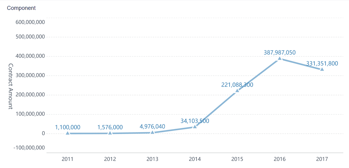
A common line chart shows how a single variable changes over time. You might use a basic line graph to track monthly sales for one product. For example, Tesla’s vehicle delivery history uses a line chart to showsales trends for different models. This approach helps you see growth, decline, or steady periods at a glance. Simple line graphs like these are perfect for highlighting the real-life use of line graphs in retail or manufacturing.
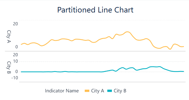
Partitioned Line Chart
A partitioned line chart breaks down data into segments, making it easier to analyze specific periods or categories. You can use this type of line chart to examine quarterly sales or production output by department. Partitioning helps you focus on changes within each segment, revealing patterns that might stay hidden in a single continuous line. This method supports comparing changes across different time frames or groups.
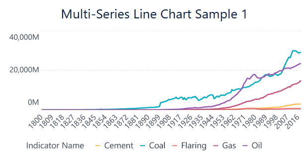
Multi-Series Line Chart
A multiple line graph, also called a multi-series line chart, lets you compare several data sets on one chart. You can track sales for multiple products or monitor defect rates across different production lines. This type of line chart makes it easy to spot highs, lows, and relationships between variables. Multi-series line charts save space and make reports more concise by combining several trends into one view. You gain a clear comparison of how each series changes over time.
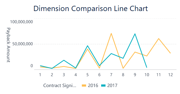
Dimension Comparison Line Chart
A dimension comparison line chart helps you evaluate performance across categories, such as sales regions or product types. You can use this chart to compare sales revenue and profits or to see how different teams perform over time. By displaying multiple line graph examples with distinct colors and markers, you quickly identify which group leads or lags. This visual comparison supports data storytelling and helps you extract insights from complex data.
FanRuan’s solutions for quality control and agile manufacturing rely on these line graph examples. FineBI dashboards use line charts to monitor production efficiency, track defect rates, and compare performance across lines or shifts. You can make informed decisions by analyzing these visual trends and responding quickly to changes in your operations.
Line Graph Examples: Common Mistakes
When you create or read a line graph, you may run into common mistakes that can make your data hard to understand or even misleading. Knowing what to avoid helps you build clear, accurate visualizations that support better decisions.
Overcrowding
Adding too many lines to a single graph often creates what experts call a "spaghetti chart." This tangle of lines makes it almost impossible to follow individual trends or spot key changes. You might feel overwhelmed by the clutter and miss important insights.
Common overcrowding issues include:
Plotting too many series at once, which confuses viewers.
Using similar colors or line styles, making it hard to tell lines apart.
Relying only on legends instead of labeling lines directly.
Combining unrelated data sets, which can distort the story.
Tip: Limit the number of lines on one chart. Use color to highlight key trends and consider splitting your data into smaller charts (faceting) for easier comparison. FineBI lets you customize colors, line styles, and even use small multiples to keep your graphs clear.
Mislabeling
Mislabeling axes, data points, or legends leads to confusion and incorrect conclusions. If you forget to label the y-axis, viewers may not know if values represent thousands, millions, or percentages. Mixing up time intervals or using vague labels can distort trends and make your graph misleading.
To avoid mislabeling:
Always use clear, descriptive labels for both axes.
Double-check that units and timeframes are correct.
Place labels close to the lines or data points they describe.
Avoid dual axes unless you clearly explain both scales.
Note:FineBI helps you prevent mislabeling by allowing you to set custom axis titles, value formats, and legend positions. You can also annotate key points and highlight important trends with bold colors or thicker lines.
By watching out for overcrowding and mislabeling, you make your line graphs easier to read and more trustworthy. FineBI’s data validation and visualization tools give you the control you need to present your data with clarity and confidence.
You use line graphs to visualize trends and changes over time, making it easier to spot patterns and outliers.
Keep your charts simple and readable by limiting the number of lines and using clear colors.
FineBI from FanRuan helps you create, analyze, and share line graphs quickly with its drag-and-drop interface and real-time data features.
Accurate data visualization uncovers trends and supports faster, smarter decisions. Try building your next line graph with FineBIto see the difference clear insights can make.
Click the banner below to try FineBI for free and empower your enterprise to transform data into productivity!
Smarter product, pricing, and inventory management across retail sectors.
FAQ
What is the main purpose of a line graph?
You use a line graph to show how data changes over time. This helps you spot trends, patterns, and outliers quickly. Line graphs make it easy to compare values and see if they rise, fall, or stay steady.
When should you use a line graph instead of a bar chart?
You should use a line graph when you want to track changes or trends over time. Bar charts work better for comparing totals or categories at one point in time.
Can you compare more than one group with a line graph?
Yes! You can plot multiple lines on one graph. This lets you compare different groups, products, or regions side by side. Use different colors or markers to keep each line clear.