Selecting the best reporting tools is critical for business success in 2025. FineReport by FanRuan, Microsoft Power BI, Tableau, Google Looker Studio, Qlik Sense, Domo, Sisense, Klipfolio, Databox, and Supermetrics stand out as leading business intelligence tools. These dashboard reporting tools transform raw data into actionable dashboards, enabling teams to make data-driven decisions. Businesses benefit from data reporting tools that integrate multiple sources, provide real-time insights, and support self-service analysis. AI reporting tools now automate forecasting and analysis, helping companies use dashboards to align teams and drive growth.
Companies using business intelligence tools report increased efficiency, improved accuracy, and a stronger data-driven culture.
Key Takeaways
- Choosing the right reporting tool helps businesses make faster, smarter decisions using real-time data.
- Look for tools that are easy to use, connect well with your existing systems, and let you customize reports to fit your needs.
- Top reporting tools like FineReport, Power BI, and Tableau offer powerful dashboards, AI features, and strong data integration.
- AI-powered reporting tools automate analysis and forecasting, saving time and improving accuracy.
- Try free trials or demos before buying to ensure the tool fits your business and helps your team work better.
Best Reporting Tools Criteria
Selecting the right reporting tools is essential for any business aiming to optimize its data reporting process and drive growth with business intelligence tools. The following criteria help organizations evaluate and compare data reporting tools to ensure they meet operational needs and support effective decision-making.
| Criterion | Explanation |
|---|---|
| User-Friendliness | Tools should be easy to use with intuitive interfaces and features like drag-and-drop, enabling quick adoption by non-experts. Tutorials and community support are also important. |
| Customization Options | Ability to tailor reports, dashboards, KPIs, and visualizations to fit unique business goals and needs. |
| Integration Capabilities | Seamless data flow from existing systems (CRM, ERP, marketing platforms) into reporting tools to save time and improve accuracy. API access and compatibility with integration platforms are key. |
Ease of Use
User-friendly reporting tools accelerate adoption and boost productivity. Intuitive dashboards and drag-and-drop interfaces allow users with varying technical skills to create visualizations and access real-time insights quickly. Businesses benefit from easy setup, guided onboarding, and comprehensive support, which reduce the learning curve. Automation features in business intelligence tools streamline the data reporting process, letting teams focus on analysis rather than manual tasks. As a result, organizations see improved collaboration and faster optimization of business operations.
Below is a Financial KPI Dashboard created by FineReport.
Integration
Integration capabilities play a critical role in the effectiveness of data reporting tools. Enterprise IT departments seek solutions that connect seamlessly to multiple data sources, including databases, cloud services, and third-party applications. Native connectors to platforms like Google Analytics, BigQuery, and Snowflake enable real-time data flow and support advanced dashboards. Embedding analytics into business applications and blending data from various channels ensures that dashboards always reflect the latest information, supporting real-time reporting and optimization.
Customization
Customization empowers businesses to tailor dashboards, reports, and visualizations to their unique objectives. Ad hoc reporting tools allow users to design reports that focus on actionable metrics, highlight key trends, and provide context for decision-making. Customizable dashboards support role-based access, ensuring each team member receives relevant data. Automated scheduling and regular updates keep reports current, while flexible visualisation options help organizations adapt to changing business needs and drive continuous optimization.
Pricing
Pricing models for business intelligence tools vary widely, making it important for businesses to assess value and scalability. Some data reporting tools offer free versions or affordable monthly plans, while others provide enterprise-level features at higher price points. For example:
| Tool | Pricing Model & Tiers |
|---|---|
| Power BI | Free version; Pro $10/user/month; Premium $20/user/month; Embedded starting at $735/month. |
| Tableau | Viewer $15/user/month; Explorer $42/user/month; Creator $75/user/month; enterprise pricing on contact. |
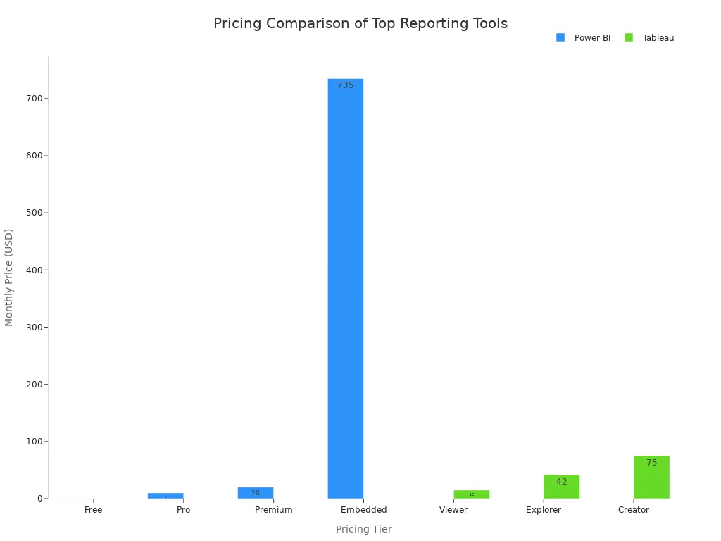
Businesses should consider both current needs and future growth when evaluating pricing for dashboards and data analytics solutions.
Security
Security remains a top priority in the data reporting process. Essential features include robust data protection, consent management, and continuous monitoring for compliance with regulations such as GDPR and HIPAA. Data reporting tools should offer flexible access controls, audit trails, and real-time synchronization to safeguard sensitive information. Automated compliance reporting and anomaly detection further enhance security, ensuring that dashboards and visualizations remain trustworthy and compliant as business needs evolve.
Choosing reporting tools based on these criteria helps businesses optimize their data reporting process, enhance real-time decision-making, and achieve greater success with business intelligence tools.
Top 10 Reporting Tools

FineReport by FanRuan
FineReport by FanRuan stands out among dashboard reporting tools for its enterprise-grade capabilities and flexibility. This software enables businesses to create pixel-perfect reports, advanced dashboards, and custom visualizations with an intuitive Excel-like designer. FineReport supports multiple report types, including normal reports for detailed data analysis, aggregation reports for complex layouts, and dashboards for real-time monitoring.
| Report Type | Description & Features | Ideal Use Cases & Scenarios |
|---|---|---|
| Normal Report | Grid-based, Excel-like design; supports pagination, grouping, dynamic cell operations. | Complex, detailed reports such as group reports, crosstabs, multi-source parent-child reports, and data entry. |
| Aggregation Report | Canvas-style design; independent cell expansion and separation for irregular layouts. | Large, irregular layout reports with multiple component blocks, e.g., complex voucher reports. |
| Dashboard | Canvas-style, drag-and-drop interface; supports multi-screen and mobile adaptation. | Management cockpits for real-time monitoring and multi-dimensional data analysis, strategic and operational. |
FineReport offers seamless integration with over 500 data sources, including SQL databases, cloud platforms, and file formats. Businesses benefit from real-time insights, scheduled report generation, and mobile access. The platform supports collaboration through shared annotations, template lockdown, and data permission controls. Organizations in government, manufacturing, and financial services rely on FineReport for streamlined reporting, optimization, and decision-making.
FineReport distinguishes itself with pixel-perfect reporting, advanced dashboards, and robust embedded reporting tools. Its real-time data visualisation and self-service analytics empower teams to optimize operations and drive business growth.
Pros:
- Intuitive drag-and-drop designer
- Extensive data connectivity
- Real-time dashboards and visualizations
- Mobile and multi-screen support
- 24/7 customer support
Pricing:
Custom enterprise pricing. Free trial available. Visit FineReport for details.
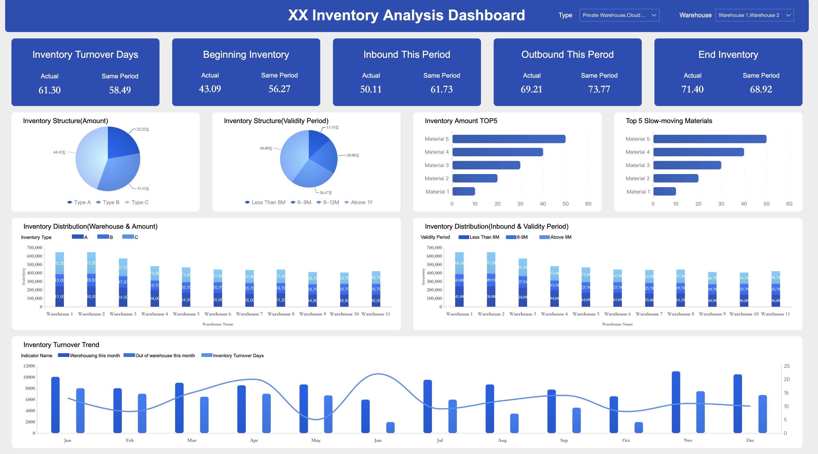
Below is a Production Management Dashboard created by FineReport.
Microsoft Power BI
Microsoft Power BI ranks among the most popular data reporting tools for businesses seeking robust dashboard reporting tools and real-time insights. Power BI connects to hundreds of data sources, including Excel, SQL, and cloud services. Users can create interactive dashboards, visualizations, and custom reports with a user-friendly drag-and-drop interface.
| Strengths | Weaknesses |
|---|---|
| Connects to hundreds of data sources | Bulky and cluttered user interface |
| Easy export to Excel | Rigid formula language (DAX) |
| Multi-device access | Data handling limits in free versions |
| Rich custom visualizations | Limited visual configurability |
| Real-time data queries | Performance issues with large datasets |
| Python/R integration | High dependency on technical skills |
Power BI supports embedded reporting tools, enabling integration into business applications. The platform offers AI reporting tools for predictive analytics and anomaly detection. Businesses use Power BI for sales analysis, financial reporting, and optimization of operations.
Pros:
- Affordable pricing
- Deep integration with Microsoft products
- Rich visualization options
- Regular updates
Cons:
- Steep learning curve for advanced features
- Limited real-time collaboration
- Performance issues with large datasets
Pricing:
| Pricing Model | Price (per user/month) | Key Features |
|---|---|---|
| Power BI Pro | $14 | Create, share, and collaborate on reports; 1 GB model memory; 8 refreshes/day |
| Power BI Premium Per User | $24 | Large model sizes (100 GB), 48 refreshes/day, advanced AI and dataflows |
| Power BI Embedded | Variable (capacity-based) | Embedded analytics in apps; billed by capacity usage |
| Microsoft Fabric Capacity | Variable (capacity-based) | Unified data, analytics, AI platform; capacity-based licensing |
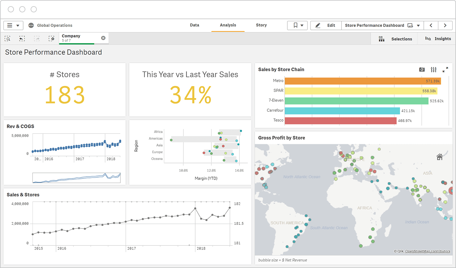
Tableau
Tableau is a leader among data visualization tools, offering advanced dashboards and interactive visualizations for business intelligence. The platform connects to various data sources, including SQL databases and cloud services, enabling real-time analysis and optimization.
Primary Features:
- Drag-and-drop dashboard creation
- Extensive customization options for dashboards and visualizations
- Real-time data analysis
- Integration with Tableau Server and Tableau Cloud for sharing and collaboration
- AI-enhanced analytics
Ideal Use Cases:
- Sales and marketing analysis
- Financial reporting
- Healthcare analytics
- Retail and e-commerce optimization
Tableau’s dashboard customization sets it apart, allowing users to personalize layouts, colors, fonts, and embed web content. Businesses leverage Tableau for self-service analytics, enabling teams to build custom dashboards and optimize performance.
Pros:
- Highly flexible dashboard customization
- Interactive visualizations
- Real-time insights
- AI capabilities
Cons:
- Higher cost for enterprise features
- Learning curve for new users
Pricing:
Viewer $15/user/month, Explorer $42/user/month, Creator $75/user/month. Enterprise pricing available on request.
Google Looker Studio
Google Looker Studio provides accessible dashboard reporting tools for small businesses and enterprises. The platform features an intuitive drag-and-drop interface, practical templates, and versatile customization options for dashboards and visualizations.
| Advantages | Disadvantages |
|---|---|
| Free basic version | Learning curve for new users |
| Intuitive interface | Limited customization compared to competitors |
| Practical templates | Data source limitations |
| Extensive connectivity | Data size and refresh limits |
| Easy sharing and embedding | Limited export options |
| Collaboration features | Dependency on Google ecosystem |
Looker Studio integrates with over 800 data sources, including Google Ads, BigQuery, and Google Sheets. Businesses use Looker Studio for marketing analytics, sales dashboards, and optimization of digital campaigns. The platform supports embedded reporting tools and offers data governance features for compliance.
Pros:
- Free version available
- Seamless integration with Google platforms
- Collaboration tools
Cons:
- Limited advanced customization
- Occasional lagging issues
Pricing:
Free basic version. Pro version pricing available upon request.
Qlik Sense
Qlik Sense delivers powerful dashboard reporting tools with self-service analytics and AI reporting tools. The platform empowers users to create interactive dashboards, visualizations, and data narratives using its QIX Engine and AutoML features.
| Feature | Description |
|---|---|
| Associative Data Exploration | Flexible navigation and analysis revealing hidden relationships across datasets |
| Self-Service Analytics | Independent report and dashboard creation reducing IT dependency |
| Broad Data Connectivity | Connects to databases, cloud services, and flat files |
| Advanced Visualization & Storytelling | Interactive charts, maps, and narrative tools |
| Robust Security & Governance | Role-based access, encryption, compliance with GDPR and HIPAA |
| AI and Machine Learning Integration | Smart suggestions, natural language processing, AutoML |
| Collaboration Features | Sharing, annotations, commenting |
| Flexible Deployment Options | On-premises, cloud, hybrid |
| Scripting Environment & APIs | Customization and integration |
| Responsive Design & Mobile Access | Seamless analytics across devices |
Qlik Sense supports real-time data integration, optimization, and compliance with major regulations. Businesses use Qlik Sense for financial analysis, operational dashboards, and predictive analytics.
Pros:
- AI and machine learning integration
- Real-time dashboards
- Enterprise-grade security
- Flexible deployment
Cons:
- Steep learning curve for advanced features
Pricing:
Custom pricing based on deployment and user count.
Domo
Domo offers scalable dashboard reporting tools for businesses seeking real-time insights and optimization. The platform integrates with various data sources, supports automated report generation, and provides customizable dashboards and visualizations.
Core Functionalities:
- Access management and collaboration tools
- API integration and custom reports
- Real-time data updates
- Mobile access
- Security and compliance with GDPR and HIPAA
Domo’s credit-based pricing model can be complex, with costs varying by data volume and user count. Businesses use Domo for sales dashboards, operational optimization, and embedded reporting tools.
Pros:
- Real-time dashboards and data integration
- Scalable for large enterprises
- Robust security features
Cons:
- High costs for large datasets
- Pricing transparency issues
Pricing:
Mid-sized companies pay $75,000–$85,000 annually. Enterprises often exceed $100,000 per year. Free trial available.
Sisense
Sisense provides enterprise-grade dashboard reporting tools with strong data integration and AI reporting tools. The platform enables businesses to create custom dashboards, visualizations, and reports with real-time analytics.
Sisense supports optimization through predictive analytics and collaboration features. Businesses use Sisense for financial dashboards, operational reporting, and embedded reporting tools.

Pros:
- AI and machine learning capabilities
- Real-time dashboards
- Scalable platform
Cons:
- Steep learning curve
- High costs for small businesses
Pricing:
Custom pricing. Contact Sisense for details.
Klipfolio
Klipfolio specializes in customizable dashboard reporting tools for businesses seeking flexible visualisation and optimization. The platform offers over 30 visualization types, including bar charts, pie charts, maps, and gauges.
Customization Capabilities:
- Custom themes, layouts, and branding
- Advanced customization with HTML, JavaScript, and CSS
- Integration with 130+ data services
- Interactive filters, drill-downs, and multiple user views
- Automated reporting and TV dashboard display
Businesses use Klipfolio for marketing dashboards, sales optimization, and real-time monitoring. The platform supports embedded reporting tools and offers onboarding and training support.
Pros:
- Highly customizable dashboards
- Wide range of visualization options
- Automated reporting
Cons:
- Learning curve for advanced customization
Pricing:
Plans start at $49/month. Free trial available.
Databox
Databox delivers dashboard reporting tools tailored for small and medium businesses. The platform supports real-time insights, mobile access, and custom dashboards for optimization.
| Plan Name | Pricing (Monthly, Annual Billing) | Key Features | Limitations / Drawbacks |
|---|---|---|---|
| Free-Forever | Free | 3 data source connections, 3 dashboards, 5 users, daily data sync, 11 months historical data, 60+ integrations, 250+ templates | Limited data connections, no white-labeling, 5GB storage |
| Starter | $72/mo (annual $72), $91/mo (monthly) | 4+ data source connections, dashboards, 20GB storage, dashboard branding, white-labeling add-on ($250/mo) | No Google Sheets integration, higher starting price, no query builder |
| Professional | Starting $169/mo (3 data sources, 9 dashboards) up to $357/mo (50 data sources, 150 dashboards) | Hourly monitoring, Google Sheets & SQL integration, query builder, data calculations, custom date ranges, removable branding | Limited customization, limited integrations |
| Performer | Starting $289/mo (3 data sources, unlimited dashboards) up to $571/mo (max data sources) | Unlimited users and dashboards, hourly & priority data sync, query builder, fiscal calendars, SSO support | Bugs and glitches reported, despite higher price |
Databox supports mobile access, including Apple Watch, and offers advanced features like query builder and fiscal calendars. Businesses use Databox for sales dashboards, marketing optimization, and team accountability.
Pros:
- Real-time dashboards
- Mobile access
- Custom dashboards
Cons:
- Occasional integration difficulties
- Setup time required
Pricing:
Free plan available. Paid plans start at $72/month.
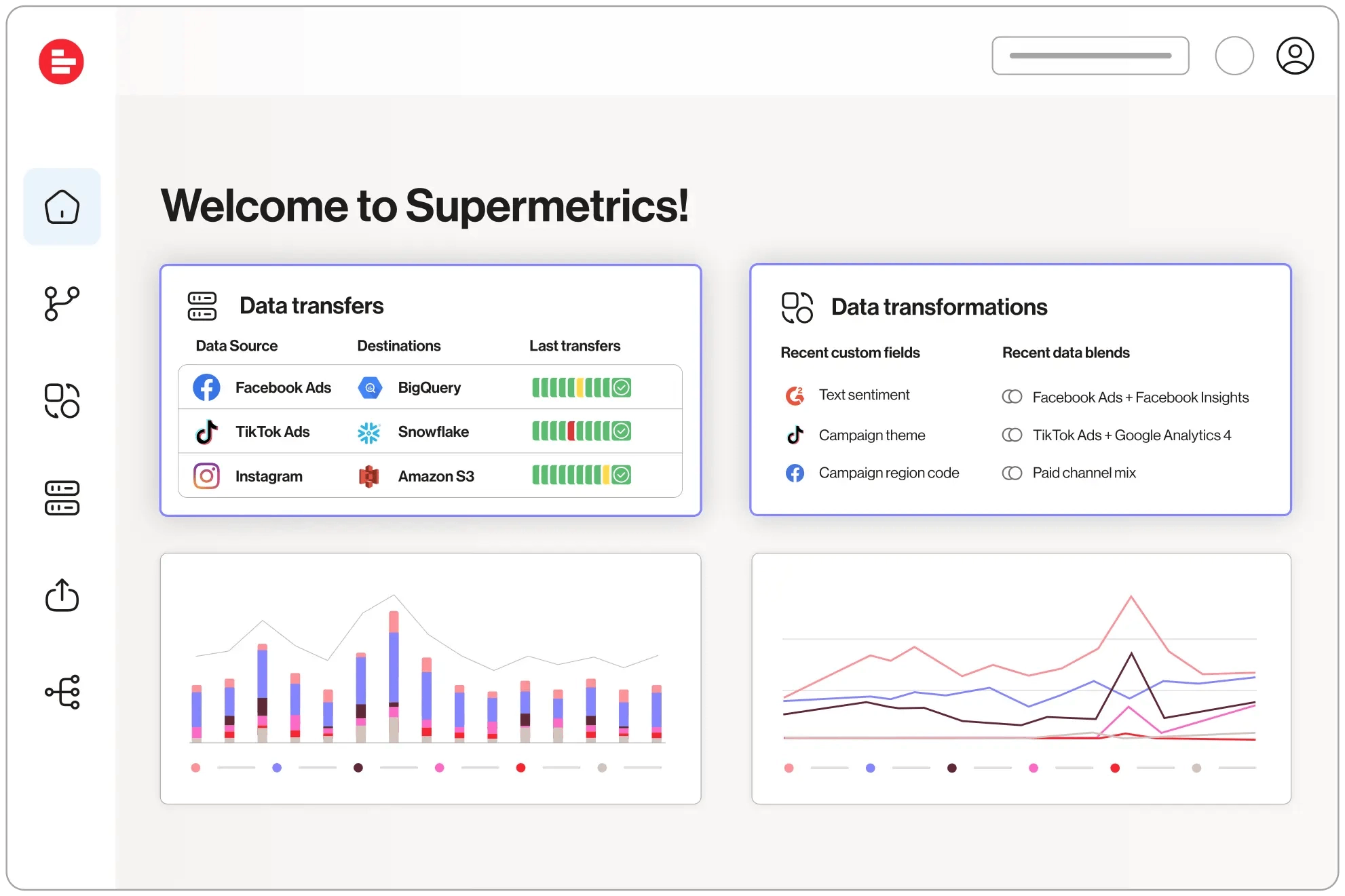
Supermetrics
Supermetrics excels in integrating marketing data sources into dashboard reporting tools. The platform supports real-time data extraction from over 150 marketing and sales platforms, including Google Analytics, Facebook Ads, Shopify, and HubSpot.
Integration Features:
- Pre-built connectors for instant access
- Custom data import for offline or proprietary sources
- Automated data updates and scalable workflows
- API for advanced data extraction
- Secure and compliant data integration
Businesses use Supermetrics to streamline marketing dashboards, optimize campaign performance, and reduce reporting time. The platform supports embedded reporting tools and offers advanced reporting templates.
Pros:
- Extensive marketing data integrations
- Real-time data updates
- Scalable and secure solution
Cons:
- Pricing varies by connector and destination
Pricing:
Custom pricing based on connectors and data volume.
These top 10 reporting tools empower businesses to create real-time dashboards, optimize operations, and drive data-driven decision-making. Each platform offers unique strengths in data visualisation, integration, and report generation, supporting business growth and continuous optimization.
Choosing Reporting Tools
Assessing Needs
Selecting the right dashboards and reporting solution starts with a clear understanding of business requirements. Companies should match the tool to their organizational structure and work style. Some teams need collaborative dashboards, while others prefer individual reporting. The right choice depends on the type of reports needed and the audience’s familiarity with complex data.
- Match the tool to the business’s structure and workflow.
- Choose dashboards that generate formats suitable for the intended audience.
- Consider the technical skills of users to ensure easy adoption.
- Evaluate data integration capabilities for unified, real-time views.
- Prioritize customization and flexibility to align with business goals.
- Ensure scalability to handle growing data volumes and user numbers.
A step-by-step approach helps business define use cases, assess user skills, and plan for future growth. Companies should also look for self-service dashboards that empower teams and reduce IT bottlenecks.
Budget Considerations
Budget plays a major role in the selection process. Businesses often set financial limits early, considering all costs such as licensing, data storage, training, and support. Many organizations choose scalable dashboards that can grow with their needs, ensuring cost-effectiveness over time. Automation and AI-powered workflows help save time and reduce manual tasks, making the investment more valuable. Drag-and-drop interfaces and prebuilt templates also lower the need for technical expertise, which can further reduce costs.
Tip: Define your budget and list all potential expenses before comparing solutions. This approach helps avoid unexpected costs and ensures the chosen dashboards fit both current and future business needs.
Free Trials and Demos
Most reporting tool vendors in 2025 offer free trials or interactive demos, usually ranging from 14 to 30 days. These trials allow businesses to test dashboards with real-time data and explore features before making a commitment. Free trials help teams evaluate usability, integration, and real-time performance. FineReport, for example, provides a free trial so organizations can experience its dashboards and reporting capabilities firsthand.
- Free trials let users test with real business data.
- Interactive demos provide hands-on experience.
- No credit card is required for many trials.
Note: Always take advantage of free trials or demos to ensure the dashboards meet your business’s real-time reporting needs.
Start free trial with FineReport to boost your business performance right now!

Continue Reading about Reporting Tools
Top 10 Data Reporting Tools for Business Intelligence
10 Game-Changing Project Management Reporting Types!
The Best Open Source Reporting Tools for Your Business in 2025
Build Reporting and Visualization with Data Factory Solution


FAQ

The Author
Lewis
Senior Data Analyst at FanRuan