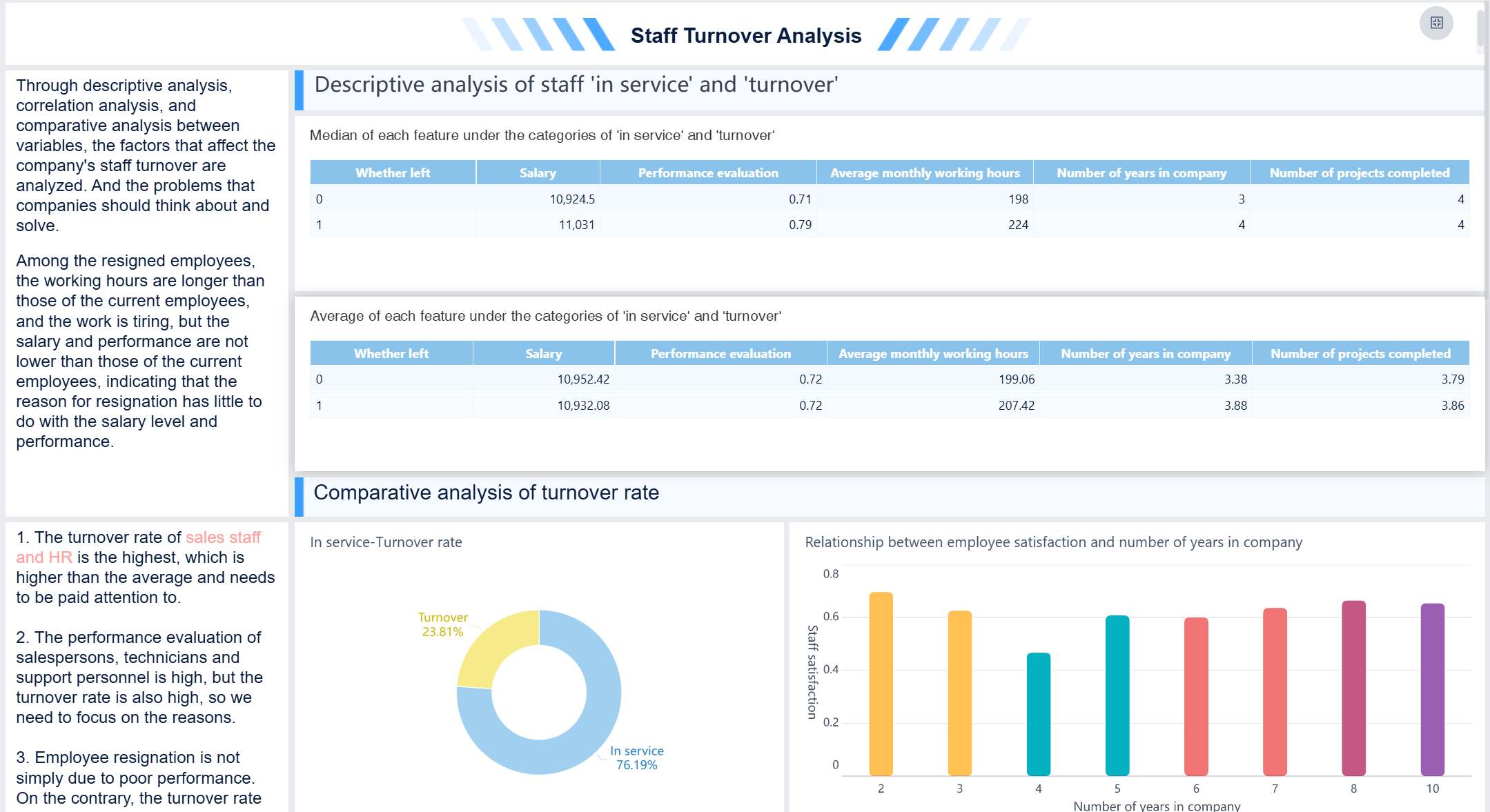
A workforce analytics dashboard is a digital tool that lets you track, visualize, and understand key HR data in one place so you can make better people decisions fast. When you use a people analytics dashboard, you see how employee engagement links directly to business results. For example, even small boosts in engagement can drive big improvements in productivity and profits. Teams that focus on learning and development often achieve higher client satisfaction and impressive ROI. If you want to spot trends, predict turnover, or plan resources with confidence, a people analytics dashboard gives you the insights you need. Buy-in from leaders and clear, actionable data matter most. FineBI makes building and sharing dashboards simple, so you can turn raw HR data into real business value.
Define Goals for Your Workforce Analytics Dashboard
A workforce analytics dashboard is a digital tool that helps you track, analyze, and visualize HR data so you can make smarter decisions about your people and workforce planning.
Identify Key Workforce Questions
You want your people analytics dashboard to answer the questions that matter most. Start by thinking about what you need to know about your team. Maybe you want to compare productivity across departments or see how turnover rates change over time. You might wonder which skills are most common or how remote teams perform compared to in-office groups. Here’s a quick look at common questions and the type of analysis they need:
| Key Questions to Address | Type of Analysis |
|---|---|
| How do productivity levels compare across teams, job roles, and locations? | Descriptive |
| How are employees using technology? Which applications do they use most and least? | Descriptive |
| Has employee turnover changed over time? How about retention rates? | Descriptive |
| What skills are most common in your workforce? | Descriptive |
| Are there significant differences in results for in-office, remote, and hybrid teams? | Descriptive |
| What productivity level would you like all teams to achieve? | Diagnostic |
| Which applications would you like employees to use more or less often? | Diagnostic |
| What changes should you make to address talent needs and skill gaps? | Diagnostic |
| Which skills do you need to hire for or cultivate to plan for the future? | Diagnostic |
Align Dashboard Objectives with HR Strategy
Your people analytics dashboard should support your company’s big goals. You want to understand why things are happening, not just what’s happening. The dashboard helps you turn insights into real changes your team can feel. To make sure your dashboard matches your HR strategy, try these steps:
- Get clear on your business strategy and culture.
- Build strong relationships with leaders.
- Know your workforce inside and out.
- Plan and communicate your HR strategy with KPIs.
- Use HR systems to measure and track progress.
FineBI makes it easy to align dashboard objectives with your HR strategy. You can collaborate across departments and keep everyone focused on what matters most.

Stakeholder Buy-In and Requirements
You need buy-in from leaders and end users for your hr analytics dashboard to succeed. Start by finding out what stakeholders want to achieve. Ask questions first, then suggest dashboard metrics. Figure out how people will use the dashboard and which KPIs matter most. Work together on the layout and choose the dashboard type before you build. Repurpose analyzed data to create dashboards that tell a clear story.
Fernando Lopez says, "Every dashboard needs to tell a story visually, so we work with stakeholders to determine a common end goal and work backward from there, making metric suggestions that can all help keep the ‘story’ on track."
Projects with high stakeholder engagement have a much higher success rate. When you involve your team, you deliver dashboards that drive business performance and help everyone make data-driven decisions.
Select Metrics and Integrate Data with FineBI
A workforce analytics dashboard is a digital tool that brings together HR data, metrics, and visualizations so you can track trends, spot issues, and make smarter decisions about your people—all in one place.
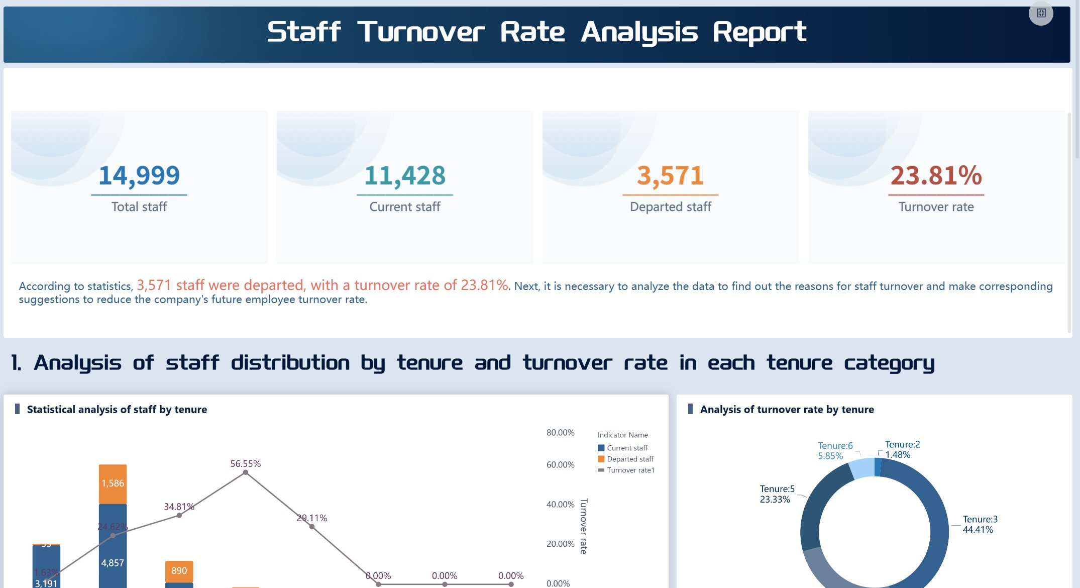
Choose KPIs for Workforce Analytics Dashboard
You want your people analytics dashboard to show the numbers that matter most. KPIs help you measure progress, spot risks, and guide your team. If you pick the right KPIs, you get a dashboard that tells a clear story and helps you act fast. Here are some of the most popular metrics HR teams use:
- Recruitment and hiring metrics: Track application completion rate, time to hire, and quality of hire.
- Employee engagement and satisfaction metrics: Measure Employee Net Promoter Score (eNPS) and employee satisfaction score.
- Retention and turnover metrics: Focus on voluntary turnover rate and employee retention rate.
- Productivity and performance metrics: Evaluate employee productivity rate and training impact.
You can mix and match these KPIs to fit your goals. If you want to boost retention, focus on turnover rates and satisfaction scores. If you care about hiring, track time to hire and quality of hire. Your people analytics dashboard should make these numbers easy to see and understand.
Tip: Standardize your KPIs across departments. When everyone uses the same definitions, you avoid confusion and make better decisions.
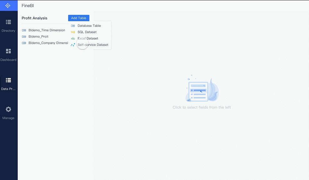
Data Sources and Integration in FineBI
You need good data to build a great dashboard. FineBI makes it easy to connect to all your HR data sources, whether you use databases, spreadsheets, or cloud apps. You can pull in data from MySQL, Oracle, SQL Server, Excel files, and even APIs. FineBI supports over 60 connectors, so you don’t have to worry about missing information.
Here’s how you can bring your data together in FineBI:
| Data Source Type | Examples | Integration Method |
|---|---|---|
| Relational Databases | MySQL, PostgreSQL, Oracle | Direct connector |
| Cloud Warehouses | Snowflake, Amazon Redshift | Secure cloud connection |
| Big Data Platforms | Hadoop, Spark | Advanced driver support |
| Files | Excel, CSV | File upload |
| APIs | REST, JSON, XML | API integration |
You can schedule automatic updates, so your dashboard always shows the latest numbers. If you have legacy systems, FineBI lets you use custom connectors or SDKs to bring in that data too.
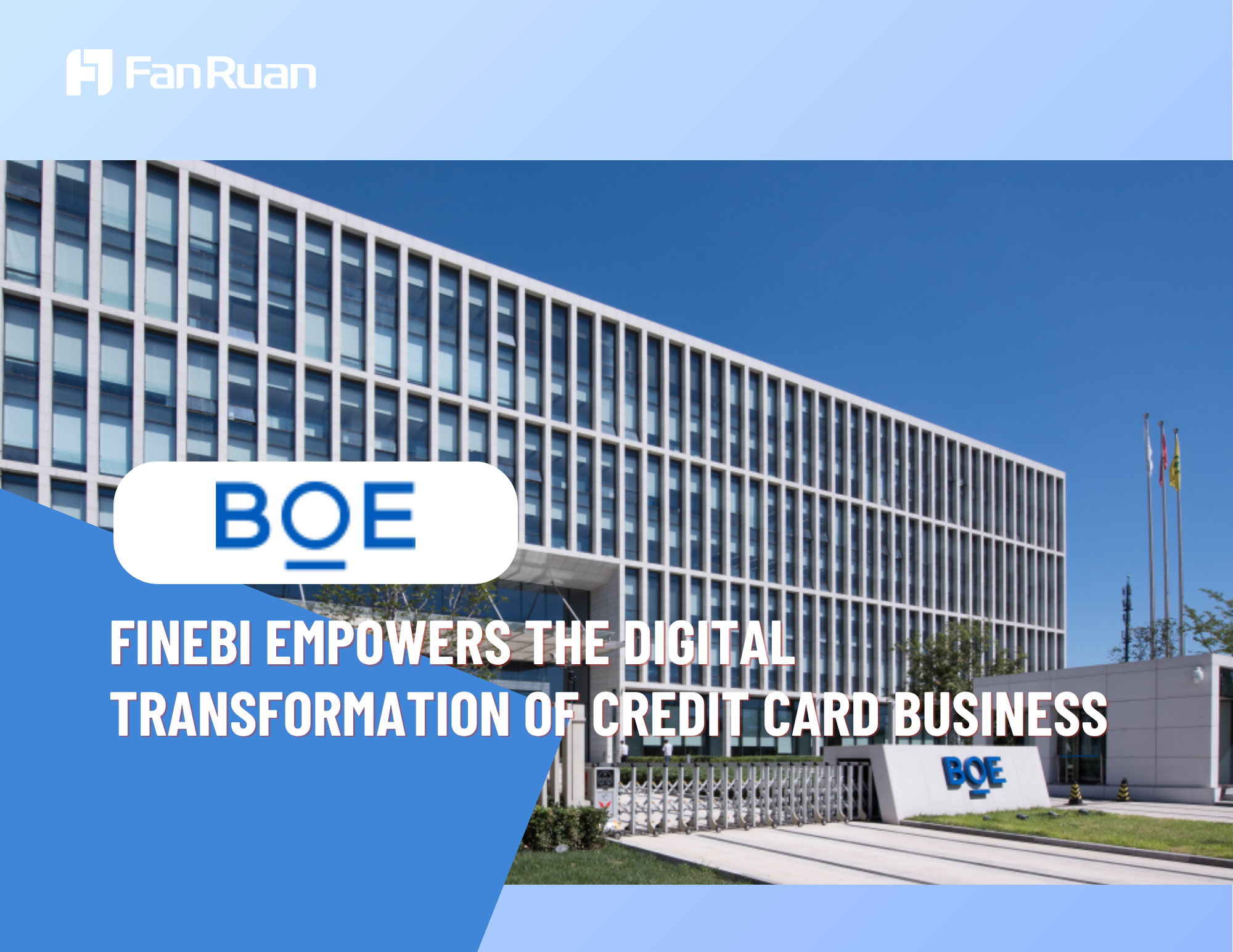
BOE Technology Group used FineBI to solve data fragmentation and inconsistent metrics. They built a unified data warehouse, standardized their KPIs, and created dashboards for real-time monitoring. This helped them cut inventory costs by 5% and boost operational efficiency by 50%. When you integrate your data with FineBI, you get a people analytics dashboard that supports fast, data-driven decisions.
Data Cleaning and Preparation Best Practices
Clean data makes your dashboard trustworthy. If you skip this step, you risk showing wrong numbers and making bad choices. FineBI gives you easy tools to clean and prep your data before you build your dashboard.
Here’s what you should do:
- Select only the fields you need. This keeps your dashboard simple.
- Join tables to combine data from different sources.
- Add calculated fields for custom metrics.
- Filter out old or irrelevant records.
- Standardize field names and data types.
- Handle missing values and duplicates.

Note: Preview your data after each step. This helps you catch mistakes early and keeps your dashboard accurate.
FineBI lets you merge data sets, clean up records, and apply filters—all without coding. You can see changes in real time and make sure your people analytics dashboard is ready for action. When your data is clean and consistent, you build dashboards that everyone can trust.

Design and Build Your People Analytics Dashboard in FineBI
A workforce analytics dashboard is a digital tool that lets you track, visualize, and analyze HR data in real time, helping you make smarter decisions about your people and business—all from one central place.
Design and Build Your People Analytics Dashboard in FineBI
You’re ready to bring your people analytics dashboard to life. FineBI makes this step easy, even if you’re not a tech expert. You get a self-service platform that lets you create dashboards with just a few clicks. Let’s walk through how you can design, customize, and interact with your dashboard using FineBI.
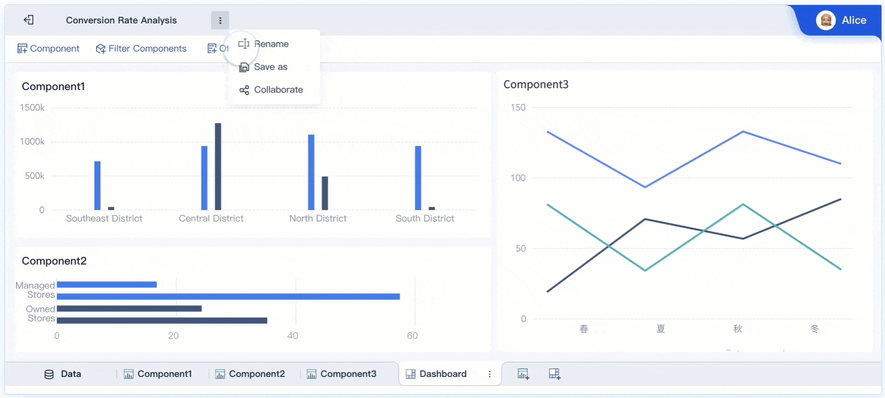
Drag-and-Drop Visualization Tools
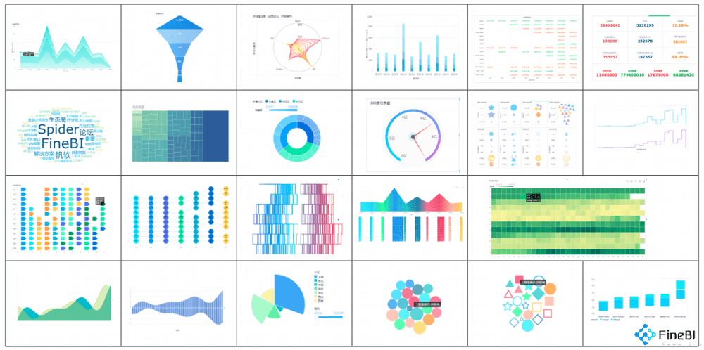
FineBI gives you a user-friendly interface where you can drag and drop data fields to build your dashboard. You don’t need to write code or wait for IT support. You can choose from over 50 chart types, so your people analytics dashboard can show trends, comparisons, and patterns in ways that make sense to you.
| Feature | Description |
|---|---|
| User-friendly interface | Drag-and-drop tools make dashboard creation simple and fast. |
| Chart types | Pick from bar charts, pie charts, line graphs, maps, and more—over 50 options. |
| Interactive dashboards | Click, filter, and explore data in real time for deeper insights. |
| Collaborative features | Work with your team on dashboards at the same time. |
| Self-service capabilities | Build dashboards on your own, no technical skills needed. |
- You can create visual dashboards independently.
- You don’t have to rely on IT for data analysis.
- You move from spreadsheets to dashboards and get insights faster.
Tip: Try different chart types to see which ones help you tell your story best. Sometimes a simple bar chart works better than a fancy map.
Customizing Layouts and Components
You want your people analytics dashboard to look clean and easy to use. FineBI lets you arrange charts, tables, and other components just how you like. You can resize, move, and group items to highlight what matters most. Add text boxes, images, or tabs to give context or guide users through the dashboard.
- Adjust the size and position of each chart or table.
- Group related metrics together for quick comparisons.
- Add notes or images to explain trends or highlight key results.
FineBI’s dashboard editor helps you create layouts that fit any device. Your dashboard looks great on desktops, tablets, and phones. Responsive design means leaders and HR teams can check insights wherever they are.

Note: Preview your dashboard before sharing it. Make sure everything lines up and the most important numbers stand out.
Real-Time Filtering and Interaction
You don’t just want to see static numbers. FineBI lets you filter and interact with your people analytics dashboard in real time. You can slice data by department, time period, or job role with a click. Results update instantly, so you can spot trends or risks as they happen.
- Real-time data gives HR leaders insights for quick decisions.
- Dashboards help you plan your workforce and spot turnover risks.
- Automated reports and centralized data save you time and boost efficiency.
When you launch a new policy, you can see its impact right away. If you notice a spike in time-off requests, you can act before it becomes a problem. Research shows that data visualization speeds up decision-making by five to seven times. You get answers fast and can respond with confidence.
Tip: Use global filters to control multiple charts at once. This makes it easy to switch views and compare different groups or time periods.
Your people analytics dashboard in FineBI isn’t just a report—it’s a living tool that helps you understand your workforce, make better decisions, and drive business results.
Test, Launch, and Optimize HR Dashboards
A workforce analytics dashboard is a digital tool that brings together HR data, metrics, and visualizations so you can track workforce trends, spot issues, and make smarter decisions about your people—all in one place.
Test, Launch, and Optimize HR Dashboards
User Feedback and Iteration
You want your people analytics dashboard to work for everyone. Testing helps you spot problems before launch. Try these methods to collect feedback:
- Run moderated user tests and watch how people interact with the dashboard.
- Use unmoderated remote tests to gather feedback quickly.
- Set up task-based usability tests. Ask users to find answers using the dashboard.
- Send out feedback surveys after testing. Ask about navigation, information completeness, and accuracy.
After you collect feedback, start improving your hr analytics dashboard. Schedule regular feedback loops. Use shift surveys and pulse check-ins to catch fresh reactions. Managers can review dashboard effectiveness, and open channels let employees share ideas anytime. Look for patterns in feedback, dig into root causes, and track trends over time. Prioritize changes, test new features, and keep improving your dashboards with small updates.
Training and Adoption Strategies
Training helps everyone get the most out of essential hr dashboards. You want users to feel confident and engaged. Here are proven strategies:
| Strategy | Description |
|---|---|
| Ongoing Communication Campaigns | Remind decision-makers about dashboard features and benefits. |
| Success Stories | Share wins from teams using people analytics dashboard to motivate others. |
| Champions | Recruit advocates to promote dashboard use across departments. |
| Onboarding | Include dashboard training for new hires so everyone starts strong. |
| Role Specifications | Update job descriptions to include data-driven skills and dashboard usage. |
Common challenges include low engagement, lack of technology, and trouble measuring training success. Make training easy to access and show how dashboards help solve real problems.
Ensuring Ongoing Alignment with Business Objectives
Your people analytics dashboard should always support your company’s goals. Involve HR in strategic planning and translate business priorities into dashboard metrics. Design HR programs that drive business outcomes and define what success looks like. Align incentives with your strategy and keep adapting as business needs change.
FineBI’s governance and access control features help you share dashboards securely and collaborate across teams. You can monitor usage, audit activity, and make sure your dashboards stay relevant. When you use hr dashboards to track progress, you turn HR into a driver of business success.
Tip: Keep communication open between HR and leadership. Regular check-ins help you adjust dashboards as your business evolves.
A workforce analytics dashboard is a tool that helps you track, visualize, and act on HR data to improve business results. You followed these steps to build your people analytics dashboard:
- Align with your company’s goals.
- Pick the right KPIs.
- Use clean, reliable data.
- Design for easy use.
- Enable scenario planning.
- Protect sensitive information.
When you use a people analytics dashboard, you get more than just numbers. You see real impact. Companies with strong analytics see up to 8% higher sales growth and 24% higher net income. HR becomes a true business partner, and you make faster, smarter decisions.
| Metric | Impact on Business Performance |
|---|---|
| Sales Growth | 8% higher with strong analytics |
| Net Income | 24% higher than peers |
| Sales per Employee | 58% higher productivity |
| HR’s Strategic Role | 94% say analytics elevated HR |
Ready to get started? Define your audience, choose your KPIs, pick a platform like FineBI, and build your dashboard. Set permissions and share your essential hr dashboards with your team. Take the first step to optimize your hr dashboards and unlock the power of your people analytics dashboard today.
Continue Reading About Workforce Analytics Dashboard
Top 10 HR Dashboard Software Platforms Compared and Reviewed
What is an HR dashboard and how does it work
What is an HR Analytics Dashboard


FAQ

The Author
Lewis
Senior Data Analyst at FanRuan
Related Articles

How to Build an Investment Portfolio Reporting Dashboard for Executives: KPIs, Benchmarks, and Drill-Down Views
Investment portfolio reporting for executives is not about showing every holding, transaction, and chart your investment team can produce. It is about giving CEOs, CFOs, CIOs, boards, and investment committees a fast, re
Yida YIn
Jun 25, 2026

12 KPI Reporting Examples for Executive Dashboards: What to Show in Weekly, Monthly, and Quarterly Reviews
Executive leaders do not need more data. They need decision ready $1 examples that match how often they review the business and what actions they are expected to take. A weekly $1 should surface fast moving risks and per
Yida YIn
Jun 25, 2026

How to Build a Digital Marketing Reports Dashboard: Executive Examples, KPIs, and Templates
A $1 is the control layer that helps executives and marketing leaders turn scattered channel data into fast, confident decisions. If you are a CEO, CMO, operations director, or marketing analytics lead, the real problem
Yida Yin
May 07, 2026