A campaign dashboard gives you a real-time view of your marketing or business campaigns. You can see key metrics, track progress, and spot trends at a glance. This tool helps you make smart decisions quickly and keeps everyone on the same page.
When you build a dashboard, you turn raw data into insights that matter. Over 70% of companies using actionable data report higher efficiency. Still, a dashboard only works when you connect it to real decisions people make in your organization.
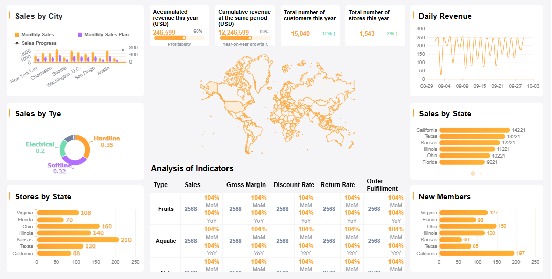
FineReport stands out as a top choice for creating dashboards. Its drag-and-drop interface, multi-source integration, and mobile options make it easy to design dashboards that drive results.
Define Audience & Objectives for Campaign Dashboard
Before you start building a campaign dashboard, you need to know who will use it and what decisions it should help them make. When you get this right, your dashboard becomes a tool that guides action, not just a collection of numbers.
Identify Stakeholders & Needs
Think about everyone who will interact with your campaign dashboard. Each group has different needs and priorities. Here’s a quick look at common stakeholder groups in large organizations:
| Stakeholder Group | Description |
|---|---|
| Project Sponsor | Senior leader who funds and champions the project. |
| Project Manager | Plans, executes, and controls the project. |
| Project Team Members | Specialists who do the work and affect quality and deadlines. |
| Customers/End Users | People who use the dashboard; their needs drive requirements. |
| Functional Managers | Allocate resources and control staff availability. |
| Executives and Senior Leadership | Influence funding and strategic alignment. |
| Regulatory and Compliance Bodies | Set legal and industry standards for compliance. |
| Finance and Budgeting Teams | Ensure the project stays within budget. |
| IT and Technical Support Teams | Make sure technology needs are met. |
| Marketing and Sales Teams | Align to drive demand and ensure successful go-to-market execution. |
You want to talk to these groups early. Ask what problems they face and what decisions they need to make. For example, in manufacturing quality control, dashboards help managers spot defects and improve processes. In the BOE case, a unified dashboard helped align teams and track KPIs across departments, making data-driven decisions easier.
Set Clear Campaign Goals
Every campaign dashboard should start with clear goals. If you skip this step, you won’t know if your campaign works or what to improve. Here’s why clear goals matter:
- You know what success looks like.
- You can measure progress and spot problems early.
- You pick the right KPIs for your dashboard.
- Teams use the dashboard more when it matches their real needs.
Start by defining what you want to achieve. Do you want more leads, better retention, higher awareness, or increased revenue? Make your goals specific, measurable, achievable, relevant, and time-bound (SMART). When you set clear objectives, your dashboard becomes a tool that everyone trusts and uses.
Select KPIs & Tools for Campaign Dashboard

A marketing campaign performance dashboard only works if you track the right things. You want to see results, not just numbers. The first step is to choose KPIs that match your campaign goals and help your team make decisions fast.
Choose Relevant KPIs
When you build a marketing campaign performance dashboard, focus on KPIs that show real progress. Here are some of the most common KPIs you might want to include:
- Customer Acquisition Cost (CAC)
- Return on Marketing Investment (ROMI)
- Conversion Rate (CR)
- Marketing Qualified Leads (MQLs)
- Sales Qualified Leads (SQLs)
- Lead-to-Customer Rate
- Cost Per Lead (CPL)
- Website Traffic
- Traffic-to-Lead Ratio
- Click-Through Rate (CTR)
- Bounce Rate
- Time on Page (Session Duration)
- Email Open Rate
- Email Click-Through Rate
- Social Media Engagement Rate
- Brand Mentions / Share of Voice
- Organic Search Traffic
- Keyword Rankings
- Customer Lifetime Value (CLV)
- Net Promoter Score (NPS)
Pick the KPIs that fit your campaign’s goals and your audience’s needs. Not every metric will matter for every campaign. For example, if you run an email campaign, focus on open rates and click-through rates. If you want more leads, track MQLs and conversion rates.
The selection of KPIs is crucial for the effectiveness of campaign dashboards as it directly impacts how well marketing performance is tracked and understood.
To get the most from your marketing campaign performance dashboard:
- Define clear, measurable goals.
- Select KPIs that track progress toward those goals.
- Review and adjust your KPIs regularly.
Use FineReport for Dashboard Creation
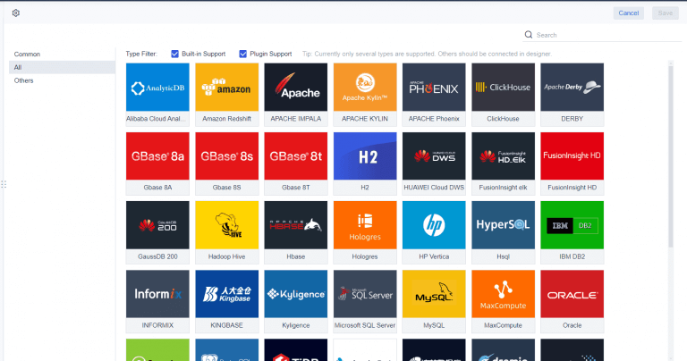
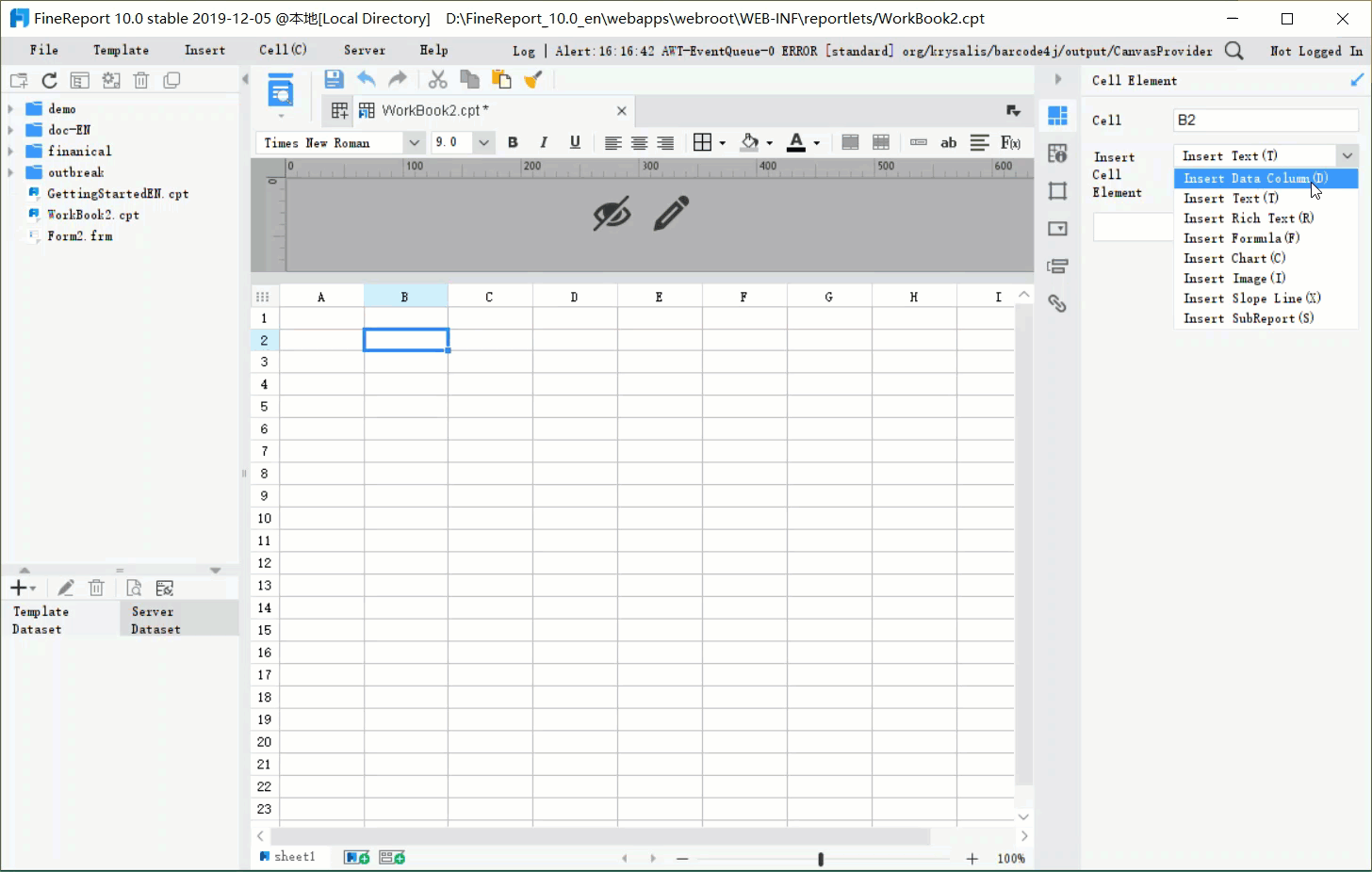
Once you know which KPIs to track, you need a tool that brings your marketing campaign performance dashboard to life. FineReport makes this easy. You can use its drag-and-drop design to build dashboards quickly, even if you don’t have coding skills. FineReport connects to multiple data sources, so you can pull in data from your CRM, website, or social media all in one place. This multi-source integration gives your dashboard more accurate and timely information, helping you make better decisions.
FineReport also supports mobile dashboards, so you can check your marketing campaign performance dashboard on any device. Real-world companies use FineReport for everything from manufacturing quality control to KPI dashboards, like BOE’s cross-factory benchmarking. With FineReport, you get a flexible, powerful way to track your key performance indicators and performance metrics in one view.
Integrate Data & Plan Campaign Dashboard Layout
When you want your campaign dashboard to deliver real value, you need to bring all your data together and present it in a way that makes sense. A marketing analytics dashboard only works if it pulls from every source that matters and displays the results clearly.
Connect Multiple Data Sources
You probably have data scattered across different platforms—CRM systems, social media, email tools, and maybe even spreadsheets. To build a campaign dashboard that tells the whole story, you need to connect these sources. Many organizations start with manual exporting, but that gets messy fast. For ongoing campaigns, you want to use ETL (Extract-Transform-Load) or ELT (Extract-Load-Transform) processes. These methods help you clean and standardize your data, so your marketing analytics dashboard always shows accurate and up-to-date information.
You might run into challenges like data fragmentation, inconsistent formats, or even legacy systems that don’t play well with new tools. Data quality matters, too. Outdated or incorrect data can throw off your entire campaign dashboard. To keep things running smoothly, define clear objectives for your dashboard, automate updates, and make sure your visualizations are easy for everyone to understand.
Structure for Clarity & Usability
A well-structured marketing analytics dashboard helps you find answers fast. You want to see the most important numbers first, with supporting details just a click away. Here’s a quick look at layout strategies that boost usability and satisfaction:
| Strategy | Description |
|---|---|
| Leverage Asynchronous Data Loading | Let users interact with parts of the dashboard while other elements load in the background. |
| Optimize Image and Asset Sizes | Use vector graphics or compressed formats to reduce loading times. |
| Implement Lazy Loading | Load only critical elements first for faster access. |
| Establish a Clear Visual Hierarchy | Use layout, color, and typography to guide attention to key information. |
| Maintain Consistency | Keep navigation and data labels uniform for an intuitive experience. |
| Minimize Cognitive Load | Focus on essentials and avoid overwhelming users with too much detail. |
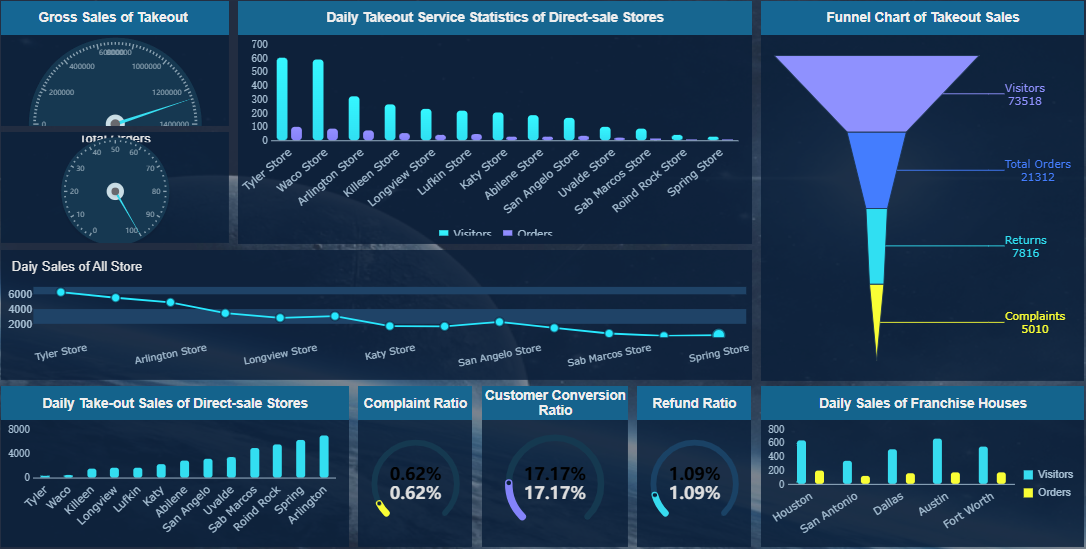
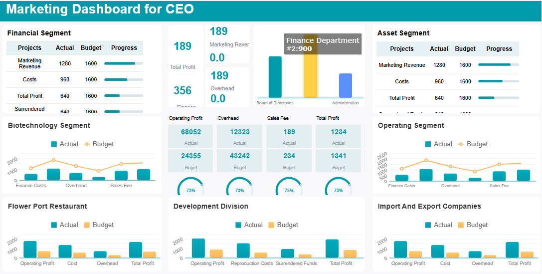
A good campaign dashboard also uses multi-report and dashboard layouts. This means you can show different tables, charts, and views all in one place. You get a comprehensive look at your campaign without flipping between screens. When you tailor views for different stakeholders, everyone gets the insights they need, and decisions happen faster.
Tip: Test your dashboard with real users. Try A/B testing or track interactions to see what works best. Always look for ways to simplify and improve.
By connecting your data and planning your layout, you set up your campaign dashboard for success. You make it easier for your team to spot trends, compare results, and act on insights right away.
Design an Effective Campaign Dashboard

Visual Best Practices
When you want to create an effective marketing dashboard, start with a clean and simple design. A clutter-free layout helps you focus on what matters most. Use a clear visual hierarchy so your eyes go straight to the most important numbers. Size and color play a big role here. Make key metrics larger and use bold colors to highlight them. Keep supporting details in neutral tones so they don’t distract you.
Here’s a quick table to guide your design choices:
| Best Practice | Description |
|---|---|
| Visual Hierarchy | Use size, color, and layout to draw attention to critical information. |
| Customizable Layout | Let users adjust the dashboard to fit their needs for better engagement. |
| Clean UI Design | Remove unnecessary elements for clarity and ease of use. |
Stick to 2D charts for most of your data. These charts make it easy to compare numbers and spot trends. 3D charts might look cool, but they can make it harder to read values accurately. Scatterplots work well when you want to show relationships between different marketing metrics.
Responsive design is another must-have. Your effective marketing dashboard should look great and work smoothly on any device. This way, you and your team can check results on a phone, tablet, or desktop without missing a beat.
Add Interactivity & Customization
An effective marketing dashboard becomes even more powerful when you add interactive features. Drill-downs let you explore details without cluttering the main view. Filters and descriptive titles help you find what you need fast. You can also link dashboards together, making it easy to move from high-level overviews to deeper insights.
- Companies using interactive dashboards find insights faster and boost productivity.
- Real-time analytics help teams act quickly and build stronger customer relationships.
- Interactive dashboards are common in industries like healthcare, finance, and retail because they support smarter decisions.
Grouping related metrics keeps your dashboard organized. Use drill-downs to avoid clutter and let users dig into the data that matters to them. FineReport makes this easy with drag-and-drop tools, responsive layouts, and interactive charts. You can customize your dashboard for any campaign, making sure it fits your workflow and goals.
By following these best practices, you set up your effective marketing dashboard to deliver clear, actionable insights every time.
Add Context, Test & Iterate in Your Campaign Dashboard
Provide Data Narrative
You want your campaign dashboard to do more than just show numbers. Add context so users know what the data means and what actions to take. Start by including annotations that explain sudden changes or important trends. Use benchmarks to show how your results compare to targets or industry standards. Set up alerts for key metrics, so your team gets notified when something needs attention.
A good data narrative helps everyone understand the story behind the numbers. For example, if your conversion rate drops, an annotation can point out a recent website update. Benchmarks let you see if your campaign is ahead or behind goals. Alerts make sure you never miss a critical change. These features turn your dashboard into a tool for action, not just observation.
Gather Feedback & Improve
Testing your campaign dashboard with real users is essential. You want to know if it helps them make decisions or if they get stuck. Here’s how you can gather useful feedback:
- Limit features to what matters most, so users focus on key actions.
- Show your dashboard in person and explain its purpose.
- Ask for feedback in simple ways, like quick surveys or comment boxes.
- Make sure everyone understands the dashboard’s goal.
- Present challenges and let users suggest solutions.
- Use project management tools to collect and organize feedback.
- Support your design choices with data.
- Encourage ongoing feedback by making it easy to share thoughts.
You should test and update your dashboard regularly. Many organizations review and improve their dashboards during planning, rollout, and after launch. This ongoing process helps you catch problems early and keep your dashboard useful as needs change.
When you improve your dashboard based on feedback, you save time and boost productivity. Teams can respond to changes faster, sometimes in minutes instead of days. Companies that keep improving their dashboards often see big gains in efficiency and performance.
You now know the essential steps for building a high-impact campaign dashboard. Start by aligning your objectives and KPIs, then connect your data for a clear view of performance. Regularly review and refine your dashboard to keep it relevant. FineReport gives you flexible tools to design, customize, and iterate with ease. If you want inspiration, explore industry solutions and customer stories that show how a campaign dashboard can drive real results.
| Step | Description |
|---|---|
| 1 | Define objectives and select KPIs for your campaign dashboard. |
| 2 | Integrate data sources and plan your dashboard layout. |
| 3 | Design, test, and improve your dashboard for ongoing success. |

Continue Reading About Campaign Dashboard
Best Dashboard Apps for Business Insights
What is a Call Center Dashboard and Why Does It Matter
What is a Reporting Dashboard and How Does it Work
What is An Interactive Dashboard and How Does It Work
What is a Call Center Metrics Dashboard and How Does It Work


FAQ

The Author
Lewis
Senior Data Analyst at FanRuan
Related Articles

How to Build an Investment Portfolio Reporting Dashboard for Executives: KPIs, Benchmarks, and Drill-Down Views
Investment portfolio reporting for executives is not about showing every holding, transaction, and chart your investment team can produce. It is about giving CEOs, CFOs, CIOs, boards, and investment committees a fast, re
Yida YIn
Jun 25, 2026

12 KPI Reporting Examples for Executive Dashboards: What to Show in Weekly, Monthly, and Quarterly Reviews
Executive leaders do not need more data. They need decision ready $1 examples that match how often they review the business and what actions they are expected to take. A weekly $1 should surface fast moving risks and per
Yida YIn
Jun 25, 2026

How to Build a Digital Marketing Reports Dashboard: Executive Examples, KPIs, and Templates
A $1 is the control layer that helps executives and marketing leaders turn scattered channel data into fast, confident decisions. If you are a CEO, CMO, operations director, or marketing analytics lead, the real problem
Yida Yin
May 07, 2026