You know how fast things move in business today. A supply chain dashboard gives you the power to see everything in one place, right when you need it. With the right examples, you can spot risks, cut costs, and make smarter decisions. In 2026, supply chain dashboards powered by FineReport from FanRuan help you automate tasks, boost productivity, and get real-time visibility. These dashboards turn complex data into clear insights, making your job easier and your operations smoother.
Why Supply Chain Dashboards Matter
Real-Time Visibility for Decision-Making
You want to make smart decisions fast. A supply chain dashboard gives you real-time visibility into every part of your operations. When you connect dashboards directly to your ERP or warehouse systems, you always see the latest numbers. No more guessing or waiting for updates.
Real-time dashboards transform complex data into simple, actionable intelligence. They act as the nerve center for your supply chain, showing you what’s happening right now.
Here’s how dashboards boost your decision-making:
- You get instant access to accurate, up-to-date insights.
- Your team can align on priorities quickly.
- You can escalate decisions when something needs urgent attention.
Check out this table to see how dashboards improve business performance:
| Evidence Description | Benefit to Business Performance |
|---|---|
| Supply chain dashboards centralize data into a single interface. | This provides real-time visibility, streamlining decision-making and improving operational efficiency. |
| Effective dashboards integrate with live data sources. | This ensures information is current and relevant, eliminating risks associated with outdated reports. |
| Real-time accuracy is vital for high-velocity supply chains. | Dashboards empower teams to respond proactively to emerging issues, mitigating risks and preventing disruptions. |
| Monitoring and analysis of KPIs optimize business processes. | This adds value to the large volumes of data generated, enhancing overall business performance. |
| Dashboards should align with broader business strategies. | They deliver insights that drive outcomes important to the business, such as customer satisfaction and cost leadership. |
Strategic Alignment Across Operations
You need everyone on the same page. Supply chain dashboards help you track the metrics that matter most. When you use examples that focus on strategic KPIs, you can see how each part of your supply chain supports your goals.
Here’s a quick look at the most common metrics for alignment:
| Metric | Description |
|---|---|
| Perfect Order Index | Measures the error-free rate of the entire supply chain process, serving as a benchmark for overall performance. |
| Cash-to-Cash Time | Measures the time between cash outflow to suppliers and cash inflow from customers, indicating financial efficiency. |
| Supply Chain Cycle Time | Indicates the total time required to fulfill a customer order, reflecting overall supply chain efficiency. |
| Fill Rate | Represents the percentage of customer demand met without backorders, crucial for customer satisfaction. |
| Inventory Turnover | Measures how often inventory is sold and replaced over a period, indicating inventory management efficiency. |
When you track these metrics in your dashboards, you can spot trends, compare performance, and make sure your team is working toward the same objectives.
Operational Excellence with Data Integration
You want your supply chain to run smoothly. Supply chain dashboards powered by real-time data integration make that possible. When you use examples that show how dashboards connect to different systems, you get a complete view of your operations.
- Real-time monitoring keeps you updated on critical factors, like temperature tracking for refrigerated freight.
- Dynamic delivery estimates help you predict arrival times by considering traffic and weather.
- Event management sends automated notifications, so you can fix problems before they grow.
- Strategic assessment lets you evaluate your current capabilities and plan upgrades for better performance.
With these features, you can respond quickly, improve customer satisfaction, and keep your supply chain running at its best.
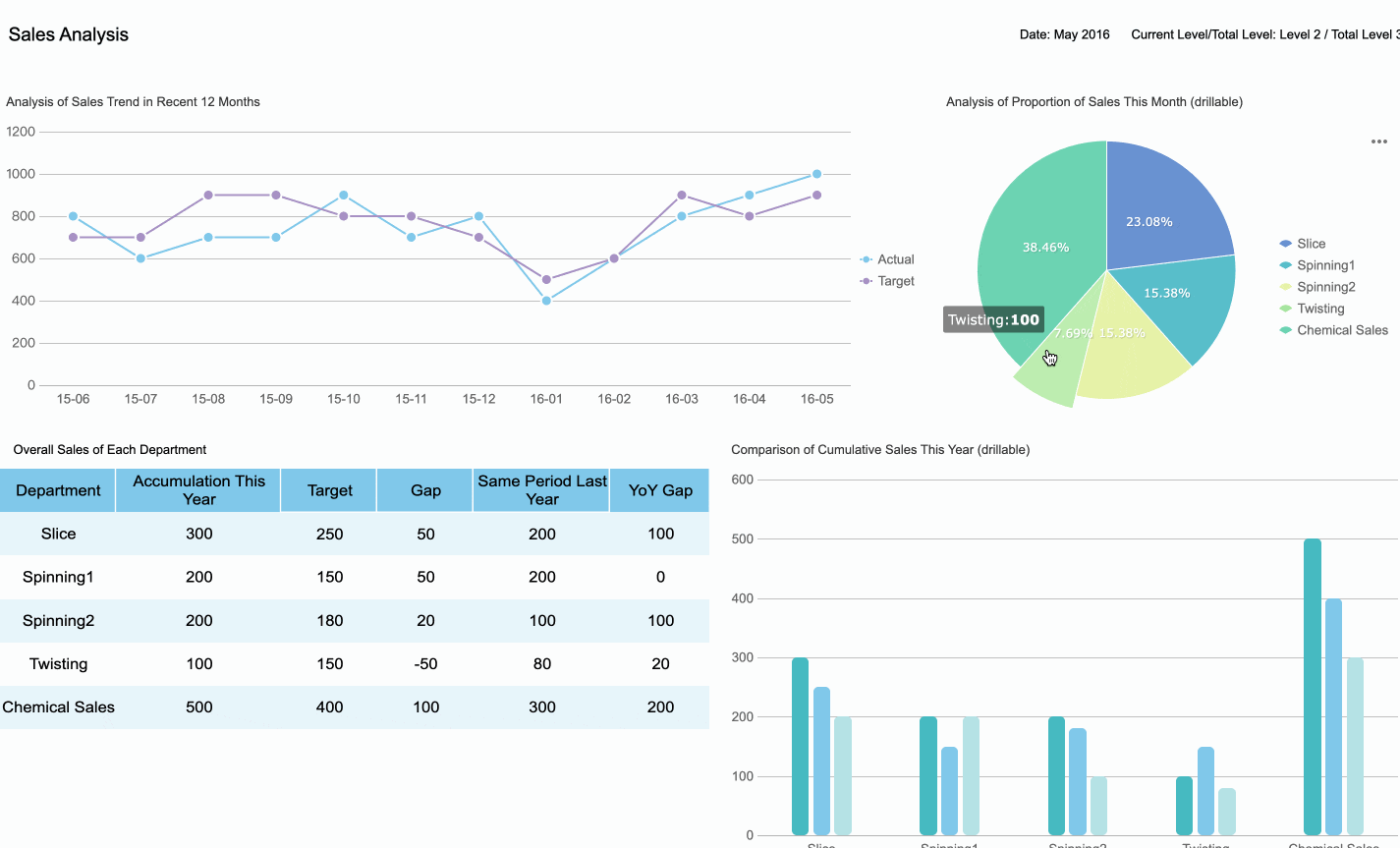
1.Executive Supply Chain Dashboard Overview
Purpose and Key Metrics
You want to see the big picture fast. An executive supply chain dashboard gives you a clear view of your entire operation. You can spot trends, track progress, and make decisions with confidence. These dashboards focus on the numbers that matter most to leaders. Here are some key metrics you’ll find in top performance dashboard examples:
- Order fill rate
- Perfect order rate
- On-time delivery
- Cycle time
- Inventory turnover
- Days of inventory on hand
- Cash-to-cash cycle time
- Supplier quality
- Supplier lead time
- Freight cost per unit shipped
- Warehouse capacity utilization
- Return rate
- Stockout rate
- Supply chain risk index
- Sustainability
You can use these examples to compare your results with industry standards or your own goals. When you see all these numbers in one place, you can act quickly.
Features with FineReport Integration
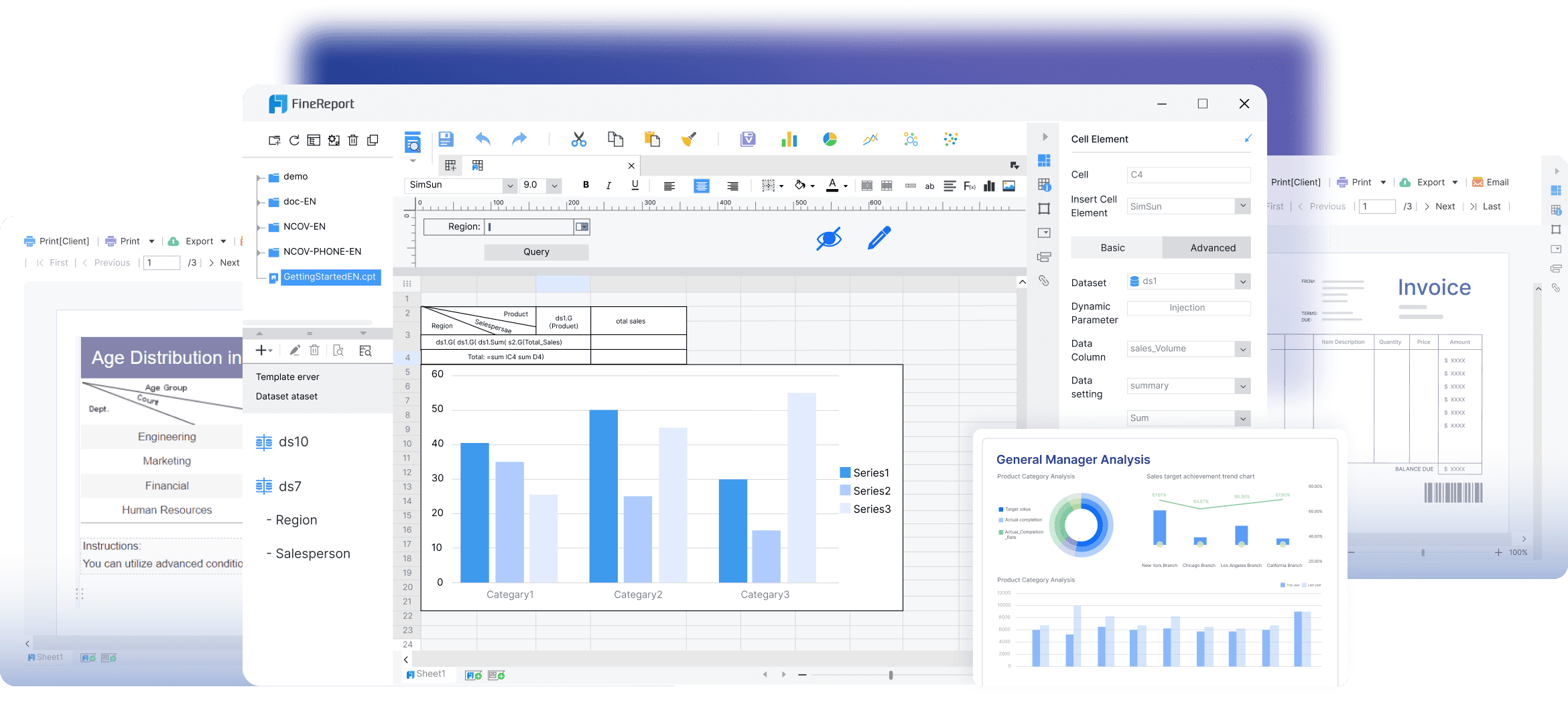
FineReport makes it easy to build supply chain dashboards that work for you. You can connect data from different systems and see everything in real time. The drag-and-drop designer lets you create custom views without coding. You can add charts, tables, and even 3D visuals to your dashboard. Want to check your numbers on your phone? FineReport supports mobile dashboards, so you stay in control wherever you go.
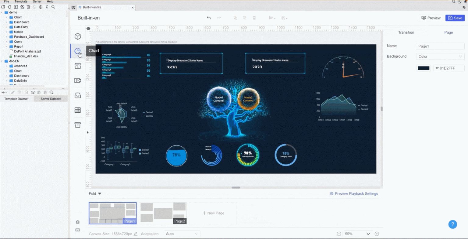
You can use data dashboard examples to show how FineReport brings together information from sales, inventory, and logistics. These examples help you see how each part of your supply chain affects the others. You can drill down into details or zoom out for a high-level view.
Business Benefits and Use Cases
When you use executive supply chain dashboards, you get real results. Here are some ways these performance dashboard examples help your business:
- You make better decisions with real-time data.
- You see your whole supply chain, end to end.
- You plan production and manage inventory more easily.
- You track delivery times and improve efficiency.
- You cut costs by finding waste and fixing problems.
- You spot risks before they become big issues.
- You find bottlenecks fast and keep things moving.
- You help teams work together by sharing the same data.
Many companies use real-world performance dashboard examples to improve how they work. For instance, you can use examples to show how a business reduced stockouts or improved supplier quality. These data dashboard examples give you ideas for your own dashboards and help you reach your goals.
2.Inventory Management Dashboard Examples
Tracking Stock and Turnover
You want to know what’s happening with your inventory right now. A supply chain dashboard makes it easy to track stock levels and turnover. You can see which products move fast and which ones sit on the shelf. Here are some performance dashboard examples that help you stay on top of your inventory:
- Inventory Turnover: This KPI shows how quickly you sell and replace products. You calculate it by dividing the cost of goods sold by the average inventory value.
- Real-time tracking: You get instant updates on sales, stock amounts, and other important data. No more waiting for reports.
- Visual tools: Bar charts and line graphs show inventory patterns over time. Heatmaps make it simple to spot high- and low-stock areas across locations.
Tip: When you use supply chain dashboards that connect to your POS, ERP, and other systems, you get a complete view of your inventory. You can spot trends and act before problems grow.
FineReport Solutions for Inventory Control
FineReport gives you the tools to build powerful inventory dashboards. You can connect data from different platforms and see everything in one place. The drag-and-drop designer lets you create custom views without coding. You can use data dashboard examples to show stock levels, turnover rates, and even SKU profitability.
- FineReport integrates with your existing systems, so you don’t have to switch platforms.
- You can set up alerts for low stock or overstock situations.
- The dashboard supports multi-location tracking, making it easy to manage inventory across warehouses.
These performance dashboard examples help you prevent stockouts and overstocking. You get accurate stock-level assessments and can make timely decisions.

Business Impact
When you use supply chain dashboards for inventory management, you see real results. Check out these real-world performance dashboard examples and their impact:
| Missed Opportunity | Long-term Impact |
|---|---|
| Identifying excess inventory early | Cash is tied up in dead stock, reducing your ability to invest in growth. |
| Identifying underperforming suppliers | Chronic delays, lower service levels, and higher costs for your business. |
| Seeing demand shifts in real time | Higher risk of stock-outs, unhappy customers, and lost revenue. |
| Tracking SKU-level profitability | Carrying unprofitable SKUs drains your working capital. |
| Testing “what-if” scenarios | You can’t flex planning to consider all possible outcomes. |
| Multi-location redistribution | One site faces stock-outs, while another wastes space on excess inventory. |
You can use these examples to guide your own dashboard design. When you see the right data at the right time, you make smarter choices and keep your supply chain running smoothly.
3.Supplier Performance Dashboard
Monitoring Supplier KPIs
You want your suppliers to deliver on time, keep quality high, and respond quickly when you need help. A supply chain dashboard helps you track these key performance indicators so you can see who’s helping your business grow and who’s holding you back. Here are some of the most important metrics you should watch:
- On-time delivery rate
- Defect rate
- Compliance rate
- Cost savings generated
- Supplier risk score
- Supplier responsiveness
- Lead times
- Innovation
- Customer service
When you use performance dashboard examples that focus on these KPIs, you get a clear picture of supplier reliability and value. You can spot trends, compare suppliers, and make better decisions for your business.
FineReport for Supplier Analysis
FineReport makes supplier analysis simple and powerful. You can pull data from your ERP, MES, and SRM systems into one place. No more jumping between platforms or dealing with data silos. With FineReport, you get a supply chain dashboard that brings everything together for easy analysis. Check out how it works:
| Feature | Description |
|---|---|
| Data Integration | Connects all your supplier data for a unified view. |
| Low-Code Functionality | Lets you build dashboards fast, even if you’re not a developer. |
| Comprehensive Data Visualization | Shows all your supplier info in one interactive dashboard. |
| Real-Time Insights | Gives you up-to-the-minute charts and trends for quick action. |
| Risk Alerts | Uses AI to warn you about risks and suggest what to do next. |
You can use data dashboard examples to see how these features help you manage suppliers more effectively. Try different examples to find the best way to visualize your supplier performance.
Use Case: Enhancing Supplier Collaboration
Want to work better with your suppliers? Performance dashboard examples can show you how. For instance, some companies use dashboards to map their entire supply network. They share demand forecasts with Tier 2 and Tier 3 suppliers. This helps everyone adjust faster and plan better. When all suppliers see the same data, collaboration improves. You avoid surprises and keep your supply chain running smoothly.
Here’s a look at how dashboards drive collaboration:
| Evidence of Improved Collaboration | Description |
|---|---|
| Multi-Tier Supply Network Mapping | Share forecasts with all suppliers for faster adjustments and better coordination. |
| Real-Time Information Sharing | Everyone works from the same data, making planning easier and more accurate. |
| Cost Savings from Collaboration | Deeper integration can save millions each year by reducing inventory and boosting efficiency. |
You can use these examples to inspire your own supply chain dashboards. When you focus on collaboration, you build stronger partnerships and unlock more value from your suppliers.
4.Logistics and Transportation Dashboard
Shipping and Delivery Insights
You want your shipments to arrive on time and at the right cost. A logistics and transportation dashboard gives you the real-time visibility you need to track every package, route, and carrier. With the right examples, you can see where your money goes and how your deliveries perform.
Here’s a table that shows the most valuable shipping and delivery insights you should track:
| Metric | What it Measures | Why it’s Helpful |
|---|---|---|
| Total spend | Total amount spent on shipping across all carriers and services | Helps you spot savings and forecast future costs |
| Number of labels purchased | Total shipping labels created (packages shipped) | Shows shipping volume, useful for planning and carrier negotiations |
| Average transit days | Average time for packages to reach customers | Lets you set delivery expectations and track carrier reliability |
| Cost per package | Average shipping cost per order, including all fees | Uncovers inefficiencies and helps match the right carrier to each shipment |
| Carrier split | Percentage of shipments handled by each carrier | Avoids over-reliance on one carrier and helps you adjust quickly if disruptions happen |
| Service split | Distribution of shipments across service levels | Identifies ways to cut costs without slowing delivery |
| Peer shipper benchmarking | Compares your shipping performance with similar businesses | Highlights strengths and weaknesses for a competitive edge |
You can also track on-time delivery rate, cost per mile, shipment accuracy, average delivery time, and inventory turnover rate. These examples help you understand your logistics performance at a glance.
FineReport for Logistics Optimization
FineReport makes it easy to build dashboards that show you exactly what’s happening in your logistics network. You can connect real-time data from your TMS, ERP, and warehouse systems. The drag-and-drop interface lets you create custom dashboards without coding. You can use data dashboard examples to visualize shipping trends, carrier splits, and delivery times.
Want to see how your drivers perform? Bar charts and bubble charts compare performance across your team. Line charts track loads, miles, and orders over time. Map charts show where your deliveries go, so you can spot patterns and make smarter routing decisions. Donut charts break down load status and booking sources for quick insights.
Tip: Use these examples to find bottlenecks, improve routes, and negotiate better rates with carriers.
Reducing Costs and Improving Efficiency
You want to save money and keep your logistics running smoothly. Logistics dashboards help you do both. When you use examples that highlight cost per shipment and average delivery time, you can see where to cut waste and boost efficiency.
A recent survey found that most supply chain leaders saw big improvements after using logistics dashboards. They built resilience and managed disruptions more effectively. You can use real-time visibility to spot delays, track costs, and keep your customers happy.
With the right examples, you can compare your performance to industry peers. You can test new strategies and see the results fast. These dashboards help you make decisions that drive down costs and keep your supply chain moving forward.
5.Demand Planning Dashboard Examples
Forecasting and Trend Analysis
You want to stay ahead of demand swings. Demand planning dashboards help you spot trends and forecast with confidence. When you use the right examples, you can see how sales, seasonality, and promotions shape future demand. Take a look at this table to see which techniques work best:
| Technique | Description |
|---|---|
| Advanced Analytics | Uses data analysis to boost forecasting accuracy and speed. |
| Real-time Data | Shows up-to-date info for smarter planning. |
| Cloud-based Solutions | Makes teamwork and quick changes easy. |
| Metrics Tracking | Monitors KPIs to catch issues early. |
| Demand Trend Analysis | Looks at past sales and seasons to predict what’s next. |
| Forecast Accuracy Monitoring | Compares forecasts to actual sales for better future planning. |
| Promotion Impact Analysis | Checks how marketing affects demand. |
| Customer-Level Forecasting | Breaks down forecasts by customer for more precise planning. |
| Product Lifecycle Management | Tracks product stages to match forecasts with market changes. |
| Exception Reporting | Flags odd demand spikes so you can act fast. |
You can use examples like a forecast accuracy tracker or a demand trend dashboard to keep your planning sharp.
FineReport for Demand Planning
FineReport gives you the tools to build demand planning dashboards that work for your business. You get a management cockpit for a big-picture view and an operational cockpit for digging into details. You can check key indicators on your phone, so you never miss a beat. Real-time monitoring means you always see the latest numbers. With data dashboard examples, you can link sales, inventory, and promotions to spot patterns and adjust quickly.
| Feature | Description |
|---|---|
| Management Cockpit | Lets you see everything at a glance and make fast decisions. |
| Operational Cockpit | Helps you drill down and connect different data points. |
| Multi-terminal Display | Keeps you updated on mobile, wherever you are. |
| Real-time Monitoring | Shows key indicators instantly for quick action. |
Try out examples that track forecast accuracy, compare forecasts to actuals, and visualize promotion impacts. These dashboards make your demand planning smarter and more flexible.
Minimizing Stockouts and Overstock
You want shelves full but not overflowing. Demand planning dashboards help you balance inventory by using smart strategies. Here are some proven ways to keep stockouts and overstock in check:
- AI-powered demand forecasting predicts what you’ll need by analyzing lots of data.
- Automated replenishment optimization keeps products available and cuts waste.
- Intelligent allocation sends inventory to the right places based on demand.
- Dynamic safety stock management adjusts levels in real time.
- Real-time inventory visibility lets you track stock across all locations.
Tip: Retailers use automated replenishment to restock popular items daily, stopping spoilage and lost sales. Shoe stores send the right sizes to busy shops, boosting sales and reducing markdowns. When you use examples like these, you can see how dashboards help you respond fast and keep customers happy.
6.Order Management Dashboard
Order Status and Fulfillment Rates
You want to know where every order stands. An order management dashboard gives you instant updates on order status and fulfillment rates. You can track the whole journey, from order receipt to delivery. Here are the most common metrics you’ll see in these dashboards:
- Order cycle time
- Pick-and-pack speed
- Shipment accuracy
- Return rate
- Fulfillment cost per order
- Inventory turnover
- Carrier performance
Tracking these metrics helps you spot bottlenecks before they slow down your customers. You can also monitor:
- Order processing time from receipt to dispatch
- Carrier performance by region and service level
- First-attempt delivery success rates
- Cost per delivery against service level agreements
Want to focus on speed and reliability? Try these examples:
- Order Fulfillment Time KPIs
- Order Fill Rate
- Internal Order Cycle Time
- Order Fulfillment Cycle Time
- On-time Shipping Rate
These examples make it easy to see where you need to improve.
FineReport for Order Tracking
FineReport gives you powerful tools for order tracking. You can visualize real-time data and follow every order’s path. Take a look at this table to see how FineReport helps you manage orders:
| Feature | Description |
|---|---|
| Real-time Data Visualization | FineReport provides plugins that enable real-time tracking and visualization of data from terminal devices. |
| Trajectory Map Plugin | This plugin allows for the animation of latitude and longitude data, managing trajectories of millions of devices simultaneously. |
You can use these examples to track shipments, monitor delivery routes, and analyze performance. FineReport makes it simple to build dashboards that show exactly what’s happening with every order.
Improving Customer Satisfaction
You want happy customers who come back again and again. Order management dashboards help you deliver on that promise. When you track KPIs, you create a clear link between your process and how customers see your reliability. Improved order accuracy and delivery speed become goals you can measure, not just hope for.
- Tracking KPIs through dashboards connects your process to customer trust.
- Real-time visibility improves order precision and transparency.
- Fewer errors and complaints mean you meet expectations more often.
- Real-Time Inventory Dashboards reduce stockouts by 40%.
- Reliable, timely deliveries boost repeat customer rates by 35%.
Try different dashboard examples to see what works best for your business. When you use these examples, you build a reputation for reliability and keep customers coming back.
7.Sustainability and Compliance Dashboard
Monitoring ESG and Compliance KPIs
You want to show your commitment to sustainability and compliance. A supply chain dashboard helps you track the right numbers and share your progress with your team. You can use clear tables to display the most important ESG and compliance KPIs. Here’s a quick look at the top ones you should monitor:
| KPI Name | Description |
|---|---|
| Energy Use Intensity | Total energy used per unit of output (like kWh per product or per revenue). |
| Renewable Energy Share | Percentage of energy from certified renewable sources. |
| Operational Emissions Intensity | Direct greenhouse gas emissions per output. |
| Waste Diversion Rate | Percentage of waste kept out of landfills through recycling or reuse. |
| Hazardous Waste Volume | Total hazardous material disposed. |
| Water Use Intensity | Water used per unit of output. |
| Environment-Related Non-Compliance Incidents | Number of environmental breaches or regulatory issues. |
| Sustainable Sourcing Ratio | Portion of materials sourced with eco-certifications. |
You can also track carbon footprint, energy use, waste management, and water use. These examples help you see where you stand and where you can improve.
FineReport for Sustainability Reporting
FineReport makes sustainability reporting simple and powerful. You can connect data from different systems and see everything in one dashboard. The drag-and-drop designer lets you build custom views for your ESG goals. You can set up alerts for non-compliance or spikes in emissions. Want to share your progress? FineReport supports mobile dashboards, so you can show results anywhere.

You can use examples like a waste diversion dashboard or a renewable energy tracker to highlight your achievements. These examples make it easy to spot trends and share wins with your team. You can even compare your numbers to industry standards or your own targets.
Supporting Responsible Supply Chains
You want your supply chain to support your values. Dashboards help you set clear goals and track supplier compliance. Here’s how you can build a responsible supply chain with dashboards:
- Define your KPIs and align them with your business strategy.
- Pick a dashboard tool that works with your current systems.
- Design dashboards that are easy for everyone to use.
- Make sure your data updates in real time.
- Review your dashboard data often and look for ways to improve.
You can use a direct approach by setting targets for suppliers and monitoring their compliance. You might also provide training or incentives to help suppliers adopt better practices. Some companies work together with industry peers or global organizations to raise the bar for everyone. These examples show how dashboards help you build a supply chain that’s both responsible and resilient.
Tip: When you use real-world examples, you make sustainability and compliance part of your daily routine—not just a yearly report.
How to Implement Supply Chain Dashboards
Assessing Data Readiness
You want your dashboard to show the right information. Start by checking your current tools and data sources. Ask yourself: Is your data accurate and up to date? Can you access it easily? Make a list of all the systems you use, like ERP, warehouse management, and sales platforms. Look for gaps or silos that might slow you down. Clean up duplicate records and standardize your metrics. When your data is ready, you can build dashboards that give you a clear, data-driven view of your supply chain.
Tip: Involve your IT team early. They can help you connect systems and set up secure data flows.
Customizing with FineReport
FineReport makes dashboard customization simple. You can use dashboard templates or create your own from scratch. The drag-and-drop designer lets you build reports fast, even if you’re not a developer. You can display dashboards on any device, from your computer to your phone or even a TV screen. FineReport’s open reporting platform lets you integrate with other systems using web scripts and APIs.
Here’s a quick look at how FineReport helps you customize dashboards:
| Feature | Description |
|---|---|
| Open Reporting Platform | Develop and customize platforms via web scripts and APIs, integrating with other systems. |
| Intuitive Visual Design Environment | Quick report design through a drag-and-drop interface. |
| Multi-Device Display | View reports on PCs, mobile devices, and TV screens using HTML5. |
You can tailor dashboards for different teams, showing only the metrics that matter to each group.
Driving Adoption and Improvement
Getting everyone on board is key. Start by securing support from your leadership team. When executives back the project, everyone pays attention. Create dashboards for each department so users see information that fits their needs. Communicate the benefits clearly, so people understand how dashboards help them work smarter.
Keep dashboards easy to access. Integrate them into the apps your team uses every day. Offer training sessions to help users get comfortable. Don’t stop after launch—keep improving your dashboards based on feedback.
| Strategy | Description |
|---|---|
| Leadership Buy-in | Support from top executives aligns KPIs and goals across the organization. |
| Tailored Dashboards | Specific dashboards for departments address unique needs and boost satisfaction. |
| Clear Communication | Explaining goals and benefits increases engagement. |
| Accessibility | Integrating dashboards into daily apps and ensuring mobile access keeps analytics front and center. |
| Ongoing Training | Initial and continuous training helps users understand and use dashboards confidently. |
Note: FanRuan offers support and resources to help you train your team and keep your dashboards up to date.
Modern supply chain dashboards change how you manage your business. With FineReport, you get real-time insights, smarter decisions, and a smoother workflow. Take a moment to review your current dashboards. If you want better results, try FanRuan solutions.
Ready to get started? Launch your first dashboard project or reach out to FanRuan experts for advice. Data-driven decisions will keep your supply chain strong and future-ready.


FAQ

The Author
Lewis
Senior Data Analyst at FanRuan
Related Articles

How to Build an Investment Portfolio Reporting Dashboard for Executives: KPIs, Benchmarks, and Drill-Down Views
Investment portfolio reporting for executives is not about showing every holding, transaction, and chart your investment team can produce. It is about giving CEOs, CFOs, CIOs, boards, and investment committees a fast, re
Yida YIn
Jun 25, 2026

12 KPI Reporting Examples for Executive Dashboards: What to Show in Weekly, Monthly, and Quarterly Reviews
Executive leaders do not need more data. They need decision ready $1 examples that match how often they review the business and what actions they are expected to take. A weekly $1 should surface fast moving risks and per
Yida YIn
Jun 25, 2026

How to Build a Digital Marketing Reports Dashboard: Executive Examples, KPIs, and Templates
A $1 is the control layer that helps executives and marketing leaders turn scattered channel data into fast, confident decisions. If you are a CEO, CMO, operations director, or marketing analytics lead, the real problem
Yida Yin
May 07, 2026