A marketing campaign performance report is not just a recap of clicks, impressions, and spend. It is a decision tool that helps executives assess business impact, managers optimize budget allocation, and channel owners identify what to scale, fix, or stop. If your current reporting leaves leadership asking “So what?” or your team spends hours stitching spreadsheets together without clear next actions, the issue is not a lack of data. It is a lack of reporting structure, business context, and decision-ready presentation.
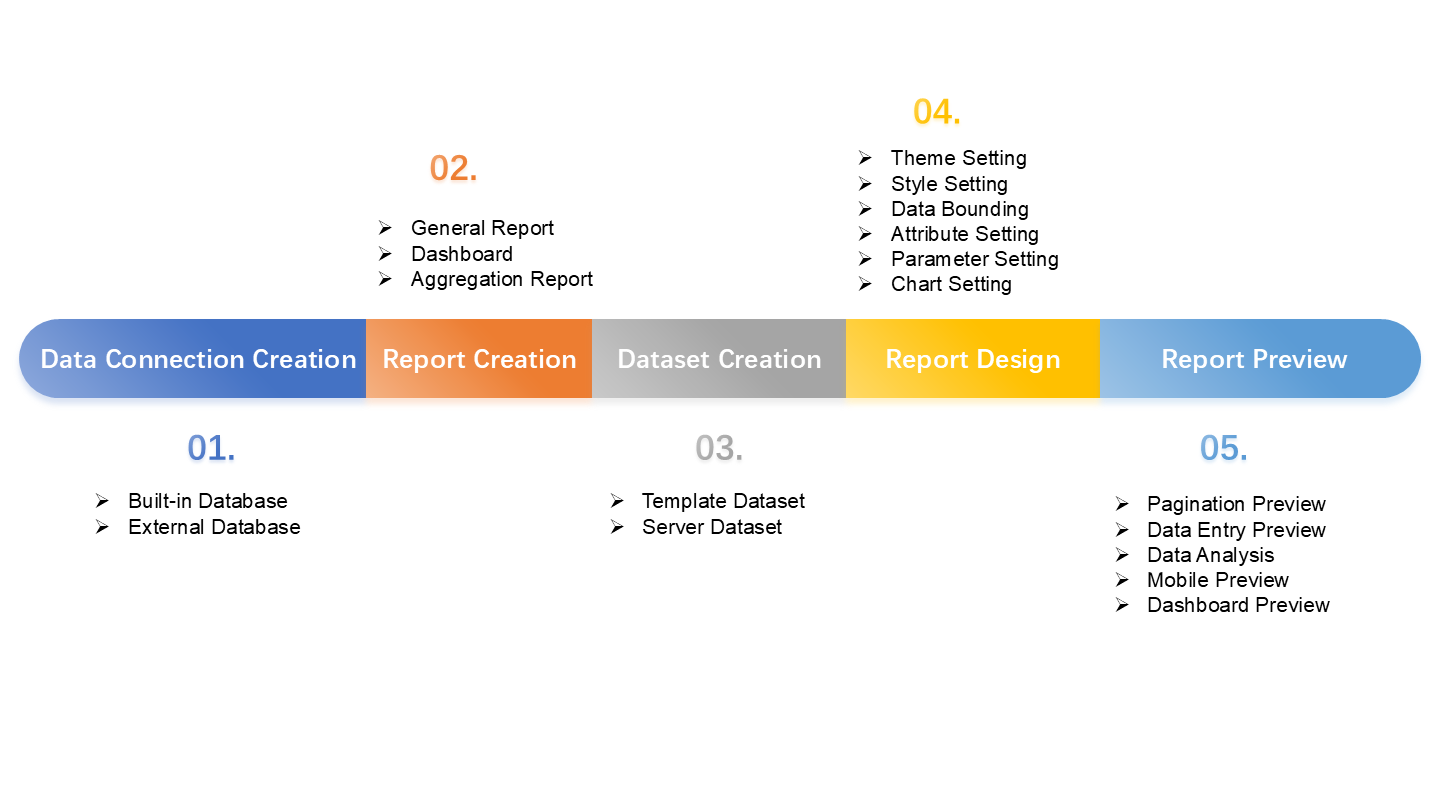
All reports in this article are built with FineReport
What a marketing campaign performance report should accomplish
A strong marketing campaign performance report should answer one core question: Did this campaign create measurable business value, and what should happen next? Everything in the report should support faster, better decisions.
Define the report’s purpose for executives, managers, and channel owners
Different stakeholders use the same report differently, so the structure must reflect that reality.
Executives want the business headline:
Did the campaign influence pipeline, revenue, or customer acquisition?
Which audiences, creatives, and offers worked best?
Where are tracking or attribution issues affecting accuracy?
Which tests should be run next?
A report that tries to satisfy everyone with the same level of detail usually fails all three groups. The better model is layered reporting: executive summary first, detailed diagnostics below.
Clarify the difference between a campaign recap, dashboard, and decision-making report
These are not the same thing.
Campaign recap: A post-campaign summary of activities and top-level outcomes.
Dashboard: A live or recurring visual view of KPIs and trends.
Decision-making report: A structured narrative that explains results, causes, risks, and recommended actions.
A dashboard shows what happened. A decision-making report explains why it happened and what to do next. Enterprise teams need both, but if leadership is reviewing budgets, priorities, or channel strategy, a dashboard alone is rarely enough.
Explain which business questions the report must answer to be useful
Your report should be built backward from the business questions it needs to answer. At minimum, it should cover these:
Did the campaign meet its primary objective?
What revenue, pipeline, or conversion value did it influence?
Which channels, audiences, creatives, and offers drove results?
How efficient was the campaign compared with target and benchmark?
What changed versus prior periods?
How confident are we in the data, attribution model, and tracking coverage?
What should we scale, reduce, pause, or test next?
If your report does not answer these questions clearly, it may be visually polished but operationally weak.
Core metrics to include in every report
The best reports focus on metrics that connect marketing activity to business outcomes, channel performance, and efficiency. This is where many teams go wrong: they overload reports with vanity metrics instead of showing how campaign inputs turned into meaningful business results.
ROAS (Return on Ad Spend): Revenue generated for every unit of ad spend.
CTR (Click-Through Rate): Percentage of impressions that resulted in clicks; useful for measuring message relevance.
Conversion Rate: Percentage of visits or clicks that completed the target action.
Lead Quality: A measure of whether leads meet qualification thresholds or progress through the funnel.
Audience Segment Performance: Results by persona, geography, account tier, lifecycle stage, or demographic.
Creative Performance: Comparative results by ad creative, asset type, or message variation.
Offer Performance: Impact of different CTAs, promotions, content offers, or landing page propositions.
Benchmark Variance: Difference between actual performance and target, historical average, or industry benchmark.
Attribution Coverage: The percentage of campaign activity that can be confidently tracked and attributed.
Business outcomes and revenue impact
The first job of the report is to tie campaign goals to measurable business outcomes. That may mean pipeline, influenced revenue, ecommerce sales, booked demos, trials, subscription starts, or customer acquisition, depending on the business model.
A useful report should show:
Campaign objective
Actual outcome
Target
Variance to target
Comparison to prior period
Comparison to benchmark
This instantly creates context. A campaign with a high CTR but poor conversion value is a weak campaign. A campaign with moderate click volume but strong pipeline contribution may be a strategic success.
When possible, present business outcome metrics at three levels:
Total campaign impact
Channel contribution
Segment or asset-level drivers
That structure helps leaders understand not just results, but what produced them.
Channel and audience performance
Once business outcomes are established, the next step is to break down performance by the variables that most often determine success.
These usually include:
Channel
Audience segment
Geography
Device
Creative
Offer
Landing page
Campaign variation
This is where the report becomes actionable. If paid social drove low-cost conversions but low-quality leads, while email delivered fewer conversions but stronger downstream revenue, your next budget decision should reflect that difference.
To analyze individual campaign performance effectively, look for patterns such as:
One audience converting well across multiple channels
One creative format outperforming across segments
One offer driving clicks but not meaningful conversions
One channel producing volume without business quality
That is how a marketing team moves from reporting to optimization.
Efficiency and quality indicators
A campaign can look successful on volume and still be inefficient or low quality. That is why every report should include a layer of efficiency metrics.
This section should also call out reporting constraints. Strong reporting is honest reporting. Include concise notes on:
Attribution model used
Data freshness
Offline conversion gaps
Cookie loss or consent-related blind spots
Platform-reported versus unified reporting differences
UTM or naming inconsistencies
That transparency builds trust with executives and prevents false certainty.
How to build a report executives actually use
Executive adoption depends less on the quantity of data and more on the clarity of the story. Leaders do not want raw exports. They want a short path from numbers to decision.
The first section should be scannable in under a minute. It should lead with three things:
Headline outcome
Key insight
Recommended next action
A strong opening summary might sound like this:
Campaign exceeded pipeline target by 18% but missed ROAS goal due to rising paid social costs.
Mid-funnel content offers converted best among enterprise accounts.
Recommended next step: shift 15% of spend from broad prospecting to high-intent retargeting and replicate the top-performing offer in email and search.
That gives leadership a conclusion before they enter the detail.
Structure the story behind the numbers
A report becomes useful when it follows a logical business flow. The best sequence is:
Goals
Results
Insights
Causes
Actions
This structure keeps teams from dumping disconnected charts into a slide deck. Each section should answer a different question:
Goals: What were we trying to achieve?
Results: What happened?
Insights: What matters most?
Causes: Why did it happen?
Actions: What should we do next?
This narrative style separates signal from noise. It helps executives move quickly without oversimplifying the data.
How to present a digital marketing performance report clearly
A digital marketing performance report should be visual, concise, and comparison-driven. The goal is not to show everything available. The goal is to make decisions obvious.
Use these principles:
Write short commentary above or beside charts
Compare against target, prior period, and benchmark consistently
Highlight changes and anomalies, not just static totals
Use plain language for conclusions
Avoid vanity metrics unless they support a business outcome
For example, impressions and reach should only appear if they help explain cost efficiency, awareness lift, or funnel performance. If they do not support a business question, remove them.
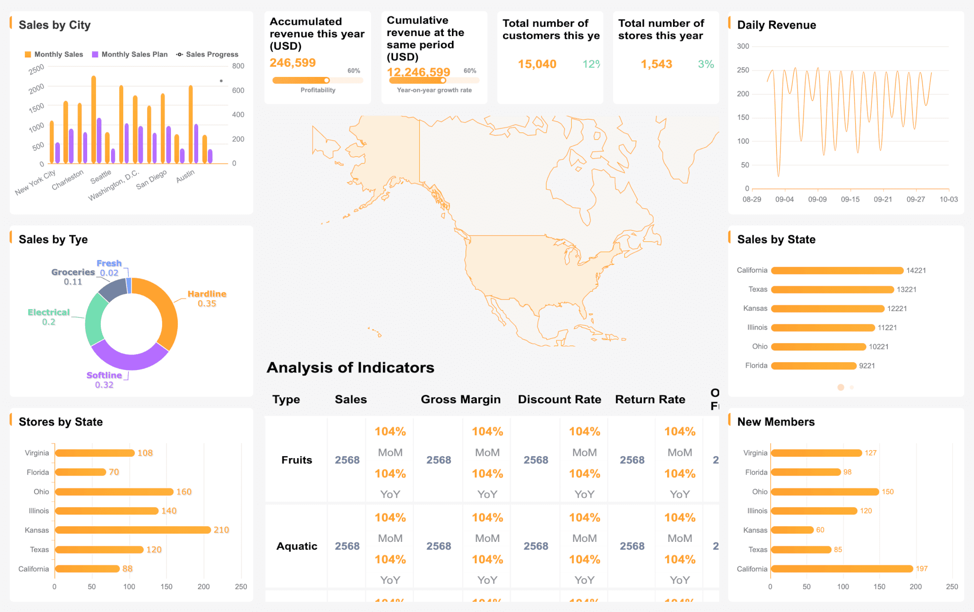
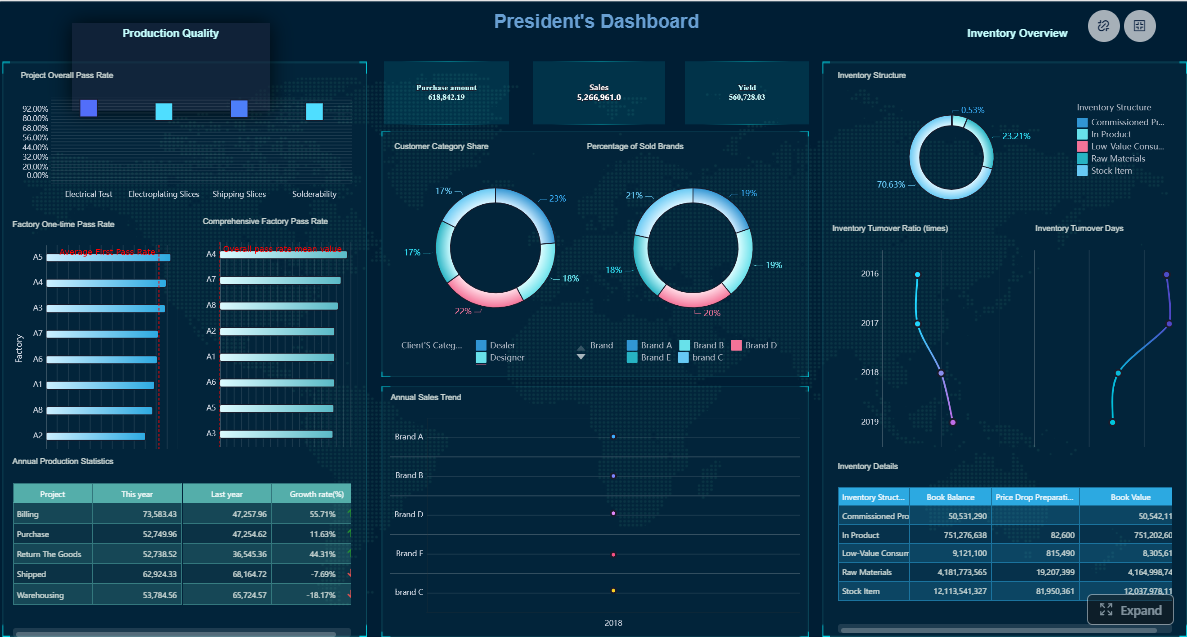
Marketing campaign reporting: visualizing success
The right visual design turns a dense marketing campaign performance dashboard report into an executive tool rather than a data dump.
This structure works well for internal teams, agencies, and enterprise reporting because it combines business context with operational depth.
What strong examples have in common
When reviewing 5 of the best marketing report examples, the strongest ones usually share the same characteristics.
1. Paid media report example
Strong paid media reports connect spend to conversions, pipeline, or revenue rather than stopping at impressions and clicks. They also isolate audience, creative, and bid strategy effects.
2. Email marketing report example
Good email reports go beyond opens and clicks. They show downstream conversion rate, unsubscribe trends, revenue per send, and performance by segment and content type.
3. Content marketing report example
The best content reports connect engagement to assisted conversions, lead quality, influenced pipeline, and long-tail conversion behavior instead of only pageviews.
4. Multi-channel campaign report example
Strong multi-channel reporting standardizes attribution, compares contribution across touchpoints, and explains how channels worked together across the funnel.
5. Executive board report example
The best executive formats are short, visual, and recommendation-heavy. They prioritize business outcomes, risks, and budget implications over channel-level detail.
What all strong examples have in common:
Clear business question
Limited but meaningful KPI set
Consistent comparison logic
Honest data limitations
Actionable next steps
Owner accountability
Executive tips for better adoption
If you want your report to influence decisions, not just get opened and ignored, follow these practical rules.
1. Tailor depth by audience
Executives want summary and decision points. Managers want diagnostics. Specialists want detail. Build one layered report, not three conflicting reports.
2. Always recommend an action
Never end with analysis alone. Say what should happen next, why, and who owns it.
3. Assign follow-up owners
Insights without ownership die in meetings. Each major recommendation should have a responsible team or leader.
4. Set the right reporting cadence
Choose cadence based on decision speed:
Weekly for active optimization
Monthly for performance management
Quarterly for budget and planning reviews
End-of-campaign for postmortem and playbook updates
5. Keep methodology visible
If attribution changes, tracking breaks, or definitions shift, call it out. Trust matters more than overclaiming precision.
How to implement this reporting process effectively
Building a high-value reporting process takes more than a template. It requires operating discipline. Here are the best practices I recommend to enterprise marketing teams.
1. Define the decision before the report
Start with the exact decision this report should support.
Ask:
Are we deciding where to shift budget?
Are we evaluating campaign profitability?
Are we reviewing audience-market fit?
Are we preparing for an executive planning meeting?
This prevents metric overload and keeps the report focused.
2. Standardize campaign naming and KPI definitions
Inconsistent naming breaks reporting faster than most teams realize. Standardize:
Campaign IDs
Channel names
Market names
Objective labels
Funnel stage definitions
Revenue and attribution logic
Without this, cross-platform comparison becomes unreliable.
3. Build a single source of truth for marketing data
Do not rely on disconnected platform screenshots and manual spreadsheet joins. Bring ad, CRM, web, email, and conversion data into one governed reporting layer.
This reduces:
Manual errors
Reporting lag
Definition conflicts
Stakeholder mistrust
4. Add commentary directly into the dashboard or report
Do not force executives to interpret charts alone. Add short notes such as:
“Paid search CPA increased 22% due to branded competition”
“Enterprise audience generated lower lead volume but 2.4x higher opportunity rate”
“Email offer B outperformed offer A by 31% in conversion value”
That is what makes reporting decision-ready.
5. Turn every report into a recurring optimization loop
The best reporting process is not linear. It is cyclical:
Report results
Diagnose causes
Recommend actions
Execute changes
Measure again
This turns your marketing campaign performance report into an operating system for continuous improvement.
Add interactive filters for date range, channel, audience, market, and campaign
For enterprise teams, this matters because reporting is rarely just about one campaign. It is about repeatability, governance, speed, and trust. FineReport makes it easier to produce reports that executives actually use and marketing teams can act on immediately.
If your current reporting process depends on manual exports, version-control chaos, and hours of formatting before every meeting, the operational cost is already too high. FineReport reduces that burden while improving consistency and insight quality.
Final takeaway
A high-performing marketing campaign performance report does three things well:
Connects campaign activity to business outcomes
Explains what drove success or underperformance
Recommends concrete next actions with ownership
That is what separates a useful report from a decorative dashboard.
If you want a reporting process that is faster to build, easier to scale, and stronger in executive settings, FineReport is the practical way to get there.
A useful report should include business outcome metrics like pipeline, revenue, conversions, spend, CPA, and ROAS, along with channel, audience, creative, and offer performance. It should also explain what changed, why it happened, and what actions to take next.
A dashboard mainly shows current KPIs and trends, while a performance report adds interpretation, context, and recommendations. In short, the dashboard shows what happened, and the report explains why it happened and what to do next.
Executives usually care most about revenue attributed, pipeline generated, customer acquisition, spend efficiency, and return metrics like ROAS or ROI. They also want a clear summary of risks, opportunities, and the decision needed next.
The right cadence depends on campaign size, budget, and decision speed, but many teams use weekly monitoring and monthly or post-campaign reporting. High-spend or fast-changing campaigns may need more frequent reviews.
Attribution helps connect campaign interactions to leads, deals, revenue, or conversions so teams can understand true impact. Without clear attribution and tracking coverage, performance conclusions can be incomplete or misleading.
Product Trial
FineReport
Pixel-perfect reports · Interactive dashboards · Easy data entry · Digital twins