Dashboard reporting is the practice of turning business data into a live, visual report dashboard that helps teams track performance, identify issues early, and make decisions faster. For IT managers, operations leaders, analysts, and department heads, the value is simple: instead of waiting for static reports in spreadsheets or email attachments, they get one view of the metrics that matter now.
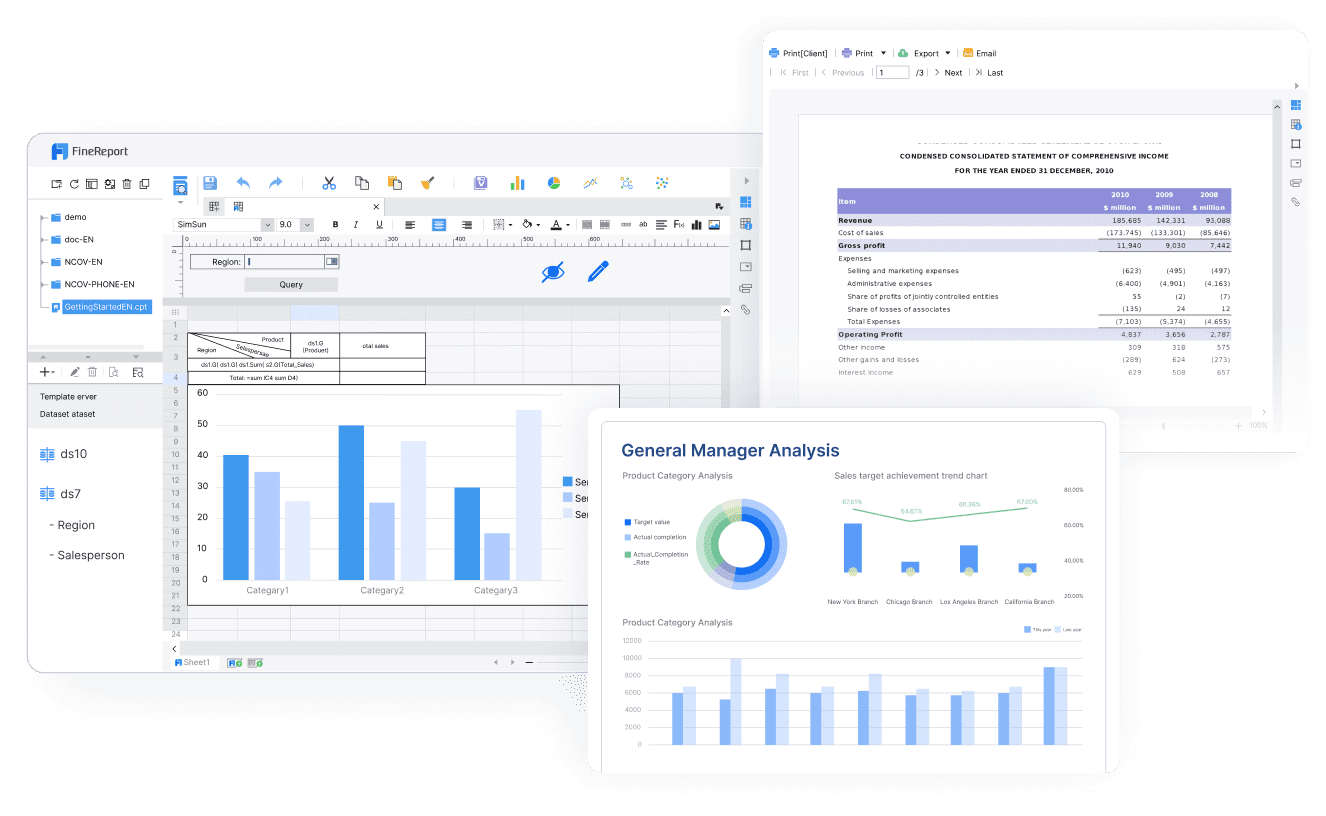
All reports in this article are built with FineReport
A report dashboard is a visual interface that combines key metrics, charts, tables, and filters into one interactive view. Its job is not to show everything. Its job is to show the most important information clearly enough for someone to act on it.
A static report usually captures data at a single point in time. It may be exported as PDF, PowerPoint, or Excel and reviewed after the fact. A dashboard, by contrast, is designed for ongoing monitoring. It can refresh on a schedule, allow users to filter by region or period, and support drill-down analysis when something needs investigation.
That difference matters in real operations. A finance leader may want a monthly board pack, but a supply chain manager needs to see late shipments today. A marketing lead may still need campaign summaries, but they also need a report dashboard that shows conversions by channel before budget is reallocated.
Operations teams: fulfillment speed, service levels, downtime, bottlenecks
If the business question changes frequently, if data needs to be filtered by user or region, or if delays in reporting create real cost, a report dashboard is usually the right format.
Core elements of an effective dashboard reporting setup
An effective dashboard is not just a collection of charts. It is a reporting system with clear definitions, refresh logic, and visual hierarchy.
Metrics, KPIs, and data sources
The first rule is focus. Most weak dashboards fail because they try to track too much. Start with a small set of KPIs directly tied to business outcomes.
Key Metrics (KPIs)
Revenue:Total sales generated in a defined period.
Conversion Rate: Percentage of users or leads that complete a target action.
Pipeline Value: Total value of open sales opportunities.
Win Rate: Percentage of opportunities converted into closed deals.
Customer Acquisition Cost (CAC): Cost required to acquire a new customer.
Return on Ad Spend (ROAS): Revenue generated for each unit of ad spend.
Fulfillment Cycle Time: Time required to process and deliver an order.
On-Time Delivery Rate: Percentage of shipments delivered within target time.
Service Level Agreement (SLA) Compliance: Percentage of service requests handled within agreed limits.
Inventory Turnover: Rate at which stock is sold and replenished.
Website Sessions: Number of visits to the website during a period.
Bounce Rate: Percentage of visitors who leave after viewing one page.
Average Order Value (AOV): Average revenue per order.
Forecast vs. Actual: Comparison between planned and achieved performance.
Variance to Target: Gap between current performance and goal.
A good KPI earns its place by answering a business question. If a metric does not trigger discussion or action, it probably does not belong on the main page.
The critical issue is consistency. If sales, finance, and operations define “revenue,” “active customer,” or “qualified lead” differently, the report dashboard will create arguments instead of insight.
Real-time dashboards work best for operational monitoring, service desks, production lines, and fast-moving digital campaigns.
Daily refresh dashboards are often enough for sales management, finance tracking, and business reviews.
Weekly dashboards suit strategic summaries where trend interpretation matters more than immediate action.
More frequent refresh is not always better. Real-time data can create noise when the business only acts weekly. Align the update cycle with the rhythm of decisions.
Filters improve usefulness without multiplying reports. The most practical filters are:
Date range
Region or branch
Product line
Team or owner
Customer segment
Campaign or channel
Drill-down views also matter. Executives may start with top-line numbers, then click into business units, regions, or product categories. This preserves a clean overview while still supporting investigation.
People do not read dashboards line by line. They scan. That means layout is a performance factor, not just a design choice.
A practical layout usually follows this hierarchy:
Top row: summary KPI cards
Middle section: trends, comparisons, and exceptions
Lower section: detail tables or supporting breakdowns
This structure helps users answer three questions in seconds:
What is happening?
Is it good or bad?
Where should I look next?
For visual clarity, use:
Summary cards for headline metrics
Line charts for trends over time
Bar charts for ranking and comparisons
Tables for detailed review
Color sparingly to highlight status, not decorate the page
Whitespace and alignment to reduce scanning effort
Themes, templates, and mobile-friendly layouts are especially important in enterprise use. A standardized report dashboard improves trust because users see the same labels, logic, and design patterns across departments.
The best way to understand dashboard reporting is to see how the format changes by audience.
Executive dashboard
An executive report dashboard focuses on business performance at a glance. It should show current results, target alignment, and the few exceptions that require leadership attention.
Executives do not need every operational detail on page one. They need a fast summary with the option to drill deeper only when something is off target.
A marketing report dashboard is more dynamic because channel performance changes quickly. Teams typically track website traffic, conversion performance, campaign spend, funnel drop-off, and attribution patterns.
Common views include:
Website sessions and users
Traffic by source or medium
Landing page conversion rates
Cost per lead
Campaign ROI
Email open and click rates
Attribution trends across paid, organic, and direct channels
Many teams use tools such as Looker Studio for a simple data studio overview when they need fast web reporting and lightweight sharing. That works well for basic visibility, but growing organizations usually need stronger governance, broader integrations, and more controlled dashboard distribution.
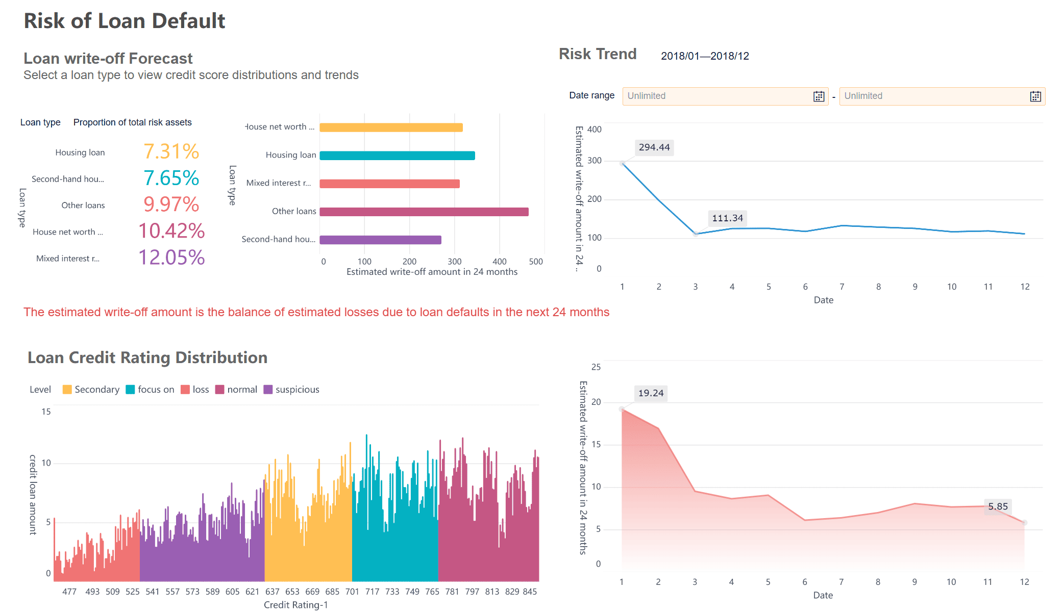
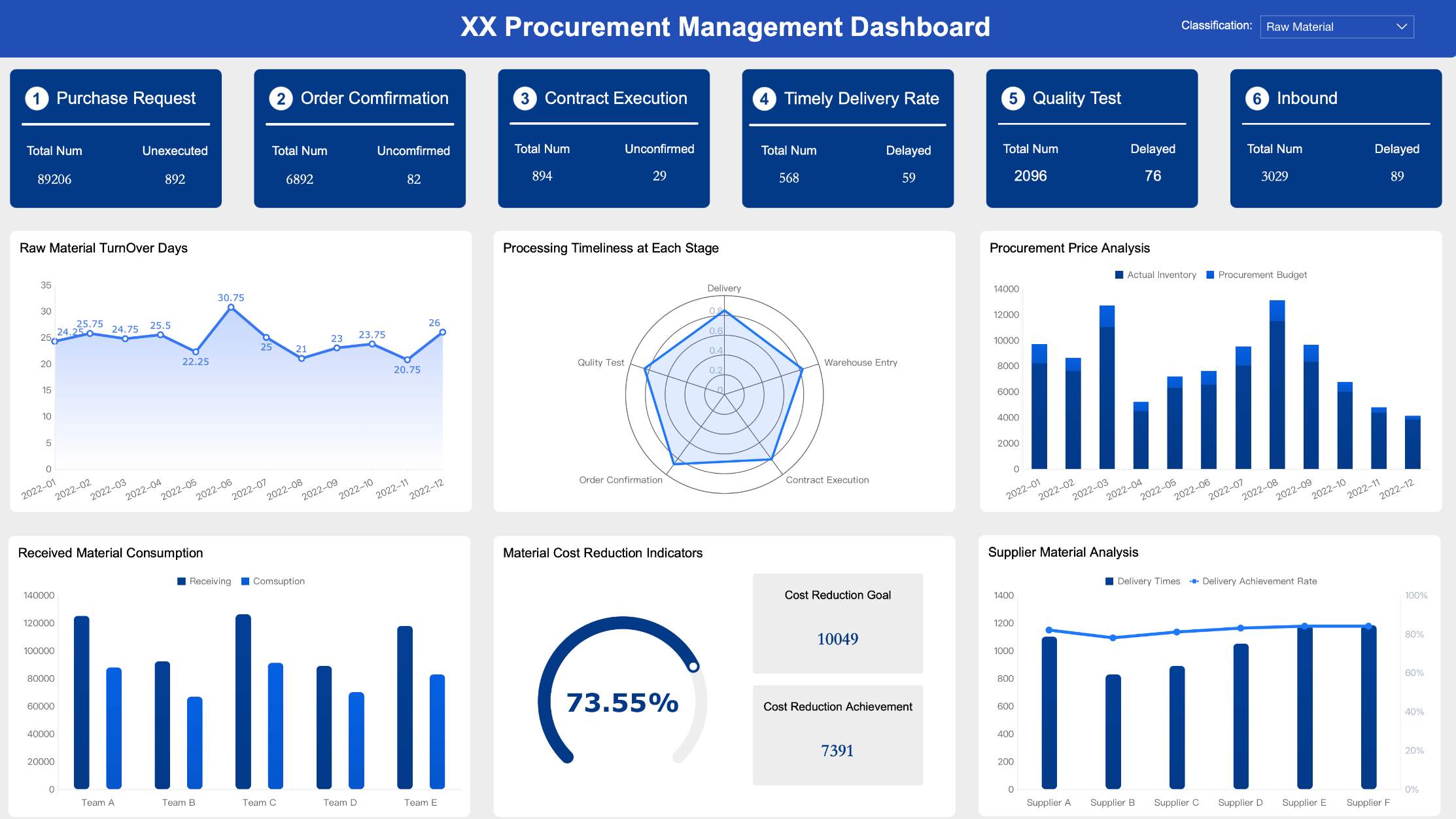
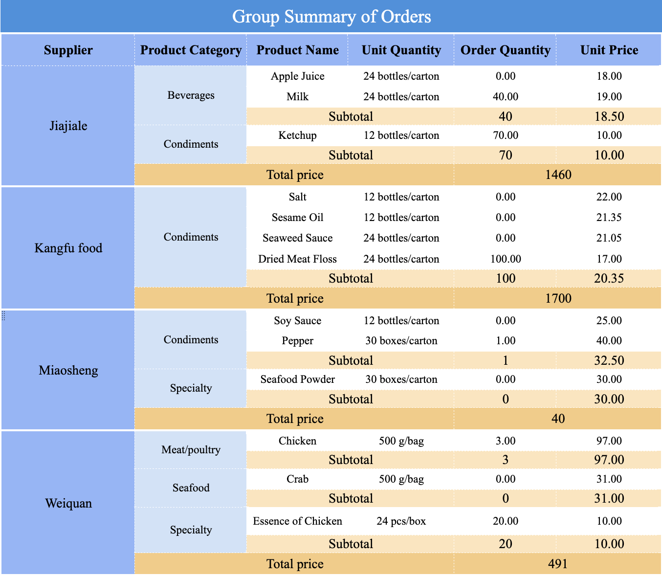
A sales and operations report dashboard brings commercial and execution data together. This is where many companies move from fragmented reporting to real business coordination.
Typical sales views include:
Lead volume
Pipeline by stage
Win rate
Revenue by rep or region
Forecast attainment
Deal cycle length
Typical operations views include:
Order volume
Fulfillment time
Backlog
On-time delivery
Service response time
Production or logistics bottlenecks
Platforms such as Power BI are often used where teams need deeper analysis, modeling, and enterprise sharing. The challenge is not just creating charts. It is ensuring that sales, service, and operations are looking at the same definitions and time windows.
How to build a dashboard that supports better decisions
A strong dashboard is built backward from decisions, not forward from data availability.
Start with the audience and business questions
Before building anything, identify:
Who will use the dashboard?
What decision are they trying to make?
How often do they review the data?
What action should follow if a metric changes?
For example, an operations director may need a daily dashboard to reroute resources when SLA compliance drops. A CMO may need a weekly view to shift budget between channels. A CFO may need a monthly dashboard for performance review and forecast updates.
This simple exercise prevents the most common failure: producing a beautiful report dashboard that no one actually uses.
Numbers without context create hesitation. A dashboard becomes decision-ready when users can immediately interpret whether a metric is acceptable and what to do next.
Add context through:
Targets and thresholds
Prior-period comparisons
Year-over-year views
Annotations for campaign launches, outages, or policy changes
Conditional alerts for exception handling
If conversion rate drops by 12%, the dashboard should show whether that is below target, whether the drop is isolated to one channel, and where to investigate next.
Best practices and mistakes to avoid
The difference between a dashboard people trust and a dashboard people ignore usually comes down to discipline.
Best practices for clarity and adoption
As a consultant, I would recommend these implementation practices first:
Define ownership before design. Assign a business owner for each KPI and a technical owner for each data pipeline.
Limit the first version aggressively. Launch with the smallest set of metrics that supports real decisions.
Standardize definitions and labels. Align naming across sales, finance, marketing, and operations.
Design for scanning, not exploration first. Put the most critical metrics at the top and use drill-downs for detail.
Review dashboard usage regularly. Remove unused metrics and refine views based on real user behavior.
These steps improve adoption far more than cosmetic redesigns.
A strong dashboard should also be easy to share, secure enough for enterprise use, and accessible across desktop, tablet, and mobile devices.
Overbuilt dashboards that require training just to read
Another major issue is overemphasis on aesthetics. A sleek interface can still fail if users cannot understand what changed, why it matters, and what action to take.
The goal of a report dashboard is not to impress stakeholders with design. It is to reduce decision friction.
Choosing tools and next steps
Choosing dashboard software should depend on more than chart variety. Enterprise teams need to evaluate how well a platform supports data integration, governance, automation, scalability, and collaboration.
Building this manually is complex; use FineReport to automate the workflow
Building a high-quality dashboard reporting environment manually is complex. You need data integration, refresh scheduling, permissions, templates, responsive layouts, and reliable distribution. Doing all of that from scratch takes time and creates governance risk.
FineReport is the practical way to solve that problem. Instead of stitching together disconnected tools, teams can use ready-made templates, build interactive dashboards, connect multiple enterprise data sources, and automate the entire reporting workflow. That means faster deployment, more consistent KPI definitions, and less dependency on manual report preparation.
If your goal is to create a report dashboard that executives trust and frontline teams actually use, FineReport gives you the structure to scale from a single departmental dashboard to enterprise-wide reporting.
Dashboard reporting is the use of a visual, interactive dashboard to track important business metrics in one place. It helps teams monitor performance, spot issues faster, and make decisions without waiting for static reports.
A traditional report is usually static and shows past results at a fixed point in time. A dashboard is designed for ongoing use, with refresh schedules, filters, and drill-down options that support faster analysis.
A report dashboard should include only the KPIs most closely tied to business goals and decisions. Common examples include revenue, conversion rate, pipeline value, SLA compliance, forecast versus actual, and variance to target.
The right refresh frequency depends on how quickly decisions need to be made. Operational dashboards may need real-time updates, while many finance, sales, or executive dashboards work well with daily or weekly refreshes.
An effective dashboard focuses on relevant metrics, uses clear visual hierarchy, and keeps data definitions consistent across teams. Useful filters, reliable data sources, and simple drill-down paths also make the dashboard more actionable.
Product Trial
FineReport
Pixel-perfect reports · Interactive dashboards · Easy data entry · Digital twins