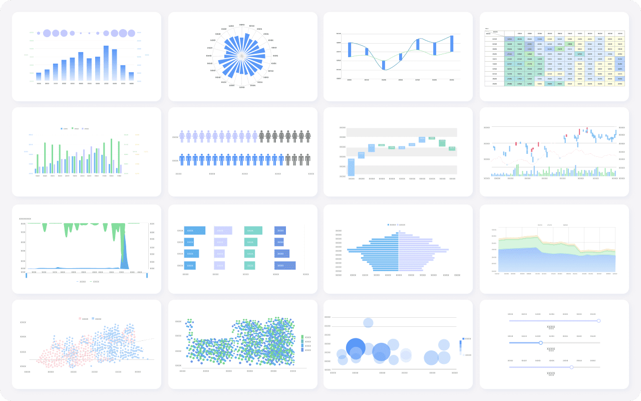
You may wonder, what are the 16 types of chart? Here is a quick list:
| Chart Type | Chart Type | Chart Type | Chart Type |
|---|---|---|---|
| Bar Chart | Column Chart | Line Chart | Area Chart |
| Pie Chart | Doughnut Chart | Scatter Plot | Bubble Chart |
| Histogram | Heatmap | Treemap | Waterfall Chart |
| Radar Chart | Funnel Chart | Gantt Chart | Box Plot |
Choosing the right chart helps you present your data visualization clearly. Bar charts, line charts, scatter plots, and box plots stand out as some of the most popular options in industry surveys. FineBI, a leading self-service BI tool, supports a wide range of charts and makes the visualization process simple.
What Are The 16 Types of Chart
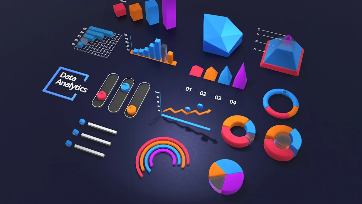
When you ask, "what are the 16 types of chart," you discover a diverse set of tools for data visualization. Each chart serves a unique purpose, helping you turn raw data into clear insights. Below, you will find a brief overview of the most popular types of charts and types of graphs used in business and scientific analysis.
Bar Chart
A bar chart uses horizontal bars to compare values across categories. You can easily see which group stands out. Bar charts work well for ranking, frequency distributions, and part-to-whole comparisons.
Column Chart
Column charts display data with vertical bars. These charts are ideal for showing trends over time and handling time-sensitive data. You can use them to highlight changes from one period to another.
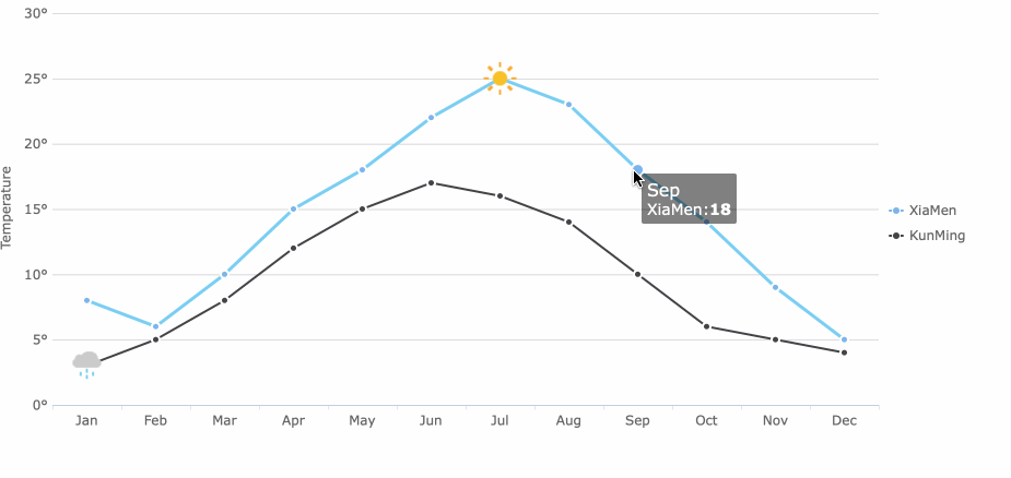
Line Chart
Line charts connect data points with lines, making them perfect for showing trends and changes over time. You can track performance, compare historical data, and spot highs and lows with a line chart.
Area Chart
Area charts fill the space below the line, helping you visualize cumulative totals. These charts show how individual parts contribute to the whole and make variations easy to understand.
Pie Chart
A pie chart divides a circle into slices, each representing a proportion of the whole. Pie charts are best for showing part-to-whole relationships. Limit the number of slices for clarity.
Doughnut Chart
Doughnut charts resemble pie charts but have a hollow center. You can use them to compare multiple datasets or display extra information in the center.
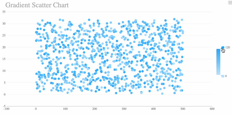
Scatter Plot
A scatter plot shows the relationship between two numeric variables. You can identify patterns, correlations, and trends in large datasets with this chart.
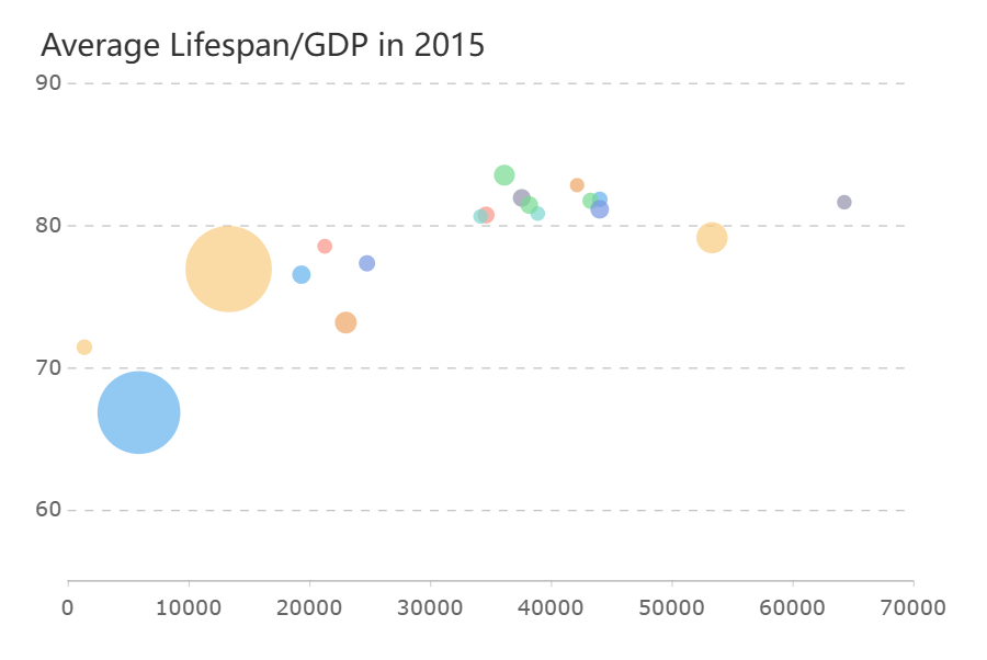
Bubble Chart
Bubble charts build on scatter plots by adding a third variable. The size of each bubble represents an extra dimension, giving you a richer view of your data.
Histogram
Histograms display the distribution of data across intervals. You can use them to explore data spread, detect outliers, and check for normality.
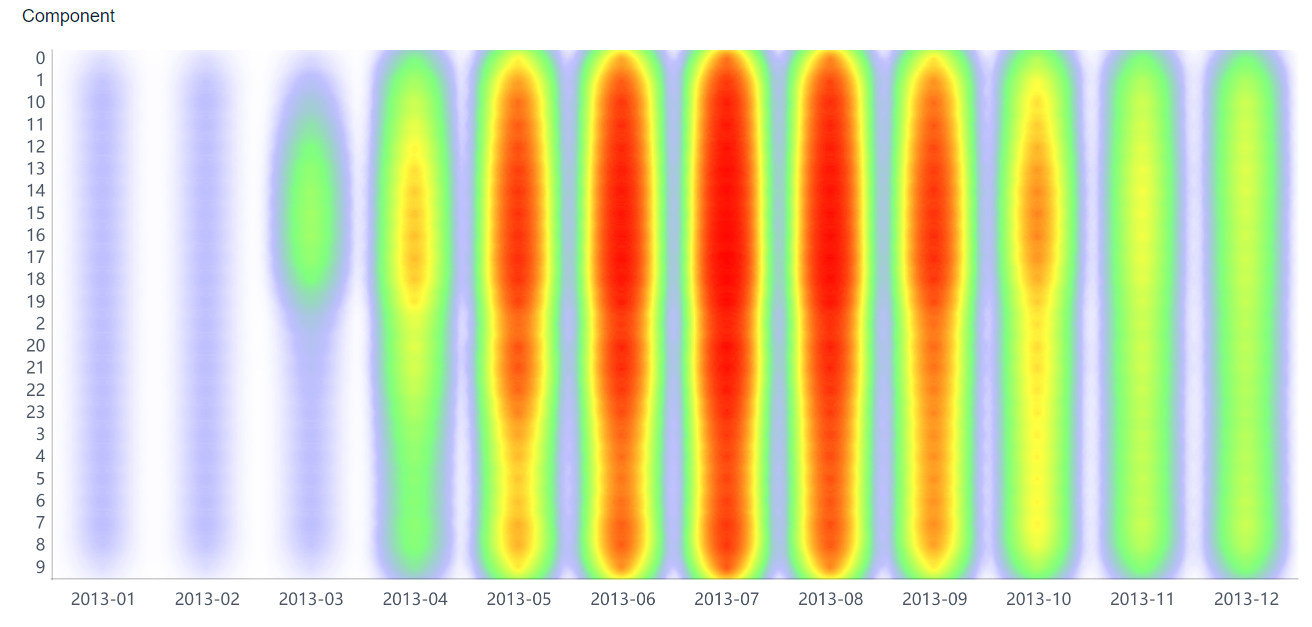
Heatmap
Heatmaps use color to represent values in a grid. These charts help you spot patterns, trends, and correlations in complex datasets.
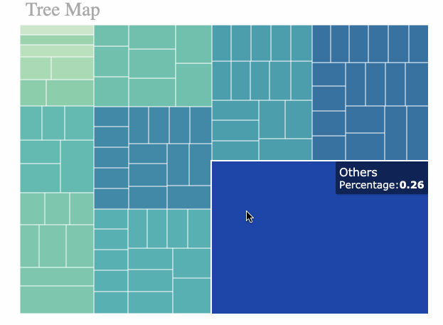
Treemap
Treemaps visualize hierarchical data using nested rectangles. You can simplify complex information and highlight trends or outliers with color scales.
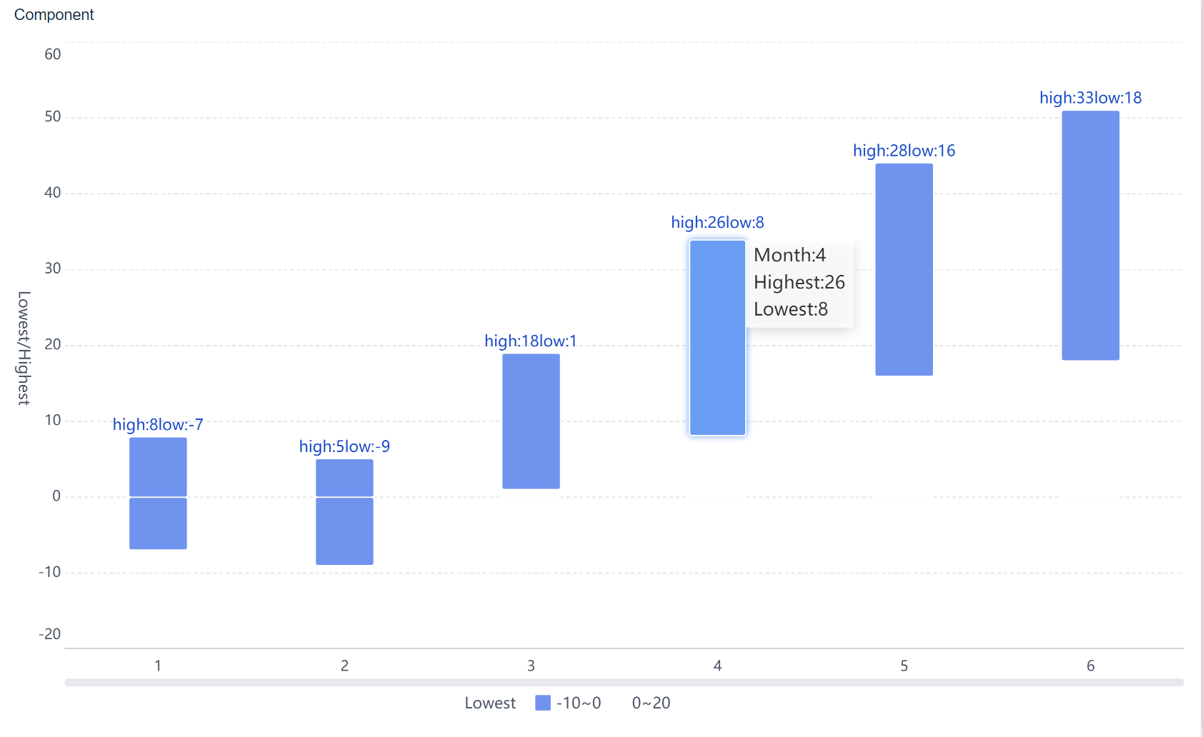
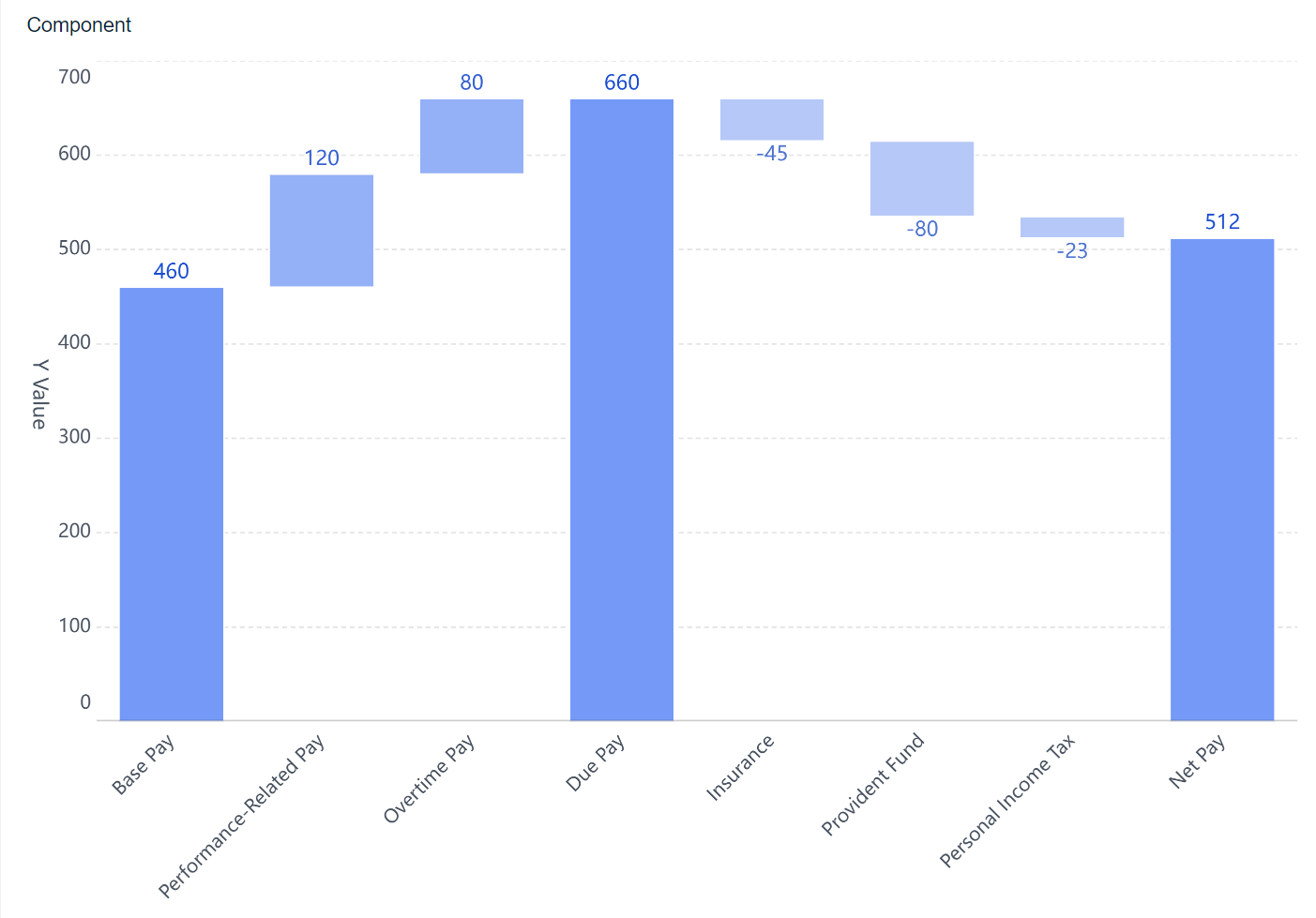
Waterfall Chart
Waterfall charts show how values change step by step. You can track cumulative changes and see how each factor affects the final result.
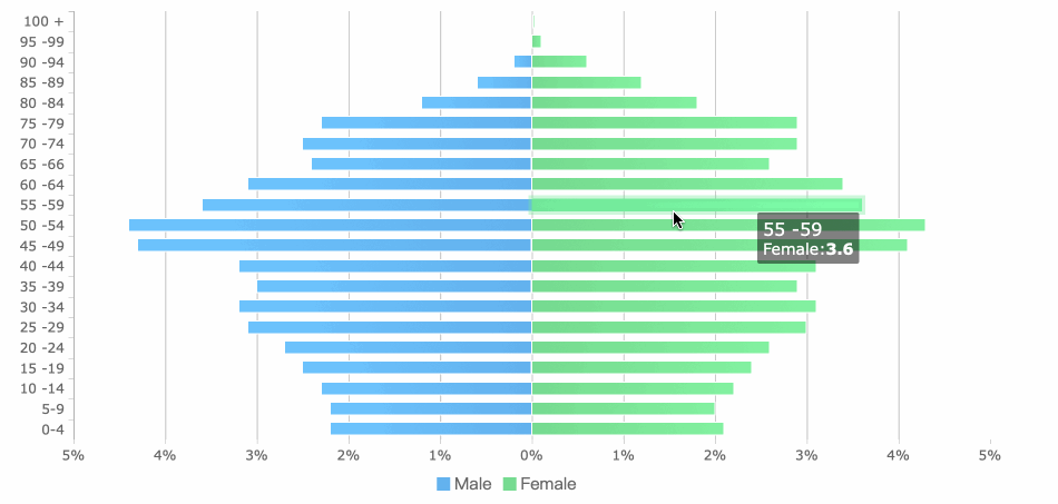
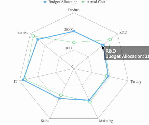
Radar Chart
Radar charts plot multiple variables on axes radiating from a center point. You can compare performance, features, or strengths and weaknesses across categories.
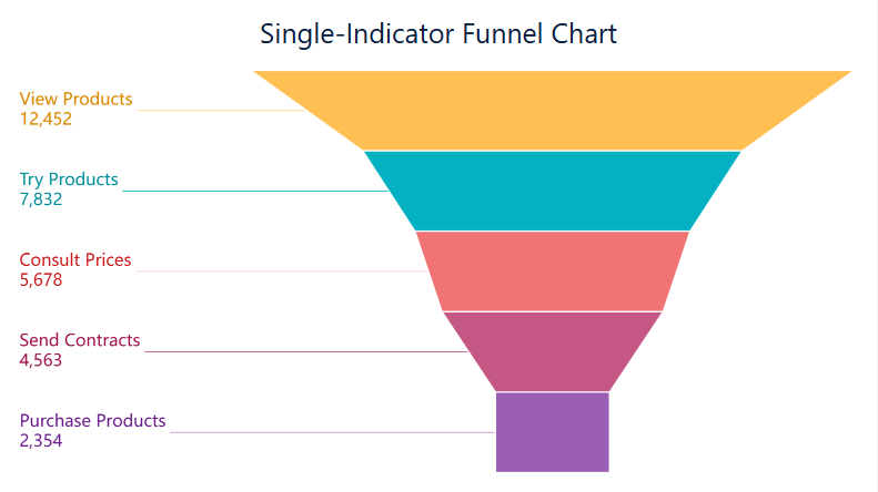
Funnel Chart
Funnel charts illustrate how data moves through stages. You can use them to track conversions, identify bottlenecks, and analyze drop-off points.
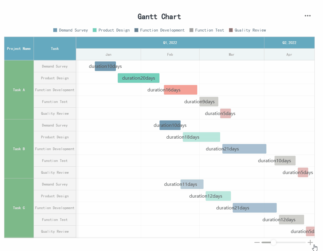
Gantt Chart
Gantt charts visualize project timelines, tasks, and dependencies. You can monitor progress, allocate resources, and identify critical paths.
Box Plot
Box plots summarize data distribution, showing median, quartiles, and outliers. You can compare groups and spot differences in spread and symmetry.
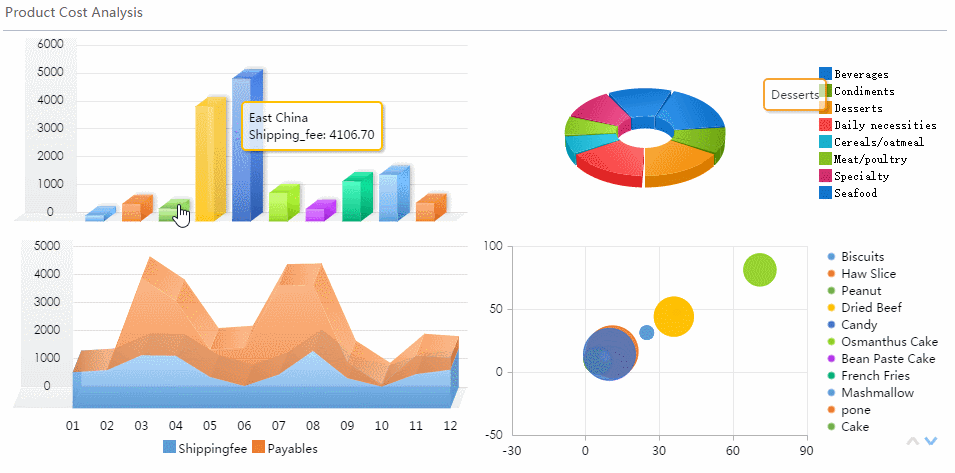
FineBI supports over 60 chart types, including all the types of charts listed above. You can create interactive dashboards with a simple drag-and-drop interface, making data visualization accessible to everyone.
What Are The 16 Types of Chart and Their Uses
Comparison Charts
When you want to compare values across categories, comparison charts give you clear answers. The most common types include the bar chart, column chart, and doughnut chart. You use a bar chart to compare quantities side by side. This chart works well when you have many categories or long labels. Bar charts help you rank items or see which group stands out.
A column chart is similar but uses vertical bars. You often use this chart to show changes over time or compare values in different periods. Doughnut charts and pie charts help you show proportions. You can use a doughnut chart when you want to compare a small number of categories and highlight relationships between them.
| Chart Type | Description | Primary Use Case |
|---|---|---|
| Bar Chart | Uses horizontal bars to compare values across categories. | Ranking, frequency distributions, part-to-whole comparisons. |
| Column Chart | Uses vertical bars to display data. | Showing changes over time, comparing periods. |
| Doughnut Chart | Circle chart with a hole in the center. | Emphasizing relationships between a few categories. |
| Combo Chart | Combines two chart types for complex data. | Comparing different data series and showing complex patterns. |
Tip: When you use comparison charts in FineBI, you can drag and drop your data fields to create instant visualizations. FineBI’s self-service data sets and real-time filtering help you explore differences between categories quickly.
Trend Charts
Trend charts help you see how data changes over time. The line chart is the most popular choice for showing trends. You use a line chart to track performance, spot patterns, and make predictions. Line charts connect data points, making it easy to see rises and falls.
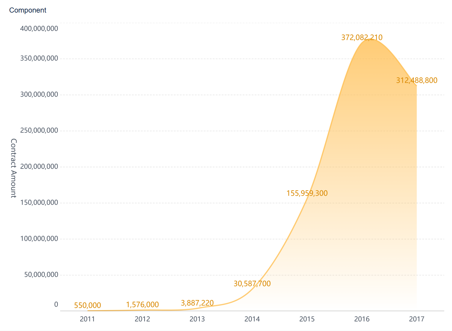
Area charts also show trends but fill the space below the line. This chart helps you see cumulative totals and how parts contribute to the whole. Overlapping area charts let you compare multiple data series and see how trends differ among groups.
- Line charts are essential for visualizing time series data, such as monthly sales figures.
- They help you identify seasonal patterns, spikes, or dips.
- Area charts work well when you want to show both trends and the size of each part.
Best Practice: Use trend charts in FineBI to analyze time-based data. You can apply real-time filters to focus on specific periods and use responsive dashboards to view trends on any device.
Distribution Charts
Distribution charts help you understand how your data spreads out. The most common types are the histogram and box plot. You use a histogram to see the frequency of values in a dataset. This chart shows you if your data clusters around certain values or spreads out evenly.
A box plot gives you a summary of your data’s range, median, and outliers. This chart helps you compare groups and spot differences in spread and symmetry.
| Chart Type | Purpose | Key Features |
|---|---|---|
| Histogram | Shows frequency of values in a distribution. | Reveals clustering, spread, and outliers. |
| Box Plot | Illustrates range and distribution of values. | Highlights quartiles, median, and outliers. |
- Always visualize the distribution before reporting summary numbers.
- Combine histograms and box plots for a complete view.
- Avoid too many bins in histograms, and do not use box plots with very small datasets.
Note: FineBI lets you create distribution charts with a few clicks. You can preview your data, adjust chart settings, and add info icons to help your audience understand the results.
Relationship Charts
Relationship charts help you find connections between variables. The scatter plot is the main tool for this purpose. You use a scatter plot to see if two variables move together. If the points form an upward trend, you have a positive correlation. If they slope downward, you see a negative correlation. Random points mean no correlation.
Bubble charts add a third variable by changing the size of each point. This chart gives you a richer view of your data.
- Positive correlation: Both variables increase together.
- Negative correlation: One variable increases while the other decreases.
- No correlation: Points scatter randomly.
The correlation coefficient measures the strength and direction of the relationship. It ranges from -1 (perfect negative) to +1 (perfect positive).
Tip: In FineBI, you can use relationship charts to explore patterns and test assumptions. Drag your variables into the chart, and FineBI will visualize the connections instantly.
Process Charts
Process charts map out workflows and steps in business operations. The most common types include flowcharts, waterfall charts, and funnel charts. You use a flowchart to show how a process moves from start to finish. This chart uses shapes to represent tasks and decisions.
A waterfall chart helps you track how values change step by step. You see how each factor adds or subtracts from the total. Funnel charts show how data moves through stages, such as sales pipelines or conversion funnels.
- Flowchart: Shows each step in a process.
- Waterfall Chart: Tracks cumulative changes.
- Funnel Chart: Visualizes drop-off points in a process.
| Type of Process Chart | Description | Best Use Cases |
|---|---|---|
| Basic Flowchart | Simple diagram of steps using standard symbols. | Documenting workflows, onboarding, brainstorming. |
| Waterfall Chart | Shows step-by-step changes in value. | Financial analysis, project tracking. |
| Funnel Chart | Illustrates data flow through stages. | Sales, marketing, process optimization. |
- Visual communication makes processes easier to understand.
- Process charts help you spot bottlenecks and clarify roles.
Best Practice: FineBI's drag-and-drop dashboard lets you map out processes visually. You can assign roles, track progress, and share workflows with your team.
Hierarchical Charts
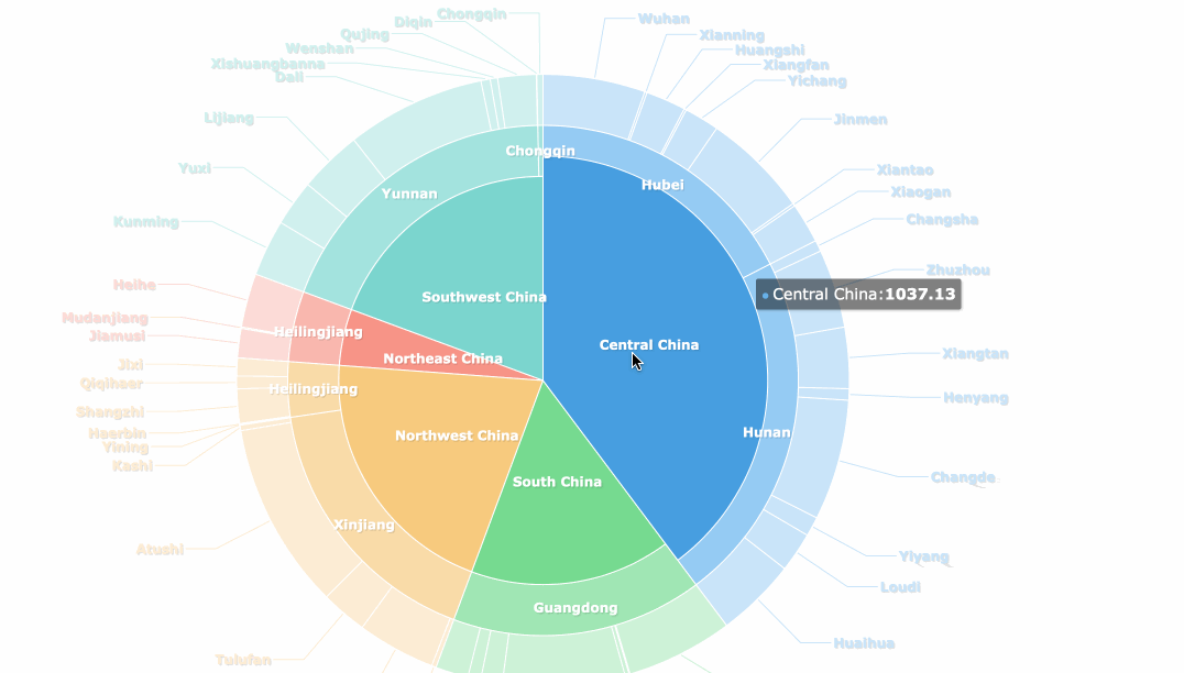
Hierarchical charts help you visualize structures and relationships within organizations or systems. Treemaps and hierarchy diagrams are the main types. You use a treemap to show how parts fit into a whole, using nested rectangles. Hierarchy diagrams display authority and responsibility from top to bottom.
| Evidence Description | Key Points |
|---|---|
| Hierarchy diagrams visualize authority and responsibility from top to bottom. | Clarify chain of command, streamline communication, foster order. |
| Employees understand their reporting structure. | Enhances efficiency, coordination, and prevents conflicts. |
| Visual representation simplifies complex structures. | A glance at the diagram conveys relationships more efficiently than text. |
- Hierarchical charts clarify who reports to whom.
- They help you streamline communication and prevent confusion.
Note: FineBI supports hierarchical charts, making it easy to present complex structures. You can use responsive dashboards to share these charts across your organization.
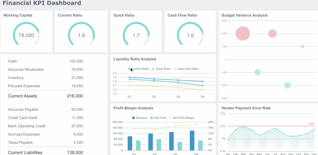
By understanding what are the 16 types of chart and how to use each for data visualization, you can choose the right chart for your needs. FineBI’s workflow—data integration, processing, visual exploration, and publishing—makes it simple to turn raw data into clear, actionable insights. With self-service data sets, real-time filtering, and responsive dashboards, you can create any of these types of charts and types of graphs with ease.
Choosing the Right Chart in What Are The 16 Types of Chart

Data Scenario Factors
Selecting the right chart for your data visualization starts with understanding your data scenario. You need to consider what story you want to tell and who your audience is. Different charts work best for different purposes. For example, a line chart helps you show trends over time, while a bar chart is better for comparing categories without a time element. The table below summarizes how to match your scenario to the recommended chart type:
| Criteria | Recommended Chart Type | Description |
|---|---|---|
| Comparing Data | Line Chart | Ideal for showing trends over time, allowing for multiple trends to be compared simultaneously. |
| Total Volume Important | Area Chart | Similar to line charts but fills the space between lines, useful for showing change over time. |
| No Linear Progression | Bar/Column Chart | Effective for comparisons without a temporal element, suitable for non-linear data. |
| Wide Range of Datasets | Treemaps | Efficiently displays a large amount of data in a hierarchical format. |
| Hierarchy Crucial | Pyramid Chart | Shows ordered distribution, useful for representing hierarchical data. |
| Frequency Highlighting | Word Clouds | Suggests frequency without focusing on actual numbers, useful for keyword analysis. |
| Comparison and Distribution | Stacked Bars/Columns | Combines comparison and distribution in one chart, showing total changes and component breakdowns. |
| Disparate Units Comparison | Dual Y-Axis Line Chart | Allows for comparison of different variables with separate units on the same canvas. |
| Complex Data | Tables | Provides detailed views and summaries, enhancing data searchability and understanding. |
You should always match your chart to your data and your message. This approach ensures your audience understands your insights quickly.
FineBI Chart Selection Tools
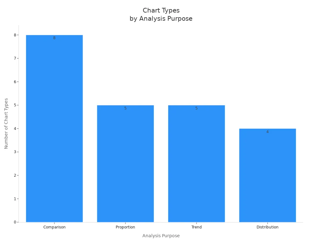
FineBI makes chart selection easy for everyone. Its intuitive interface guides you through the process of choosing the best chart for your needs. You can drag and drop your data fields, and FineBI suggests suitable charts based on your analysis goals. The platform supports a wide variety of charts for comparison, proportion, trend, and distribution analysis.
FineBI also offers augmented analytics, which means you get smart recommendations and can switch between chart types with a single click. This flexibility helps you experiment and find the most effective way to present your data visualization.
Visualization Tips
Choosing the right chart is only the first step. You also need to avoid common mistakes that can confuse your audience.
Selecting the appropriate chart type is crucial for crafting a clear data visualization. Making an incorrect choice can lead to misinterpretations, confusion, and hinder the audience’s understanding of your intended message.
Some frequent mistakes include:
- Using a pie chart when a bar chart would show differences more clearly.
- Overloading charts with too much data, which hides key insights.
- Picking a chart that does not match your data’s story.
- Keep your design simple and focused.
- Use color and labels to highlight important points.
- Test your chart with others to ensure clarity.
FineBI’s responsive dashboards and real-time filtering help you refine your charts and share them with your team, making your data visualization both accurate and engaging.
Choosing the right chart type helps you turn data into clear insights. When you match your chart to your data and goals, you make your visualizations more effective. In a data-driven business environment, strong chart selection—whether you use pie charts, bar charts, or scatter plots—accelerates decision-making and supports better outcomes. You can experiment with different chart types in FineBI to discover new perspectives. To apply your knowledge, follow these steps:
- Define your objective and gather clean data.
- Select the best chart, such as a pie chart for proportions.
- Create, refine, and share your visualization for feedback.

Continue Reading About What Are The 16 Types of Chart
Bar Chart Race: A Complete Guide
16 Types of Chart for Effective Data Visualization
22 Different Types of Graphs in Data Visualization: A Practical Guide


FAQ

The Author
Lewis
Senior Data Analyst at FanRuan
Related Articles

10 Good Data Visualization Examples by Use Case: Sales, Surveys, Finance & Time-Series
If you are searching for $1 , you likely do not need another gallery of pretty charts. You need examples that help sales leaders hit targets, finance teams explain variance, operations managers monitor change, and analys
Yida Yin
Jun 15, 2026

12 Best Data Visualization Tools for 2026: Features, Pricing, Pros and Cons
$1 are software platforms that turn raw data into charts, dashboards, maps, and interactive visual stories for analysis and decision making. 12 best data visualization tools for 2026 at a glance
Lewis Chou
Apr 23, 2026

Top 8 Data Visualization softwares You Should Try in 2026
Compare the top 8 data visualization software for 2026, including FineReport, Tableau, Power BI, and more to find the best fit for your business needs.
Lewis
Mar 19, 2026