Looking for the best kpi dashboard free tools in 2026? Here’s a quick list you should check out:
KPI dashboards help you track business performance, spot trends, and make smarter decisions. You’ll find global leaders like Tableau and Looker Studio, plus innovative picks such as FineBI. Take a look at this table to compare a few top choices and their strengths:
| Tool | Best For | Key Features |
|---|---|---|
| FineBI | Enterprises, manufacturers | Self-service analytics, data integration |
| Looker Studio | Beginners, small teams | Drag-and-drop builder, Google integrations |
| Tableau | Data-heavy teams | Powerful visualization, AI analysis |

You want to make smart decisions fast. That’s where a kpi dashboard free tool comes in. These tools help you track key performance indicator metrics without spending a fortune. You get cost savings, easy access, and quick setup. Take a look at the table below to see why so many businesses choose free kpi software over paid options:
| Advantage | Description |
|---|---|
| Cost savings | No need to invest in expensive software licenses |
| Easy access | Minimal technical skills required for use |
| Quick setup | Fast to deploy, delivering immediate insights |
| Affordability | Small businesses can access real-time insights without stretching budgets |
| Basic functionality | Aligns with user needs without requiring advanced features |
You can start using a dashboard right away. You don’t need a big IT team or a huge budget. You get real-time analytics and instant feedback on your business performance. As Tomas Keenan, founder of Step It Up Academy, puts it:
“KPIs provide valuable insights that help inform decisions, allowing businesses to make more informed choices about how best to achieve their desired outcomes. Ultimately, having clearly defined KPIs in place helps businesses stay on track and remain competitive in the marketplace.”
You can use kpi dashboard tools in almost any industry. Whether you run a coffee shop or a large manufacturing plant, you’ll find a dashboard that fits your needs. Here’s a quick look at how different industries use data dashboard software to track their most important metrics:
| Industry | Key Metrics Tracked |
|---|---|
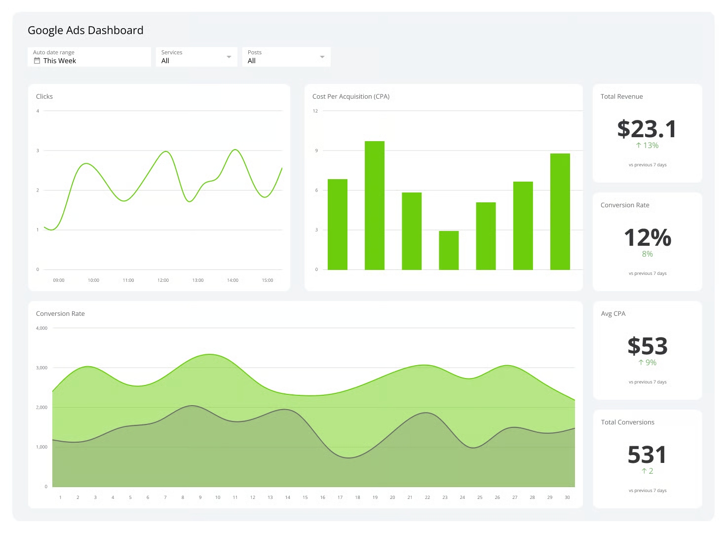
| Advertising | Cost Per Click, Click-Through Rate, Return on Ad Spend |
| Architecture | Project completion rate, client satisfaction, profit margin |
| Automotive | Production costs, resource management, efficiency |
| Boutique Hotel | Average Daily Rate, Revenue Per Available Room, labor costs |
| Coffee Shop | Costs, customer loyalty, added value offerings |
| Corporate Social Responsibility | Sustainability and ethical initiatives tracking |
| Education | Student enrollment, graduation rates, teacher-student ratios |
| Insurance Claims | Key metrics impacting claims management |
| Manufacturing | Efficiency of machines and processes |
| Retail | Consumer behavior insights, inventory levels |
You might track KPIs like calls made, appointments kept, or sales events attended. You can even test new products and use kpi software to see if your idea works. Sean Stevens, CEO at Immerse Education, says:
“I have discovered that it is essential to measure a few metrics for each of the four categories: employees, customers, processes and revenue.”
With free kpi software, you get the power to monitor, analyze, and improve your business—all in one place.
Choosing the right kpi dashboard free tool can feel overwhelming. You want something that fits your business, works with your data, and grows with you. Let’s break down what matters most.
You need features that make your dashboard useful every day. Look for real-time analytics, customizable dashboards, and easy-to-read KPI visuals. Many free kpi software options offer pre-built templates, so you can get started fast. Here’s a quick table to help you spot the essentials:
| Feature Description | Details |
|---|---|
| Real-time data monitoring | Up-to-the-minute refresh from 130+ integrations like Google Analytics |
| Customizable dashboards | Charts, graphs, and widgets for instant performance visibility |
| Integration capabilities | Connect with Microsoft 365, Excel, and Azure |
| KPI visuals | Color-coded indicators and trend analysis |
| Extensive KPI library | Templates and custom KPIs with automated calculations |
| Data integration | API connectors and direct Excel imports |
| Pre-built templates | Quick setup for marketing, sales, and finance |
Tip: If you want to track key performance indicator metrics, make sure your dashboard supports native KPI visuals and automated calculations.
You want your kpi dashboard to connect with the tools you already use. The best data dashboard software links up with spreadsheets, cloud warehouses, and popular business apps. Check out this table to see how some top tools stack up:
| Tool Name | Integration Capabilities | Data Sources Supported |
|---|---|---|
| Geckoboard | Connects to over 80 data sources | Multiple sources in a single view |
| BI Solution | Connects seamlessly to spreadsheets, cloud warehouses, etc. | Various third-party platforms |
Customizable interfaces and secure data handling matter too. You should feel confident that your data stays safe while you get the insights you need.
You want a dashboard that’s easy for everyone to use. Look for drag-and-drop design, interactive visualizations, and role-based access. As your business grows, your kpi software should scale up with you. Here’s a table showing how top features help your team:
| Feature | Benefit |
|---|---|
| Data Integration | Connects to major platforms and automates updates for scalability. |
| Visualization & Analysis | Custom dashboards improve understanding and decision-making. |
| Team & Client Features | Role-based access and mobile-friendly design boost collaboration. |
| Regular Updates | Keeps your dashboard aligned with business goals. |
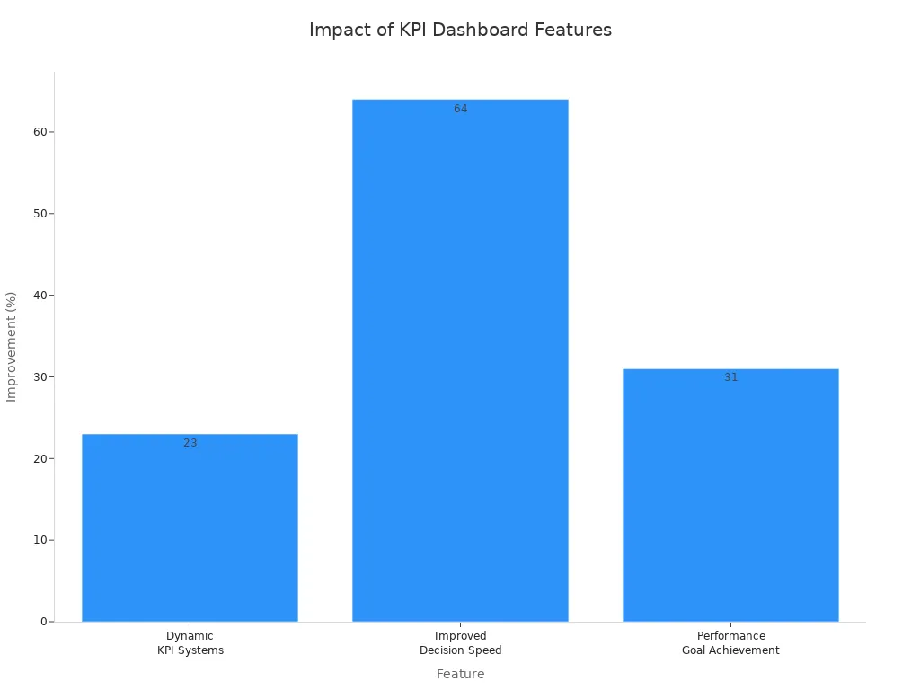
| Dynamic KPI Systems | Centralized data and automation improve goal achievement by 23%. |
| Improved Decision Speed | Speeds up decisions by 64% with clear response protocols. |
| Performance Goal Achievement | Companies with clear protocols are 31% more likely to meet their goals. |
You don’t need a data specialist to get started. Most tools let you set up dashboards and track KPIs with just a few clicks. As your business grows, your dashboard should keep up—so you always have the right insights at your fingertips.
Website: https://www.fanruan.com/en/finebi
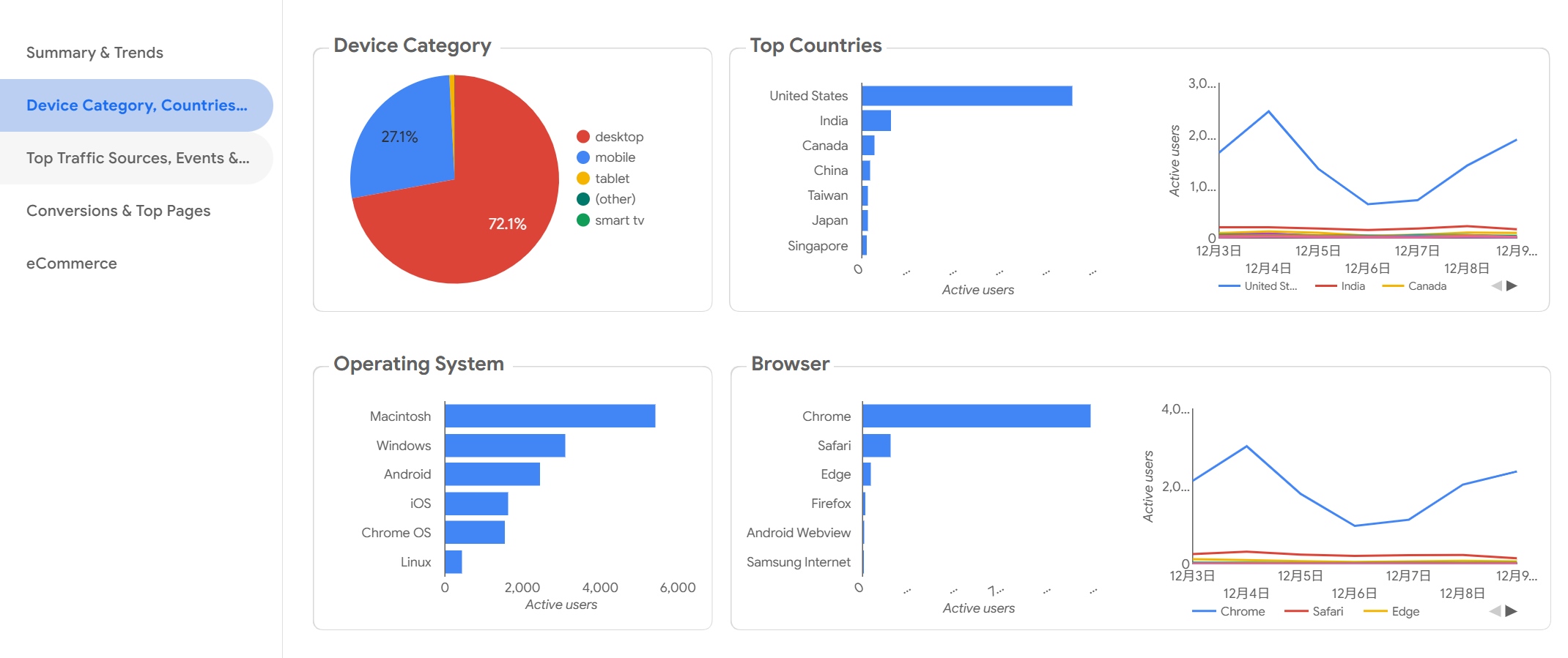
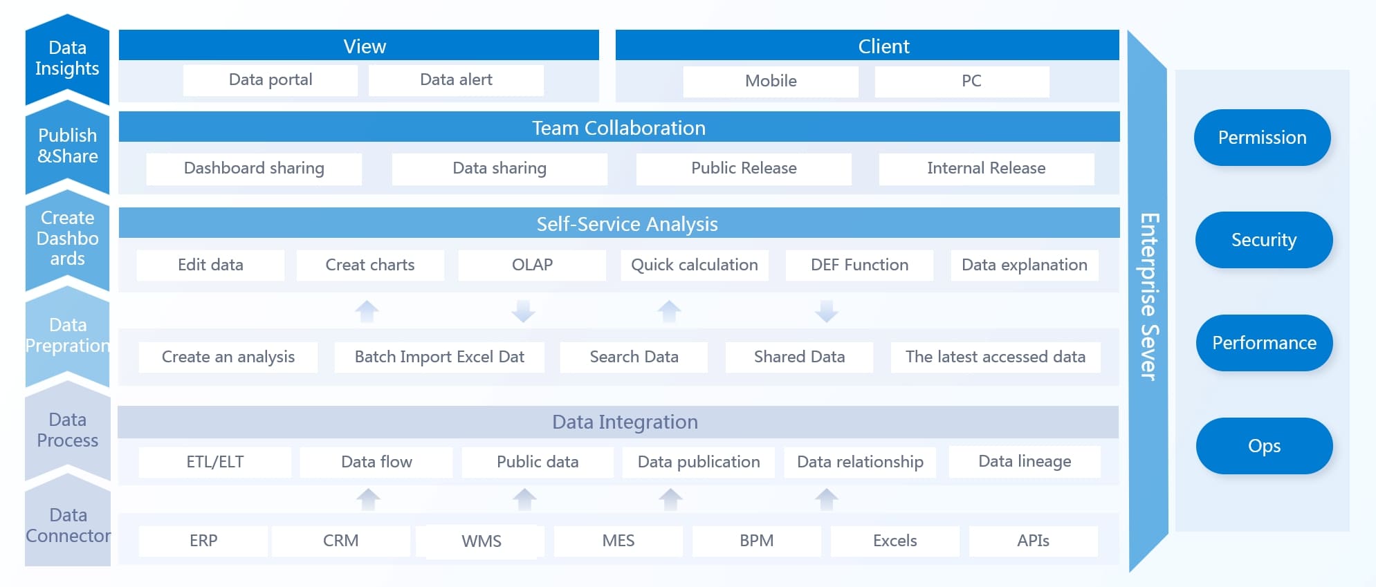
You want a kpi dashboard free tool that makes your life easier. FineBI stands out with its drag-and-drop interface and instant dashboard generation. You can ask questions in plain language and get answers fast. The AI-powered analytics help you focus on what matters most. FineBI supports Asian languages and local business practices, so you get a tool that fits your needs. You can share dashboards with your team and make decisions together.
Here’s a quick look at what sets FineBI apart:
| Feature | Description |
|---|---|
| User-Friendly Interface | No coding needed, easy for anyone to use |
| Self-Service Analytics | You can explore data and run OLAP analysis on your own |
| Mobile App Support | Access insights anytime, anywhere |
| Scalability | Start small and expand as your business grows |
| Real-Time Data Processing | Get timely updates and answers to complex queries |
| Integrated ETL Tools | Prepare your data with simple steps |
| Robust Data Modeling | Build complex visualizations without writing code |
| Elastic Cloud Deployment | Choose flexible deployment options for your business |
FineBI helps you move from manual reporting to real analytics. You save time and get more value from your data. Teams love how easy it is to create dashboards and share insights. You can use natural language querying, so even non-technical staff can analyze data. The competitive pricing makes FineBI a smart choice for mid-sized organizations.
“Implementing your product significantly streamlined our BI workflows — teams stopped spending time on manual data preparation and finally focused on real analytics and business value. It’s rare to see a tool that combines flexibility, speed and usability so well.”
— Alexander Snytko, Head of BI / Data Office, T2
Organizations like Dubai Ports and the African Development Bank have seen big improvements. Dubai Ports cut reporting time by half and automated kpi tracking. The African Development Bank delivered stalled projects and improved executive reporting.
If you work in manufacturing or a large enterprise, FineBI gives you powerful monitoring tools. You can store metadata for accurate calculations and use a monitoring probe to keep your system running smoothly. The log service records user actions, which helps with compliance and performance analysis. FineBI supports kpi software needs for complex environments, making it easier to track kpi and boost efficiency with real-time analytics.

Website: https://lookerstudio.google.com/navigation/reporting
You want a kpi dashboard free tool that feels familiar and easy to use. Google Looker Studio (formerly Data Studio) gives you a simple way to build custom dashboards for your business. You can create tailored reports that highlight your most important KPIs. If you work in marketing, you’ll love how Looker Studio connects with Google Analytics. You get instant access to campaign metrics and can track performance without jumping between platforms.
Here’s what you can do with Looker Studio:
You can use Looker Studio for marketing, sales, and website performance. The platform works well for small teams who want to share dashboards and collaborate. If you need real-time analytics, you might notice some limitations, but for most day-to-day reporting, Looker Studio covers the basics.
You want to know if Looker Studio is the right kpi software for your team. Take a look at this table to see the main advantages and disadvantages:
| Advantages of Google Looker Studio | Disadvantages of Google Looker Studio |
|---|---|
| Cost-effective | Lack of real-time updates |
| Easy to use | No support for Excel |
| Integration with Google services | Lack of comprehensive function support |
| Support for live connections | Slow speed with complex dashboards |
| Free of cost | No on-premise deployment option |
| Cloud-based and completely managed | Lack of native connector support for cloud-based data sources |
| Access and sharing controls | Complex visualizations not possible |
Tip: If you need advanced visualizations or want to connect to non-Google cloud sources, you may run into some roadblocks. Looker Studio works best for teams already using Google tools and looking for a straightforward dashboard solution.
You get a free, cloud-based dashboard that’s easy to share. You don’t need to worry about setup or maintenance. If your business relies on Google services, Looker Studio can help you track KPIs and collaborate with your team.
Website: https://www.microsoft.com/en-us/power-platform/products/power-bi
You want a tool that helps you see your business clearly. Microsoft Power BI Free gives you a strong set of features for tracking your key metrics. You can create and view dashboards, reports, and even apps. You get to interact with your content in "My Workspace," which makes it easy to keep everything organized. Power BI Free pulls your data into one place, so you always have a unified view of your company’s health.
You can customize how you see your data. Add performance and status indicators to highlight what matters most. If your KPI definitions or data sources change, your dashboard updates automatically. This means you always see the latest numbers. Power BI Free works well for small businesses, startups, and anyone who wants to try out kpi software without a big investment.
You can use Power BI Free for sales tracking, financial reporting, or project management. Many users like how it supports real-time analytics, so you can spot trends and react quickly. If you want to share your insights, you can export reports or publish them to the web.
Tip: Try using Power BI Free to test out new ideas before you commit to a paid plan. You might find it covers all your basic needs.
You want to know if Power BI Free is the right fit for your team. Here’s a quick look at what users like and what they wish was better:
| Pros | Cons |
|---|---|
| Affordability | Complexity |
| Strong data analytics capabilities | Limited compatibility |
| Extensive data source support | Dataset size constraints |
| Confusing licensing structure |
You get a lot of value for no cost. Power BI Free gives you powerful analytics and connects to many data sources. Some users find it tricky to learn at first. Others wish it worked with more systems or handled bigger datasets. The licensing rules can also be confusing if you want to upgrade.
If you want a flexible dashboard tool with strong analytics, Power BI Free is a solid choice for getting started.
Website: https://www.tableau.com/
You want a tool that makes your data look great. Tableau Public gives you a dashboard that stands out with colorful charts and interactive visuals. You can drag and drop your data to build custom reports. The platform offers a huge chart library, so you can show your KPIs in many different ways. If you love sharing your work, Tableau Public lets you publish dashboards online for everyone to see.
You can use Tableau Public for sales tracking, marketing analysis, or even school projects. Many users choose it for its strong data visualization features. You get options to customize your dashboard and make it fit your brand. If you need to track performance over time, you can set up interactive dashboards that help you spot trends and patterns. While Tableau Public does not offer full real-time analytics, you can refresh your data and keep your reports up to date.
Tip: If you want to learn more about data storytelling, Tableau Public has a big community where you can find inspiration and see what others have built.
Tableau Public brings a lot to the table, but you should know both sides before you dive in. Here’s a quick look at what makes it shine and where it might slow you down:
| Strengths | Weaknesses |
|---|---|
| Superior data visualization capabilities | High cost and complex pricing |
| Extensive chart library | Accessibility issues |
| Intuitive drag-and-drop interface | Steep learning curve |
| Customization options | |
| Interactive dashboards |
You get powerful visuals and interactive dashboards that make your data pop. The drag-and-drop interface helps you build reports quickly. You can customize almost everything, which is great if you want your dashboard to match your style. On the flip side, some users find Tableau Public hard to learn at first. The pricing can be confusing, and not all features are easy to access. If you need kpi software that everyone on your team can use right away, you might want to consider how much training you’ll need.
Website: https://databox.com/
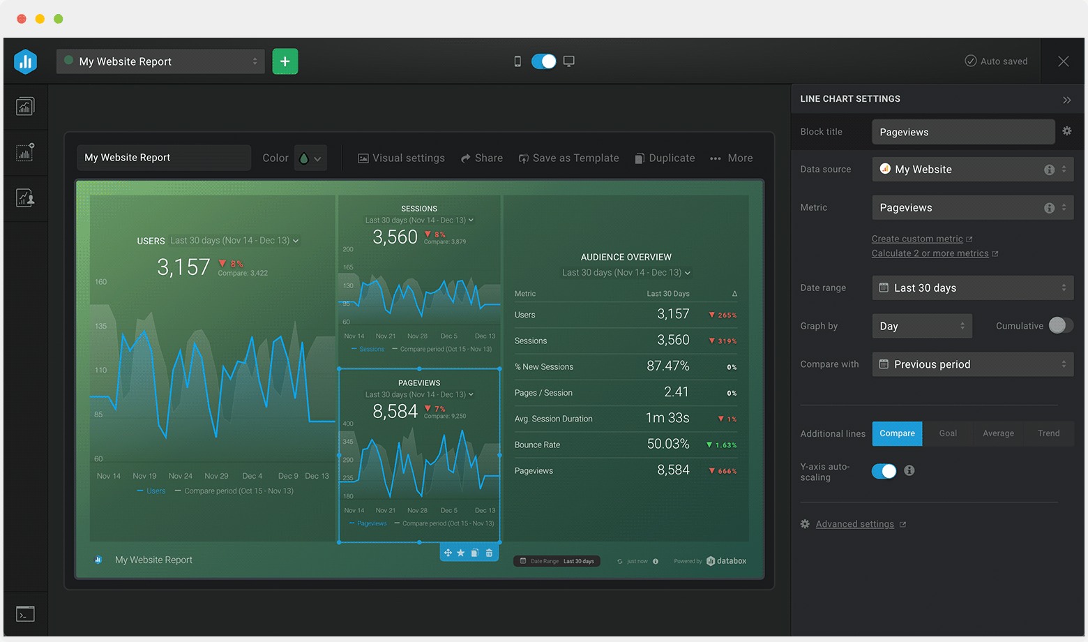
If you want a dashboard that feels easy and flexible, Databox Free KPI Software might be just what you need. You can design your own dashboards without any coding or design skills. The Dashboard Designer lets you drag and drop charts, graphs, and widgets to show your KPIs. You can combine data from different sources and create new metrics with the Calculated Metrics tool. This means you get answers fast, even if you have lots of data.
Databox helps you track your goals. The Goal Tracker shows your progress and helps you adjust your plans. You can connect several dashboards into one report using Looped Dashboards. This makes sharing results with your team simple. If you want to build custom metrics, the Custom Metric Builder gives you control without needing an engineer. You can even view your dashboards on TVs, mobile devices, or your Apple Watch.
Here’s a quick look at what Databox offers:
| Feature | Description |
|---|---|
| Dashboard Designer | Visualize KPIs and create dashboards without coding or design skills |
| Calculated Metrics | Combine data from various sources and calculate new metrics without coding |
| Goal Tracker | Visualizes goals against current performance for timely adjustments |
| Looped Dashboards | Connect multiple dashboard reports into one centralized report for easy sharing |
| Custom Metric Builder | Create specific metrics using dimensions and filters without engineering work |
| TV Dashboards | Access data across devices, including TVs and mobile devices |
You can use Databox for sales, marketing, finance, or operations. The platform supports real-time analytics, so you always see the latest numbers.
You want to know if Databox fits your business. Many users say the interface is easy to use. You get more than 70 Databox integrations and over 2,000 third-party connections. You don’t need to code, and you can work on desktop, mobile, TV, or even your Apple Watch. The drag-and-drop feature makes building dashboards quick. Automated notifications help you stay on top of your KPIs.
Some users mention that Databox sends a lot of emails and messages. Setting up integrations can take time, and some connections need extra work to optimize. You might spend a bit longer getting started, but once you do, the platform runs smoothly.
Tip: If you want a kpi software that works across many devices and gives you real-time analytics, Databox is a strong choice. Just plan a little extra time for setup.
Website: https://www.klipfolio.com/
You want a dashboard that gives you control over how your data looks and feels. Klipfolio Free lets you build custom visualizations with lots of options. You can connect to many data sources and use custom connectors to pull in the numbers you need. If you like to experiment, you’ll find plenty of ways to tweak your charts and graphs.
Klipfolio stands out for its customization, but you might notice it doesn’t offer many reporting templates. If you want a kpi software that feels flexible, Klipfolio gives you the tools to build your own style. Other platforms, like Databox, make it easier to start with pre-built templates, but Klipfolio gives you more freedom to design.
You want to know if Klipfolio Free fits your business. Take a look at this table to see the main advantages and disadvantages for small and medium companies:
| Advantages | Disadvantages |
|---|---|
| Easy setup with no coding required for basic use | Some users report confusion between Klips and PowerMetrics features |
| Cloud-based, allowing access to data anytime, anywhere | Complex customization can present a steep learning curve |
| Affordable and scalable pricing plans | Pre-built templates have limited modification options |
| Ability to control data access with password-protected links | Advanced customization may require technical skills |
| Wide variety of dashboard templates for quick setup | Working with large datasets might encounter issues with latency and refresh times |
You get quick setup and easy access, but you might need some time to learn the advanced features. Klipfolio works well if you want to build a dashboard that matches your business style. If you work with large datasets, you may notice some delays. For most small and medium businesses, Klipfolio Free offers a good balance between flexibility and control.
Website: https://www.domo.com/
You want a dashboard that brings your team together and helps everyone stay on track. Domo Free Dashboard Software does just that. You can unify your team around common goals and see actionable insights at a glance. The platform drives faster, smarter decisions for your whole organization.
Here’s how Domo helps you track KPIs and grow your business:
You get collaborative capabilities because Domo’s cloud-based dashboard works on both web and mobile devices. Your team can monitor KPIs wherever they are. Real-time monitoring lets you set up automatic notifications, so you never miss a change or a threshold breach. Domo integrates with your existing software, which means less manual work and easier KPI calculations.
If you want a kpi software that helps you make decisions quickly and keeps your team connected, Domo is a strong option.
You probably want to know what users like and dislike about Domo Free Dashboard Software. Here’s a table that breaks it down for you:
| Pros | Cons |
|---|---|
| User-friendly with drag-and-drop features | Complex pricing model |
| Integrates with over 1,000 data sources | Performance issues with large datasets |
| Real-time dashboards with rich visuals | Steep learning curve for advanced features |
| Collaboration features like Domo Buzz | Limited semantic modeling leading to inconsistencies |
| Enterprise-grade security measures |
You get a user-friendly experience with drag-and-drop features. Domo connects to more than 1,000 data sources, so you can pull in data from almost anywhere. The dashboard offers rich visuals and real-time analytics, making it easy to spot trends. Collaboration tools like Domo Buzz help your team work together. You also get strong security for your data.
Some users say the pricing model is confusing. You might notice performance issues if you work with very large datasets. Advanced features can take time to learn, and sometimes the modeling isn’t as consistent as you’d like.
Tip: If you want a dashboard that supports teamwork and gives you real-time analytics, Domo Free Dashboard Software is worth a look.
You want a dashboard that makes data easy to understand. Metabase Free KPI Dashboard gives you tools that help you analyze numbers without needing to be a tech expert. You can build dashboards that show your key metrics in a way that makes sense for your team. Sharing insights with others is simple, so everyone stays on the same page.
Take a look at this table to see what makes Metabase stand out:
| Feature | Description |
|---|---|
| User-friendly analytics | Provides intuitive tools for analyzing data without technical expertise. |
| Comprehensive dashboards | Enables users to create detailed dashboards that visualize key metrics. |
| Easy sharing of insights | Facilitates sharing of data insights with team members effortlessly. |
You can use Metabase for sales tracking, marketing performance, or project management. Many people like how easy it is to set up and start using. If you want to keep your team informed, Metabase helps you share updates quickly. You get a dashboard that works for beginners and lets you grow as your needs change. Some users wish for more advanced features, but for most small businesses, Metabase covers the basics.
You probably want to know what other users think about Metabase Free KPI Dashboard. Here’s a table that shows the most common pros and cons:
| Pros | Cons |
|---|---|
| Very easy to use | Lacks key features |
| Quite flexible | Tends to crash |
| Great for beginners | Lacks data governance |
| Open-source | Expensive for enterprise version |
Metabase is very easy to use. You don’t need much training to get started. The platform is flexible, so you can adjust your dashboard as your business grows. If you are new to kpi software, Metabase is a good place to begin. The open-source nature means you can use it for free and even customize it if you have technical skills.
On the downside, Metabase sometimes misses important features that bigger companies need. Some users say it crashes more often than they’d like. Data governance is limited, which might be a problem if you handle sensitive information. The enterprise version can get expensive, so you may want to stick with the free option if you run a small team.
Tip: If you want a simple dashboard for tracking KPIs and sharing updates, Metabase is a solid choice. For advanced needs like real-time analytics or strict data controls, you might look at other kpi software options.
You want a dashboard that gives you flexibility and speed. Mode Free KPI Software lets you connect to many data sources and add new ones easily. You can explore data without waiting for slow load times. Even if you are not a data analyst, you can use the tools for self-service reporting. Mode supports dynamic KPI tracking and lets you customize reports with HTML, CSS, JavaScript, Python, and R. You get a high-performance data engine that keeps your dashboards running fast. As you learn, you can refine your reports and tailor visualizations to fit your needs.
Take a look at this table to see why Mode is popular with data analysts and business intelligence teams:
| Feature | Benefit |
|---|---|
| Flexibility | Connects to various data sources and integrates new ones easily |
| Ease of Use | Non-analysts can explore tools without slow load times |
| Powerful Features | Supports dynamic KPI tracking and customization with coding languages |
| High-Performance Data Engine | Optimizes speed for real-time analytics and interactive tools |
| Customization | Lets analysts refine reports and tailor visualizations |
You can use Mode for sales tracking, marketing analysis, or operations management. The platform works well for teams that want to build custom dashboards and track KPIs in real time.
Mode Free KPI Software brings many advantages to your organization. You get accountability because team members know who owns each KPI. Transparency lets everyone see performance data, which helps build trust. Benchmarking allows you to compare your results with industry standards or competitors. Scalability means you can use Mode whether you run a small startup or a large corporation. Customization lets you track the metrics that matter most to your business.
| Advantage | Description |
|---|---|
| Accountability | Clarifies responsibility for specific KPIs |
| Transparency | Enables stakeholders to access performance data |
| Benchmarking | Compare performance against industry standards or competitors |
| Scalability | Adjusts to fit small startups or large corporations |
| Customization | Tracks metrics that align with your unique objectives |
You should watch out for a few challenges. Poorly chosen KPIs can lead to unwanted behaviors. If you focus too much on numbers, you might miss important qualitative factors. Unclear or unreachable KPIs can cause stress and disengagement. Sometimes, teams may manipulate data just to meet targets. Rigid KPIs can stifle creativity and experimentation. Tracking too many metrics can dilute your focus and slow down progress.
Tip: Choose KPIs that match your goals and encourage positive actions. Keep your dashboard simple and focused for the best results.
You want a tool that keeps things simple. SimpleKPI Dashboard Free does just that. You can set up your dashboard in minutes. The interface feels clean and easy to use. You don’t need to be a data expert to get started. Just pick your metrics, add them to your dashboard, and you’re ready to track performance.
SimpleKPI lets you monitor goals, targets, and trends. You can visualize your progress with colorful charts and graphs. The platform supports a wide range of KPIs, so you can track sales, marketing, finance, or operations. If you want to share results, you can export reports or invite your team to view the dashboard online.
You get access to real-time analytics. This means you always see the latest numbers. You can set up alerts for important changes. If you want to keep your team in the loop, SimpleKPI makes it easy to share updates and insights.
Tip: Try using SimpleKPI to track your team’s weekly goals. You’ll see where you stand and what needs attention.
You probably want to know if SimpleKPI fits your needs. Here’s a quick look at the main advantages and disadvantages:
| Pros | Cons |
|---|---|
| Easy to set up and use | Limited advanced customization |
| Clean, intuitive interface | Fewer integrations than some rivals |
| Good for small teams and beginners | Basic reporting features |
| Supports a wide range of KPIs | Some features require paid upgrade |
| Export and sharing options available |
You’ll like how quickly you can get started. The platform works well for small businesses or anyone new to kpi software. If you need deep customization or lots of integrations, you might find the free version a bit limited. For most users, SimpleKPI offers a straightforward way to track what matters.
You get a dashboard that feels easy to use. You don’t need technical skills. Your team sees key metrics at a glance. Geckoboard works well for small businesses or teams that want to keep things simple. If you need deep customization or advanced reporting, you might look at other kpi software. For most users, Geckoboard offers a straightforward way to track performance and boost team engagement.

You want to pick the right dashboard for your business. Let’s look at how the top free KPI tools stack up. Here’s a table that shows what matters most when you compare them:
| Tool | User Interface | Customization | Integration | Security | Mobile | Support | Data Visualization | Real-Time Analytics |
|---|---|---|---|---|---|---|---|---|
| FineBI | Intuitive | High | Extensive | Strong | Yes | Yes | Advanced | Yes |
| Looker Studio | Simple | Moderate | Google Apps | Good | Yes | Limited | Good | Limited |
| Power BI | Modern | High | Wide | Strong | Yes | Yes | Advanced | Yes |
| Tableau | Visual | High | Wide | Good | Yes | Yes | Superior | Limited |
| Databox | Clean | Moderate | Many Apps | Good | Yes | Yes | Good | Yes |
| Klipfolio | Flexible | High | Wide | Good | Yes | Yes | Good | Yes |
| Domo | Modern | High | Extensive | Strong | Yes | Yes | Advanced | Yes |
| Metabase | Simple | Moderate | Wide | Basic | Yes | Limited | Good | Limited |
| Mode | Clean | High | Wide | Good | Yes | Yes | Advanced | Yes |
| SimpleKPI | Simple | Moderate | Basic | Good | Yes | Yes | Good | Yes |
Tip: When you compare tools, look for a dashboard that matches your team’s skills and connects with your favorite apps.
You want a tool that fits your industry and company size. Here’s a quick guide:
Note: If you need mobile access or strong customer support, check those features before you decide.
You want to make the best choice for your business. Start by thinking about your team’s skills and the data you use every day. If you need lots of customization, pick a tool with flexible dashboards. If security matters, choose one with strong privacy controls. For teams on the go, mobile compatibility is key. Don’t forget to check customer support options. The right dashboard helps you see your numbers clearly and make smarter decisions.
You’ve seen how free KPI dashboard tools can help you track performance and make smarter decisions. Each tool has strengths, so pick one that matches your team’s needs and skills. Try FineBI if you want powerful analytics and easy sharing. Test other platforms to see what fits best.
Tip: Choose a dashboard that grows with your business. You’ll get better results and save time.

How to Craft an Effective Analytics Dashboard
Store Performance Dashboard: Your Retail Command Center
How Dashboard Blooket Transforms Student Engagement in the Classroom
How to Access the Chrysler Employee Portal and Dashboard Anywhere
How to Access the Chrysler Employee Portal and Dashboard Anywhere

The Author
Lewis
Senior Data Analyst at FanRuan
Related Articles

Payment Analytics Dashboard: 12 KPIs Every Operations Leader Should Track to Cut Revenue Leakage
Losing revenue to declines? Discover 12 essential KPIs to track in your payment analytics dashboard to stop leakage and manage disputes.
Lewis Chou
May 05, 2026

SOC Dashboard Explained: 12 Essential KPIs, Views, and Workflows Security Teams Use
Learn about SOC dashboards, the 12 essential KPIs for security teams, and how they centralize alerts and workflows for faster threat detection and response.
Lewis Chou
May 05, 2026

EMR Dashboard Guide: 12 Metrics to Track for Faster Clinical and Operational Decisions
Learn the 12 essential EMR dashboard metrics to track for faster clinical and operational decisions, improving patient flow and revenue cycle management.
Lewis Chou
May 05, 2026


