If you are searching for good data visualization examples, you likely do not need another gallery of pretty charts. You need examples that help sales leaders hit targets, finance teams explain variance, operations managers monitor change, and analysts present insights without confusion. The business value is simple: good visuals reduce decision time, improve stakeholder alignment, and make complex data usable at a glance.

All dashboards in this article are built with FineBI.
What Makes Good Data Visualization Examples Worth Studying
Good data visualization examples are worth studying because they show how design supports decisions. A chart is not successful because it looks modern. It is successful because the intended audience can understand it quickly, trust it, and act on it.
At an enterprise level, weak visual design creates expensive problems. Teams misread trends, executives question the data, and reports get ignored. Strong visuals do the opposite: they compress complexity into an interpretable view, highlight what matters, and remove ambiguity.
What separates effective visuals from attractive but misleading charts
A good chart balances four essentials:
- Clarity: the main takeaway is obvious within seconds
- Accuracy: scales, labels, and calculations reflect reality
- Context: users know what they are seeing, why it matters, and compared to what
- Audience fit: the format matches the decision-maker’s level of expertise and objective
A visually attractive chart can still fail if it hides the baseline, exaggerates movement, overloads the screen, or uses color with no clear meaning.
Why use-case-based examples are more useful than random inspiration
Random inspiration galleries often show isolated visuals with little business context. That is rarely enough for a team building production dashboards or stakeholder-ready reports.
Use-case-based examples are more practical because they answer questions like:
- What should a sales manager see first?
- How should survey segments be compared without clutter?
- What is the clearest way to present budget vs actual?
- How can a time-series chart show trend without overstating volatility?
That is where the best good data visualization examples stand out: they are not generic. They are purpose-built.
10 Good Data Visualization Examples by Use Case
Below are 10 scenario-based examples organized by common business needs. Each one shows not just what to visualize, but why the design works.
Sales dashboards for tracking revenue, pipeline, and regional performance
Sales reporting is one of the clearest areas where strong visualization improves speed and accountability. Sales teams need to see target attainment, pipeline health, conversion movement, and regional gaps without opening five separate reports.
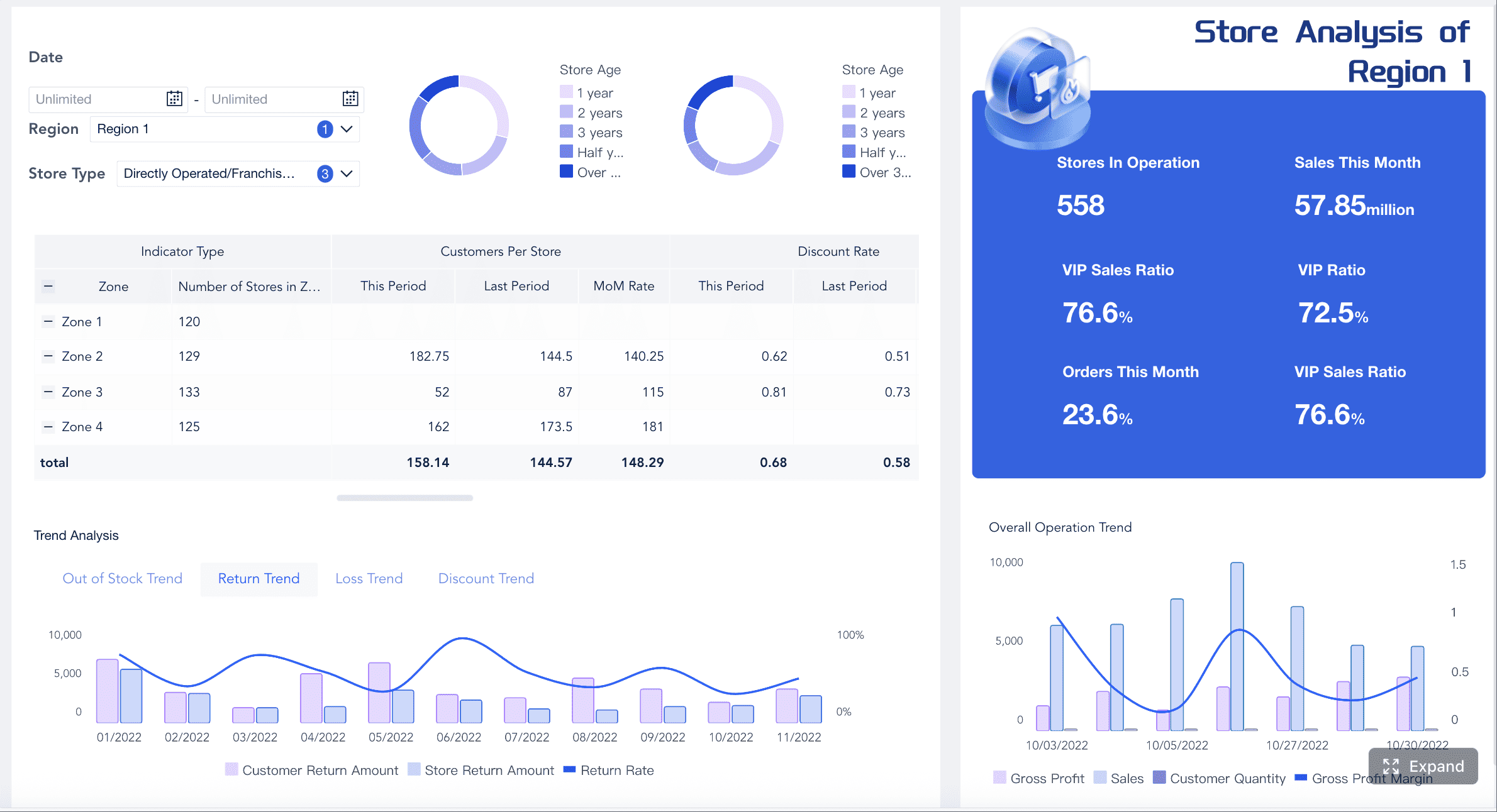
A good sales dashboard often combines several visual layers:
- KPI cards for total revenue, win rate, average deal size, and quota attainment
- Line charts for monthly or weekly revenue trends
- Bar charts for comparing reps, products, or regions
- Maps for geographic performance analysis
- Funnels for pipeline stage conversion
Example 1: Revenue trend dashboard with KPI cards and monthly line chart
This is one of the strongest good data visualization examples for executive reporting. At the top, place KPI cards for current revenue, growth rate, target achievement, and closed deals. Below that, use a line chart to show revenue over time.
Why it works:
- Executives see performance at a glance
- Trend direction is immediately visible
- Historical context supports quick interpretation
- The layout creates a natural visual hierarchy
Example 2: Pipeline dashboard with stage funnel and conversion bars
A sales pipeline dashboard should help managers answer one question fast: where are deals getting stuck?
Use:
- A funnel chart for stage progression
- Bar charts for conversion rates by stage
- A table with conditional formatting for aging opportunities
- A scatter plot for deal size vs probability if deeper prioritization is needed
Why it works:
- The funnel provides a high-level narrative
- Stage-level bars reveal friction points
- Conditional formatting turns operational risk into a visible signal
Example 3: Regional sales dashboard with map and ranked bar chart
When geography matters, pair a map with a sorted bar chart. The map supports spatial pattern recognition, while the bar chart gives precise comparison.
Why it works:
- Maps reveal territory clusters and whitespace
- Ranked bars prevent visual ambiguity
- Users can compare absolute and regional performance side by side
Survey results for comparing responses, sentiment, and demographic differences
Survey data becomes unreadable quickly when teams try to show every question, every response option, and every demographic cut in a single view. Good design here is about structure and compression.
Example 4: Likert-style survey dashboard for satisfaction and agreement analysis
Likert charts are ideal for agreement scales such as strongly disagree to strongly agree. Instead of showing raw percentages in multiple pie charts, a horizontal stacked bar is far easier to compare across questions.
Use:
- Diverging stacked bars centered around neutral
- Question sorting by positive or negative response share
- Color grouping that distinguishes favorable, neutral, and unfavorable responses
Why it works:
- Users can compare sentiment across many questions quickly
- Positive and negative patterns are immediately visible
- The design reduces clutter while preserving nuance
Example 5: Demographic response heatmap for segment comparison
When the goal is to compare age groups, regions, departments, or customer tiers, a heatmap is often more efficient than dozens of separate charts.
Use a heatmap for:
- Agreement rates by demographic segment
- NPS or satisfaction by audience category
- Survey completion by channel or cohort
Why it works:
- Dense comparisons fit in a compact layout
- Color intensity reveals patterns fast
- Small differences are easier to scan than in repeated bar charts
Example 6: Small multiples for multi-question or multi-segment survey reporting
Small multiples are one of the best good data visualization examples when consistency matters. Use repeated mini charts with identical axes to compare different questions, teams, or respondent groups.
Why it works:
- Consistent structure lowers cognitive load
- Users can scan patterns without relearning the chart
- It scales better than one oversized multi-series graphic
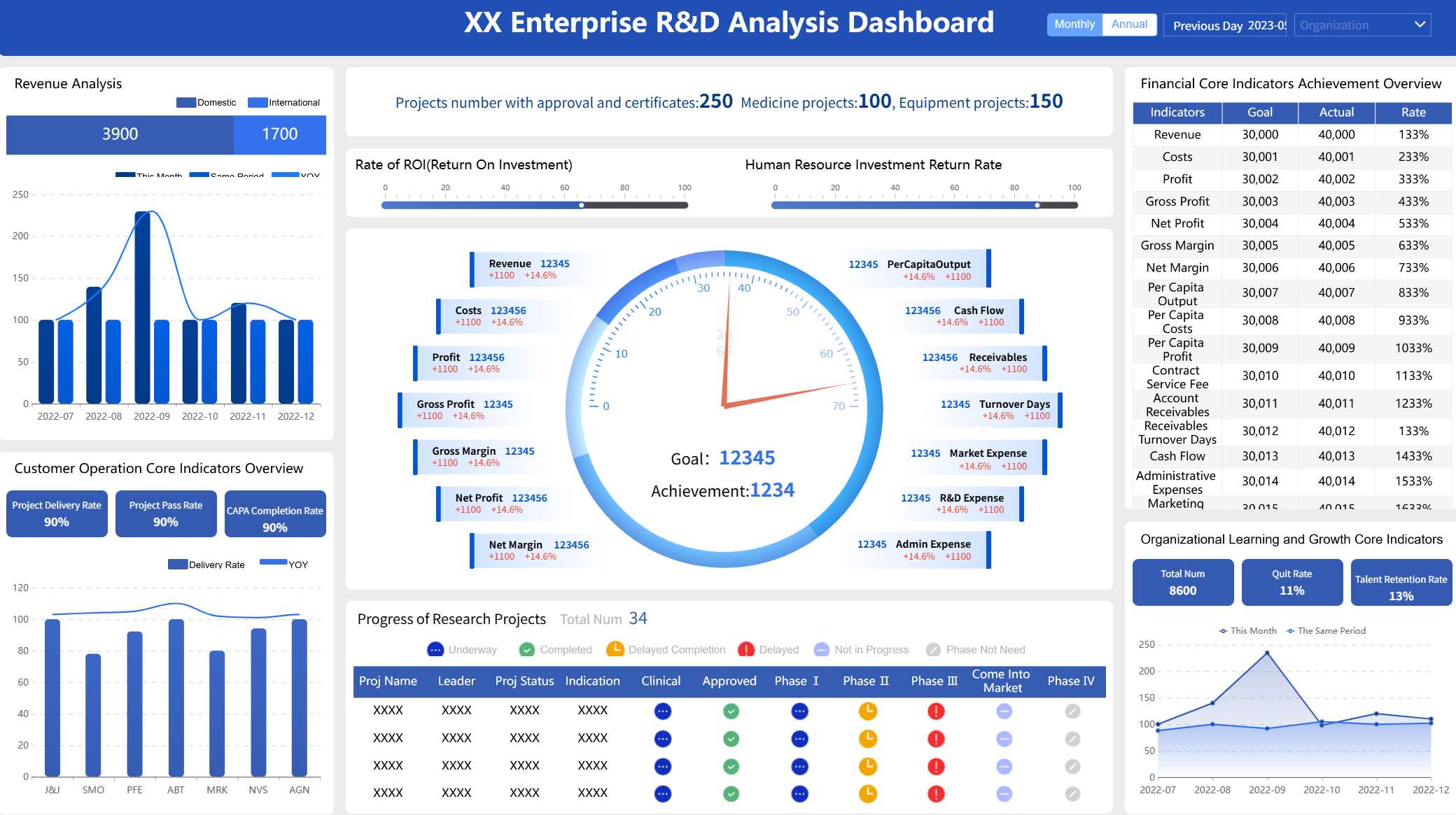
Finance reporting for budgets, cash flow, variance, and profitability
Financial visuals need more discipline than most business charts. Here, trust matters as much as readability. If labels are inconsistent or color use is careless, the audience may question the report before they engage with the insight.
Example 7: Budget vs actual dashboard with variance bars and annotation
A classic finance visualization uses grouped bars or bullet-style comparisons to show budget versus actual by department, cost center, or month.
Include:
- Grouped bar charts for budget and actual comparison
- Variance labels as percentage and absolute amount
- Annotations for major deviations
- Threshold colors used sparingly for over- or under-performance
Why it works:
- Period-over-period comparison is straightforward
- Variance becomes interpretable, not just visible
- Annotations provide executive-ready explanation
Example 8: Cash flow waterfall for movement across inflows and outflows
Waterfall charts are particularly effective for explaining how starting cash turns into ending cash through operating, investing, and financing activities.
Why it works:
- The narrative is sequential
- Positive and negative contributions are easy to distinguish
- Stakeholders can trace cause and effect without reading dense tables
Example 9: Profitability dashboard with margin trend and expense composition
Pair a line chart for margin trend with stacked bars or a treemap for expense composition.
Why it works:
- Trend and composition answer different but related finance questions
- Color discipline improves trust
- The dashboard helps users connect profitability pressure to cost structure
Time-series analysis for seasonality, growth, anomalies, and forecasting
Time-series analysis is often where otherwise strong dashboards go wrong. Teams overreact to short-term movement, use inconsistent time intervals, or blur actual performance with forecast data.
Example 10: Trend and forecast dashboard with line chart, sparkline table, and indexed comparison
A strong time-series dashboard typically combines several layers:
- Line charts for the primary trend
- Area bands for confidence intervals or forecast ranges
- Sparklines for compact category-level trend monitoring
- Indexed comparison charts to compare categories from a common starting point
Why it works:
- Long-term pattern is visible without losing detail
- Forecast is clearly separated from historical actuals
- Indexed comparison avoids misleading comparisons between differently sized series
Key Metrics (KPIs) to include in these scenarios
The best good data visualization examples are built around the right metrics, not just the right chart types.
 FineBI's Chart Visuals
Sales KPIs
- Revenue: total sales value in a given period
- Quota attainment: percentage of target achieved
- Pipeline value: total value of open opportunities
- Win rate: percentage of opportunities converted to closed-won
- Average deal size: average revenue per closed deal
- Sales cycle length: average time from lead to close
- Regional growth: revenue change by geography
Survey KPIs
- Response rate: percentage of invited participants who responded
- Completion rate: percentage of respondents who finished the survey
- Favorable score: share of positive responses
- Neutral score: share of middle responses
- Unfavorable score: share of negative responses
- NPS or satisfaction score: summary loyalty or satisfaction measure
- Segment variance: difference in scores across demographic groups
Finance KPIs
- Budget vs actual: planned spend or revenue compared with realized values
- Variance: absolute or percentage difference from plan
- Cash inflow/outflow: money entering and leaving the business
- Gross margin: revenue minus cost of goods sold as a percentage
- Operating margin: operating income as a percentage of revenue
- Expense ratio: expenses relative to revenue or budget
- Profitability by unit: margin by product, department, or region
Time-Series KPIs
- Growth rate: change over time in percentage terms
- Trend slope: overall direction and pace of change
- Seasonal index: recurring pattern relative to average
- Anomaly count: number of unusual spikes or dips
- Forecast variance: difference between projected and actual outcomes
- Moving average: smoothed trend over a rolling period
- Indexed performance: relative movement from a common baseline
Bad and Good Visualization Examples: What These Examples Get Right
Studying good examples only helps if you understand what they avoid. Many weak charts are not disastrous because of one huge mistake. They fail because of several small design choices that collectively reduce comprehension.
Common mistakes that weaken otherwise useful charts
Here are the issues I see most often in enterprise reporting:
- Overloaded dashboards with too many charts competing for attention
- Distorted axes that exaggerate small changes
- Poor labels that force users to guess units, periods, or categories
- Confusing color choices with no semantic logic
- Inconsistent time intervals that break trend interpretation
- 3D effects and decoration that add visual noise
- Too many series in one chart without emphasis or grouping
A sales dashboard with 20 widgets may look comprehensive, but it often performs worse than a focused layout with six well-prioritized components. A finance chart with bright, arbitrary colors may appear dynamic, but it can undermine trust if users cannot tell whether red means loss, risk, or simply category C.
Practical criteria for judging whether a chart is actually effective
Use this checklist before sharing a chart with stakeholders.
Readability
- Can the viewer identify the main message in under 5 seconds?
- Are labels, units, and time frames visible and unambiguous?
- Is the layout scannable on desktop and mobile?
Integrity
- Does the chart represent the data honestly?
- Are axes, baselines, and scales appropriate?
- Are forecast and historical data clearly separated?
Emphasis
- Is attention directed to the most important takeaway?
- Are annotations used only where needed?
- Is color reserved for meaning rather than decoration?
Actionability
- Does the chart answer a real business question?
- Can the intended user decide what to do next?
- Is there enough context to support confident interpretation?
How the Good Data Visualization Examples Drive Engagement
Strong visuals do more than explain data. They improve engagement because they lower effort. When a chart is intuitive, the audience spends less energy decoding and more energy discussing implications.
Storytelling techniques that make charts easier to understand
Good business storytelling in data visualization is not about drama. It is about sequencing information so the user understands the narrative in the right order.
Useful techniques include:
- Top-down hierarchy: start with KPIs, then trend, then detail
- Callouts: highlight the one spike, drop, or variance that matters most
- Captions: state the takeaway directly beneath the chart
- Progressive disclosure: show summary first, detail on click or filter
- Annotations: explain events, policy changes, campaigns, or anomalies
Interactivity can help, but only when it supports a clear use case. Filters, drill-down, and hover detail are useful when users need to explore segments. They are a distraction when the report’s purpose is to communicate one simple conclusion.
 An Interactive Dashboard created by FineBI
Design patterns readers can reuse in their own reports
Across these good data visualization examples, several patterns repeat:
| Design pattern | Where it works best | Why it works |
|---|---|---|
| KPI cards above charts | Executive dashboards | Establishes immediate context |
| Sorted bars | Ranking comparisons | Reduces scan time |
| Diverging stacked bars | Survey sentiment | Clarifies positive vs negative balance |
| Waterfall charts | Cash flow and variance explanation | Shows sequential contribution |
| Sparklines in tables | Category trend monitoring | Adds compact trend context |
| Indexed lines | Time-series comparison | Normalizes different starting values |
| Annotations on exceptions | Finance and operations | Adds trust and decision context |
These patterns are reusable because they align with how decision-makers consume information: quickly, selectively, and with a bias toward action.
How to Choose the Right Visualization for Your Data and Audience
The right chart is determined by the business question, not by personal preference. That sounds obvious, but many reporting problems begin when teams start with a favorite chart type instead of the decision they need to support.
Match chart types to business questions instead of aesthetic preference
Use this practical mapping:
For comparison
Best choices:
- Bar charts
- Grouped bars
- Bullet charts
- Dot plots
Use when asking:
- Which region performed best?
- How does actual compare to target?
- Which department exceeded budget?
For composition
Best choices:
- Stacked bars
- Treemaps
- Waterfall charts
Use when asking:
- What makes up total spend?
- How does product mix change over time?
- Which items contribute most to change?
For distribution
Best choices:
- Histograms
- Box plots
- Heatmaps
Use when asking:
- How are response times distributed?
- Are scores tightly clustered or spread out?
- Which segments show concentration or extremes?
For relationship
Best choices:
- Scatter plots
- Bubble charts
- Correlation matrices
Use when asking:
- Does deal size relate to win rate?
- Is spend associated with profitability?
- Which variables move together?
For trend
Best choices:
- Line charts
- Area charts
- Sparklines
- Indexed line charts
Use when asking:
- Is revenue growing?
- Are we seeing seasonality?
- Is the latest dip meaningful or temporary?
Audience knowledge matters too. Senior executives often need summary-first visuals with direct takeaway labeling. Analysts may need denser views with drill-down. Frontline managers usually need highly actionable dashboards tied to thresholds and workflow.
Actionable Best Practices for Building Better Visualizations
If you want to create your own versions of these good data visualization examples, follow these consultant-style implementation steps.
1. Start with one decision, not one dashboard
Before selecting a chart, define the operational question:
- What decision should this chart support?
- Who will use it?
- What action should follow?
If a visualization answers multiple unrelated questions, split it.
2. Prioritize metrics using visual hierarchy
Put the most important metrics first and largest. Use a clear reading flow:
- KPI summary
- Primary trend or comparison
- Breakdown by segment
- Supporting detail table
This prevents users from getting lost in low-priority information.
3. Use color as a semantic tool
Assign color deliberately:
- Green for positive performance, if culturally appropriate
- Red for risk, loss, or underperformance
- Neutral tones for context
- One accent color for emphasis
Do not use six bright colors when only one metric needs attention.
4. Add context directly into the chart
Do not assume the audience remembers last quarter’s target or the reason behind a spike. Add:
- Reference lines
- Benchmark labels
- Short annotations
- Variance percentages
- Time period definitions
Context is what turns a chart into a business tool.
5. Test comprehension before publishing
Before rollout, ask a target user:
- What is the main takeaway?
- What concerns or opportunities do you see?
- What would you do next based on this chart?
If the answer is vague or delayed, revise the visualization.
Build a Simple Review Process Before Publishing a Chart
A lightweight review process dramatically improves reporting quality, especially when multiple teams create dashboards independently.
Use this pre-publish workflow:
Data review
- Validate source data and refresh timing
- Check calculations, filters, and aggregation logic
- Confirm that outliers are real, not data issues
Design review
- Ensure the title states the business question
- Verify axis labels, legends, and units
- Remove unnecessary gridlines, decoration, and redundant labels
Accessibility review
- Check color contrast
- Avoid relying on color alone for meaning
- Ensure charts remain readable on smaller screens
Decision review
- Confirm that the chart answers a real stakeholder need
- Make the takeaway visible without interaction
- Add drill-down only where exploration adds value
Final Takeaway: Why These Good Data Visualization Examples Matter
The best good data visualization examples are not memorable because they are flashy. They are memorable because they help people decide faster and with more confidence. A sales dashboard should surface risk and opportunity. A survey report should reveal sentiment and segment gaps. A finance view should strengthen trust. A time-series chart should clarify change without exaggerating noise.
That is the standard worth aiming for.
If you are building dashboards for enterprise teams, the most practical approach is to combine strong chart selection, disciplined design, clear KPI structure, and a tool that supports interactive analysis without sacrificing clarity. FineBI is a natural fit for that kind of work, especially when you need business-ready dashboards that are both self-service and presentation-ready.
 Get Ready-to-Use Dashboard Templates in Fine Gallery
FAQs
A strong example makes the main takeaway clear within seconds, uses accurate scales and labels, and gives enough context for the audience to act on the insight. It should support a real decision, not just look visually appealing.
Start with the question you need to answer, then match the chart to that purpose. Line charts work well for trends over time, bar charts for comparisons, funnels for stage movement, and maps for geographic patterns.
The most common issues are distorted axes, too many colors, cluttered layouts, and missing baselines or labels. These choices can exaggerate changes or make the message harder to interpret correctly.
Group related questions, reduce clutter, and use formats that support comparison across responses and segments. For example, diverging stacked bars are often clearer than multiple pie charts for Likert-scale survey data.
Use interactivity when viewers need to explore segments, filter details, or compare categories on demand. If the goal is a fast executive summary, keep the core view simple and make the key message visible immediately.


The Author
Yida Yin
FanRuan Industry Solutions Expert
Related Articles

12 Best Data Visualization Tools for 2026: Features, Pricing, Pros and Cons
$1 are software platforms that turn raw data into charts, dashboards, maps, and interactive visual stories for analysis and decision making. 12 best data visualization tools for 2026 at a glance
Lewis Chou
Apr 23, 2026

Top 8 Data Visualization softwares You Should Try in 2026
Compare the top 8 data visualization software for 2026, including FineReport, Tableau, Power BI, and more to find the best fit for your business needs.
Lewis
Mar 19, 2026
10 Must-Have Data Visualization Tools for Modern Businesses
Compare the top 10 data visualization tools for 2025 to boost business insights, streamline analytics, and empower smarter decision-making.
Lewis
Dec 17, 2025