Picture this: You finish a big sale or complete a freelance project and want to see your earnings update right away. You open your phone and, with a tap, watch your numbers grow in real time. That’s the magic of a live earnings dashboard. You don’t need to wait for end-of-month spreadsheets or dig through emails. You get instant updates, which helps you feel more in control and confident about your finances.
What Is a Live Earnings Dashboard?
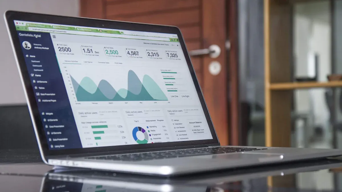
A live earnings dashboard is a tool that lets you see your income and financial data as it happens. You don’t have to wait for reports or dig through spreadsheets. Instead, you get instant updates and clear visuals that help you understand your money flow. With a live earnings dashboard, you can track sales, payments, and other earnings in one place. This makes it much easier to spot trends and make smart choices.
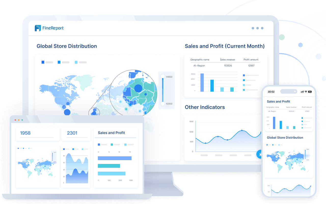
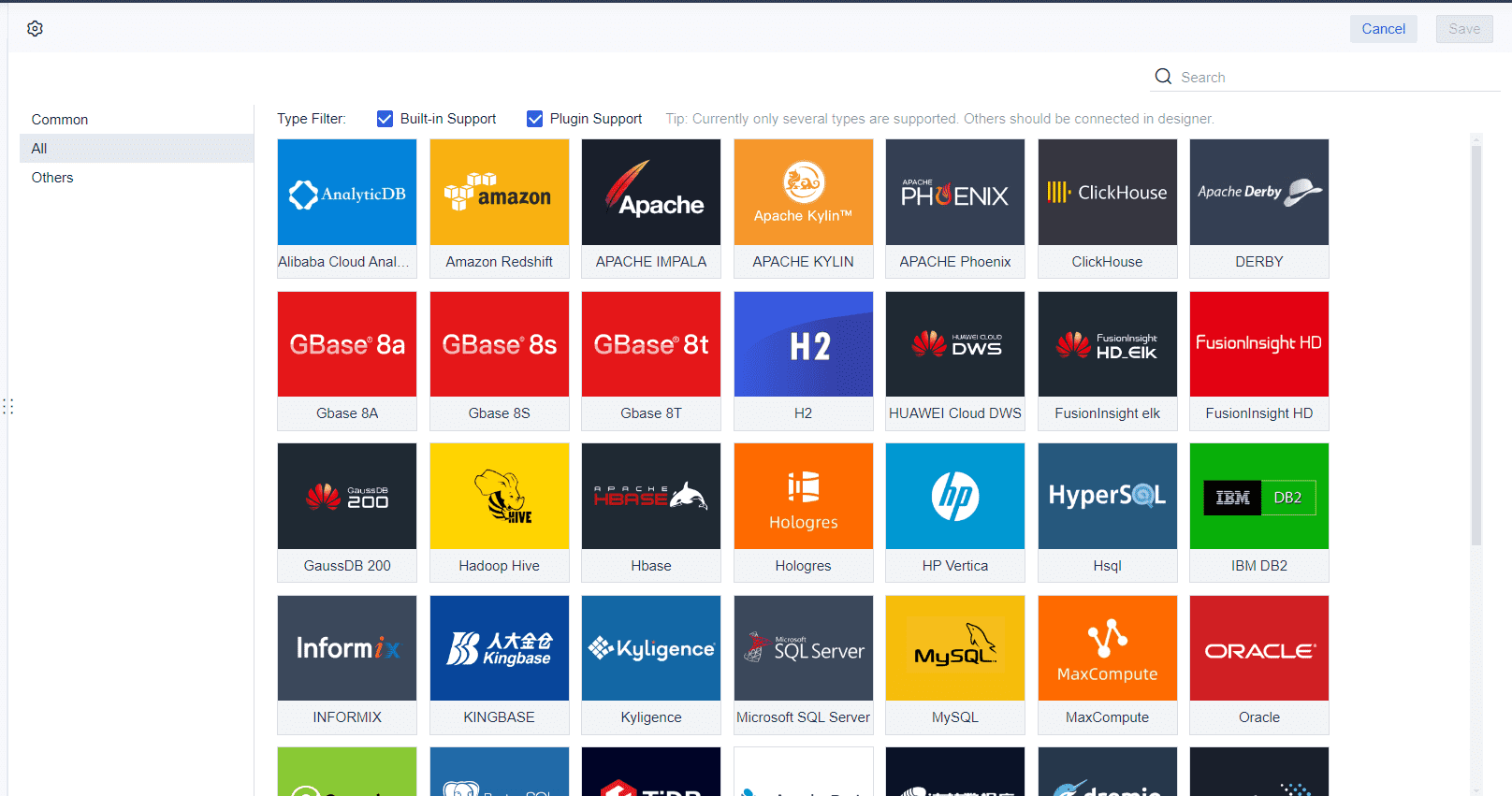
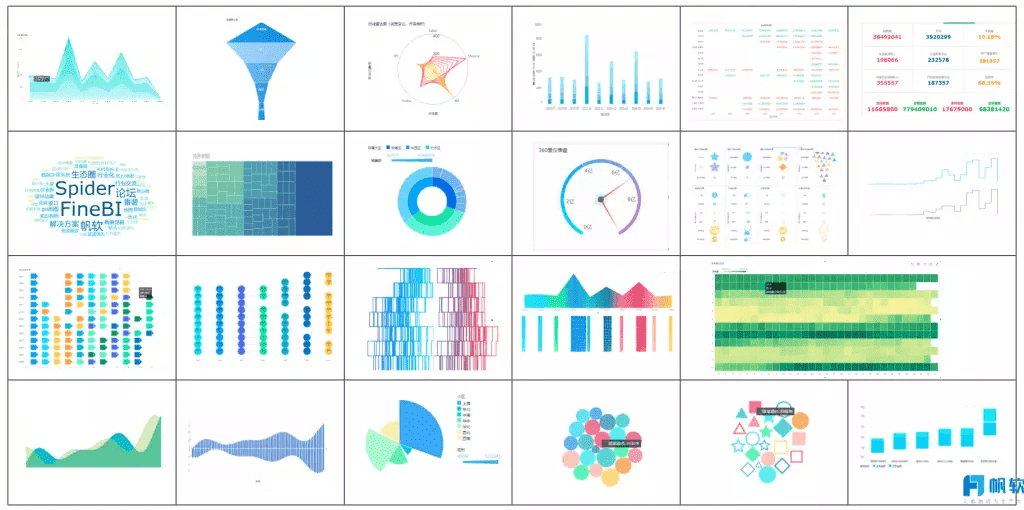
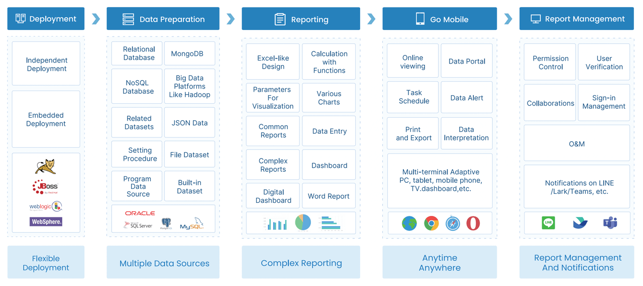
FanRuan is a leader in business intelligence and data analytics. Their FineReport software gives you a simple way to build your own live earnings dashboard. FineReport connects to many data sources and brings everything together in real time. You get a clear view of your finances, whether you’re at your desk or on your phone. FineReport’s real-time analytics help you stay on top of your earnings and make decisions quickly.
Key Features for Beginners
When you start with a live earnings dashboard, you want features that make your life easier. Here’s a quick look at what you should look for:
| Feature | Description |
|---|---|
| Time period controls | Change the view to see trends over days, weeks, or months. |
| Filtering options | Focus on certain types of earnings or time frames for better analysis. |
| Save and share | Save your favorite layouts and share them with your team. |
| Mobile-friendly design | Check your dashboard on your phone or tablet, wherever you are. |
| Customization options | Adjust the dashboard to fit your needs without feeling overwhelmed. |
FineReport offers all these features, so you can build a dashboard that fits your workflow. The drag-and-drop design makes it easy, even if you’re new to real-time analytics.
Why Real-Time Matters
Real-time analytics change the way you manage your money. You get up-to-the-minute updates, which means you can:
- Make decisions faster and with more confidence.
- See your cash flow as it happens.
- Adapt quickly if something changes in your business.
- Work better with your team because everyone sees the same numbers.
With real-time analytics, you can monitor key performance indicators and spot new opportunities right away. You don’t just react—you act with purpose. This level of insight builds trust and helps you grow your business, even if you’re just starting out.
Benefits of Real-Time Data Visualization
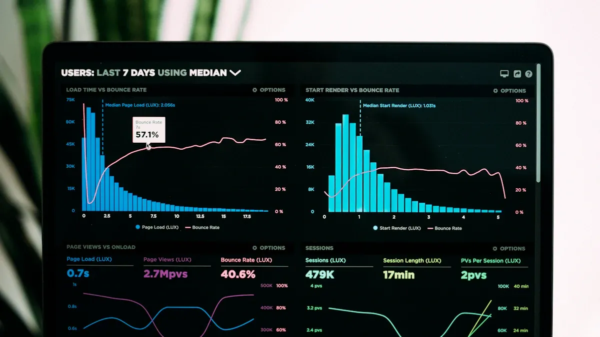
When you use real-time data visualization, you get a clear picture of your earnings and performance as they happen. You do not need to wait for reports or guess what is going on. This approach changes how you handle financial analysis and makes your daily work much easier.
Faster Financial Insights
Real-time data visualization gives you instant access to key numbers. You can see your revenue, cash flow, and other important details right away. This speed helps you spot trends and react quickly. Here is what you gain:
- You see your earnings update the moment a sale happens.
- You notice patterns and outliers before they become problems.
- You move from static reports to dynamic views that show you what matters most.
- You lead with proactive decisions instead of reacting after the fact.
FineReport’s real-time data visualization tools let you check your dashboard on your phone or computer. You always know where you stand, no matter where you are. This means you can keep up with your financial analysis and make changes on the fly.
Financial analysts often deal with complex data. Real-time data visualization updates your view every second, so you never miss a beat. You turn raw numbers into insights that help you grow your business.
Better Decision-Making
Making good choices starts with having the right information. Real-time data visualization makes your analysis simple and clear. You do not have to dig through spreadsheets or wait for someone to send you a report. Instead, you get visuals that highlight what matters.
| Key Findings | Details |
|---|---|
| Speed of Insights | Visuals are processed 60,000 times faster than text, enabling quicker decisions. |
| Retention Rate | People retain 80% of what they see versus 20% of what they read. |
| Collaboration Improvement | Visual tools bridge gaps between technical and non-technical teams. |
| Focus on Key Metrics | Dashboards highlight critical data, cutting through information overload. |
| Proven Results | Companies using visualization tools see up to 85% higher sales growth and improved efficiency. |
With FineReport, you can share your real-time data visualization dashboards with your team. Everyone sees the same numbers, which makes collaboration easy. You focus on the most important metrics and avoid information overload. This helps you make smarter choices and drive better results.
Tip: Real-time data visualization is not just for experts. Anyone can use it to improve their analysis and financial analysis skills. Start simple, and you will see the benefits right away.
Set Up Your Live Earnings Dashboard with FineReport
Ready to build your own live earnings dashboard? You don’t need to be a tech expert. FineReport makes the process simple and fun. Let’s walk through the steps together so you can start tracking your earnings in real time.
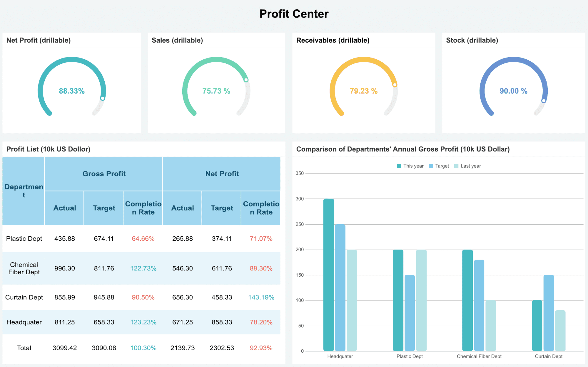
Define Your Goals and Metrics
Before you jump into design, think about what you want your dashboard to show. Ask yourself: What do I need to see every day? What helps me make better decisions? When you set clear goals, you create a dashboard that works for you, not against you.
Most beginners start with a few key metrics. These give you a full picture of your money flow and help you spot trends fast. Here are some of the most common metrics you’ll want to track:
- Cash Flow: See how money moves in and out so you can avoid surprises.
- Revenue: Track your sales and watch your growth over time.
- Gross Profit Margin: Check how efficiently you turn sales into profit after direct costs.
- Net Profit: Find out what’s left after all expenses for a true look at profitability.
- Accounts Receivable (AR): Keep an eye on unpaid invoices so you can follow up quickly.
- Accounts Payable (AP): Track upcoming bills to manage your outflows.
- Operating Expenses: Monitor where your money goes and spot areas to save.
- Runway (for startups): See how many months you can keep going with your current cash.
You don’t need to add every metric at once. Start with the basics, then add more as you get comfortable. Your dashboard should help you, not overwhelm you.
Connect Data Sources Easily
Now it’s time to bring your numbers to life. FineReport connects to almost any data source you use—Excel files, databases, cloud apps, and more. You can pull in sales data, payment records, or even inventory numbers. This means your dashboard always shows the latest information.
If you have data spread across different systems, FineDataLink can help. It acts like a bridge, pulling data from multiple places and syncing it in real time. You don’t have to worry about manual updates or missing numbers. FineDataLink handles the heavy lifting, so your dashboard stays accurate and up to date.
Here’s how you can connect your data in FineReport:
- Open FineReport and start a new dashboard project.
- Use the drag-and-drop interface to add your data sources. You can connect to databases, upload Excel sheets, or link to cloud services.
- If you need to combine data from different places, set up FineDataLink for seamless integration.
- Test your connections to make sure everything updates in real time.
You’ll see your numbers appear right away. No more waiting for end-of-month reports!
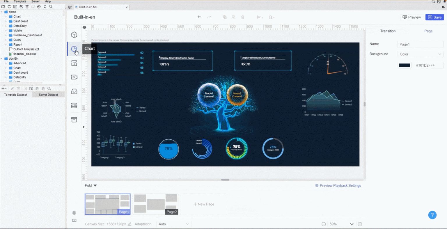
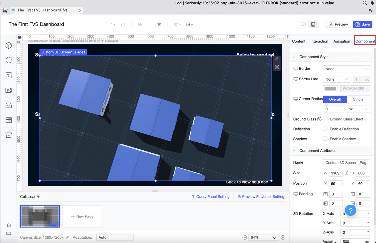
Design Your Dashboard Layout
Now comes the fun part—designing your dashboard. You want it to look good and work well on any device. FineReport gives you lots of options to make your dashboard both beautiful and useful.
Start by thinking about who will use the dashboard. Is it just for you, or will you share it with your team? User-facing dashboards should be clear and easy to read. Pick the most important metrics and put them front and center.
Here are some best practices for designing your dashboard layout in FineReport:
| Step | What to Do |
|---|---|
| Define your users | Know who will use the dashboard and what they need to see. |
| Identify key metrics | Choose the numbers that matter most for your goals. |
| Use color effectively | Pick colors that make sense and use them the same way throughout the dashboard. |
| Ensure readability | Use clear fonts and strong contrast so everyone can read the numbers easily. |
| Leverage interactive tools | Add filters, tooltips, and clickable charts to let users explore the data themselves. |
FineReport supports multi-screen self-adaptation, so your dashboard looks great on computers, tablets, and phones. You can add tables, charts, and widgets to show your data in different ways. Try different layouts—like adaptive or absolute—until you find what works best for you.
Tip: Don’t overload your dashboard with too much information. Less is more. Focus on the numbers that help you take action.
With FineReport, you can build a dashboard that grows with you. Start simple, then add more features as you learn. Business intelligence tools like FineReport give you the power to turn raw data into insights you can use every day.
You’re not just building a dashboard—you’re creating a tool that helps you make smarter choices, faster. Enjoy the process and watch your earnings story unfold in real time!

Dashboard Design Tips for Beginners
Designing your dashboard can feel exciting and a little overwhelming. You want it to look good, work well, and help you make smart decisions. Let’s break down some simple tips to help you build a dashboard that’s both powerful and easy to use.
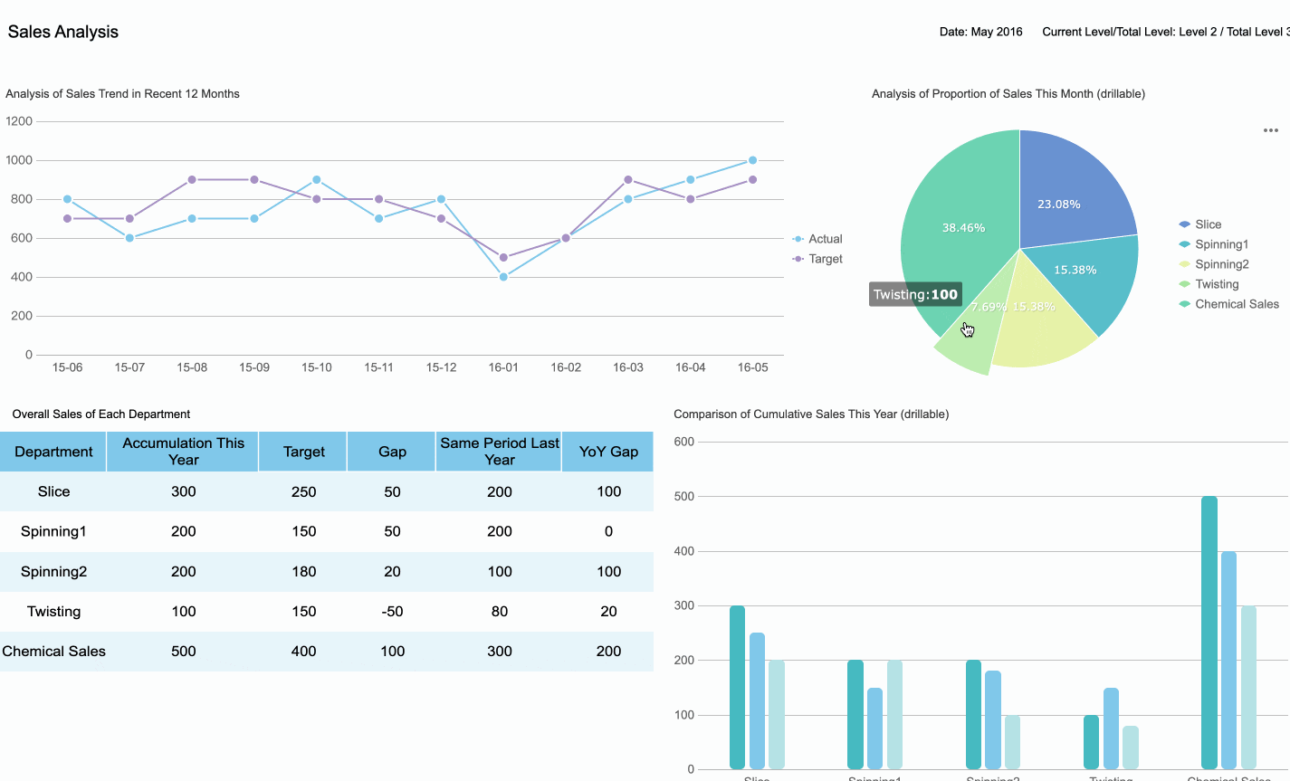
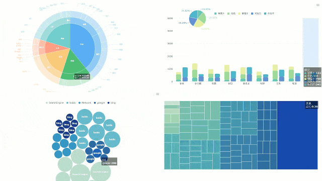
Choose the Right Charts
Picking the right chart makes your dashboard clear and helpful. You don’t need to use every chart type—just choose what fits your data best.
| Chart Type | Description |
|---|---|
| Bar Charts | Great for comparing categories like sales or survey results. |
| Line Charts | Perfect for tracking changes over time, such as revenue growth. |
| Scatter Plots | Excellent for exploring relationships between two numerical variables. |
FineReport’s drag-and-drop interface lets you add charts quickly. Try starting with bar charts to compare earnings, line charts to show trends, and scatter plots if you want to explore relationships. You can always switch things up as you get more comfortable with your dashboard.
Tip: Keep your dashboard simple at first. Too many charts can make things confusing.
Organize Data Clearly
A well-organized dashboard helps you find what you need fast. Group related numbers together and use clear labels. Consistency in design makes your dashboard easier to navigate. When you organize your dashboard, you reduce clutter and help everyone focus on what matters.
| Benefit | Description |
|---|---|
| Empowers faster decisions | Clear organization allows you to quickly find the information you need. |
| Enhances user experience | A well-structured layout improves satisfaction with the dashboard. |
| Minimizes training time | Beginners can navigate the dashboard more intuitively. |
| Reduces cognitive overload | Less clutter helps you focus on key insights. |
FineReport makes grouping and arranging data simple. You can drag and drop tables, charts, and widgets to create a dashboard that feels just right for you.
Ensure Mobile Readiness
You want your dashboard to work wherever you are. FineReport supports adaptive display on phones and tablets, so your dashboard looks great on any device. You don’t need to redesign your dashboard for each platform. One dashboard works everywhere.

Note: Responsive design means your dashboard adjusts automatically, saving you time and effort.
If you want an interactive dashboard, FineReport lets you add filters and clickable charts. You can explore your data on the go and make decisions from anywhere.
Building a dashboard doesn’t have to be hard. Start with these tips, use FineReport’s easy tools, and watch your dashboard become a daily helper.
Common Challenges and Solutions
Starting with a live earnings dashboard feels exciting, but you might run into a few bumps along the way. Let’s look at some common challenges and see how you can tackle them with FineReport.
Data Accuracy Issues
You want your dashboard to show the right numbers every time. Sometimes, you might see outdated or inconsistent data. This can happen if your dashboard doesn’t update often or pulls from different sources. You may also notice errors if someone enters the wrong information. To keep your data accurate, FineReport connects to your sources in real time and syncs updates instantly. You can set up automatic checks and alerts for missing or unusual data. This way, you always trust what you see.
Tip: Test your dashboard connections regularly. If something looks off, check your data sources and refresh your dashboard.
Avoiding Overload
Too much information on one screen can make you feel lost. You might see charts, numbers, and widgets everywhere, but not know where to look first. Beginners often struggle with dashboards that show every metric at once. FineReport helps you focus by letting you pick key performance indicators and hide less important details. You can use features like delta indicators, trend sparklines, and change animations to highlight what matters.
| Strategy | How It Helps |
|---|---|
| Prioritize key KPIs | Keeps your dashboard simple and focused |
| Use clear visual hierarchy | Guides your eyes to the most important data |
| Apply thresholds and status indicators | Shows you when something needs attention |
| Provide snapshot freeze or hover reveal | Offers extra context only when you need it |

Start with a few metrics. Add more as you get comfortable. Your dashboard should help you, not overwhelm you.
Keeping Data Secure
Protecting your financial data is a must. You don’t want sensitive information to end up in the wrong hands. FineReport gives you tools to keep your dashboard safe. You can assign roles so only the right people see certain data. Layered protection keeps out unwanted visitors. Regular reviews of access and audit logs help you spot problems early.
- Use multi-factor authentication for extra security.
- Mask sensitive details so only authorized users see them.
- Encrypt your data during storage and transmission.
With these steps, you keep your dashboard secure and your peace of mind intact.
Real-World Use Cases and Success Stories
You might wonder how a live earnings dashboard works in real businesses. Let’s look at some real-world examples where FineReport makes a big difference.
Financial Management Dashboards
When you use a live earnings dashboard for finance, you get more than just numbers. You see your cash position in real time. You know exactly how much money you have across all your accounts. FineReport helps you track inflows and outflows, so you can spot what drives your cash flow. You can even forecast your future cash position and get alerts if your balance drops too low. Here’s what you can do:
- Track your real-time cash position across all accounts.
- Categorize inflows and outflows to see where your money comes from and where it goes.
- Forecast cash flow to plan ahead.
- Get alerts when cash balances are low.
- Integrate multiple bank accounts for a complete view.
- Monitor accounts receivable and payable.
- Calculate your burn rate to manage spending.
- Prevent cash flow crises with early warnings.
- Make better decisions about vendor payments.
With FineReport, you stay ahead of your finances and avoid surprises.
Lean Production Monitoring
Manufacturing companies use live dashboards to keep their operations running smoothly. FineReport gives you accurate, up-to-the-second data. You avoid information silos because everyone sees the same numbers at the same time. Managers can make quick decisions and spot bottlenecks before they slow things down. Here’s a quick look at the benefits:
| Benefit | Description |
|---|---|
| Accurate data | See real-time, precise information instead of old reports. |
| Avoids information silos | All teams access the same current data. |
| Improved decision-making | Make smart choices fast with the latest numbers. |
| Enhanced operational efficiency | Find bottlenecks and use resources better. |
| Increased profitability | Boost equipment effectiveness and cut costs. |
You also get real-time visibility into key metrics, faster responses to problems, and better teamwork. FineReport helps you balance all your KPIs, so nothing gets missed.
Customer Success: Kintetsu & UnionPay Data Services
Let’s see how real companies use these dashboards. Kintetsu World Express wanted to manage customer information and logistics data better. With FineReport, they built a real-time dashboard that brought together data from different sources. Now, their sales teams can see customer visits and cargo volumes instantly. This change improved their efficiency and decision-making.
UnionPay Data Services faced challenges with scattered data and slow reporting. They used FineReport to create a unified dashboard for credit card revenue and customer engagement. The result? They improved system efficiency and could identify valuable customers with 90% accuracy. Their teams now make faster, smarter decisions and boost customer engagement.

Real-world dashboards help you see the big picture, act quickly, and grow your business with confidence.
Next Steps and Learning Resources
You’ve built your first live earnings dashboard. What comes next? You can keep learning and make your dashboard even better. Here’s how you can take your skills to the next level.
Explore FineReport Tutorials
FineReport offers step-by-step tutorials for beginners. You can learn how to navigate your dashboard, adjust timeframes, and break down your revenue. These guides show you how to track earnings from tickets, subscriptions, e-commerce, and tips. You also discover how refunds and canceled subscriptions affect your numbers. The tutorials help you understand analytics and make smarter decisions.
| Feature | Description |
|---|---|
| Basic Navigation | Learn to move around your dashboard with ease. |
| Earnings Analytics | Find out how to read and use your earnings data. |
| Timeframe Adjustment | Filter your earnings by day, week, month, or year. |
| Revenue Breakdown | See where your money comes from—tickets, subscriptions, and more. |
| Transactions Data | Understand how refunds and cancellations change your totals. |
Tip: Start with the basics. Try one new feature at a time. You’ll build confidence as you go.
Keep Improving Your Dashboard Skills
Practice makes perfect. Try new chart types, experiment with filters, and organize your data in different ways. Watch training videos and follow learning paths. You can earn certifications to show your skills. Every time you update your dashboard, you learn something new.
- Set small goals for each week.
- Ask for feedback from other users.
- Explore plugins to add new features.
You’re on your way to becoming a dashboard pro. Keep learning, stay curious, and enjoy the journey!
You’ve learned how to set up a live earnings dashboard and why it matters. Here’s what you gain:
- Real-time insights help you act fast.
- Visual data makes trends easy to spot.
- Accurate numbers lead to better decisions.
- Everything in one place saves time.
- Forecasting gets easier with historical data.
Start building your dashboard with FineReport. Stay curious and explore these resources to keep growing:
| Resource Type | Link |
|---|---|
| Dashboard Guide | Step-by-step dashboard tutorial |
| Design Tips | Dashboard design tips |
| Template Library | Report template library |
Continue Reading About dashboard
How to Craft an Effective Analytics Dashboard
Store Performance Dashboard: Your Retail Command Center
How Dashboard Blooket Transforms Student Engagement in the Classroom
How to Access the Chrysler Employee Portal and Dashboard Anywhere
How to Access the Chrysler Employee Portal and Dashboard Anywhere


FAQ

The Author
Lewis
Senior Data Analyst at FanRuan
Related Articles

Portfolio Reporting for PMOs: 9 Executive Metrics Every Weekly Portfolio Dashboard Should Include
Weekly portfolio reporting should help executives answer three questions fast: Are we delivering the right initiatives, are we putting outcomes at risk, and what decisions need leadership this week? For PMOs, that means
Yida Yin
Jul 01, 2026

How to Build an Investment Portfolio Reporting Dashboard for Executives: KPIs, Benchmarks, and Drill-Down Views
Investment portfolio reporting for executives is not about showing every holding, transaction, and chart your investment team can produce. It is about giving CEOs, CFOs, CIOs, boards, and investment committees a fast, re
Yida YIn
Jun 25, 2026

12 KPI Reporting Examples for Executive Dashboards: What to Show in Weekly, Monthly, and Quarterly Reviews
Executive leaders do not need more data. They need decision ready $1 examples that match how often they review the business and what actions they are expected to take. A weekly $1 should surface fast moving risks and per
Yida YIn
Jun 25, 2026