What is a data analysis dashboard? A data analysis dashboard is a visual tool that helps you see and understand important information at a glance. You use it to track numbers, spot patterns, and make smart choices faster. Imagine checking your phone to see the weather or your daily steps—dashboards work the same way, but for business data.
Many companies rely on dashboards to guide their decisions.
- 78% of businesses offer dashboards to users.
- 40% of users feel dashboards sometimes lack enough information for strong decisions.
Dashboards help you work better. Studies show teams finish projects 25% faster and reach financial goals 20% more often when they use dashboards.
| Benefit | Statistic | Source |
|---|---|---|
| Project Success Rates | 28% increase | Project Management Institute |
| Project Delivery Speed | 25% faster | Tech Analytics 2024 Survey |
| Financial Goals Achieved | 20% more likely | Gartner Report |
What is a Data Analysis Dashboard
Dashboard Definition
A data analysis dashboard is a tool that helps you see important information about your business or organization in one place. You use a data dashboard to track key performance indicators, also known as KPIs, and other metrics that matter to your goals. The dashboard shows these numbers and trends in charts, tables, and graphs, making it easy for you to understand what is happening right now.
You can think of a data dashboard as a control panel for your business. It brings together data from different sources and displays it visually. This helps you spot patterns, compare results, and make decisions quickly. Leading technology sources describe a data dashboard as a dynamic tool that visually tracks and presents KPIs and metrics, offering a complete overview of business performance. The dashboard integrates data from many places and gives you real-time updates, so you always see the latest information.
Here is a widely accepted definition from the business intelligence industry:
| Definition of BI Dashboard |
|---|
| A data visualization and analysis tool that displays on one screen the status of key performance indicators (KPIs) and other important business metrics. It provides these data points to an organization, department, team, or process. Dashboards are an integral component of most BI software platforms and are used to deliver analytics information to business executives and other employees. |
A data analysis dashboard helps you connect the dots between different metrics. You can explore data visually, identify patterns, and use dashboard reporting to guide your next steps. The dashboard makes it easy for you to compare KPIs over time and across teams.
Key Features
When you use a data analysis dashboard, you get several important features that make your work easier and more effective. Market research shows that the top five features found in data dashboards include:
- Customizable dashboards: You can adjust the dashboard to show the metrics and KPIs that matter most to you.
- Interactive dashboards: You can click, filter, and drill down into the data to explore details.
- Real-time data processing: The dashboard updates automatically, so you always see the latest numbers.
- Ease of use: You do not need technical skills to use the dashboard. The interface is simple and clear.
- Flexible sharing: You can share dashboard reporting with your team or other departments easily.
A data dashboard often aggregates data from multiple sources. You can see KPIs and metrics from sales, finance, marketing, or operations all in one dashboard. This helps you make better decisions and respond quickly to changes.
Open-source data dashboard solutions, such as Apache Superset, Metabase, and Redash, focus on customization and flexibility. You can tailor these dashboards to your needs. Commercial solutions, on the other hand, offer a polished user experience and may limit customization. You get a trade-off between ease of use and flexibility.
- Apache Superset provides over 40 built-in visualization types and drag-and-drop exploration.
- Metabase makes analytics simple for non-technical users but has limited visual customization.
- Redash is great for SQL users and offers a straightforward query-to-visualization workflow.
No matter which type you choose, a data analysis dashboard should help you track KPIs, monitor metrics, and share dashboard reporting across your organization.
FineBI Overview
After you understand what a data analysis dashboard is and what features to expect, you may want a solution that makes dashboard reporting simple and powerful. FineBI stands out as a leading data dashboard tool in the business intelligence market.
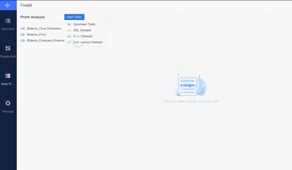
FineBI gives you a self-service, zero-code experience. You can create dashboards by dragging and dropping data fields, building charts, and arranging layouts without writing any code. FineBI supports real-time analytics and integrates with a wide mix of data sources, including cloud and local databases.
Here is a comparison of FineBI and other dashboard tools:
| Feature | FineBI | Other Dashboard Tools |
|---|---|---|
| Self-Service Dashboards | Yes | Varies |
| Zero-Code Capabilities | Drag-and-drop reporting | Often requires technical skills |
| Real-Time Analytics | Yes | Varies |
| Integration with Data Sources | Wide mix of cloud and local | Limited options |
| Governance | Strong built-in governance | May lack comprehensive governance |
| Scalability | SMBs to large enterprises | Often limited to specific sizes |
| Cost | Budget-friendly | Generally more expensive |
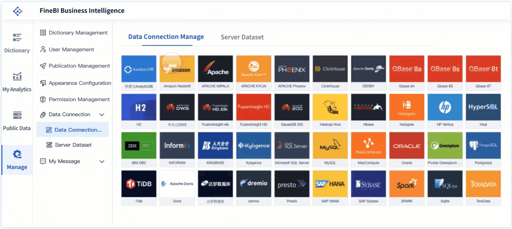
FineBI connects to more than 30 types of data sources, such as MySQL, Oracle, Amazon Redshift, Hadoop Hive, and SAP HANA. You can also use FineBI to link to cloud platforms and big data environments. This flexibility means you can bring all your data together in one dashboard.
- Hsql
- IBM DB2
- Microsoft SQL Server
- MySQL
- Oracle
- Alibaba Cloud AnalyticDB
- Amazon Redshift
- Apache Impala
- Apache KYLIN
- Apache Phoenix
- DERBY
- GBase 8A
- GBase 8S
- GBase 8T
- H2
- Huawei Cloud DWS
- Fusioninsight elk
- Fusioninsight HD
- GaussDB 200
- Hadoop Hive
- HBase
- HP Vertica
- INFORMIX
- KINGBASE
- Pivotal Greenplum Database
- Postgresql
- Presto
- SAP HANA
- SAP Sybase
- SPARK
- Sqlite
- TeraData
- TRANSWARP INCEPTOR
You can use FineBI to build dashboards that track KPIs, monitor metrics, and share dashboard reporting with your team. The platform offers strong governance, so you control who can see and edit each dashboard. FineBI scales from small businesses to large enterprises, making it a smart choice for many organizations.
A data analysis dashboard helps you turn raw data into clear insights. FineBI makes this process easy, fast, and accessible for everyone.
Why Data Analysis Dashboard Matters
Business Benefits
You need a data dashboard to make sense of your business data. When you use a dashboard, you see all your important information in one place. This helps you understand what is happening in your business right now. You can track kpis, compare metrics, and spot trends quickly. A business data dashboard gives you a clear view of your performance indicators, so you know where you stand.
Here are some practical benefits you get from using a data dashboard:
- You communicate business-critical information at-a-glance. A dashboard lets you see the most important data without searching through reports.
- You track and execute on kpis. Dashboards make it easy to monitor your progress toward goals.
- You empower yourself and your team with better access to information. Dashboards simplify how you view and understand business data.
A dashboard also helps you work with others. When you share a dashboard, everyone sees the same data and kpis. This keeps your team aligned and focused on the same goals.
Tip: A data dashboard centralizes your business data, making it easier for teams to stay informed and work together.
- Dashboards improve communication by providing a platform for sharing updates and insights.
- They foster transparency and accountability, allowing team members to track progress and identify challenges together.
Real-Time Insights
A data dashboard gives you real-time insights into your business. You see up-to-date data as soon as it changes. This means you can react quickly to problems or opportunities. For example, in manufacturing, a dashboard can show you production line status. If something goes wrong, you notice it right away and fix it before it becomes a bigger issue.
- Manufacturing companies use dashboards to monitor production lines. This leads to 15% less downtime and 10% higher productivity.
- Supply chain managers track inventory levels in real time to prevent shortages.
- IT teams detect system failures and cybersecurity threats instantly.
- Customer support teams monitor incoming requests to improve response times.
When you use a dashboard, you do not have to wait for reports. You get the latest data and kpis, so you make decisions faster. Real-time analytics help you stay ahead of problems and keep your business running smoothly.
Data-Driven Decisions
A data dashboard encourages you to make decisions based on facts, not guesses. You rely on data and analytics to guide your choices. Dashboards show you kpis and metrics that matter most to your business. You see where you are doing well and where you need to improve.
| Functionality | Benefit to Decision-Making |
|---|---|
| Identify inefficiencies in real time | Enables quick corrective actions |
| Monitor key performance indicators (KPIs) | Provides a clear view of organizational performance |
| Allocate resources effectively | Ensures optimal use of resources |
| Enhance transparency and accountability | Builds trust and informed decision-making |
Dashboards help you spot inefficiencies and take action right away. You monitor kpis and performance indicators, so you know if you are meeting your goals. You allocate resources where they are needed most. Dashboards also build trust by making data and analytics visible to everyone.
- Dashboards encourage you to rely on data over intuition.
- They promote evidence-based decision-making among employees.
A data dashboard is more than a tool for displaying data. It transforms how you run your business. You use insights from analytics to act quickly and achieve your objectives.
Business forecasting also improves with dashboards. You create dashboards with forecast accuracy metrics. You focus on items with the least accurate forecasts to find root causes of errors. You publish forecast accuracy results regularly, tracking progress over time. Dashboards distinguish between system-generated and manual forecasts, giving you clarity. You report overall and individual forecaster accuracy, which promotes healthy competition and improvement.
| Practice | Description |
|---|---|
| Create a dashboard with Forecast Accuracy Metrics (FAMs) | Focus on items with the least accurate forecasts to uncover root causes of errors. |
| Publish forecast accuracy results regularly | Track time-phased progress and provide a progress graph for transparency. |
| Distinguish between system-generated and manual forecasts | Ensures clarity in evaluating accuracy and reliability. |
| Report overall and individual forecaster accuracy | Promotes healthy competition and prioritizes forecasting improvement. |
Machine learning systems in dashboards automatically adjust forecasts based on changing conditions. This improves accuracy over time with minimal manual input.
FineBI Value
FineBI takes the power of a data dashboard and makes it accessible to everyone in your organization. You do not need technical skills to use FineBI. You build dashboards by dragging and dropping data fields, creating charts, and arranging layouts. FineBI connects to many data sources, so you bring all your business data together in one dashboard.
FineBI helps you track kpis, monitor metrics, and share dashboards with your team. You control who can see and edit each dashboard, keeping your data secure. FineBI supports real-time analytics, so you always see the latest data. You use FineBI to improve efficiency, boost collaboration, and make better decisions.
BOE Technology Group Co., Ltd. used FineBI to solve problems with fragmented data and inconsistent metrics. They built a unified data dashboard to standardize kpis and performance indicators. This led to a 5% reduction in inventory costs and a 50% increase in operational efficiency. BOE now uses dashboards to monitor business performance, identify risks early, and compare results across factories.
FineBI empowers you to turn raw data into actionable insights. You make smarter decisions, respond faster to changes, and drive your business forward with confidence.
How Data Analysis Dashboard Works
Data Integration
You start building a data analytics dashboard by bringing together data from different sources. Most organizations connect their dashboards to systems like CRM, ERP, databases, external files, data warehouses, and data lakes. This step ensures you have all the information you need in one place. You can track kpis and metrics from sales, finance, and operations without switching between tools. A dashboard makes it easy to unify your data for analysis.
Data Processing
After you gather your data, you need to prepare it for your dashboard. You organize and clean the data so it is accurate and reliable. You plan and set responsibilities for who manages the dashboard. You create a style guide to keep your data visualization consistent. Techniques like indexing and caching help your dashboard run faster. Data validation catches errors early, so your metrics stay trustworthy. These steps make sure your dashboard delivers real-time insights and supports effective decision-making.
Visual Exploration
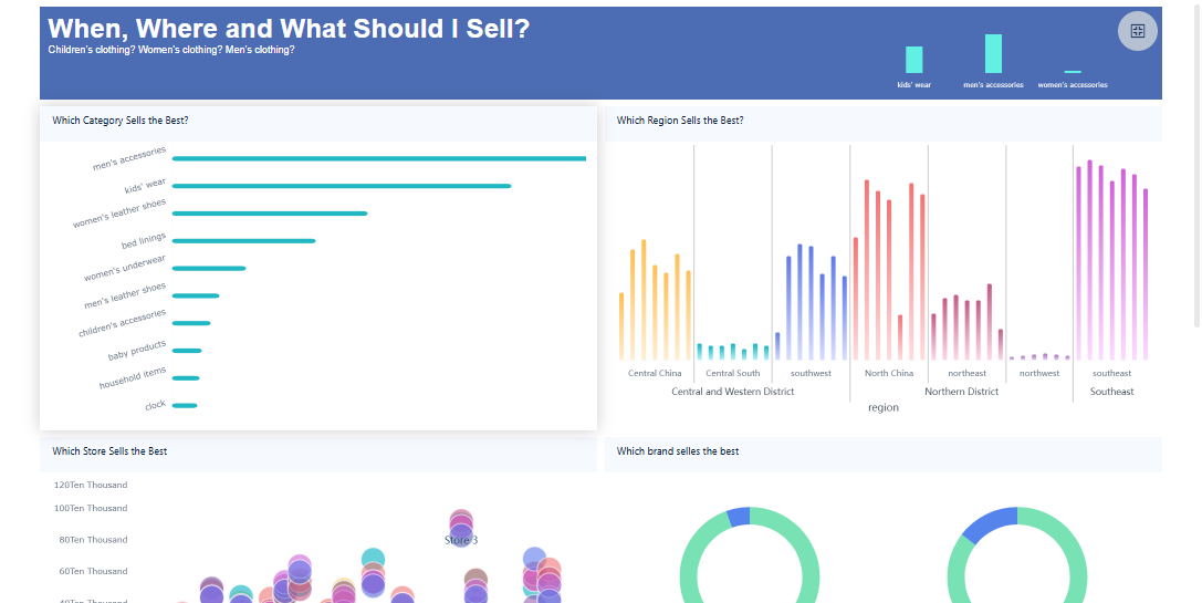
Once your data is ready, you use your dashboard to explore it visually. You see charts, graphs, and tables that show trends and patterns. Dashboards let you focus on kpis and metrics that matter most. You can filter data, drill down into details, and compare results over time. Different dashboard types help you analyze business performance, track marketing progress, monitor operations, and manage projects. The table below shows common dashboard types and their purposes:
| Dashboard Type | Purpose |
|---|---|
| Strategic | Measures company performance against long-term objectives and tracks high-level KPIs. |
| KPIs | Focuses on key performance indicators to measure progress towards goals. |
| Marketing | Tracks progression towards marketing KPIs for sales and marketing teams. |
| Operational | Enables data analysis to discover trends and insights. |
| Analytical | Provides tools for in-depth data analysis. |
| Tactical | Monitors progress of projects or goals with short to moderate deadlines. |
| Sales | Evaluates sales performance metrics like revenue and profit margins. |
| HRM | Manages human resources effectively to enhance productivity. |
| Finance | Measures specific KPIs related to the finance department. |
| Executive | Gathers high-level data for senior management decision-making. |
| Project | Tracks progress towards milestones in large projects. |
| Performance | Evaluates the performance of individuals or teams. |
| Geographical | Visualizes data on maps using various methods. |

Publishing & Collaboration
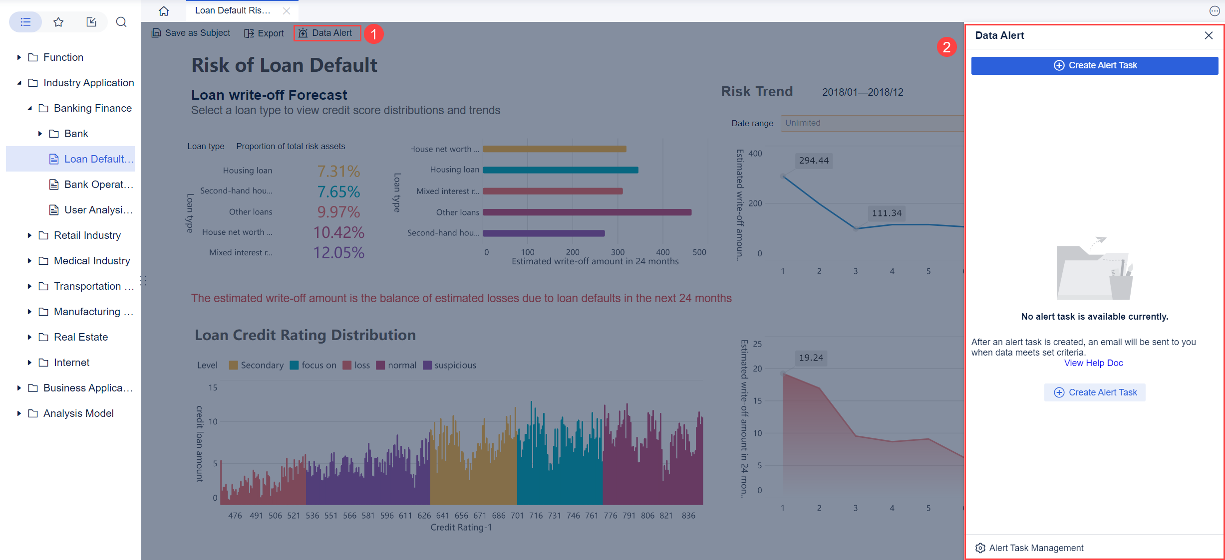
When your dashboard is ready, you share it with your team. You publish dashboards so everyone can see the latest data and kpis. Collaborative features help you work together. You create department-specific views, add comments, and tag important metrics. Automated reporting sends updates to different audiences. Shared workspaces let teams focus on relevant data while using the same dashboard. Annotation features allow you to document insights directly on the dashboard. Automated alerts notify you about critical metrics, helping you respond quickly.
FineBI Workflow
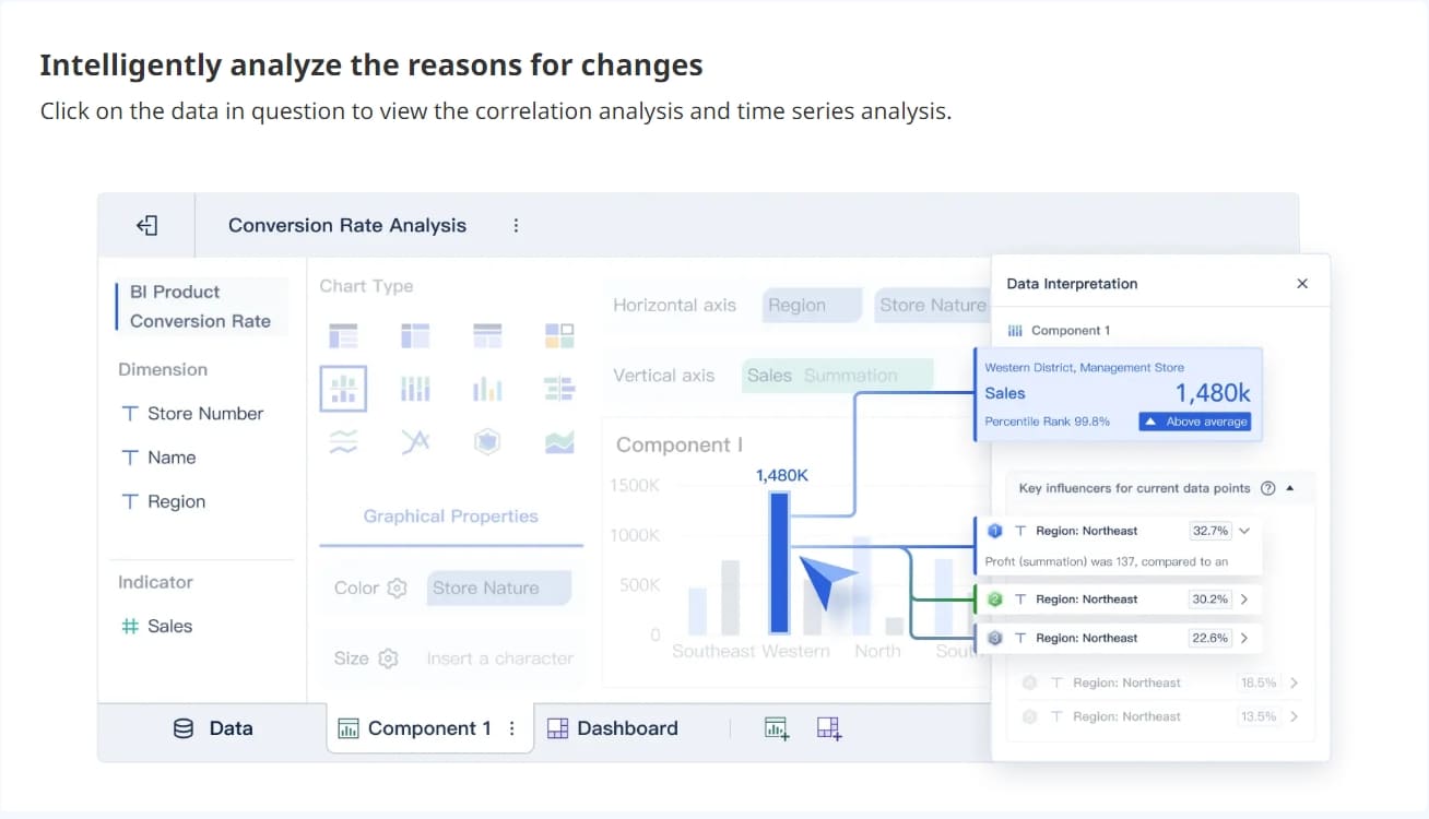
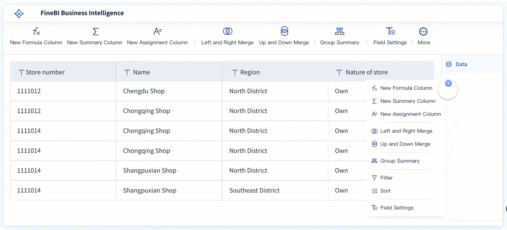
FineBI makes each step of the data analytics dashboard process simple. You connect to many data sources using built-in connectors. You prepare and process data with a drag-and-drop interface, so you do not need technical skills. FineBI offers over 50 chart types for data visualization, letting you explore data in ways that fit your needs. The built-in computing engine handles large data sets for real-time analysis. FineBI supports collaboration by allowing multiple users to edit dashboards, share analysis, and work together in shared folders. You publish dashboards and control who can view or edit them, keeping your data secure and accessible.
Types of Data Analysis Dashboard
You will find that not all dashboards serve the same purpose. Each type of dashboard helps you understand your data in a different way. Let’s look at the main types you will use in your organization.
Operational Dashboards
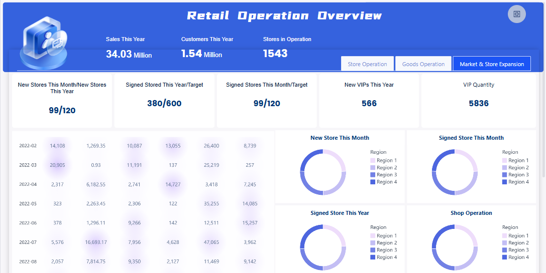
You use an operational dashboard to monitor daily activities and performance. This dashboard gives you real-time updates on your business processes. You can track kpis and metrics like sales numbers, inventory levels, or customer support tickets. Operational dashboards help you react quickly to changes. For example, if you manage a call center, you can see the number of calls waiting and adjust staffing as needed. These dashboards focus on immediate actions and keep your team informed.
Analytical Dashboards
An analytical dashboard helps you dive deep into your data. You use this dashboard to explore trends, patterns, and relationships between different metrics. Analytical dashboards support complex decision-making. You can compare kpis over time, analyze sales by region, or study customer behavior. This type of dashboard is valuable when you want to understand why something happened. You can use filters and drill-down features to get detailed insights.
Strategic Dashboards
A strategic dashboard gives you a high-level view of your organization’s goals and progress. You use this dashboard to track long-term kpis and align your team with business strategy. Strategic dashboards show you if you are meeting your targets. Executives and managers rely on these dashboards to measure overall performance and guide the company’s direction. You can see how different departments contribute to your main objectives.
Tip: Use a strategic dashboard to keep everyone focused on the big picture and make sure your data supports your business vision.
Custom Dashboards
Sometimes, you need a dashboard that fits your unique needs. A custom dashboard lets you choose which data, kpis, and metrics to display. You can add or remove components, adjust layouts, and create views that match your workflow. This flexibility is important for teams with special requirements. For example, a marketing team might build a dashboard that tracks website visits, campaign results, and social media engagement all in one place.
Here is a table to help you compare the main dashboard types:
| Dashboard Type | Purpose | Audience | Functionality |
|---|---|---|---|
| Operational | Monitors performance and operations | Departmental users | Real-time monitoring, quick decisions |
| Analytical | Provides in-depth insights | Analysts, managers | Detailed analysis, complex decision-making |
| Strategic | Tracks business strategy and goals | Executives, leaders | Measures kpis, aligns departments |
| Custom | Adapts to unique needs | Any user | User-defined metrics, flexible layout |
FineBI supports all these dashboard types across industries and roles. You can customize your data dashboard by adding or removing components, adjusting layouts, and focusing on the kpis and metrics that matter most to you. FineBI makes it easy for you to build dashboards that fit your business, whether you need real-time updates, deep analysis, or a strategic overview.
Data Analysis Dashboard Examples & Best Practices
Industry Use Cases
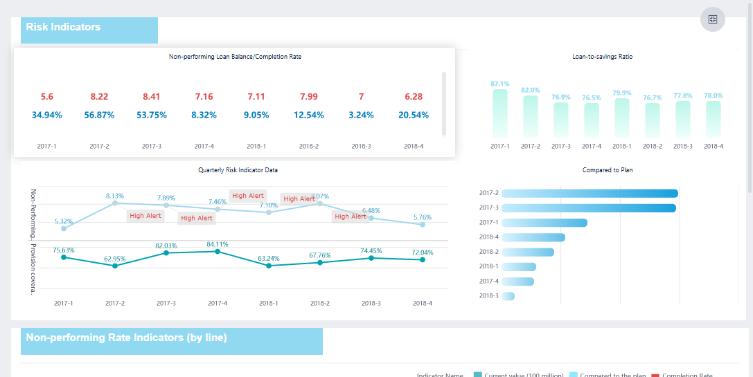
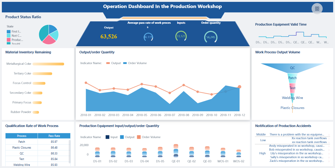
You see data dashboards in action across many industries. In banking, you use dashboards to monitor liquidity, analyze customer behavior, and assess risk. Manufacturing teams rely on dashboards for production monitoring, quality control, and supply chain visibility. Healthcare organizations use dashboards to track clinical outcomes, manage hospital operations, and review financial health. Each dashboard brings together data from different sources, helping you make decisions faster and with more confidence.
- Banking: Real-time liquidity monitoring, customer analytics, risk assessment.
- Manufacturing: Production monitoring, quality control, supply chain visibility.
- Healthcare: Clinical dashboards, operational dashboards, financial dashboards.
Role-Based Examples
Dashboards adapt to your role in the organization. As a manager, you use a dashboard to review team performance and spot trends. Analysts rely on dashboards to dig into data and uncover patterns. Executives use dashboards to track strategic goals and measure overall business health. Role-based dashboards present the most relevant data, so you focus on what matters most for your responsibilities. You save time and make better decisions because you see the right information at the right moment.
Tips for Effective Dashboards
You want your dashboard to deliver clear insights. Follow these best practices:
- Define the purpose and user needs. Understand what you want your dashboard to achieve and who will use it.
- Organize data for clarity. Match visuals to the type of data and keep charts simple.
- Incorporate accessibility standards. Make sure your dashboard works for everyone, including those with disabilities.
- Use visualizations that fit the data.
- Ensure good contrast for readability.
- Test your dashboard with users to find what works best.
Tip: A well-designed dashboard helps you see key data quickly and reduces confusion.
FineBI Success Stories
FineBI helps you build dashboards that drive results. BOE Technology Group Co., Ltd. used FineBI to unify fragmented data and standardize metrics. Their new dashboard reduced inventory costs by 5% and improved operational efficiency by 50%. Teams now monitor KPIs, compare performance across factories, and identify risks early. FineBI’s drag-and-drop interface and strong data integration make it easy for you to create dashboards that fit your needs. You gain actionable insights and improve decision-making across your organization.
A data analysis dashboard helps you see important business information in one place. You track key metrics, spot trends, and make better decisions faster. You improve teamwork and boost efficiency when you use dashboards. FineBI makes building and sharing dashboards easy for everyone. You gain real-time insights and keep your business moving forward. Data analysis dashboards matter because they turn your data into clear actions that drive success.

Continue Reading About Data Analysis Dashboard
Best Dashboard Apps for Business Insights
What is a Call Center Dashboard and Why Does It Matter
What is a Reporting Dashboard and How Does it Work
What is An Interactive Dashboard and How Does It Work
What is a Call Center Metrics Dashboard and How Does It Work


FAQ

The Author
Lewis
Senior Data Analyst at FanRuan
Related Articles

How to Build an Investment Portfolio Reporting Dashboard for Executives: KPIs, Benchmarks, and Drill-Down Views
Investment portfolio reporting for executives is not about showing every holding, transaction, and chart your investment team can produce. It is about giving CEOs, CFOs, CIOs, boards, and investment committees a fast, re
Yida YIn
Jun 25, 2026

12 KPI Reporting Examples for Executive Dashboards: What to Show in Weekly, Monthly, and Quarterly Reviews
Executive leaders do not need more data. They need decision ready $1 examples that match how often they review the business and what actions they are expected to take. A weekly $1 should surface fast moving risks and per
Yida YIn
Jun 25, 2026

How to Build a Digital Marketing Reports Dashboard: Executive Examples, KPIs, and Templates
A $1 is the control layer that helps executives and marketing leaders turn scattered channel data into fast, confident decisions. If you are a CEO, CMO, operations director, or marketing analytics lead, the real problem
Yida Yin
May 07, 2026