A product dashboard is a visual tool that brings together key data and metrics from your product, helping you track performance, spot trends, and make informed decisions quickly. It supports your team by showing important information in one place.
You need a dashboard to keep your product on track. With clear data, you can respond faster to changes and improve results. Teams that use dashboards see customer retention rise from 22% to 57%, cancellations drop to 10%, and sales growth increase by up to 85%.
| Metric | Impact |
|---|---|
| Customer Retention | 22% → 57% |
| Cancellations | 57% → 10% |
| Decision-Making Speed | +10% |
| Sales Growth | Up to +85% |
| Information Gathering Speed | +28% |
What is a Product Dashboard
A product dashboard is a visual tool that brings together key metrics and data, helping you monitor your product’s performance and make informed decisions quickly.
Core Purpose and Benefits
You use a product dashboard to see all your important product data in one place. This tool helps you track progress, spot trends, and respond to changes fast. When you rely on a product analytics dashboard, you gain clarity about what data matters most for your product’s success. You can access real-time analytics, which lets you react quickly to shifts in user behavior or product performance. This speed reduces operational risks and improves your decision-making by 10%.
Here is a summary of the main benefits:
| Benefit | Explanation |
|---|---|
| Clarity in data needs | You know exactly which metrics and analytics are necessary for success. |
| Real-time access to analytics | You can respond quickly to changes in product performance. |
| Improved decision-making speed | You make better choices and reduce risks faster. |
A product analytics dashboard also boosts team efficiency and collaboration. Customizable dashboards let your team adjust quickly to new priorities. Real-time performance tracking gives everyone immediate insights, improving coordination. When you align your goals and make them visible, you reduce miscommunication and increase transparency. Recognition systems in your dashboard encourage team engagement and motivation.
| Feature | Benefit |
|---|---|
| Customizable Dashboards | Teams respond quickly to shifting priorities. |
| Real-time Performance Tracking | Immediate insights improve coordination and decisions. |
| Shared Goals Alignment | Everyone stays focused on the same objectives. |
| Visibility of Goals and Progress | Transparency increases across departments. |
| Recognition Systems | Team members feel more engaged and motivated. |
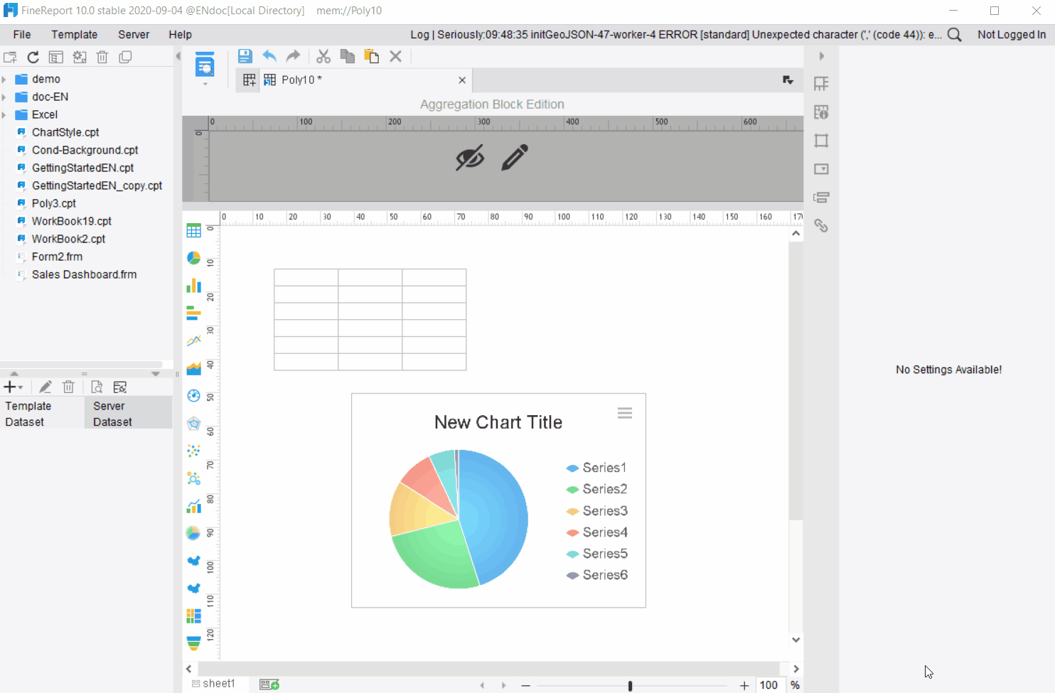
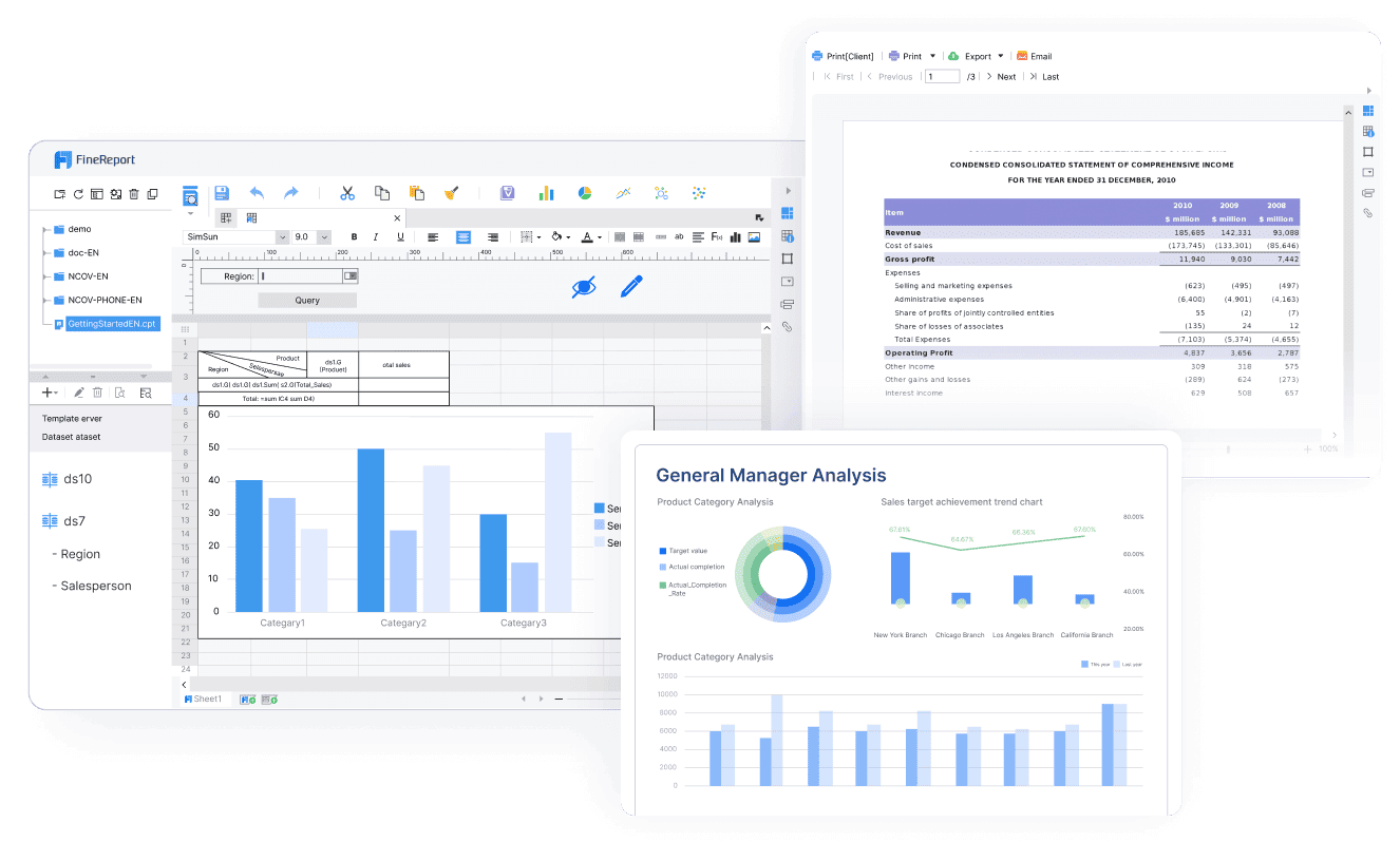
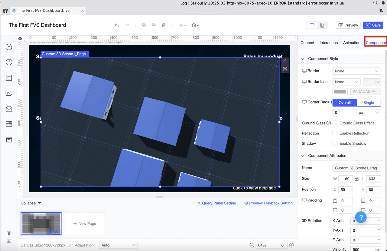
FineReport stands out as a leading tool for building a product analytics dashboard. It offers an intuitive drag-and-drop interface, real-time data integration, and advanced visualization options. You can connect multiple data sources and customize your dashboard to fit your product’s unique needs.

Types of Product Dashboards
You will find several types of product analytics dashboards, each serving a different purpose. Operational dashboards focus on real-time tracking of business operations. Strategic dashboards give you an overview of long-term goals and strategies. Each type targets a different audience and tracks different key performance indicators (KPIs).
| Feature | Operational Dashboards | Strategic Dashboards |
|---|---|---|
| Purpose | Real-time tracking of business operations | Overview of long-term strategies and goals |
| Target Audience | Operational managers and teams | High-level executives |
| Key Performance Indicators (KPIs) | Immediate, actionable metrics | Complex, high-level KPIs for strategic decisions |
| Functionality | Enables quick responses to issues | Helps understand overall progress and improvement |
In SaaS and e-commerce, you often use a product analytics dashboard to track metrics like Monthly Recurring Revenue (MRR), Customer Acquisition Cost (CAC), Churn Rate, and Customer Lifetime Value (CLV). You also monitor Net Promoter Score (NPS), Product Engagement Score, Total Online Sales Revenue, Conversion Rate, Average Order Value (AOV), Shopping Cart Abandonment Rate, and Return Rate.
| Metric | Description |
|---|---|
| Monthly Recurring Revenue (MRR) | Predictable monthly revenue for SaaS |
| Customer Acquisition Cost (CAC) | Cost to acquire new customers |
| Churn Rate | Rate of customer loss |
| Customer Lifetime Value (CLV) | Total value a customer brings over time |
| Net Promoter Score (NPS) | Customer satisfaction and loyalty |
| Product Engagement Score | Customer usage of the product |
| Total Online Sales Revenue | Financial health in e-commerce |
| Conversion Rate | Percentage of visitors who make a purchase |
| Average Order Value (AOV) | Average amount spent per transaction |
| Shopping Cart Abandonment Rate | Percentage of incomplete purchases |
| Return Rate | Percentage of products returned |
A product analytics dashboard helps you focus on the metrics that matter most for your product and industry.
Who Uses Product Dashboards
You will see many roles using a product analytics dashboard. Product managers rely on dashboards to track feature adoption, user engagement, and product performance. Marketing teams use dashboards to measure campaign effectiveness and customer behavior. Executives depend on dashboards for high-level overviews and strategic planning. Operations teams monitor real-time performance and spot issues before they grow.
A product analytics dashboard brings everyone onto the same page. It ensures that each team member, from developers to executives, has access to the right data at the right time. FineReport makes this possible by supporting multi-source data integration, customizable layouts, and mobile access. You can empower your entire organization to make smarter, faster decisions with a well-designed product analytics dashboard.
Why a Product Dashboard Matters
A product dashboard is a visual tool that displays your most important product kpis and metrics in one place, helping you track product performance and make better decisions. You need a dashboard because it turns complex data into actionable insights, driving product success and business growth.
Impact on Product Success
You want your product to succeed in a competitive market. A dashboard helps you achieve this by making your kpis and product performance visible and easy to understand. When you track metrics like user engagement kpis and customer kpis, you can quickly spot trends and respond to changes. Companies with strong dashboard practices reduce their time-to-decision by 46% and see 38% higher feature adoption rates. They are also 3.2 times more likely to deliver features that meet customer needs.
| Source | Evidence |
|---|---|
| Amplitude | Companies with mature product analytics practices reduce time-to-decision by 46%. |
| Pendo | Regular metric reviews lead to 38% higher feature adoption rates. |
| Mixpanel | Product dashboards increase the likelihood of shipping features that meet customer needs. |
Decision-Making with Dashboards
You make better decisions when you have access to real-time data and actionable insights. A dashboard gives you immediate visibility into product performance and kpis, so you do not have to wait for reports. This speed matters. Timely data helps you act before problems grow. When you share evidence through a dashboard, your team aligns faster and avoids confusion. Dashboards turn raw data into clear, actionable insights, supporting confident decisions.
- Real-time visualizations speed up business intelligence.
- You can improve customer engagement and reduce churn with up-to-date product metrics.
- Dashboards transform complex data into clarity, making it easier to track user engagement kpis and customer kpis.
Business Outcomes
A dashboard does more than display numbers. It drives real business outcomes by connecting product performance to your goals. Companies that use dashboards see faster sales cycles, improved customer engagement, and better use of resources. For example, HydraFacial improved decision-making and sales with actionable insights from dashboards. Hexaview reduced errors and improved data accuracy by automating business tracking. A Fortune 500 company maximized its marketing budget and improved customer engagement by visualizing kpis across channels.
| Company | Implementation Details | Outcomes |
|---|---|---|
| HydraFacial | Used analytics dashboards to replace traditional dashboards. | Faster sales cycles and better decision-making. |
| Hexaview | Automated business tracking with dashboards. | Improved data accuracy and business tracking. |
| Fortune 500 | Analyzed marketing campaign data with dashboards. | Maximized marketing budget and improved customer engagement. |
You can use a dashboard to monitor product performance, track kpis, and turn data into actionable insights. This approach helps you stay ahead in your industry and deliver products that meet customer needs.
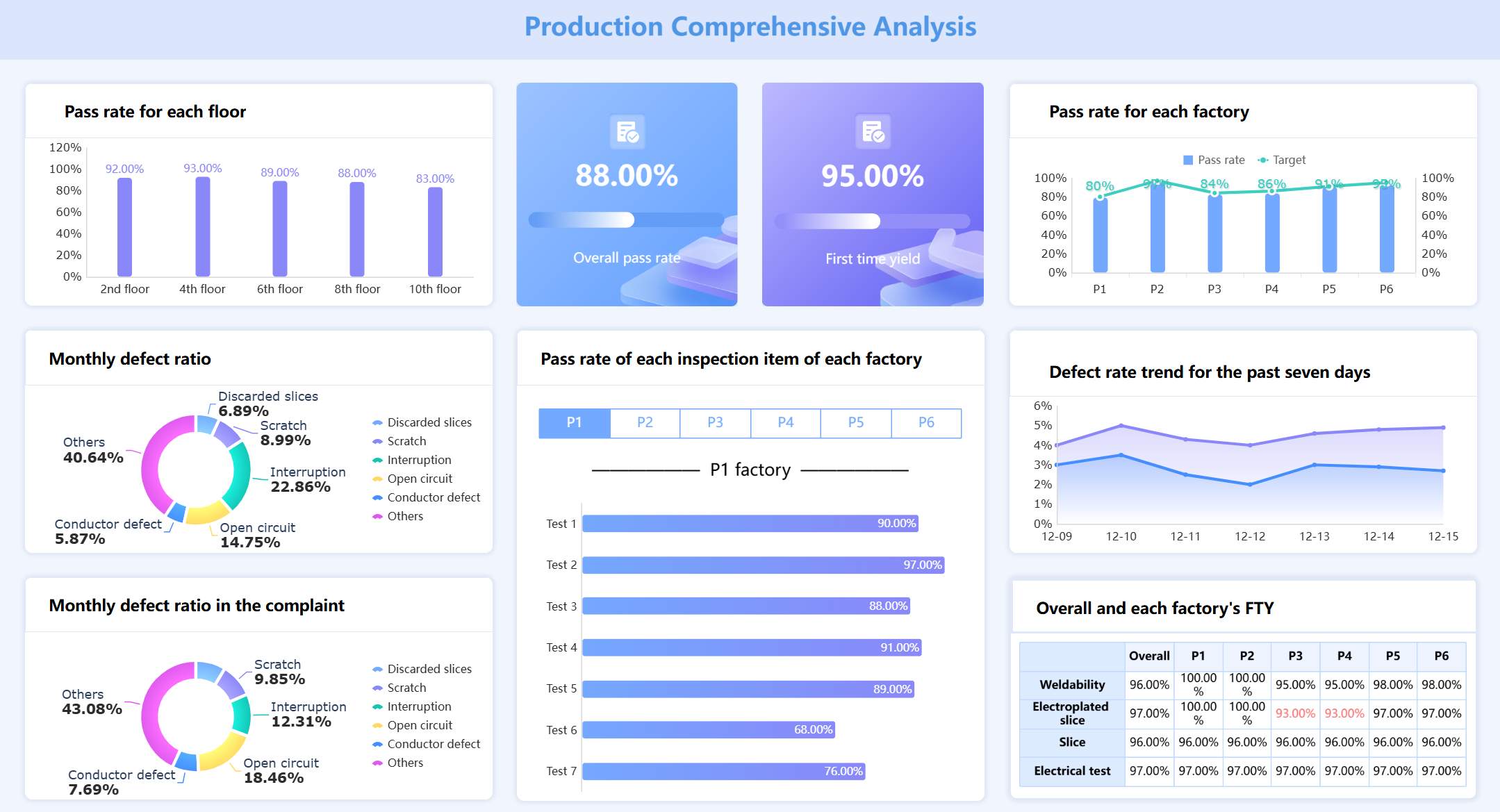
Key Features of a Product Analytics Dashboard
A product dashboard is a visual platform that brings together analytics, metrics, and insights to help you monitor, understand, and improve your product’s performance in real time.
A product dashboard gives you a single source of truth for analytics, making it easier to track essential product management metrics and drive better decisions.
Essential Metrics to Track
You need to focus on the right analytics to get the most value from your dashboard. The most important metrics include:
- Customer KPIs: These show customer satisfaction and retention.
- Product quality KPIs: These measure product quality and defect rates.
- User engagement KPIs: These track how users interact with your product.
- Business performance KPIs: These evaluate the financial health of your product.
You can use analytics methods like predictive analytics, data mining, segmentation analysis, machine learning algorithms, trend analysis, and data visualization to select the best metrics for your product.
| Statistical Method | Description |
|---|---|
| Predictive Analytics | Uses past data to predict future events, helping identify leading KPIs. |
| Data Mining | Extracts useful information from large datasets, revealing relationships that guide KPI selection. |
| Segmentation Analysis | Divides data into segments to identify specific KPIs based on performance comparisons. |
| Machine Learning Algorithms | Learns from data to identify influential factors for KPI selection. |
| Trend Analysis | Spots patterns in data to highlight KPIs that may impact future performance. |
| Data Visualization | Uncovers insights through visual representation, aiding in KPI selection by revealing significant trends. |
Customization and Visualization
You can tailor your dashboard to your needs with FineReport’s flexible design. Customization lets you choose which analytics and metrics to display, making your data more relevant and actionable. You can focus on what matters most, leading to better decisions and a clearer understanding of user behavior.
- Customization helps you highlight the most important analytics.
- You can reduce ambiguity by displaying only the necessary data.
- Real-time updates give you immediate insights into user preferences.
- Automated reporting speeds up your decision-making.
Visualization techniques make your analytics easy to understand. FineReport supports a wide range of charts and graphs, including:
| Visualization Technique | Description | Use Case |
|---|---|---|
| Line Chart | Represents continuous data with minor changes. | Best for showing trends over time. |
| Bar Chart | Compares data using horizontal or vertical bars. | Useful for comparing categories. |
| Pie Chart | Represents proportions or percentages of data. | Ideal for showing parts of a whole with fewer than seven categories. |
| Column Chart | Compares various categories with subcategories. | Effective for comparing multiple items within a range. |
| Area Chart | Shows how values develop over time. | Good for illustrating the share of a category over time. |
Colors play a key role in making analytics more understandable. FineReport’s advanced visualizations help you spot trends and patterns quickly.
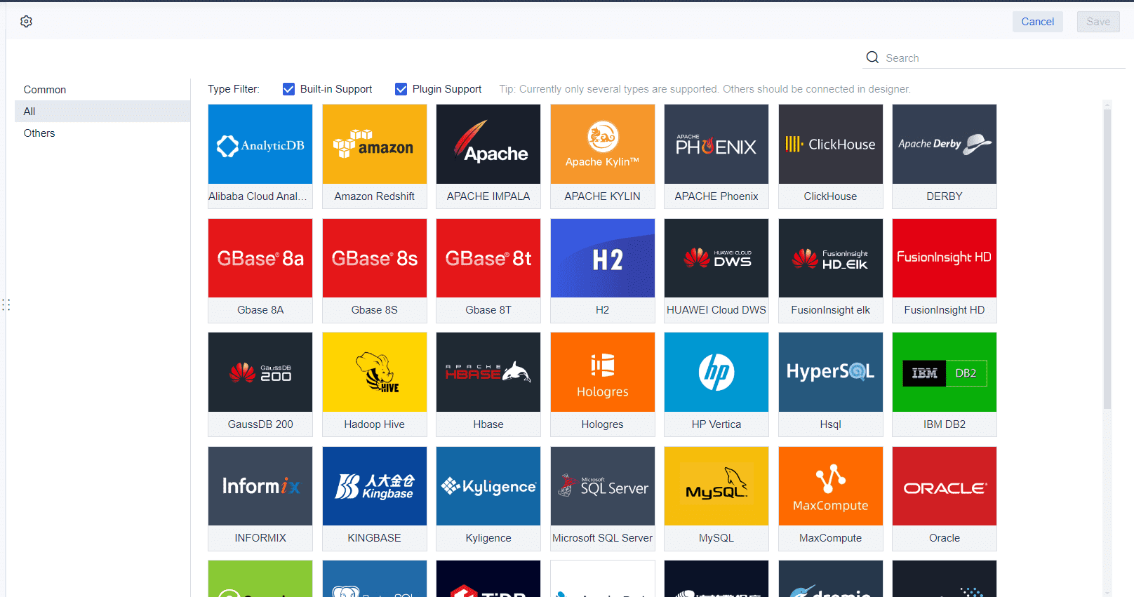
Real-Time Data and Alerts
You need real-time analytics to make fast, informed decisions. FineReport connects to multiple data sources, giving you up-to-date analytics on any device, including mobile. This keeps your team aligned and helps bridge the gap between technical and business goals.
| Evidence Point | Explanation |
|---|---|
| Bridge technical and business teams | Dashboards help translate technical metrics into business impact, ensuring alignment between teams and strategic goals. |
| Enable managers without creating bottlenecks | Self-service analytics provide managers with insights without disrupting developers, allowing for early issue detection. |
| Foster data-driven culture | Accessible dashboards promote a culture where data is integral to decision-making, enhancing team discussions and productivity. |
Automated alerts in your dashboard monitor risk indicators and notify you when thresholds are crossed. This reduces response times and helps your team catch issues as they happen.
| Feature | Benefit |
|---|---|
| Automated Alerts | Immediate visibility into risks and compliance gaps. |
| Continuous Monitoring | Teams catch issues in real time, not weeks later. |
| Configurable Thresholds | Critical risks are flagged instantly, minimizing exposure. |
With FineReport, you can create a dashboard that delivers analytics, essential product management metrics, and real-time analytics to drive your product’s success.
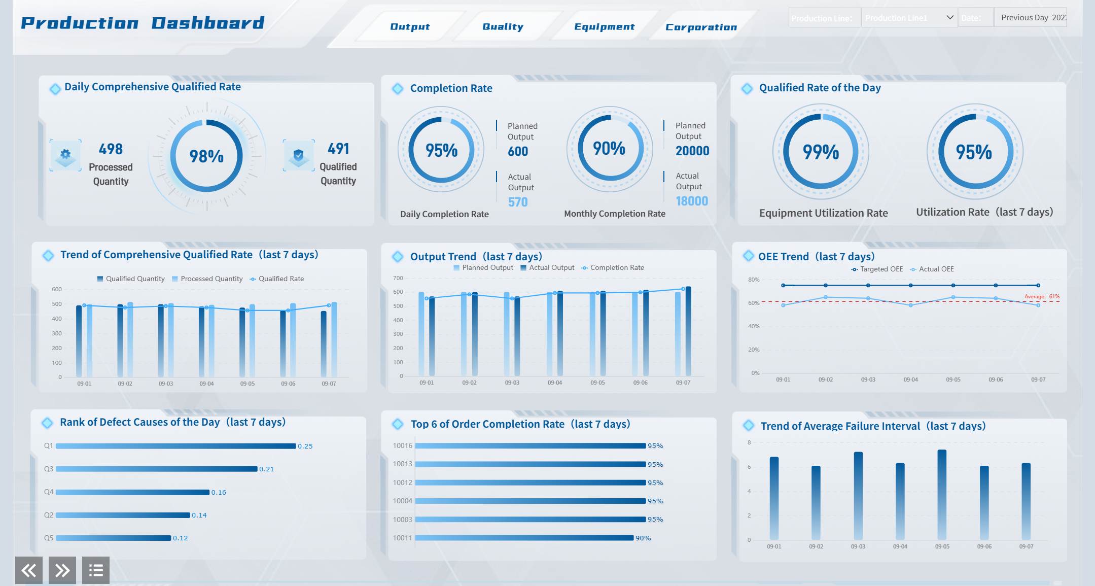
How to Create a Product Management Dashboard with FineReport
A product dashboard is a visual platform that displays essential product metrics, helping you monitor performance and make informed decisions quickly.
You can create a product management dashboard in FineReport by following a structured process. This approach ensures you track the right product metrics, improve customer satisfaction, and boost your customer retention rate.
Steps to Build a Dashboard
To build an effective product management dashboard, follow these steps:
- Determine the analytical indicators you want to track, such as customer satisfaction score or product quality.
- Design the layout to organize your product data clearly.
- Select chart types that best represent your product metrics.
- Add dynamic effects to make your product dashboard interactive.
- Import data from your product sources.
- Create a template for consistent product reporting.
- Select visualization elements that highlight key product trends.
FineReport’s drag-and-drop interface makes these steps easy. You can arrange charts and tables with visible, immediate actions. Most users find this interface familiar, which improves usability and speeds up the process.
Best Practices
Tip: Keep your product management dashboard simple and focused on actionable insights.
- Define clear objectives for your product dashboard.
- Choose metrics that align with your product goals, such as customer satisfaction score.
- Audit your product data regularly for accuracy.
- Design for intuitive navigation to help users find product information quickly.
- Gather feedback from users to improve your product dashboard over time.
You should understand user needs, select the right dashboard type, and use storytelling techniques to make your product data engaging.
Common Pitfalls
Watch out for these common mistakes when you create a product management dashboard:
- Including product data that does not add value for users.
- Using incomplete or outdated product data.
- Overloading your product dashboard with too many metrics, causing analysis paralysis.
- Making your product dashboard too complex, which can drive users back to spreadsheets.
- Ignoring user feedback, which can reduce trust and adoption.
You can avoid these pitfalls by starting with clear objectives, verifying your product data, and focusing on actionable insights.
| Feature | Description |
|---|---|
| Scheduled Tasks | Set up regular product report generation for daily, monthly, or annual needs. |
| Automated Report Generation | FineReport updates your product dashboard automatically at set times. |
| Scheduled Data Management | Manage product data and notifications through email or SMS. |
| Report Generation Results | View product reports in your browser for quick access. |
A well-designed product management dashboard helps you track product performance, improve customer satisfaction, and increase your customer retention rate.
A product dashboard is a visual tool that helps you track, analyze, and improve your product’s performance in real time. You gain a single source of truth for your product’s key metrics, which drives smarter decisions and business growth.
You benefit from product dashboards in many ways:
- Track performance with real-time KPIs.
- Spot issues early and act fast.
- Understand your customers better.
- Optimize costs and boost ROI.
- Adapt quickly with customizable views.
- Plan strategically for the future.
- Increase accountability and transparency.
- Benchmark against industry standards.
- Manage risks before they grow.
- Stay compliant with regulations.
- Build a data-driven culture.
FineReport empowers you to create dashboards that are easy to use, customizable, and accessible on any device. Start exploring product dashboards today to unlock better insights and drive your organization’s success.
Continue Reading About Product Dashboard
Production Management Benefits for Manufacturers
Mastering Real-Time Monitoring with a Production Dashboard
How to Build a Personal Productivity Dashboard That Works


FAQ

The Author
Lewis
Senior Data Analyst at FanRuan
Related Articles

How to Build an Investment Portfolio Reporting Dashboard for Executives: KPIs, Benchmarks, and Drill-Down Views
Investment portfolio reporting for executives is not about showing every holding, transaction, and chart your investment team can produce. It is about giving CEOs, CFOs, CIOs, boards, and investment committees a fast, re
Yida YIn
Jun 25, 2026

12 KPI Reporting Examples for Executive Dashboards: What to Show in Weekly, Monthly, and Quarterly Reviews
Executive leaders do not need more data. They need decision ready $1 examples that match how often they review the business and what actions they are expected to take. A weekly $1 should surface fast moving risks and per
Yida YIn
Jun 25, 2026

How to Build a Digital Marketing Reports Dashboard: Executive Examples, KPIs, and Templates
A $1 is the control layer that helps executives and marketing leaders turn scattered channel data into fast, confident decisions. If you are a CEO, CMO, operations director, or marketing analytics lead, the real problem
Yida Yin
May 07, 2026