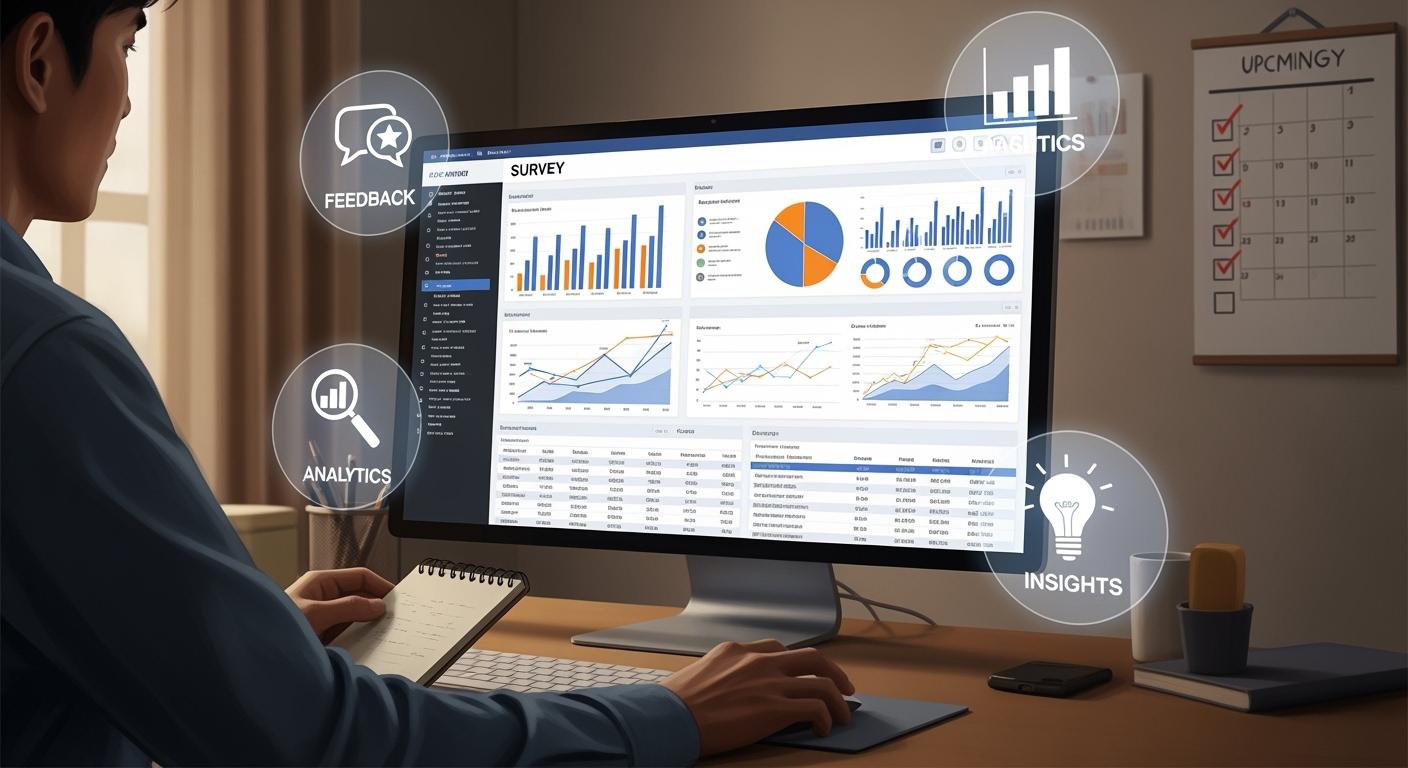
A survey dashboard gives you a clear view of your survey results in a single place. You can track responses, spot trends, and analyze feedback quickly. Many companies rely on dashboards to simplify complex data. In fact, 78% of organizations include dashboards in their products. Real-time dashboards improve decision accuracy and speed, helping you act on insights when they matter most. FineReport makes building and customizing your survey dashboard simple, so you get the information you need without delay.
What Is a Survey Dashboard?
Core Purpose and Functionality
A survey dashboard helps you turn raw survey data into clear, actionable insights. You see your results in one place, making it easier to understand what your respondents think and feel. The dashboard gives you a visual representation of survey responses, so you can analyze feedback quickly and make smart decisions.
A survey dashboard collects information in one location. You do not need to search through spreadsheets or emails. Instead, you get concise graphics that highlight important trends and patterns. This setup allows you to spot key metrics at a glance and respond to changes as soon as they happen.
You use a survey dashboard to:
- Visualize data with charts and graphs.
- Track key performance indicators (KPIs) for customer satisfaction or employee engagement.
- Segment data by demographics or time periods.
- Collaborate with your team by sharing insights.
- Make informed decisions based on real-time updates.
Here is a table showing the main functions of a survey dashboard:
| Function | Description |
|---|---|
| Visualizing data | Transforms complex data into actionable insights quickly, allowing for easier interpretation. |
| Facilitating quick analysis | Enables you to grasp key findings rapidly through visual representations. |
| Enhancing collaboration | Consolidates insights from various sources, simplifying the reporting process for teams. |
| Enabling informed decision-making | Empowers you to make strategic decisions based on clear, visualized data. |
Survey dashboards simplify the process of interpreting large volumes of survey data. You can extract insights faster and share them with others. Advanced dashboards also streamline reporting, so your organization can respond to market needs effectively.
Key Components and Layouts
You find several important components in a survey dashboard. Each one helps you analyze and act on your survey results. The most common components include:
| Component | Description |
|---|---|
| Real-time updates | Ensures you have access to the latest insights as new responses are collected. |
| Customized visualizations | Allows you to tailor the dashboard to display relevant metrics using various chart types. |
| Interactive Filtering | Enables segmentation of data by demographics or time periods for deeper insights. |
| Centralized Data Management | Brings together results from multiple surveys for comparison and connection spotting. |
| Collaboration and Sharing | Facilitates easy sharing of dashboards with colleagues or clients, promoting access and collaboration. |
You can customize the layout of your survey dashboard to fit your needs. Most dashboards use a logical organization, placing critical data at the top or left side. This design helps you focus on the most important information first. You might see current performance metrics on the left and historical trends on the right, guiding you from immediate results to broader context.
- Establish a clear visual hierarchy to guide your attention.
- Organize critical data at the top or left-hand side of the dashboard.
- Group related data points and use white space to enhance scanning.
Modern survey dashboards often include features like interactive filtering and real-time updates. You can segment your data by age, location, or other factors. This flexibility lets you dive deeper into your results and develop targeted strategies.
Survey dashboards also support collaboration. You can share your dashboard with your team or clients, making it easy for everyone to access the same insights. This approach encourages teamwork and helps your organization make better decisions.
You may face challenges when adopting a survey dashboard. Sometimes, dashboards do not provide relevant information, or the data quality is poor. You should ensure your dashboard displays actionable insights and uses accurate, up-to-date data.
Recent trends in survey dashboard technology include AI-powered dashboards and augmented analytics. These tools automate insights and make data more accessible for everyone. Enhanced collaboration features also help teams work together more effectively.
A survey dashboard gives you the tools to visualize, analyze, and share your survey data. You can track trends, compare results, and make decisions with confidence.
Survey Dashboard Benefits
Data Visualization and Clarity
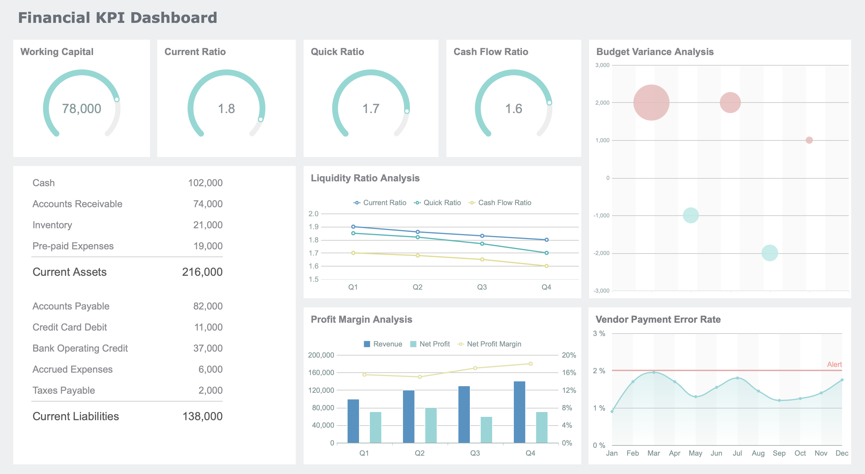
You need clear visuals to understand survey results quickly. A survey dashboard helps you see patterns and trends without getting lost in numbers. When you use best practice dashboard layouts, you organize key metrics for easy navigation. You can choose from graphs, charts, and heat maps to represent your data. Each visualization type serves a different purpose.
| Visualization Type | Purpose |
|---|---|
| Graphs | Communicate trends and patterns |
| Charts | Represent data clearly |
| Heat Maps | Show data density and distribution |
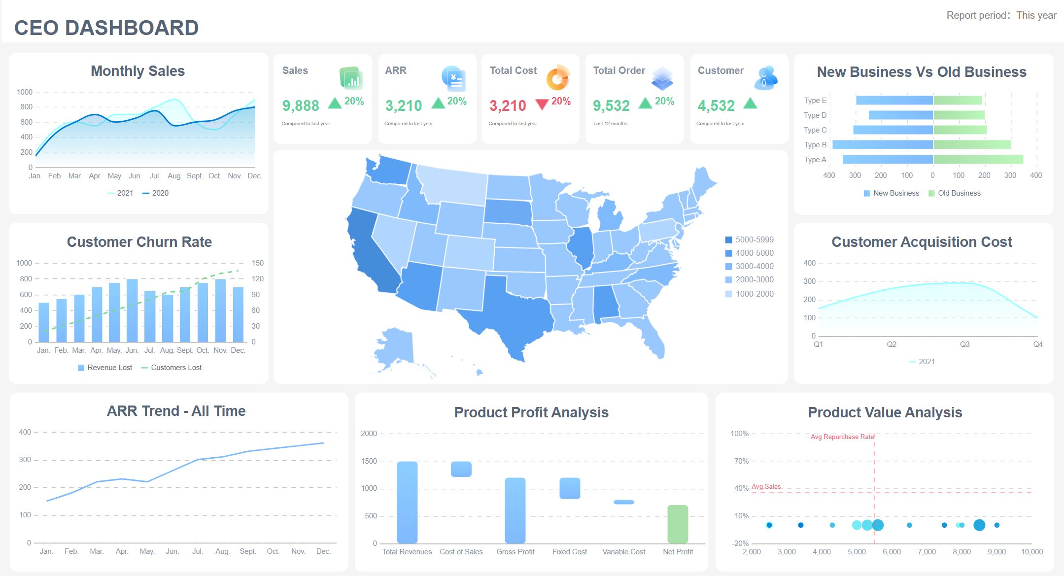
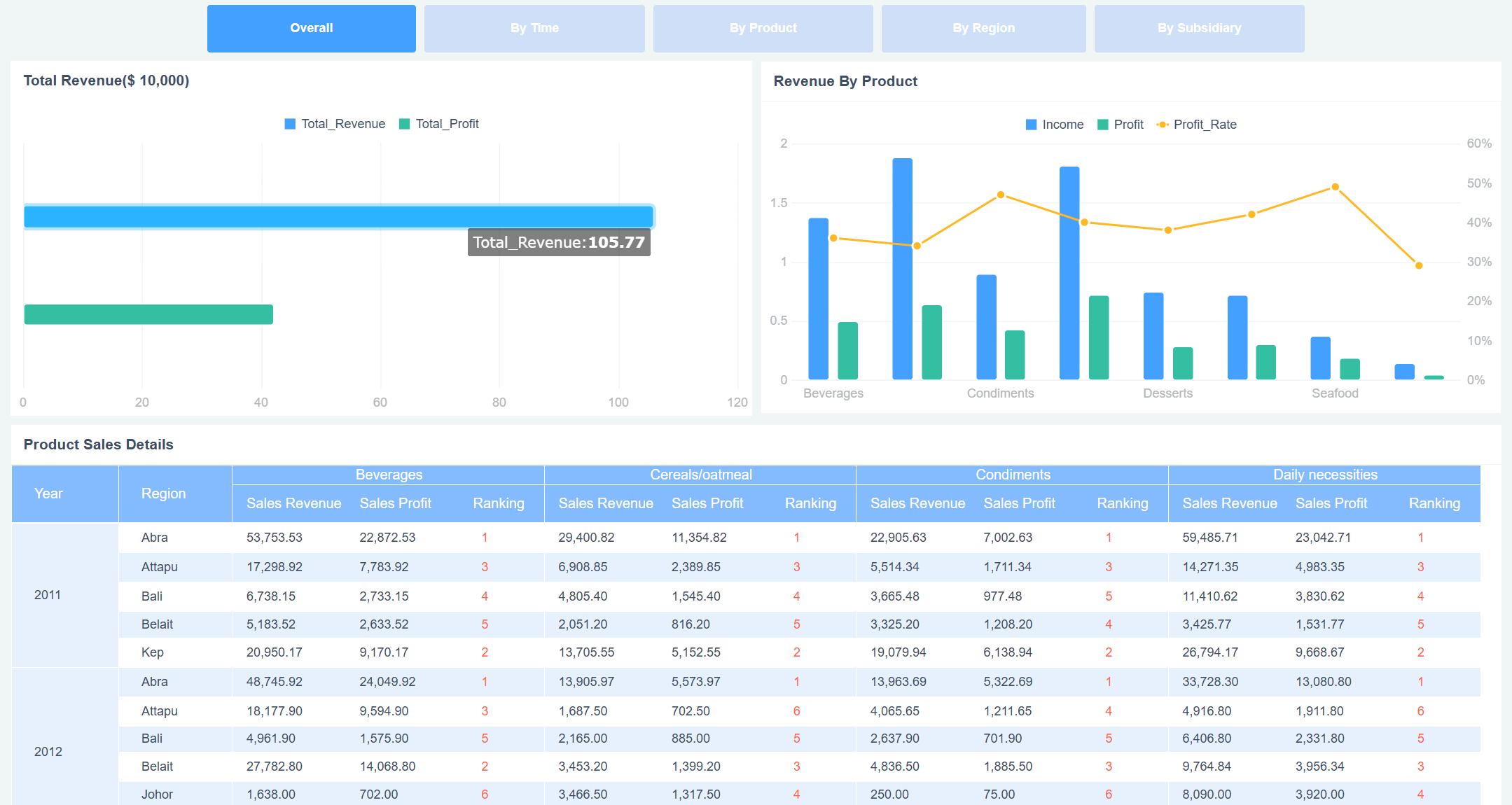
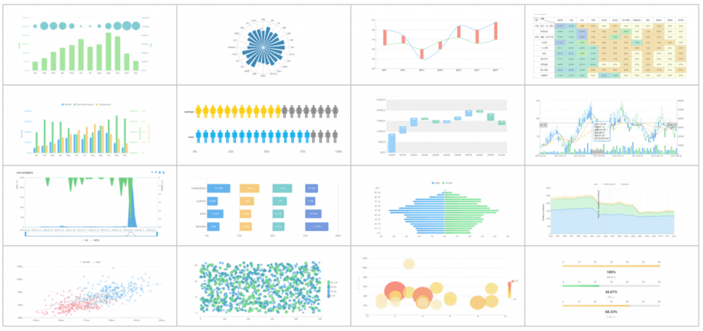
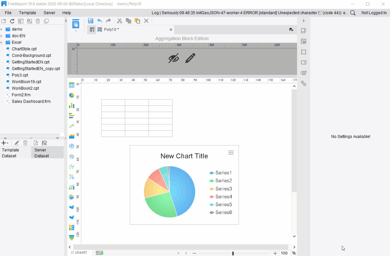
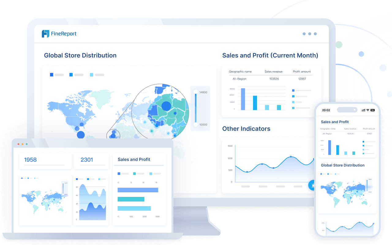
FineReport gives you access to over 50 chart styles, including interactive graphs and heat maps. You can use drag-and-drop tools to build dashboards that match your needs. With FineReport, you avoid information overload by arranging only the most important metrics at the top or left side of your dashboard.
Tip: Use color, text, and whitespace to highlight important data. This makes your survey dashboard easier to read and helps you focus on what matters.
When you follow best practice dashboard design, you make it simple for your team to explore data at different levels. You can add interactivity, so users filter results by age, location, or other segments. This approach supports your employee listening program by making feedback easy to analyze.
FineReport integrates AI-driven tools, such as ChartGPT, to help you create complex charts and interactive visualizations. You can analyze large datasets and generate presentations that communicate results clearly. Using survey dashboards effectively means you always have actionable data at your fingertips.
Organizations report measurable benefits when they use automated feedback analysis:
- 75% improvement in response times
- 40% increase in issue resolution rates
- 40% higher employee engagement when feedback impact is communicated
- 25% improvement in customer retention rates

Faster Decision-Making with FineReport
You want to make decisions quickly and confidently. A survey dashboard speeds up your decision-making process by delivering real-time insights. FineReport supports best practice dashboard design with features that help you prepare for meetings and respond to market changes.
| Feature | Description |
|---|---|
| Easy-to-use designer | Drag-and-drop interface for building interactive dashboards |
| One-click integrations | Connects directly to mainstream databases for real-time data access |
| Pre-built HTML5 charts | Over 50 chart styles for dynamic visualization and customization |
| Mobile app | ReactNative technology for real-time updates on mobile devices |
You can use FineReport to automate scenario analysis and deliver insights before meetings. This helps you focus on key issues and make proactive, data-driven choices. When you use survey dashboards effectively, you reduce decision-making time from hours or days to minutes. Machine learning models in FineReport can forecast key business metrics with up to 95% accuracy.
Note: Personalization and narrative engagement in your dashboard increase user adoption. Teams collaborate better when everyone sees the same visual story.
FineReport enables cross-functional collaboration by sharing dashboards across departments. You break down silos and align your team around common goals. Early adopters of best practice dashboard tools gain a sustainable competitive edge. You respond faster to market threats and adjust strategies with confidence.
Tracking Trends and KPIs
You need to monitor trends and key performance indicators to improve your employee listening program. A survey dashboard tracks metrics like response rates, satisfaction scores, and participation trends. FineReport makes it easy to set up recurring analysis schedules, so you always know how your organization is performing.
| Feature | Description |
|---|---|
| Real-time Insights | Immediate data visualization to spot trends as they emerge |
| Market Behavior Analysis | Compares past and current data to identify dominant patterns |
| Visualization Options | Multiple ways to view data for easy comparison over time |
Common metrics you track using survey dashboards include:
- Response and participation metrics: See how many people complete your surveys and track changes over time.
- Satisfaction and sentiment scores: Monitor customer satisfaction (CSAT), Net Promoter Score (NPS), and engagement scores.
- Question-level insights: Analyze ratings for individual questions to find strengths and gaps.
- Segment and demographic analysis: Break down results by region, department, or customer segment.
You can use best practice dashboard layouts to highlight trends and patterns. FineReport consolidates survey data in one place, so you interpret results quickly. You do not need advanced analytical skills to find actionable data. Your employee listening program benefits from regular feedback analysis, helping you respond to emerging trends and adjust strategies.
When you use survey dashboards effectively, you create a centralized platform for survey data. You interpret complex results through visualizations and make faster decisions by spotting trends early. FineReport supports your efforts with real-time insights and customizable dashboards for every business need.
Real-World Applications of Survey Dashboard
Industry Use Cases
You see survey dashboards in many industries. Each sector uses dashboards to solve unique challenges and improve decision-making. For example, insurance companies analyze claims and customer feedback. Local governments track public health and manage benefits. Energy and utility firms monitor grid performance and sustainability. Professional services use dashboards for project profitability and client reporting. Hospitality and tourism businesses rely on dashboards for revenue management and guest analytics.
Here is a table showing how different industries use survey dashboards:
| Industry | Primary Use Cases |
|---|---|
| Insurance | Claims analytics, underwriting performance, customer insights, regulatory compliance |
| Local Government | Social care planning, benefits processing, environmental monitoring, public health tracking |
| Energy and Utilities | Grid monitoring, sustainability metrics, customer analytics, asset management |
| Professional Services | Project profitability, resource utilization, business development, client reporting |
| Hospitality and Tourism | Revenue management, guest analytics, operations, seasonal planning |
You also find survey dashboards in healthcare, education, and retail. Restaurants use dashboards to gather feedback on food and service quality. Advertising agencies rely on market research dashboards to understand consumer interests. Photographers track preferences for wedding locations. Bakeries use dashboards to identify popular cake flavors. Event organizers run straw polls to gauge opinions quickly.
Who Gains from Survey Dashboards
You benefit from survey dashboards if you work in HR, executive leadership, or any team that values data-driven decisions. HR teams use dashboards to monitor employee engagement and satisfaction. You can track participation rates and see how your initiatives impact morale. Dashboards help you translate HR efforts into measurable outcomes.
- HR teams gain insights into engagement scores and employee sentiment.
- Executive leaders use dashboards to assess organizational health.
- Teams across departments collaborate better with shared dashboards.
Survey dashboards also improve collaboration. You and your colleagues access real-time data and share feedback instantly. Dashboards consolidate insights, simplify reporting, and support informed decisions. You do not need advanced analytical skills to use them. Everyone in your organization can engage with data and contribute to strategic planning.
Here is a table showing how dashboards support teamwork:
| Benefit | Description |
|---|---|
| Consolidation of Insights | Dashboards bring together scattered data, making reporting easier. |
| Real-time Data Updates | You see the latest survey responses as soon as they arrive. |
| Democratization of Data Access | Everyone can interact with data, fostering informed decisions. |
| Real-time Collaboration | Teams share dashboards and receive feedback instantly, boosting teamwork. |
You unlock the full potential of survey dashboards when you use them to connect teams, track key metrics, and make decisions based on clear, up-to-date information.
Essential Features in FineReport
Must-Have Dashboard Functions
You need a survey dashboard that makes data analysis simple and effective. FineReport gives you several essential features to help you get the most from your survey results.
- Drag-and-drop design: You can build dashboards quickly without coding. The interface feels familiar, like working in a spreadsheet.
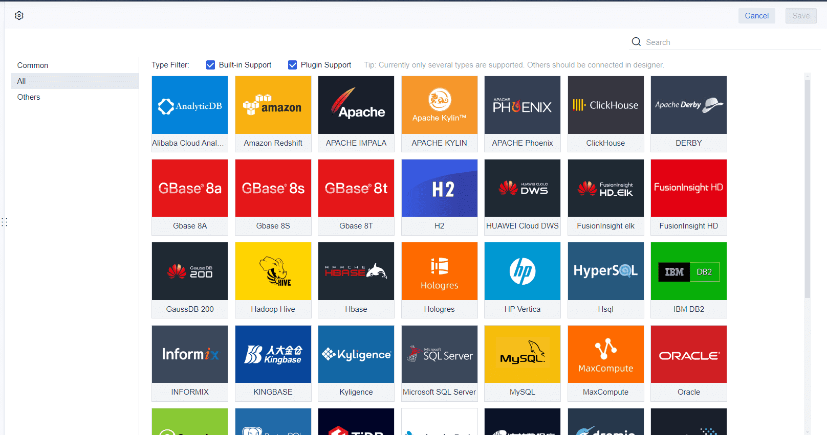
- Multi-source integration: FineReport connects to many databases and file types. You can centralize data from different sources and see everything in one place.
- Mobile access: You view dashboards on your phone or tablet. This keeps you informed wherever you go.
- Automated reporting: FineReport schedules reports and sends updates automatically. You always have the latest information.
Multi-source integration stands out because it lets you connect diverse datasets. You see real-time updates and create tailored views for different teams. This shift from static reports to dynamic dashboards improves communication and helps you make better decisions.
Tip: Use interactive filters to segment survey data by age, region, or other factors. This helps you find deeper insights and act faster.
Choosing the Right Solution
When you select a survey dashboard tool, you should look for features that match your business needs. FineReport offers strong integration, customization, and security.
| Criteria | Why It Matters |
|---|---|
| Integration capabilities | Pull data from many sources for a complete view |
| Customization options | Tailor dashboards to fit your goals |
| Security features | Protect sensitive survey data |
| Mobile accessibility | Make decisions on the go |
You should also plan your dashboard layout carefully. Guide users through the data and make sure everyone can access and interact with the dashboard. Interactivity lets users filter and explore data based on their needs.
Before you decide, compare costs and features of different solutions. Conduct a cost-benefit analysis to see which tool gives you the best value. FineReport’s strengths in integration, customization, and mobile access make it a top choice for many organizations.
Note: A dashboard that centralizes data and offers real-time updates will help your team respond quickly and stay ahead.
Survey dashboards help you manage data efficiently and make smarter decisions. You see real-time updates, spot trends, and share insights with your team. FineReport lets you build dashboards that save time and improve productivity. You can quickly identify problems and use survey results to boost customer retention.
| Benefit | Impact on Business Outcomes |
|---|---|
| Improved Decision-Making | Make better decisions faster |
| Time Savings | Reduce manual data processing |
| Quick Problem Identification | Spot issues and opportunities rapidly |
| Enhanced Customer Retention | Address feedback quickly |
| Valuable Data Utilization | Turn survey data into actionable insights |
Explore FineReport to create dashboards that drive better business outcomes for your organization.
Continue Reading About Survey Dashboard
What Is a Data Dashboard and How Does It Work
Top Tips for Effective Dashboard Design
Understanding data visualization dashboards in 2026


FAQ

The Author
Lewis
Senior Data Analyst at FanRuan
Related Articles

How to Build an Investment Portfolio Reporting Dashboard for Executives: KPIs, Benchmarks, and Drill-Down Views
Investment portfolio reporting for executives is not about showing every holding, transaction, and chart your investment team can produce. It is about giving CEOs, CFOs, CIOs, boards, and investment committees a fast, re
Yida YIn
Jun 25, 2026

12 KPI Reporting Examples for Executive Dashboards: What to Show in Weekly, Monthly, and Quarterly Reviews
Executive leaders do not need more data. They need decision ready $1 examples that match how often they review the business and what actions they are expected to take. A weekly $1 should surface fast moving risks and per
Yida YIn
Jun 25, 2026

How to Build a Digital Marketing Reports Dashboard: Executive Examples, KPIs, and Templates
A $1 is the control layer that helps executives and marketing leaders turn scattered channel data into fast, confident decisions. If you are a CEO, CMO, operations director, or marketing analytics lead, the real problem
Yida Yin
May 07, 2026