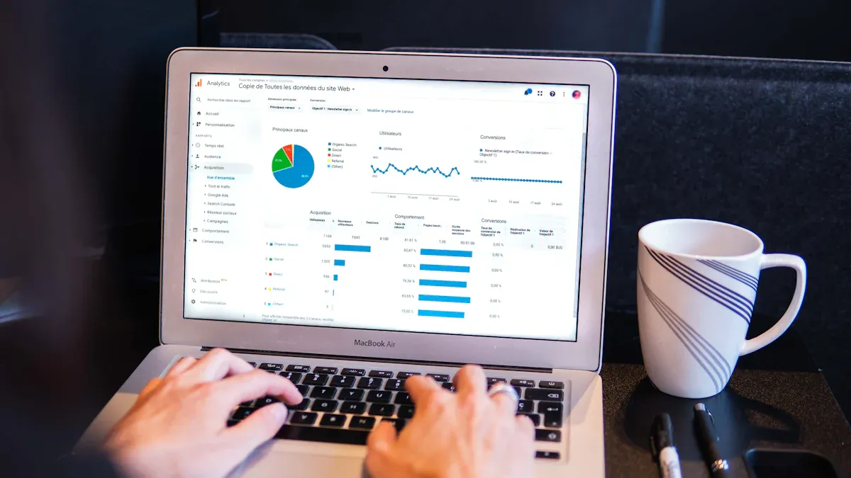
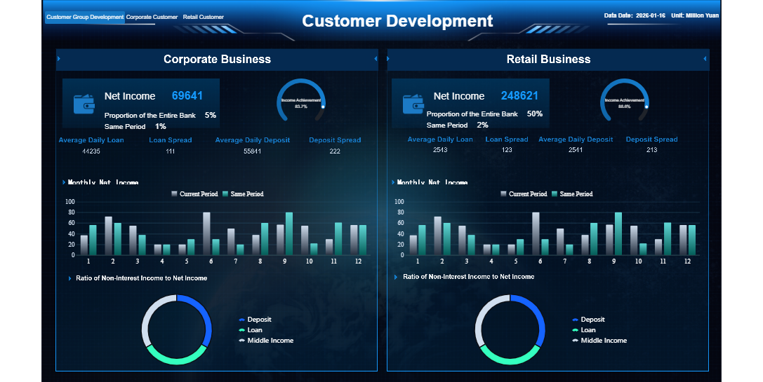
What is a product analytics dashboard? This tool gives you a visual overview of your product’s performance and user interactions. You track essential metrics and trends in one place, making it easy to understand how users engage with your product.
A product analytics dashboard helps you make sense of your data. With real-time analytics, you can spot patterns, measure the impact of changes, and validate ideas quickly. Teams use dashboards to answer questions fast, explore user behavior, and improve product decisions. Designers check user flows, engineers monitor technical improvements, and marketers see which features drive engagement. Tools like FineReport empower you to act on these insights and drive better results.
What is a Product Analytics Dashboard
Core Definition and Purpose
A product analytics dashboard gives you a clear view of how users interact with your product. You can see important data in one place, making it easier to understand what works and what needs improvement. The main purpose of a product analytics dashboard is to help you monitor, measure, and analyze user behavior and product performance. This tool brings together data from different sources, so you can track trends and make informed decisions.
You use a product analytics dashboard to:
- Monitor user interactions with your product
- Track feature adoption and usage patterns
- Assess overall product performance
- Highlight customer engagement metrics such as active users, session length, and retention
With a product analytics dashboard, you can quickly spot changes in user behavior. You can see which features users like most and which ones need attention. This helps you focus your efforts on areas that will have the biggest impact. Product analytics dashboards also support product analysis by giving you a real-time overview of key metrics. You can use these insights to guide your product strategy and improve outcomes.
How Product Analytics Dashboard Works
A product analytics dashboard collects and processes data from your product. It tracks every user action, such as clicks, page views, and feature usage. The dashboard then organizes this data into charts, tables, and graphs, making it easy for you to see patterns and trends.
Product analytics dashboards use several technologies to help you understand your data:
- Event tracking tools collect data on user actions.
- Funnels and user flows show how users move through your product and where they drop off.
- Retention analysis tracks how often users return over time.
- Segmentation lets you filter and compare different user groups.
- Customizable dashboards and reports provide real-time monitoring of key metrics.
- Experimentation and A/B testing features help you measure the impact of new features.
You can use these tools to perform deep analysis and uncover insights that drive product growth. Product analytics dashboards make it possible to turn raw data into actionable information.
Who Uses Product Analytics Dashboard
Many teams rely on product analytics dashboards to guide their work. Product managers use dashboards to track feature adoption and measure the success of new releases. Designers look at user flows to improve the product experience. Engineers monitor technical performance and spot issues early. Marketers analyze which features drive engagement and retention.
You might also find executives using product analytics dashboards to get a high-level view of product performance. Customer support teams can use dashboards to identify common pain points and improve service. In short, anyone involved in product development or management can benefit from the insights provided by a product analytics dashboard.
FineReport stands out as a leading tool for building product analytics dashboards. It offers seamless database connections, customizable report templates, and advanced visualization features. FineReport helps you create dashboards that bring together all your product analytics in one place. You can track key metrics, analyze user behavior, and share insights across your team. This makes it easier to make data-driven decisions and achieve better outcomes.
| Feature | FineReport | FineBI |
|---|---|---|
| Target Users | Information personnel | Business professionals |
| Report Generation | Fixed-format reports | Self-service query platform |
| Data Connection | Seamless database connection | Real-time data access |
| Report Customization | Customized report templates | Drag-and-drop analytical charts |
| Analytical Capabilities | Fixed-format analytical reports with chart linkage | Dashboard with key indicators and dimensions |
A product analytics dashboard is essential for anyone who wants to understand product analytics, improve product analysis, and drive better outcomes. With the right product analytics tools, you can turn data into insights and make smarter decisions for your product.
Why Product Analytics Dashboard Matters
Business Value and Benefits
A product analytics dashboard brings clarity and focus to your organization. You can track key metrics and outcomes that matter most for your product. By using a dashboard, you set clear targets and measure progress toward your goals. This approach helps you understand which features drive user engagement and which areas need improvement. You gain a comprehensive view of product analytics, making it easier to monitor performance and spot trends over time.
A dashboard also reduces ambiguity by showing you exactly what data you need for product analysis. You can see which products generate the most revenue, identify high-value accounts, and monitor payment patterns. Automated reporting saves time and reduces errors, leading to faster and more accurate decisions.
Impact on Decision-Making
Product analytics dashboards transform how you make decisions. You get real-time access to analytics, which means you can respond quickly to changes in user behavior or product performance.
A product analytics dashboard acts as a strategic decision engine. It aligns teams, clarifies direction, and uncovers hidden opportunities. You can track feature adoption, user engagement, and product health, ensuring your analytics framework supports business outcomes.
Key Features and Metrics in Product Analytics Dashboard
Essential Dashboard Features
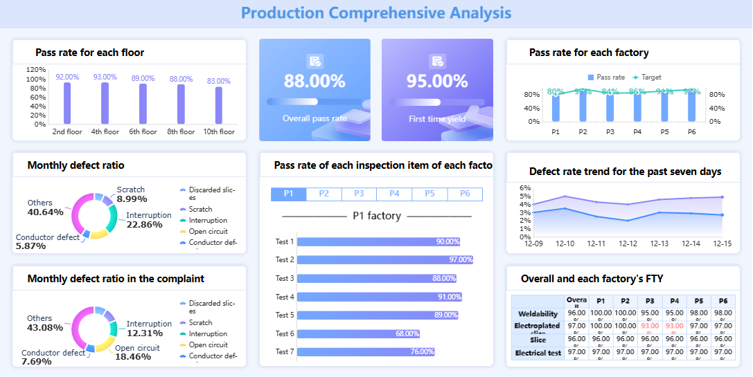
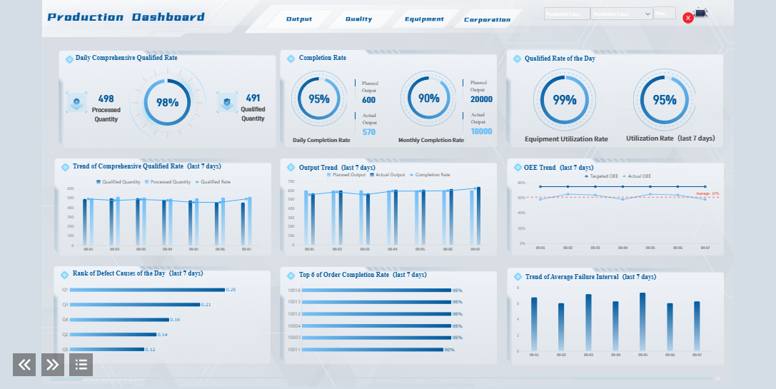
When you use a product analytics dashboard, you gain access to features that help you understand your product and drive better business outcomes. Most dashboards offer pre-made and customizable dashboard templates, making it easy to get started or tailor your view. You can track data across multiple platforms, which gives you a complete picture of product usage analytics. Many dashboards consolidate KPIs from different marketing activities, so you see all your important metrics in one place. Dynamic performance timelines let you track progress over time, while threshold alerts notify you if any area underperforms. You can compare results to targets and plans, and export reports for sharing with your team.
Key features include:
- Customizable dashboard layouts for different teams
- Real-time data integration for up-to-date product analysis
- Interactive elements for deeper product insights
- Easy export options for reporting and collaboration
Advanced visualization capabilities improve clarity and engagement. Interactive dashboards allow you to customize your view, making it easier to focus on the metrics that matter most. Real-time data ensures your product analytics reflect current conditions, supporting quick decisions.
Common Metrics Tracked
A product analytics dashboard tracks a range of metrics that reveal how users interact with your product. You often monitor daily active users (DAU), monthly active users (MAU), sessions per user, and bounce rate. Metrics like customer satisfaction (CSAT), Net Promoter Score (NPS), user retention, churn rate, and customer acquisition cost (CAC) help you measure product experience and business outcomes. You also track customer lifetime value (CLTV), monthly recurring revenue (MRR), adoption rate, and average revenue per user (ARPU). These metrics support product usage analytics and feature adoption dashboard analysis.
| Metric | Definition |
|---|---|
| Funnel Completion Rate | Percentage of users completing a journey |
| DAU/MAU | Unique users engaging daily/monthly |
| Repeat Purchase Rate | Customers making multiple purchases |
| Activation Rate | New users experiencing product value |
| Feature Adoption Rate | Users actively using specific features |
| Predictive Retention Score | Likelihood of users staying active |
| Churn Rate | Percentage of users lost over time |
| User Retention Rate | How well your product retains users |
| Customer Lifetime Value | Total revenue from a single customer |
FineReport for Product Insights Dashboard
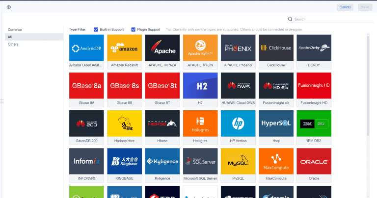
FineReport stands out as a powerful solution for building a product insights dashboard. You can connect to over 70 different data sources, including databases, spreadsheets, and APIs. FineReport enables you to create complex dashboards that combine product analytics, product usage analytics, and feature adoption dashboard views. Its advanced visualization tools help you present data insights clearly, supporting faster decision-making and higher user engagement.
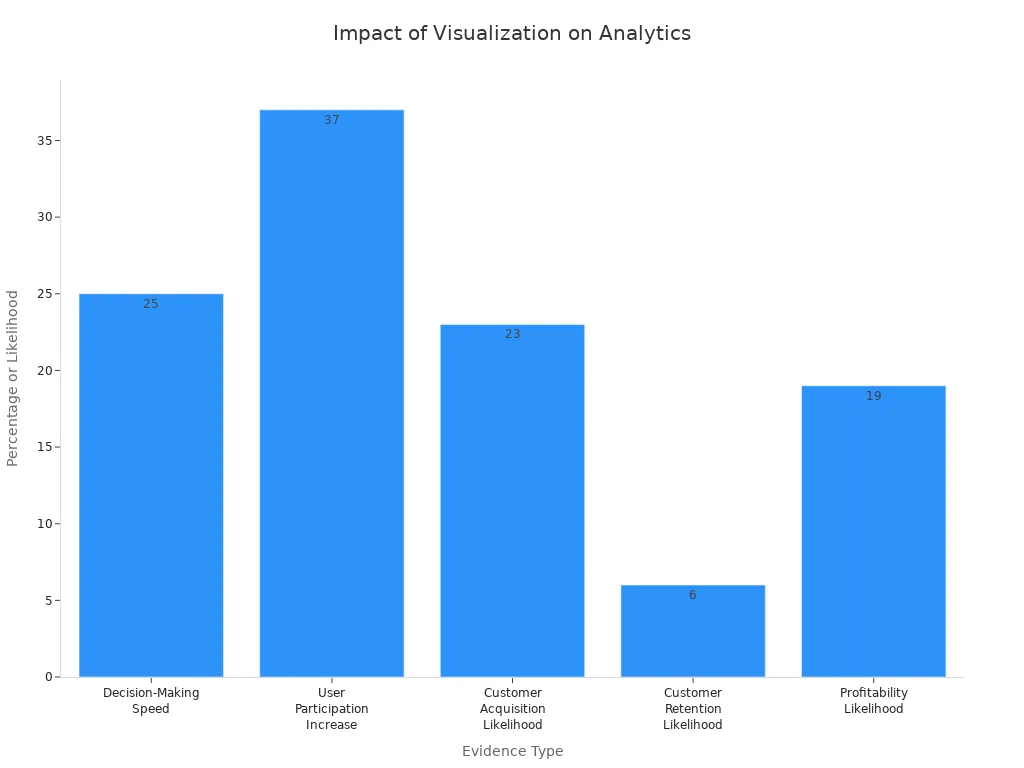
Organizations using advanced visualization tools like FineReport make decisions 25% faster and see a 37% increase in user participation. Data-driven companies are much more likely to acquire and retain customers, and to achieve profitability. FineReport’s customizable dashboard features and seamless integration with multiple data sources make it an ideal choice for product analytics tools. You can use it to track product engagement, in-app engagement, and drive better business outcomes through actionable insights.
Using Product Analytics Dashboard Effectively
Best Practices for Adoption
You can maximize the value of a product analytics dashboard by following a few best practices. Start by choosing the right metrics for your business goals. Customize your dashboard to highlight the numbers that matter most for your product. Select platforms that unify product analytics and user interaction data, so you avoid splitting insights across tools. Set up alerts and notifications to stay informed about important changes in your analytics. Review and update your dashboard regularly to keep your analysis aligned with evolving objectives.
Tip: Clean data and clear definitions help everyone understand what the metrics mean. Make your dashboard accessible and easy to use for all team members. Invest in documentation and training materials. Appoint champions in your organization to support ongoing adoption and knowledge sharing.
Common Applications
You can use a product analytics dashboard in many ways to improve your product experience and drive business outcomes. Track user behavior within your product to see how people interact with features. Analyze engagement with different parts of your product and monitor progression through funnels. Measure onboarding engagement rates and evaluate activation and feature adoption. Assess time to value and key user actions per session. Calculate customer engagement scores and analyze product stickiness.
Fashion retailers use dashboards to track seasonal trends. Electronics companies analyze product lifecycle performance. Beauty brands identify bestselling categories across customer segments. For example, Benefit Cosmetics used real-time dashboards to adjust marketing during a product launch, which led to a 50% increase in click-through rates and a 40% boost in revenue.
Tips for Better Decisions
To make better data-driven decisions, focus your product analytics dashboard on relevant data and visuals. Remove unnecessary features and widgets to minimize clutter. Provide context for your analytics, so users understand what actions to take. Include the right KPIs to ensure your dashboard drives actionable outcomes.
"The best way to make your dashboard more actionable is to choose the right data charts... These charts, graphs, and trend lines can yield meaningful insights to help the team make better decisions."
FineReport supports you in customizing dashboards for your unique needs. You can use dynamic visualizations, interactive components, and a variety of chart types to simplify complex product analysis. Features like bullet maps and flowcharts help you express user insights clearly, making it easier to act on your analytics and improve outcomes.

A product analytics dashboard gives you the power to connect feature adoption with business outcomes, track essential metrics, and eliminate scattered data. You gain clear visibility and actionable insights that drive better decisions. FineReport helps you build dashboards efficiently with simplified data processing, flexible customization, and multi-source data collection.
| FineReport Advantage | What You Get |
|---|---|
| User-friendly design | Quick start and easy report creation |
| Multi-platform display | Access dashboards anywhere |
| Reusable datasets | Faster report development |
To get started, understand your audience, clean your data, choose relevant metrics, and design for action. Iterate based on feedback to maximize the value of your product analytics dashboard.

Continue Reading About Product Analytics Dashboard
Best Dashboard Apps for Business Insights
What is a Call Center Dashboard and Why Does It Matter
What is a Reporting Dashboard and How Does it Work
What is An Interactive Dashboard and How Does It Work
What is a Call Center Metrics Dashboard and How Does It Work


FAQ

The Author
Lewis
Senior Data Analyst at FanRuan
Related Articles

How to Build an Investment Portfolio Reporting Dashboard for Executives: KPIs, Benchmarks, and Drill-Down Views
Investment portfolio reporting for executives is not about showing every holding, transaction, and chart your investment team can produce. It is about giving CEOs, CFOs, CIOs, boards, and investment committees a fast, re
Yida YIn
Jun 25, 2026

12 KPI Reporting Examples for Executive Dashboards: What to Show in Weekly, Monthly, and Quarterly Reviews
Executive leaders do not need more data. They need decision ready $1 examples that match how often they review the business and what actions they are expected to take. A weekly $1 should surface fast moving risks and per
Yida YIn
Jun 25, 2026

How to Build a Digital Marketing Reports Dashboard: Executive Examples, KPIs, and Templates
A $1 is the control layer that helps executives and marketing leaders turn scattered channel data into fast, confident decisions. If you are a CEO, CMO, operations director, or marketing analytics lead, the real problem
Yida Yin
May 07, 2026