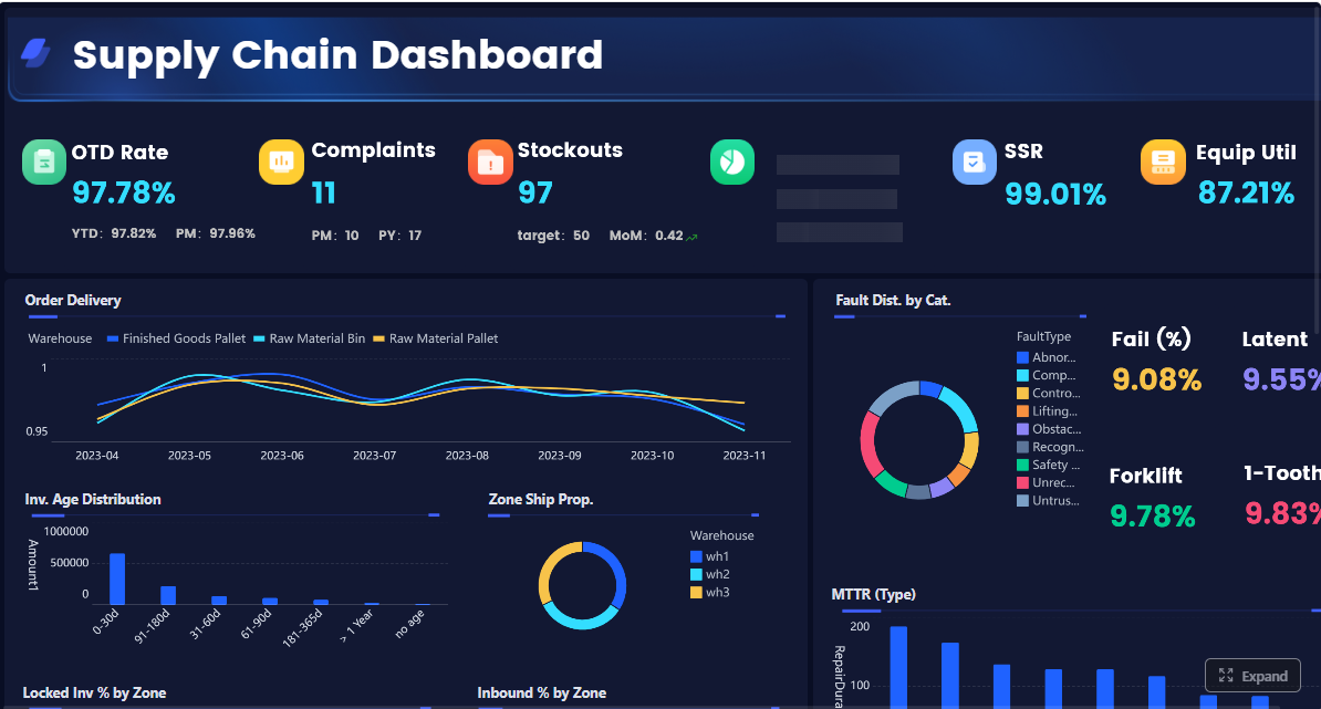
A warehouse KPI dashboard turns raw operational activity into decision-ready signals. For operations directors, warehouse managers, and supply chain leaders, that matters because warehouse performance problems rarely start as major failures. They begin as small delays in receiving, rising pick errors, unmanaged overtime, missed shipment cutoffs, or inventory mismatches that compound over time.
Without a clear dashboard, leaders are forced to manage by anecdotes, static reports, or disconnected system views across WMS, ERP, labor, and transportation tools. That creates three common problems:
Slow response to bottlenecks
Conflicting versions of performance
Too many metrics with no operational ownership
A well-designed warehouse KPI dashboard fixes this by giving leadership one source of truth for throughput, accuracy, labor productivity, cost, and service levels. More importantly, it helps teams focus on the few numbers that actually drive action.
The goal is not to track everything. The goal is to surface the metrics that tell you where the warehouse is winning, where it is drifting, and what needs intervention now.
Click To Try The Dashboard
What a warehouse KPI dashboard should do for operations leaders
A warehouse dashboard should do more than display charts. It should support daily control, weekly performance review, and longer-term process improvement.
At the operational level, it should show whether inbound, storage, picking, packing, and shipping are moving at the expected pace. At the management level, it should reveal whether labor, space, and process design are supporting service targets or quietly eroding them. At the executive level, it should connect warehouse execution to business outcomes like cost-to-serve, customer satisfaction, and margin protection.
In practical terms, a high-value warehouse KPI dashboard should help leaders answer questions like:
Are we shipping on time without overspending on labor?
Is throughput increasing, or are we just working more overtime?
Are picking gains causing more errors or returns?
Which site, shift, zone, or SKU category is underperforming?
Where should supervisors intervene first today?
This is why operations leaders need a single source of truth. If one team calculates productivity from labor hours in one system, while another uses paid hours from payroll and a third uses planned hours from scheduling, the dashboard becomes a debate tool instead of a decision tool.
Just as important, good dashboards avoid the trap of over-measurement. Warehouses can generate dozens of possible KPIs, but not all of them deserve dashboard real estate. A strong scorecard prioritizes metrics that are:
The 12 metrics every warehouse KPI dashboard should include
These 12 KPIs cover the core operating model of most warehouse environments. Together, they give a balanced view of speed, quality, labor efficiency, cost control, and customer service.
Key Metrics (KPIs)
Orders picked per hour: Measures how many orders are picked in one hour. Indicates outbound productivity and workflow speed.
Lines picked per labor hour: Tracks picking output relative to labor input. Useful for labor planning and productivity benchmarking.
Dock-to-stock time: Measures the time from receipt at dock to inventory availability in storage. Reveals inbound bottlenecks.
Order cycle time: Tracks elapsed time from order release to shipment. Shows end-to-end fulfillment responsiveness.
Inventory accuracy: Compares system inventory to physical inventory. Critical for planning, availability, and trust in the WMS.
Order picking accuracy: Measures the percentage of picks completed correctly. Directly affects returns, rework, and customer satisfaction.
Perfect order rate: Tracks orders delivered complete, on time, accurate, and undamaged. A high-level service quality metric.
Labor utilization: Measures how effectively paid labor time is converted into productive warehouse work.
Overtime percentage: Shows the share of labor hours worked as overtime. Signals capacity issues, poor planning, or seasonal strain.
Space utilization: Tracks how much usable storage capacity is occupied. Helps balance density, accessibility, and flow.
Cost per order shipped: Measures total warehouse fulfillment cost divided by shipped orders. Important for margin and efficiency management.
On-time shipment rate: Tracks the percentage of orders shipped by promised cutoff or SLA. Core customer service metric.
Throughput and flow metrics
Orders picked per hour
This metric shows the number of customer orders picked in a single hour. It is one of the clearest indicators of outbound productivity.
A falling rate often points to congestion, poor slotting, labor imbalance, replenishment delays, or inefficient travel paths. A rising rate is positive only if accuracy remains stable. On its own, speed can be misleading.
Best use cases:
Compare productivity by shift
Spot performance differences by picking method
Monitor impact of process changes or automation
Lines picked per labor hour
Orders vary in complexity. That is why lines picked per labor hour is often a better productivity measure than orders alone. It adjusts for the number of line items processed and ties output directly to labor consumption.
This metric is especially useful in warehouses with mixed order profiles, high SKU counts, or variable order sizes.
Best use cases:
Benchmark labor performance across teams
Evaluate slotting and travel efficiency
Separate true productivity improvements from order mix effects
Dock-to-stock time
Dock-to-stock time measures how long it takes incoming inventory to move from receiving to available stock. This KPI matters because inbound delays create downstream problems fast: replenishment shortages, inaccurate availability, and backorder risk.
When dock-to-stock time increases, leaders should investigate receiving staffing, inspection delays, put-away congestion, and system transaction timing.
Best use cases:
Improve receiving process flow
Reduce inventory latency
Support faster replenishment and order availability
Order cycle time
Order cycle time tracks the elapsed time from order release to shipment. It is a broad but powerful view of warehouse responsiveness.
Long cycle times can signal bottlenecks in wave planning, replenishment, picking, packing, staging, or carrier handoff. This KPI becomes more valuable when segmented by channel, order priority, or customer type.
Best use cases:
Monitor service responsiveness
Compare standard vs. expedited order flow
Identify where fulfillment slows down
Accuracy and quality metrics
Inventory accuracy
Inventory accuracy compares what the system says is in stock with what is physically present. If this number is weak, many other warehouse KPIs become less trustworthy.
Poor inventory accuracy often leads to stockouts, unnecessary expedites, lost sales, and wasted labor. Root causes usually include transaction timing errors, unrecorded moves, receiving discrepancies, and ineffective cycle counting.
Best use cases:
Strengthen replenishment reliability
Improve planning and allocation
Reduce exceptions during picking
Order picking accuracy
Order picking accuracy measures the percentage of order lines or orders picked correctly the first time. This is one of the most important warehouse quality metrics because mis-picks generate rework, returns, credits, and customer dissatisfaction.
Leaders should track this by picker, zone, SKU type, and shift to isolate systemic issues.
Best use cases:
Reduce returns and complaints
Support training and coaching
Validate scanning and verification processes
Click To Try The Dashboard
Perfect order rate
Perfect order rate is the composite service metric. It reflects whether an order was shipped complete, on time, accurate, and undamaged. This is the KPI many executives care about most because it captures the customer-facing outcome of warehouse execution.
A warehouse can have strong internal productivity but still underperform on perfect orders if damage rates, late shipments, or documentation errors are rising.
Best use cases:
Align warehouse metrics with customer experience
Connect execution quality to business performance
Track service consistency over time
Labor and capacity metrics
Labor utilization
Labor utilization shows how much paid time is spent on productive work. It helps leaders understand whether staffing levels and task allocation are aligned with workload.
Low utilization may indicate overstaffing, poor work balancing, waiting time, equipment constraints, or scheduling mismatch. High utilization can look efficient, but if it is sustained too long, it may increase fatigue, errors, and turnover.
Best use cases:
Improve workforce scheduling
Balance work across shifts and zones
Identify idle time and task gaps
Overtime percentage
Overtime percentage tracks how much of total labor is being delivered through overtime hours. Used carefully, overtime is a flexible capacity lever. Overused, it becomes a cost and quality risk.
A sustained increase may indicate weak forecasting, poor labor planning, peak mismanagement, or process inefficiency.
Best use cases:
Manage labor costs
Detect hidden capacity stress
Balance service needs with workforce sustainability
Space utilization
Space utilization measures how much warehouse capacity is occupied. It is essential, but it should not be optimized in isolation. A warehouse that is too full may reduce travel efficiency, block replenishment, create safety issues, and slow picking.
The best operators balance storage density with flow efficiency.
Best use cases:
Improve slotting strategy
Delay unnecessary expansion
Identify congestion risk in fast-moving zones
Cost and service metrics
Cost per order shipped
Cost per order shipped combines labor, overhead, packing, and operational handling costs into a simple financial efficiency measure.
This KPI is particularly useful for executive review because it translates warehouse performance into cost language. It should be segmented where possible by order type, customer class, channel, or facility because not all orders cost the same to fulfill.
Best use cases:
Track efficiency gains over time
Compare operating models across sites
Support pricing and cost-to-serve analysis
On-time shipment rate
On-time shipment rate tracks the percentage of orders shipped by their required cutoff, customer promise date, or SLA commitment. It is one of the cleanest service indicators on the dashboard.
This metric should be visible in real time or near real time for supervisors, especially in high-volume operations with fixed carrier windows.
Best use cases:
Protect customer commitments
Prioritize work during peak periods
Measure warehouse contribution to service performance
How to organize metrics into a dashboard your team will actually use
A warehouse KPI dashboard only drives value if teams can interpret it quickly and act on it confidently. The design should match how warehouse leaders make decisions, not how source systems happen to store data.
Group KPIs by operational goal
The most effective dashboards group metrics into operational themes. This helps users move from data review to action without hunting across unrelated charts.
A practical structure is:
Speed and throughput: Orders picked per hour, lines picked per labor hour, dock-to-stock time, order cycle time
Accuracy and quality: Inventory accuracy, order picking accuracy, perfect order rate
Cost control and capacity: Labor utilization, overtime percentage, space utilization, cost per order shipped
Customer service: On-time shipment rate, plus supporting exception views
This structure also makes ownership clearer. For example:
Receiving leaders influence dock-to-stock time
Picking supervisors influence orders picked per hour and picking accuracy
Inventory control teams influence inventory accuracy
Operations managers influence labor utilization and overtime
Distribution leaders influence on-time shipment rate
When every KPI has an owner, the dashboard becomes operationally useful.
Set targets, thresholds, and drill-down views
A dashboard should not just display current values. It should show whether performance is on target, drifting, or outside control limits.
Use three layers:
Target: What good performance looks like
Threshold: When intervention is required
Trend: Whether the KPI is improving or deteriorating
Drill-down capability is what turns a warehouse KPI dashboard into a management tool. Leaders should be able to move from enterprise view to root-cause view by:
Shift
Zone
SKU category
Order type
Carrier
Facility
Team or supervisor
For example, a low on-time shipment rate becomes actionable only when the dashboard reveals whether the issue is isolated to one late shift, one congested packing area, or one facility serving a promotion-heavy region.
Use dashboard views for different stakeholders
Not every stakeholder should see the same dashboard.
Directors and senior operations leaders need:
Trend lines
Cross-facility comparisons
Exception summaries
Cost and service views
Executive-level scorecards
Warehouse supervisors need:
Real-time or intraday status
Queue volumes
Threshold alerts
Shift-level productivity
Immediate exception lists
Analysts and continuous improvement teams need:
Deeper drill-down capability
Historical trend comparisons
Segmentation by process, SKU, order profile, and labor pattern
A common dashboard design mistake is trying to serve all users with one screen. In practice, role-based views increase adoption and reduce confusion.
Common mistakes to avoid before developing a warehouse dashboard
Most dashboard failures are not caused by visualization problems. They are caused by poor KPI design, weak governance, or unreliable data.
Tracking too many KPIs without ownership
Many warehouse teams begin with the wrong assumption: if a metric is available, it should be shown. That approach creates clutter and dilutes focus.
A better approach is to build a manageable operational scorecard. Start with the KPIs that support the most important decisions and assign ownership for each one.
For every KPI, define:
Who owns the result
What action is expected when it worsens
How often it is reviewed
What root causes are most likely
Without this discipline, the dashboard becomes a passive reporting layer instead of a performance management system.
Using inconsistent definitions and unreliable data
This is one of the fastest ways to lose trust in a warehouse KPI dashboard. If two leaders calculate the same KPI differently, no one believes the numbers.
Standardize formulas across systems and document them clearly. Common problem areas include:
Productive hours vs. paid hours
Order release time vs. order creation time
Shipped on time vs. delivered on time
Order-level vs. line-level accuracy
Net usable space vs. gross facility space
Before tying dashboard outputs to reviews or incentives, audit the data thoroughly. Validate event timestamps, transaction completeness, and master data quality across WMS, ERP, LMS, and transportation systems.
Ignoring context behind the numbers
KPI movement is only meaningful in context. A drop in lines picked per labor hour may not mean the team is underperforming. It may reflect a spike in small, complex orders, a promotional surge, labor onboarding, or a slotting reset.
Context that should be considered alongside dashboard performance includes:
Order mix changes
Seasonality
Promotions
Carrier cutoffs
Staffing shortages
Facility constraints
New SKU introductions
Smart warehouse leaders never read dashboard numbers in isolation. They pair metrics with operational reality.
Examples and insights for turning dashboard data into operational improvements
The real value of a warehouse KPI dashboard is not visibility alone. It is better action. The strongest teams build routines around the dashboard and use KPI patterns to improve flow, reduce waste, and protect service.
Improving throughput without sacrificing accuracy
A common operational mistake is chasing speed metrics without monitoring quality. For example, pushing pick rates aggressively can increase mis-picks, short ships, and rework.
A smarter approach is to pair:
Orders picked per hour
Lines picked per labor hour
Order cycle time
Order picking accuracy
Perfect order rate
This combination helps leaders identify where throughput gains are sustainable and where they are masking instability.
Example scenario:
Picking productivity rises 12%
Order cycle time improves 8%
Picking accuracy falls from 99.6% to 98.9%
That pattern suggests the process has become faster but less controlled. The likely response is not simply to slow down. It may involve re-slotting high-velocity SKUs, improving scan compliance, adjusting batch size, or refining replenishment timing.
Reducing cost while protecting service levels
Cost reduction efforts often fail because they focus narrowly on labor hours. If labor cuts reduce on-time shipment performance, the business simply shifts cost into expediting, customer dissatisfaction, and margin erosion.
The right dashboard view compares:
Labor utilization
Overtime percentage
Cost per order shipped
On-time shipment rate
Example scenario:
Overtime percentage rises steadily for four weeks
Cost per order shipped increases
On-time shipment rate remains flat
This may indicate that overtime is compensating for a process problem rather than demand growth. Possible causes include poor slotting, packing bottlenecks, unbalanced scheduling, or delayed replenishment.
In that case, the dashboard should trigger targeted action such as:
Reviewing zone-level labor allocation
Auditing top delay categories during peak shifts
Testing slotting changes for fast movers
Adjusting cut-off management and wave timing
Building a cadence for review and continuous improvement
A dashboard creates value when it is embedded into operating rhythms.
A practical cadence looks like this:
Daily review
Supervisor huddles
Exceptions from prior shift
Throughput, labor, and shipment risk
Immediate corrective actions
Weekly review
Trend discussion by function
Root-cause analysis for recurring misses
Team coaching priorities
Process adjustments and short-term experiments
Monthly review
Cross-site comparison
Target resets
Structural process improvement initiatives
Investment or automation decisions
This review rhythm turns dashboard outputs into a cycle of action:
Detect performance change
Diagnose likely cause
Test corrective action
Measure impact
Standardize if successful
That is how KPI reporting evolves into continuous improvement.
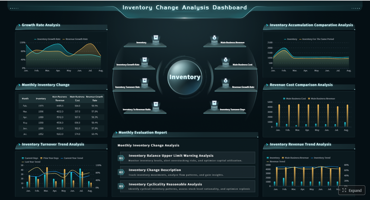
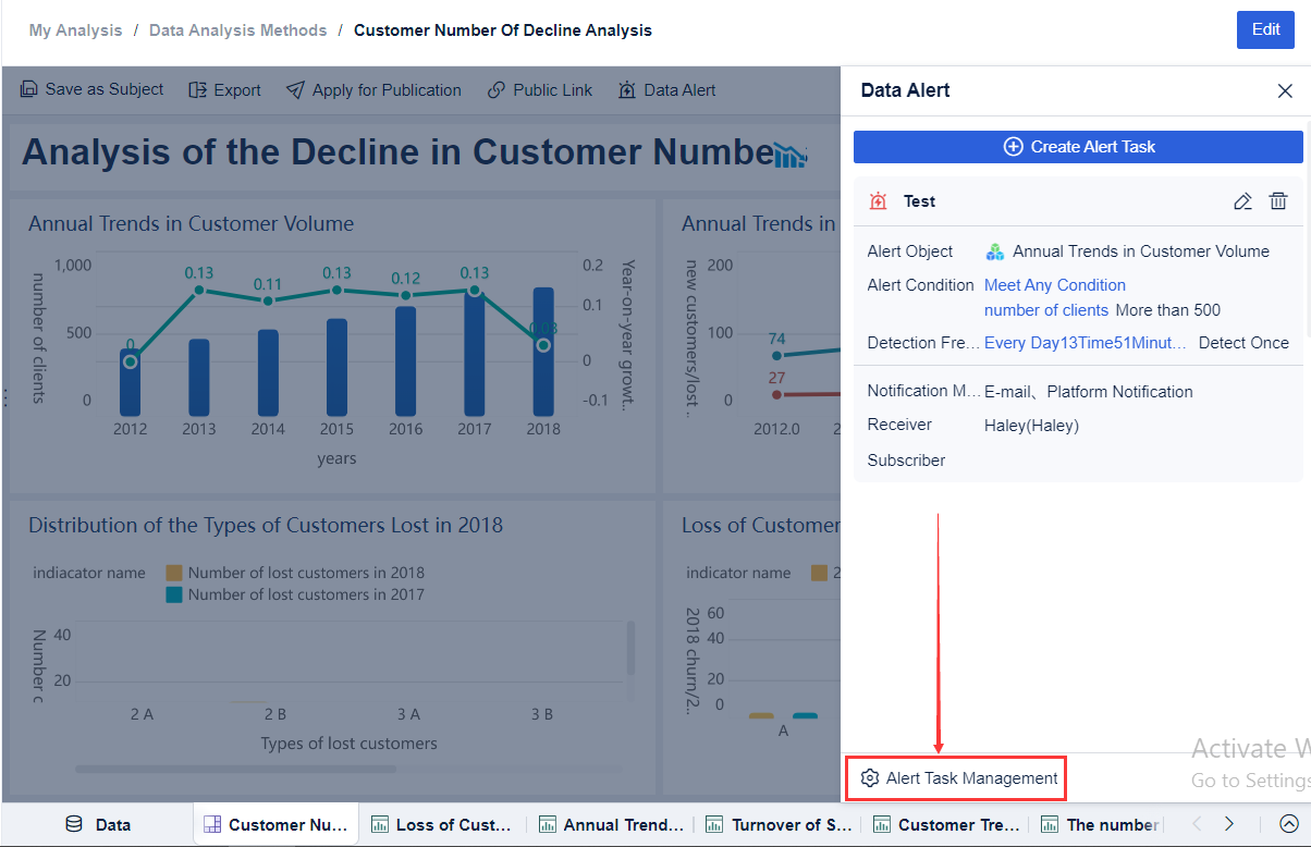
Building this manually is complex; use FineReport to automate the workflow
Designing a high-value warehouse KPI dashboard is not just a reporting task. It requires metric standardization, multi-system integration, role-based views, threshold logic, drill-down design, and dependable refresh cycles. Building all of that manually in spreadsheets or fragmented BI tools is slow, hard to govern, and difficult to scale across facilities.
This is where FineReport becomes the practical solution.
Building this manually is complex; use FineReport to utilize ready-made templates and automate this entire workflow.
FineReport helps warehouse and operations teams move faster by enabling them to:
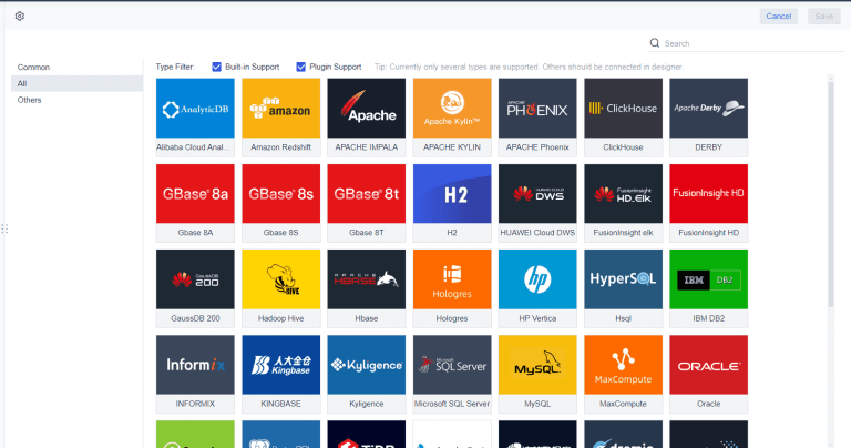
Connect data from WMS, ERP, MES, labor, and transportation systems
Build role-based dashboards for directors, managers, and supervisors
Use ready-made templates to accelerate warehouse KPI reporting
Set thresholds, alerts, and drill-down paths for exception management
Standardize KPI formulas across facilities
Refresh dashboards automatically for daily and real-time operational visibility
For enterprise decision-makers, that means less time debating numbers and more time improving throughput, accuracy, and service performance. For warehouse teams, it means a dashboard that is actually usable in live operations, not just during month-end reviews.
If your current reporting environment depends on manual exports, disconnected definitions, or static scorecards, the next step is clear: define the 12 KPIs that matter most, assign ownership, and deploy a dashboard platform that can operationalize them at scale. FineReport gives you that foundation without forcing you to build the entire reporting framework from scratch.
FAQs
A warehouse KPI dashboard should include a focused set of metrics covering throughput, accuracy, labor efficiency, cost, space, and service levels. Common examples include dock-to-stock time, order cycle time, inventory accuracy, picking accuracy, cost per order shipped, and on-time shipment rate.
The most useful throughput KPIs are orders picked per hour, lines picked per labor hour, dock-to-stock time, and order cycle time. Together, they show whether goods are moving faster or if delays are building in receiving, picking, or shipping.
Choose KPIs that are clearly defined, tied to operational decisions, and owned by a specific team or manager. The best dashboard tracks a small number of actionable metrics rather than too many disconnected numbers.
Inventory accuracy is critical because bad stock data leads to stockouts, mispicks, rework, and lost trust in the system. When the physical count matches the WMS, planners and supervisors can make faster and more reliable decisions.
Review core operational KPIs daily to catch bottlenecks early, and use weekly or monthly reviews for trends, root causes, and improvement planning. The right cadence depends on how quickly the metric changes and who is expected to act on it.
Product Trial
FineReport
Pixel-perfect reports · Interactive dashboards · Easy data entry · Digital twins