
What Is Dashboard Design?
Dashboard vs Report Meaning
What's the difference between a dashboard and a report?
- Dashboards represent how you're performing against strategic goals visually and in real-time. And by goals, we mean specific business outcomes, such as targeted quarterly revenue or targeted new customers per month.
- Reports support dashboards by representing the tactical processes or actions necessary to achieve the strategic goals. Reports track and measure historical data against targets for specific actions.
More resources:
- Dive deeper on the question, "What is a dashboard?"
- Download interactive dashboard templates
Don't just collect data. Visualize what matters.
Download the Dashboard Design Guide to learn:
- 10 essential steps to build effective dashboards
- How to choose the right charts and avoid visual clutter
- 15 top-notch dashboard templates for 2026

Why Is Good Design Important?
Good design is an important way to ensure your teams are supporting the overall goals of the organization. Here are some of the biggest reasons why you need effective dashboard design.
- Keep your teams aligned: Whether measuring project success or employee performance, a unified visual layout keeps teams moving in the same direction.
- Provide a health check: Clean designs give you a realistic look at the health of your organization, from risk factors to financial indicators.
- Make adjustments: Dashboards help you clearly see your successes and failures so you can do more of what's working, and less of what's not.
- Hold your teams accountable: Make sure everyone provides value with visual metrics that help employees track their progress and help managers move things along.
Types of Dashboard Layouts
Dashboards come in many flavors. While some are used to measure monthly progress against a goal, others have a longer-term focus. The one thing all effective dashboards have in common is that they're tied to strategic goals. Here's an overview of some of the most common types of layouts.
Strategic Dashboard
These big-picture dashboards monitor organizational goals. Executives typically look to one or two strategic dashboards to find out how the organization is doing at any given time. Examples include visual summaries of return on investment, revenue and market share.
Operational Dashboard
These dashboards typically measure performance in a shorter time frame, and are focused on organizational processes and efficiencies. Some examples include sales by region, average monthly transportation costs and cost per acquisition (CPA).
Analytical Dashboard
Regardless of the type of dashboard you define, you should know the difference between leading indicators and lagging indicators. Analytical layouts allow users to drill down into the data to explore both what has happened and what might happen. Organizations use a mix of both to ensure they're tracking what's most important.
How to Design a Dashboard
- Who, what, how. Be clear about who the audience is, what they want, and how they're going to use the dashboard. This means working with your stakeholders to identify the core metrics that map directly to their goals and strategy.
- Be clear and contextual. Make sure your layout focuses on Specific, Measurable, Attainable, Realistic, and Time-bound targets. This is a useful touchstone whenever you're considering whether a visual should be on your dashboard.
- Iterate and evolve. Over time, see how you or your audience are using the set of visualizations and if you find that certain ones aren't relevant, remove or replace them.
Dashboard Design Examples
In this guide, we've identified and prioritized the most impactful dashboard design examples for each department. Use the table of contents below to find the dashboard examples most relevant to your organization and teams.
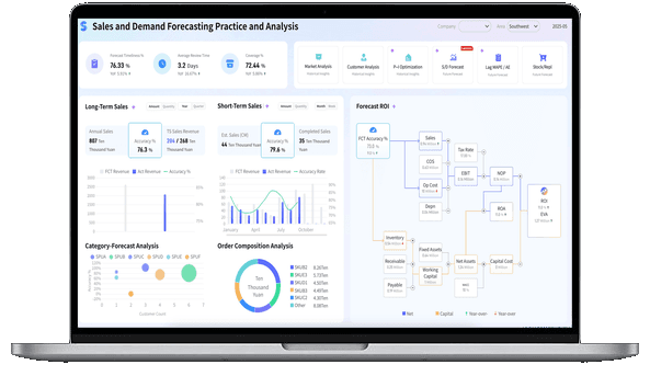
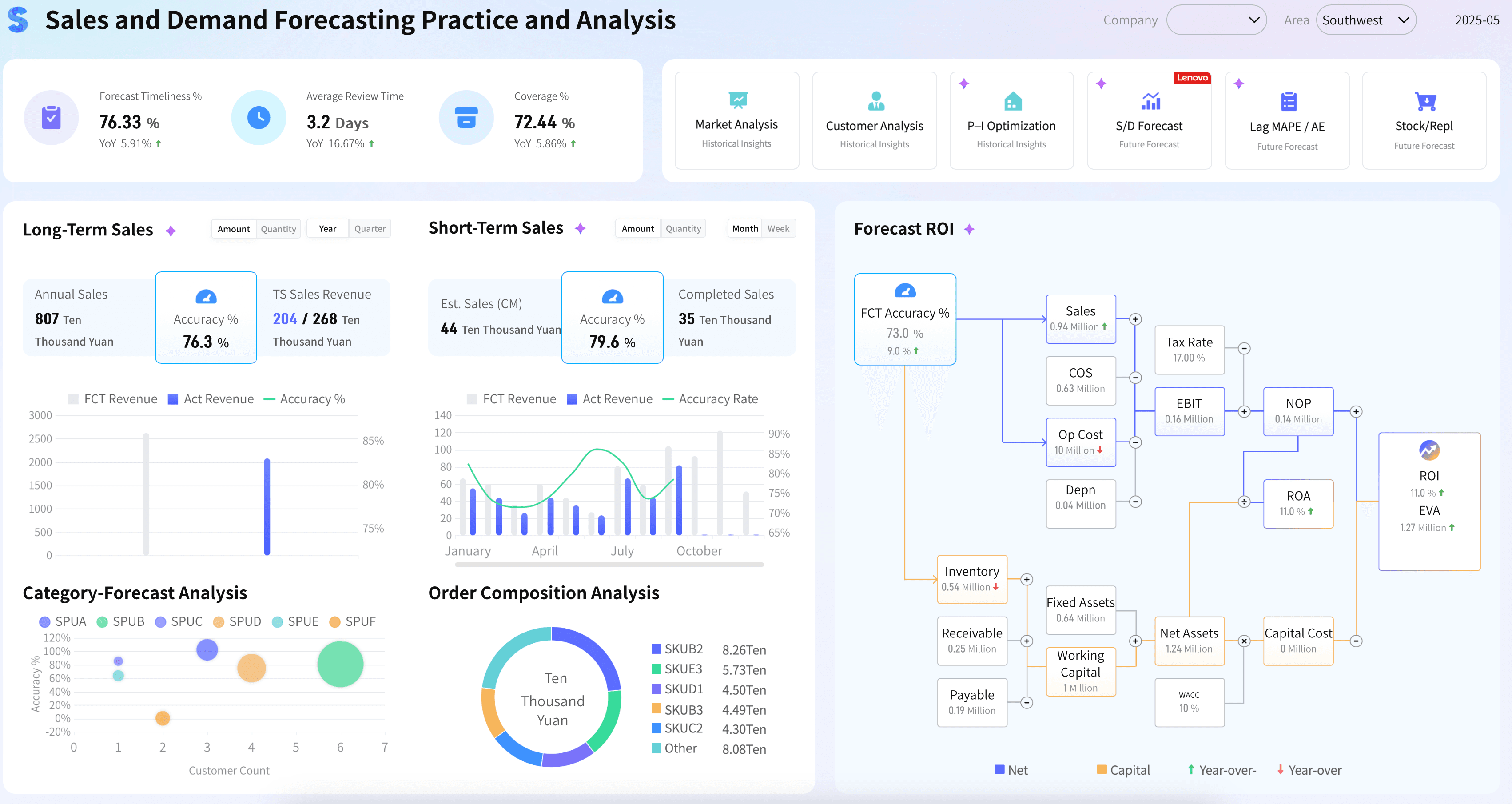
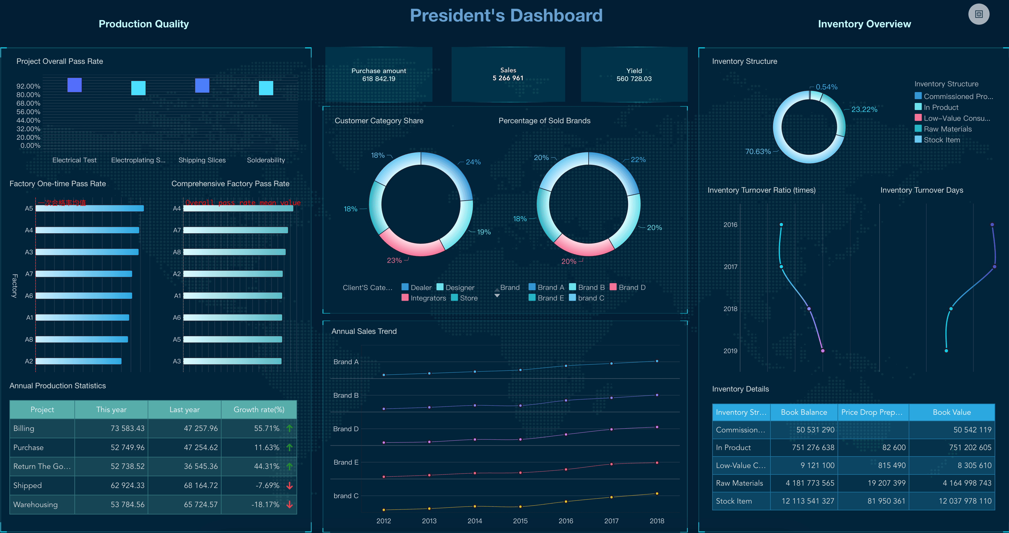
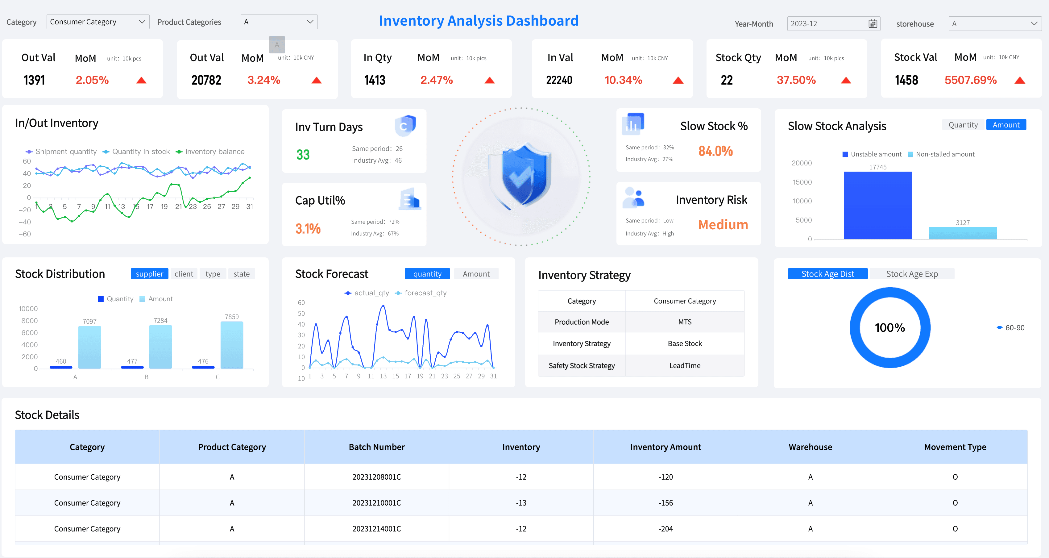
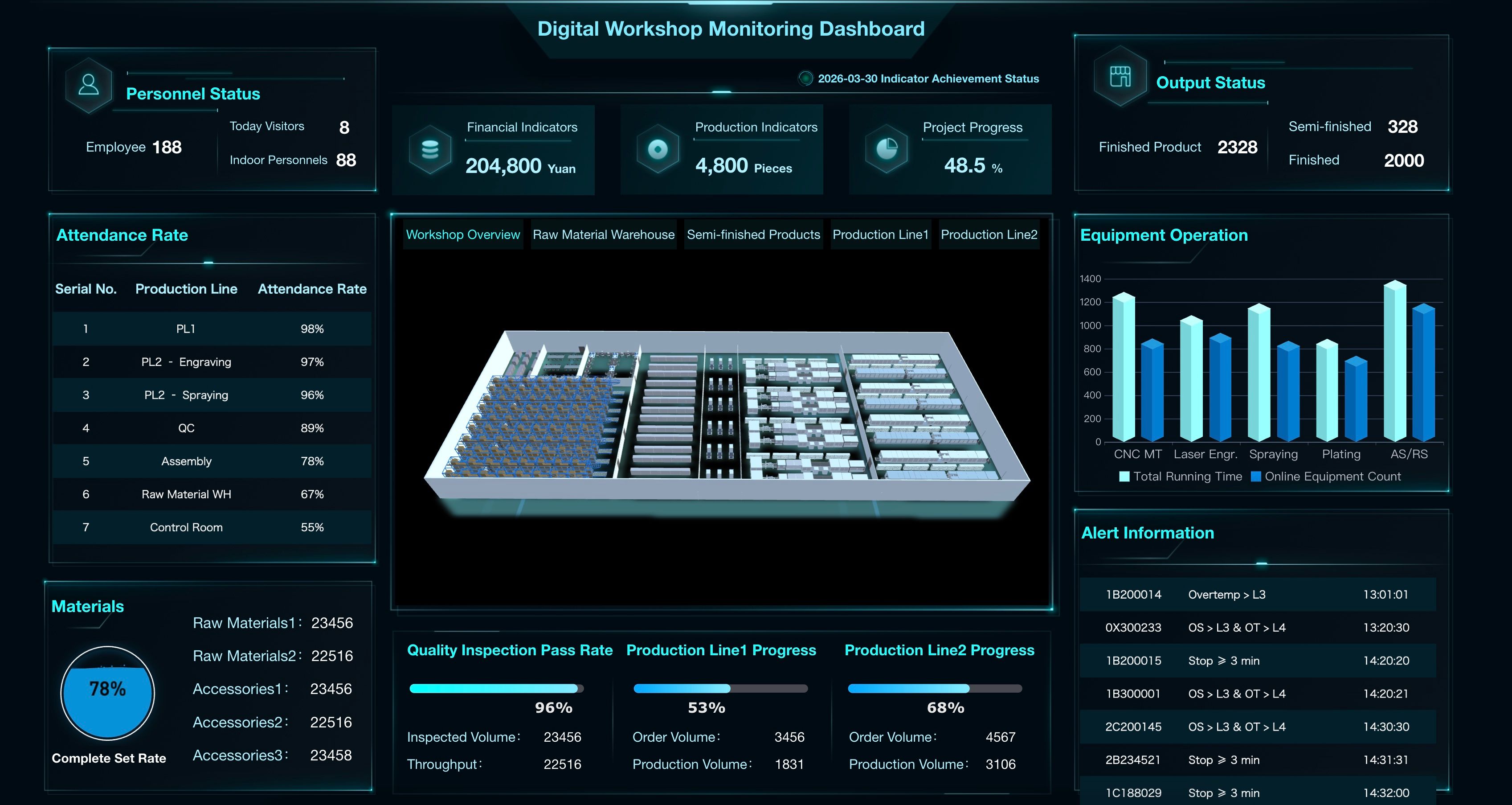
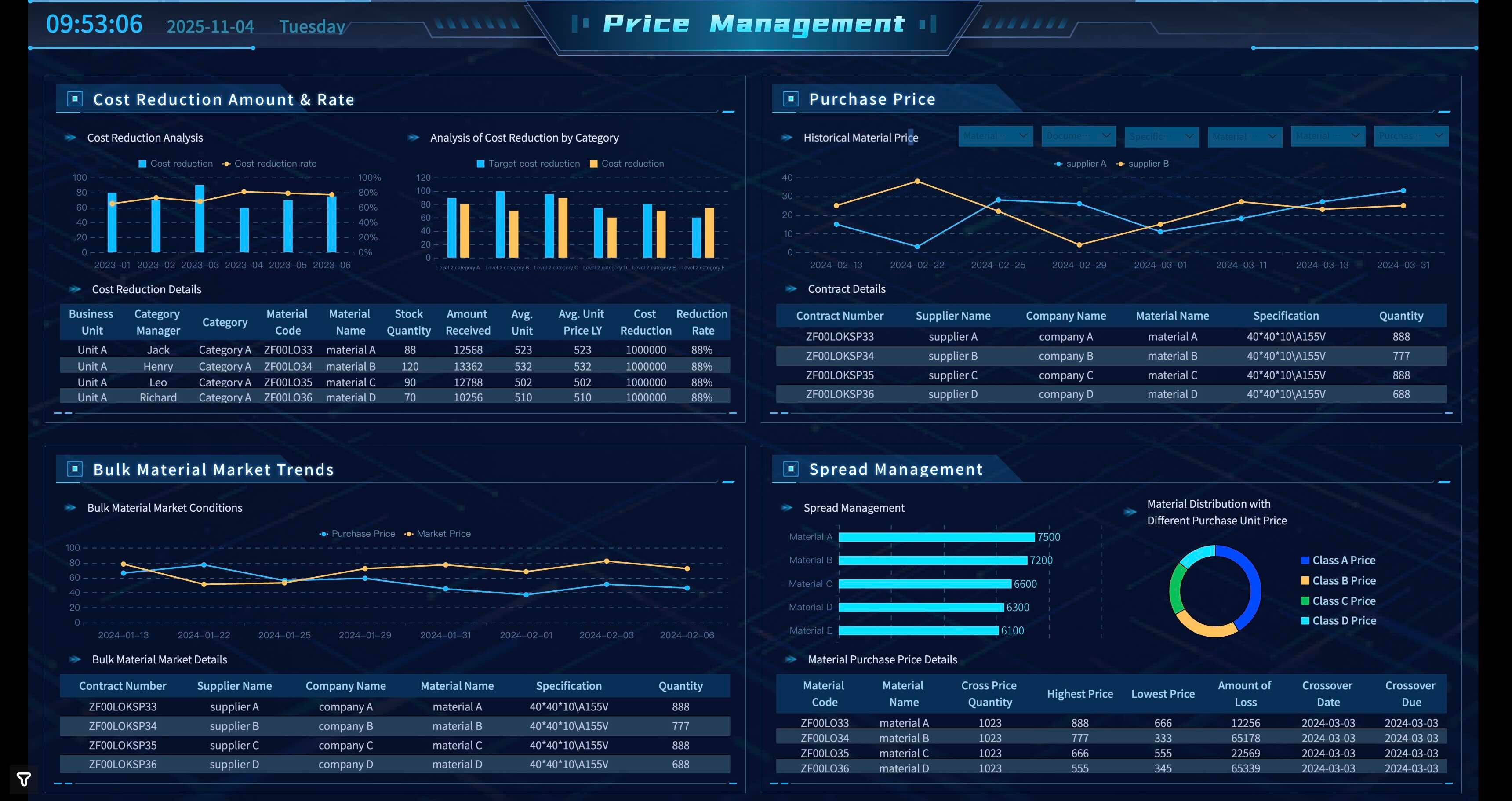
Manufacturing Dashboard Examples
Manufacturing leaders and plant managers need to track the metrics that help them optimize production and minimize downtime. Below are essential elements for your manufacturing dashboard:
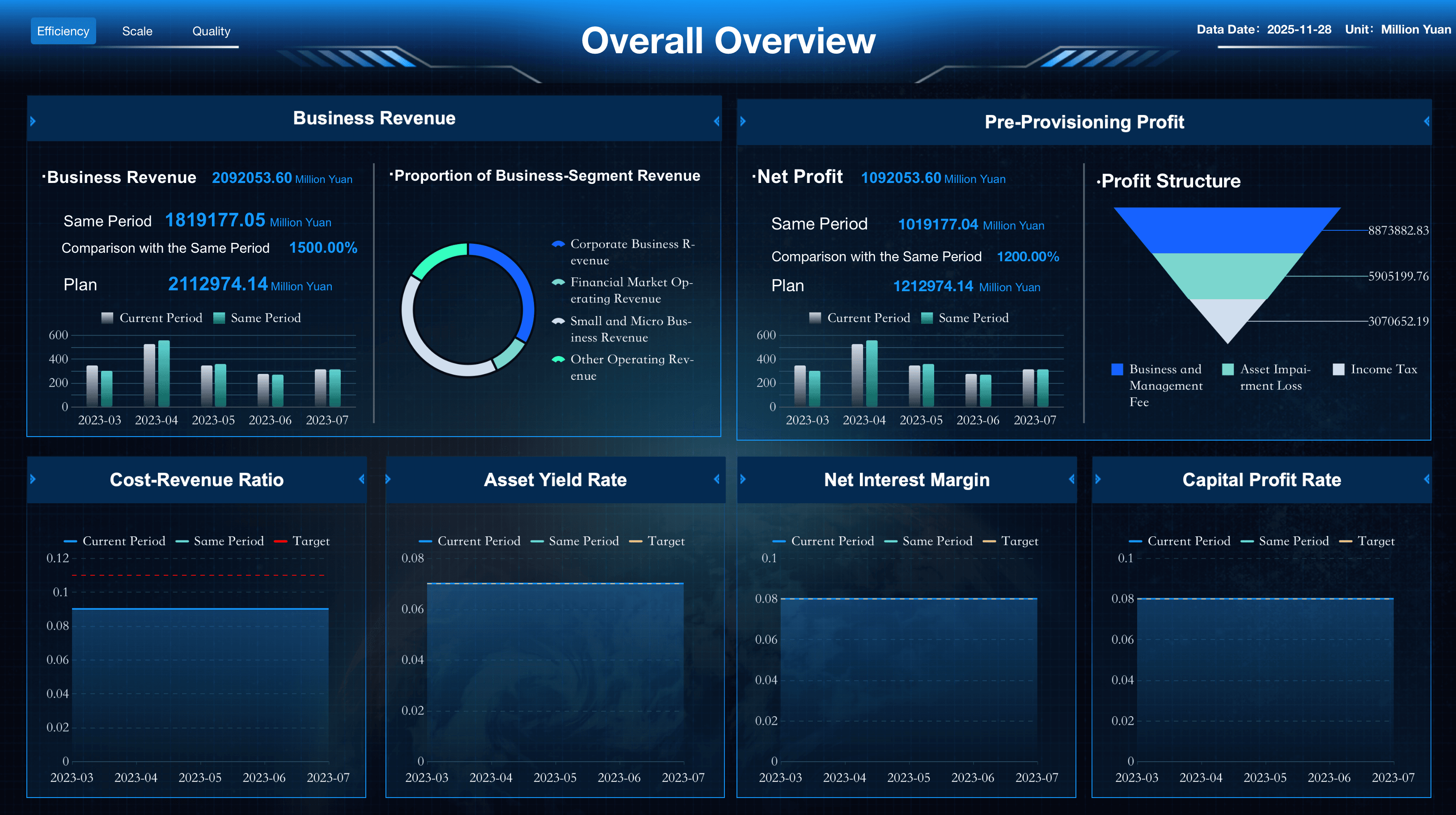
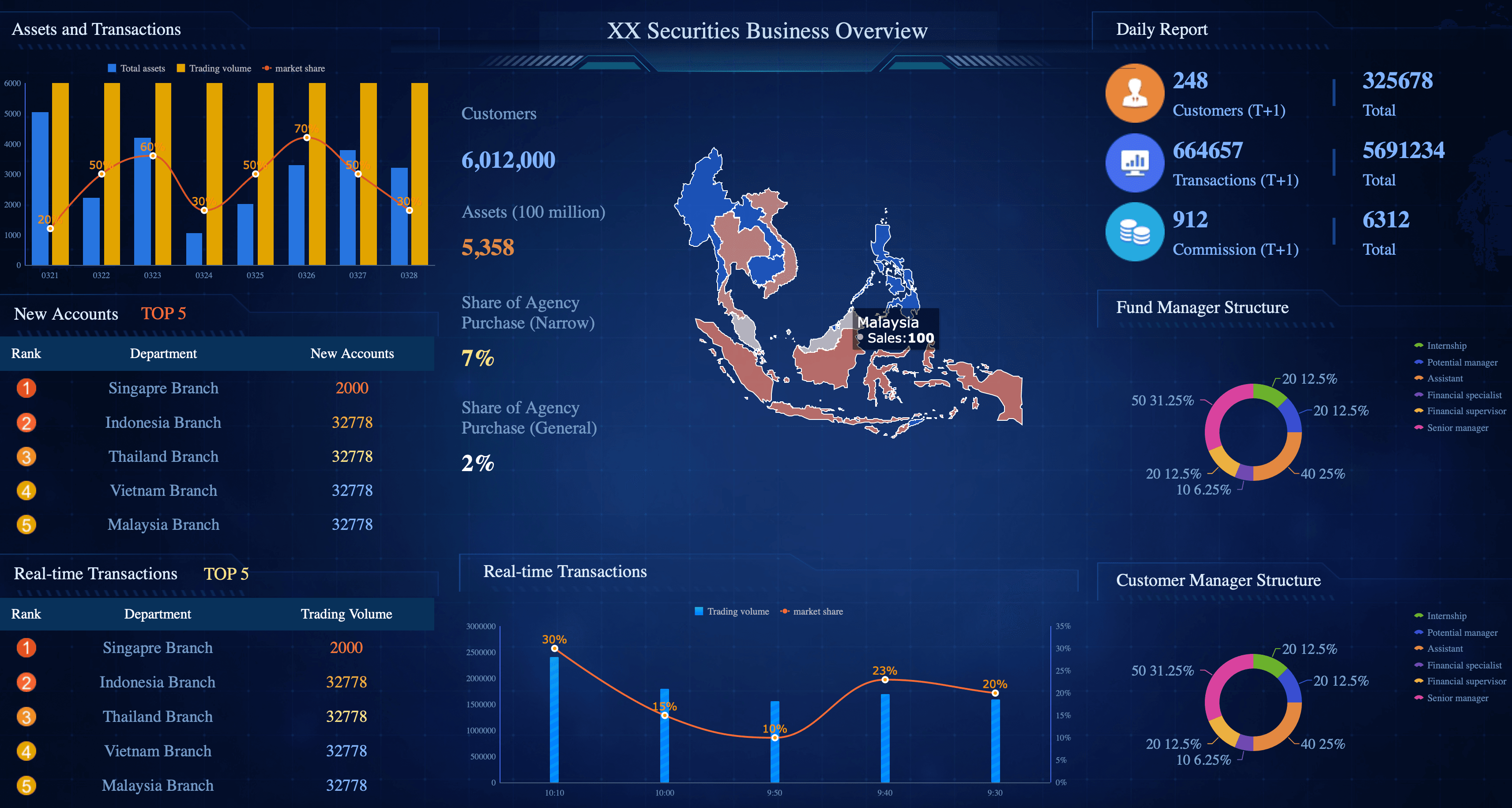
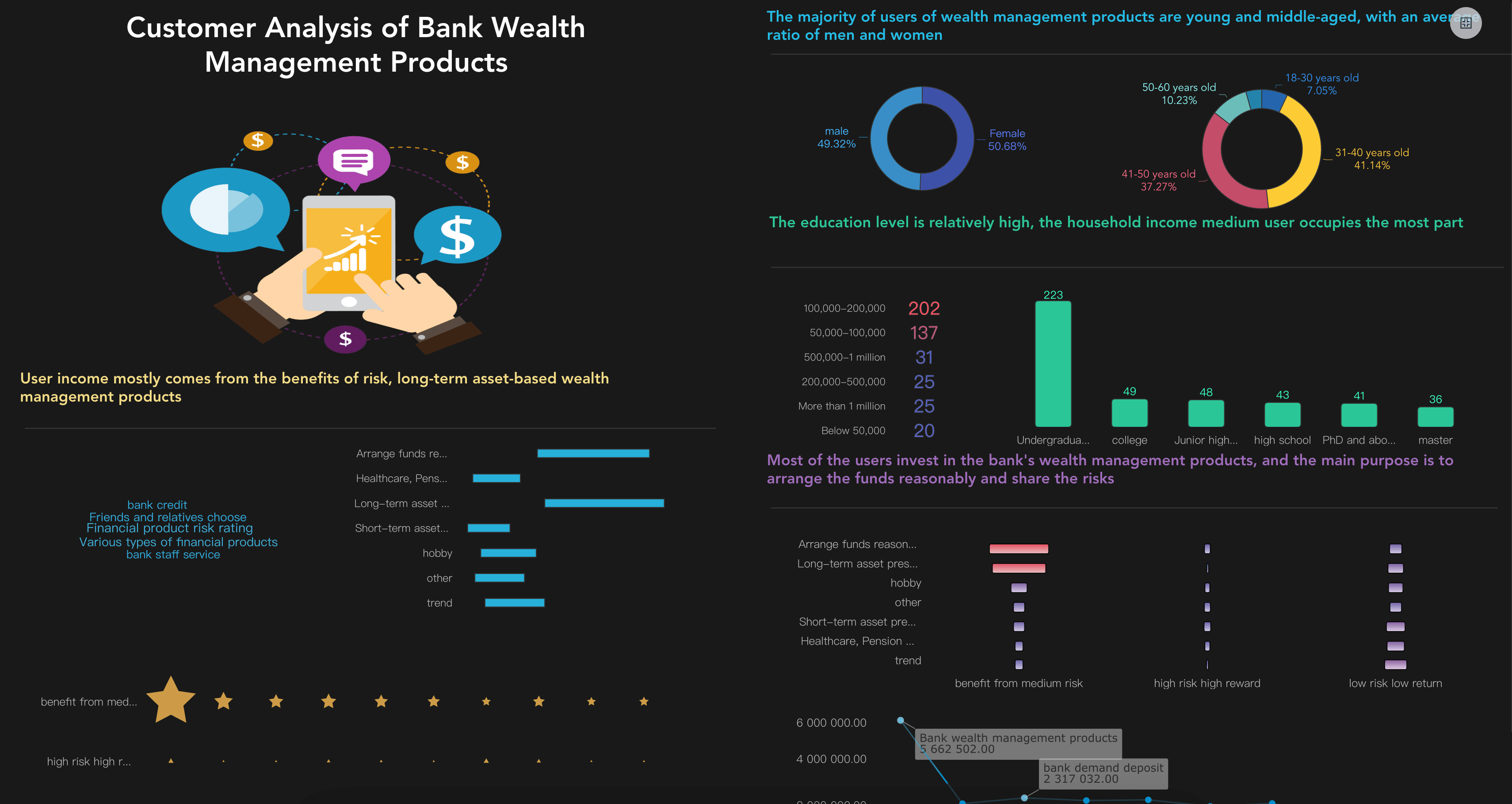
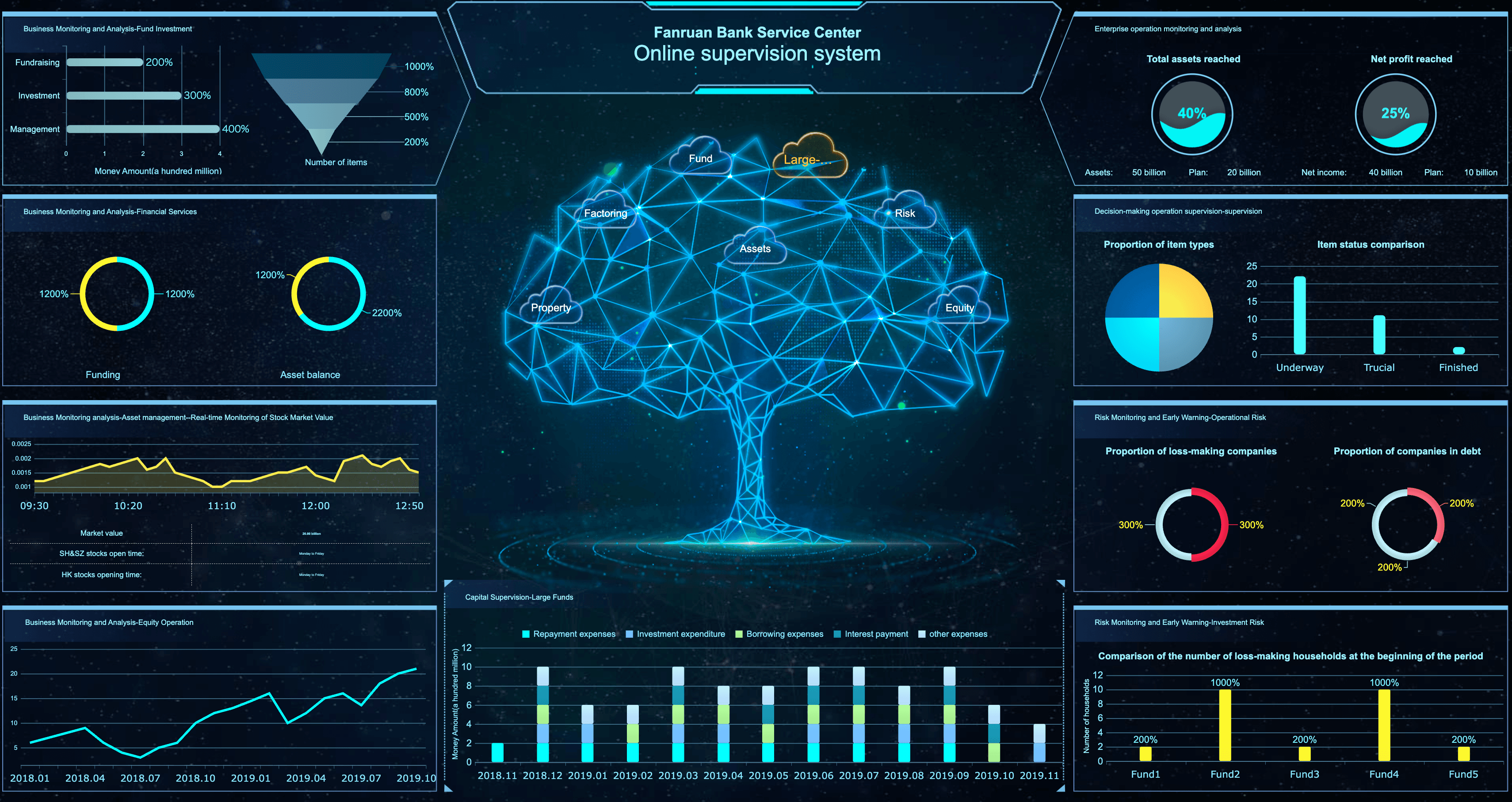
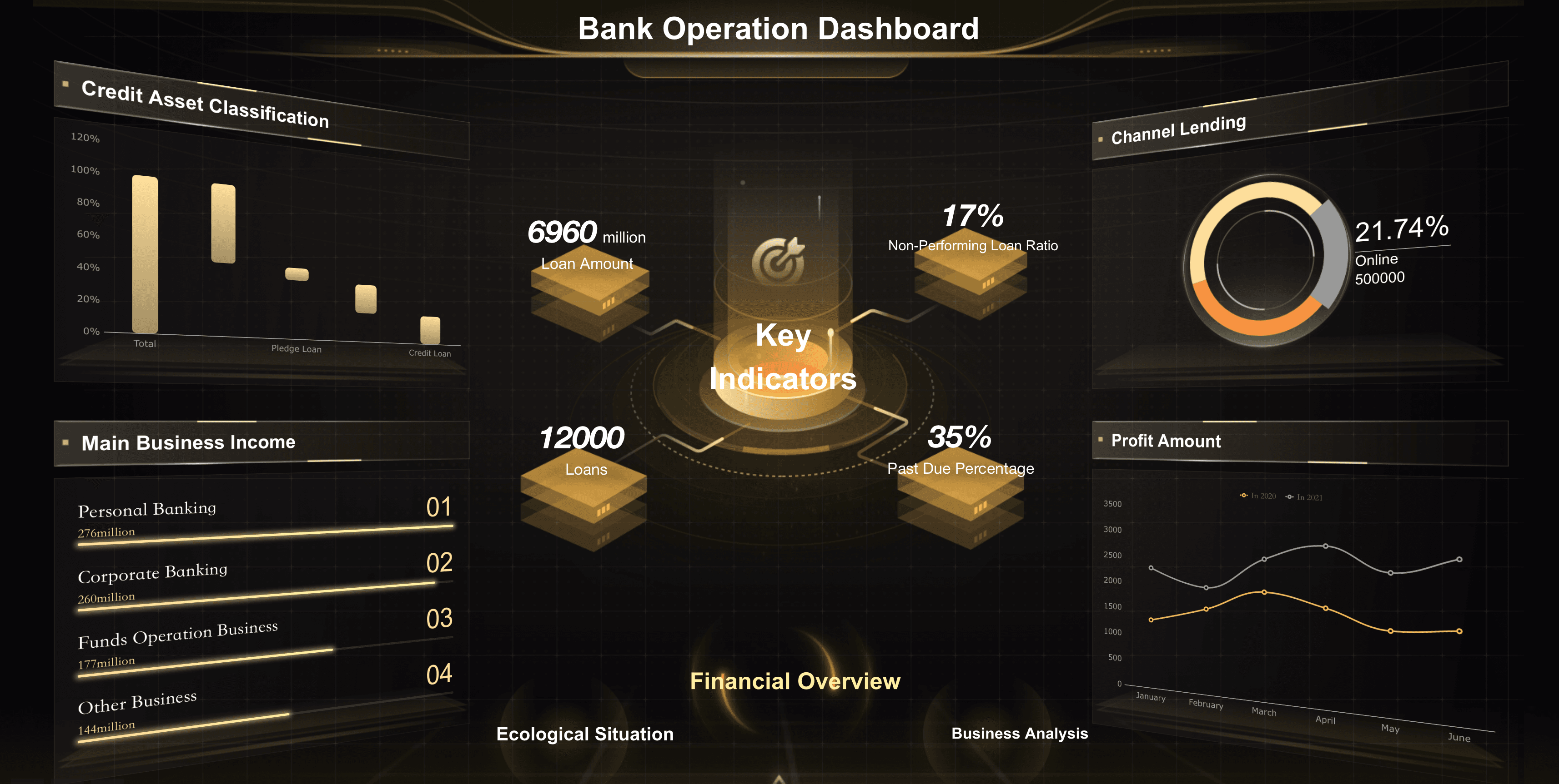
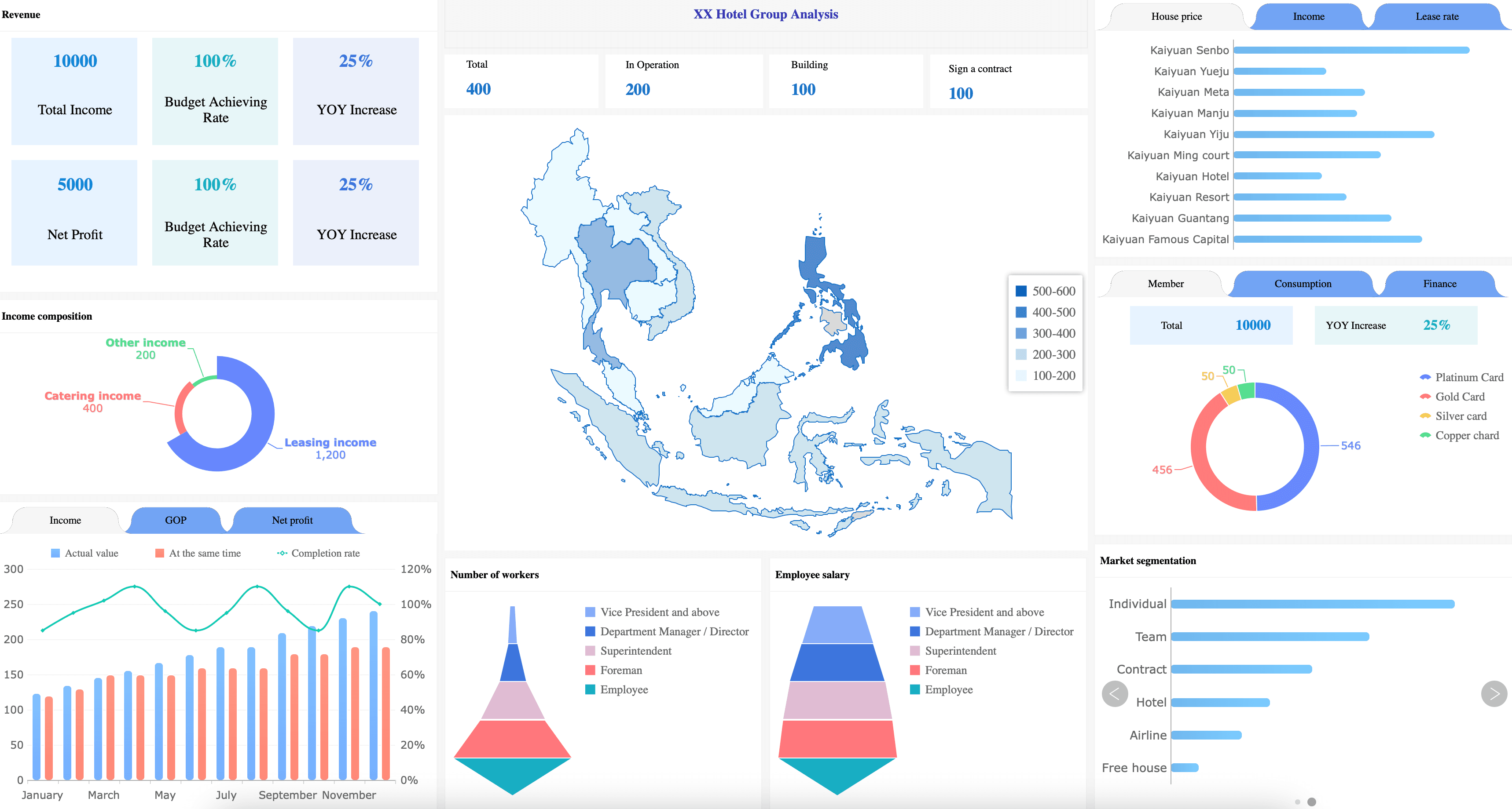
Financial Services Dashboard Examples
Banking and wealth management leaders need to track the financial indicators that help them drive institutional profitability and manage risk. Below are essential metrics for a financial kpi dashboard:
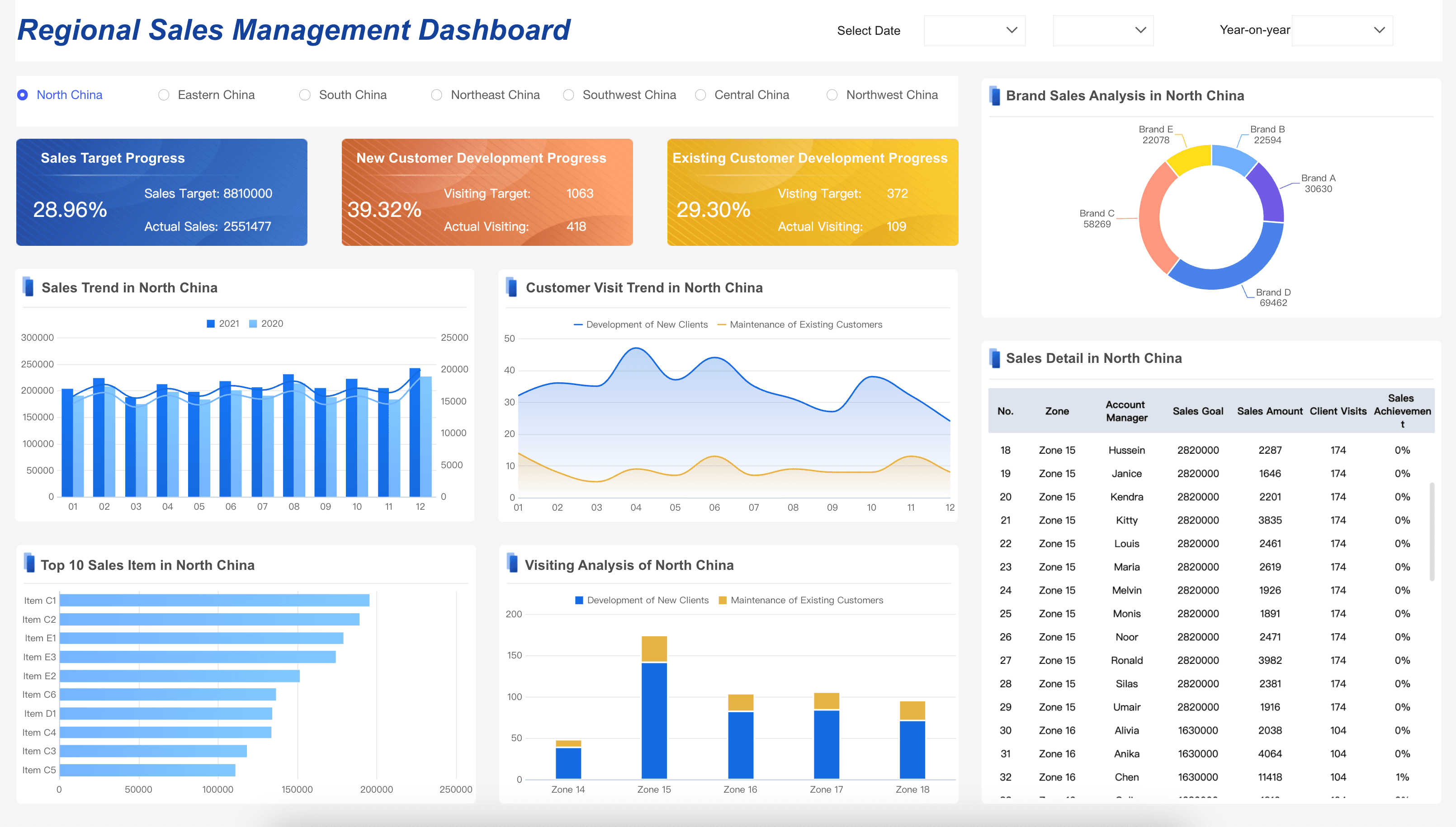
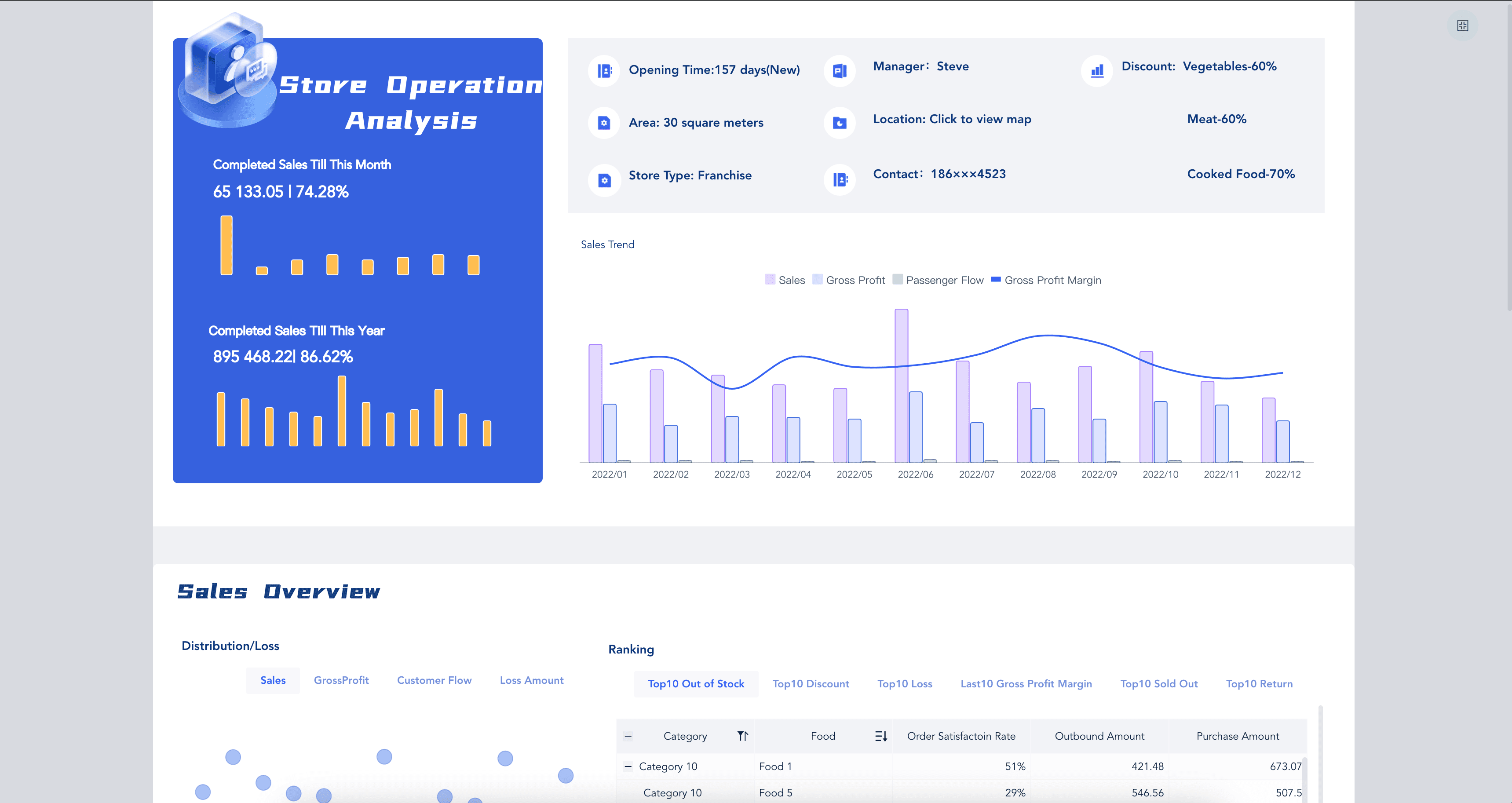
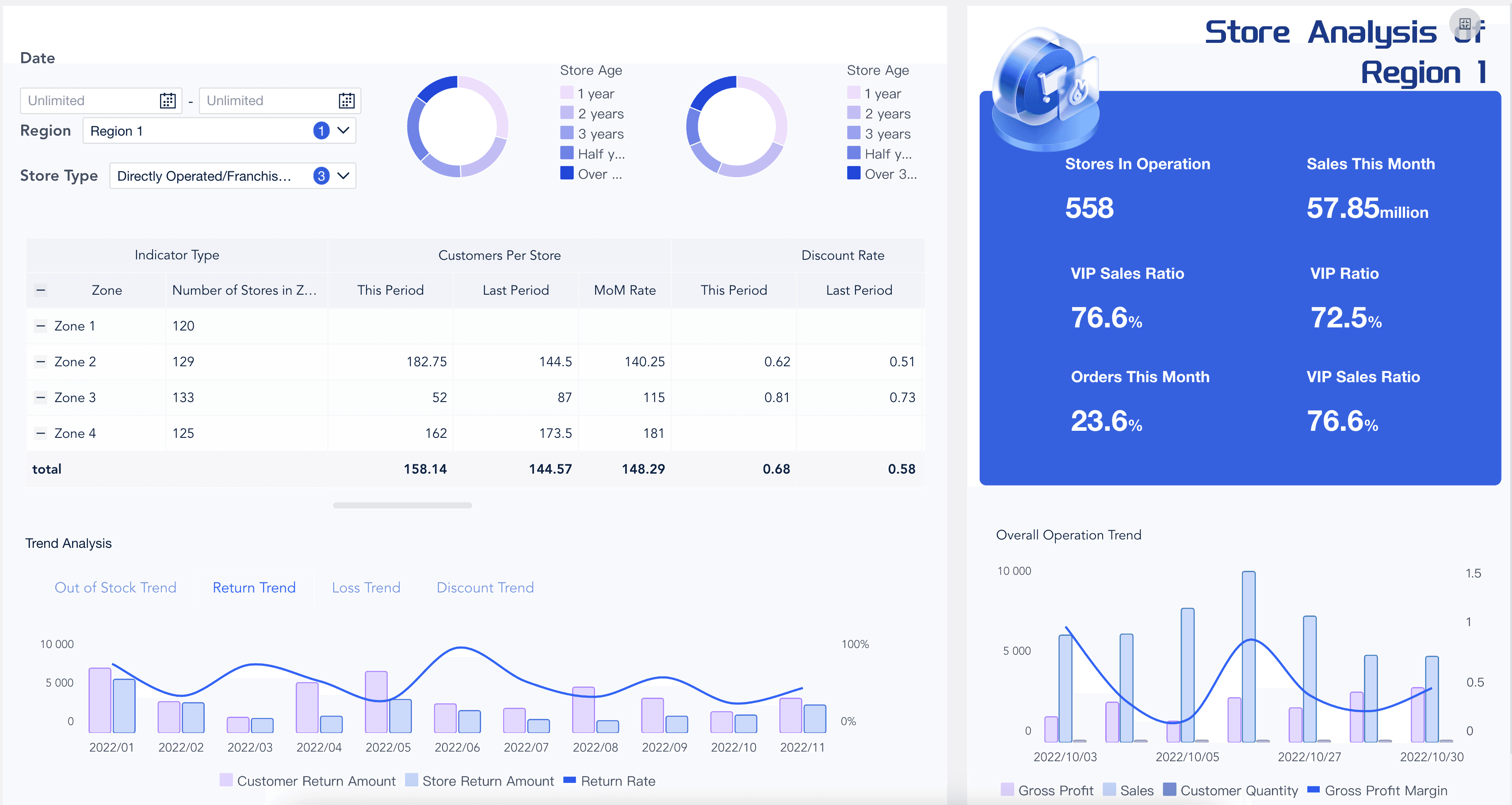
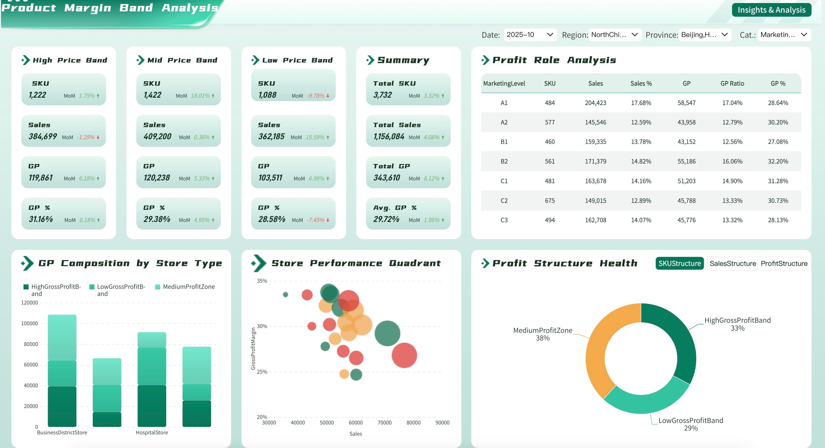
Retail Dashboard Examples
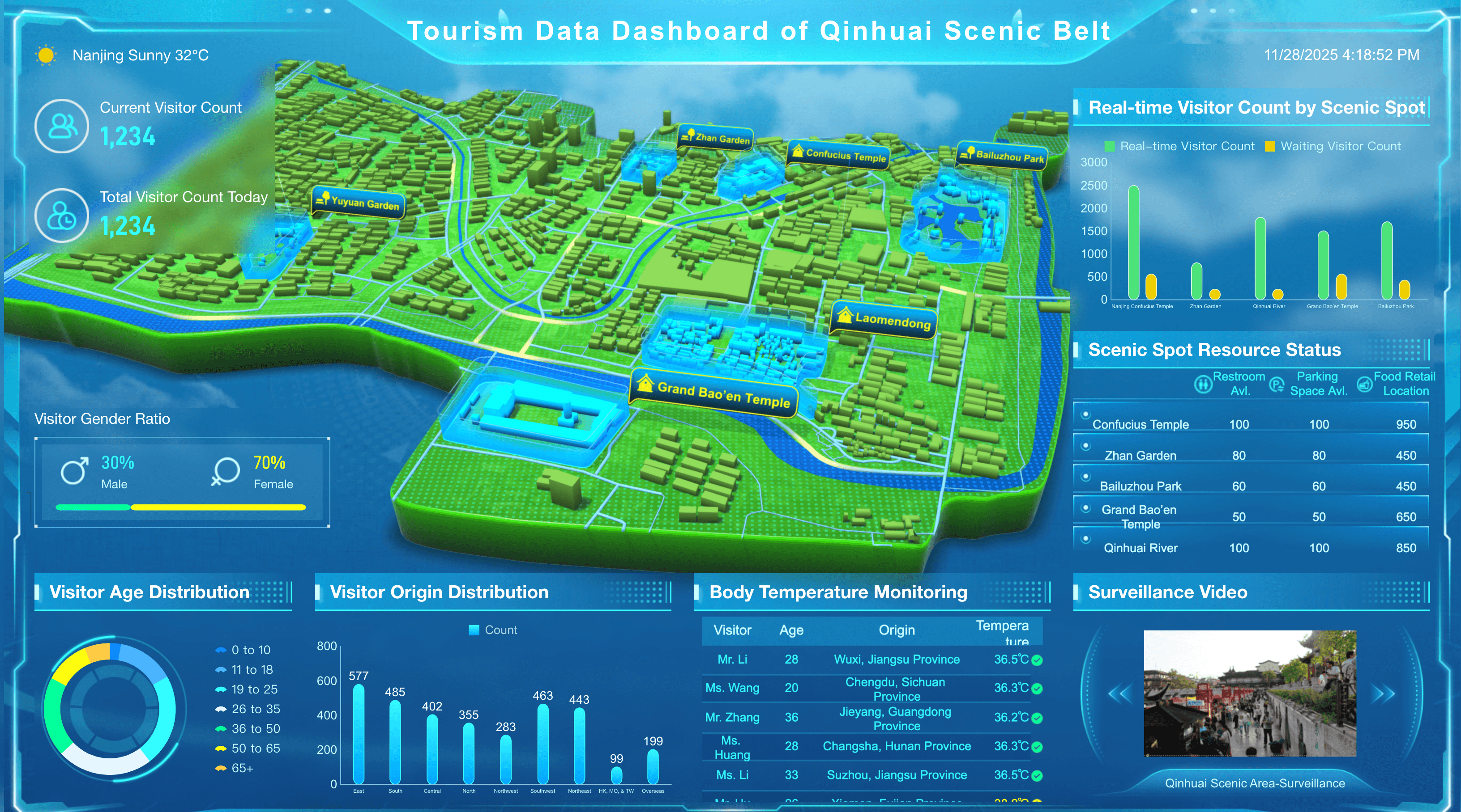
Store managers and retail executives need to track the key performance indicators that help them maximize sales and manage inventory effectively. Below are essential metrics for a retail business dashboard:
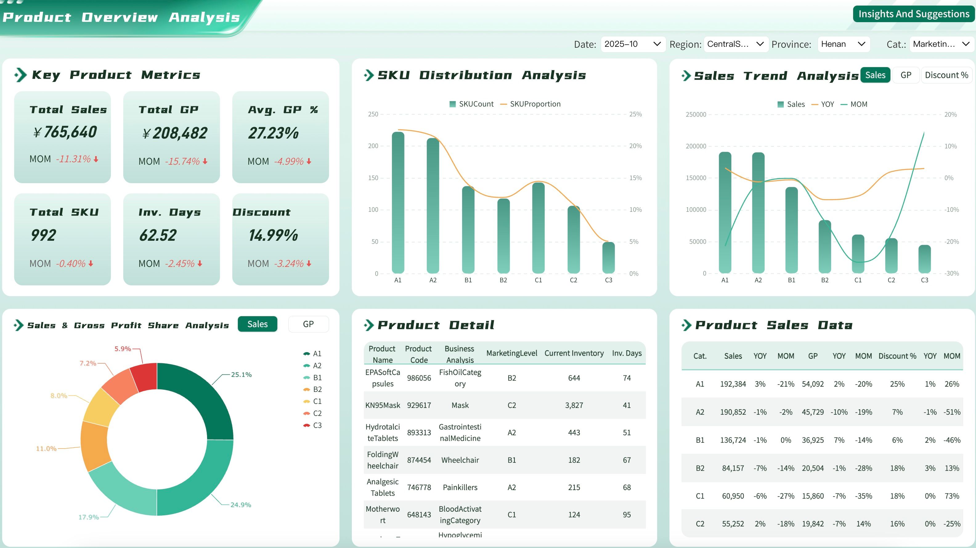
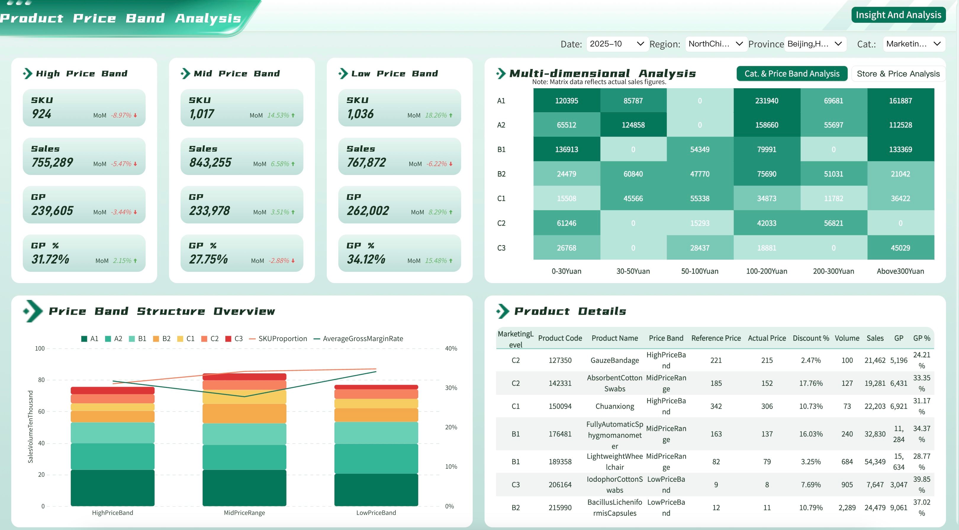
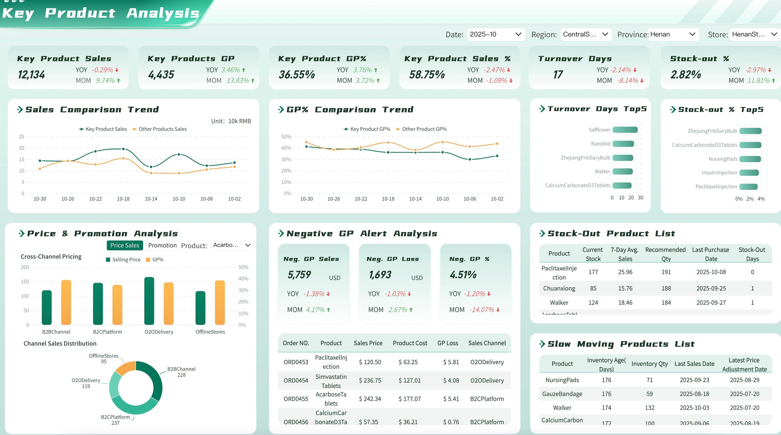
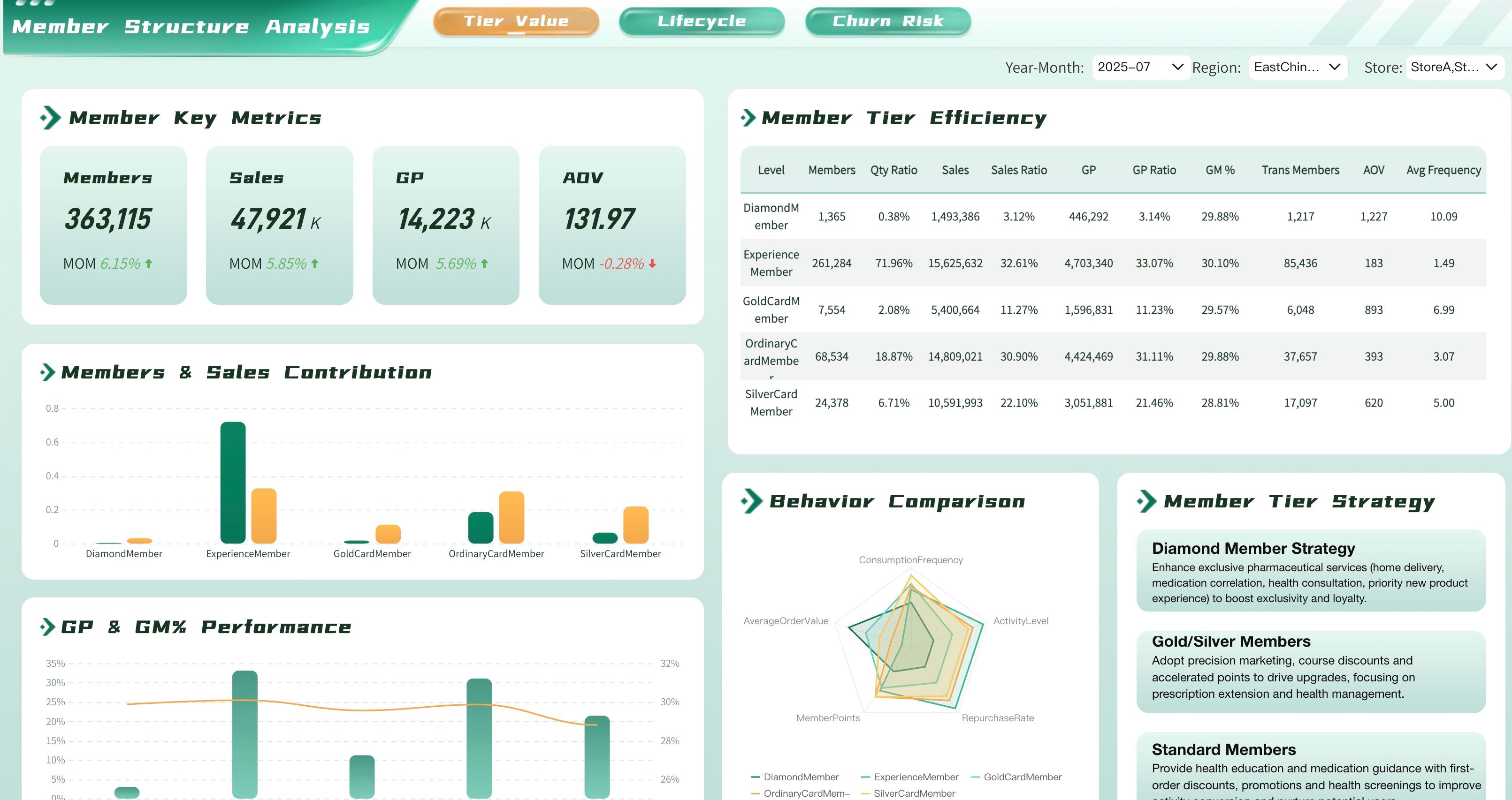
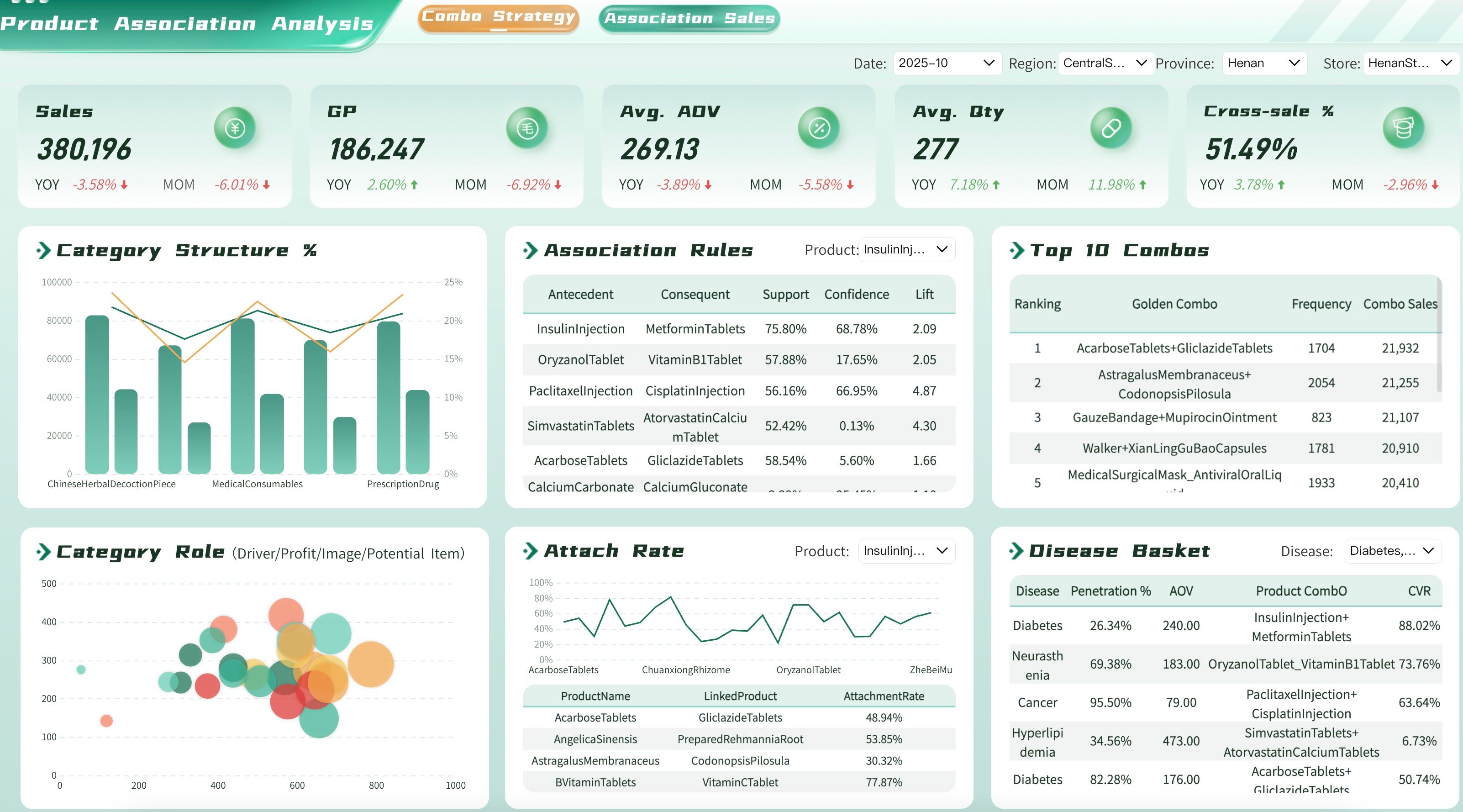
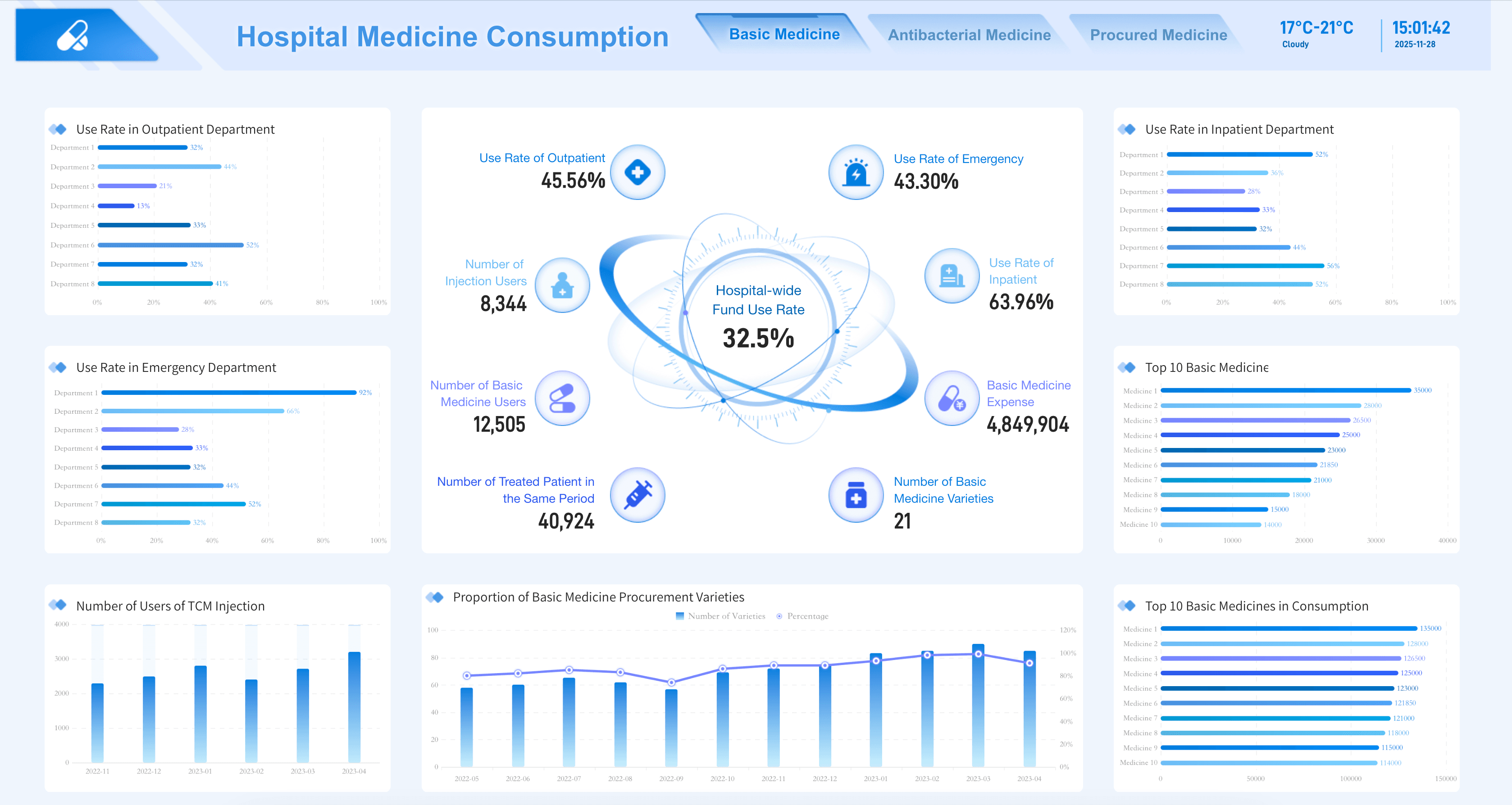
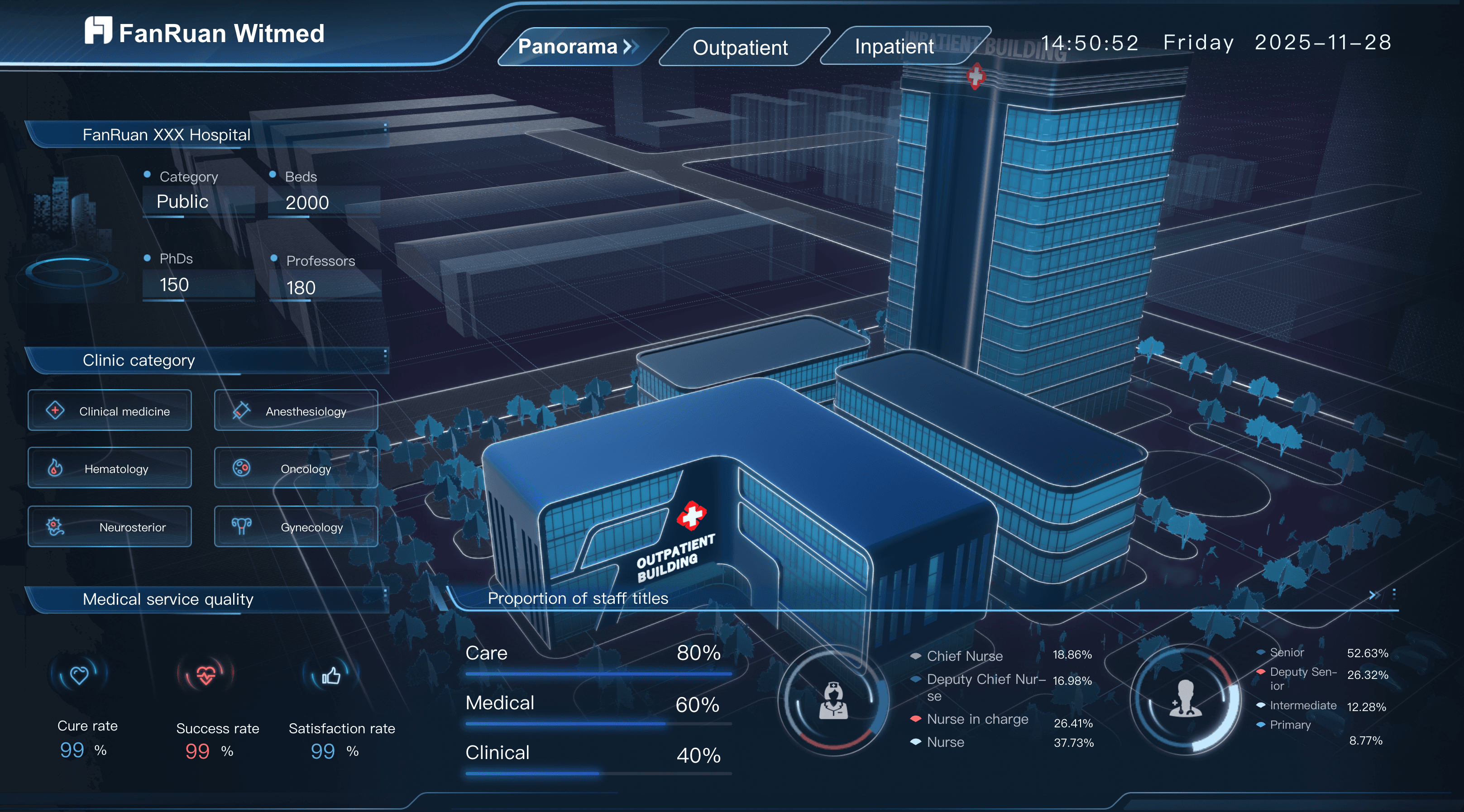
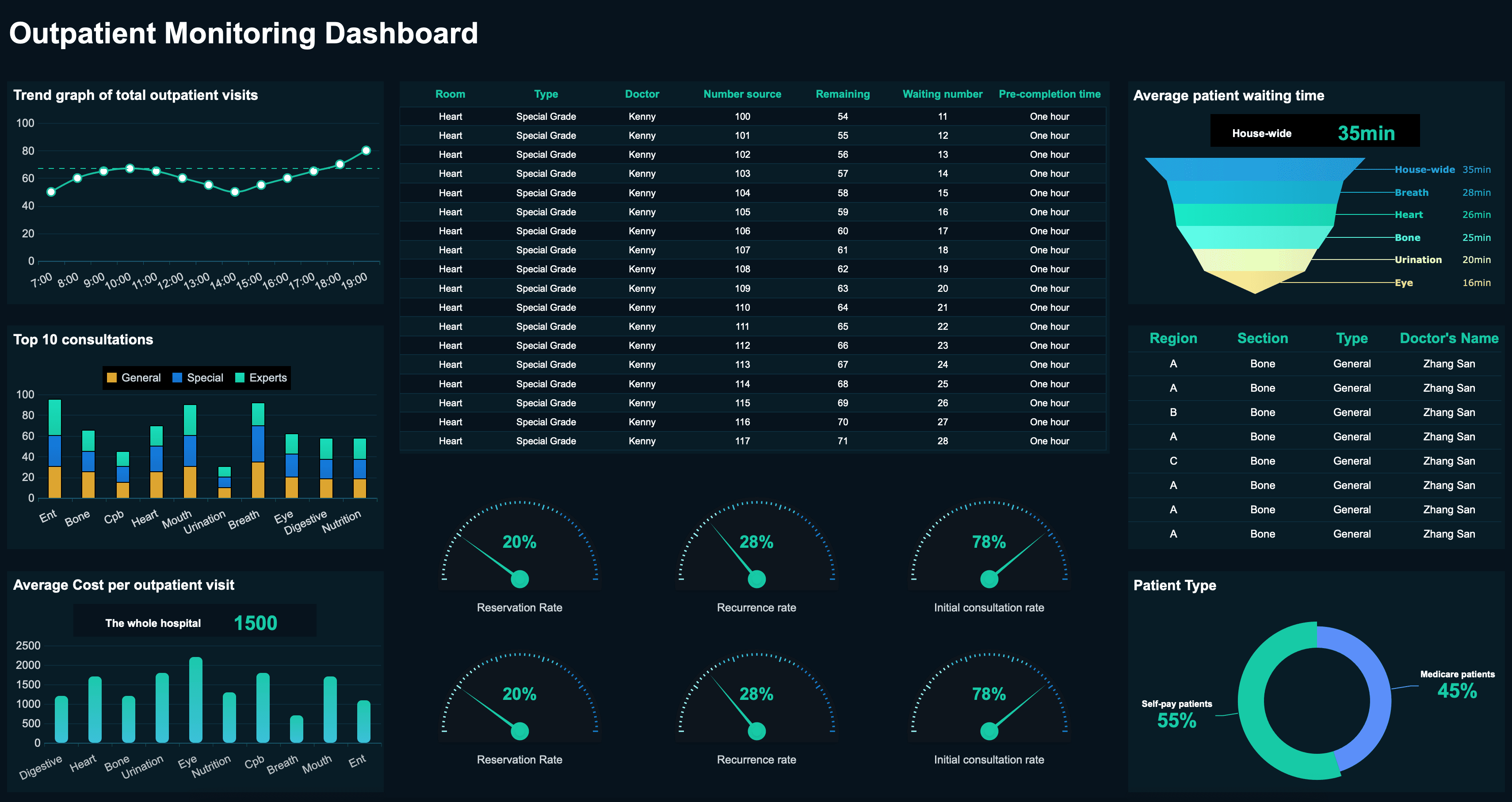
Healthcare Dashboard Examples
Hospital administrators and clinical leaders need to track the key performance indicators that help them improve patient care and facility efficiency. Below are essential metrics for a healthcare analytics dashboard:
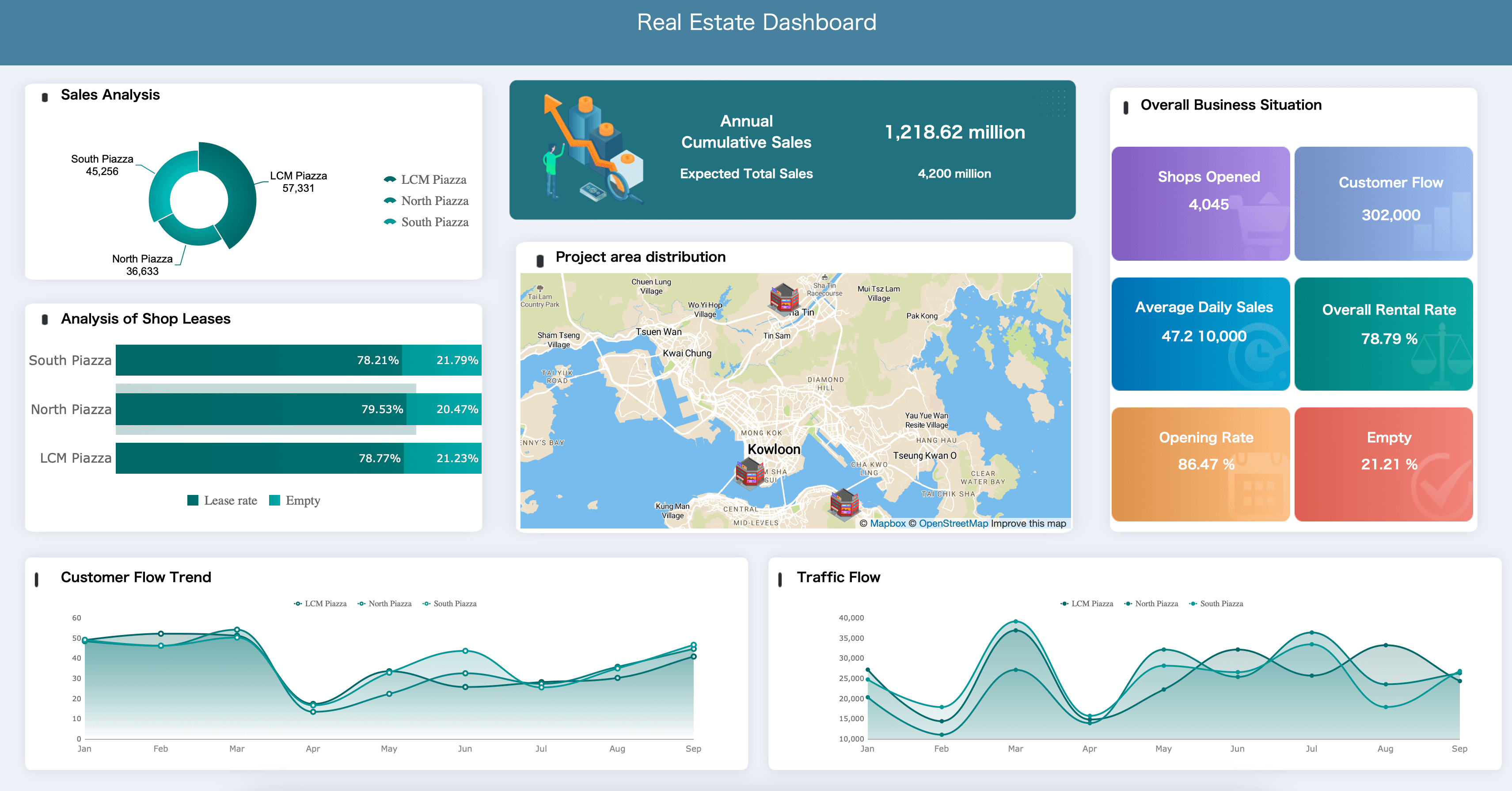
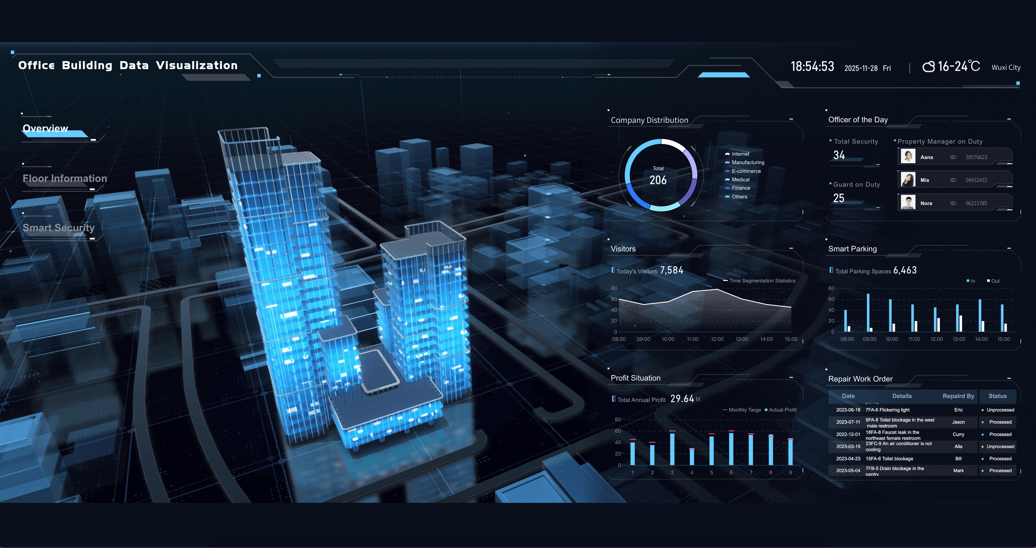
Real Estate Dashboard Examples
Property managers and real estate agents need to track the metrics that help them maximize portfolio value and tenant satisfaction. Below are essential examples for your real estate dashboard:
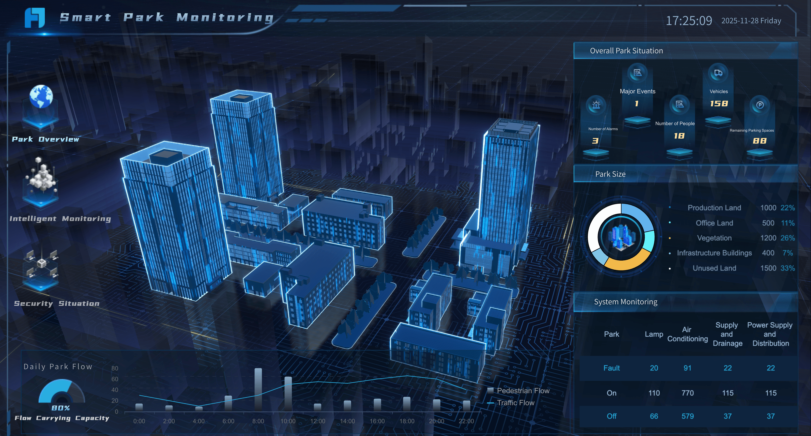
Energy & Utilities Dashboard Examples
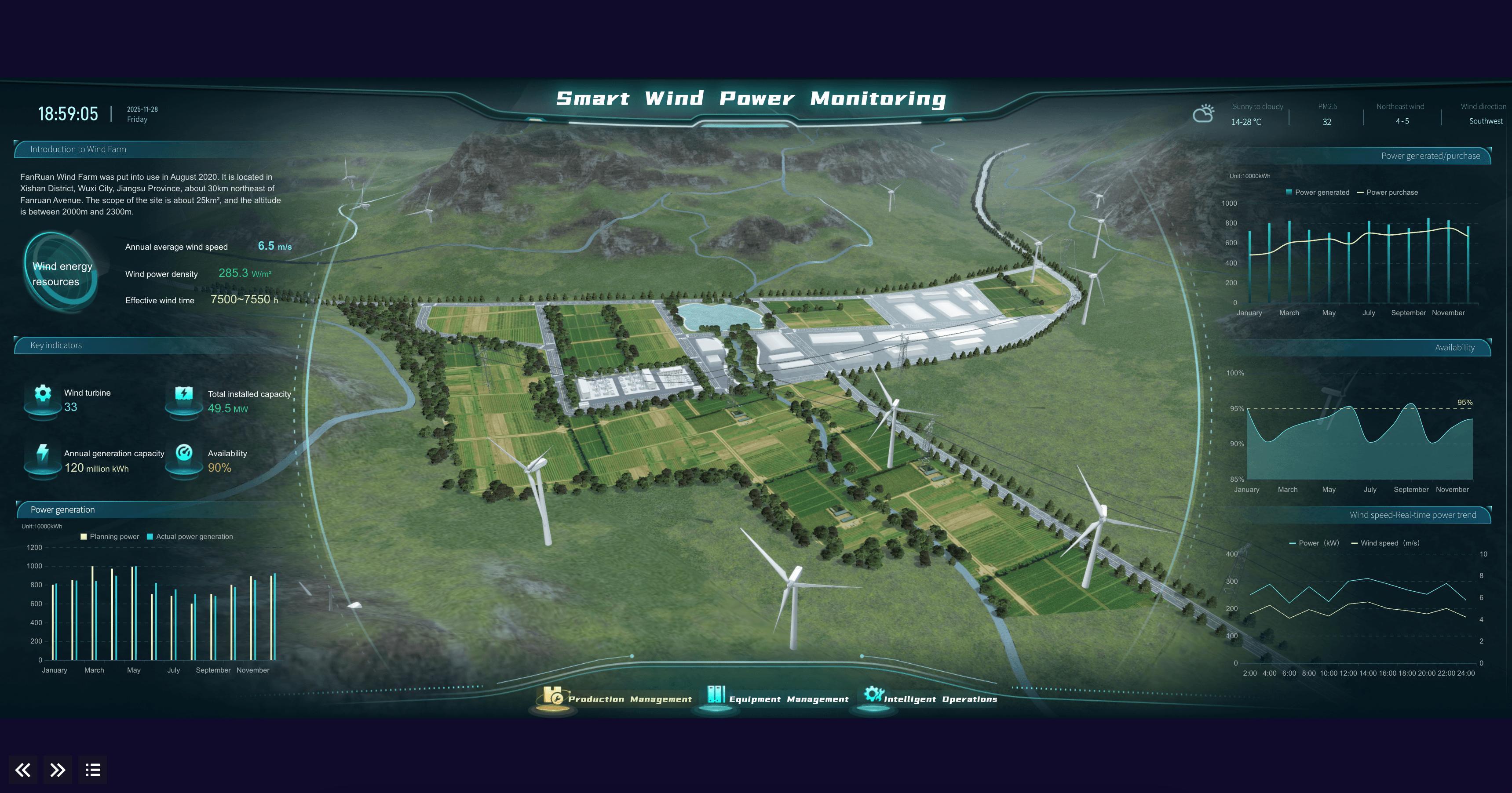
Plant operators and grid managers need to track the metrics that help them optimize energy distribution and asset reliability. Below are essential examples for an energy dashboard:

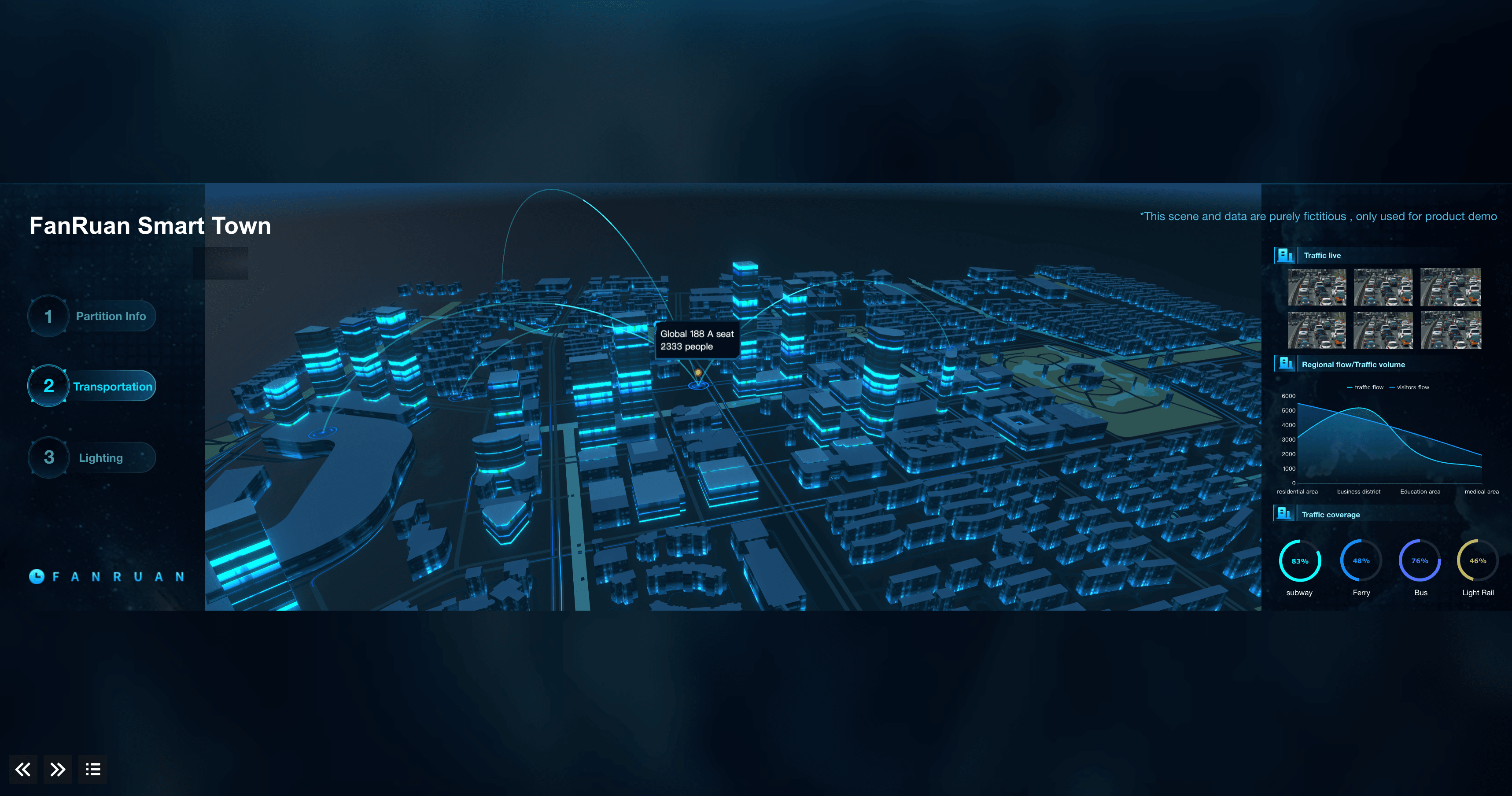
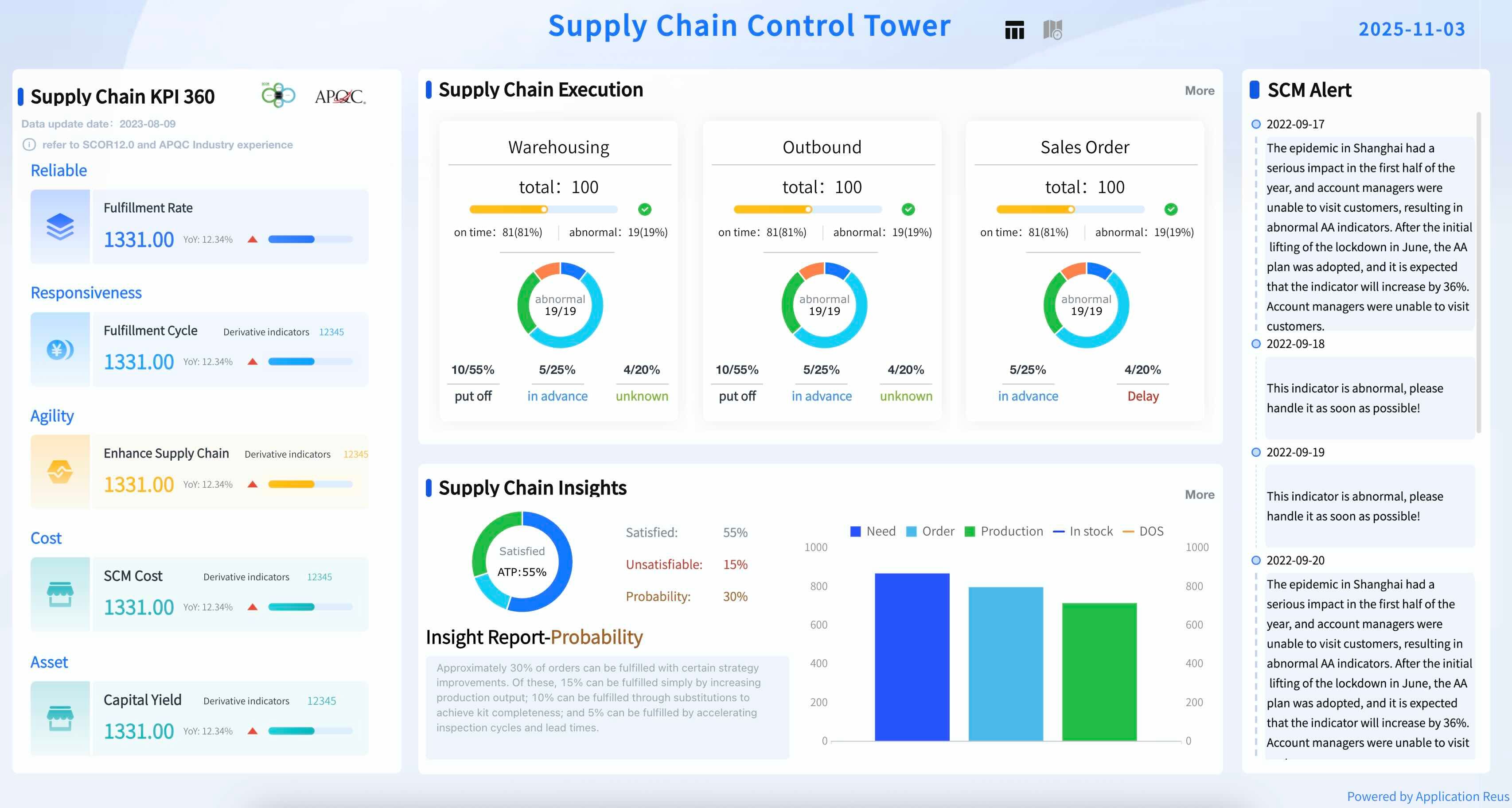
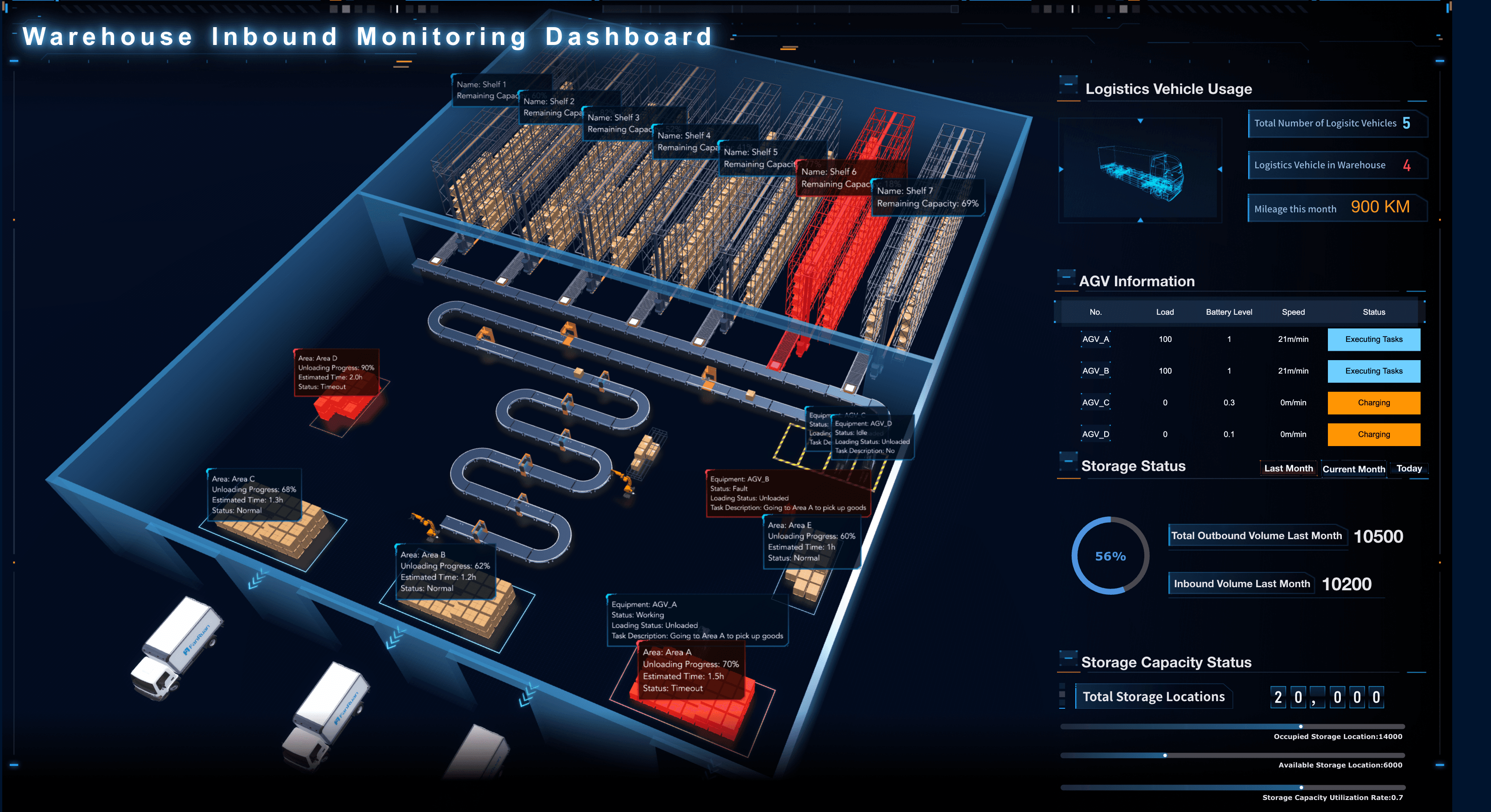
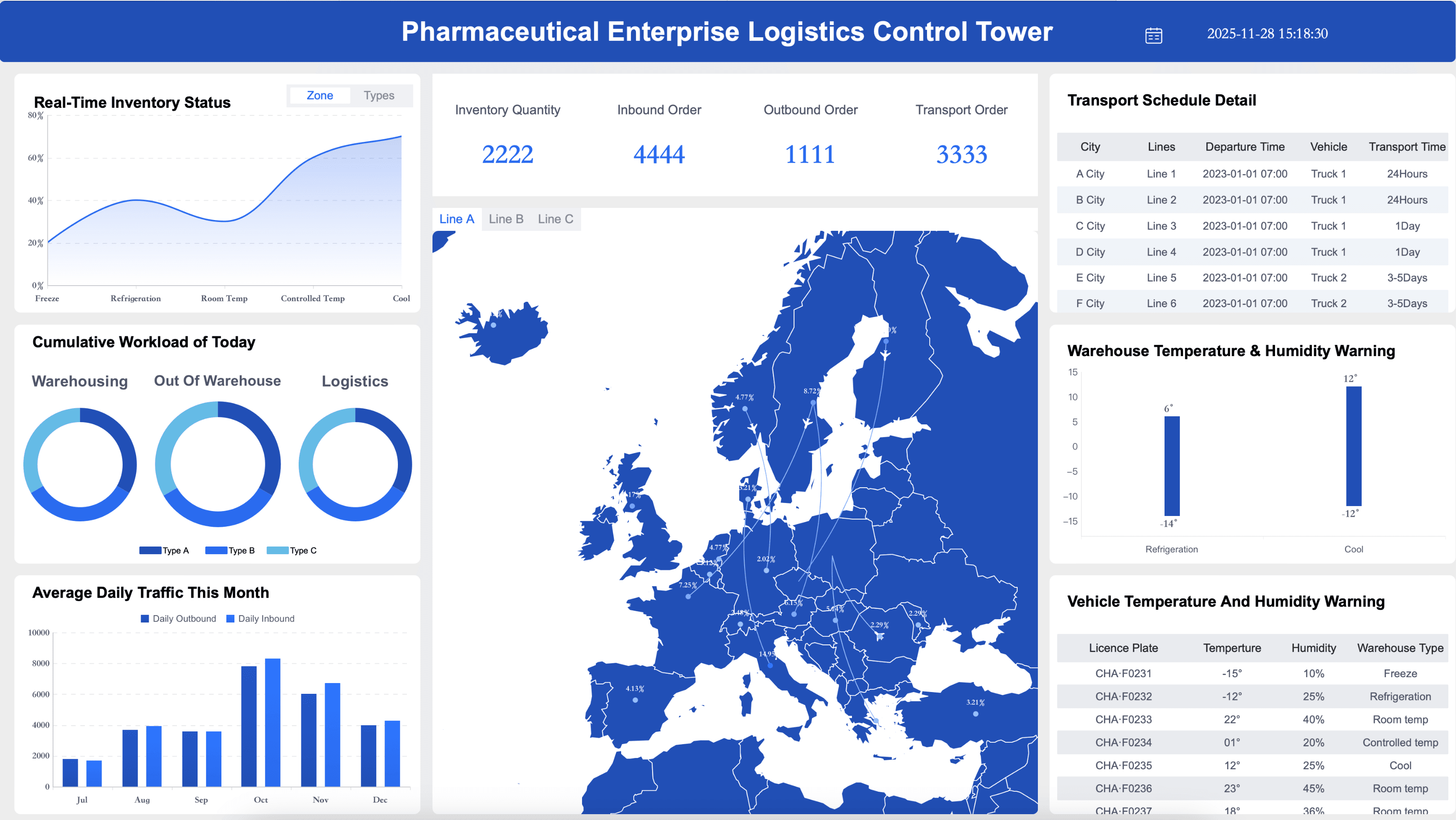
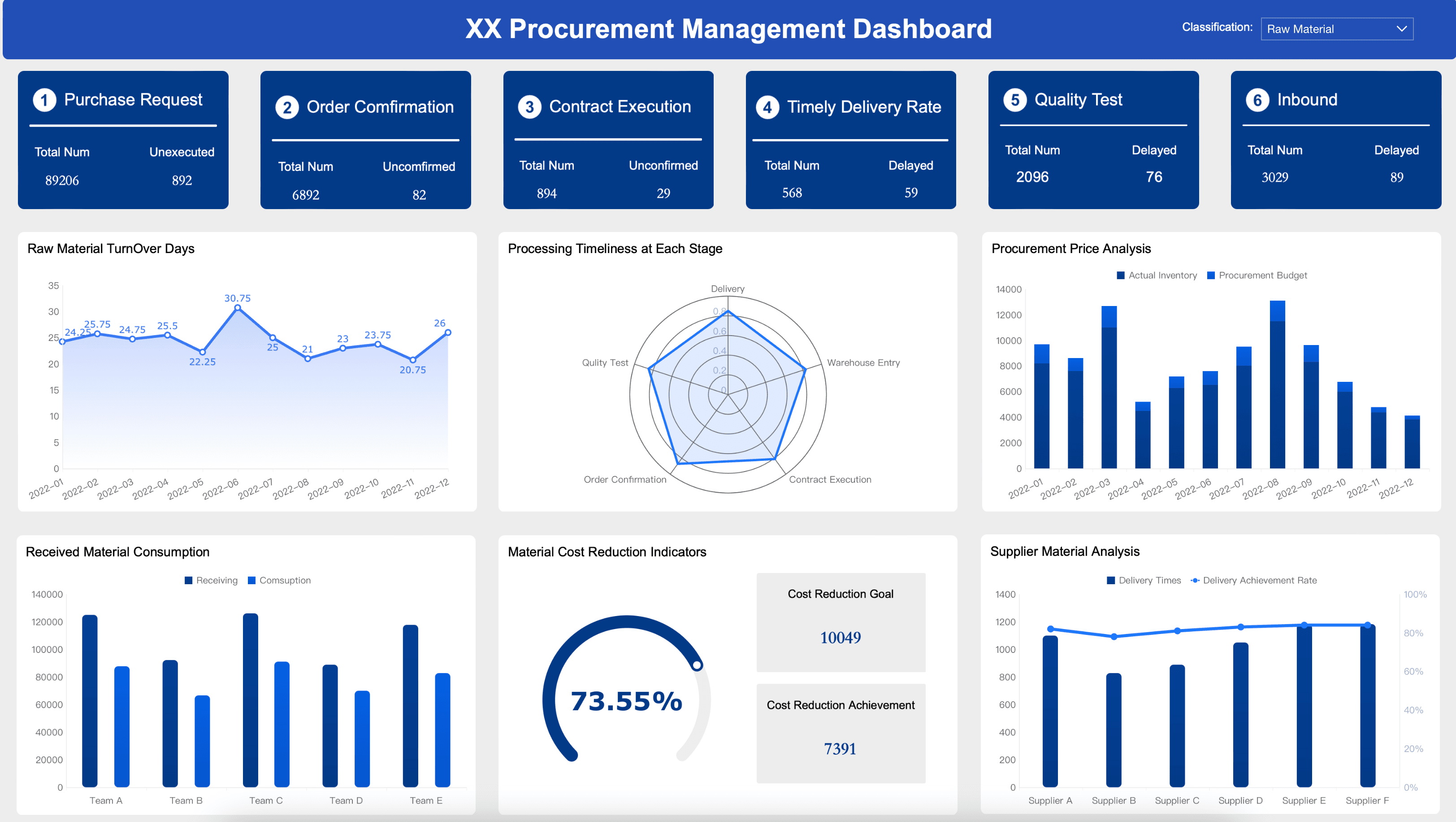
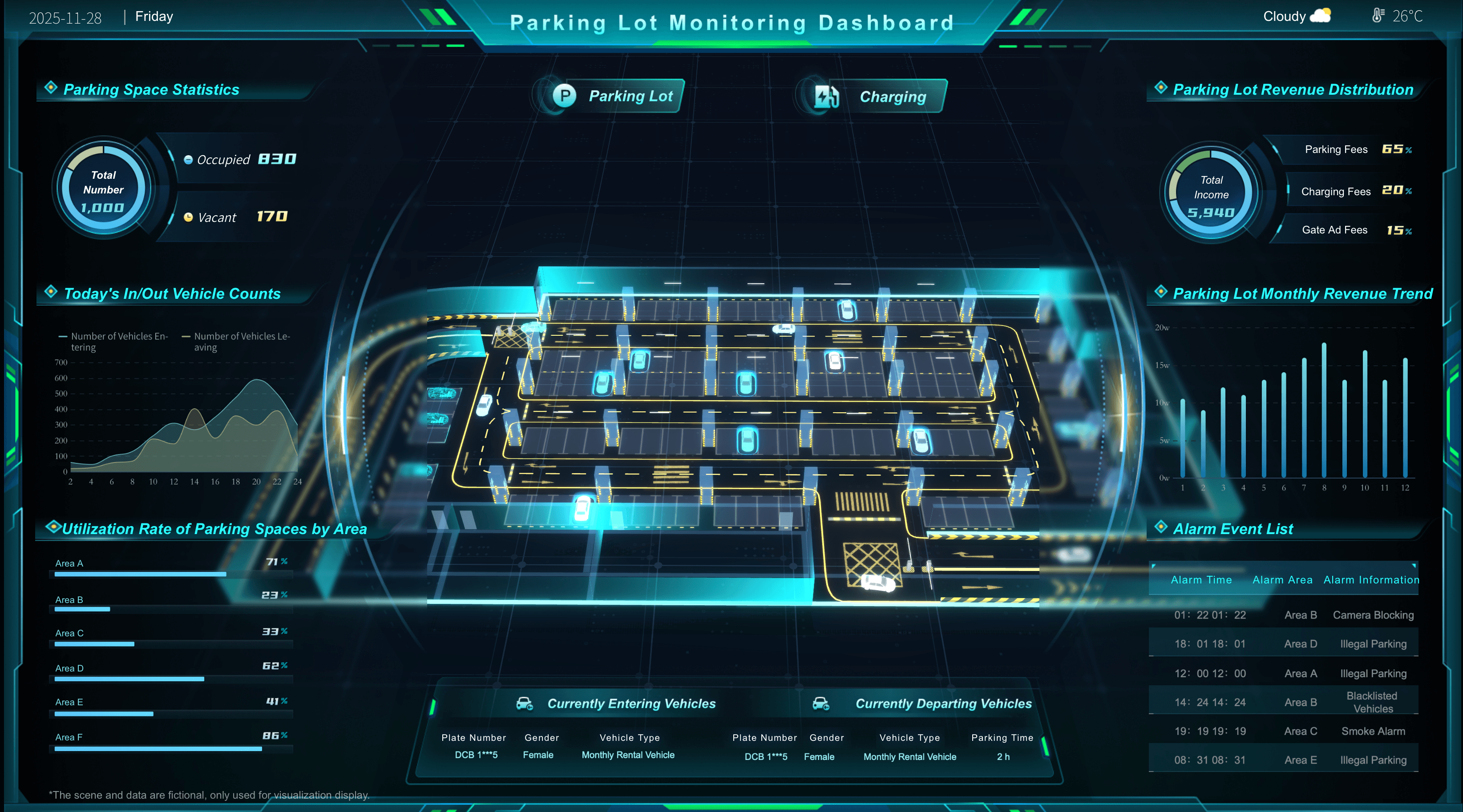
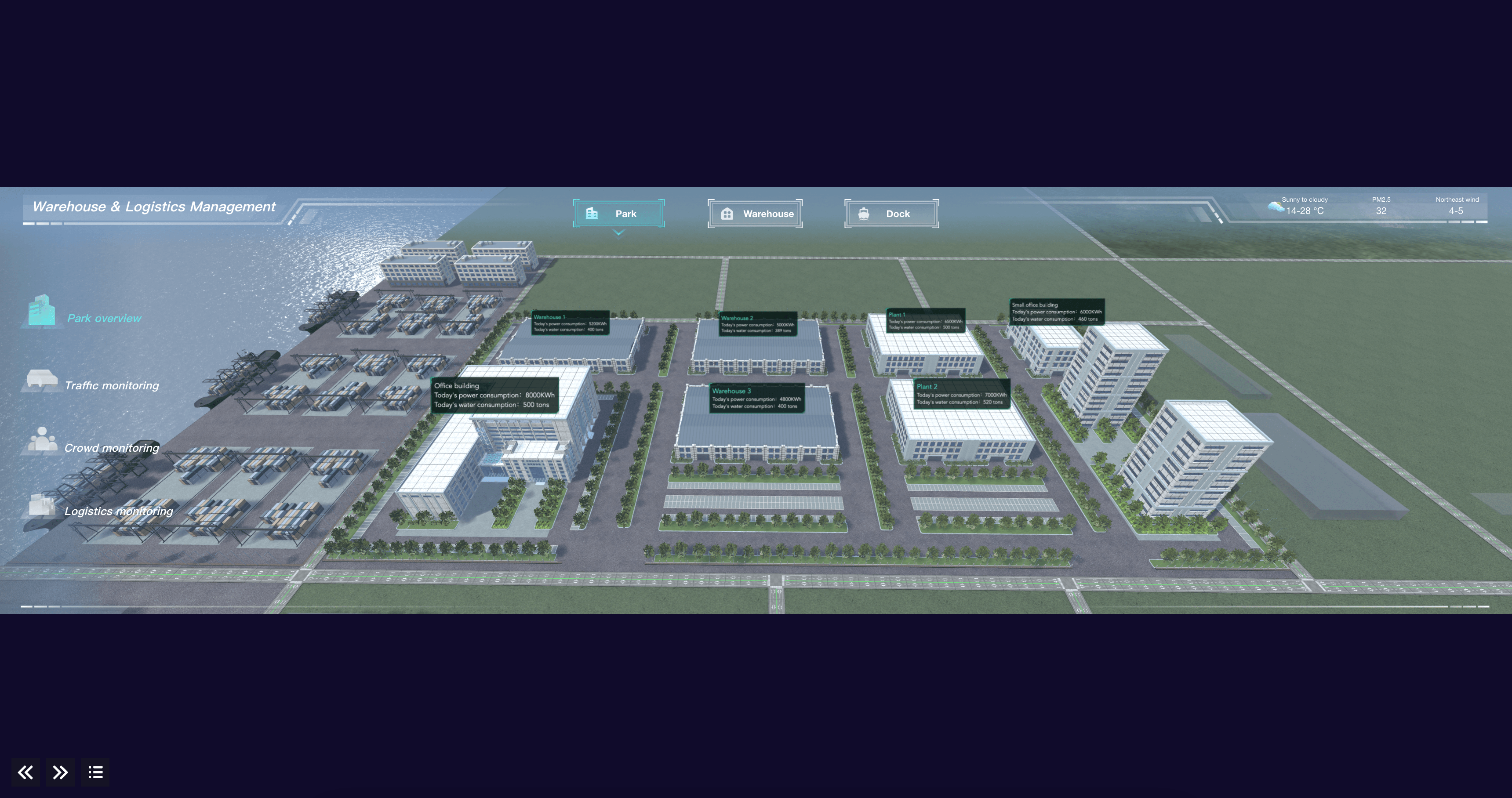
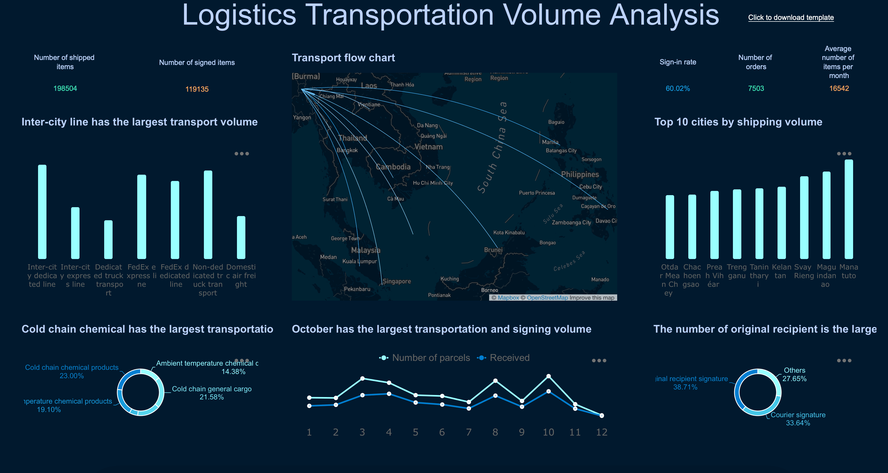
Transportation & Logistics Dashboard Examples
Fleet managers and supply chain teams need to track the key performance indicators that help them ensure on-time delivery and reduce freight costs. Below are essential elements for a logistics dashboard:
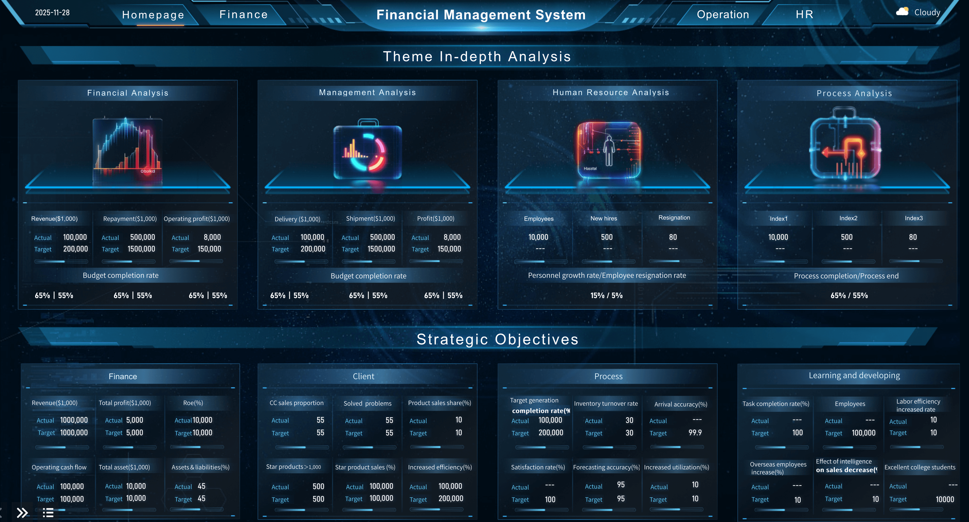
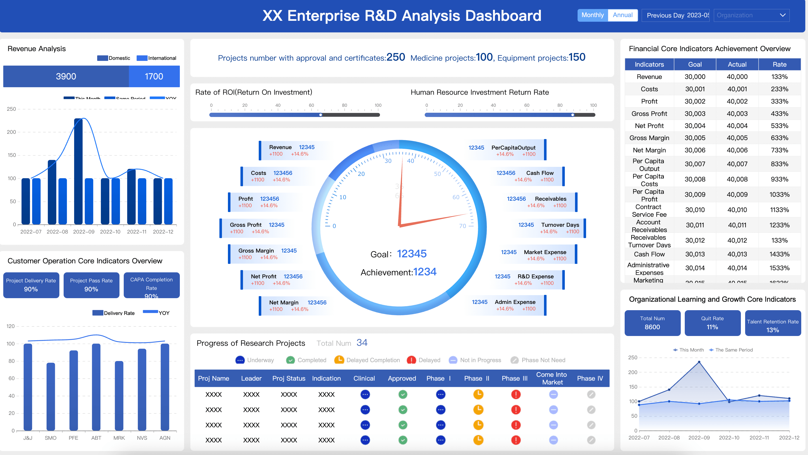
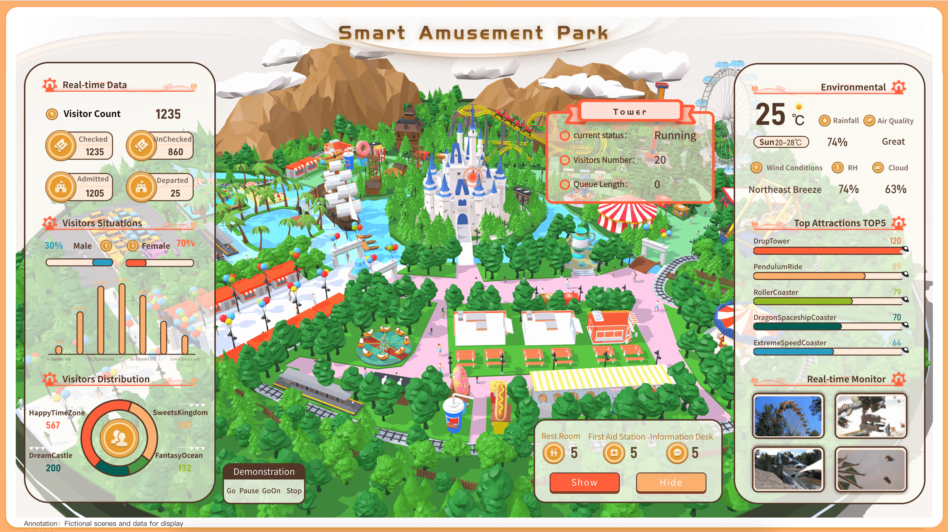
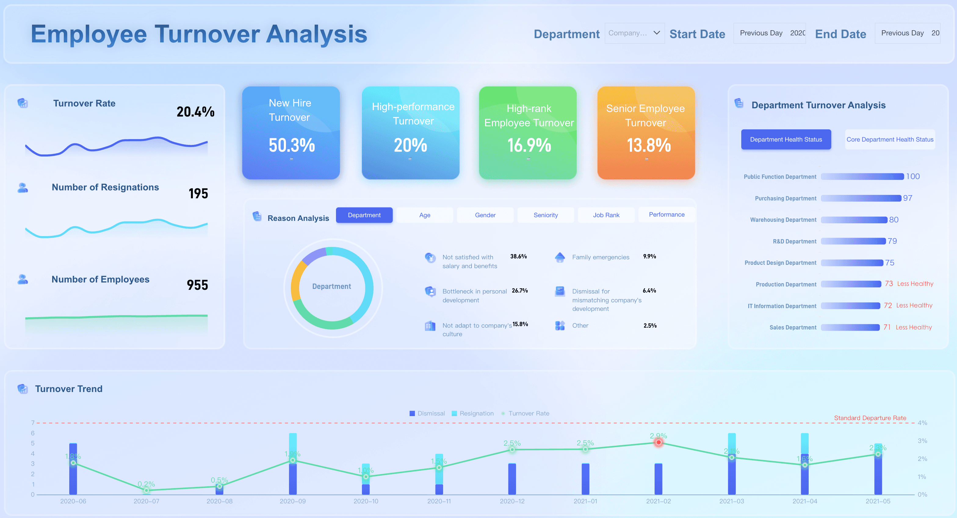
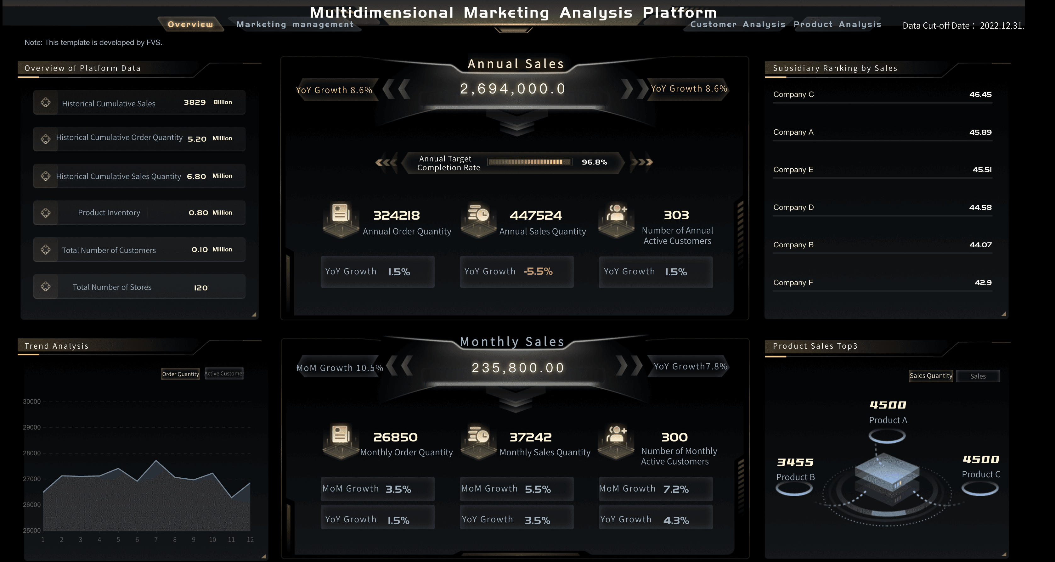
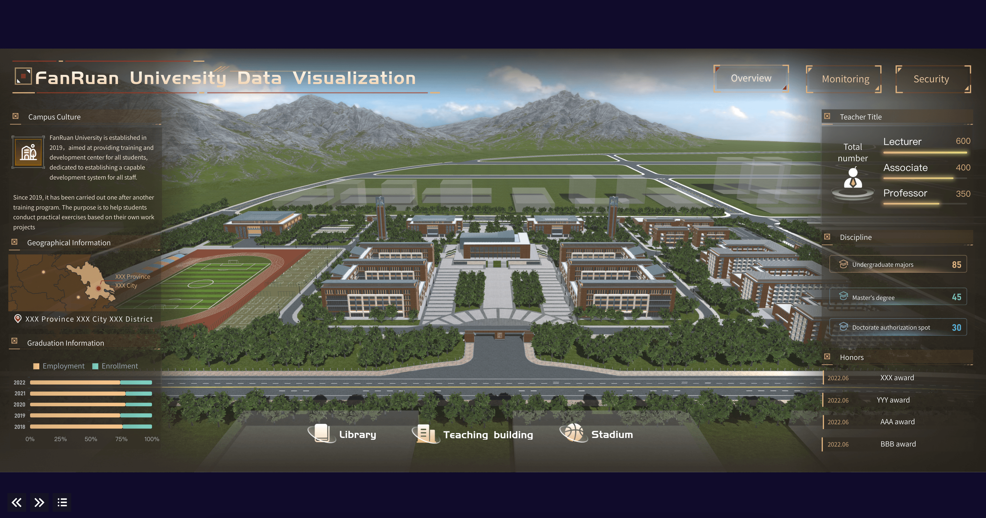
General Business Dashboard Examples
Executive leaders and department heads need to track the cross-functional metrics that help them drive sustainable, organization-wide growth. Below are essential metrics for an executive dashboard:
FAQs
Effective dashboard design follows a few core principles: clarity, relevance, and simplicity. A well-designed dashboard displays only the metrics that matter most to the user's goals, uses the right chart types for each data set, and avoids visual clutter. Layout hierarchy is also critical — the most important KPIs should be immediately visible without scrolling.
There's no universal number, but most dashboard design best practices recommend limiting a single view to 5–10 key metrics. Displaying too many data points at once leads to cognitive overload and makes it harder for users to identify what needs attention. If you need to show more data, consider using drill-downs or multiple dashboard views organized by theme or department.
Dashboard design prioritizes real-time visibility and at-a-glance decision-making, so it favors interactive charts, gauges, and KPI cards with minimal text. Report design, on the other hand, is built for detailed analysis over a fixed time period, often using tables, narratives, and structured sections. Dashboards are meant to be monitored continuously; reports are meant to be read periodically.
The right chart depends on what story you're trying to tell with the data. Use line charts for trends over time, bar charts for comparing categories, pie or donut charts sparingly for part-to-whole relationships, and scorecards or KPI tiles for single important numbers. Avoid using complex or unfamiliar chart types that require users to spend time interpreting the visualization instead of acting on the insight.
The most frequent mistakes include: overloading the dashboard with too many metrics, using inconsistent colors and fonts that confuse the reader, choosing flashy chart types over clear ones, failing to define the target audience before designing, and neglecting mobile responsiveness. Another common pitfall is designing a dashboard without input from the end users — always validate your design with the people who will use it daily.
