A PMO dashboard is not just a reporting screen. It is an executive control layer for portfolio performance, investment governance, and timely intervention. If your leadership team is still piecing together status updates from slides, spreadsheets, and disconnected project tools, decision quality will suffer. Priorities become unclear, risks surface too late, and resource conflicts stay hidden until delivery slips.
For PMO leaders, operations directors, CIOs, and transformation executives, the business value is straightforward: a well-built PMO dashboard turns fragmented project data into a decision system. It helps leaders answer critical questions fast:
Which initiatives are off track?
Where should funding shift now?
Which risks require escalation?
Do we have the capacity to deliver the portfolio we approved?
What decisions must be made this week, month, or quarter?
The best dashboards do not try to show everything. They show what leaders need to know to act.
Click To Try The Dashboard
What a PMO Dashboard Is and Why Executives Rely on It
A PMO dashboard is a centralized visual management tool that consolidates portfolio, program, project, financial, risk, and resource data into a format leaders can use to govern delivery. Its purpose is to support portfolio oversight, governance discipline, and executive decision-making.
At the PMO level, the dashboard serves three core functions:
Oversight: Provide a high-level view of delivery performance across projects and programs.
Governance: Standardize how status, risk, resource demand, and financial performance are reported.
Decision support: Highlight where leadership attention is required, not just where activity is happening.
Executive audiences need something very different from project teams. A project manager may need task-level details, sprint movement, daily blockers, or dependency logs. Executives do not. They need a concise view of:
strategic alignment
delivery confidence
investment exposure
capacity constraints
major risks
pending decisions
That distinction matters. Many PMO dashboards fail because they are built from available operational data rather than around executive decisions.
A strong PMO dashboard should directly influence outcomes such as:
Portfolio prioritization: Decide which initiatives should accelerate, pause, or stop.
Risk response: Escalate major threats early and assign accountable owners.
Resource allocation: Shift key skills and funding to the initiatives that matter most.
Governance efficiency: Reduce meeting time spent interpreting status and increase time spent making decisions.
Strategic execution: Confirm that delivery activity aligns with business objectives and expected benefits.
In short, a PMO dashboard should not be a passive display. It should be an active management instrument.
Core Metrics Every PMO Dashboard Should Include
The right PMO dashboard metrics depend on the maturity of your PMO, the complexity of your portfolio, and the decisions your executives make. However, some KPI categories are essential in nearly every enterprise environment.
Key Metrics (KPIs)
Below is a structured list of the most important PMO dashboard KPIs and what each one should tell decision-makers:
Portfolio health status: A consolidated view of whether projects are on track, at risk, or off track.
Schedule variance: Measures deviation between planned and actual delivery timelines.
Budget variance: Compares approved budget to actual spend.
Forecast accuracy: Shows how reliably teams predict cost, timeline, or delivery outcomes.
Milestone performance: Tracks whether key milestones are completed on time.
Scope change rate: Indicates how frequently project scope is expanding or shifting.
Resource utilization: Measures how much team capacity is allocated and used.
Capacity vs. demand: Compares available resources against portfolio demand.
Strategic investment mix: Shows how funding is distributed across strategic themes, business units, or initiative types.
Risk exposure: Summarizes the number, severity, and concentration of enterprise-level delivery risks.
Dependency risk: Highlights cross-project dependencies that may affect delivery confidence.
Escalated issues: Tracks unresolved blockers that require leadership action.
Benefits realization status: Indicates whether completed or active initiatives are delivering expected business value.
Decision backlog: Shows pending approvals or unresolved decisions delaying progress.
These KPIs should be tightly defined, consistently calculated, and tied to thresholds. If a metric has no clear owner or no expected leadership response, it probably does not belong on the dashboard.
Portfolio health and delivery status
Executives need a fast answer to one fundamental question: Is the portfolio healthy enough to deliver strategic outcomes?
That means your PMO dashboard should summarize delivery status across schedule, budget, scope, and milestones at the portfolio level. Avoid forcing senior leaders to inspect dozens of individual project lines unless they intentionally drill down.
A practical portfolio health section usually includes:
overall portfolio status using simple status logic
count of projects by red, amber, and green condition
trend of status changes over time
percentage of milestones delivered on time
top exceptions by impact level
confidence score or forecasted delivery likelihood
The key is surfacing red flags without overwhelming the audience. Executives should immediately see:
which projects are deteriorating
whether issues are isolated or systemic
where intervention could materially improve outcomes
A useful rule: if a project detail does not change executive behavior, keep it off the main page.
Financial, resource, and capacity indicators
Financial and resource visibility is where many PMO dashboards earn their credibility. Leaders want to know whether the portfolio is affordable, whether forecasts are reliable, and whether the organization has enough capacity to deliver approved work.
Essential indicators include:
Budget variance: Where projects are overspending or underutilizing funds
Forecast accuracy: Whether financial and timeline forecasts can be trusted
Utilization rate: Whether critical teams are overallocated or underused
Capacity gaps: Where demand exceeds available skills or headcount
Strategic investment mix: How spend is distributed across transformation, operations, compliance, innovation, or growth initiatives
This part of the PMO dashboard is especially valuable during portfolio reprioritization. It helps leadership identify where staffing constraints will reduce delivery confidence, even if projects still appear green in conventional status reports.
For example, a portfolio can look healthy on paper while key architecture, data, or engineering teams are already operating above sustainable capacity. A mature dashboard makes that risk visible before schedules collapse.
Risk, dependency, and decision signals
This is the section executives often care about most. Delivery failure rarely comes from a missed task alone. It comes from unresolved enterprise risks, cross-project dependencies, delayed approvals, and ambiguous ownership.
A strong PMO dashboard should therefore present:
top enterprise risks by impact and likelihood
critical cross-project dependencies
unresolved issues awaiting executive action
aging escalations
decision deadlines and accountable owners
Just as important, it should show when leaders must intervene. That means every major issue or risk should carry:
an escalation threshold
an assigned owner
a required action
a target decision date
Without this structure, dashboards become informational rather than operational. Executives should not have to ask, “What do you want from us?” The dashboard should answer that directly.
A high-performing PMO dashboard is built backward from leadership decisions, not forward from raw data. That is the difference between a dashboard people review and one they actually use.
Start with executive decisions, not just available data
Before choosing charts or integrations, identify the recurring decisions leadership makes at different cadences.
For example:
Weekly: Which projects require escalation or recovery support?
Monthly: Where should resources or budget be reallocated?
Quarterly: Which initiatives remain aligned with strategic priorities and expected returns?
Then map each decision to the minimum viable metrics required to support it.
This consulting approach prevents a common failure mode: dashboards overloaded with easy-to-export data that offers little executive value.
A simple working method is:
List the top 10 recurring decisions made in governance meetings.
Identify the 1 to 3 metrics needed for each decision.
Eliminate duplicate or low-value metrics.
Group remaining metrics into executive themes such as delivery, financials, risk, and capacity.
If you do this well, your PMO dashboard becomes naturally focused and far easier to maintain.
Choose data sources, structure, and refresh rules
Once your decisions and metrics are clear, define where each data point comes from and how often it should update.
Typical sources include:
project management platforms
PPM systems
ERP or finance systems
resource management tools
HR systems
ticketing or issue tracking systems
spreadsheets used for legacy governance
The challenge is not just connecting systems. It is creating data standards that make reporting consistent across programs and portfolios.
That means defining:
status logic and color rules
financial categories
milestone definitions
risk severity scales
project stage classifications
owner naming conventions
update frequency and cut-off rules
You also need clear refresh discipline. Not every dashboard component requires real-time updates. Executive PMO reporting often works best with controlled refresh schedules, such as:
daily for risk or issue escalations
weekly for project health
monthly for budget and forecast reporting
quarterly for benefits realization and strategic mix
Consistency builds trust. If leaders suspect data is stale, manually overridden, or interpreted differently across teams, dashboard adoption will drop quickly.
Design views that are fast to read and easy to trust
An effective PMO dashboard should be readable in under five minutes. If executives need a guided tour every time they open it, the design is too complicated.
place the highest-value information at the top left or center
highlight trends, exceptions, and decisions required
reduce chart count and avoid visual clutter
use drill-down views for detail instead of overloading the landing page
separate informational content from actionable content
A strong visual hierarchy typically looks like this:
portfolio status and strategic summary
financial and resource condition
top risks and dependencies
actions, decisions, and escalations
Favor concise labels over clever names. “Projects at Risk” beats “Delivery Signal Monitor.” Also be careful with color usage. Too many colors weaken meaning. Reserve strong color contrast for true exceptions.
Most importantly, the dashboard must feel trustworthy. That comes from standardized definitions, visible timestamps, clear ownership, and predictable refresh cycles.
10 Examples of PMO Dashboards for Project Management
Different dashboard types serve different governance needs. Below are 10 practical PMO dashboard examples you can use as models depending on your audience and operating model.
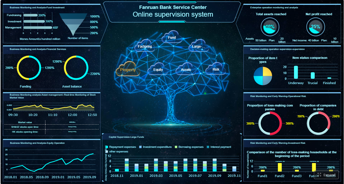
Executive portfolio summary dashboard
This is the classic one-page executive PMO dashboard. It gives leadership a strategic view of the entire portfolio.
Typical contents include:
overall portfolio health
top 5 risks
major budget and schedule variances
strategic initiative status
decisions required this period
resource hotspots
This format works well for board reviews, steering committees, and monthly executive governance meetings.
PMO project management dashboard
This version is more delivery-focused and often used by PMO leaders and program managers who need broader visibility than a single project view.
It usually covers:
project timeline adherence
milestone tracking
budget performance
issue escalation status
scope changes
delivery confidence trend
This dashboard is useful when the PMO needs to bridge operational execution and executive reporting.
Portfolio health dashboard in Power BI
A portfolio health dashboard in Power BI is a popular model because it supports trend analysis, filtering, drill-downs, and flexible data blending across enterprise systems.
A strong Power BI-style PMO dashboard often includes:
portfolio RAG status by business unit
investment distribution by strategic objective
health trends over 3 to 12 months
risk concentration by program
delivery confidence scoring
This format is especially effective for enterprises that need interactive portfolio analysis across large initiative sets.
Resource and governance dashboard variations
Resource and governance dashboards can take several forms depending on the PMO’s maturity and problem areas.
Common variations include:
Capacity planning dashboard
Focuses on utilization, available capacity, overallocated roles, and future staffing gaps.
Stage-gate compliance dashboard
Tracks whether projects are completing governance checkpoints, approvals, and required artifacts on time.
Benefits tracking dashboard
Monitors expected vs. realized value, often by program, sponsor, or strategic objective.
Dependency management dashboard
Highlights cross-project blockers, dependency aging, and ownership for resolution.
Risk escalation dashboard
Summarizes severe risks, mitigation plans, due dates, and accountable leaders.
Transformation office dashboard
Focuses on enterprise initiatives, adoption milestones, business readiness, and strategic impact.
Demand intake dashboard
Tracks new requests, prioritization stage, approval status, and impact on portfolio capacity.
Program-level control tower dashboard
Gives a consolidated view of multiple related projects within a major transformation program.
Hybrid PMO dashboard
Combines traditional and agile indicators, such as milestone health, budget confidence, sprint predictability, and release readiness.
The best model depends on what your leadership team is actually trying to manage. One dashboard rarely fits every stakeholder, which is why modular design matters.
Best Practices to Create a PMO Dashboard That Drives Decision-Making
A PMO dashboard only creates value when it changes leadership behavior. The following best practices help ensure your dashboard becomes a decision tool rather than another passive report.
Make every metric actionable
Every KPI on the dashboard should answer three questions:
What does this metric mean?
When is it a concern?
What should leadership do about it?
Tie each KPI to:
a threshold
an accountable owner
an expected response
For example, showing budget variance alone is not enough. You should also indicate whether the variance exceeds tolerance, who owns correction, and whether the situation requires executive approval, resource shifts, or scope adjustment.
Remove metrics that do not trigger discussion or action. They consume space and dilute signal.
Balance standardization with flexibility
Enterprise PMOs need consistency, but they also need tailored stakeholder views. The solution is to standardize core definitions while allowing presentation flexibility.
This creates a scalable PMO dashboard structure that can evolve with portfolio complexity without breaking trust in the data.
Review adoption and improve over time
Dashboard design is not finished at launch. You should evaluate whether executives actually use it in decision forums.
Track indicators such as:
dashboard usage in governance meetings
frequency of executive drill-down requests
number of decisions made using dashboard data
recurring questions that the dashboard still does not answer
feedback on clarity, relevance, and trust
Then improve iteratively. As portfolio maturity grows, leadership needs often change. What starts as a health dashboard may later need stronger financial forecasting, dependency mapping, or benefits realization tracking.
Common Mistakes to Avoid When Building a PMO Dashboard
Many PMO dashboards fail for predictable reasons. Avoid these common mistakes if you want a dashboard executives will trust and use.
Overloading the dashboard with too many charts, colors, or status indicators
More data does not mean more insight. Clutter slows comprehension and weakens prioritization.
Reporting activity instead of outcomes, risks, and decisions
Executives do not need a task diary. They need visibility into whether strategic outcomes are at risk.
Ignoring data quality, ownership, and refresh discipline
A dashboard with inconsistent definitions or stale data loses credibility quickly.
Designing for the PMO team instead of the executive audience
If the dashboard reflects internal reporting comfort instead of leadership decision needs, adoption will be low.
Using inconsistent status logic across projects
One team’s “amber” cannot mean another team’s “red.” Standardization is mandatory.
Failing to define escalation triggers
If a risk is visible but no one knows when it requires intervention, the dashboard is incomplete.
Trying to solve every stakeholder need in one screen
Executive, PMO, finance, and delivery audiences may need related but different views.
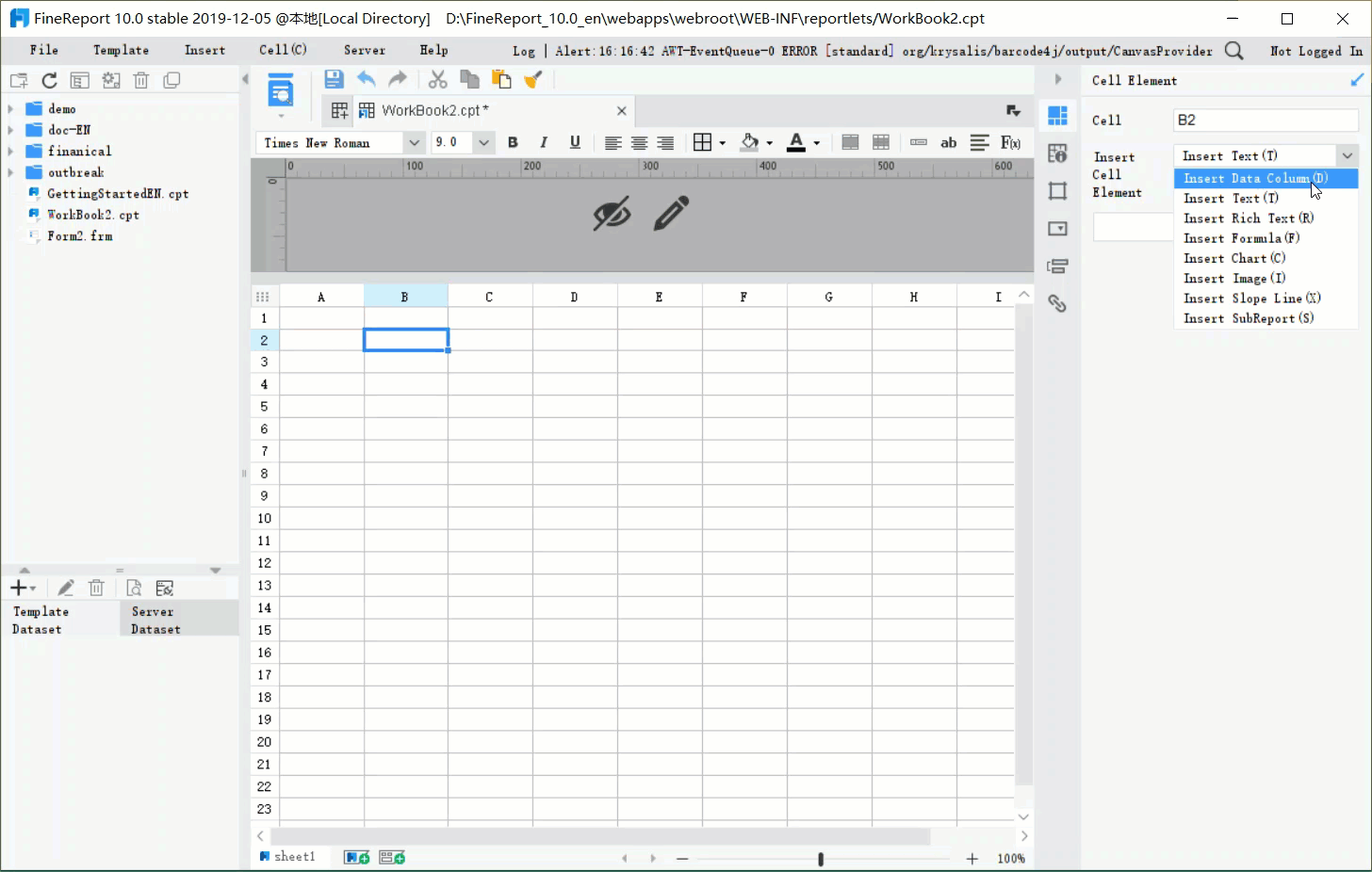
Build Smarter, Faster, and at Scale with FineReport
Building a robust PMO dashboard manually is possible, but it is also time-consuming, fragile, and difficult to scale. Most teams end up stitching together spreadsheets, slide decks, exported reports, and disconnected BI views. That approach creates version-control issues, inconsistent KPI definitions, and too much manual effort before every governance meeting.
This is where the right platform changes the equation.
Building this manually is complex; use FineReport to utilize ready-made templates and automate this entire workflow.
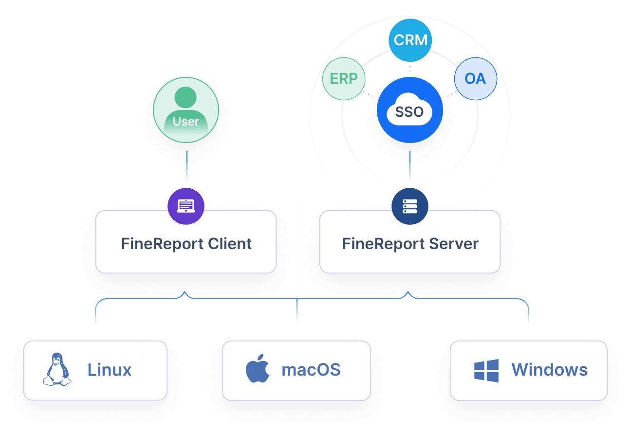
FineReport enables PMOs to move from static reporting to governed, automated, executive-ready dashboards by helping teams:
integrate data from multiple business systems
standardize PMO metrics and status logic
create role-based dashboard views for executives, PMO leaders, and delivery teams
automate refresh cycles and recurring reporting
use ready-made templates to accelerate deployment
drill down from portfolio summaries into underlying project details
improve trust with consistent visuals and controlled governance rules
For enterprise decision-makers, that means faster implementation, better data consistency, and less manual reporting overhead. For PMO teams, it means more time spent on portfolio leadership and less time chasing updates.
If your goal is to build a PMO dashboard that truly supports executive decision-making, the methodology matters. But so does the tool. FineReport gives you the structure, automation, and flexibility to operationalize the dashboard approach described in this guide without rebuilding it from scratch every reporting cycle.
FAQs
A PMO dashboard gives executives a single view of portfolio performance, risks, resources, and financial health so they can make faster decisions. Its value is not just reporting status, but showing where leadership action is needed.
The most useful KPIs usually include portfolio health, schedule variance, budget variance, milestone performance, resource utilization, capacity versus demand, risk exposure, and benefits realization. These metrics should be clearly defined and tied to decision thresholds.
A project dashboard focuses on delivery details like tasks, blockers, and day-to-day progress within one initiative. A PMO dashboard operates at portfolio level and highlights strategic alignment, investment exposure, major risks, and decisions requiring executive attention.
Start by identifying the decisions leaders need to make, then choose only the metrics that directly support those decisions. Keep the layout simple, standardize data definitions, and make sure the dashboard surfaces exceptions, trends, and escalation points quickly.
Many fail because they show too much operational detail and not enough actionable insight. If the dashboard is cluttered, inconsistent, or disconnected from governance decisions, executives will not use it effectively.
Product Trial
FineReport
Pixel-perfect reports · Interactive dashboards · Easy data entry · Digital twins